These layouts provide a simple undo bar with Material Design.
This gist does not contain any Android L API.
| undobar with action | undobar mobile |
|---|---|
 |
 |
| // Dagger 1 example | |
| @Module( | |
| complete = false, | |
| library = true | |
| ) | |
| public final class ApiModule { | |
| @Provides | |
| @Singleton | |
| Retrofit provideRetrofit(Gson gson, Application app) { | |
| return new Retrofit.Builder() |
| dependencies { | |
| compile 'io.reactivex:rxjava:1.0.12' | |
| compile 'com.squareup.okhttp:okhttp:2.5.0' | |
| compile 'com.squareup.retrofit:retrofit:2.0.0-beta1' | |
| compile 'com.squareup.retrofit:converter-gson:2.0.0-beta1' | |
| compile 'com.squareup.retrofit:adapter-rxjava:2.0.0-beta1' | |
| } |
| ackage main | |
| import "github.com/go-redis/redis" | |
| import "github.com/go-martini/martini" | |
| import "crypto/md5" | |
| import "fmt" | |
| var client *redis.Client | |
| func main() { |
| func handleUpload(u io.Reader) (err error) { | |
| // capture all bytes from upload | |
| b, err := ioutil.ReadAll(u) | |
| if err != nil { | |
| return | |
| } | |
| // wrap the bytes in a ReadSeeker | |
| r := bytes.NewReader(b) |
| package main | |
| import ( | |
| "bytes" | |
| "flag" | |
| "image" | |
| "image/color" | |
| "image/draw" | |
| "image/jpeg" | |
| "log" |
| /* | |
| * Copyright 2014 Chris Banes | |
| * | |
| * Licensed under the Apache License, Version 2.0 (the "License"); | |
| * you may not use this file except in compliance with the License. | |
| * You may obtain a copy of the License at | |
| * | |
| * http://www.apache.org/licenses/LICENSE-2.0 | |
| * | |
| * Unless required by applicable law or agreed to in writing, software |
| AppCompat-v7:21 provides a very useful way of dealing with pressed/focused/activated states maintaining backwards compatibility downto API-7, but there's a small issue (big for some) with the default selectableItemBackground: It uses some PNGs and/or default values for API<21. | |
| The main reason is that android drawable resource definitions (prior API 21) CANNOT use theme attributes at all, so there's no way of making something like: | |
| <shape android:shape="rectangle"> | |
| <solid android:color="?attr/colorControlHighlight" /> | |
| </shape> | |
| For this, I've put this simple mockup on how to give your app better drawables that the appcompat defaults. |
| Unless specified otherwise, all of the below tinting applies to both Lollipop and pre-Lollipop using AppCompat v21. To use the support version of these attributes, remove the android namespace. For instance, "android:colorControlNormal" becomes "colorControlNormal". These attributes will be propagated to their corresponding attributes within the android namespace for devices running Lollipop. Any exceptions to this will be noted by including the "android:" prefix. | |
| All Clickable Views: | |
| ----------- | |
| * ripple effect (Lollipop only) -- "colorControlHighlight" | |
| Status Bar: | |
| ------------ | |
| * background (Lollipop only) - "colorPrimaryDark" |
| import android.content.Context; | |
| import android.support.v7.widget.RecyclerView; | |
| import android.util.AttributeSet; | |
| import android.view.View; | |
| import org.jetbrains.annotations.NotNull; | |
| import org.jetbrains.annotations.Nullable; | |
| public class EmptyRecyclerView extends RecyclerView { | |
| @Nullable View emptyView; |
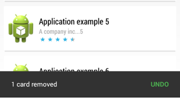
These layouts provide a simple undo bar with Material Design.
This gist does not contain any Android L API.
| undobar with action | undobar mobile |
|---|---|
|
|