Last active
August 23, 2023 10:53
-
-
Save jrosell/959ca3160df1f2658531088b1e922708 to your computer and use it in GitHub Desktop.
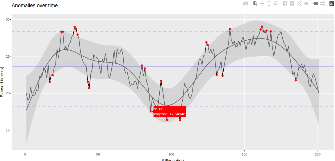
Detect anomalies over time using percentiles and using a GAM model with a local smoother or Isolation Forest model
This file contains bidirectional Unicode text that may be interpreted or compiled differently than what appears below. To review, open the file in an editor that reveals hidden Unicode characters.
Learn more about bidirectional Unicode characters
| # GAM model with a local smoother | |
| library(tidyverse) | |
| set.seed(2) | |
| elapsed <- arima.sim(model = list(order = c(0, 1, 0)), n=200) + 20 | |
| elapsed <- pmax(elapsed, 1) | |
| data <- tibble( | |
| x = 1:201, | |
| elapsed = elapsed | |
| ) | |
| plot(data) | |
| gam_mod <- mgcv::gam(elapsed ~ s(x), data = data, family = gaussian()) | |
| data <- data %>% | |
| mutate( | |
| pred = predict(gam_mod, data, type = "link"), | |
| se = predict(gam_mod, data, type = "link", se.fit = TRUE)$se.fit, | |
| conf = qnorm(.975) * se, | |
| conf_upper = pred + conf * 4, | |
| conf_lower = pred - conf * 4 | |
| ) | |
| mean_rate <- mean(data$elapsed) | |
| q <- quantile(data$elapsed, probs = c(0.05, 0.95)) | |
| lower <- q[1] | |
| upper <- q[2] | |
| anomalies <- data %>% | |
| filter(elapsed > conf_upper | elapsed < conf_lower | elapsed > upper | elapsed < lower) | |
| anomalies_plot <- ggplot(data, aes(x)) + | |
| geom_line(aes(y = elapsed)) + | |
| geom_line(aes(y = pred)) + | |
| geom_ribbon(aes(ymin = conf_lower, ymax = conf_upper), fill = "grey", alpha = .5) + | |
| geom_hline(yintercept = mean_rate, col = "blue", alpha = .35, lty = 1) + | |
| geom_hline(yintercept = lower, col = "blue", alpha = .35, lty = 2) + | |
| geom_hline(yintercept = upper, col = "blue", alpha = .35, lty = 2) + | |
| geom_point(aes(y = elapsed), data = anomalies, col = "red") + | |
| labs(title = "Anomalies over time", x="# Execution", y = "Elapsed time (s)") | |
| plotly::ggplotly(anomalies_plot) | |
| # Isolation Forest model | |
| library(isotree) | |
| set.seed(2) | |
| elapsed <- arima.sim(model = list(order = c(0, 1, 0)), n=200) + 20 | |
| data <- tibble( | |
| x = as.numeric(1:201), | |
| elapsed = as.numeric(elapsed) | |
| ) | |
| data | |
| model <- isolation.forest(data, ntrees = 1) | |
| result <- bind_cols( | |
| data, | |
| tibble(pred = predict(model, data)) | |
| ) | |
| mean_rate <- mean(data$elapsed) | |
| q <- quantile(data$elapsed, probs = c(0.05, 0.95)) | |
| lower <- q[1] | |
| upper <- q[2] | |
| anomalies <- result %>% | |
| filter(elapsed > upper | elapsed < lower | pred > 0.7) | |
| anomalies_plot <- ggplot(result, aes(x)) + | |
| geom_line(aes(y = elapsed, col = pred)) + | |
| geom_point(aes(y = elapsed), data = anomalies, col = "red") + | |
| geom_hline(yintercept = mean_rate, col = "blue", alpha = .35, lty = 1) + | |
| geom_hline(yintercept = lower, col = "blue", alpha = .35, lty = 2) + | |
| geom_hline(yintercept = upper, col = "blue", alpha = .35, lty = 2) + | |
| labs(title = "Anomalies over time", x="# Execution", y = "Elapsed time (s)") | |
| anomalies_plot | |
| plotly::ggplotly(anomalies_plot) |

Sign up for free
to join this conversation on GitHub.
Already have an account?
Sign in to comment
GAM