In this talk, we will learn how to set up all the necessary infrastructure to build a Design System of reusable React components, with state of the art developer experience afforded by Storybook.
A design system is a series of components that can be reused in different combinations. Design systems allow you to manage design at scale. Design Systems can be a significant productivity multiplier in any medium-to-large project or company because you can document our components as you develop them, ensure a consistent look and feel throughout all our screens, and have a seamless workflow between designers and developers.
Head to designsystemsrepo.com and you can see Design Systems used by some of the biggest companies and strongest brands from Priceline, Apple, IBM, Wework, Github, and even the US Government. Design Systems can be a significant productivity multiplier in any medium-to-large project or company because you can document our components as you develop them, ensure a consistent look and feel throughout all our screens, and have a seamless workflow between designers and developers
Design systems can be a significant productivity multiplier in any medium to large project or company, because you can document our components as you develop them, ensuring consistent look and feel throughout all our screens, and have a seamless workflow between designers and developers.
00:50 Throughout this course, we will progressively build up a very simple design system containing one button, but show you all the functionality that Storybook can bring to enhance our developer experience and project velocity.
01:04 You will learn to set up the same storybooks used in production by everyone from Lonely Planet to Uber, but at the same time, we'll keep it as simple as possible, so you can repurpose these APIs for our specific needs.
01:16 After setting up a basic storybook, we'll explore three React-specific add-ons and decorators that are particularly useful in React storybooks, as well as create co-located stories, which allow for extremely maintainable design systems.
01:29 The best design systems come with strong typing. We'll finish by learning how to configure Storybook to work with TypeScript for type safety. The great thing about pairing Storybook with TypeScript is that you can auto-generate documentation for our React components. Be sure not to miss that.
01:45 Because Storybook is relatively unopinionated, there can be a lot of configuration to puzzle out for the React TypeScript design system use case. With this case, you will learn how to have the best practice setup for our next great component library.
Storybook is a UI component development environment for React, Vue, and Angular. With that, you can develop UI components without running our app.
Here I show how to set up Storybook to display React components from scratch.
Start from an empty folder. You know this, when you type ls, there is nothing in this folder. I'm going to start the project with npm init -y, which answers yes for all the initializing questions and gives me a package.json
package.json
{
  "name": "mattersupply-demo",
  "version": "1.0.0",
  "main": "index.js",
  "license": "MIT",
}
Now, I'm going to add my dependencies, so I type npm i -D for devDependencies. I'm going to add @storybook/react for the React version as well as babel-core for Babel.
console
$ npm install -D @storybook/react babel-coreWhen you are done installing, you should see @storybook/react and babel-core in our devDependencies section of our package.json.
package.json
{
  "name": "mattersupply-demo",
  "version": "1.0.0",
  "main": "index.js",
  "license": "MIT",
  "devDependencies": {
    "@storybook/react": "^3.4.3",
    "babel-core": "^6.26.3"
  },
}
I'm also going to add react and react-dom as real dependencies.
When the installation is finished, you should have react and react-dom in our dependencies section of our package.json file.
{
  "name": "mattersupply-demo",
  "version": "1.0.0",
  "main": "index.js",
  "license": "MIT",
  "devDependencies": {
    "@storybook/react": "^3.4.3",
    "babel-core": "^6.26.3"
  },
    "dependencies": {
    "react": "^16.3.2",
    "react-dom": "^16.3.2"
  }
}
Now, I'm using the mkdir command to set up two folders, .storybook -- which is the special folder for storybook -- and src.
I'm going to leave the src folder empty, but I'm going to set up a empty config file in .storybook. This is required for storybook to run.
console
touch .storybook/config.jsFinally, head too package.json and add an npm scripts.
This is not required, but it makes it much more convenient to run our storybook in future. Just type storybook: "start-storybook -p 6006 which is standard port -c.storybook for the folder and that's it.
package.json
{
  "name": "storybook1-rough",
  "version": "1.0.0",
  "main": "index.js",
  "license": "MIT",
  "devDependencies": {
    "@storybook/react": "^3.4.3",
    "babel-core": "^6.26.3"
  },
  "dependencies": {
    "react": "^16.3.2",
    "react-dom": "^16.3.2"
  },
  "scripts": { "storybook": "start-storybook -p 6006 -c .storybook" }
}
When you run npm run storybook, it's going to start up a server on http://localhost:6006, which you can navigate to and see the result. That's our storybook.
So I going to show the best configuration for React Storybook, and walk through adding our very first React Component and Story to our Storybook.
I am going to start by configuring our storybook. First, we import the configure method from @storybook/react.
config.js
import { configure } from '@storybook/react';Then we define a small utility function from require.context. What this does is it looks through everything in the src folder, and it uses a regex to look for files that end in stories.js.
const req = require.context('../src', true, /.stories.js$/);I am going to use this in a function called loadStories. For every file that matches, I'm going to require it, like so.
function loadStories() {
  req.keys().forEach(file => req(file));
}
Finally, I am going to pass that function to the configure method along with the current module.
configure(loadStories, module);Next, I am going to go over to our empty src folder and set up our first React component. I am going to import React from 'react'.
Then we'll define a small functional component. It's going to take props bg and children, and render them. That's a simple React component.
import React from 'react';

export const Button = ({ bg, children }) => (
  <button style={{ backgroundColor: bg }}> {children}</button>
);
Now, I am going to set up the stories for this React component. Make a new file called Button.stories.js. Whatever it is, the file name just has to end in .stories.js to match up with the regex.
I am going to import React, import the storiesOf function from @storybook/react. I am going to import the component that we just made.
import React from 'react';

import { storiesOf } from '@storybook/react';
import { Button } from './Button';
Now, to actually define the story, we declaratively say storiesOf, and then the category, which is Button, the current module. Then we'll say add.
storiesOf('Button', module)
  .add
Some description goes here, of the particular story that we want. I am just going to say with background, for example.
We'll pass a simple function that is essentially a React's element that implements an instance of whatever I am trying to demonstrate with our story.
I am going to say, "Hello World," over here, and save it.
storiesOf('Button', module)
  .add('with background', () => <Button bg="palegoldenrod">Hello world</Button>)
Now when I run storybook, it's going to show the button that we just implement. When I refresh, you can see over here that we have the new button with the background.
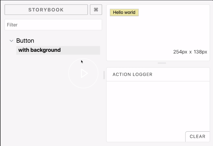
If I want to demonstrate other capabilities of the component that I'm demonstrating, I can just make another story and, say, change some of the props, save it, refresh it, and then we'll add a new story here which we can navigate to.
storiesOf('Button', module)
  .add('with background', () => <Button bg="palegoldenrod">Hello world</Button>)
  .add('with background 2', () => <Button bg="green">Hello world2</Button>);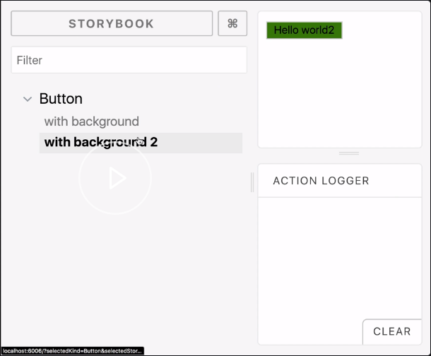
That's storybook.
So Her I will show how to add a landing/welcome page to our Storybook, so that first-time viewers get to read a message from our or have some orientation around the structure of the Storybook we are building.
I am going to add a welcome page of our storybook, almost like any other page, except we are going to add it in the .storybook folder.
In here, we are going to import the usual React and @storybook/react, imports.
welcomeStory.js
import { storiesOf } from '@storybook/react';
import React from 'react';
I am going to define the story, much like we do everywhere else. We add the module, then we say, "To our new storybook," with a ta-da emoji -- that's very important -- and then a little welcome message, "Welcome to our new storybook."
import React from 'react';
import { storiesOf } from '@storybook/react';

storiesOf('Welcome', module).add('to our new Storybook 🎉', () => (
  <h1> welcome to our new Storybook</h1>
));
Now, all you do to set it up is head to the config.js, and notice how we didn't name it .stories.js. We just named it welcomeStory.js. That's enough because we can just add it here. Because it's sequentially above the rest of the stories, it's always going to show up first.
config.js
function loadStories() {
  require('./welcomeStory');
  req.keys().forEach(file => req(file));
}
When I run the storybook, and I refresh it on the screen, it's going to show the welcome page. It's going to be the first thing that any user sees when they see the storybook.
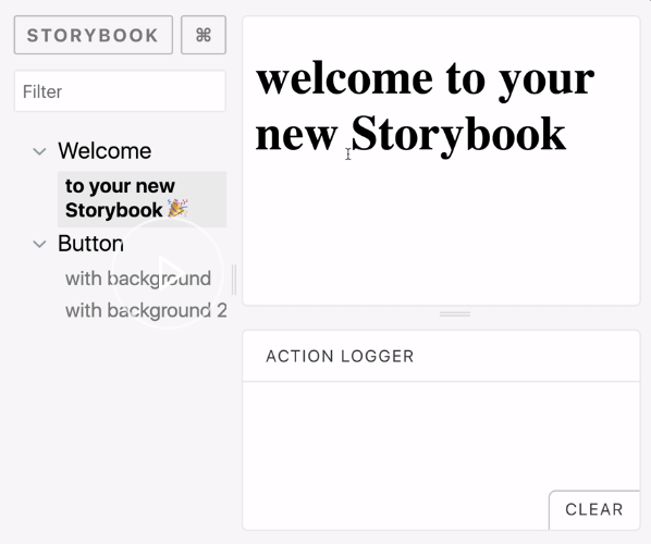
Storybook has a rich Addons ecosystem that really adds a lot to the developer experience. Here I show how to set up the JSX Addon in Storybook to display the code behind React components. The juxtaposition of code and visual display can be very effective documentation for any users of our components.
First, I will install some dev dependencies for @storybook/addons. In particular, I'm going to use the storybook-addon-jsx.
console
$ npm i -D @storybook/addons storybook-addon-jsxTo configure the Addons, I'm going to create a new file in the .storybook folder called addons.js, then just declare our dependency storybook-addon-js/register, and that calls it within. Internally, this executes a registration function.
addons.js
import 'storybook-addon-jsx/register';Now over in config.js, I'm going to import an additional function called setAddon from @storybook/react, and I'm going to import JSXAddon from storybook-addon-jsx. Then I'm just going to pair them together with setAddon, JSXAddon.
config.js
import { configure, setAddon } from '@storybook/react';
import JSXAddon from 'storybook-addon-jsx';
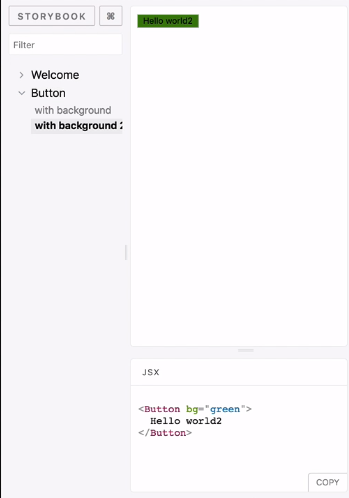
setAddon(JSXAddon);That's all the setup we need to do. Now we can use this globally in any of those stories by just saying addWithJSX for any JSX component. Since I'm using a React code base, this is basically all the components.
Button.stories.js
storiesOf('Button', module)
  .addWithJSX('with background', () => (
    <Button bg="palegoldenrod">Hello world</Button>
  ))
  .addWithJSX('with background 2', () => (
    <Button bg="green">Hello world2</Button>
  ));
Now when I run storybook, and then I refresh on the right, I can see the JSX of whatever the component I'm demonstrating on the top.
In this stetp I will show how to set up the Info addon to make our Storybook stories into interactive documentation, including the best way to style the Info addon to our heart's desires.
Start by adding the addon-info to our storybook project.
console
$ npm i -D @storybook/addon-infoThe addon-info doesn't require additional configuration on top of what you already have. You just have a function called withInfo, which you can wrap around our existing elements.
Inside withInfo, you can type in some descriptive texts.
Button.stories.js
import { withInfo } from '@storybook/addon-info';

storiesOf('Button', module)
    .addWithJSX('with background', withInfo(`description of the component`)
    (() => <Button bg="palegoldenrod">Hello world</Button>))
Now, when you run storybook, it will show the text.
If you click show info on the top right, you will see a description of the component, as also source and types if you use prop types.
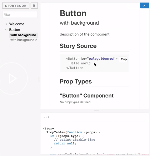
withInfo does this markdown, so you can do things like escaping and putting code blocks within our markdown for further descriptive ability.
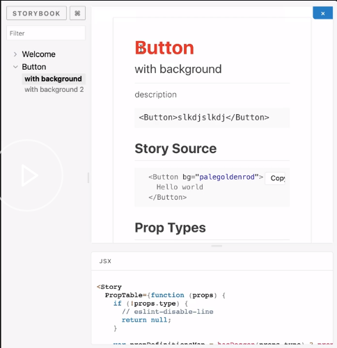
Button.stories.js
storiesOf('Button', module)
  .addWithJSX(
    'with background',
    wInfo(`
      description

      ~~~js
      <Button>slkdjslkdj</Button>
      ~~~
      `)(() => <Button bg="palegoldenrod">Hello world</Button>),
  )
If you save it over here, you should be able to see that additional markdown up in our info box.
You can optionally style our info box by passing in an object, and declaring the component styles, like so. Here, I am putting a red color on the h1s, and passing in the same text that I used to have -- description, button.
Button.stories.js
storiesOf('Button', module)
.addWithJSX(
'with background',
withInfo({
styles: {
header:{
h1: {
color: 'red',
},
},
},
},
text: `
description
~~~js
<Button>slkdjslkdj</Button>
~~~
`)(() => <Button bg="palegoldenrod">Hello world</Button>),
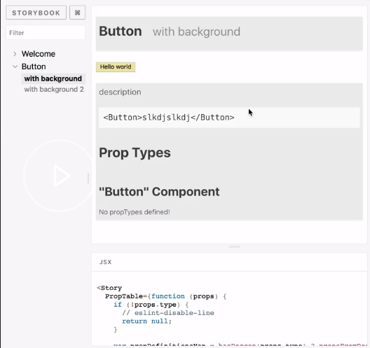
)If I reload over here, I can see that the h1 has been styled.
I don't necessarily recommend defining our own styles inline every single time. I do like setting up utilities folder, utils.js, and then defining the styles that I like, particularly the inline display, and then using this as a high-order component from my other stories.
utils.js
import { withInfo } from '@storybook/addon-info';
const wInfoStyle = {
  header: {
    h1: {
      marginRight: '20px',
      fontSize: '25px',
      display: 'inline',
    },
    body: {
      paddingTop: 0,
      paddingBottom: 0,
    },
    h2: {
      display: 'inline',
      color: '#999',
    },
  },
  infoBody: {
    backgroundColor: '#eee',
    padding: '0px 5px',
    lineHeight: '2',
  },
};

export const wInfo = text => withInfo({ inline: true, source: false, styles: wInfoStyle, text: text });
Over in my stories, I can just replace withInfo with my new utility, wInfo from './utils'. Wherever I used to say withInfo, I can just say wInfo and skip the styling. That seems a lot more reasonable to use.
Button.stories.js
storiesOf('Button', module)
.addWithJSX(
'with background',
wInfo(`
description
~~~js
<Button>slkdjslkdj</Button>
~~~`)(() => <Button bg="palegoldenrod">Hello world</Button>),
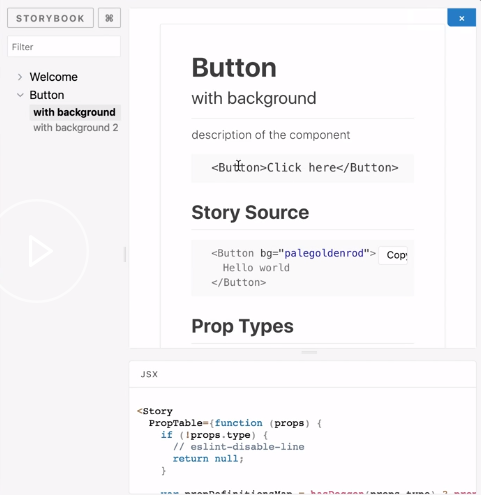
)Now, when I refresh, this is how it looks by default, with everything inline and no additional click needed on the top right.
The last part I will show how to set up the Knobs decorator in Storybook to make your Storybook stories infinitely interactive based on their props, and not just your predefined Stories.
First, I'm going to add the Knobs addon to our project.
console
$ npm i -D @storybook/addon-knobsThen we register it in addons.js.
addons.js
import '@storybook/addon-knobs/register';Next, over in config.js I'm going to import a new method called decorators, so addDecorator.
I'm going to configure that with the withKnobs decorator from addon-knobs.
config.js
import { configure, setAddon, addDecorator } from '@storybook/react';
import { withKnobs } from '@storybook/addon-knobs/react';
addDecorator(withKnobs);
Now I'm all set to use the knobs decorator. Just head over to the stories, import the appropriate knob. For example, I'm importing the text knob over here.
Button.stories.js
import { text } from '@storybook/addon-knobs/react';
Wherever I have text, I can now use the text knob to make it dynamic.

.addWithJSX('with background 2', () => (
    <Button bg={text('bg', `green`)}>Hello world2</Button>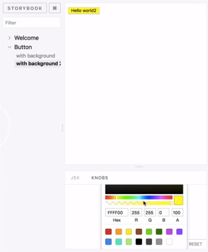
));bg, so you just have a label here and then whatever text you want it to submit as your ordinary text. Now when I refresh my storybooks, you can see a new area called knobs.
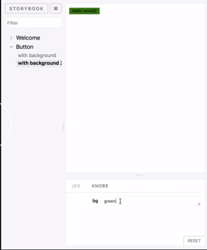
Here I can change it to whatever I want. Let's just say, purple It just changes to purple. It's reactive to whatever I do. This is very handy for testing any props that your components may have.
There are a whole range of other knobs, and I encourage you to read the docs to explore them. For example, since I'm really using colors here, I can say for the color knob I can have a default value of green. I can also have a color-picker over here and pick a different color based on whatever I want.
import { color } from '@storybook/addon-knobs/react';
storiesOf('Button', module)
  .addWithJSX(
    'with background',
    wInfo(`
      description

      ~~~js
      <Button>slkdjslkdj</Button>
      ~~~
      `)(() => <Button bg="palegoldenrod">Hello world</Button>),
  )
  .addWithJSX('with background 2', () => (
    <Button bg={color('bg', 'green', 'group1')}>Hello world2</Button>
  ));