Instantly share code, notes, and snippets.
Last active
June 29, 2020 18:31
-
Star
(0)
0
You must be signed in to star a gist -
Fork
(0)
0
You must be signed in to fork a gist
-
Save kieranb662/f2b7f3cba82c8e92280b368398a240b1 to your computer and use it in GitHub Desktop.
[Reactive Button] An example recreation of SwiftUI's built in Button with custom styling features. Plus an example style. #SwiftUI #View
This file contains bidirectional Unicode text that may be interpreted or compiled differently than what appears below. To review, open the file in an editor that reveals hidden Unicode characters.
Learn more about bidirectional Unicode characters
| // | |
| // ReactiveButton.swift | |
| // | |
| // Created by Kieran Brown on 4/17/20. | |
| import SwiftUI | |
| // MARK: - Style Setup | |
| public struct ReactiveButtonConfiguration { | |
| public let isPressing: Bool | |
| public let label: AnyView | |
| } | |
| public protocol ReactiveButtonStyle { | |
| associatedtype Body: View | |
| func makeBody(configuration: ReactiveButtonConfiguration) -> Self.Body | |
| } | |
| extension ReactiveButtonStyle { | |
| func makeBodyTypeErased(configuration: ReactiveButtonConfiguration) -> AnyView { | |
| AnyView(self.makeBody(configuration: configuration)) | |
| } | |
| } | |
| public struct AnyReactiveButtonStyle: ReactiveButtonStyle { | |
| private let _makeBody: (ReactiveButtonConfiguration) -> AnyView | |
| public func makeBody(configuration: ReactiveButtonConfiguration) -> some View { | |
| return self._makeBody(configuration) | |
| } | |
| init<ST: ReactiveButtonStyle>(_ style: ST) { | |
| self._makeBody = style.makeBodyTypeErased | |
| } | |
| } | |
| public struct DefaultReactiveButtonStyle: ReactiveButtonStyle { | |
| public init() {} | |
| public func makeBody(configuration: ReactiveButtonConfiguration) -> some View { | |
| configuration.label | |
| .padding() | |
| .background(RoundedRectangle(cornerRadius: 5) | |
| .fill(configuration.isPressing ? Color.orange : Color.blue)) | |
| } | |
| } | |
| public struct ReactiveButtonStyleKey: EnvironmentKey { | |
| public static let defaultValue: AnyReactiveButtonStyle = AnyReactiveButtonStyle(DefaultReactiveButtonStyle()) | |
| } | |
| extension EnvironmentValues { | |
| public var reactiveButtonStyle: AnyReactiveButtonStyle { | |
| get { | |
| return self[ReactiveButtonStyleKey.self] | |
| } | |
| set { | |
| self[ReactiveButtonStyleKey.self] = newValue | |
| } | |
| } | |
| } | |
| extension View { | |
| public func reactiveButtonStyle<S>(_ style: S) -> some View where S: ReactiveButtonStyle { | |
| self.environment(\.reactiveButtonStyle, AnyReactiveButtonStyle(style)) | |
| } | |
| } | |
| // MARK: Example Button | |
| /// # Reactive Button | |
| /// | |
| /// An implementation of a button that behaves similarly to the buttons in the iOS calculator app | |
| /// when a user taps the button immediatly responds, if the user presses down and drags the button | |
| /// reacts to display whether the drag is inside of the button or outside, if the drag returns inside and is released | |
| /// the action is performed | |
| /// | |
| /// ## Styling | |
| /// | |
| /// To make a custom style for this button you need to create a `ReactiveButtonStyle` conforming struct. | |
| /// Conformance requires implementation of a single method `makeBody(configuration: ReactiveButtonConfiguration)`. | |
| /// Where ReactiveButtonConfiguration is an object containing various button state values | |
| /// | |
| /// public struct ReactiveButtonConfiguration { | |
| /// public let isPressing: Bool // Whether the users finger is inside of the button | |
| /// public let label: AnyView // The buttons label | |
| /// } | |
| /// | |
| /// After the style has been created call the `reactiveButtonStyle(_ :)` view modifier to apply the style through environment values. | |
| /// To make it easier use the following example style based on the `DefaultReactiveButtonStyle` | |
| /// | |
| /// | |
| /// public struct <#My Button Style#>: ReactiveButtonStyle { | |
| /// public func makeBody(configuration: ReactiveButtonConfiguration) -> some View { | |
| /// configuration.label | |
| /// .padding() | |
| /// .background(RoundedRectangle(cornerRadius: 5) | |
| /// .fill(configuration.isPressing ? Color.orange : Color.blue)) | |
| /// } | |
| /// } | |
| /// | |
| public struct ReactiveButton<Label>: View where Label: View { | |
| @Environment(\.reactiveButtonStyle) private var style: AnyReactiveButtonStyle | |
| struct ReactiveButtonKey: PreferenceKey { | |
| static var defaultValue: Anchor<CGRect>? { nil } | |
| static func reduce(value: inout Anchor<CGRect>?, nextValue: () -> Anchor<CGRect>?) { | |
| value = nextValue() | |
| } | |
| } | |
| enum ButtonState { | |
| case inactive | |
| case outside | |
| case inside | |
| var isPressing: Bool { | |
| switch self { | |
| case .inside: | |
| return true | |
| default: | |
| return false | |
| } | |
| } | |
| var isActive: Bool { | |
| switch self { | |
| case .inside, .outside: | |
| return true | |
| default: | |
| return false | |
| } | |
| } | |
| } | |
| @State private var state: ButtonState = .inactive | |
| let action: () -> Void | |
| let label: Label | |
| public init(action: @escaping () -> Void, @ViewBuilder label: () -> Label) { | |
| self.action = action | |
| self.label = label() | |
| } | |
| public var body: some View { | |
| return style.makeBody(configuration: .init(isPressing: state.isPressing, label: AnyView(label))) | |
| .opacity(0) | |
| .anchorPreference(key: ReactiveButtonKey.self, value: .bounds, transform: { $0 }) | |
| .overlayPreferenceValue(ReactiveButtonKey.self) { (bound) in | |
| GeometryReader { proxy in | |
| self.style.makeBody(configuration: .init(isPressing: self.state.isPressing, label: AnyView(self.label))) | |
| .gesture(DragGesture(minimumDistance: 0) | |
| .onChanged({ (value) in | |
| guard let bounds = bound else { return } | |
| let rect: CGRect = proxy[bounds] | |
| self.state = rect.contains(value.location) ? .inside : .outside | |
| }).onEnded({ (value) in | |
| guard let bounds = bound else { return } | |
| let rect: CGRect = proxy[bounds] | |
| if rect.contains(value.location) {self.action()} | |
| self.state = .inactive | |
| })) | |
| } | |
| } | |
| } | |
| } | |
| extension ReactiveButton where Label == Text { | |
| public init<S>(_ title: S, action: @escaping () -> Void) where S: StringProtocol { | |
| self.action = action | |
| self.label = Text(title) | |
| } | |
| } | |
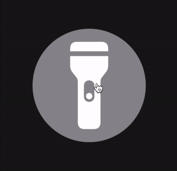
| public struct FlashlightButtonStyle: ReactiveButtonStyle { | |
| public let isOn: Bool | |
| public func makeBody(configuration: ReactiveButtonConfiguration) -> some View { | |
| configuration.label | |
| .foregroundColor(self.isOn ? configuration.isPressing ? Color.gray : Color.yellow : Color.white) | |
| .padding(30) | |
| .background( | |
| Group { | |
| if isOn { | |
| Circle() | |
| .stroke(configuration.isPressing ? Color.gray : Color.yellow) | |
| } else { | |
| Circle() | |
| .fill(configuration.isPressing ? Color.yellow : Color.gray) | |
| } | |
| } | |
| ).contentShape(Circle()) | |
| } | |
| } | |
| // Important: The Previews seem to have an issue displaying Views with Generics so you may need to make another file | |
| // and test the ReactiveButtonExample inside a container View | |
| struct ReactiveButtonExample: View { | |
| @State var isOn: Bool = false | |
| var body: some View { | |
| ZStack { | |
| Color(red: 23/255, green: 23/255, blue: 23/255).edgesIgnoringSafeArea(.all) | |
| VStack { | |
| ReactiveButton(action: {self.isOn.toggle()}, | |
| label: { | |
| Image(systemName: self.isOn ? "flashlight.on.fill" : "flashlight.off.fill") | |
| .resizable() | |
| .aspectRatio(contentMode: .fit) | |
| .frame(width: 200, height: 200) | |
| }).reactiveButtonStyle(FlashlightButtonStyle(isOn: self.isOn)) | |
| } | |
| } | |
| } | |
| } | |
| struct ReactiveButton_Previews: PreviewProvider { | |
| static var previews: some View { | |
| ReactiveButtonExample() | |
| } | |
| } |
Sign up for free
to join this conversation on GitHub.
Already have an account?
Sign in to comment