July 29, 2015
Find this document here:
- RealTime Data
- Types + Topics
- Mapping Samples
- Mapping in CartoDB
- Examples
- Tour of the interface
- APIs / JS Libs
- Data Import + Sync Tables
- Customizing UI + CartoCSS
- Building a Map App
- Mapping in the Editor
- Mapping in Code
- Python
- Node
- R
- Building a Narrative
- Case Study: Realtime Earthquake Map for Nepal
- Tell Time/Stories: Odyssey + Torque
- Graphs + Charts
- Resources
- Journalism + CartoDB: https://cartodb.com/industries/journalism/
- Gallery of Journalism projects: https://cartodb.com/gallery/journalism/
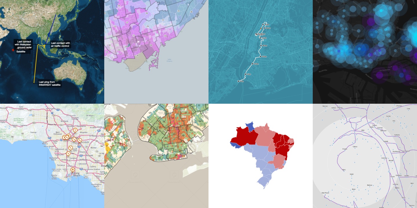
Election Maps
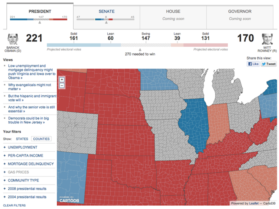
Source: WSJ 2012 Election Map.
Check out the Toronto Municpal Election Maps or the 2011 Spanish Election Results.
Lots of journalists need to make realtime election trackers, preferably with mapped admin districts. More info on how to do that with CartoDB here.
Weather Maps
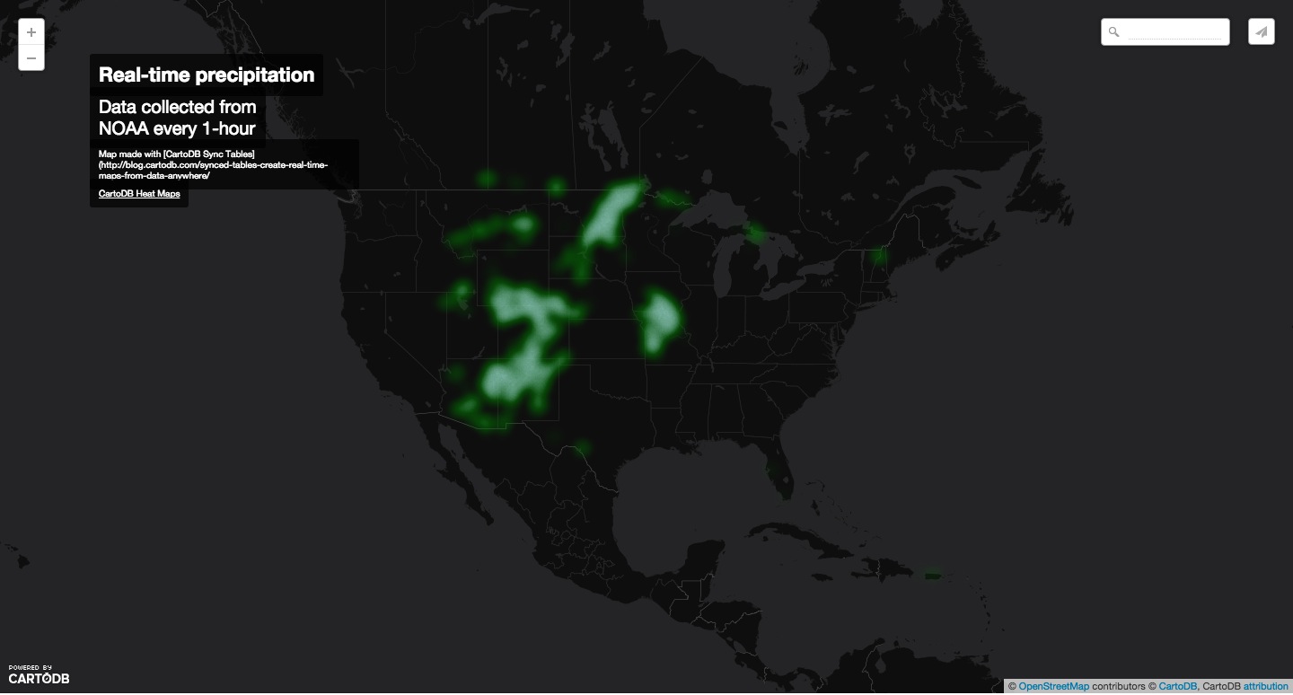
Source: Realtime Precipitation Map
Data: NOAA Weather data
Traffic Maps
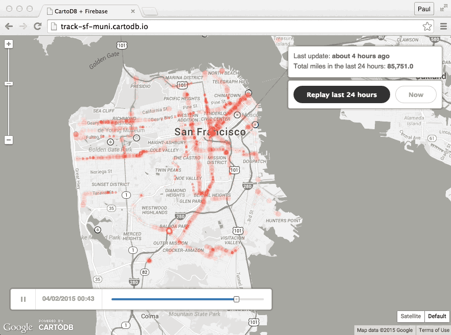
Source: Traffic Change Data for SF
Demo: Municipal Traffic in SF App
Blog: CartoDB + Firebase
Climate Tracking Maps
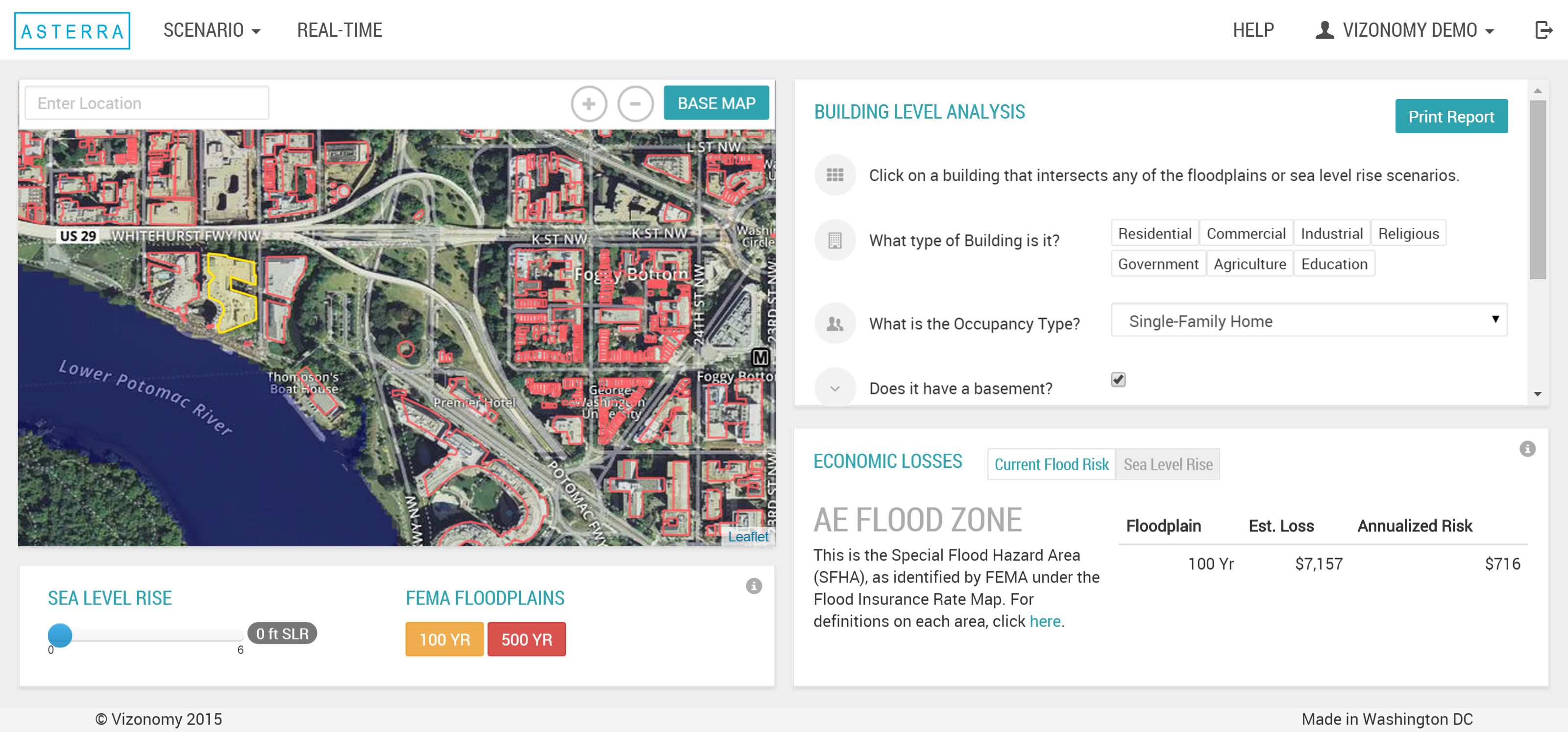
Source: Vizonomy + NOAA collaboration on Asterra's Climate Dashboard
Crisis Monitoring Maps

Source: Andy's Earthquake Workshop
Media Watch Maps
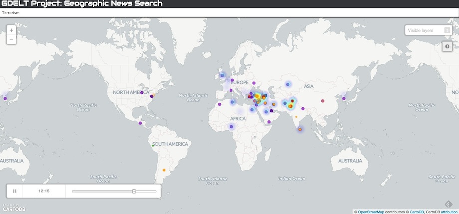
Source: GDELT Geographic News Search Tool
Journalists have used the GDELT data to track wildlife crime, and the spread of the Islamic State in the Middle East among other things.
You can fork the GDELT hourly synced data set from the CartoDB DataLibrary and add it as a layer on your map or use the Geographic Search Tool linked above to search for tags of interest.
Read more about how to filter and author queries via the GDELT API to build dynamic media maps to mashup with your data:
- GDELT Account in CartoDB: for sample maps and demos
- Introduction to GDELT + CartoDB: for getting started with maps + the GDELT hourly dataset
- Advanced Mapping with the GDELT API: for custom and advanced queries with the GDELT API
Other
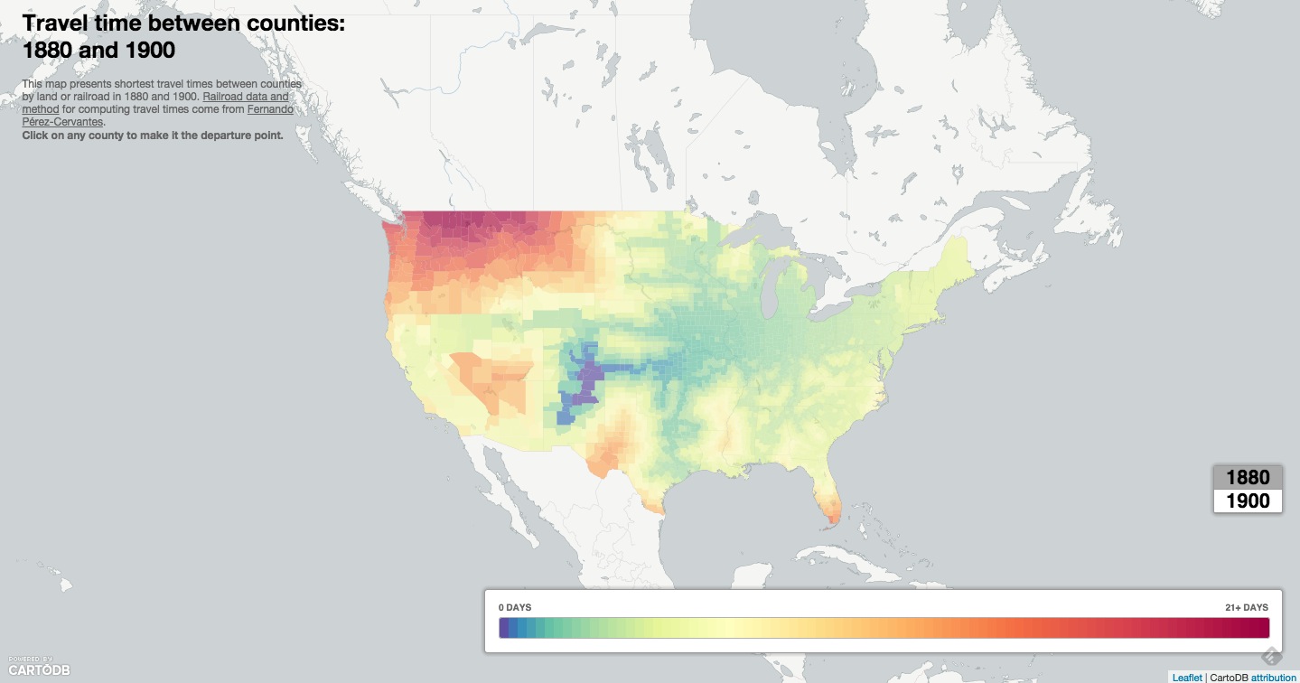
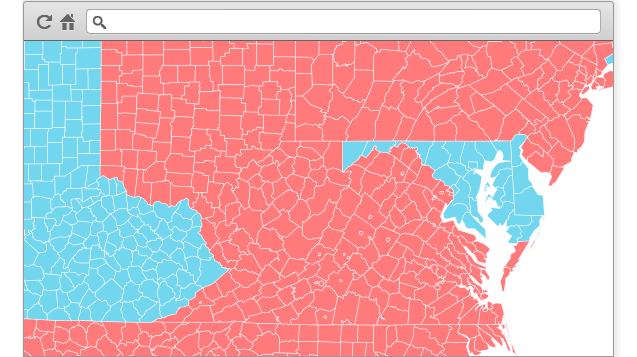
Source: Time Travel Between Counties, Carto.JS
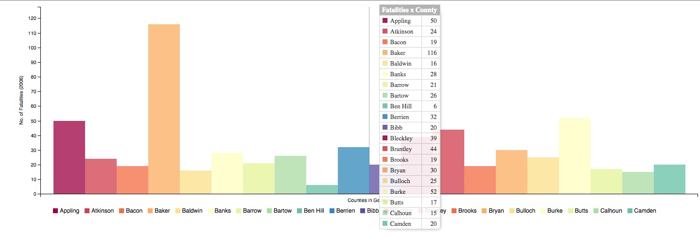
Source: Georgia County Car Crash Counts, C3.JS
Source: Realtime Mapping templates here
- CartoJS - JS library for interacting with CartoDB
- Maps API - generate public/private maps with data hosted on your CDB account
- SQL API - run sql in your code that dynamically filters/affects/queries your mapped data stored in CartoDB
- Import API - CRUD files in your CartoDB Account
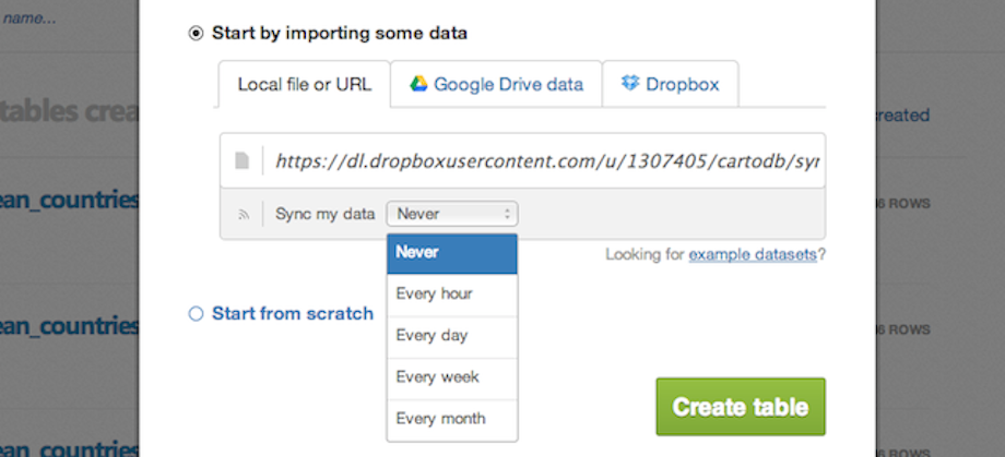
The Editor is especially setup to process realtime data updates via sync tables.
You can import data that lives online via a URL, and set it to pull and update your map at regular intervals.
Check the file types supported in sync tables; keep in mind that it also works with dropbox + google drive.
Notes:
- to auto-geocode a sync table, verify that it contains the following:
- country column, a latitude column and a separate longitude column
- a column of IP addresses
- to edit sync tables you need to be disconnected from the datasource, so during syncing, you can use SQL to manipulate the dataset on the fly
- you can create sync tables in both the Editor and via the Import API
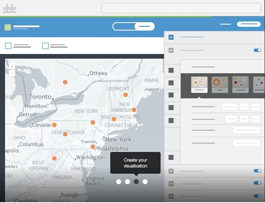
You have myriad customization options in the in-browser editor:
sql- run sql and postgis functions across your datawizard- adjust the type, colors and fills in your mapinfowindow- create hovers, tooltips with information from your datatablescss- customize the css and style of your map outside the wizardlegends- create keys for your mapfilters- filter the data without sql
Likewise, many types of visualizations:
- Simple -- most basic visualization
- Cluster -- counts number of points within a certain binned region
- Choropleth -- makes a histogram of your data and gives bins different colors depending on the color ramp chosen
- Category -- color data based on unique category (works best for a handful of unique types)
- Bubble -- size markers based on column values
- Intensity -- colors by density
- Density -- data aggregated by number of points within a hexagon
- Torque -- temporal visualization of data
- Heat -- more fluid map of concentration; emphasis on far over near-view
Torque and heatmaps might be most relevant for realtime data.
The Wizard allows you to select your visualization "type" and customize color palettes, design details, and otherwise set the tone for your map.
- Marker Fill: change the size, color, and opacity of all markers
- Marker Stroke: change the width, color, and opacity of every marker's border
- Composite Operation: change the color of markers when they overlap
- Label Text: Text appearing by a marker (can be from columns)
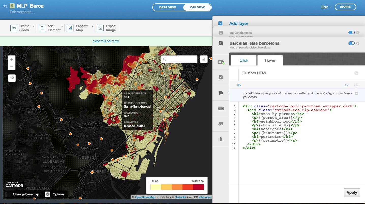
- Select which column data appear in infowindow by toggling column on
- Customize further by selecting HTML-view
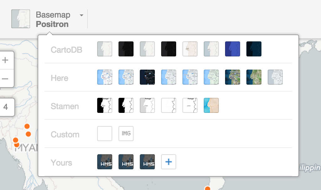
Check out the base CartoDB Basemaps from Stamen.
Use the CartoDB Python module to create and update tables; check out Andy's IPythonNB demos.
Use the CartoDB Uploader package available in NPM for working in Node.js
Use Kyle Walker's R2CartoDB project to create and update tables in R.
Move over to this tutorial on how to use CartoDB's sync tables to track realtime earthquakes vis-à-vis districts in Nepal.
Or, Stuart made this rad proxy for EONET and we can play with importing it into a CartoDB table and setting up a sync.
Outside of the CartoJS library, we have others to help you build dynamic narrative with your data.
Maps that tell Time - Torque
<iframe src="https://srogers.cartodb.com/viz/337d9194-6458-11e3-85b5-e5e70547d141/embed_map" width="100%" height="500px"></iframe>- Demonstrations in Brazil
- Animal migration patterns
- Diwali Celebrated
- Ramadan Tweets w/OdysseyJS
- Alcatraz Escapees
- Lynching and the Press
Maps that tell Stories - Odyssey JS
You can use CartoDB's SQL API to query your data and pull it into any charting library of your choosing.
You can easily wire up a chart of pollution data for example, set it as a sync table to update continuously, check the code here.
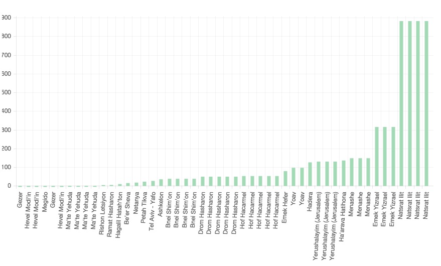
Learn more about it here!
Here are some examples:
| Type | Title | Link/Demo | BlogPost |
|---|---|---|---|
| Chart.js Bar Graph | Traffic Data | Aurelia's Block | |
| Highcharts | Sensor Data | Github / Demo | MOW Post |
| Highcharts | Weather Data | Aurelia's Block | Tutorial |
| Chart.js Line Graph | Tornado Data | Andrew's Block | |
| Plot.ly | Earthquake Data | Plotly Tutorial | CartoDB Blog |
- Map Academy
- CartoDB.js -- build a web app to visualize your data, allowing for user interaction
- SQL and PostGIS
- CartoDB Tutorials
- CartoDB Editor Documentation
- CartoDB APIs
- Community help on StackExchange
- CartoDB Map Gallery
- CartoDB Bootstrap Template by Chris Wong
- Charting Tools Repository
- Workshops @ CartoDB
- Recommended tools for Visualizations
- Perception Concerns
- Gestalt Theory
- Color Brewer or Geocolor
Please give us feedback on the workshop here! Whoot!
