Created
July 2, 2020 16:40
-
-
Save leontappe/123445ff7e4b4ceb1795fd043c5351ef to your computer and use it in GitHub Desktop.
This file contains bidirectional Unicode text that may be interpreted or compiled differently than what appears below. To review, open the file in an editor that reveals hidden Unicode characters.
Learn more about bidirectional Unicode characters
| // Copyright 2014 The Flutter Authors. All rights reserved. | |
| // Edited 2020 Leon Tappe | |
| // Use of this source code is governed by a BSD-style license that can be | |
| // found in the LICENSE file. | |
| // @dart = 2.8 | |
| import 'dart:math' as math; | |
| import 'package:flutter/foundation.dart'; | |
| import 'package:flutter/material.dart'; | |
| import 'package:flutter/rendering.dart'; | |
| import 'package:flutter/services.dart'; | |
| import 'package:flutter/widgets.dart'; | |
| const double _kLeadingWidth = kToolbarHeight; // So the leading button is square. | |
| const double _kMaxTitleTextScaleFactor = | |
| 1.34; // TODO(perc): Add link to Material spec when available, https://github.com/flutter/flutter/issues/58769. | |
| // Bottom justify the toolbarHeight child which may overflow the top. | |
| /// A material design app bar. | |
| /// | |
| /// An app bar consists of a toolbar and potentially other widgets, such as a | |
| /// [TabBar] and a [FlexibleSpaceBar]. App bars typically expose one or more | |
| /// common [actions] with [IconButton]s which are optionally followed by a | |
| /// [PopupMenuButton] for less common operations (sometimes called the "overflow | |
| /// menu"). | |
| /// | |
| /// App bars are typically used in the [Scaffold.appBar] property, which places | |
| /// the app bar as a fixed-height widget at the top of the screen. For a scrollable | |
| /// app bar, see [SliverAppBar], which embeds an [GradientAppBar] in a sliver for use in | |
| /// a [CustomScrollView]. | |
| /// | |
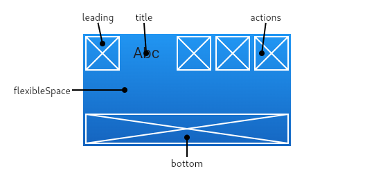
| /// The GradientAppBar displays the toolbar widgets, [leading], [title], and [actions], | |
| /// above the [bottom] (if any). The [bottom] is usually used for a [TabBar]. If | |
| /// a [flexibleSpace] widget is specified then it is stacked behind the toolbar | |
| /// and the bottom widget. The following diagram shows where each of these slots | |
| /// appears in the toolbar when the writing language is left-to-right (e.g. | |
| /// English): | |
| /// | |
| /// The [GradientAppBar] insets its content based on the ambient [MediaQuery]'s padding, | |
| /// to avoid system UI intrusions. It's taken care of by [Scaffold] when used in | |
| /// the [Scaffold.appBar] property. When animating an [GradientAppBar], unexpected | |
| /// [MediaQuery] changes (as is common in [Hero] animations) may cause the content | |
| /// to suddenly jump. Wrap the [GradientAppBar] in a [MediaQuery] widget, and adjust its | |
| /// padding such that the animation is smooth. | |
| /// | |
| ///  | |
| /// | |
| /// If the [leading] widget is omitted, but the [GradientAppBar] is in a [Scaffold] with | |
| /// a [Drawer], then a button will be inserted to open the drawer. Otherwise, if | |
| /// the nearest [Navigator] has any previous routes, a [BackButton] is inserted | |
| /// instead. This behavior can be turned off by setting the [automaticallyImplyLeading] | |
| /// to false. In that case a null leading widget will result in the middle/title widget | |
| /// stretching to start. | |
| /// | |
| /// {@tool dartpad --template=stateless_widget_material} | |
| /// | |
| /// This sample shows an [GradientAppBar] with two simple actions. The first action | |
| /// opens a [SnackBar], while the second action navigates to a new page. | |
| /// | |
| /// ```dart preamble | |
| /// final GlobalKey<ScaffoldState> scaffoldKey = GlobalKey<ScaffoldState>(); | |
| /// final SnackBar snackBar = const SnackBar(content: Text('Showing Snackbar')); | |
| /// | |
| /// void openPage(BuildContext context) { | |
| /// Navigator.push(context, MaterialPageRoute( | |
| /// builder: (BuildContext context) { | |
| /// return Scaffold( | |
| /// appBar: GradientAppBar( | |
| /// title: const Text('Next page'), | |
| /// ), | |
| /// body: const Center( | |
| /// child: Text( | |
| /// 'This is the next page', | |
| /// style: TextStyle(fontSize: 24), | |
| /// ), | |
| /// ), | |
| /// ); | |
| /// }, | |
| /// )); | |
| /// } | |
| /// ``` | |
| /// | |
| /// ```dart | |
| /// Widget build(BuildContext context) { | |
| /// return Scaffold( | |
| /// key: scaffoldKey, | |
| /// appBar: GradientAppBar( | |
| /// title: const Text('GradientAppBar Demo'), | |
| /// actions: <Widget>[ | |
| /// IconButton( | |
| /// icon: const Icon(Icons.add_alert), | |
| /// tooltip: 'Show Snackbar', | |
| /// onPressed: () { | |
| /// scaffoldKey.currentState.showSnackBar(snackBar); | |
| /// }, | |
| /// ), | |
| /// IconButton( | |
| /// icon: const Icon(Icons.navigate_next), | |
| /// tooltip: 'Next page', | |
| /// onPressed: () { | |
| /// openPage(context); | |
| /// }, | |
| /// ), | |
| /// ], | |
| /// ), | |
| /// body: const Center( | |
| /// child: Text( | |
| /// 'This is the home page', | |
| /// style: TextStyle(fontSize: 24), | |
| /// ), | |
| /// ), | |
| /// ); | |
| /// } | |
| /// ``` | |
| /// {@end-tool} | |
| /// | |
| /// See also: | |
| /// | |
| /// * [Scaffold], which displays the [GradientAppBar] in its [Scaffold.appBar] slot. | |
| /// * [SliverAppBar], which uses [GradientAppBar] to provide a flexible app bar that | |
| /// can be used in a [CustomScrollView]. | |
| /// * [TabBar], which is typically placed in the [bottom] slot of the [GradientAppBar] | |
| /// if the screen has multiple pages arranged in tabs. | |
| /// * [IconButton], which is used with [actions] to show buttons on the app bar. | |
| /// * [PopupMenuButton], to show a popup menu on the app bar, via [actions]. | |
| /// * [FlexibleSpaceBar], which is used with [flexibleSpace] when the app bar | |
| /// can expand and collapse. | |
| /// * <https://material.io/design/components/app-bars-top.html> | |
| class GradientAppBar extends StatefulWidget implements PreferredSizeWidget { | |
| /// A widget to display before the [title]. | |
| /// | |
| /// Typically the [leading] widget is an [Icon] or an [IconButton]. | |
| /// | |
| /// Becomes the leading component of the [NavigationToolBar] built | |
| /// by this widget. The [leading] widget's width and height are constrained to | |
| /// be no bigger than [kToolbarHeight] and [toolbarHeight] respectively. | |
| /// | |
| /// If this is null and [automaticallyImplyLeading] is set to true, the | |
| /// [GradientAppBar] will imply an appropriate widget. For example, if the [GradientAppBar] is | |
| /// in a [Scaffold] that also has a [Drawer], the [Scaffold] will fill this | |
| /// widget with an [IconButton] that opens the drawer (using [Icons.menu]). If | |
| /// there's no [Drawer] and the parent [Navigator] can go back, the [GradientAppBar] | |
| /// will use a [BackButton] that calls [Navigator.maybePop]. | |
| /// | |
| /// {@tool snippet} | |
| /// | |
| /// The following code shows how the drawer button could be manually specified | |
| /// instead of relying on [automaticallyImplyLeading]: | |
| /// | |
| /// ```dart | |
| /// GradientAppBar( | |
| /// leading: Builder( | |
| /// builder: (BuildContext context) { | |
| /// return IconButton( | |
| /// icon: const Icon(Icons.menu), | |
| /// onPressed: () { Scaffold.of(context).openDrawer(); }, | |
| /// tooltip: MaterialLocalizations.of(context).openAppDrawerTooltip, | |
| /// ); | |
| /// }, | |
| /// ), | |
| /// ) | |
| /// ``` | |
| /// {@end-tool} | |
| /// | |
| /// The [Builder] is used in this example to ensure that the `context` refers | |
| /// to that part of the subtree. That way this code snippet can be used even | |
| /// inside the very code that is creating the [Scaffold] (in which case, | |
| /// without the [Builder], the `context` wouldn't be able to see the | |
| /// [Scaffold], since it would refer to an ancestor of that widget). | |
| /// | |
| /// See also: | |
| /// | |
| /// * [Scaffold.appBar], in which an [GradientAppBar] is usually placed. | |
| /// * [Scaffold.drawer], in which the [Drawer] is usually placed. | |
| final Widget leading; | |
| /// Controls whether we should try to imply the leading widget if null. | |
| /// | |
| /// If true and [leading] is null, automatically try to deduce what the leading | |
| /// widget should be. If false and [leading] is null, leading space is given to [title]. | |
| /// If leading widget is not null, this parameter has no effect. | |
| final bool automaticallyImplyLeading; | |
| /// The primary widget displayed in the app bar. | |
| /// | |
| /// Typically a [Text] widget that contains a description of the current | |
| /// contents of the app. | |
| /// | |
| /// Becomes the middle component of the [NavigationToolBar] built by this widget. | |
| /// The [title]'s width is constrained to fit within the remaining space | |
| /// between the toolbar's [leading] and [actions] widgets. Its height is | |
| /// _not_ constrained. The [title] is vertically centered and clipped to fit | |
| /// within the toolbar, whose height is [toolbarHeight]. Typically this | |
| /// isn't noticeable because a simple [Text] [title] will fit within the | |
| /// toolbar by default. On the other hand, it is noticeable when a | |
| /// widget with an intrinsic height that is greater than [toolbarHeight] | |
| /// is used as the [title]. For example, when the height of an Image used | |
| /// as the [title] exceeds [toolbarHeight], it will be centered and | |
| /// clipped (top and bottom), which may be undesirable. In cases like this | |
| /// the height of the [title] widget can be constrained. For example: | |
| /// | |
| /// ```dart | |
| /// MaterialApp( | |
| /// home: Scaffold( | |
| /// appBar: GradientAppBar( | |
| /// title: SizedBox( | |
| /// height: toolbarHeight, | |
| /// child: child: Image.asset(logoAsset), | |
| /// ), | |
| /// toolbarHeight: toolbarHeight, | |
| /// ), | |
| /// ) | |
| /// ``` | |
| final Widget title; | |
| /// The gradient displayed in the AppBar | |
| final Gradient gradient; | |
| /// Widgets to display in a row after the [title] widget. | |
| /// | |
| /// Typically these widgets are [IconButton]s representing common operations. | |
| /// For less common operations, consider using a [PopupMenuButton] as the | |
| /// last action. | |
| /// | |
| /// The [actions] become the trailing component of the [NavigationToolBar] built | |
| /// by this widget. The height of each action is constrained to be no bigger | |
| /// than the [toolbarHeight]. | |
| final List<Widget> actions; | |
| /// This widget is stacked behind the toolbar and the tab bar. It's height will | |
| /// be the same as the app bar's overall height. | |
| /// | |
| /// A flexible space isn't actually flexible unless the [GradientAppBar]'s container | |
| /// changes the [GradientAppBar]'s size. A [SliverAppBar] in a [CustomScrollView] | |
| /// changes the [GradientAppBar]'s height when scrolled. | |
| /// | |
| /// Typically a [FlexibleSpaceBar]. See [FlexibleSpaceBar] for details. | |
| final Widget flexibleSpace; | |
| /// This widget appears across the bottom of the app bar. | |
| /// | |
| /// Typically a [TabBar]. Only widgets that implement [PreferredSizeWidget] can | |
| /// be used at the bottom of an app bar. | |
| /// | |
| /// See also: | |
| /// | |
| /// * [PreferredSize], which can be used to give an arbitrary widget a preferred size. | |
| final PreferredSizeWidget bottom; | |
| /// The z-coordinate at which to place this app bar relative to its parent. | |
| /// | |
| /// This controls the size of the shadow below the app bar. | |
| /// | |
| /// The value is non-negative. | |
| /// | |
| /// If this property is null, then [ThemeData.appBarTheme.elevation] is used, | |
| /// if that is also null, the default value is 4, the appropriate elevation | |
| /// for app bars. | |
| final double elevation; | |
| /// The color to paint the shadow below the app bar. | |
| /// | |
| /// If this property is null, then [ThemeData.appBarTheme.shadowColor] is used, | |
| /// if that is also null, the default value is fully opaque black, the appropriate | |
| /// color for shadows. | |
| final Color shadowColor; | |
| /// The material's shape as well its shadow. | |
| /// | |
| /// A shadow is only displayed if the [elevation] is greater than | |
| /// zero. | |
| final ShapeBorder shape; | |
| /// The color to use for the app bar's material. Typically this should be set | |
| /// along with [brightness], [iconTheme], [textTheme]. | |
| /// | |
| /// If this property is null, then [ThemeData.appBarTheme.color] is used, | |
| /// if that is also null, then [ThemeData.primaryColor] is used. | |
| final Color backgroundColor; | |
| /// The brightness of the app bar's material. Typically this is set along | |
| /// with [backgroundColor], [iconTheme], [textTheme]. | |
| /// | |
| /// If this property is null, then [ThemeData.appBarTheme.brightness] is used, | |
| /// if that is also null, then [ThemeData.primaryColorBrightness] is used. | |
| final Brightness brightness; | |
| /// The color, opacity, and size to use for app bar icons. Typically this | |
| /// is set along with [backgroundColor], [brightness], [textTheme]. | |
| /// | |
| /// If this property is null, then [ThemeData.appBarTheme.iconTheme] is used, | |
| /// if that is also null, then [ThemeData.primaryIconTheme] is used. | |
| final IconThemeData iconTheme; | |
| /// The color, opacity, and size to use for the icons that appear in the app | |
| /// bar's [actions]. This should only be used when the [actions] should be | |
| /// themed differently than the icon that appears in the app bar's [leading] | |
| /// widget. | |
| /// | |
| /// If this property is null, then [ThemeData.appBarTheme.actionsIconTheme] is | |
| /// used, if that is also null, then this falls back to [iconTheme]. | |
| final IconThemeData actionsIconTheme; | |
| /// The typographic styles to use for text in the app bar. Typically this is | |
| /// set along with [brightness] [backgroundColor], [iconTheme]. | |
| /// | |
| /// If this property is null, then [ThemeData.appBarTheme.textTheme] is used, | |
| /// if that is also null, then [ThemeData.primaryTextTheme] is used. | |
| final TextTheme textTheme; | |
| /// Whether this app bar is being displayed at the top of the screen. | |
| /// | |
| /// If true, the app bar's toolbar elements and [bottom] widget will be | |
| /// padded on top by the height of the system status bar. The layout | |
| /// of the [flexibleSpace] is not affected by the [primary] property. | |
| final bool primary; | |
| /// Whether the title should be centered. | |
| /// | |
| /// If this property is null, then [ThemeData.appBarTheme.centerTitle] is used, | |
| /// if that is also null, then value is adapted to the current [TargetPlatform]. | |
| final bool centerTitle; | |
| /// Whether the title should be wrapped with header [Semantics]. | |
| /// | |
| /// Defaults to false. | |
| final bool excludeHeaderSemantics; | |
| /// The spacing around [title] content on the horizontal axis. This spacing is | |
| /// applied even if there is no [leading] content or [actions]. If you want | |
| /// [title] to take all the space available, set this value to 0.0. | |
| /// | |
| /// Defaults to [NavigationToolbar.kMiddleSpacing]. | |
| final double titleSpacing; | |
| /// How opaque the toolbar part of the app bar is. | |
| /// | |
| /// A value of 1.0 is fully opaque, and a value of 0.0 is fully transparent. | |
| /// | |
| /// Typically, this value is not changed from its default value (1.0). It is | |
| /// used by [SliverAppBar] to animate the opacity of the toolbar when the app | |
| /// bar is scrolled. | |
| final double toolbarOpacity; | |
| /// How opaque the bottom part of the app bar is. | |
| /// | |
| /// A value of 1.0 is fully opaque, and a value of 0.0 is fully transparent. | |
| /// | |
| /// Typically, this value is not changed from its default value (1.0). It is | |
| /// used by [SliverAppBar] to animate the opacity of the toolbar when the app | |
| /// bar is scrolled. | |
| final double bottomOpacity; | |
| /// A size whose height is the sum of [toolbarHeight] and the [bottom] widget's | |
| /// preferred height. | |
| /// | |
| /// [Scaffold] uses this size to set its app bar's height. | |
| @override | |
| final Size preferredSize; | |
| /// Defines the height of the toolbar component of an [GradientAppBar]. | |
| /// | |
| /// By default, the value of `toolbarHeight` is [kToolbarHeight]. | |
| final double toolbarHeight; | |
| /// Creates a material design app bar. | |
| /// | |
| /// The arguments [primary], [toolbarOpacity], [bottomOpacity] | |
| /// and [automaticallyImplyLeading] must not be null. Additionally, if | |
| /// [elevation] is specified, it must be non-negative. | |
| /// | |
| /// If [backgroundColor], [elevation], [shadowColor], [brightness], [iconTheme], | |
| /// [actionsIconTheme], [textTheme] or [centerTitle] are null, then their | |
| /// [AppBarTheme] values will be used. If the corresponding [AppBarTheme] property is null, | |
| /// then the default specified in the property's documentation will be used. | |
| /// | |
| /// Typically used in the [Scaffold.appBar] property. | |
| GradientAppBar({ | |
| Key key, | |
| this.leading, | |
| this.automaticallyImplyLeading = true, | |
| this.title, | |
| this.actions, | |
| this.flexibleSpace, | |
| this.bottom, | |
| this.elevation, | |
| this.shadowColor, | |
| this.shape, | |
| this.backgroundColor, | |
| this.brightness, | |
| this.iconTheme, | |
| this.actionsIconTheme, | |
| this.textTheme, | |
| this.primary = true, | |
| this.centerTitle, | |
| this.excludeHeaderSemantics = false, | |
| this.titleSpacing = NavigationToolbar.kMiddleSpacing, | |
| this.toolbarOpacity = 1.0, | |
| this.bottomOpacity = 1.0, | |
| this.toolbarHeight, | |
| this.gradient, | |
| }) : assert(automaticallyImplyLeading != null), | |
| assert(elevation == null || elevation >= 0.0), | |
| assert(primary != null), | |
| assert(titleSpacing != null), | |
| assert(toolbarOpacity != null), | |
| assert(bottomOpacity != null), | |
| preferredSize = Size.fromHeight( | |
| toolbarHeight ?? kToolbarHeight + (bottom?.preferredSize?.height ?? 0.0)), | |
| super(key: key); | |
| @override | |
| _GradientAppBarState createState() => _GradientAppBarState(); | |
| bool _getEffectiveCenterTitle(ThemeData theme) { | |
| if (centerTitle != null) return centerTitle; | |
| if (theme.appBarTheme.centerTitle != null) return theme.appBarTheme.centerTitle; | |
| assert(theme.platform != null); | |
| switch (theme.platform) { | |
| case TargetPlatform.android: | |
| case TargetPlatform.fuchsia: | |
| case TargetPlatform.linux: | |
| case TargetPlatform.windows: | |
| return false; | |
| case TargetPlatform.iOS: | |
| case TargetPlatform.macOS: | |
| return actions == null || actions.length < 2; | |
| } | |
| return null; | |
| } | |
| } | |
| // TODO(eseidel): Toolbar needs to change size based on orientation: | |
| // https://material.io/design/components/app-bars-top.html#specs | |
| // Mobile Landscape: 48dp | |
| // Mobile Portrait: 56dp | |
| // Tablet/Desktop: 64dp | |
| class _GradientAppBarState extends State<GradientAppBar> { | |
| static const double _defaultElevation = 4.0; | |
| static const Color _defaultShadowColor = Color(0xFF000000); | |
| @override | |
| Widget build(BuildContext context) { | |
| assert(!widget.primary || debugCheckHasMediaQuery(context)); | |
| assert(debugCheckHasMaterialLocalizations(context)); | |
| final ThemeData theme = Theme.of(context); | |
| final AppBarTheme appBarTheme = AppBarTheme.of(context); | |
| final ScaffoldState scaffold = Scaffold.of(context, nullOk: true); | |
| final ModalRoute<dynamic> parentRoute = ModalRoute.of(context); | |
| final bool hasDrawer = scaffold?.hasDrawer ?? false; | |
| final bool hasEndDrawer = scaffold?.hasEndDrawer ?? false; | |
| final bool canPop = parentRoute?.canPop ?? false; | |
| final bool useCloseButton = parentRoute is PageRoute<dynamic> && parentRoute.fullscreenDialog; | |
| final double toolbarHeight = widget.toolbarHeight ?? kToolbarHeight; | |
| IconThemeData overallIconTheme = | |
| widget.iconTheme ?? appBarTheme.iconTheme ?? theme.primaryIconTheme; | |
| IconThemeData actionsIconTheme = | |
| widget.actionsIconTheme ?? appBarTheme.actionsIconTheme ?? overallIconTheme; | |
| TextStyle centerStyle = widget.textTheme?.headline6 ?? | |
| appBarTheme.textTheme?.headline6 ?? | |
| theme.primaryTextTheme.headline6; | |
| TextStyle sideStyle = widget.textTheme?.bodyText2 ?? | |
| appBarTheme.textTheme?.bodyText2 ?? | |
| theme.primaryTextTheme.bodyText2; | |
| if (widget.toolbarOpacity != 1.0) { | |
| final double opacity = | |
| const Interval(0.25, 1.0, curve: Curves.fastOutSlowIn).transform(widget.toolbarOpacity); | |
| if (centerStyle?.color != null) | |
| centerStyle = centerStyle.copyWith(color: centerStyle.color.withOpacity(opacity)); | |
| if (sideStyle?.color != null) | |
| sideStyle = sideStyle.copyWith(color: sideStyle.color.withOpacity(opacity)); | |
| overallIconTheme = | |
| overallIconTheme.copyWith(opacity: opacity * (overallIconTheme.opacity ?? 1.0)); | |
| actionsIconTheme = | |
| actionsIconTheme.copyWith(opacity: opacity * (actionsIconTheme.opacity ?? 1.0)); | |
| } | |
| Widget leading = widget.leading; | |
| if (leading == null && widget.automaticallyImplyLeading) { | |
| if (hasDrawer) { | |
| leading = IconButton( | |
| icon: const Icon(Icons.menu), | |
| onPressed: _handleDrawerButton, | |
| tooltip: MaterialLocalizations.of(context).openAppDrawerTooltip, | |
| ); | |
| } else { | |
| if (canPop) leading = useCloseButton ? const CloseButton() : const BackButton(); | |
| } | |
| } | |
| if (leading != null) { | |
| leading = ConstrainedBox( | |
| constraints: const BoxConstraints.tightFor(width: _kLeadingWidth), | |
| child: leading, | |
| ); | |
| } | |
| Widget title = widget.title; | |
| if (title != null) { | |
| bool namesRoute; | |
| switch (theme.platform) { | |
| case TargetPlatform.android: | |
| case TargetPlatform.fuchsia: | |
| case TargetPlatform.linux: | |
| case TargetPlatform.windows: | |
| namesRoute = true; | |
| break; | |
| case TargetPlatform.iOS: | |
| case TargetPlatform.macOS: | |
| break; | |
| } | |
| title = _AppBarTitleBox(child: title); | |
| if (!widget.excludeHeaderSemantics) { | |
| title = Semantics( | |
| namesRoute: namesRoute, | |
| child: title, | |
| header: true, | |
| ); | |
| } | |
| title = DefaultTextStyle( | |
| style: centerStyle, | |
| softWrap: false, | |
| overflow: TextOverflow.ellipsis, | |
| child: title, | |
| ); | |
| // Set maximum text scale factor to [_kMaxTitleTextScaleFactor] for the | |
| // title to keep the visual hierarchy the same even with larger font | |
| // sizes. To opt out, wrap the [title] widget in a [MediaQuery] widget | |
| // with [MediaQueryData.textScaleFactor] set to | |
| // `MediaQuery.textScaleFactorOf(context)`. | |
| // ignore: deprecated_member_use_from_same_package | |
| if (appBarTheme?.shouldCapTextScaleForTitle == true) { | |
| final MediaQueryData mediaQueryData = MediaQuery.of(context); | |
| title = MediaQuery( | |
| data: mediaQueryData.copyWith( | |
| textScaleFactor: math.min( | |
| mediaQueryData.textScaleFactor, | |
| _kMaxTitleTextScaleFactor, | |
| ), | |
| ), | |
| child: title, | |
| ); | |
| } | |
| } | |
| Widget actions; | |
| if (widget.actions != null && widget.actions.isNotEmpty) { | |
| actions = Row( | |
| mainAxisSize: MainAxisSize.min, | |
| crossAxisAlignment: CrossAxisAlignment.stretch, | |
| children: widget.actions, | |
| ); | |
| } else if (hasEndDrawer) { | |
| actions = IconButton( | |
| icon: const Icon(Icons.menu), | |
| onPressed: _handleDrawerButtonEnd, | |
| tooltip: MaterialLocalizations.of(context).openAppDrawerTooltip, | |
| ); | |
| } | |
| // Allow the trailing actions to have their own theme if necessary. | |
| if (actions != null) { | |
| actions = IconTheme.merge( | |
| data: actionsIconTheme, | |
| child: actions, | |
| ); | |
| } | |
| final Widget toolbar = NavigationToolbar( | |
| leading: leading, | |
| middle: title, | |
| trailing: actions, | |
| centerMiddle: widget._getEffectiveCenterTitle(theme), | |
| middleSpacing: widget.titleSpacing, | |
| ); | |
| // If the toolbar is allocated less than toolbarHeight make it | |
| // appear to scroll upwards within its shrinking container. | |
| Widget appBar = ClipRect( | |
| child: CustomSingleChildLayout( | |
| delegate: _ToolbarContainerLayout(toolbarHeight), | |
| child: IconTheme.merge( | |
| data: overallIconTheme, | |
| child: DefaultTextStyle( | |
| style: sideStyle, | |
| child: toolbar, | |
| ), | |
| ), | |
| ), | |
| ); | |
| if (widget.bottom != null) { | |
| appBar = Column( | |
| mainAxisAlignment: MainAxisAlignment.spaceBetween, | |
| children: <Widget>[ | |
| Flexible( | |
| child: ConstrainedBox( | |
| constraints: BoxConstraints(maxHeight: toolbarHeight), | |
| child: appBar, | |
| ), | |
| ), | |
| if (widget.bottomOpacity == 1.0) | |
| widget.bottom | |
| else | |
| Opacity( | |
| opacity: const Interval(0.25, 1.0, curve: Curves.fastOutSlowIn) | |
| .transform(widget.bottomOpacity), | |
| child: widget.bottom, | |
| ), | |
| ], | |
| ); | |
| } | |
| // The padding applies to the toolbar and tabbar, not the flexible space. | |
| if (widget.primary) { | |
| appBar = SafeArea( | |
| bottom: false, | |
| top: true, | |
| child: appBar, | |
| ); | |
| } | |
| appBar = Align( | |
| alignment: Alignment.topCenter, | |
| child: appBar, | |
| ); | |
| if (widget.flexibleSpace != null) { | |
| appBar = Stack( | |
| fit: StackFit.passthrough, | |
| children: <Widget>[ | |
| widget.flexibleSpace, | |
| appBar, | |
| ], | |
| ); | |
| } | |
| final Brightness brightness = | |
| widget.brightness ?? appBarTheme.brightness ?? theme.primaryColorBrightness; | |
| final SystemUiOverlayStyle overlayStyle = | |
| brightness == Brightness.dark ? SystemUiOverlayStyle.light : SystemUiOverlayStyle.dark; | |
| return Semantics( | |
| container: true, | |
| child: AnnotatedRegion<SystemUiOverlayStyle>( | |
| value: overlayStyle, | |
| child: Material( | |
| color: widget.backgroundColor ?? appBarTheme.color ?? theme.primaryColor, | |
| elevation: widget.elevation ?? appBarTheme.elevation ?? _defaultElevation, | |
| shadowColor: widget.shadowColor ?? appBarTheme.shadowColor ?? _defaultShadowColor, | |
| shape: widget.shape, | |
| child: Container( | |
| decoration: ShapeDecoration( | |
| shape: widget.shape, | |
| gradient: widget.gradient, | |
| ), | |
| child: Semantics( | |
| explicitChildNodes: true, | |
| child: appBar, | |
| ), | |
| ), | |
| ), | |
| ), | |
| ); | |
| } | |
| void _handleDrawerButton() { | |
| Scaffold.of(context).openDrawer(); | |
| } | |
| void _handleDrawerButtonEnd() { | |
| Scaffold.of(context).openEndDrawer(); | |
| } | |
| } | |
| class _AppBarTitleBox extends SingleChildRenderObjectWidget { | |
| const _AppBarTitleBox({Key key, @required Widget child}) | |
| : assert(child != null), | |
| super(key: key, child: child); | |
| @override | |
| _RenderAppBarTitleBox createRenderObject(BuildContext context) { | |
| return _RenderAppBarTitleBox( | |
| textDirection: Directionality.of(context), | |
| ); | |
| } | |
| @override | |
| void updateRenderObject(BuildContext context, _RenderAppBarTitleBox renderObject) { | |
| renderObject.textDirection = Directionality.of(context); | |
| } | |
| } | |
| class _RenderAppBarTitleBox extends RenderAligningShiftedBox { | |
| _RenderAppBarTitleBox({ | |
| RenderBox child, | |
| TextDirection textDirection, | |
| }) : super(child: child, alignment: Alignment.center, textDirection: textDirection); | |
| @override | |
| void performLayout() { | |
| final BoxConstraints constraints = this.constraints; | |
| final BoxConstraints innerConstraints = constraints.copyWith(maxHeight: double.infinity); | |
| child.layout(innerConstraints, parentUsesSize: true); | |
| size = constraints.constrain(child.size); | |
| alignChild(); | |
| } | |
| } | |
| class _ToolbarContainerLayout extends SingleChildLayoutDelegate { | |
| final double toolbarHeight; | |
| const _ToolbarContainerLayout(this.toolbarHeight); | |
| @override | |
| BoxConstraints getConstraintsForChild(BoxConstraints constraints) { | |
| return constraints.tighten(height: toolbarHeight); | |
| } | |
| @override | |
| Offset getPositionForChild(Size size, Size childSize) { | |
| return Offset(0.0, size.height - childSize.height); | |
| } | |
| @override | |
| Size getSize(BoxConstraints constraints) { | |
| return Size(constraints.maxWidth, toolbarHeight); | |
| } | |
| @override | |
| bool shouldRelayout(_ToolbarContainerLayout oldDelegate) => | |
| toolbarHeight != oldDelegate.toolbarHeight; | |
| } |
Sign up for free
to join this conversation on GitHub.
Already have an account?
Sign in to comment