Hey guys, this part 4 of the ongoing series e-commerce series mobile app. Check out the previous lesson if you haven't done so already in order to follow along. In the previous lesson, we created the home screen and product listing view with other views that compliment them. In this one we will continue from where we left off. Let's get started
Let's start with the product detail screen. The view consists of an images carousel scrolled vertically like the one on the home screen and a sheet that contains further details which is expendable. There's also a way of seeing the each image fullscreen where one can double-click it to zoom and drag it around. let's implement one of them at a time.
We will create the sheet in such a way that it can be reused even if we won't reuse it in this series. In the Views folder, add the following :
CustomSheet.swift
import SwiftUI

struct CustomSheet<Content: View>: View {

    // 1
    enum SheetState {
        case expanded, folded
    }

    @State private var yOffset: CGFloat = Sizes.screenHeight
    @State private var sheetState: SheetState = .folded

    // 2
    @Binding var progress: CGFloat

    // 3
    var foldedHeight: CGFloat
    var expandedHeight: CGFloat

    // 4
    var content: (() -> Content)

    init(progress: Binding<CGFloat>,foldedHeight: CGFloat = 300, expandedHeight: CGFloat = Sizes.screenHeight, @ViewBuilder content: @escaping (() -> Content)) {
        self._progress = progress
        self.content = content
        self.foldedHeight = foldedHeight
        self.expandedHeight = expandedHeight
    }

    var body: some View {
        Group {
            createContent()
        }.frame( maxWidth: .infinity, maxHeight: .infinity, alignment: .bottom)
        .onAppear(perform: {
            yOffset = deltaHeight()
        })
    }

    fileprivate func createContent() -> some View {
        Color.background
            .overlay(content(), alignment: .top)
            .frame(height: expandedHeight, alignment: .bottom)
            .offset(x: 0, y: yOffset)
            .gesture(
                DragGesture().onChanged({ drag in
                    handleOnDrag(drag)
                }).onEnded({ drag in
                    handleOnEnded(drag)
                })
            ).animation(.easeInOut, value: self.sheetState)
    }

    // 6
    private func handleOnDrag(_ drag: DragGesture.Value) {
        self.yOffset = sheetState == .expanded
            ? max(drag.translation.height, 0)
            : min(drag.location.y, deltaHeight() )
        self.progress = yOffset / deltaHeight()
    }

    // 7
    private func handleOnEnded(_ drag: _ChangedGesture<DragGesture>.Value) {
        switch sheetState {
        case .expanded:
            resetValues(for: drag.translation.height > foldedHeight  ? .folded : .expanded)
        case .folded:
            resetValues(for: abs(drag.location.y) < deltaHeight()  ? .expanded : .folded)
        }
    }

    private func resetValues(for state: SheetState)  {
        self.yOffset = state == .folded ? deltaHeight() : 0
        self.sheetState = state
        self.progress = state == .folded ? 1 : 0
    }

    private func deltaHeight() -> CGFloat {
        expandedHeight - foldedHeight
    }
}

struct CustomSheet_Previews: PreviewProvider {
    static var previews: some View {
        CustomSheet(progress: .constant(0), foldedHeight: 200, expandedHeight: UIScreen.main.bounds.height - 200) {
            Text("This is a custom sheet")
                .frame(maxWidth: .infinity, maxHeight: .infinity)
                .background(Color.blue)
                .edgesIgnoringSafeArea(.all)
        }
    }
}
Explanation
- We create an enum that will hold the sheet state. The other 2 private properties do the following:
yOffsetis the one that will change the state of the view being dragged andsheetStatewill keep track of the current sheet state. - The
progress, as its name implies, will track the drag progress from 0 to 1. - We expose the
foldedHeightandexpandedHeightto allow the calling site to set them via theinitfunction. - The
contentis a closure that takes in nothing and returns aViewwhich can be any type of view. This will allow us to pass in a complex view like the built-in swift ui containers. - we add the content as an overlay to the color that will act as a background, then align the overlay's content to the top. There's another away of doing this... One could use a
ZStackcontainer instead of what we have done. - We then add a gesture and handle it in the
handleOnDragfunction at little down (here)... In thehandleDragwe update theyOffsetbased on thesheetState. So when the sheet is in the expanded state, we set the offset to be translate height value which is the difference between the start y location and the current y location, if it's thefoldedState, we just use the location of the finger. - In the
handleOnEndedfunction, we reset the 3 valuesyOffset,sheetState,progressnot only based on the sheet state but also based on the current location of the drag.
In the Views folder, add the following:
ImageView.swift
import SwiftUI
import KingfisherSwiftUI

struct ImageView: View {

    var image: String
    private let screenWidth = Sizes.screenWidth
    private let screenHeight = Sizes.screenHeight

    var body: some View {
        URL(string: image).map {

            KFImage($0)
                .resizable()
                .aspectRatio(contentMode: .fill)
                .frame(width: screenWidth, height: screenHeight)
        }
    }
}

struct ImageView_Previews: PreviewProvider {
    static var previews: some View {
        ImageView(image: "zara-textured-check-shirt 3.JPG")
    }
}
Explanation
First import KingFisherSwiftUI to help download images. Then declare some more properties at top. Inside the body we create and unwrap the url using map, and inside the map block we create the Image using KFImage and the $0 (which represent the unwrapped image). We then set the aspect ration to fill and the frame to the screen size. We will use this view in the section.
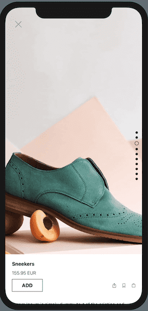
As I mentioned earlier, the user will have the ability to view a single image, so let's create the view that will handle that. In the Views folder, add the following:
ProductImageView.swift
import SwiftUI
import KingfisherSwiftUI

struct ProductImageView: View {

    var imgUrl: String
    // 1
    var animation: Namespace.ID
    var onDismissPreview = {}

    @State private var zoomLevel: CGFloat = 1
    @State private var offset: CGSize = .zero

    var body: some View {
        ImageView(imgUrl: imgUrl)
            .scaleEffect(self.zoomLevel)
            .offset(self.offset)
            .gesture(handleDragGesture())
            .gesture(handleMagnificationGesture())
            .onTapGesture(count: 2, perform: handleDoubleTapGesture)
            .onTapGesture(count: 1, perform: handleSingleTapGesture)
            .background(Color.background)
            .edgesIgnoringSafeArea(.all)
            .animation(.easeIn, value: self.zoomLevel)
    }

    private func handleDragGesture() -> _EndedGesture<_ChangedGesture<DragGesture>> {
        return DragGesture()
            .onChanged({ value in
                if zoomLevel > 1 {
                    self.offset = value.translation
                }
            }).onEnded({ value in
                withAnimation {
                    self.offset = .zero
                }
            })
    }

	 private func handleMagnificationGesture() -> _EndedGesture<_ChangedGesture<MagnificationGesture>> {
        return MagnificationGesture().onChanged({ (value) in
            self.zoomLevel = value
        }).onEnded { value in
            if value < CGFloat(1) {
                self.zoomLevel = 1
            }
        }
    }

    private func handleSingleTapGesture() {
        if zoomLevel == 1 {
            onDismissPreview()
        }
    }

    private func handleDoubleTapGesture() {
        if zoomLevel > 1 {
            zoomLevel = 1
        } else {
            zoomLevel = 2
        }
    }
}

struct ProductImageView_Previews: PreviewProvider {
    @Namespace static var animation
    static var previews: some View {
        ProductImageView(imgUrl: "", animation: animation)
    }
}
Explanation
- Make sure you import the KingfisherSwiftUI framework first.
- Next, we declare the first 3 that will be passed in via the initialiser. We declare a
[Namespace.ID](http://namespace.ID)to synchronise animations between this particular view and the selectedImageViewin theProductDetailView,that we haven't created yet, usingmatchedGeometryEffect. - Next we declare the states properties that will update the view every time they change. The first one is the
zoomLevelto change how zoomed in the image is and the second isoffsetfor moving the image around. - We then attach a
scaleEffectmodifier to scale up or down the image when a user performs aMagnificationGesturethat is handled in thehandleMagnificationGesturefunction. The maximum zoom amount will be 2x the normal size of the image. - The
offsetis used to move around the image using a drag gesture when in zoomed-in state .The drag gesture will only work when the image is zoomed in. - We then add 2
onTapGesturemodifiers, one handles a double taps and another single tap. The double tap is used to zoom in or out the image whereas the single tap will be used to dismiss the preview. - In the
handleDragGesture, we update theoffsetwith the translation of the finger in theonChangeblock, and in theonEndedblock, we reset theoffsetto zero which is the initial position. - In the
handleMagnificationGesture, we update thezoomLevelwith the value in theonChangeblock, then when the user lifts the finger, we reset thezoomLevelif the value is less than 1 which is the zoomed-out state. - In the
handleSingleTapGesture, we first check if we are in the normal state, and if so we dismiss the image preview. - In this
handleDoubleTapGesture, we first check if we are zoomed-in ( ifzoomLevelis greater than 1), we reset it to 1 which is the normal state. If we are not in zoomed-in, we set the zoomLevel to 2 to zoom theImageViewin.
This is the content that will go in the custom sheet we've created, so in the Views folder, add the following:
ProductDetailContent.swift
import SwiftUI
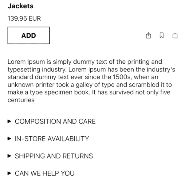
struct ProductDetailContent: View {
var product: Product
var body: some View {
VStack(alignment: .leading, spacing: 30) {
VStack(alignment: .leading, spacing: 10) {
Text(product.title)
.font(.system(size: 15, weight: Font.Weight.bold, design: Font.Design.default))
Text(product.price)
.font(.system(size: 14, weight: Font.Weight.light, design: Font.Design.default))
HStack {
BorderedButton(text: "ADD") {}
Spacer()
HStack(spacing: 20) {
IconButton(icon: "square.and.arrow.up") {}
IconButton(icon: "bookmark") {}
IconButton(icon: "bag") {}
}
}
}
Text(product.description).font(.system(size: 14, weight: Font.Weight.light, design: Font.Design.default))
VStack(alignment: .leading, spacing: 20) {
ArrowButtton(text: "COMPOSITION AND CARE") {}
ArrowButtton(text: "IN-STORE AVAILABILITY") {}
ArrowButtton(text: "SHIPPING AND RETURNS") {}
ArrowButtton(text: "CAN WE HELP YOU") {}
}
}.padding(.all, 20)
}
}
struct ProductDetailContent_Previews: PreviewProvider {
static var previews: some View {
ProductDetailContent(product: Product.kids.first!)
}
}Explanation
The above code is way simpler than it looks... Everything will flow vertically, just take a look a preview and read the code, it should be self-explanatory.
Preview
In the Views folder, add the following:
ClearNavBar.swift
struct ClearNavBar: View {

    var opacity: Double
    var onDismiss = {}

    var body: some View {
        HStack {

            Button(action: onDismiss, label: {
                Image(systemName: "xmark")
                    .font(.system(size: 25, weight: Font.Weight.light, design: Font.Design.default))
                    .foregroundColor(.gray)
                    .padding(10)
            })

            Spacer()
        }.padding(.horizontal, 20)
        .padding(.bottom, 10)
        .frame(height: Sizes.navBarHeight, alignment: .bottom)
        .background(Color.background.opacity(opacity))

    }
}

struct ClearNavBar_Previews: PreviewProvider {
    static var previews: some View {
        ClearNavBar(opacity: 1)
    }
}
Explanation
This navigation bar is a bit special, notice how we expose the opacity, we want the opacity to progressively increase to 1 or decrease to 0 as the user drags the sheet up or down.
This is where we will put everything product detail related views we've just created.
In the Screens folder, add the following:
import SwiftUI
import KingfisherSwiftUI

struct ProductDetailScreen: View {

    var product: Product
    var onDismiss = {}

    @State private var progress: CGFloat = 1
    @State private var selectedIndex: Int?

    @Namespace private var animation

    private let foldedHeight: CGFloat = 150
    private let expandedHeight = Sizes.screenHeight - Sizes.navBarHeight

    var body: some View {

        ZStack(alignment: .top) {
            createPagingController()
            createNavBarView()

            if selectedIndex == nil {
                createCustomSheet()
            } else {
                createProductImageView()
            }
        }.edgesIgnoringSafeArea(.all)
        .animation(.linear, value: selectedIndex)

    }

    fileprivate func createCustomSheet() -> some View {
        CustomSheet(progress: self.$progress, foldedHeight: foldedHeight, expandedHeight: expandedHeight) {
            ProductDetailContent(product: product)
        }.transition(.move(edge: .bottom))
    }

    fileprivate func createProductImageView() -> ProductImageView {
        let images = product.images
        return ProductImageView(imgUrl: images[selectedIndex!], animation: animation)
            { self.selectedIndex = nil }
    }

    fileprivate func createPagingController() -> some View {
        PagingController(viewControllers:
                                    product.images.map({
                                                        UIHostingController(rootView:
                                                                                ImageView(imgUrl: $0)
                                                                                .matchedGeometryEffect(id: $0, in: animation)
                                                        )}), selectedIndex: self.$selectedIndex)
    }

    fileprivate func createNavBarView() -> some View {
        ClearNavBar(opacity: Double(1 - progress), onDismiss: onDismiss)
            .padding(.top, UIApplication.shared.windows.first?.safeAreaInsets.top)
    }

}

struct DetailScreen_Previews: PreviewProvider {
    static var previews: some View {
        ProductDetailScreen(product: Product.men.first!)
    }
}
Explanation
- We will need the
product, so we declare it. TheonDIsmisswill called when the close button on the clear nav bar is tapped. - Next, we declare the
progressto keep track of the drag progress, and theselectedIndexto show the product image when selected. - The animation property will be used sync the transition between the image displayed in the
CollectionCelland the single full screen productImage. The next 2 properties will hold the folded and expanded height of the detail sheet. - Inside the
ZStack, we add the various views that make up the product detail screen. The part to pay attention to is the condition, so if selectedIndex is nil meaning if no cell is selected, we will show the custom sheet, otherwise we will show the product Image view. - The
createCustomSheetfunction creates and returns a custom sheet instance, adding a move transition to it so that it animated from the bottom. - In the
createProductImageView, we create and return aProductItemViewinstance. When the close button is tapped, theonDIsmissclosure will run and inside it we set theselectedIndexto nil. - In the
createPagingController, we do the same thing we did when creating the paging controller in the Home screen view, but in this one, we looping over an array of url strings rather pages, then we bindselectedIndexproperty to theselectedIndexin the CollectionView.
The preview will not display the images unless you click the play button on it.
Preview
And this is lesson 4 of this mini course... stay tuned for lesson 4 which in my humble opinion will be more exciting than the last 3. So make sure you've subscribed to not miss when I publish that and share this article. Happy coding!