Hey guys, this is part 3 of the ZARA replica mobile app. Check out the previous lesson if you haven't done so already in order to follow along. So, in this one we will continue from where we left off last week .
In the Utils folder, add the following if you don't have it already:
Sizes.swift
import SwiftUI

enum Sizes {

		static var navBarHeight: CGFloat { 50 }
    static var tabBarHeight: CGFloat { UIScreen.main.bounds.width * 0.15 }
    static var screenWidth = UIScreen.main.bounds.width
    static var screenHeight = UIScreen.main.bounds.height

}
Explanation
This is a simple helper struct that will be used in the app.
In the Views folder, add the following:
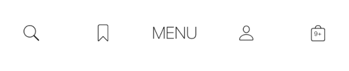
TabbarView.swift
import SwiftUI

struct TabbarView: View {

    @Binding var tab: Tab?

    var body: some View {
        HStack {
            Button(action: {
               onTabSelected(.search)
            }, label: {
                Image(systemName: "magnifyingglass")
                    .thinFont()
                    .frame(maxWidth: .infinity)
            })

            Button(action: { onTabSelected(.bookmark) }, label: {
                Image(systemName: "bookmark")
                    .thinFont()
                    .frame(maxWidth: .infinity)
            })

            Button(action: { onTabSelected(.menu) }, label: {

                Text("MENU").thinFont()
                    .frame(maxWidth: .infinity)
            })

            Button(action: { onTabSelected(.profile) }, label: {
                Image(systemName: "person")
                    .thinFont()
                    .frame(maxWidth: .infinity)
            })

            Button(action: { onTabSelected(.cart) }, label: {
                Image(systemName: "bag")
                    .thinFont()
                    .overlay(
                        Text("9+").font(.system(size: 7, weight: Font.Weight.light, design: Font.Design.default))
                            .padding(.top, 2)
                        , alignment: .center)
                    .frame(maxWidth: .infinity)
            })

        }
        .frame(maxWidth: .infinity, maxHeight: Sizes.tabBarHeight, alignment: .top)
        .textColor()
        .bgColor()

    }

		func onTabSelected(_ tab: Tab)  {
        self.tab = tab
    }
}

struct TabbarView_Previews: PreviewProvider {
    static var previews: some View {
        TabbarView(tab: .constant(.bookmark))
    }
}
Explanation
The tab bar view is a horizontal stack of buttons, and in each button's action we call a onTabSelected function to set the tab binding property.
Preview
Before creating the product listing screen, we first need to create some views that will compose it. In the Views folder, add the following:
ProductItemView.swift
import SwiftUI
import KingfisherSwiftUI

struct ProductItemView: View {
    // 1
    var product: Product
    var showDetail = {}
    var bookmark = {}

    var body: some View {

        VStack {
								// 2
                KFImage(URL(string: product.mainImage)!)
                    .resizable()
                    .scaledToFill()
                    .frame(width: (Sizes.screenWidth / 2 - 25), height: 250)
                    .clipped()
                    .onTapGesture(perform: showDetail)

                 // 3
                VStack(alignment: .leading) {
                    Text(product.title)
                        .lightFont()
                        .lineLimit(1)
                    // 4
                    HStack {
                        Text(product.price)
                            .lightFont()
                        Spacer()
                        Button(action: bookmark, label: {
                            Image(systemName: "bookmark")
                                .lightFont()
                                .textColor()
                        })
                    }
                }

        }.padding(.horizontal)
    }
}

struct ProductItemView_Previews: PreviewProvider {
    static var previews: some View {
        ProductItemView(product: Product.men.first!)
    }
}
Explanation
- We first declare our properties. The
showDetailclosure will be called when a user taps on the product image to present the product detail view. Thebookmarkclosure will be used for bookmarking. KFImagein a wrapper around the native swiftUI Image that we use to download and cache remote images.- We put the title and the
HStackinto aVStackaligned to the left. - The
HStackcontains 2 views separated by aSpacerview.
Preview
Add the following in the Views folder:
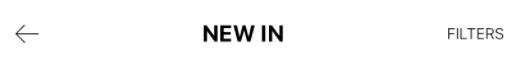
NabBarView.swift
import SwiftUI

struct NavBarView: View {

    var title: String
    var onReturn = {}
    var onFilter = {}

    var body: some View {
        HStack {
            Button(action: onReturn, label: {
                Image(systemName: "arrow.left")
                    .thinFont()
            })

            Text(title)
                .font(.system(size: 18, weight: Font.Weight.bold, design: Font.Design.default))
                .frame(maxWidth: .infinity, alignment: .center)

            Button(action: onFilter, label: {
                Text("FILTERS")
                    .lightFont()
            })

        }.padding(.horizontal)
        .padding(.bottom, 10)
        .textColor()
        .frame(height: Sizes.navBarHeight, alignment: .bottom)
        .bgColor()
    }
}

struct NavBarView_Previews: PreviewProvider {
    static var previews: some View {
        NavBarView(title: "NEW IN")
            .preferredColorScheme(.light)
    }
}
Explanation
The navbar has a title and 2 buttons, left and right. The left one will be used to return or dismiss and it will call the onReturn closure when clicked and the right one will used to filter and will call the onFilter closure when clicked.
Preview
In the Screens folder, add the following:
ProductListingScreen.swift
import SwiftUI

struct ProductListingScreen: View {


    @Binding var category: Category?
    // 1
    @EnvironmentObject private var store: Store

    @State private var selectedProduct: Product?

    // 2
    private let columns = [
        GridItem(.adaptive(minimum: 150), spacing: 20)
    ]


    var body: some View {

       return ZStack(alignment: .top) {
            ScrollView {
                // 3
                createGrid()
            }.padding(.top, Sizes.navBarHeight)
                .padding(.horizontal, 15)
            // 4
            createNavBar()

        }.onAppear(perform: {
            // 5
            setProducts()
        }).fullScreenCover(item: $selectedProduct, content: {
            ProductDetailScreen(product: $0){
				selectedProduct = nil
						}
        })

    }

    // 3
    fileprivate func createGrid() -> LazyVGrid<ForEach<[Product], String, ProductItemView>> {
        LazyVGrid(columns: self.columns, alignment: .center, spacing: 40) {
            ForEach(store.state.products) { product in
                createProductItemView(product) // 7
            }
        }
    }

    // 4
    fileprivate func createNavBar() -> NavBarView {
        return NavBarView(title: "NEW IN") {
            category = nil
        } onFilter: { }
    }

    // 5
    fileprivate func setProducts() {
        guard let cat = self.category else {
            return
        }
        switch cat {
        case .men:
            store.dispatch(.addProducts(Product.men))
        case .women:
            store.dispatch(.addProducts(Product.women))
        case .kids:
            store.dispatch(.addProducts(Product.kids))
        }
    }

    // 6
    fileprivate func createProductItemView(_ product: Product) -> ProductItemView {
        return ProductItemView(product: product) {
            selectedProduct = product
        } bookmark: {
            store.dispatch(.bookmark(product))
        }
    }

}

struct ProductListingScreen_Previews: PreviewProvider {
    static var previews: some View {
        ProductListingScreen(category: .constant(Category.kids)).environmentObject(Store())
    }
}
Explanation
- We need the store object to perform operations and retrieve products, so we get it from the
environmentObject.. - We then declare the columns property that will define how the
LazyVGridlayouts its views. Using adaptive grid items allows us to fit as many items per row as possible with 150 minimum width - Inside the
createGridfunction, we return aLazyVGrid. Thecolumnswill be an array of adaptive GridItems. Adaptive means we fit as many items as possible in a row, but each item must have a width of no less than 150. Inside the content block, we return aForEachblock looping through the products and creatingProductItemViewfor each product. - In the
createNavBar, we return aNavBarinstance initialized with a hard-coded title, but in a real world app, this would dynamic. In theonReturnclosure, we set thecategoryto nil.onFilterwill stay empty. - The
setProductswill be called in theonAppearblock of the mainZStackcontainer. We then dispatch anaddProductsaction based on the unwrappedcategoryto loads products. - The
createProductItemViewfunction creates and return aProductItemViewwhich is the single item in the grid, it has 2 closures, the first one handles the selection of a product that will dispatch aselectProductUIActionto the store and trigger the presentation of its detail screen, and the second one handles bookmarking that will dispatch abookmarkAction to the store. - In body, we add our grid in the
Scrollview, then below it we add the navbar. ThefullScreenCovercontaining the detail screen will be presented whenstore.uiState.selectedProductis notnil. - Remember to add
.environmentObject(Store())in the preview for it to work .
Preview

Now that we have all we need to implement the content view, let's do that. Add the following in the ContentView.swift.
struct ContentView: View {

    @EnvironmentObject private var store: Store
    @State private var presentScreen = false
    @State private var selectedTab: Tab?
    @State private var selectedCategory: Category?

    var body: some View {

        if store.state.isLoggedIn {
            createHomeScreen()
        } else {
            createLoginScreen()
        }
    }

    fileprivate func createLoginScreen() -> some View {
        return LoginScreen {
            store.dispatch(.login)
        }.transition(.move(edge: .bottom))
        .animation(.easeOut)
    }

    fileprivate func createHomeScreen() -> some View {

        return ZStack(alignment: .bottom){
            HomeScreen(category: $selectedCategory)
            TabbarView(tab: $selectedTab)
        }
        .fullScreenCover(isPresented: $presentScreen, content: {
            if selectedCategory != nil{
                ProductListingScreen(category: $selectedCategory)
            }

            if let tab = selectedTab {
                createTabScreen(tab)
            }
        })
        .onChange(of: selectedCategory) { category in
            presentScreen.toggle()
        }.onChange(of: selectedTab) { _ in
            presentScreen.toggle()
        }

    }

    @ViewBuilder
    private func createTabScreen(_ tab: Tab) -> some View {
        switch tab {
        case .bookmark:
            Text("Bookmark")
        case .cart:
            Text("Shopping bar")
        case .search:
            Text("Search")
        case .profile:
            Text("Profile")
        case .menu:
            Text("Menu")
        }
    }

}

struct ContentView_Previews: PreviewProvider {
    static var previews: some View {
        ContentView().environmentObject(Store())
    }
}
Explanation
- We create the home screen which consist of
ZStackcontaining theHomeScreenandTabbarView. This is also where we add the full screen cover modifier that will present product listing screen or other screen based on the selected tab bar button. - We create the
LoginScreen, and in itsonDismissclosure, we dispatch aloginaction. The login functionality does not work for real though. - In the
presentScreenmethod, we present a screen based on a selected tabBar button. We haven't created those screens yet that's why we have returned placeholderTextviews. - The
onTabSelectedwill be used to present other screens.
Preview
To build and run the app, we need to set the store as an environmentObject. To do this, add the following in the ZaraReplicaApp struct.
To the top of the struct
private var store = Store()And this modifier on the ContentView:
.environmentObject(store)Your file should look like this:
import SwiftUI

@main
struct ClothingUIApp: App {
    @StateObject private var store = Store()

    var body: some Scene {
        WindowGroup {

            ContentView().environmentObject(store)
        }
    }
}
Now build and run the app. Everything should work fine... make sure you run the app on a physical device as it looks much better than on a simulator.
And this is lesson 3 of this mini course... stay tuned for lesson 4 which in my humble opinion will be more exciting than the last 3. So make sure you've subscribed to not miss when I publish that. Happy coding guys!