Some notes on image performance. What we'll cover:
- The cost of images (Both on the Network & Render side)
- Image srcset – what it does and how it works
- Linting responsive images
Use the Network Panel to understand the download time of images.
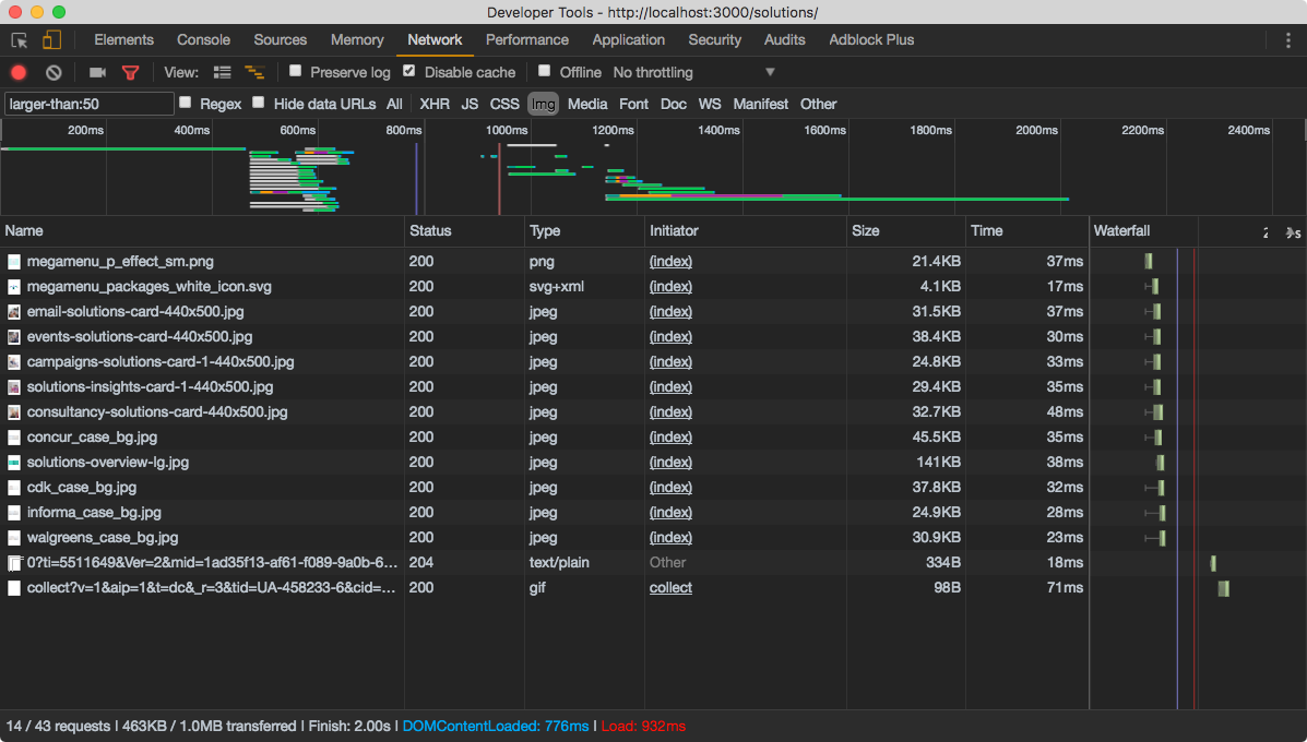
⭐ Use the larger-than Network panel filter to quickly find big resources. See list of filters in the official docs.
The "render" cost, in our context, represents the time it takes for a browser to "draw" the image to the screen. Once an image has been downloaded from the network, the browser will spend more time decoding that image and drawing it to the screen. Traditional website performance recommendations focus heavily on the network. In 2017, with better developer tooling, we can begin to understanding timings after an image has been downloaded.
Image Decode is an operation the browser performs on an image to prepare it for displaying to you, the user. An overlooked performance aspect with images is the duration of this operation. Note: Image decoding may take ~5ms with a small image on a powerful machine, however it's a different story on a low-end device + large image.
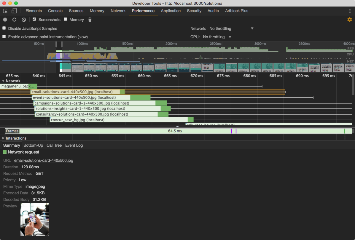
Note that the cost of image decoding on a say Nexus 4 is even greater. (see remote debugging)
Before diving into what srcset is, take some time to understand the problem it can solve.
Have a look at the images on the Poppulo landing page. For example the raw image email-solutions-card-[size].jpg has a width of 960px, however I only display it at 960px on a large screen. Also, on a narrow viewport size, for example when the viewport width is at 440px, the image width is constrained to 440px and resized accordingly.
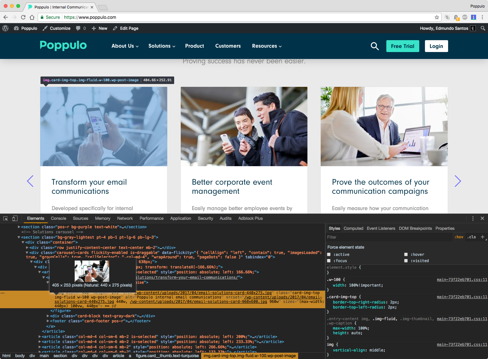
The problem is when you have a high-quality image scaled down to the user (with CSS), regardless of what size it will be displayed at. It would be like downloading a 4K video from YouTube, but then watching it at 480p.
The srcset attribute on the img tag can help us solve this.
The srcset attribute extends the img element, so you can supply multiple image files for difference device characteristics.
<!-- You can say -->
<img src="image.jpg">

<!-- But with srcset, we can hint to the browser certain things -->
<img srcset="image-small.jpg 400w, image-medium.jpg 800w">

<!-- Device pixel ratio -->
<img srcset="image-small.jpg 1x, image-medium.jpg 2x">
I'm using these two tools that are quite hand on linting responsiveness of images:
- respimagelint – Linter for responsive images
- Lighthouse – Google tool for performance in general, also reports on responsive images.
On the website we are using imagemin with mozjpeg and optipng for optimizing the images without losing quality. Sadly that doesn't work on images uploaded through WordPress :(
Browser support - Supports all modern browsers BUT for IE (yes for Edge).