- Classes vs id's
- CSS selectors
- p.className
- p .className
- p, .className
- What makes up a CSS property? (key:value)
- 3 ways to include CSS in a document
- inline
- head
- external
- How are CSS rules applied? What's the order of precedence?
Demonstrate what elements look like without any styling by going to a popular website and removing the stylesheet
Go to https://generalassemb.ly and remove stylesheets
A block-level element always starts on a new line and takes up the full width available
- div
- h1
- p
- header, footer, nav
An inline element does not start on a new line and only takes up as much width as necessary.
- span
- a
- img
In an HTML document, each element is represented as a rectangular box. Determining the size and other properties like color, background, border, etc is up to the rendering engine.
Each of these rectangular boxes is described using the box model. This box model describes the amount of space taken up by the element in the document.
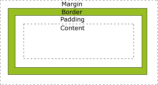
In Chrome, inspect elements on existing web pages and view the box model under the "computed" tab
<!DOCTYPE html>
<html>
<head>
<title></title>
<style type="text/css">
	.box {
		width: 50%;
		border: 3px solid green;
		background-color: orange;
		float: left;
		/* box-sizing: border-box; */
	}
</style>
</head>
<body>
	<div class="box">Box 1</div>
	<div class="box">Box 2</div>
</body>
</html>box-sizing is a CSS3 property that helps to make building layouts more intuitive for developers.
- content-box: Default. The width and height of an element does not include padding or borders
- border-box: The width of an element includes the padding and borders
Demo: Go to previous example and add the box-sizing: border-box property to the box class
Set up the following base HTML:
<!DOCTYPE html>
<html>
<head>
<title>CSS Positioning</title>
<style type="text/css">
</style>
</head>
<body>
<ul>
<li>Austin</li>
<li>Dallas</li>
<li>Houston</li>
<li>Amarillo</li>
</ul>
<footer>© 2015 General Assembly</footer>
</body>
</html><style type="text/css">
ul {
display: none;
/*visibility: hidden;*/
}
</style>Note Mention "visibility: hidden" property and how it's different
<style type="text/css">

li {
	display: block;
}

</style><style type="text/css">
li {
display: inline;
}
</style><style type="text/css">
li {
display: inline-block;
}
</style>You Do (15 min)
Life Optimizer: https://github.com/ga-students/wdi-atx-7-class/tree/master/w01/d04/morning/exercise_life_optimizer
Static is the default value. An element positioned with "position: static" is not positioned in any special way. Follows the natural flow of the document.
Relative behaves just like "static" unless you add "top", "bottom", "left", or "right"
<style type="text/css">

ul {
	position: relative;
	top: 400px;
	left: 50px;
}

</style>Fixed elements are always positioned in the same location, even if the user scrolls
<!DOCTYPE html>
<html>
<head>
<title>CSS Positioning</title>
<style type="text/css">
body {
background: #ccc;
}
ul {
position: relative;
}
img {
position: fixed;
right: 0;
bottom: 0;
}
</style>
</head>
<body>
<ul>
<li>Austin</li>
<li>Dallas</li>
<li>Houston</li>
<li>Amarillo</li>
</ul>
<img src="https://ga-core.s3.amazonaws.com/production/uploads/program/default_image/3677/thumb_thumb_thumb_Partner-Happy-Hours-General.jpg" alt="">
<footer>© 2015 General Assembly</footer>
</body>
</html>Absolute elements are removed from the normal flow and can overlap other elements.
<!DOCTYPE html>
<html>
<head>
<title>CSS Positioning</title>
<style type="text/css">
body {
background: #ccc;
}
ul {
position: relative;
}
li {
height: 100px;
}
img {
position: fixed;
right: 0;
bottom: 0;
}
.relative {
position: relative;
left: 150px;
}
.absolute {
position: absolute;
left: 150px;
}
</style>
</head>
<body>
<ul>
<li>Austin</li>
<li>Dallas</li>
<li class="absolute">Houston</li>
<li>Amarillo</li>
</ul>
<img src="https://ga-core-production-herokuapp-com.global.ssl.fastly.net/assets/ga-lockup-1788582934ade008a8ea6068b784b8ee.png" alt="">
<footer>© 2015 General Assembly</footer>
</body>
</html>- "px" - Columns, margins, padding are a set size no matter how the viewport or fonts are resized
- "%" - Columns, margins, padding are resized as the viewport is changed
Using the "float" property, elements can be pushed to the left or right, allowing other elements to wrap around it.
<!DOCTYPE html>
<html>
<head>
<title>CSS Positioning</title>
<style type="text/css">
body {
background: #ccc;
}
ul {
}
li {
background: black;
color: white;
width: 250px;
margin-right: 2px;
float: left;
list-style-type: none;
}
footer {
}
</style>
</head>
<body>
<nav>
<ul>
<li>Austin</li>
<li>Dallas</li>
<li>Houston</li>
<li>Amarillo</li>
</ul>
</nav>
<footer>© 2015 General Assembly</footer>
</body>
</html>Elements that come after an element that has been floated will flow around it. To get out, use "clear".
<!DOCTYPE html>
<html>
<head>
<title>CSS Positioning</title>
<style type="text/css">
body {
background: #ccc;
}
ul {
}
li {
background: black;
color: white;
width: 250px;
margin-right: 2px;
float: left;
list-style-type: none;
}
footer {
clear: left;
}
</style>
</head>
<body>
<nav>
<ul>
<li>Austin</li>
<li>Dallas</li>
<li>Houston</li>
<li>Amarillo</li>
</ul>
</nav>
<footer>© 2015 General Assembly</footer>
</body>
</html>The "clearfix" workaround is used on parent containers with floating elements inside of them. Without it, the parent container would not get any height.
<!DOCTYPE html>
<html>
<head>
<title>CSS Positioning</title>
<style type="text/css">
.container {
background: green;
}
.other {
background: blue;
}
img {
float: right;
}
.clearfix {
overflow: auto;
}
</style>
</head>
<body>
<div class="container clearfix">
<span class="label">Some content</span>
<img src="http://media0.giphy.com/media/v0x4zvenp9TEc/giphy.gif" alt="">
<p>
Uh oh... this image is taller than the element containing it, and it's floated, so it's overflowing outside of its container!
</p>
<div class="other">This is another div container</div>
</div>
<footer>© 2015 General Assembly</footer>
</body>
</html><!DOCTYPE html>
<html>
<head>
<title>CSS Positioning</title>
<style type="text/css">
nav {
width: 200px;
float: left;
}
.clearfix {
overflow: auto;
}
</style>
</head>
<body>
<nav class="left">
<ul>
<li>Austin</li>
<li>Dallas</li>
<li>Houston</li>
<li>Amarillo</li>
</ul>
</nav>
<section class="right clearfix">
<p>Lorem ipsum dolor sit amet, consectetur adipiscing elit. Sed non fermentum nibh, eu mattis turpis. Pellentesque sagittis tincidunt enim vel gravida. Mauris egestas, mauris id vehicula cursus, erat ante finibus ipsum, nec tincidunt tellus tortor non augue. Vivamus vitae dui auctor leo varius bibendum. Donec egestas nulla dui, ac tincidunt justo mattis eget. Proin vestibulum fermentum molestie. Nunc efficitur sapien non sem bibendum, id venenatis magna laoreet.</p>
<p>Nunc volutpat vitae mauris et elementum. Vestibulum ante ipsum primis in faucibus orci luctus et ultrices posuere cubilia Curae; Vestibulum auctor ex ut ex aliquet dapibus. Praesent consequat quam ut odio suscipit egestas. Nulla metus ante, ultricies et felis vitae, rhoncus faucibus ante. Nulla elit nisl, pharetra eu neque vitae, porttitor condimentum nisl. Phasellus eget mollis nisi, vitae suscipit dui. Vivamus euismod quis ligula et mollis. Integer hendrerit nisl ac ipsum eleifend sagittis.</p>
<p>Curabitur risus elit, venenatis ac tellus nec, pharetra faucibus orci. Aliquam erat volutpat. Interdum et malesuada fames ac ante ipsum primis in faucibus. Mauris aliquam pharetra elementum. Fusce a vehicula lectus. Etiam accumsan quis quam semper molestie. Donec molestie vehicula enim congue pellentesque. Aliquam augue eros, venenatis malesuada bibendum quis, dictum in lectus.</p>
<p>Vestibulum ante ipsum primis in faucibus orci luctus et ultrices posuere cubilia Curae; Fusce vel efficitur ex, faucibus feugiat nunc. Suspendisse pellentesque nisl sit amet orci aliquet feugiat. Nullam vel sodales ipsum. Praesent iaculis laoreet tortor vitae condimentum. Donec sed orci fermentum, iaculis mi sit amet, consequat mi. Vestibulum vehicula sodales venenatis. Nunc sit amet eros at enim lacinia varius. Suspendisse potenti. Donec a luctus lacus, sit amet fermentum sem. Donec bibendum varius odio, sit amet ultrices nisl vehicula ut. Suspendisse blandit, nunc nec cursus posuere, nunc lorem venenatis augue, nec imperdiet lorem quam eu orci. Phasellus ac orci et urna volutpat laoreet commodo vitae massa.</p>
</section>
<footer>© 2015 General Assembly</footer>
</body>
</html>20 min
https://github.com/ga-wdi-exercises/dew_about_me_css
20 min