In the first few months of the pandemic, the infection rates of COVID varied widely between different states. By November 1st, the least infected state, Vermont, had less than 3% of its population infected. The most infected state (excluding the ones with major outbreaks before lockdown) was North Dakota with nearly 28% of its population infected.
At the same time the approach and strictness of the lockdown in different states seemed to vary widely, and more strict states seemed to have better results than those which were more loose. Florida and California came to represent these two approaches. Neither had the best, or the worst results but they did show differences. From May to November, people in Florida spent about 20% more time outside the home, than those in California did. In turn Florida had about 20% of its population infected, while California only had 12% infected.
At first glance this seems perfectly natural, this large increase in mobility corresponds to Florida's looser restrictions, and led to a correspondingly large increase in infections. We can use the daily infections in Florida to estimate the R0 parameter. If we were to reduce this parameter by 20% we should then expect to see ~10% infected, just like California. Instead, the standard model predicts that only .75% of the population would have been infected (more than three times better than the best state). According to the standard model, in order for Florida to equal California's numbers it would have needed to reduce transmission by just 3%.
The difference between Florida and the best state, Vermont, is only 10%. If instead Florida had increased transmission by 10% it would have had nearly twice the infections. This would result in the most cases out of any state, even surpassing New York in the spring.
This leads to two major challenges for the standard model.
- Despite seemingly wide variations in behavior and lockdown strictness all states had nearly the same amount of transmission.
- The precise level of transmission that all states fell into is the only narrow range where we would have this prolonged level of cases. If transmission was slightly lower, the US would have had vastly fewer cases, if transmission was slightly higher, herd immunity would have meant that cases would fall off.
This problem arises because the standard model incorporates a strong feedback loop. If cases start to rise, they will rise exponentially; If they start to fall, they will fall exponentially. This means that the apparent stability we see is a remarkable coincidence.
If we look at the observed daily R0 for Florida and California we also see something interesting:
Rather than Florida being consistently more "open" than California, it instead fluctuates. At times Florida even seems to be more "closed" than California, against all intuition and in a way not confirmed by the mobility data.
These challenges to the standard model are not new, and there are explanations for them. I find these explanations unsatisfying and will explain why later in the article.
Instead I will focus on explaining a new model to explain these challenges. In this model a 20% transmission reduction for Florida results in ~10% being infected. This is very close to the difference predicted by mobility data. Similarly a 10% increase leads to ~25% being infected instead of ~40%.
Examining the inferred transmission levels based on this model also shows a story which is much closer to what we would expect from the mobility data and policy.
Starting in June, Florida began to diverge from California, and had ~20% more transmission. Over the next few months this gap widened at a fairly steady pace. Unlike the standard model, this does not show any point at which Florida was more "closed" than California.
In the following sections I will try to explain the ideas underlying this model and explain how with only minor modifications to the standard model, the observed data becomes explainable.
Suppose that you repeatedly ran an experiment where you put one infected person in a room with 100 healthy people for one hour. On average at the end of this experiment two of the healthy people become infected.
You are now asked to predict the results of two follow up experiments.
- How many healthy people would be infected if instead there were two sick people in the room.
- How many healthy people would be infected if they were in the room for two hours rather than one.
Without knowing the mechanism behind how the disease was transmitted, it would be hard to predict the results.
If for instance the mechanism was that the sick person randomly coughed on two people per hour, it would be easy to predict that in either case four people would be infected.
On the other hand if the sick person person coughed on everybody, and only two people get sick there would be two extreme possibilities:
- If you get coughed on you have a 2% chance of getting sick => Twice the coughs lead to twice the infection.
- 2% of people get sick if they are coughed on, everybody else is safe => Twice the coughs have no impact on infection.
The standard model assumes that the first alternative is true. In my model we consider an in between possibility, where some people are safe if you cough on them, and others have some chance of getting sick. Precisely how many people get sick if there are twice as many sick people (or people are in the room for twice as long) is uncertain, and depends on where on the spectrum between the two extremes we are at.
If we want to formalize this model, we could say that there are three parameters of interest:
- How many people are vulnerable.
- How many people would be infected if everybody was vulnerable.
- How stable is vulnerability. If we repeated the experiment a week later, how many of the same people would be vulnerable.
At the start of an outbreak, when nobody is immune, we can measure the product of the first two parameters. This is called R0 in the standard model. Over time, even if R0 stays constant, different values for the three parameters will lead to different epidemic curves.
We can consider three different scenarios
| Experiment | Exposed | Vulnerable | Stability | R0 |
|---|---|---|---|---|
| Standard Model | 2 | 100% | 100% | 2 |
| Stable Vulnerability | 10 | 20% | 100% | 2 |
| Semistable Vulnerability | 10 | 20% | 90% | 2 |
In all of the scenarios we will use the same starting conditions:
- There is a population of 1,000,000 people
- On the first day, there is 1 person infected.
- On average a person will infect two other vulnerable people at random (R0=2)
- Once a person is infected they are permanently immune from further infections.
In the standard model, everybody is vulnerable and we get the familiar exponential curve. Once the population reaches 50% immunity cases peak, and then start to decline rapidly.
In this model we simply assume that only one out of five people can be infected. Again we get the same curve as in the standard model, with one key difference. Instead of needing 50% of the population to become immune, we only need 50% of those who are vulnerable (or 10% of the population) to become immune.
If we consider a situation where the vulnerable population is not stable over time something interesting happens.
The initial spike is very similar to the stable case. Once 50% of the vulnerable are infected, the spike dies down. Unlike the stable case however, there is a second, smaller spike which occurs later on and an even smaller third one.
Every week some of the vulnerable population is replaced at random from the general population. Since these newly vulnerable people were not affected by the first spike, they have much less immunity. As fewer new people get infected the immune percentage of the vulnerable population degrades to match the general population.
Eventually, when that percentage drops below 50%, the population loses "herd immunity" and cases start to rise again. Until the overall population reaches equilibrium with the vulnerable population, the cycle will continue.
If we compare the weekly growth rates between the standard model and the vulnerability model, the difference becomes apparent. In the standard model there is no natural tendency towards stability. Once cases start to fall, they will continue to fall unless something changes. On the other hand the Semi-Stable model has a strong tendency to stabilize at a constant level.
You may have noticed that in our earlier graphs, California's big spike in the winter was cut off. In the standard model this spike is explainable but mysterious. For whatever reason, starting in October the level of exposure to COVID jumped to a level much higher than ever seen before.
Our basic vulnerability model does far worse. As more and more people should be immune, it breaks down when confronted with California's spike.
If we update our vulnerability model so that starting in October more of the population becomes vulnerable (going from 20% -> 33% over time) we see something more feasible.
In neither model is there a particularly compelling explanation for what happened, something clearly changed to cause the spike, and it is still not clear what.
As mentioned earlier there are two alternative explanations for this surprising behavior. In this section I will explain why I think these explanations are not nearly as compelling.
The behavioral explanation relies on people adapting their behavior in response to the observed course of the epidemic. When case numbers rise too high, people stay home and when case numbers drop people go out and party. Like a thermostat, this serves to keep case numbers at a constant level.
This explanation is adopted in various forms, by those who are strongly pro-lockdown, those who are strongly anti-lockdown, and those who are somewhere in the middle. However I believe that the behavioral story is implausible.
Firstly, feedback mechanisms like this work best when they are
- Linear: Small behavioral changes cause small differences in outcome.
- Precise: It is possible to make fine tuned adjustments in behavior to achieve the desired outcome.
- Immediate Feedback: After making a change, it is possible to quickly see the outcome.
With COVID-19, none of these factors are present, which makes the proposed precision of the feedback mechanism implausible.
Finally whatever the feedback mechanism is, it is not readily observable in mobility data. For instance here is a graph of COVID "close contacts" over time.
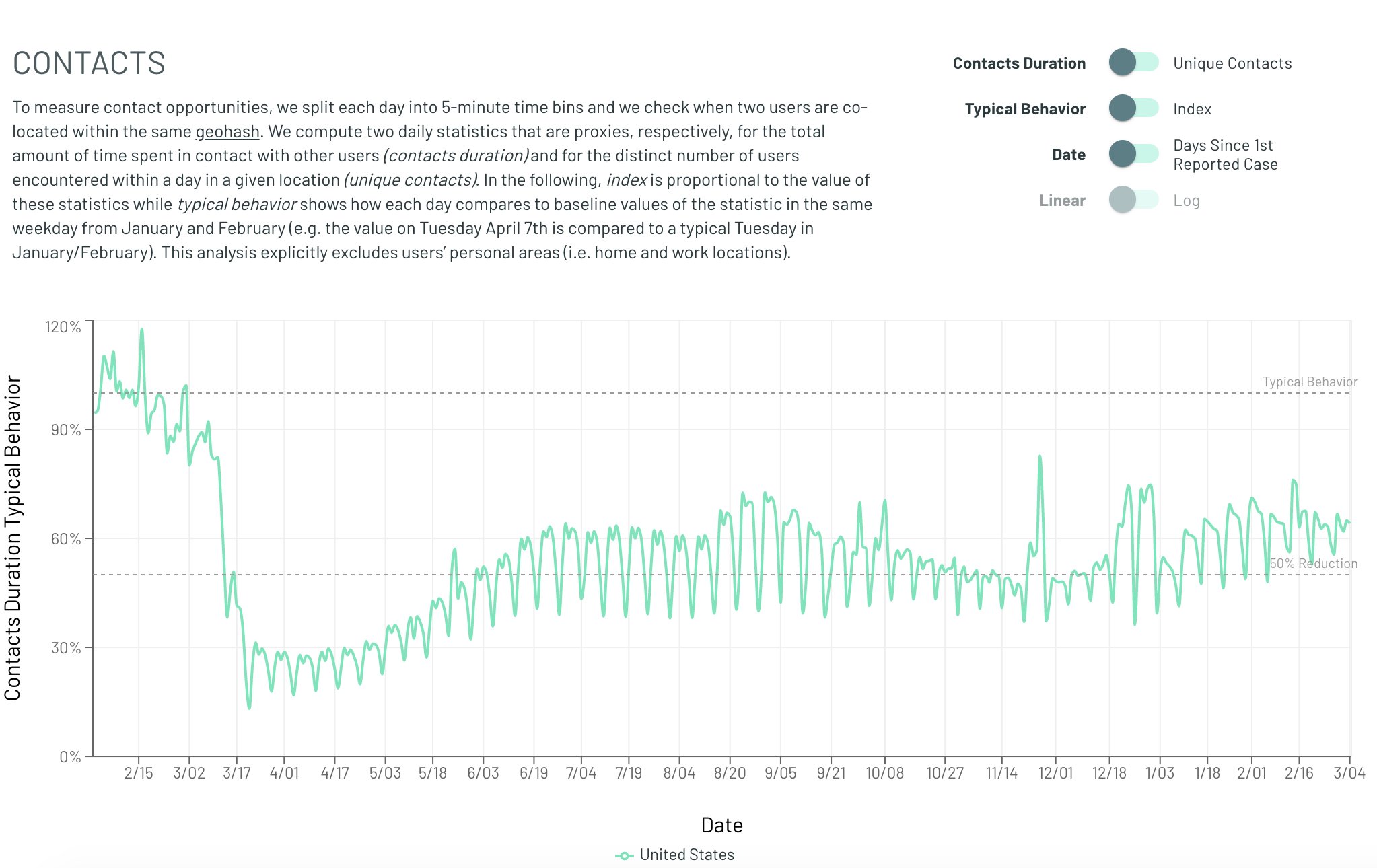
Whatever the feedback mechanism is, it is not observable with anything close to the required magnitude in that data. Obviously this dataset is not perfect and perhaps there are other changes in behavior which are being missed. But other datasets (time away from home, Google mobility trends) also don't show any obvious trend. If dramatic behavioral changes are driving the change in spread, why can't we see them?
The other main explanation for the apparent flatness, is that transmission is heterogenous. Early on the most social and susceptible groups get completely infected, and then as they reach herd immunity only those groups which are close to stability remain transmitting. This explanation can mathematically explain the earlier than expected peaks, and some of the flatness. However these heterogenous models make two predictions which have not fared very well.
Heterogenous models predict a much lower herd immunity threshhold. After the most vulnerable groups have been infected the rest of the population should have a much harder time becoming infected. But in places like Florida and Texas the winter wave was much more severe than the summer one, when theoretically they should have been far more resilient.
More importantly though is the problem of where this hyper-social heterogenous spread happened. Where is the observable group which both had super high spread early on, but now appears to be completely immune? Aren't insular communities which are hosting 10,000 person weddings prime candidates for this burnout? Why does nobody seem to have the 80-90% infection rate predicted by this heterogenity?
Similarly to the behavioral analysis, proponents of heterogenous spread are left pointing to nebulous, informal social groups. But still, at some point we should be able to point to a town or a group which has very obvious heterogenous spread.
The vulnerability model does not have this problem. If we compare Florida to a hypothetical super high transmission state, with twice the transmission levels. We see that even though the super high transmission does reach a much higher peak, it never reaches "herd immunity" where cases drop to near nothingness. That means that it is entirely plausible for some groups to be much more transmitting than others, while still not ever seeing the near complete immunity that the standard model would predict.
Starting in the fall of 2020 a new variant of COVID started circulating in the UK. Researchers estimated that it was ~50% more infectious than the baseline variety, and as expected it came to represent a greater and greater proportion of the observed infections.
As of March 2021, an estimated 50% of all new infections in Florida are due to this variant. However instead of leading to a skyrocketing case rate, this climb has occurred as case numbers have continued to decline.
In the standard model this should absolutely lead to an explosion of infection levels. Somehow, behavioral changes have precisely offset the effect of this much more contagious variant.
The vulnerability model can explain this phenomenon in a much simpler fashion there are two potential explanations.
We can see that although the introduction of a more infectious variant is associated with increased case levels, it is a much gentler increase, which could more easily be masked by minor external factors (e.g. seasonality).
One fact that this theory has difficulty explaining is how, if only a small fraction of people are vulnerable at any point, we see cases where a wave of infections spreads rapidly throughout a small group. There are two main plausible explanations for how these sorts of superspreader events can occur.
In our model most of the population is not susceptible to infection at any one time. However there may be groups of people where that is not the case. Environments like nursing homes have many immunocompromised people, who may be much more likely to become infected. Similarly, there may be cases where the environment itself, rather than the people in it, leads to the higher vulnerability. Prisons or other group living environments may have lower sanitation standards which could explain why more of the people are vulnerable.
The other possibility is that within close quarters, transmission is more direct and a much greater proportion of the population is vulnerable. however, the bulk of the transmission occurs in more casual settings where only a small fraction of people are vulnerable.
This model proposed is not intended to be a fully realistic description of the world, instead it is intended to provide a basic framework on which more complex models can be built, here are some examples of possible future extensions which could make this model more realistic:
- Heterogenity: We assume that the population mixing is random and uniform, what happens when different populations with different vulnerability rates and different transmission characteristics interact?
- Vulnerability: We assume that vulnerability is a binary variable, and if you are not vulnerable there is absolutely no chance of being infected. What happens if instead each person has a different susceptibility level which changes over time?
- Household Infections: We have some data on how COVID is transmitted within a household (about 30-40% of household members catch it). Could we use that data to determine the vulnerability? Could we look for deviations in that number over time to determine seasonality?