-
-
Save mjbalcueva/b21f39a8787e558d4c536bf68e267398 to your computer and use it in GitHub Desktop.
| "use client" | |
| import { forwardRef, useState } from "react" | |
| import { EyeIcon, EyeOffIcon } from "lucide-react" | |
| import { Button } from "@/components/ui/button" | |
| import { Input, InputProps } from "@/components/ui/input" | |
| import { cn } from "@/lib/utils" | |
| const PasswordInput = forwardRef<HTMLInputElement, InputProps>( | |
| ({ className, ...props }, ref) => { | |
| const [showPassword, setShowPassword] = useState(false) | |
| const disabled = props.value === "" || props.value === undefined || props.disabled | |
| return ( | |
| <div className="relative"> | |
| <Input | |
| type={showPassword ? "text" : "password"} | |
| className={cn("hide-password-toggle pr-10", className)} | |
| ref={ref} | |
| {...props} | |
| /> | |
| <Button | |
| type="button" | |
| variant="ghost" | |
| size="sm" | |
| className="absolute right-0 top-0 h-full px-3 py-2 hover:bg-transparent" | |
| onClick={() => setShowPassword((prev) => !prev)} | |
| disabled={disabled} | |
| > | |
| {showPassword && !disabled ? ( | |
| <EyeIcon | |
| className="h-4 w-4" | |
| aria-hidden="true" | |
| /> | |
| ) : ( | |
| <EyeOffIcon | |
| className="h-4 w-4" | |
| aria-hidden="true" | |
| /> | |
| )} | |
| <span className="sr-only"> | |
| {showPassword ? "Hide password" : "Show password"} | |
| </span> | |
| </Button> | |
| {/* hides browsers password toggles */} | |
| <style>{` | |
| .hide-password-toggle::-ms-reveal, | |
| .hide-password-toggle::-ms-clear { | |
| visibility: hidden; | |
| pointer-events: none; | |
| display: none; | |
| } | |
| `}</style> | |
| </div> | |
| ) | |
| }, | |
| ) | |
| PasswordInput.displayName = "PasswordInput" | |
| export { PasswordInput } |
| "use client" | |
| import { useState } from "react" | |
| import { PasswordInput } from "@/components/password-input" | |
| import { Button } from "@/components/ui/button" | |
| import { Label } from "@/components/ui/label" | |
| const SampleUseCase = () => { | |
| const [currentPassword, setCurrentPassword] = useState("") | |
| const [password, setPassword] = useState("") | |
| const [passwordConfirmation, setPasswordConfirmation] = useState("") | |
| return ( | |
| <div className="space-y-4"> | |
| <div> | |
| <Label htmlFor="current_password">Current Password</Label> | |
| <PasswordInput | |
| id="current_password" | |
| value={currentPassword} | |
| onChange={(e) => setCurrentPassword(e.target.value)} | |
| autoComplete="current-password" | |
| /> | |
| </div> | |
| <div> | |
| <Label htmlFor="password">New Password</Label> | |
| <PasswordInput | |
| id="password" | |
| value={password} | |
| onChange={(e) => setPassword(e.target.value)} | |
| autoComplete="new-password" | |
| /> | |
| </div> | |
| <div> | |
| <Label htmlFor="password_confirmation">Confirm Password</Label> | |
| <PasswordInput | |
| id="password_confirmation" | |
| value={passwordConfirmation} | |
| onChange={(e) => setPasswordConfirmation(e.target.value)} | |
| autoComplete="new-password" | |
| /> | |
| </div> | |
| <Button type="submit">Save</Button> | |
| </div> | |
| ) | |
| } | |
| export default SampleUseCase |
gread example, thx
awesome man, thanks!
for those people who are having trouble error message seen as "Function components cannot be given refs. Attempts to access this ref will fail.",
Use React.forwardRef instead of forwardRef
and make sure don't forget import
import React, {useState} from "react"
not
import { forwardRef, useState } from "react"
thanks!
Love you, 💯
thanks a lot.
Thanks!
thanks alot
Thanks a lot, made a shadcn-svelte version. -> https://gist.github.com/laryhills/dddd2d17dd0db9179f5686c6afbc9c94
import { EyeOffIcon, EyeIcon } from "lucide-react";
import { useFormContext } from "react-hook-form";
import { Box } from "@/components/ui/box";
import {
  FormField,
  FormItem,
  FormControl,
  FormMessage,
  FormDescription,
} from "@/components/ui/form";
import { Input } from "@/components/ui/input";
import { createElement, useState } from "react";

type PasswordFieldProps = {
  name?: string;
  placeholder?: string;
  description?: string | JSX.Element;
};

export function PasswordField({
  name = "password",
  placeholder = "Enter password",
  description,
}: PasswordFieldProps) {
  const { control, getFieldState } = useFormContext();
  const [passwordVisibility, setPasswordVisibility] = useState(false);

  return (
    <FormField
      control={control}
      name={name}
      render={({ field }) => (
        <FormItem>
          <FormControl>
            <Box className="relative">
              <Input
                {...field}
                type={passwordVisibility ? "text" : "password"}
                autoComplete="on"
                placeholder={placeholder}
                className={`pr-12 ${getFieldState(name).error && "text-destructive"}`}
              />
              <Box
                className="absolute inset-y-0 right-0 flex cursor-pointer items-center p-3 text-muted-foreground"
                onClick={() => setPasswordVisibility(!passwordVisibility)}
              >
                {createElement(passwordVisibility ? EyeOffIcon : EyeIcon, {
                  className: "h-6 w-6",
                })}
              </Box>
            </Box>
          </FormControl>
          <FormMessage />
          {description && <FormDescription>{description}</FormDescription>}
        </FormItem>
      )}
    />
  );
}
This is another approach with better control. Make sure to wrap the form using FormProvider.
Usage example:
<PasswordField
  // description={<Link href="reset">Forgot your password?</Link>}
  description={"Forgot your password?"}
/>
hi immdraselkhan, thanks! Can you share your Box component?
hi immdraselkhan, thanks! Can you share your Box component?
☺️
Hello @thomaslemoine, here you go...
import { cn } from "@/lib/shadcn/cn";
import React from "react";

interface BoxProps extends React.HTMLAttributes<HTMLDivElement> {}

const Box = React.forwardRef<HTMLDivElement, BoxProps>(
  ({ className, ...props }, ref) => (
    <div className={cn(className)} ref={ref} {...props} />
  ),
);

Box.displayName = "Box";

export { Box };
Has anyone tried to implement this with zod?
Has anyone tried to implement this with zod?
👉 Usage example
  const form = useForm<FieldKeysValues>({
    mode: "onBlur",
    resolver: zodResolver(passwordZodSchema),
    defaultValues: {
      password: "",
      password2: "",
    },
  });
👉 passwordZodSchema
export const passwordZodSchema = z
  .object({
    password: passwordSchema,
    password2: passwordSchema,
  })
  .refine(({ password, password2 }) => password === password2, {
    path: ["password2"],
    message: "Password didn't match.",
  });
👉 passwordSchema
export const passwordSchema = z
  .string({
    required_error: "Password can not be empty.",
  })
  .regex(/^.{8,20}$/, {
    message: "Minimum 8 and maximum 20 characters.",
  })
  .regex(/(?=.*[A-Z])/, {
    message: "At least one uppercase character.",
  })
  .regex(/(?=.*[a-z])/, {
    message: "At least one lowercase character.",
  })
  .regex(/(?=.*\d)/, {
    message: "At least one digit.",
  })
  .regex(/[$&+,:;=?@#|'<>.^*()%!-]/, {
    message: "At least one special character.",
  });
Thanks! <3 Helped me a lot
awesome man, thanks!
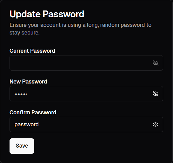
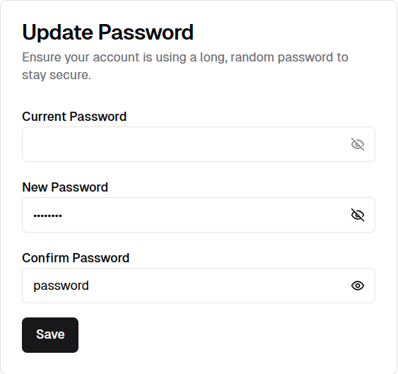
and here's what it looks like: