-
-
Save mrvincenzo/1d42e2f23034f94fae68c1d3a6256769 to your computer and use it in GitHub Desktop.
This file contains bidirectional Unicode text that may be interpreted or compiled differently than what appears below. To review, open the file in an editor that reveals hidden Unicode characters.
Learn more about bidirectional Unicode characters
| [ | |
| { | |
| "sourcePath": "lib/src/material/floating_action_button.dart", | |
| "sourceLine": 122, | |
| "id": "material.FloatingActionButton.1", | |
| "serial": "1", | |
| "package": "flutter", | |
| "library": "material", | |
| "element": "FloatingActionButton", | |
| "file": "material.FloatingActionButton.1.dart", | |
| "description": "This example shows how to make a simple [FloatingActionButton] in a\n[Scaffold], with a pink [backgroundColor] and a thumbs up [Icon].\n\n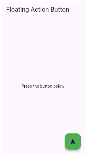" | |
| }, | |
| { | |
| "sourcePath": "lib/src/material/dropdown.dart", | |
| "sourceLine": 593, | |
| "id": "material.DropdownButton.1", | |
| "serial": "1", | |
| "package": "flutter", | |
| "library": "material", | |
| "element": "DropdownButton", | |
| "file": "material.DropdownButton.1.dart", | |
| "description": "This sample shows a `DropdownButton` with a customized icon, text style,\nand underline and whose value is one of \"One\", \"Two\", \"Free\", or \"Four\".\n\n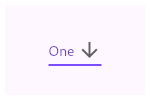" | |
| }, | |
| { | |
| "sourcePath": "lib/src/material/raised_button.dart", | |
| "sourceLine": 101, | |
| "id": "material.RaisedButton.1", | |
| "serial": "1", | |
| "package": "flutter", | |
| "library": "material", | |
| "element": "RaisedButton", | |
| "file": "material.RaisedButton.1.dart", | |
| "description": "This sample shows how to render a disabled RaisedButton, an enabled RaisedButton\nand lastly a RaisedButton with gradient background.\n\n" | |
| }, | |
| { | |
| "sourcePath": "lib/src/material/checkbox_list_tile.dart", | |
| "sourceLine": 250, | |
| "id": "material.CheckboxListTile.3", | |
| "serial": "3", | |
| "package": "flutter", | |
| "library": "material", | |
| "element": "CheckboxListTile", | |
| "file": "material.CheckboxListTile.3.dart", | |
| "description": "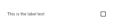\n\nHere is an example of a custom LabeledCheckbox widget, but you can easily\nmake your own configurable widget." | |
| }, | |
| { | |
| "sourcePath": "lib/src/material/chip.dart", | |
| "sourceLine": 236, | |
| "id": "chip.DeletableChipAttributes.onDeleted.1", | |
| "serial": "1", | |
| "package": "flutter", | |
| "library": "chip", | |
| "element": "DeletableChipAttributes.onDeleted", | |
| "file": "chip.DeletableChipAttributes.onDeleted.1.dart", | |
| "description": "This sample shows how to use [onDeleted] to remove an entry when the\ndelete button is tapped." | |
| }, | |
| { | |
| "sourcePath": "lib/src/material/expansion_panel.dart", | |
| "sourceLine": 310, | |
| "id": "material.ExpansionPanelList.radio.1", | |
| "serial": "1", | |
| "package": "flutter", | |
| "library": "material", | |
| "element": "ExpansionPanelList.radio", | |
| "file": "material.ExpansionPanelList.radio.1.dart", | |
| "description": "Here is a simple example of how to implement ExpansionPanelList.radio." | |
| }, | |
| { | |
| "sourcePath": "lib/src/widgets/single_child_scroll_view.dart", | |
| "sourceLine": 196, | |
| "id": "widgets.SingleChildScrollView.1", | |
| "serial": "1", | |
| "package": "flutter", | |
| "library": "widgets", | |
| "element": "SingleChildScrollView", | |
| "file": "widgets.SingleChildScrollView.1.dart", | |
| "description": "In this example, the children are spaced out equally, unless there's no more\nroom, in which case they stack vertically and scroll.\n\nWhen using this technique, [Expanded] and [Flexible] are not useful, because\nin both cases the \"available space\" is infinite (since this is in a viewport).\nThe next section describes a technique for providing a maximum height constraint." | |
| }, | |
| { | |
| "sourcePath": "lib/src/material/scaffold.dart", | |
| "sourceLine": 1256, | |
| "id": "material.Scaffold.of.2", | |
| "serial": "2", | |
| "package": "flutter", | |
| "library": "material", | |
| "element": "Scaffold.of", | |
| "file": "material.Scaffold.of.2.dart", | |
| "description": "When the [Scaffold] is actually created in the same `build` function, the\n`context` argument to the `build` function can't be used to find the\n[Scaffold] (since it's \"above\" the widget being returned in the widget\ntree). In such cases, the following technique with a [Builder] can be used\nto provide a new scope with a [BuildContext] that is \"under\" the\n[Scaffold]:" | |
| }, | |
| { | |
| "sourcePath": "lib/src/material/expansion_panel.dart", | |
| "sourceLine": 218, | |
| "id": "material.ExpansionPanelList.1", | |
| "serial": "1", | |
| "package": "flutter", | |
| "library": "material", | |
| "element": "ExpansionPanelList", | |
| "file": "material.ExpansionPanelList.1.dart", | |
| "description": "Here is a simple example of how to implement ExpansionPanelList." | |
| }, | |
| { | |
| "sourcePath": "lib/src/material/chip.dart", | |
| "sourceLine": 236, | |
| "id": "material.DeletableChipAttributes.onDeleted.1", | |
| "serial": "1", | |
| "package": "flutter", | |
| "library": "material", | |
| "element": "DeletableChipAttributes.onDeleted", | |
| "file": "material.DeletableChipAttributes.onDeleted.1.dart", | |
| "description": "This sample shows how to use [onDeleted] to remove an entry when the\ndelete button is tapped." | |
| }, | |
| { | |
| "sourcePath": "lib/src/material/scaffold.dart", | |
| "sourceLine": 950, | |
| "id": "material.Scaffold.2", | |
| "serial": "2", | |
| "package": "flutter", | |
| "library": "material", | |
| "element": "Scaffold", | |
| "file": "material.Scaffold.2.dart", | |
| "description": "This example shows a [Scaffold] with a [backgroundColor], [body] and\n[FloatingActionButton]. The [body] is a [Text] placed in a [Center] in order\nto center the text within the [Scaffold]. The [FloatingActionButton] is\nconnected to a callback that increments a counter.\n\n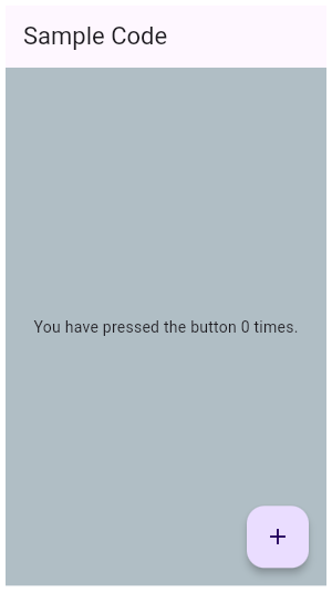" | |
| }, | |
| { | |
| "sourcePath": "lib/src/widgets/basic.dart", | |
| "sourceLine": 5523, | |
| "id": "widgets.Listener.1", | |
| "serial": "1", | |
| "package": "flutter", | |
| "library": "widgets", | |
| "element": "Listener", | |
| "file": "widgets.Listener.1.dart", | |
| "description": "This example makes a [Container] react to being touched, showing a count of\nthe number of pointer downs and ups." | |
| }, | |
| { | |
| "sourcePath": "lib/src/material/switch_list_tile.dart", | |
| "sourceLine": 255, | |
| "id": "material.SwitchListTile.2", | |
| "serial": "2", | |
| "package": "flutter", | |
| "library": "material", | |
| "element": "SwitchListTile", | |
| "file": "material.SwitchListTile.2.dart", | |
| "description": "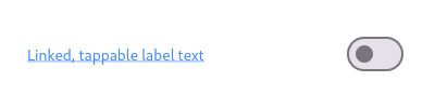\n\nHere is an example of a custom labeled radio widget, called\nLinkedLabelRadio, that includes an interactive [RichText] widget that\nhandles tap gestures." | |
| }, | |
| { | |
| "sourcePath": "lib/src/material/floating_action_button.dart", | |
| "sourceLine": 122, | |
| "id": "material.FloatingActionButton.2", | |
| "serial": "2", | |
| "package": "flutter", | |
| "library": "material", | |
| "element": "FloatingActionButton", | |
| "file": "material.FloatingActionButton.2.dart", | |
| "description": "This example shows how to make an extended [FloatingActionButton] in a\n[Scaffold], with a pink [backgroundColor], a thumbs up [Icon] and a\n[Text] label.\n\n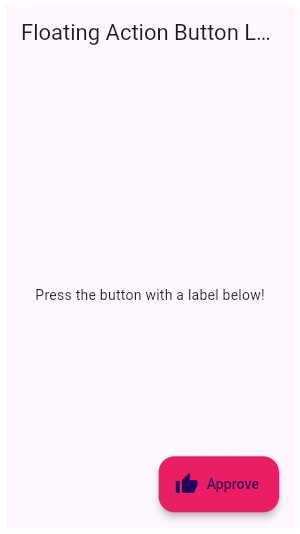" | |
| }, | |
| { | |
| "sourcePath": "lib/src/material/switch_list_tile.dart", | |
| "sourceLine": 255, | |
| "id": "material.SwitchListTile.3", | |
| "serial": "3", | |
| "package": "flutter", | |
| "library": "material", | |
| "element": "SwitchListTile", | |
| "file": "material.SwitchListTile.3.dart", | |
| "description": "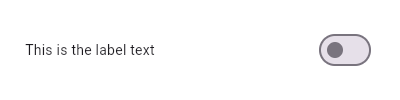\n\nHere is an example of a custom LabeledSwitch widget, but you can easily\nmake your own configurable widget." | |
| }, | |
| { | |
| "sourcePath": "lib/src/material/scaffold.dart", | |
| "sourceLine": 950, | |
| "id": "material.Scaffold.1", | |
| "serial": "1", | |
| "package": "flutter", | |
| "library": "material", | |
| "element": "Scaffold", | |
| "file": "material.Scaffold.1.dart", | |
| "description": "This example shows a [Scaffold] with a [body] and [FloatingActionButton].\nThe [body] is a [Text] placed in a [Center] in order to center the text\nwithin the [Scaffold]. The [FloatingActionButton] is connected to a\ncallback that increments a counter.\n\n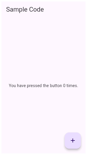" | |
| }, | |
| { | |
| "sourcePath": "lib/src/widgets/basic.dart", | |
| "sourceLine": 4878, | |
| "id": "widgets.Flow.1", | |
| "serial": "1", | |
| "package": "flutter", | |
| "library": "widgets", | |
| "element": "Flow", | |
| "file": "widgets.Flow.1.dart", | |
| "description": "This example uses the [Flow] widget to create a menu that opens and closes\nas it is interacted with, shown above. The color of the button in the menu\nchanges to indicate which one has been selected." | |
| }, | |
| { | |
| "sourcePath": "lib/src/material/ink_well.dart", | |
| "sourceLine": 831, | |
| "id": "material.InkWell.1", | |
| "serial": "1", | |
| "package": "flutter", | |
| "library": "material", | |
| "element": "InkWell", | |
| "file": "material.InkWell.1.dart", | |
| "description": "Tap the container to cause it to grow. Then, tap it again and hold before\nthe widget reaches its maximum size to observe the clipped ink splash." | |
| }, | |
| { | |
| "sourcePath": "lib/src/widgets/image.dart", | |
| "sourceLine": 666, | |
| "id": "widgets.Image.frameBuilder.1", | |
| "serial": "1", | |
| "package": "flutter", | |
| "library": "widgets", | |
| "element": "Image.frameBuilder", | |
| "file": "widgets.Image.frameBuilder.1.dart", | |
| "description": "The following sample demonstrates how to use this builder to implement an\nimage that fades in once it's been loaded.\n\nThis sample contains a limited subset of the functionality that the\n[FadeInImage] widget provides out of the box." | |
| }, | |
| { | |
| "sourcePath": "lib/src/material/scaffold.dart", | |
| "sourceLine": 1256, | |
| "id": "material.Scaffold.of.1", | |
| "serial": "1", | |
| "package": "flutter", | |
| "library": "material", | |
| "element": "Scaffold.of", | |
| "file": "material.Scaffold.of.1.dart", | |
| "description": "Typical usage of the [Scaffold.of] function is to call it from within the\n`build` method of a child of a [Scaffold]." | |
| }, | |
| { | |
| "sourcePath": "lib/src/services/keyboard_key.dart", | |
| "sourceLine": 124, | |
| "id": "services.LogicalKeyboardKey.1", | |
| "serial": "1", | |
| "package": "flutter", | |
| "library": "services", | |
| "element": "LogicalKeyboardKey", | |
| "file": "services.LogicalKeyboardKey.1.dart", | |
| "description": "This example shows how to detect if the user has selected the logical \"Q\"\nkey." | |
| }, | |
| { | |
| "sourcePath": "lib/src/material/icon_button.dart", | |
| "sourceLine": 126, | |
| "id": "material.IconButton.1", | |
| "serial": "1", | |
| "package": "flutter", | |
| "library": "material", | |
| "element": "IconButton", | |
| "file": "material.IconButton.1.dart", | |
| "description": "This sample shows an `IconButton` that uses the Material icon \"volume_up\" to\nincrease the volume." | |
| }, | |
| { | |
| "sourcePath": "lib/src/material/radio_list_tile.dart", | |
| "sourceLine": 293, | |
| "id": "material.RadioListTile.1", | |
| "serial": "1", | |
| "package": "flutter", | |
| "library": "material", | |
| "element": "RadioListTile", | |
| "file": "material.RadioListTile.1.dart", | |
| "description": "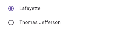\n\nThis widget shows a pair of radio buttons that control the `_character`\nfield. The field is of the type `SingingCharacter`, an enum." | |
| }, | |
| { | |
| "sourcePath": "lib/src/widgets/image.dart", | |
| "sourceLine": 734, | |
| "id": "widgets.Image.loadingBuilder.1", | |
| "serial": "1", | |
| "package": "flutter", | |
| "library": "widgets", | |
| "element": "Image.loadingBuilder", | |
| "file": "widgets.Image.loadingBuilder.1.dart", | |
| "description": "The following sample uses [loadingBuilder] to show a\n[CircularProgressIndicator] while an image loads over the network." | |
| }, | |
| { | |
| "sourcePath": "lib/src/widgets/basic.dart", | |
| "sourceLine": 4461, | |
| "id": "widgets.Expanded.1", | |
| "serial": "1", | |
| "package": "flutter", | |
| "library": "widgets", | |
| "element": "Expanded", | |
| "file": "widgets.Expanded.1.dart", | |
| "description": "This example shows how to use an [Expanded] widget in a [Column] so that\nit's middle child, a [Container] here, expands to fill the space.\n\n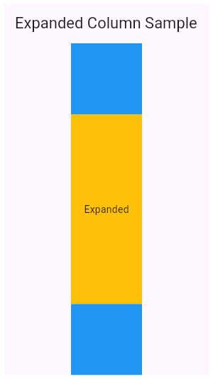" | |
| }, | |
| { | |
| "sourcePath": "lib/src/services/keyboard_key.dart", | |
| "sourceLine": 2019, | |
| "id": "services.PhysicalKeyboardKey.1", | |
| "serial": "1", | |
| "package": "flutter", | |
| "library": "services", | |
| "element": "PhysicalKeyboardKey", | |
| "file": "services.PhysicalKeyboardKey.1.dart", | |
| "description": "This example shows how to detect if the user has selected the physical key\nto the right of the CAPS LOCK key." | |
| }, | |
| { | |
| "sourcePath": "lib/src/widgets/implicit_animations.dart", | |
| "sourceLine": 606, | |
| "id": "widgets.AnimatedContainer.1", | |
| "serial": "1", | |
| "package": "flutter", | |
| "library": "widgets", | |
| "element": "AnimatedContainer", | |
| "file": "widgets.AnimatedContainer.1.dart", | |
| "description": "The following example (depicted above) transitions an AnimatedContainer\nbetween two states. It adjusts the [height], [width], [color], and\n[alignment] properties when tapped." | |
| }, | |
| { | |
| "sourcePath": "lib/src/widgets/focus_scope.dart", | |
| "sourceLine": 135, | |
| "id": "widgets.Focus.1", | |
| "serial": "1", | |
| "package": "flutter", | |
| "library": "widgets", | |
| "element": "Focus", | |
| "file": "widgets.Focus.1.dart", | |
| "description": "This example shows how to manage focus using the [Focus] and [FocusScope]\nwidgets. See [FocusNode] for a similar example that doesn't use [Focus] or\n[FocusScope]." | |
| }, | |
| { | |
| "sourcePath": "lib/src/material/radio.dart", | |
| "sourceLine": 92, | |
| "id": "material.Radio.1", | |
| "serial": "1", | |
| "package": "flutter", | |
| "library": "material", | |
| "element": "Radio", | |
| "file": "material.Radio.1.dart", | |
| "description": "Here is an example of Radio widgets wrapped in ListTiles, which is similar\nto what you could get with the RadioListTile widget.\n\nThe currently selected character is passed into `groupValue`, which is\nmaintained by the example's `State`. In this case, the first `Radio`\nwill start off selected because `_character` is initialized to\n`SingingCharacter.lafayette`.\n\nIf the second radio button is pressed, the example's state is updated\nwith `setState`, updating `_character` to `SingingCharacter.jefferson`.\nThis causes the buttons to rebuild with the updated `groupValue`, and\ntherefore the selection of the second button.\n\nRequires one of its ancestors to be a [Material] widget." | |
| }, | |
| { | |
| "sourcePath": "lib/src/material/card.dart", | |
| "sourceLine": 99, | |
| "id": "material.Card.2", | |
| "serial": "2", | |
| "package": "flutter", | |
| "library": "material", | |
| "element": "Card", | |
| "file": "material.Card.2.dart", | |
| "description": "This sample shows creation of a [Card] widget that can be tapped. When\ntapped this [Card]'s [InkWell] displays an \"ink splash\" that fills the\nentire card." | |
| }, | |
| { | |
| "sourcePath": "lib/src/material/switch_list_tile.dart", | |
| "sourceLine": 255, | |
| "id": "material.SwitchListTile.1", | |
| "serial": "1", | |
| "package": "flutter", | |
| "library": "material", | |
| "element": "SwitchListTile", | |
| "file": "material.SwitchListTile.1.dart", | |
| "description": "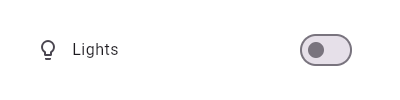\n\nThis widget shows a switch that, when toggled, changes the state of a [bool]\nmember field called `_lights`." | |
| }, | |
| { | |
| "sourcePath": "lib/src/material/radio_list_tile.dart", | |
| "sourceLine": 293, | |
| "id": "material.RadioListTile.3", | |
| "serial": "3", | |
| "package": "flutter", | |
| "library": "material", | |
| "element": "RadioListTile", | |
| "file": "material.RadioListTile.3.dart", | |
| "description": "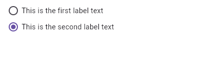\n\nHere is an example of a custom LabeledRadio widget, but you can easily\nmake your own configurable widget." | |
| }, | |
| { | |
| "sourcePath": "lib/src/material/list_tile.dart", | |
| "sourceLine": 606, | |
| "id": "material.ListTile.5", | |
| "serial": "5", | |
| "package": "flutter", | |
| "library": "material", | |
| "element": "ListTile", | |
| "file": "material.ListTile.5.dart", | |
| "description": "Here is an example of an article list item with multi-line titles and\nsubtitles. It utilizes [Row]s and [Column]s, as well as [Expanded] and\n[AspectRatio] widgets to organize its layout.\n\n" | |
| }, | |
| { | |
| "sourcePath": "lib/src/services/system_chrome.dart", | |
| "sourceLine": 376, | |
| "id": "services.SystemChrome.setSystemUIOverlayStyle.2", | |
| "serial": "2", | |
| "package": "flutter", | |
| "library": "services", | |
| "element": "SystemChrome.setSystemUIOverlayStyle", | |
| "file": "services.SystemChrome.setSystemUIOverlayStyle.2.dart", | |
| "description": "The following example creates a widget that changes the status bar color\nto a random value on Android." | |
| }, | |
| { | |
| "sourcePath": "lib/src/material/list_tile.dart", | |
| "sourceLine": 606, | |
| "id": "material.ListTile.4", | |
| "serial": "4", | |
| "package": "flutter", | |
| "library": "material", | |
| "element": "ListTile", | |
| "file": "material.ListTile.4.dart", | |
| "description": "Here is an example of a custom list item that resembles a Youtube related\nvideo list item created with [Expanded] and [Container] widgets.\n\n" | |
| }, | |
| { | |
| "sourcePath": "lib/src/material/app_bar.dart", | |
| "sourceLine": 166, | |
| "id": "material.AppBar.1", | |
| "serial": "1", | |
| "package": "flutter", | |
| "library": "material", | |
| "element": "AppBar", | |
| "file": "material.AppBar.1.dart", | |
| "description": "This sample shows an [AppBar] with two simple actions. The first action\nopens a [SnackBar], while the second action navigates to a new page." | |
| }, | |
| { | |
| "sourcePath": "lib/src/material/card.dart", | |
| "sourceLine": 99, | |
| "id": "material.Card.1", | |
| "serial": "1", | |
| "package": "flutter", | |
| "library": "material", | |
| "element": "Card", | |
| "file": "material.Card.1.dart", | |
| "description": "This sample shows creation of a [Card] widget that shows album information\nand two actions." | |
| }, | |
| { | |
| "sourcePath": "lib/src/material/checkbox_list_tile.dart", | |
| "sourceLine": 250, | |
| "id": "material.CheckboxListTile.2", | |
| "serial": "2", | |
| "package": "flutter", | |
| "library": "material", | |
| "element": "CheckboxListTile", | |
| "file": "material.CheckboxListTile.2.dart", | |
| "description": "\n\nHere is an example of a custom labeled checkbox widget, called\nLinkedLabelCheckbox, that includes an interactive [RichText] widget that\nhandles tap gestures." | |
| }, | |
| { | |
| "sourcePath": "lib/src/material/radio_list_tile.dart", | |
| "sourceLine": 293, | |
| "id": "material.RadioListTile.2", | |
| "serial": "2", | |
| "package": "flutter", | |
| "library": "material", | |
| "element": "RadioListTile", | |
| "file": "material.RadioListTile.2.dart", | |
| "description": "\n\nHere is an example of a custom labeled radio widget, called\nLinkedLabelRadio, that includes an interactive [RichText] widget that\nhandles tap gestures." | |
| }, | |
| { | |
| "sourcePath": "lib/src/widgets/focus_manager.dart", | |
| "sourceLine": 363, | |
| "id": "widgets.FocusNode.1", | |
| "serial": "1", | |
| "package": "flutter", | |
| "library": "widgets", | |
| "element": "FocusNode", | |
| "file": "widgets.FocusNode.1.dart", | |
| "description": "This example shows how a FocusNode should be managed if not using the\n[Focus] or [FocusScope] widgets. See the [Focus] widget for a similar\nexample using [Focus] and [FocusScope] widgets." | |
| }, | |
| { | |
| "sourcePath": "lib/src/widgets/single_child_scroll_view.dart", | |
| "sourceLine": 196, | |
| "id": "widgets.SingleChildScrollView.2", | |
| "serial": "2", | |
| "package": "flutter", | |
| "library": "widgets", | |
| "element": "SingleChildScrollView", | |
| "file": "widgets.SingleChildScrollView.2.dart", | |
| "description": "In this example, the column becomes either as big as viewport, or as big as\nthe contents, whichever is biggest." | |
| }, | |
| { | |
| "sourcePath": "lib/src/material/stepper.dart", | |
| "sourceLine": 236, | |
| "id": "material.Stepper.controlsBuilder.1", | |
| "serial": "1", | |
| "package": "flutter", | |
| "library": "material", | |
| "element": "Stepper.controlsBuilder", | |
| "file": "material.Stepper.controlsBuilder.1.dart", | |
| "description": "Creates a stepper control with custom buttons." | |
| }, | |
| { | |
| "sourcePath": "lib/src/material/bottom_navigation_bar.dart", | |
| "sourceLine": 137, | |
| "id": "material.BottomNavigationBar.1", | |
| "serial": "1", | |
| "package": "flutter", | |
| "library": "material", | |
| "element": "BottomNavigationBar", | |
| "file": "material.BottomNavigationBar.1.dart", | |
| "description": "This example shows a [BottomNavigationBar] as it is used within a [Scaffold]\nwidget. The [BottomNavigationBar] has three [BottomNavigationBarItem]\nwidgets and the [currentIndex] is set to index 0. The selected item is\namber. The `_onItemTapped` function changes the selected item's index\nand displays a corresponding message in the center of the [Scaffold].\n\n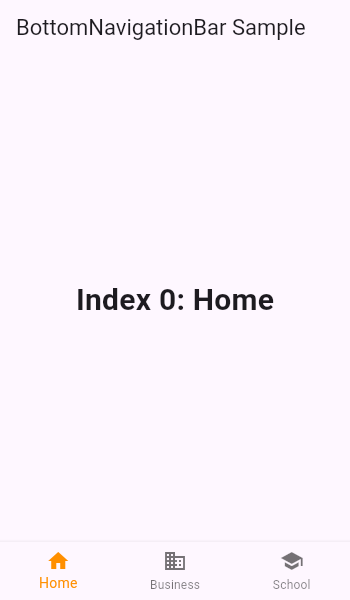" | |
| }, | |
| { | |
| "sourcePath": "lib/src/widgets/navigator.dart", | |
| "sourceLine": 761, | |
| "id": "widgets.Navigator.1", | |
| "serial": "1", | |
| "package": "flutter", | |
| "library": "widgets", | |
| "element": "Navigator", | |
| "file": "widgets.Navigator.1.dart", | |
| "description": "The following example demonstrates how a nested [Navigator] can be used to\npresent a standalone user registration journey.\n\nEven though this example uses two [Navigator]s to demonstrate nested\n[Navigator]s, a similar result is possible using only a single [Navigator].\n\nRun this example with `flutter run --route=/signup` to start it with\nthe signup flow instead of on the home page." | |
| }, | |
| { | |
| "sourcePath": "lib/src/material/scaffold.dart", | |
| "sourceLine": 950, | |
| "id": "material.Scaffold.3", | |
| "serial": "3", | |
| "package": "flutter", | |
| "library": "material", | |
| "element": "Scaffold", | |
| "file": "material.Scaffold.3.dart", | |
| "description": "This example shows a [Scaffold] with an [AppBar], a [BottomAppBar] and a\n[FloatingActionButton]. The [body] is a [Text] placed in a [Center] in order\nto center the text within the [Scaffold]. The [FloatingActionButton] is\ncentered and docked within the [BottomAppBar] using\n[FloatingActionButtonLocation.centerDocked]. The [FloatingActionButton] is\nconnected to a callback that increments a counter.\n\n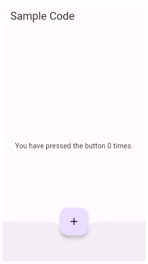" | |
| }, | |
| { | |
| "sourcePath": "lib/src/widgets/editable_text.dart", | |
| "sourceLine": 855, | |
| "id": "widgets.EditableText.onSubmitted.1", | |
| "serial": "1", | |
| "package": "flutter", | |
| "library": "widgets", | |
| "element": "EditableText.onSubmitted", | |
| "file": "widgets.EditableText.onSubmitted.1.dart", | |
| "description": "When a non-completion action is pressed, such as \"next\" or \"previous\", it\nis often desirable to move the focus to the next or previous field. To do\nthis, handle it as in this example, by calling [FocusNode.focusNext] in\nthe [TextFormField.onFieldSubmitted] callback ([TextFormField] wraps\n[EditableText] internally, and uses the value of `onFieldSubmitted` as its\n[onSubmitted])." | |
| }, | |
| { | |
| "sourcePath": "lib/src/widgets/form.dart", | |
| "sourceLine": 66, | |
| "id": "widgets.Form.1", | |
| "serial": "1", | |
| "package": "flutter", | |
| "library": "widgets", | |
| "element": "Form", | |
| "file": "widgets.Form.1.dart", | |
| "description": "This example shows a [Form] with one [TextFormField] and a [RaisedButton]. A\n[GlobalKey] is used here to identify the [Form] and validate input." | |
| }, | |
| { | |
| "sourcePath": "lib/src/widgets/basic.dart", | |
| "sourceLine": 4461, | |
| "id": "widgets.Expanded.2", | |
| "serial": "2", | |
| "package": "flutter", | |
| "library": "widgets", | |
| "element": "Expanded", | |
| "file": "widgets.Expanded.2.dart", | |
| "description": "This example shows how to use an [Expanded] widget in a [Row] with multiple\nchildren expanded, utilizing the [flex] factor to prioritize available space.\n\n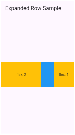" | |
| }, | |
| { | |
| "sourcePath": "lib/src/widgets/editable_text.dart", | |
| "sourceLine": 120, | |
| "id": "widgets.TextEditingController.1", | |
| "serial": "1", | |
| "package": "flutter", | |
| "library": "widgets", | |
| "element": "TextEditingController", | |
| "file": "widgets.TextEditingController.1.dart", | |
| "description": "This example creates a [TextField] with a [TextEditingController] whose\nchange listener forces the entered text to be lower case and keeps the\ncursor at the end of the input." | |
| }, | |
| { | |
| "sourcePath": "lib/src/material/icon_button.dart", | |
| "sourceLine": 126, | |
| "id": "material.IconButton.2", | |
| "serial": "2", | |
| "package": "flutter", | |
| "library": "material", | |
| "element": "IconButton", | |
| "file": "material.IconButton.2.dart", | |
| "description": "In this sample the icon button's background color is defined with an [Ink]\nwidget whose child is an [IconButton]. The icon button's filled background\nis a light shade of blue, it's a filled circle, and it's as big as the\nbutton is." | |
| }, | |
| { | |
| "sourcePath": "lib/src/material/checkbox_list_tile.dart", | |
| "sourceLine": 250, | |
| "id": "material.CheckboxListTile.1", | |
| "serial": "1", | |
| "package": "flutter", | |
| "library": "material", | |
| "element": "CheckboxListTile", | |
| "file": "material.CheckboxListTile.1.dart", | |
| "description": "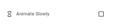\n\nThis widget shows a checkbox that, when checked, slows down all animations\n(including the animation of the checkbox itself getting checked!).\n\nThis sample requires that you also import 'package:flutter/scheduler.dart',\nso that you can reference [timeDilation]." | |
| }, | |
| { | |
| "sourcePath": "lib/src/widgets/basic.dart", | |
| "sourceLine": 5775, | |
| "id": "widgets.MouseRegion.1", | |
| "serial": "1", | |
| "package": "flutter", | |
| "library": "widgets", | |
| "element": "MouseRegion", | |
| "file": "widgets.MouseRegion.1.dart", | |
| "description": "This example makes a [Container] react to being entered by a mouse\npointer, showing a count of the number of entries and exits." | |
| } | |
| ] |
Sign up for free
to join this conversation on GitHub.
Already have an account?
Sign in to comment