- [[DesignCode]]
- [[Design resources]]
- [[Icons]]
- [[Design inspiration]]
- [[Colors]]
- https://material.io/design/color/the-color-system.html#tools-for-picking-colors
- Color Tool - Material Design
- Useful for setting and seeing colors with their difference uses
- [[Colors Tip]] Move 2 or 3 levels above or below the colors to select other colors that match it nicely
- Color Tool - Material Design
- https://coolors.co/
- https://material.io/design/color/the-color-system.html#tools-for-picking-colors
- [[Figma]]
- [[Figma - Plugins]]
- [Looper – Figma] (https://www.figma.com/community/plugin/754418010908848797/Looper) repeat a design many times to create cool illustration
- Blobs – Figma create Blobs
- SkewDat – Figma
- From video 16, pricing cards
- [[Figma - tips]]
- Using Auto-Layout makes everything easier. It behaves like flexbox, so it avoids common designer annoyances that make it hard to translate to code
- [[Figma - Plugins]]
- [[Illustrations]]
- Shape - 26000+ Icons & Illustrations to SVG, Lottie, React.
- Angle 3 - 4060 Device Mockups for Figma, Sketch and XD
- [[Figma]] lets you change the colors of vectors very easily
- [[Typography]]
- Butterick’s Practical Typography [[To-read]]
- Line leght: 45 to 90 characters or 2-3 alphabets
- Line height: 130 to 140%
- Butterick’s Practical Typography [[To-read]]
- [[Design Hierarchy]]
- [[Drop shadow]]
- Values
- Y axis should be about half of blur
- Opacity should be 10% to 30%
- w hen combining drop shadows they should not excees 25% opacity
- The more the blue the "higher" the element
- Values
- [[Buttons]]
- The bigger the more attention-grabbing
- A button with an icon will attract more attention than without
- [[Drop shadow]]
- [[ Design Tricks/Tips/Ideas/Implementations ]]
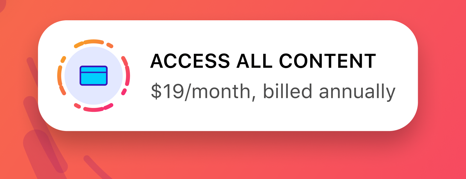
- I love this button.
- The borders around the icon make it look super fancy and incredible.
- The slight space with the background color
- The border gradient
- The non-linear border.
- I love this button.
- [[Design - spacing]]
- The space between the elements is usually half than the space around them
- [[Design resources]]
Last active
September 2, 2021 11:11
-
-
Save obedparla/3561e2a49ffcf17dbb5b79c3b03f6ec5 to your computer and use it in GitHub Desktop.
Design for devs notes
Sign up for free
to join this conversation on GitHub.
Already have an account?
Sign in to comment