This is an outdated draft. Current version: guardian/frontend#19550
Issue just tracks the deployment and provides a description, I will close it as soon as the work is done.
This describes new quality standard of web and app fonts we use. Currently to roll out there are new versions of Text Egyptian and Text Sans. Scope of rollout:
- dotcom
- AMP
- NG apps and app templates
- Tools
- Interactives
- Everything else I forgot
New versions of these two families benefit from optimisations and fixes described below (similar to recently deployed GH Guardian Headline) and also:
- Have new vertical metrics, so will cause reflows and have to be carefully checked by Design before rolling out
- Have consistent naming scheme for both web and app fonts (old dotcom schema minus ‘Web‘ at the end)
- Three subsets:
- Full,
- NoAlts (main one everywhere),
- Latin 1
- Two hinting options:
- no hinting (main one everywhere),
- autohinting (minority of dotcom Win clients).
Webfonts:
- WOFF2 (main one, wherever supported)
- WOFF (minority)
- TTF (legacy)
App fonts:
- TTF (identical to webfonts, but with PS names intact for iOS)
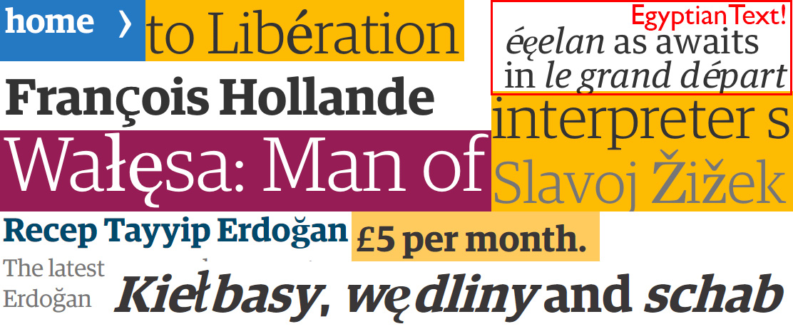
Last time we updated our fonts, we optimised them to be half the size by e.g. removing LTSH, VDMX, hdmx and redundant legacy kern tables. We were also quick to appreciate the savings offered by WOFF2. We have also used different mixes of character set subsets depending on font file format to minimise the payload. Unfortunately, this last decision meant we’ve had to live with occasional ugly font substitutions and faux styles (even though we’ve tried to minimise the impact with clever fallbacks). This has grown increasingly at odds with our ambition to spell correctly whatever the language and our appreciation of good typography (faux italics in antiqua!).
Because fixing it permanently using our current fonts would mean increasing the payload by various amounts depending on font format and charset mix used (e.g. WOFF2: 196KB→362KB; TTFautohint: 753KB→1782KB), we resorted to patching it here and there where the visual impact was deemed too much.
Lastly, we serve various flavours of hinting to different Windows clients and hinting substantially increases the payload.
We’ve worked hard with our font provider – Commercial Type – and thanks to their expertise, invaluable help and patience (special thanks go to Mark Record, who did all the work!), been able to reduce the fonts file sizes by ~half again. This issue is meant to document the optimisations, bug fixes and changes and to outline outstanding fixes. Lastly, we also list ideas for future optimisations which are outside the scope of this update.
With this update we hope to be able to greatly reduce or even eliminate (in WOFF2 at least) all faux styles and ugly glyph substitutions. It should eliminate the need for most or all hinting flavours reducing logic complexity. It also introduces some unrelated fixes.
- [main optimisation – ~27–45% smaller] Removed OpenType features and corresponding glyphs that we weren’t using anyway. Removed and “flattened” when necessary:
frac,dnom,numr,sinf,sups,lnum,onum,ordn,case,tnum,pnum,ss01,ss02,salt. - [~10% smaller] Used Raph Levien’s Fontcrunch to optimise font outlines.
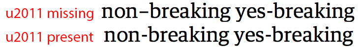
- Added a Unicode codepoint for non-breaking hyphen and for no-break space to fix rendering in some browsers (incl. this beauty):
-
Added a U+2010 Unicode codepoint to existing U+002D glyph. Harfbuzz only falls back from U+2011>U+2010, not from U+2010>U+002D. Browsers should have our back, but they don’t.
-
While “flattening” OT features, settled on Proportional Oldstyle figures style (instead of Tabular) as default for Text Egyptian to match other fonts and for better-looking text:

-
Adjusted Vertical metrics, so that baselines match between different families on Windows and Windows matches Mac rendering:
 [note how kickers line up better, ignore changes in hinting]
 -
[~10% smaller] Changed
posttables to be version 3. And, yes, we are fine with a slight regression on a Mac (haven’t checked iOS, but unlikely to be there; it’s even less of an issue on HiDPI screens), maybe Apple will fix it one day:

- Fixed
gasptable to only allowVersion 1: Grid Fit, Anti-Alias, Symmetric-Smoothing, Grid Fit w/ Symmetric-Smoothing(value15) for all sizes to fix Windows rendering of non-hinted (and ClearType-hinted) fonts under some circumstances (e.g. Chrome<37 and any Firefox with OS set ClearType off, any Chrome on XP set to Standard). - Added short
prepprogram according to this recommendation attributed to Vern Adams (thank you!) to all unhinted fonts to fix Windows rendering (e.g. Chrome<37, any Win XP set to ClearType and all Firefoxes without hardware acceleration): [illustrates both pts. 8, 9]
 - Compressed all WOFFs using latest sfnt2woff-zopfli.
- Applied Palettize-kerning from Just Another Foundry for different amount of GPOS optimisation. Thank you!
- Encoded diacritical marks with codepoints from Combining Marks Unicode block, so browsers less sophisticated than Chrome can compose decomposed forms correctly too (Chrome seems to very cleverly compatibility- compose, and decompose, even when just one glyph is present from the needed combination. Should be zero, but hey).
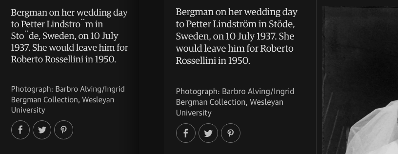
[old versions of the fonts without Combining, just with spacing marks, decomposed form called for; Firefox – left, Chrome – right]
- Bumped version numbers to 2.001 (the same as GH Guardian Headline).
…is bright! I suspect possible further savings could exceed another 50%, by when, according to my math skillz, the fonts weight should be… negative 😜
-
Look into trying to productionise the idea behind Adam Twardoch’s super-clever ttfdiet. If only all other browsers would be as flexible as Chrome when doing composition and decomposition, maybe the whole hack wouldn’t even be necessary? This requires impeccable Mark Positioning whenever it may provide result identical to precomposed forms (including kerning!) with alternate designs for cap marks working and all the goodness.
-
Embrace OpenType 1.8 Variable Fonts. New format should provide file savings for current fonts, but should also help to combine Text and Headline families for even more radical savings!
- Layman’s take: The (relatively?) easy step would be just to combine whatever styles we already use as masters, italics and roman separately. Harder would be to roll-in sans serif italics into a variable roman font. Harder still, would be to try to remove some masters whenever we use more than two and let browsers use instances there. Harder again, would be to combine Text and Headline families (contrast axis yay!). Because to roll in serif italics into roman sounds a bit too crazy, right? (although I think I’ve heard it mentioned). Interesting that with VF the savings will provide a way to bring back some of the features that we have removed in this here very update, so the dance between aesthetics and performance will continue, even though they are one: poor performance forces compromises that result in poor aesthetics. Maybe one day it will be solved by streaming font data?
-
Look into subsetting fonts on the fly to minimise loading for when component/projects cannot use dotcom’s fonts directly and there is no way to message them through.
-
Look into expanding (and standardising: Guardian Headline contains e.g. π & μ which are missing from other families) our Latin charset to cover more languages (e.g. Vietnamese!), so that we won’t have to be ashamed of ugly substitutions, won’t have to spend hours shaping individual glyphs for print manually and we won’t be hitting browser bugs (as rewarding as this is :-)). Hopefully, this should be helped by pt. 11 to avoid inflating font file sizes:

Fixes guardian/frontend#17506 and properly fixes guardian/frontend#8158 (pts. 3, 4). Properly fixes: guardian/frontend#7630 and guardian/frontend#7373 and guardian/frontend#7912 and guardian/frontend#7654 (pts. 8, 9; wrong gasp was causing jaggies in Blink browsers and wrong rendering of ClearType-hinted fonts). Properly fixes guardian/frontend#7545 (pt. 6; Vertical metrics consistent between environments). Properly fixes: guardian/frontend#5190 and guardian/frontend#3253 (file-size should allow for serving full charsets, clever fallbacks were only so clever). And, most probably, a bunch of others.
Nice doc.
I'm guessing you've already done this but have worked out the character frequencies from every piece of content the Guardian has ever produced? Such an exercise may help you define a character set which is more specific to your needs.