Learn how to use Flexbox layout to dynamically resize elements in multiple columns and ensure your content looks great!
When laying out content inside our web or mobile app we need to ensure things are fluidly responsive and fill the screen. This requires that we have items that expand to take up the full width equally, but we also want these items to wrap into a new row when there are too many of them.
This article assumes you are already familiar with the basics of Flexbox layout. To brush up, there is a great playground here: https://flexbox.tech
We know that we need flex-direction: row here to specify that the items should flow horizontally. We also know that we need flex-wrap: wrap so that these items flow into a new row once they fill the width.
But we also want these items to resize to fill the width that is available to them after reflowing.
This is where flex-basis comes in. The following screenshots will explain how this works.
| flex-basis: 20% | flex-basis: 30% | flex-basis: 40% |
|---|---|---|
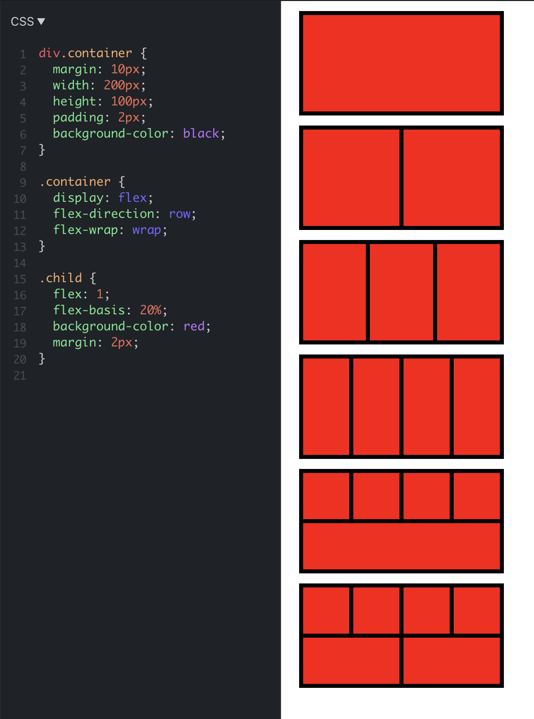 |
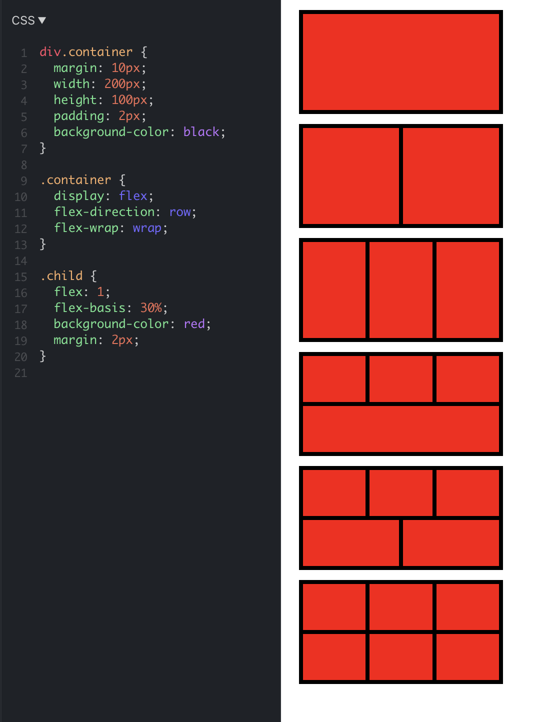 |
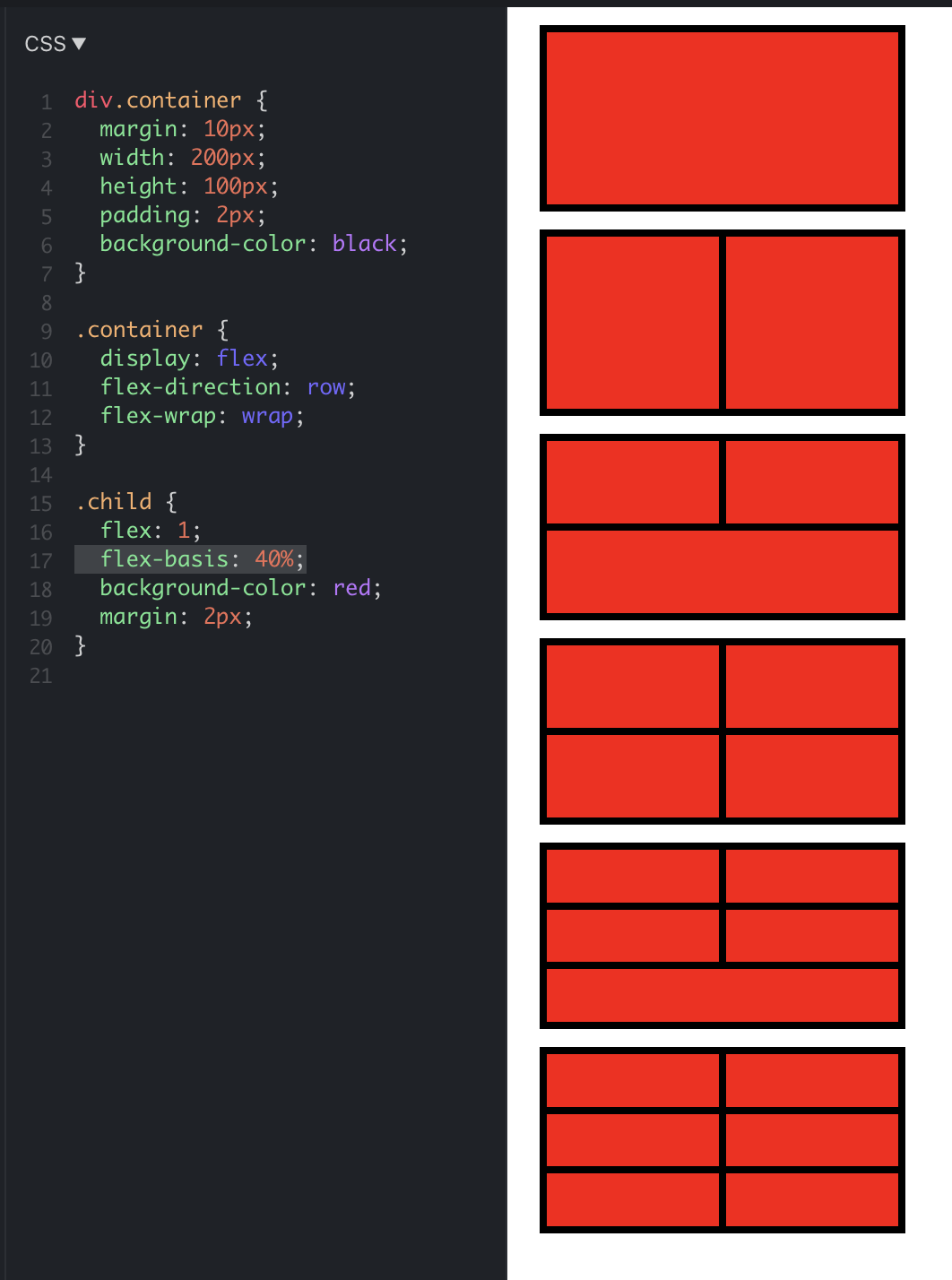 |
(Note that this works on the web as well as in app with Yoga layout in React Native)
This is how flex-basis is explained: flexBasis is an axis-independent way of providing the default size of an item along the main axis. Setting the flexBasis of a child is similar to setting the width of that child if its parent is a container with flexDirection: row or setting the height of a child if its parent is a container with flexDirection: column. The flexBasis of an item is the default size of that item, the size of the item before any flexGrow and flexShrink calculations are performed.
You can try the full JSFiddle here: https://jsfiddle.net/paramaggarwal/w37t0epy/1/