Here's a big dump of code examples from my slides, plus some examples that didn't make it to the final cut.
The snippets should be organised by slide number, e.g. #46--_search.scss is the snippet of search-related SCSS shown on slide 46.
Here's a PDF of my slides (via Google Drive) for your reference, or if Zoom goes wrong!
It's okay to not like the look of classes like u-bg-grey-25 that contain an explicit colour name. We define these colours in our Tailwind file, but we also add aliases like these and use these in the components for non-grey colours:
colors.primary = colors['purple-700'];
colors.secondary = colors['purple-900'];
colors.light = colors.white;
colors.dark = colors.black;
That way our components use classes like bg-primary or text-light and this makes sharing component code between projects super easy! (We share a lot of code between projects).
https://www.youtube.com/watch?v=MYY1teFZ_Fk
- https://tailwindcss.com/docs
- https://www.youtube.com/c/TailwindLabs/videos
- https://www.youtube.com/c/AdamWathan/videos
- https://medium.com/@cole_peters/building-and-shipping-functional-css-4f29b947bcb9 (2015)
- https://hackernoon.com/full-re-write-with-tachyons-and-functional-css-a-case-study-part-1-635ccb5fb00b (2017)
- https://medium.com/@johnpolacek/by-the-numbers-a-year-and-half-with-atomic-css-39d75b1263b4 (2017)
- https://css-irl.info/a-year-of-utility-classes (2019)
- https://johnpolacek.github.io/the-case-for-atomic-css (a big collection of links to resources)
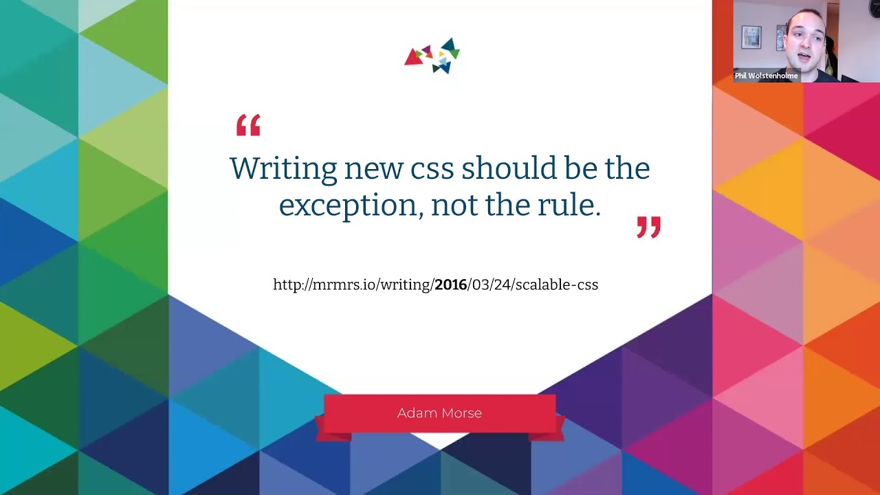
- http://mrmrs.cc/writing/scalable-css (2016)
- https://www.smashingmagazine.com/2013/10/challenging-css-best-practices-atomic-approach (2013)
- https://frontstuff.io/in-defense-of-utility-first-css (2018)
- https://adamwathan.me/css-utility-classes-and-separation-of-concerns (2017) 👈 Written by one of the Tailwind founders
- https://seesparkbox.com/foundry/naming_css_stuff_is_really_hard (2014)
- https://wolstenhol.me (built with Tailwind, Alpine.js, and Eleventy)
- https://twitter.com/philw_
- https://www.drupal.org/u/phil-wolstenholme
For Drupal, there's a starter kit theme that I maintain that people can fork in their projects and use as a starting point for their custom themes - https://www.drupal.org/project/tailwindcss.
There are currently releases for D7, D8 and D9.