The aim of this project is finding a graphic that does not fit into visualization's best practices, which can either make the viewer get mistaken information from it or difficult the information ingestion process. Therefore, we will get a graphic which we think can be improved, discuss the aspects that we feel were treated poorly and propose a better solution.
The chosen visualization is trying to help the reader compare how much time different countries guarantee of paternity leave. It was extracted from WTF Visualizations:
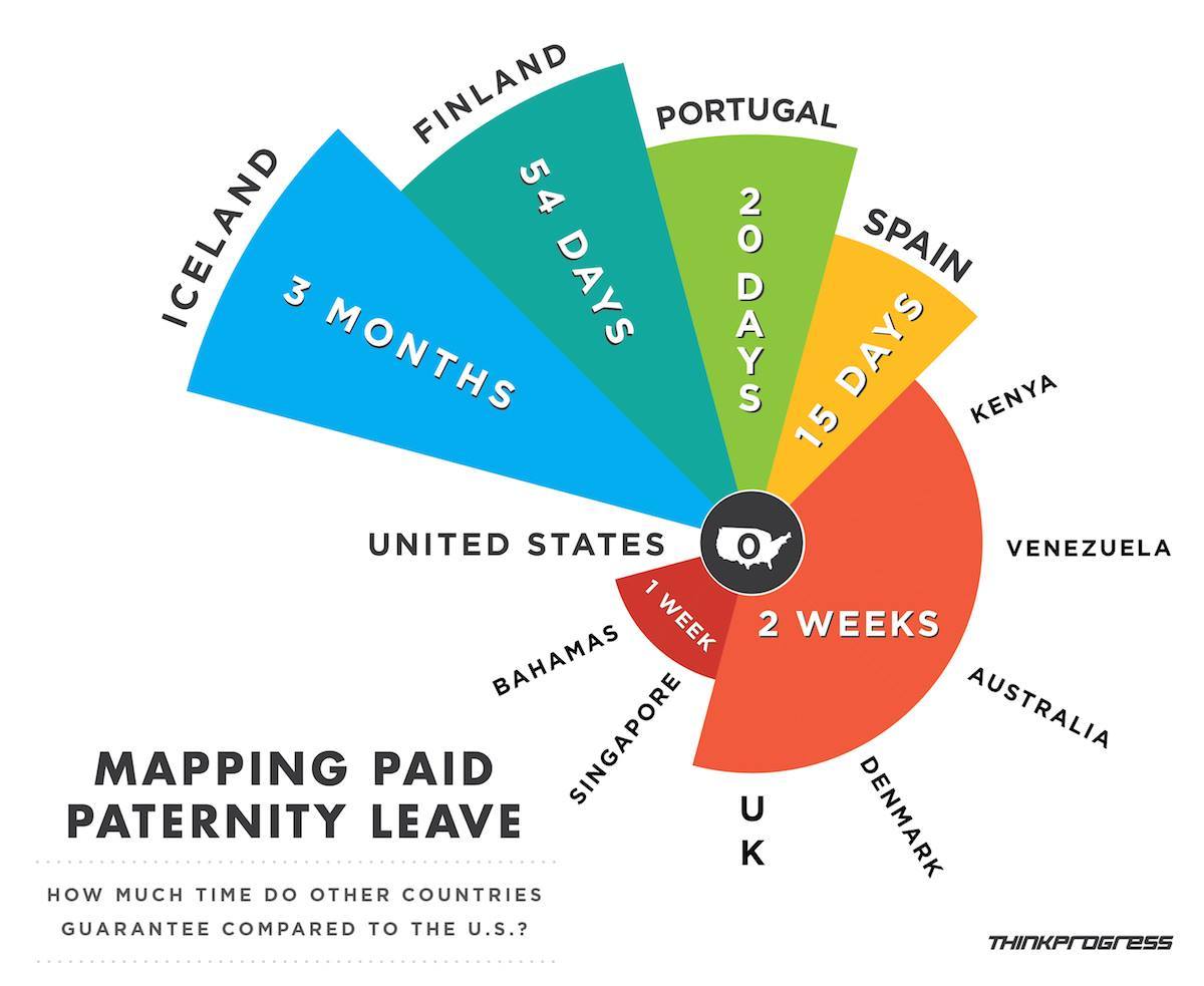
However, there are quite a few issues going on:
- The choice of a pie chart is fairly useless, as the divisions have no real meaning despite of the country they are referring to. At most, you could say from it that around ~41% of countries guarantee 2 weeks of paternity leave, but as this sample of 12 countries is rather random it is hard for me to figure out how much useful this information actually is.
- It is lacking category separation and label positioning can be confusing.
- As if anyone could be surprised, Unitated States stands at the center.
- The real information, amount of time, is shown in the pieces length. However, all the steps measure the same and do not represent the real data change. For example, they represent as equal the change from 2 weeks to 15 days than the 20 days to 54.
- Data is not normalized: days, weeks and months.
- Color change gives no additional information, as it only separates time categories.
- I also find the subtitle choice somehow off and useless.
An improved visualization could be a bar chart, where each category represents a country and amounts are normalized. Also, if we wanted to focus the comparison against the US, we could use the same color for all countries and a different one for the United States. However, an amount of 0 can't be colorized. We will keep it simple, with no Y axis and showing the amount directly on the bars. Keeping a graphic simple and focusing all the visual effects on presenting the information makes the resulting visualization easier to digest and helps the reader focus on what is important.
Obtained this static graphic with d3.js, css in separated file. All feedback is welcome :)

You can run it downloading all files in a given directory and calling python -m http.server, using python3.