The aim of this project is finding a graphic that does not fit into visualization's best practices, which can either make the viewer get mistaken information from it or difficult the information ingestion process. Therefore, we will get a graphic which we think can be improved, discuss the aspects that we feel were treated poorly and propose a better solution.
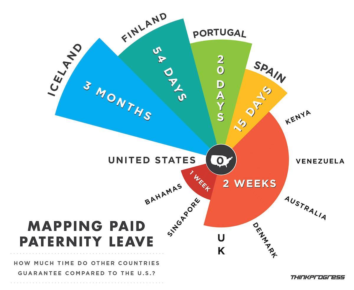
The chosen visualization is trying to help the reader compare how much time different countries guarantee of paternity leave. It was extracted from WTF Visualizations: