- Preamble
- How to get started
- Completion Percentage Over Expectation (CPOE) along Depth of Target (DOT)
- Effect of Interceptions on Win Probability
- Next Gen Stats Receiving
- Playcalling Distribution
- Running Back Receiving (Number of Targets vs Average Depth of Target)
- Quarterback Bad Throw Percentage
I have been asked repeatedly if I can provide the code (written in R) to create the plots that I publish on Twitter. Since I am an advocate of Open Source and also hope for critical review of my code, I will now do so on this page. In the time being, I have done more analysis and charts than I originally expected, so I will add charts to this page progressively.
If the code you are looking for is missing, come back later and I might have added it!
If you have any suggestions or criticism please contact me on Twitter, @mrcaseb.
Update as of May 2020: In the meanwhile @nflfastR has been published. Some of the newer examples could use those data. The old examples may or may not be updated.
Copyright (c) 2020 mrcaseb
Permission is hereby granted, free of charge, to any person obtaining a copy of this software and associated documentation files (the “Software”), to deal in the Software without restriction, including without limitation the rights to use, copy, modify, merge, publish, distribute, sublicense, and/or sell copies of the Software, and to permit persons to whom the Software is furnished to do so, subject to the following conditions:
The above copyright notice and this permission notice shall be included in all copies or substantial portions of the Software.
THE SOFTWARE IS PROVIDED “AS IS”, WITHOUT WARRANTY OF ANY KIND, EXPRESS OR IMPLIED, INCLUDING BUT NOT LIMITED TO THE WARRANTIES OF MERCHANTABILITY, FITNESS FOR A PARTICULAR PURPOSE AND NONINFRINGEMENT. IN NO EVENT SHALL THE AUTHORS OR COPYRIGHT HOLDERS BE LIABLE FOR ANY CLAIM, DAMAGES OR OTHER LIABILITY, WHETHER IN AN ACTION OF CONTRACT, TORT OR OTHERWISE, ARISING FROM, OUT OF OR IN CONNECTION WITH THE SOFTWARE OR THE USE OR OTHER DEALINGS IN THE SOFTWARE.
Most of the following sections will only show how to perform the corresponding analyses and create plots with an existing data set. I will not explicitly discuss how to obtain the data sets, because there are already excellent sources for this. Without claiming to be complete, I provide some of these sources:
- Ben Baldwin does a great job with his Basic nflscrapR tutorial (the tutorial includes further sources that you may wish to look at) and is providing further code on his GitHub. He has bundled this and even more on rbsdm.com
- If you are interested in the Python counterpart to the above mentioned tutorial by Ben Baldwin you should check the nflscrapR Python Guide by Deryck
- Lee Sharpe created a ton of useful functions that I am using throughout my scripts and is providinng them via his GitHub (https://github.com/leesharpe/nfldata)
- Zach Feldman provides some ready to use nflscrapR play-by-play datasets beginning with 2009 including additional objects introduced by Ben and Lee
- Going back even further, as far as 1999, Nick Shoemaker provides play-by-play datasets comparable to nflscrapR
- If you are interested in Next Gen Stats datasets you should check the nextgenstats-spider by Lars Jaakko Havro
- ESPN datasets are accessible very easy now with espnscrapeR by Tom Mock
library(tidyverse)
library(nflfastR)

# choose seasons for which the plot shall be generated
# CPOE starts in 2006
season <- 2019

# load pbp for the choosen seasosn from nflfastR data repo
# can be multiple seasons as well
pbp <-
  purrr::map_df(season, function(x) {
    readRDS(url(glue::glue("https://raw.githubusercontent.com/guga31bb/nflfastR-data/master/data/play_by_play_{x}.rds")))
  })

# load roster data from nflfastR data repo
roster <-
  readRDS(url("https://raw.githubusercontent.com/guga31bb/nflfastR-data/master/roster-data/roster_1999_to_2019.rds"))

# compute cpoe grouped by air_yards
cpoe <-
  pbp %>%
  filter(!is.na(cpoe)) %>%
  group_by(passer_player_id, air_yards) %>%
  summarise(count = n(), cpoe = mean(cpoe))

# summarise cpoe using player ID (note that player ids are 'NA' for 'no_play' plays.
# Since we would filter those plays anyways we can use the id here)
# The correct name is being joined using the roster data
# first arranged by number of plays to filter the 30 QBs with most pass attempts
# The filter is set to 30 because we want to have 6 columns and 5 rows in the facet
summary <-
  pbp %>%
  filter(!is.na(cpoe)) %>%
  group_by(passer_player_id) %>%
  summarise(plays = n()) %>%
  arrange(desc(plays)) %>%
  head(30) %>%
  left_join(
    roster %>% filter(team.season == season) %>% select(name = teamPlayers.displayName, teamPlayers.gsisId, team.abbr, teamPlayers.headshot_url),
    by = c("passer_player_id" = "teamPlayers.gsisId")
  ) %>%
  mutate(# some headshot urls are broken. They are checked here and set to a default
    teamPlayers.headshot_url = dplyr::if_else(
      RCurl::url.exists(as.character(teamPlayers.headshot_url)),
      as.character(teamPlayers.headshot_url),
      "http://static.nfl.com/static/content/public/image/fantasy/transparent/200x200/default.png",
    )
  ) %>%
  left_join(cpoe, by = "passer_player_id") %>%
  left_join(
    teams_colors_logos %>% select(team_abbr, team_color, team_logo_espn),
    by = c("team.abbr" = "team_abbr")
  )

# create data frame used to add the logos
# arranged by name because name is used for the facet
colors_raw <-
  summary %>%
  group_by(passer_player_id) %>%
  summarise(team = first(team.abbr), name = first(name)) %>%
  left_join(
    teams_colors_logos %>% select(team_abbr, team_color),
    by = c("team" = "team_abbr")
  ) %>%
  arrange(name)

# the below used smooth algorithm uses the paramter n as the number
# of points at which to evaluate the smoother. When using color as aesthetics
# we need exactly the same number of colors (-> n times the same color per player)
n_eval <- 80
colors <-
  as.data.frame(lapply(colors_raw, rep, n_eval)) %>%
  arrange(name)

# mean data frame for the smoothed line of the whole league
mean <-
  summary %>%
  group_by(air_yards) %>%
  summarise(league = mean(cpoe), league_count = n())

# create the plot. Set asp to make sure the images appear in the correct aspect ratio
asp <- 1.2
plot <-
  summary %>%
  ggplot(aes(x = air_yards, y = cpoe)) +
  geom_smooth(
    data = mean, aes(x = air_yards, y = league, weight = league_count), n = n_eval,
    color = "red", alpha = 0.7, se = FALSE, size = 0.5, linetype = "dashed"
  ) +
  geom_smooth(
    se = FALSE, alpha = 0.7, aes(weight = count), size = 0.65,
    color = colors$team_color, n = n_eval
  ) +
  geom_point(color = summary$team_color, size = summary$count / 15, alpha = 0.4) +
  ggimage::geom_image(aes(x = 27.5, y = -20, image = team_logo_espn),
    size = .15, by = "width", asp = asp
  ) +
  ggimage::geom_image(aes(x = -2.5, y = -20, image = teamPlayers.headshot_url),
    size = .15, by = "width", asp = asp
  ) +
  xlim(-10, 40) + # makes sure the smoothing algorithm is evaluated between -10 and 40
  coord_cartesian(xlim = c(-5, 30), ylim = c(-25, 25)) + # 'zoom in'
  labs(
    x = "Target Depth In Yards Thrown Beyond The Line Of Scrimmage (DOT)",
    y = "Completion Percentage Over Expectation (CPOE in percentage points)",
    caption = "Figure: @mrcaseb | Data: @nflfastR",
    title = glue::glue("Passing Efficiency {season}"),
    subtitle = "CPOE as a function of target depth. Dotsize equivalent to number of targets. Smoothed for -10 ≤ DOT ≤ 40 Yards. Red Line = League Average."
  ) +
  theme_bw() +
  theme(
    axis.title = element_text(size = 10),
    axis.text = element_text(size = 6),
    plot.title = element_text(size = 12, hjust = 0.5, face = "bold"),
    plot.subtitle = element_text(size = 10, hjust = 0.5),
    plot.caption = element_text(size = 8),
    legend.title = element_text(size = 8),
    legend.text = element_text(size = 6),
    strip.text = element_text(size = 6, hjust = 0.5, face = "bold"),
    aspect.ratio = 1 / asp
  ) +
  facet_wrap(vars(name), ncol = 6, scales = "free")

# save the plot
ggsave(glue::glue("cpoe_vs_dot_{season}.png"), dpi = 600, width = 24, height = 21, units = "cm")
source("https://raw.githubusercontent.com/leesharpe/nfldata/master/code/plays-functions.R")

# load pbp dataset
pbp_all <- readRDS("data/pbp") %>%
  filter(season >= 2009 & !is.na(season))

# compute the dataframe with all ints
ints <- pbp_all %>%
  filter(
    interception == 1 &
    !play_type == "no_play" &
    !play_type == "note" &
    !is.na(wpa)
    )

# compute values of the percentiles
perc_10 <- 100*quantile(ints$wpa, .10)
perc_50 <- 100*quantile(ints$wpa, .50)
perc_90 <- 100*quantile(ints$wpa, .90)

# create the first plot
p1 <-
  ints %>%
  ggplot(aes(x=100*wpa, y=..density..)) +
  geom_vline(xintercept=perc_10, color="red", linetype="dotted") +
  geom_vline(xintercept=perc_50, color="red") +
  geom_vline(xintercept=perc_90, color="red", linetype="dotted") +
  geom_histogram(binwidth = 1, alpha=0.3) +
  geom_density(bw=0.5) +
  labs(
    x = "Win Probability Added in Percentage Points (WPA)",
    y = "Relative Frequency Density",
    title = "Effect of Interceptions NFL Seasons 2009 - 2019",
    subtitle = "Histogram and Distribution of Added Win Probability for Plays that Ended in Interceptions"
  ) +
  ggthemes::theme_stata(scheme = "sj", base_size = 10) +
  theme(
    plot.title = element_text(face = 'bold'),
    plot.caption = element_text(hjust = 1),
    legend.title = element_text(size = 10, hjust = 0, vjust = 0.5, face = 'bold')
  )

# create the second plot
p2 <-
  ints %>%
  ggplot(aes(x=100*wpa, y=..density..)) +
  geom_vline(xintercept=perc_10, color="red", linetype="dotted") +
  geom_vline(xintercept=perc_50, color="red") +
  geom_vline(xintercept=perc_90, color="red", linetype="dotted") +
  geom_histogram(binwidth = 1, alpha=0.3) +
  geom_density(bw=0.5) +
  geom_text(
    aes(x=perc_10-.1, y=0.0075),
    label=glue("10th Percentile =  {round(perc_10,1)}"),
    color="red",angle=90, hjust=0, vjust=0
  ) +
  geom_text(
    aes(x=perc_50-.1, y=0.0075),
    label=glue("50th Percentile =  {round(perc_50,1)}"),
    color="red",angle=90, hjust=0, vjust=0
  ) +
  geom_text(
    aes(x=perc_90-.1, y=0.0075),
    label=glue("90th Percentile =  {round(perc_90,1)}"),
    color="red",angle=90, hjust=0, vjust=0
  ) +
  coord_cartesian(xlim = c(-25, 0)) +
  labs(
    x = "Win Probability Added in Percentage Points (WPA)",
    y = "Relative Frequency Density",
    subtitle = "Zoom in on the Significant Area in the Plot above",
    caption = "Figure: @mrcaseb | Data: @nflscrapR"
  ) +
  ggthemes::theme_stata(scheme = "sj", base_size = 10) +
  theme(
    plot.title = element_text(face = 'bold'),
    plot.caption = element_text(hjust = 1),
    legend.title = element_text(size = 10, hjust = 0, vjust = 0.5, face = 'bold')
  )

# commbine the plots
plot <- gridExtra::grid.arrange(p1, p2, nrow = 2)

# save combined plots
ggsave(plot=plot, 'Gists/Interceptions WPA/Interceptions_wpa.png',
       dpi=600, width = 16, height = 20, units = "cm")
Note: You’ll need NextGenStats Data to run this code. See How to get started for further information.
source("https://raw.githubusercontent.com/leesharpe/nfldata/master/code/plays-functions.R")

# load NGS Dataset
NGS_rec_total <- read_csv("ngs_receiving_2019_overall.csv")

# compute the dataframe for first plot
NGS_total_p1 <- NGS_rec_total %>%
  apply_colors_and_logos() %>%
  select(-X1) %>%
  arrange(desc(shareOfTeamAirYards)) %>%
  filter(row_number() <= 40)

# compute the dataframe for second plot
NGS_total_p2 <- NGS_rec_total %>%
  apply_colors_and_logos() %>%
  select(-X1) %>%
  arrange(desc(avgYACAboveExpectation)) %>%
  filter(row_number() <= 32)

# create the first plot
p1 <-
  NGS_total_p1 %>%
  ggplot(aes(x = shareOfTeamAirYards / 100, y = avgYACAboveExpectation)) +
  geom_point(aes(cex = targets),
             alpha = 0.5,
             color = NGS_total_p1$use_color) +
  geom_vline(aes(xintercept = mean(shareOfTeamAirYards / 100)),
             color = "red", linetype = "dotted") +
  geom_hline(aes(yintercept = mean(avgYACAboveExpectation)),
             color = "red", linetype = "dotted") +
  geom_hline(yintercept = 0, size = 0.25) +
  ggrepel::geom_text_repel(aes(label = shortName)) +
  scale_x_continuous(labels = scales::percent, limits = c(NA, NA)) +
  scale_size("Number of Targets") +
  labs(
    x = "Players Share of His Team’s Total Intended Air Yards",
    y = "Average Yards after Catch above Expectation",
    title = "Receiving Performance 2019 Regular Season",
    subtitle = "Next Gen Receiving Stats for Receivers (WR+TE) with Top 40 Target Share"
  ) +
  ggthemes::theme_stata(scheme = "sj", base_size = 10) +
  theme(
    plot.title = element_text(face = 'bold'),
    plot.caption = element_text(hjust = 1),
    axis.text.y = element_text(angle = 0, vjust = 0.5),
    legend.title = element_text(
      size = 10,
      hjust = 0,
      vjust = 0.5,
      face = 'bold'
    ),
    legend.position = "top"
  )

# create the second plot
p2 <-
  NGS_total_p2 %>%
  ggplot(aes(x = 1:nrow(NGS_total_p2), y = avgYACAboveExpectation)) +
  geom_col(
    colour = NGS_total_p2$use_color,
    fill = NGS_total_p2$use_color,
    alpha = 0.4,
    width = NGS_total_p2$shareOfTeamAirYards / 60
  ) +
  geom_text(
    aes(label = playerName, y = avgYACAboveExpectation + 0.05),
    angle = 90,
    hjust = 0
  ) +
  scale_size("Number of Targets") +
  labs(
    x = "Rank",
    y = "Average Yards after Catch above Expectation",
    caption = "Figure: @mrcaseb | Data: @NextGenStats",
    subtitle = "Top 32 Receivers (WR+TE) in Average Yards after Catch above Expectation (Column Width Corresponds to Target Share)"
  ) +
  ylim(NA, 5.7) +
  ggthemes::theme_stata(scheme = "sj", base_size = 10) +
  theme(
    plot.title = element_text(face = 'bold'),
    plot.caption = element_text(hjust = 1),
    axis.text.y = element_text(angle = 0, vjust = 0.5),
    legend.title = element_text(
      size = 10,
      hjust = 0,
      vjust = 0.5,
      face = 'bold'
    )
  )

# commbine the plots
plot <- gridExtra::grid.arrange(p1, p2, nrow = 2)

# save combined plots
ggsave(
  plot = plot,
  'NGS_YAC_above_Expectation.png',
  dpi = 600,
  width = 25,
  height = 30,
  units = "cm"
)
source("https://raw.githubusercontent.com/leesharpe/nfldata/master/code/plays-functions.R")
library(colortools)

# load nflscrapR dataset
pbp <- readRDS("data/pbp") %>%
  filter(season == 2019)

# collect all rushplays incl. penalties
rushplays <- pbp %>%
  filter(rush==1 & play==1)

# summary to plot correct means in the facet
rushsummary <-
  rushplays %>%
  group_by(posteam) %>%
  summarize(wpmean=mean(wp)) %>%
  apply_colors_and_logos()

# collect all passplays incl. penalties
passplays <- pbp %>%
  filter(pass==1 & play==1)

# summary to plot correct means in the facet
passsummary <-
  passplays %>%
  group_by(posteam) %>%
  summarize(wpmean=mean(wp)) %>%
  apply_colors_and_logos()

col <- splitComp("blue")

ggplot(NULL, aes(x=wp)) +
  geom_vline(data=passsummary, aes(xintercept = wpmean), color = col[1], linetype = "dashed") +
  geom_vline(data=rushsummary, aes(xintercept = wpmean), color = col[2], linetype = "dashed") +
  stat_density(data=rushplays, geom = "line", position = "identity", size = .3, aes(color = col[2])) +
  stat_density(data=passplays, geom = "line", position = "identity", size = .3, aes(color = col[1])) +
  geom_density(data=rushplays, alpha = .3, color = col[2], fill = col[2]) +
  geom_density(data=passplays, alpha = .3, color = col[1], fill = col[1]) +
  geom_image(data=passsummary, aes(x = .1, y = 1.8, image=team_logo), size = .15, by='width', asp=1) +
  xlim(0, 1) +
  scale_colour_identity(name = "Playtype",
                        breaks = c(col[2], col[1]),
                        labels = c("Rushing Plays", "Passing Plays"),
                        guide = "legend"
                        )+
  labs(x = "",
       y = "",
       caption = "Figure: @mrcaseb | Data: @nflscrapR",
       title = 'Playcalling 2019 Regular Season',
       subtitle = "Smoothed Distribution of Passing and Rushing Plays (x-Axis = Estimated win probability when calling the play)"
       ) +
  theme_bw() +
  theme(axis.title = element_text(size = 6),
        axis.text = element_text(size = 6),
        plot.title = element_text(size = 10, hjust = 0.5, face = 'bold'),
        plot.subtitle = element_text(size = 8, hjust = 0.5),
        plot.caption = element_text(size = 6),
        legend.title = element_text(size = 8),
        legend.text = element_text(size = 6),
        strip.text = element_text(size = 6, hjust = 0.5, face = 'bold')
        ) +
  theme(legend.background = element_rect(fill="grey", size=0.5, linetype="solid"),
        legend.position = "top"
        ) +
  facet_wrap( ~ posteam, ncol=8, scales = "free_x")


ggsave('Play_distribution_wp_teams.png', dpi=900, width = 35, height = 20, units = "cm")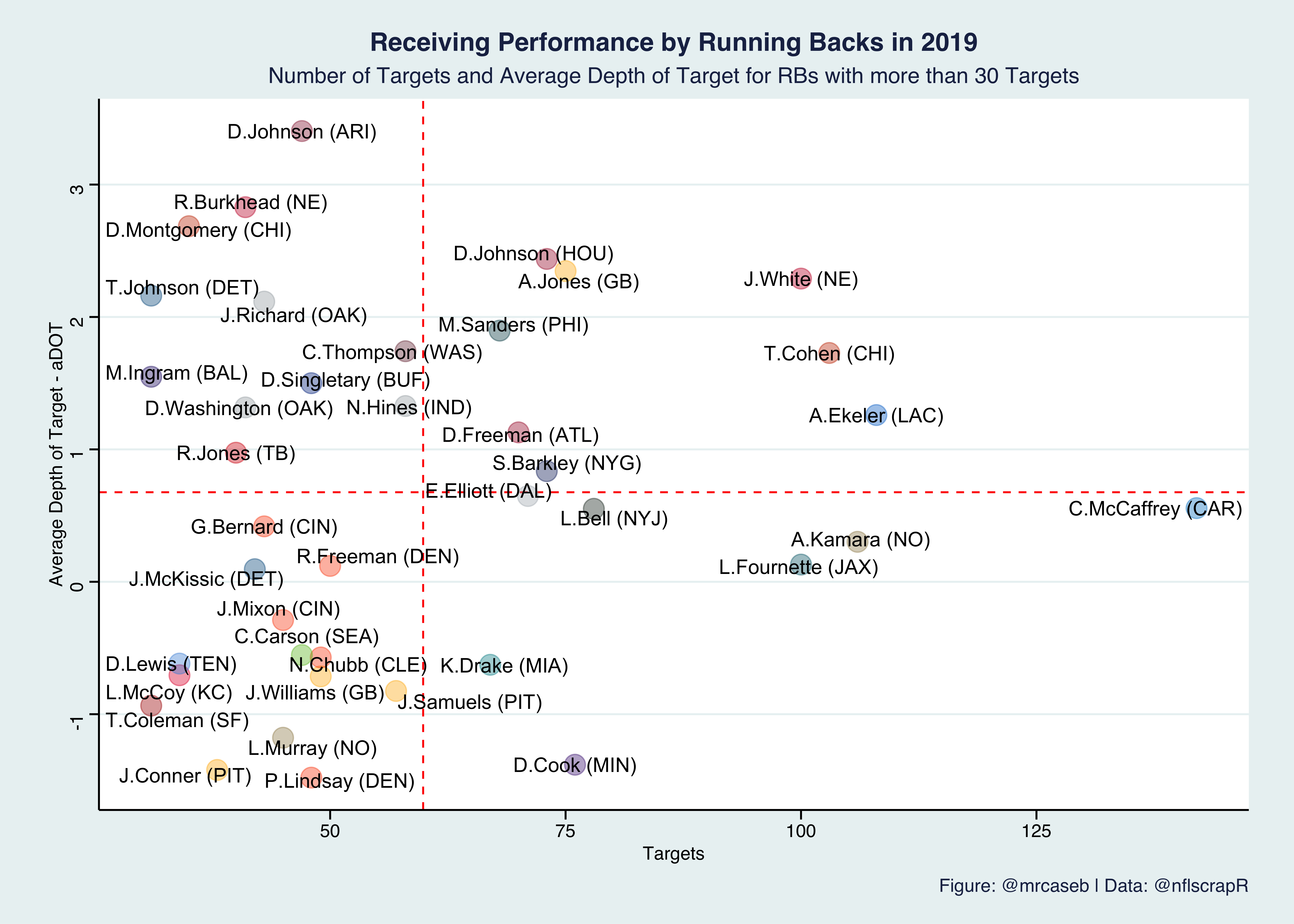
source("https://raw.githubusercontent.com/leesharpe/nfldata/master/code/plays-functions.R")
library(ggthemes)
library(ggrepel)

# load nflscrapR pbp Dataset
pbp_all <- readRDS("././data/pbp")

# put the current season in a separate dataframe to work with
pbp <- pbp_all %>% filter(season>=2019)

# since we want to work with the players GSIS-ID we load some rosterdata from ron
rosters_ron <- read_csv("https://raw.githubusercontent.com/ryurko/nflscrapR-data/master/roster_data/regular_season/reg_roster_2019.csv")

# compute the dataframe with the charting data
chart <- pbp %>%
  filter(pass==1 & play==1 & !is.na(receiver_player_id) & !play_type=="note" & special==0 & !is.na(air_yards)) %>%
  group_by(receiver_player_id) %>%
  summarise(
    tar=n(),
    adot=mean(air_yards),
    name=first(receiver_player_name)
    ) %>%
  left_join(rosters_ron
            %>% select(abbr_player_name, gsis_id, full_player_name, position, team),
            by=c("receiver_player_id"="gsis_id", "name"="abbr_player_name")) %>%
  filter(tar>=30 & position=="RB") %>%
  arrange(desc(tar)) %>%
  apply_colors_and_logos()

# create the plot
chart %>%
  ggplot(aes(x = tar, y = adot)) +
  geom_hline(aes(yintercept = mean(adot)), color = "red", linetype = "dashed") +
  geom_vline(aes(xintercept = mean(tar)), color = "red", linetype = "dashed") +
  geom_point(colour = chart$use_color, fill = chart$use_color, alpha = 0.4, cex = 5) +
  geom_text_repel(aes(label = glue("{name} ({team})")), force = 1, point.padding = 0, segment.size = 0.1) +
  labs(x = "Targets",
       y = "Average Depth of Target - aDOT",
       caption = "Figure: @mrcaseb | Data: @nflscrapR",
       title = 'Receiving Performance by Running Backs in 2019',
       subtitle = "Number of Targets and Average Depth of Target for RBs with more than 30 Targets"
       )+
  theme_stata() +
  theme(axis.title = element_text(size = 10),
        axis.text = element_text(size = 10),
        plot.title = element_text(size = 14, hjust = 0.5, face = 'bold'),
        plot.subtitle = element_text(size = 12, hjust = 0.5),
        plot.caption = element_text(size = 10, hjust = 1))

# save the plot
ggsave('RB_Receiving-Performance.png', dpi=600, width = 25, height = 25/1.4, units = "cm")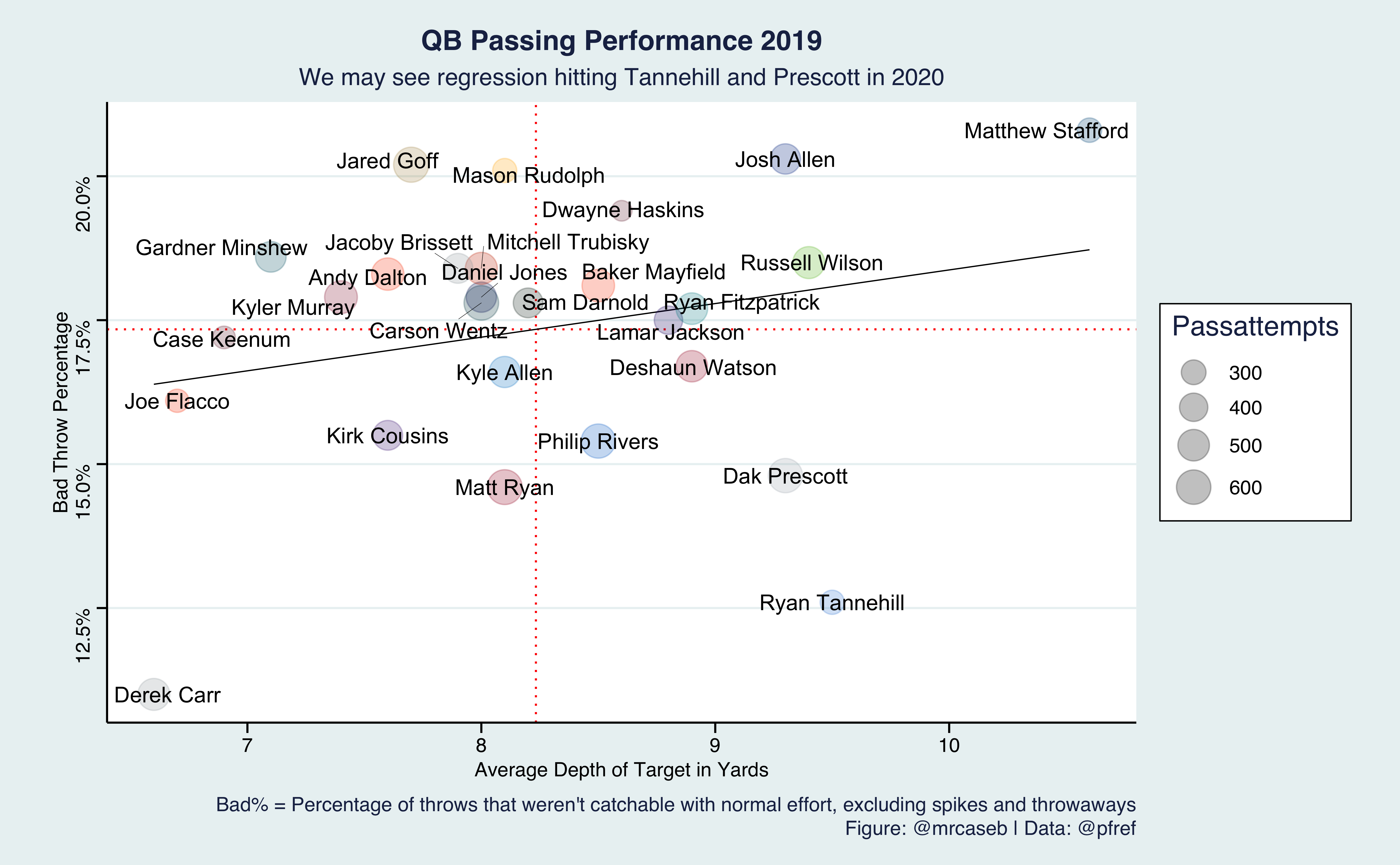
source("https://raw.githubusercontent.com/leesharpe/nfldata/master/code/plays-functions.R")
library(ggthemes)
library(ggrepel)
library(scales)
library(rvest)

# scrape data from PFR
url <- "https://www.pro-football-reference.com/years/2019/passing_advanced.htm"
pfr_raw <- url %>%
  read_html() %>%
  html_table() %>%
  as.data.frame()

# clean the scraped data
colnames(pfr_raw) <- make.names(pfr_raw[1,], unique = TRUE, allow_ = TRUE)
pfr <- pfr_raw %>%
  slice(-1) %>%
  select(Player, Tm, IAY.PA, Bad., Att) %>%
  rename(team = Tm) %>%
  mutate(
    Player = str_replace(Player, "\\*", ""),
    Player = str_replace(Player, "\\+", ""),
    IAY.PA = as.numeric(IAY.PA),
    Bad. = as.numeric(str_replace(Bad., "%", "")),
    Passattempts = as.numeric(Att)
  ) %>%
  apply_colors_and_logos() %>%
  filter(Passattempts>180) %>%
  arrange(Bad.)

# create the plot
pfr %>%
  ggplot(aes(x = IAY.PA, y = Bad./100)) +
  geom_hline(aes(yintercept = mean(Bad./100)), color = "red", linetype = "dotted") +
  geom_vline(aes(xintercept =  mean(IAY.PA)), color = "red", linetype = "dotted") +
  geom_smooth(method = "lm", se = FALSE, color="black", size=0.3) +
  geom_point(color = pfr$use_color, aes(cex=Passattempts), alpha=1/4) +
  geom_text_repel(aes(label=Player), force=1, point.padding=0, segment.size=0.1) +
  scale_y_continuous(labels=percent) +
  scale_size_area(max_size = 8) +
  labs(x = "Average Depth of Target in Yards",
       y = "Bad Throw Percentage",
       caption = "Bad% = Percentage of throws that weren't catchable with normal effort, excluding spikes and throwaways\nFigure: @mrcaseb | Data: @pfref",
       title = 'QB Passing Performance 2019',
       subtitle = "We may see regression hitting Tannehill and Prescott in 2020") +
  theme_stata() +
  theme(axis.title = element_text(size = 10),
        axis.text = element_text(size = 10),
        plot.title = element_text(size = 14, hjust = 0.5, face = 'bold'),
        plot.subtitle = element_text(size = 12, hjust = 0.5),
        plot.caption = element_text(size = 10, hjust = 1),
        legend.position = "right")

# save the plot
ggsave('QB_Bad_Throws.png', dpi=600, width = 25, height = 25/1.618, units = "cm")