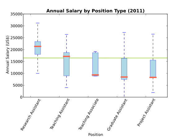
This is some matplotlib scratch code to make a pretty boxplot as seen here.
import matplotlib.pyplot as plt

# Data is external: ra, tar, tas, ta, gar, gas, pa

bp=plt.boxplot([ra,tar+tas,ta,gar+gas,pa],widths=0.2,sym='',patch_artist=True)
plt.setp(bp['caps'],color='blue',alpha=1)
plt.setp(bp['whiskers'],color='blue',alpha=1)
plt.setp(bp['medians'],color='tomato',alpha=1,linewidth=4.0)
plt.setp(bp['boxes'],facecolor='lightblue',alpha=1,color='blue',linewidth=0.5)

plt.xlabel('Position')
plt.ylabel('Annual Salary (US$)')
plt.title('Annual Salary by Position Type (2011)', fontweight='bold')
plt.xticks(plt.arange(5)+0.75,gpos,rotation=60)
plt.show()