Last active
December 23, 2022 12:22
-
-
Save rydmike/f2f45a57d4998f3c61d3fa197b5a7370 to your computer and use it in GitHub Desktop.
Flutter width constrained body with app theming demo
This file contains bidirectional Unicode text that may be interpreted or compiled differently than what appears below. To review, open the file in an editor that reveals hidden Unicode characters.
Learn more about bidirectional Unicode characters
| // MIT License | |
| // | |
| // Copyright (c) 2021 Mike Rydstrom | |
| // | |
| // Permission is hereby granted, free of charge, to any person obtaining a copy | |
| // of this software and associated documentation files (the "Software"), to deal | |
| // in the Software without restriction, including without limitation the rights | |
| // to use, copy, modify, merge, publish, distribute, sublicense, and/or sell | |
| // copies of the Software, and to permit persons to whom the Software is | |
| // furnished to do so, subject to the following conditions: | |
| // | |
| // The above copyright notice and this permission notice shall be included in all | |
| // copies or substantial portions of the Software. | |
| // | |
| // THE SOFTWARE IS PROVIDED "AS IS", WITHOUT WARRANTY OF ANY KIND, EXPRESS OR | |
| // IMPLIED, INCLUDING BUT NOT LIMITED TO THE WARRANTIES OF MERCHANTABILITY, | |
| // FITNESS FOR A PARTICULAR PURPOSE AND NONINFRINGEMENT. IN NO EVENT SHALL THE | |
| // AUTHORS OR COPYRIGHT HOLDERS BE LIABLE FOR ANY CLAIM, DAMAGES OR OTHER | |
| // LIABILITY, WHETHER IN AN ACTION OF CONTRACT, TORT OR OTHERWISE, ARISING FROM, | |
| // OUT OF OR IN CONNECTION WITH THE SOFTWARE OR THE USE OR OTHER DEALINGS IN THE | |
| // SOFTWARE. | |
| import 'package:flutter/material.dart'; | |
| void main() { | |
| runApp(const MyApp()); | |
| } | |
| class MyApp extends StatefulWidget { | |
| const MyApp({Key? key}) : super(key: key); | |
| @override | |
| State<MyApp> createState() => _MyAppState(); | |
| } | |
| class _MyAppState extends State<MyApp> { | |
| ThemeMode themeMode = ThemeMode.system; | |
| @override | |
| Widget build(BuildContext context) { | |
| return MaterialApp( | |
| title: 'Constrained Scrolling Body', | |
| debugShowCheckedModeBanner: false, | |
| theme: AppTheme.light, | |
| darkTheme: AppTheme.dark, | |
| themeMode: themeMode, | |
| home: HomePage( | |
| themeMode: themeMode, | |
| onThemeModeChanged: (ThemeMode mode) { | |
| setState(() { | |
| themeMode = mode; | |
| }); | |
| }, | |
| ), | |
| ); | |
| } | |
| } | |
| class HomePage extends StatefulWidget { | |
| const HomePage( | |
| {Key? key, required this.themeMode, required this.onThemeModeChanged}) | |
| : super(key: key); | |
| final ThemeMode themeMode; | |
| final ValueChanged<ThemeMode> onThemeModeChanged; | |
| @override | |
| State<HomePage> createState() => _HomePageState(); | |
| } | |
| class _HomePageState extends State<HomePage> { | |
| int _buttonIndex = 0; | |
| @override | |
| Widget build(BuildContext context) { | |
| final bool _isLight = Theme.of(context).brightness == Brightness.light; | |
| final MediaQueryData _media = MediaQuery.of(context); | |
| final double _topPadding = _media.padding.top + kToolbarHeight; | |
| final double _bottomPadding = | |
| _media.padding.bottom + kBottomNavigationBarHeight; | |
| return Scaffold( | |
| extendBodyBehindAppBar: true, | |
| extendBody: true, | |
| appBar: AppBar( | |
| title: const Text('Constrained Scrolling Body'), | |
| ), | |
| bottomNavigationBar: BottomNavigation( | |
| buttonIndex: _buttonIndex, | |
| onTap: (int value) { | |
| setState(() { | |
| _buttonIndex = value; | |
| }); | |
| }, | |
| ), | |
| body: CenterConstrainedBody( | |
| child: CustomScrollView( | |
| slivers: <Widget>[ | |
| SliverList( | |
| delegate: SliverChildListDelegate([ | |
| SizedBox(height: _topPadding + Insets.l), | |
| Text('Theme', style: Theme.of(context).textTheme.headline4), | |
| ListTile( | |
| title: const Text('Change theme mode'), | |
| trailing: ThemeModeSwitch( | |
| themeMode: widget.themeMode, | |
| onChanged: widget.onThemeModeChanged, | |
| ), | |
| ), | |
| Insets.vSpaceM, | |
| ]), | |
| ), | |
| const ShowThemeColors(), | |
| SliverList( | |
| delegate: SliverChildListDelegate([ | |
| Insets.vSpaceL, | |
| const SignInCard(), | |
| ]), | |
| ), | |
| const SliverToBoxAdapter(child: Insets.vSpaceL), | |
| SliverGrid( | |
| gridDelegate: const SliverGridDelegateWithMaxCrossAxisExtent( | |
| maxCrossAxisExtent: 280, | |
| mainAxisSpacing: Insets.m, | |
| crossAxisSpacing: Insets.m, | |
| mainAxisExtent: 150, | |
| ), | |
| delegate: SliverChildBuilderDelegate( | |
| (BuildContext context, int index) { | |
| return GridCard( | |
| title: 'Card nr ${index + 1}', | |
| color: Colors.primaries[index % Colors.primaries.length] | |
| [_isLight ? 800 : 400]!); | |
| }, | |
| childCount: 2000, | |
| ), | |
| ), | |
| SliverToBoxAdapter( | |
| child: SizedBox(height: Insets.l + _bottomPadding), | |
| ), | |
| ], | |
| ), | |
| ), | |
| ); | |
| } | |
| } | |
| class BottomNavigation extends StatelessWidget { | |
| const BottomNavigation({ | |
| Key? key, | |
| required this.buttonIndex, | |
| required this.onTap, | |
| }) : super(key: key); | |
| final int buttonIndex; | |
| final ValueChanged<int> onTap; | |
| @override | |
| Widget build(BuildContext context) { | |
| return BottomNavigationBar( | |
| onTap: onTap, | |
| currentIndex: buttonIndex, | |
| items: const <BottomNavigationBarItem>[ | |
| BottomNavigationBarItem( | |
| icon: Icon(Icons.chat_bubble), | |
| label: 'Item 1', | |
| // title: Text('Item 1'), | |
| ), | |
| BottomNavigationBarItem( | |
| icon: Icon(Icons.beenhere), | |
| label: 'Item 2', | |
| // title: Text('Item 2'), | |
| ), | |
| BottomNavigationBarItem( | |
| icon: Icon(Icons.create_new_folder), | |
| label: 'Item 3', | |
| // title: Text('Item 3'), | |
| ), | |
| ], | |
| ); | |
| } | |
| } | |
| /// A centered width constrained web layout page body. | |
| class CenterConstrainedBody extends StatelessWidget { | |
| /// Default constructor for the constrained PageBody. | |
| const CenterConstrainedBody({ | |
| Key? key, | |
| this.controller, | |
| this.constraints = const BoxConstraints(maxWidth: 900), | |
| this.padding = const EdgeInsets.symmetric(horizontal: 16), | |
| required this.child, | |
| }) : super(key: key); | |
| /// Optional scroll controller for the constrained page body. | |
| /// | |
| /// If you use a scrolling view as child to the page body, that needs a | |
| /// scroll controller, we need to use the same controller here too. | |
| /// | |
| /// If null, a default controller is used. | |
| final ScrollController? controller; | |
| /// The constraints for the constrained layout. | |
| /// | |
| /// Default to max width constraint, with a value of 900 dp. | |
| final BoxConstraints constraints; | |
| /// Directional padding around the page body. | |
| /// | |
| /// Defaults to EdgeInsets.symmetric(horizontal: 16). | |
| final EdgeInsetsGeometry padding; | |
| /// Child to be wrapped in the centered width constrained body, with an | |
| /// un-focus tap handler, the way an app should behave. | |
| final Widget child; | |
| @override | |
| Widget build(BuildContext context) { | |
| // We want the scroll bars to be at the edge of the screen, not next to the | |
| // width constrained content. If we use the built in scroll bars of the | |
| // in a scrolling child, it will be next to the child, not at the edge of | |
| // the screen where it belongs. | |
| return Scrollbar( | |
| controller: controller, | |
| child: Center( | |
| child: ConstrainedBox( | |
| constraints: constraints, | |
| child: ScrollConfiguration( | |
| behavior: | |
| ScrollConfiguration.of(context).copyWith(scrollbars: false), | |
| child: Padding( | |
| padding: padding, | |
| child: child, | |
| ), | |
| ), | |
| ), | |
| ), | |
| ); | |
| } | |
| } | |
| /// Dummy widget to imitate Andrea's sign in card layout. | |
| class SignInCard extends StatefulWidget { | |
| const SignInCard({ | |
| Key? key, | |
| }) : super(key: key); | |
| @override | |
| _SignInCardState createState() => _SignInCardState(); | |
| } | |
| class _SignInCardState extends State<SignInCard> { | |
| final _emailController = TextEditingController(); | |
| final _passwordController = TextEditingController(); | |
| @override | |
| void dispose() { | |
| _emailController.dispose(); | |
| _passwordController.dispose(); | |
| super.dispose(); | |
| } | |
| @override | |
| Widget build(BuildContext context) => Card( | |
| child: Padding( | |
| padding: const EdgeInsets.all(Insets.l), | |
| child: Column( | |
| crossAxisAlignment: CrossAxisAlignment.start, | |
| children: [ | |
| Text('Sign In', style: Theme.of(context).textTheme.headline4), | |
| Insets.vSpaceL, | |
| TextField( | |
| decoration: const InputDecoration(labelText: 'Email'), | |
| controller: _emailController, | |
| ), | |
| Insets.vSpaceL, | |
| TextField( | |
| decoration: const InputDecoration(labelText: 'Password'), | |
| obscureText: true, | |
| controller: _passwordController, | |
| ), | |
| Insets.vSpaceL, | |
| SizedBox( | |
| height: 55, | |
| width: double.infinity, | |
| child: ElevatedButton( | |
| onPressed: () {}, | |
| child: Text( | |
| 'Sign in', | |
| style: Theme.of(context).primaryTextTheme.headline6, | |
| ), | |
| ), | |
| ), | |
| ], | |
| ), | |
| ), | |
| ); | |
| } | |
| /// Insets and vertical and horizontal fixed size spacers. | |
| class Insets { | |
| Insets._(); | |
| // Margins | |
| static const double s = 4; | |
| static const double m = 8; | |
| static const double l = 16; | |
| // Spacers vertical | |
| static const SizedBox vSpaceS = SizedBox(height: s); | |
| static const SizedBox vSpaceM = SizedBox(height: m); | |
| static const SizedBox vSpaceL = SizedBox(height: l); | |
| // Spacers horizontal | |
| static const SizedBox hSpaceS = SizedBox(width: s); | |
| static const SizedBox hSpaceM = SizedBox(width: m); | |
| static const SizedBox hSpaceL = SizedBox(width: l); | |
| } | |
| /// Just for fun let's make a simple custom theme for this demo app. | |
| class AppTheme { | |
| AppTheme._(); | |
| /// Define the light theme. | |
| static ThemeData get light { | |
| Color _primary = Colors.indigo[700]!; | |
| Color _secondary = Colors.blue[500]!; | |
| final ColorScheme _scheme = ColorScheme.light( | |
| primary: _primary, | |
| onPrimary: onColor(_primary), | |
| primaryVariant: Colors.indigo[800]!, | |
| secondary: _secondary, | |
| onSecondary: onColor(_secondary), | |
| secondaryVariant: Colors.blue[700]!, | |
| surface: Color.alphaBlend(_primary.withAlpha(0x06), Colors.white), | |
| background: Color.alphaBlend(_primary.withAlpha(0x06), Colors.white), | |
| ); | |
| return ThemeData.from(colorScheme: _scheme).copyWith( | |
| primaryColor: _scheme.primary, | |
| primaryColorLight: Colors.indigo[200], | |
| primaryColorDark: Colors.indigo[900], | |
| secondaryHeaderColor: Colors.indigo[50], | |
| toggleableActiveColor: _secondary, | |
| scaffoldBackgroundColor: | |
| Color.alphaBlend(_primary.withAlpha(0x10), Colors.white), | |
| appBarTheme: AppBarTheme( | |
| backgroundColor: _scheme.primary.withAlpha(0xF0), | |
| elevation: 0, | |
| ), | |
| bottomNavigationBarTheme: _bottomNavigationTheme(_scheme), | |
| cardTheme: _cardTheme, | |
| elevatedButtonTheme: _elevatedButtonTheme, | |
| toggleButtonsTheme: _toggleButtonsTheme(_scheme), | |
| inputDecorationTheme: _inputDecorationTheme( | |
| _scheme.primary.withOpacity(0.035), | |
| _scheme, | |
| ), | |
| ); | |
| } | |
| /// Define the dark theme. | |
| static ThemeData get dark { | |
| Color _primary = Colors.indigo[300]!; | |
| Color _secondary = Colors.blue[300]!; | |
| final ColorScheme _scheme = ColorScheme.dark( | |
| primary: _primary, | |
| onPrimary: onColor(_primary), | |
| primaryVariant: Colors.indigo[400]!, | |
| secondary: _secondary, | |
| onSecondary: onColor(_secondary), | |
| secondaryVariant: Colors.blue[400]!, | |
| surface: Color.alphaBlend( | |
| _primary.withAlpha(0x1C), | |
| const Color(0xff121212), | |
| ), | |
| background: Color.alphaBlend( | |
| _primary.withAlpha(0x1C), | |
| const Color(0xff121212), | |
| ), | |
| ); | |
| return ThemeData.from(colorScheme: _scheme).copyWith( | |
| primaryColor: _scheme.primary, | |
| primaryColorLight: Colors.indigo[200], | |
| primaryColorDark: Colors.indigo[500], | |
| secondaryHeaderColor: Colors.indigo[100], | |
| toggleableActiveColor: _secondary, | |
| scaffoldBackgroundColor: Color.alphaBlend( | |
| _primary.withAlpha(0x2A), | |
| const Color(0xff121212), | |
| ), | |
| appBarTheme: AppBarTheme( | |
| backgroundColor: _scheme.primary.withAlpha(0xF0), | |
| elevation: 0, | |
| ), | |
| bottomNavigationBarTheme: _bottomNavigationTheme(_scheme), | |
| cardTheme: _cardTheme, | |
| elevatedButtonTheme: _elevatedButtonTheme, | |
| toggleButtonsTheme: _toggleButtonsTheme(_scheme), | |
| inputDecorationTheme: _inputDecorationTheme( | |
| _scheme.primary.withOpacity(0.15), | |
| _scheme, | |
| ), | |
| ); | |
| } | |
| // Minimum button size. | |
| static const Size _minButtonSize = Size(46, 46); | |
| // Border radius default | |
| static const double radius = 16; | |
| // Enabled outline thickness. | |
| static const double _outline = 1.5; | |
| // The rounded buttons generally need a bit more padding to look good, | |
| // adjust here to tune the padding for all of them globally in the app. | |
| static const EdgeInsets roundButtonPadding = EdgeInsets.symmetric( | |
| horizontal: 16, | |
| vertical: 16, | |
| ); | |
| /// Get onColor. | |
| static Color onColor(final Color color) => | |
| ThemeData.estimateBrightnessForColor(color) == Brightness.light | |
| ? Colors.black | |
| : Colors.white; | |
| // Rounded CardTheme. | |
| static const CardTheme _cardTheme = CardTheme( | |
| clipBehavior: Clip.antiAlias, | |
| elevation: 0, | |
| shape: RoundedRectangleBorder( | |
| borderRadius: BorderRadius.all( | |
| Radius.circular(radius), | |
| ), | |
| ), | |
| ); | |
| // Bottom NavigationBarTheme, we want primary colored selected icons | |
| // background colored navbar with a hint of opacity. | |
| static BottomNavigationBarThemeData _bottomNavigationTheme( | |
| final ColorScheme colorScheme) => | |
| BottomNavigationBarThemeData( | |
| backgroundColor: colorScheme.background.withOpacity(0.95), | |
| elevation: 0, | |
| selectedIconTheme: IconThemeData( | |
| color: colorScheme.primary, | |
| ), | |
| selectedItemColor: colorScheme.primary, | |
| ); | |
| // Rounded InputDecorationTheme, with fill color. | |
| static InputDecorationTheme _inputDecorationTheme( | |
| final Color fillColor, final ColorScheme colorScheme) => | |
| InputDecorationTheme( | |
| filled: true, | |
| fillColor: fillColor, | |
| border: const OutlineInputBorder( | |
| borderRadius: BorderRadius.all( | |
| Radius.circular(radius), | |
| ), | |
| ), | |
| enabledBorder: OutlineInputBorder( | |
| borderRadius: const BorderRadius.all( | |
| Radius.circular(radius), | |
| ), | |
| borderSide: BorderSide( | |
| color: colorScheme.primary.withOpacity(0.45), | |
| width: _outline, | |
| ), | |
| ), | |
| ); | |
| // Rounded ElevatedButton theme. | |
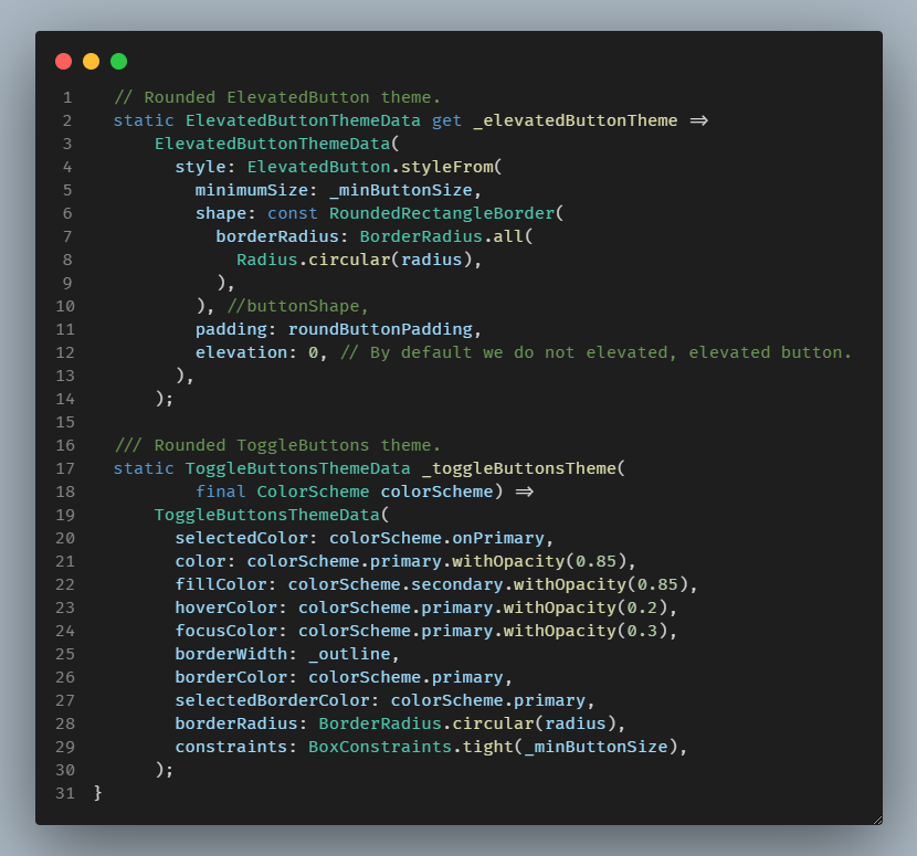
| static ElevatedButtonThemeData get _elevatedButtonTheme => | |
| ElevatedButtonThemeData( | |
| style: ElevatedButton.styleFrom( | |
| minimumSize: _minButtonSize, | |
| shape: const RoundedRectangleBorder( | |
| borderRadius: BorderRadius.all( | |
| Radius.circular(radius), | |
| ), | |
| ), //buttonShape, | |
| padding: roundButtonPadding, | |
| elevation: 0, // By default we do not elevated, elevated button. | |
| ), | |
| ); | |
| /// Rounded ToggleButtons theme. | |
| static ToggleButtonsThemeData _toggleButtonsTheme( | |
| final ColorScheme colorScheme) => | |
| ToggleButtonsThemeData( | |
| selectedColor: colorScheme.onPrimary, | |
| color: colorScheme.primary.withOpacity(0.85), | |
| fillColor: colorScheme.secondary.withOpacity(0.85), | |
| hoverColor: colorScheme.primary.withOpacity(0.2), | |
| focusColor: colorScheme.primary.withOpacity(0.3), | |
| borderWidth: _outline, | |
| borderColor: colorScheme.primary, | |
| selectedBorderColor: colorScheme.primary, | |
| borderRadius: BorderRadius.circular(radius), | |
| constraints: BoxConstraints.tight(_minButtonSize), | |
| ); | |
| } | |
| /// Widget used to toggle the theme mode of the application. | |
| class ThemeModeSwitch extends StatelessWidget { | |
| const ThemeModeSwitch({ | |
| Key? key, | |
| required this.themeMode, | |
| required this.onChanged, | |
| }) : super(key: key); | |
| final ThemeMode themeMode; | |
| final ValueChanged<ThemeMode> onChanged; | |
| @override | |
| Widget build(BuildContext context) { | |
| final List<bool> isSelected = <bool>[ | |
| themeMode == ThemeMode.light, | |
| themeMode == ThemeMode.system, | |
| themeMode == ThemeMode.dark, | |
| ]; | |
| return ToggleButtons( | |
| isSelected: isSelected, | |
| onPressed: (int newIndex) { | |
| if (newIndex == 0) { | |
| onChanged(ThemeMode.light); | |
| } else if (newIndex == 1) { | |
| onChanged(ThemeMode.system); | |
| } else { | |
| onChanged(ThemeMode.dark); | |
| } | |
| }, | |
| children: const <Widget>[ | |
| Icon(Icons.wb_sunny), | |
| Icon(Icons.phone_iphone), | |
| Icon(Icons.bedtime), | |
| ], | |
| ); | |
| } | |
| } | |
| // Draw a number of boxes showing the colors of key theme color properties | |
| // in the ColorScheme of the inherited ThemeData and some of its key color | |
| // properties. | |
| // This widget is just used so we can visually see the active theme colors | |
| // in the examples and their used FlexColorScheme based themes. | |
| class ShowThemeColors extends StatelessWidget { | |
| const ShowThemeColors({Key? key}) : super(key: key); | |
| @override | |
| Widget build(BuildContext context) { | |
| final ThemeData theme = Theme.of(context); | |
| final ColorScheme colorScheme = theme.colorScheme; | |
| final Color appBarColor = | |
| theme.appBarTheme.backgroundColor ?? theme.primaryColor; | |
| // A Wrap widget is just the right handy widget for this type of | |
| // widget to make it responsive. | |
| return SliverGrid( | |
| gridDelegate: const SliverGridDelegateWithMaxCrossAxisExtent( | |
| maxCrossAxisExtent: 110, | |
| mainAxisExtent: 70, | |
| mainAxisSpacing: Insets.s, | |
| crossAxisSpacing: Insets.s, | |
| ), | |
| delegate: SliverChildListDelegate( | |
| <Widget>[ | |
| ThemeCard( | |
| label: 'Primary', | |
| color: colorScheme.primary, | |
| textColor: colorScheme.onPrimary, | |
| ), | |
| ThemeCard( | |
| label: 'Primary\nColor', | |
| color: theme.primaryColor, | |
| textColor: theme.primaryTextTheme.subtitle1!.color ?? Colors.white, | |
| ), | |
| ThemeCard( | |
| label: 'Primary\nColorDark', | |
| color: theme.primaryColorDark, | |
| textColor: AppTheme.onColor(theme.primaryColorDark), | |
| ), | |
| ThemeCard( | |
| label: 'Primary\nColorLight', | |
| color: theme.primaryColorLight, | |
| textColor: AppTheme.onColor(theme.primaryColorLight), | |
| ), | |
| ThemeCard( | |
| label: 'Secondary\nHeader', | |
| color: theme.secondaryHeaderColor, | |
| textColor: AppTheme.onColor(theme.secondaryHeaderColor), | |
| ), | |
| ThemeCard( | |
| label: 'Primary\nVariant', | |
| color: colorScheme.primaryVariant, | |
| textColor: AppTheme.onColor(colorScheme.primaryVariant), | |
| ), | |
| ThemeCard( | |
| label: 'Secondary', | |
| color: colorScheme.secondary, | |
| textColor: colorScheme.onSecondary, | |
| ), | |
| ThemeCard( | |
| label: 'Toggleable\nActive', | |
| color: theme.toggleableActiveColor, | |
| textColor: AppTheme.onColor(theme.toggleableActiveColor), | |
| ), | |
| ThemeCard( | |
| label: 'Secondary\nVariant', | |
| color: colorScheme.secondaryVariant, | |
| textColor: AppTheme.onColor(colorScheme.secondaryVariant), | |
| ), | |
| ThemeCard( | |
| label: 'AppBar', | |
| color: appBarColor, | |
| textColor: AppTheme.onColor(appBarColor), | |
| ), | |
| ThemeCard( | |
| label: 'Bottom\nAppBar', | |
| color: theme.bottomAppBarColor, | |
| textColor: AppTheme.onColor(theme.bottomAppBarColor), | |
| ), | |
| ThemeCard( | |
| label: 'Divider', | |
| color: theme.dividerColor, | |
| textColor: colorScheme.onBackground, | |
| ), | |
| ThemeCard( | |
| label: 'Background', | |
| color: colorScheme.background, | |
| textColor: colorScheme.onBackground, | |
| ), | |
| ThemeCard( | |
| label: 'Canvas', | |
| color: theme.canvasColor, | |
| textColor: colorScheme.onBackground, | |
| ), | |
| ThemeCard( | |
| label: 'Surface', | |
| color: colorScheme.surface, | |
| textColor: colorScheme.onSurface, | |
| ), | |
| ThemeCard( | |
| label: 'Card', | |
| color: theme.cardColor, | |
| textColor: colorScheme.onBackground, | |
| ), | |
| ThemeCard( | |
| label: 'Dialog', | |
| color: theme.dialogBackgroundColor, | |
| textColor: colorScheme.onBackground, | |
| ), | |
| ThemeCard( | |
| label: 'Scaffold\nbackground', | |
| color: theme.scaffoldBackgroundColor, | |
| textColor: colorScheme.onBackground, | |
| ), | |
| ThemeCard( | |
| label: 'Error', | |
| color: colorScheme.error, | |
| textColor: colorScheme.onError, | |
| ), | |
| ], | |
| ), | |
| ); | |
| } | |
| } | |
| // This is just simple SizedBox with a Card with a passed in label, background | |
| // and text label color. Used to show the colors of a theme color property. | |
| class ThemeCard extends StatelessWidget { | |
| const ThemeCard({ | |
| Key? key, | |
| required this.label, | |
| required this.color, | |
| required this.textColor, | |
| }) : super(key: key); | |
| final String label; | |
| final Color color; | |
| final Color textColor; | |
| @override | |
| Widget build(BuildContext context) { | |
| return Card( | |
| color: color, | |
| shape: RoundedRectangleBorder( | |
| borderRadius: const BorderRadius.all( | |
| Radius.circular(AppTheme.radius), | |
| ), | |
| side: BorderSide( | |
| color: Theme.of(context).dividerColor, | |
| ), | |
| ), | |
| child: Center( | |
| child: Text( | |
| label, | |
| style: TextStyle(color: textColor, fontSize: 12), | |
| textAlign: TextAlign.center, | |
| ), | |
| ), | |
| ); | |
| } | |
| } | |
| /// Colorful cards used in the grid view. | |
| class GridCard extends StatelessWidget { | |
| const GridCard({ | |
| Key? key, | |
| required this.title, | |
| required this.color, | |
| }) : super(key: key); | |
| final String title; | |
| final Color color; | |
| @override | |
| Widget build(BuildContext context) { | |
| return Card( | |
| color: color, | |
| child: Center( | |
| child: Text( | |
| title, | |
| style: Theme.of(context).textTheme.headline5!.copyWith( | |
| color: AppTheme.onColor(color), | |
| ), | |
| ), | |
| ), | |
| ); | |
| } | |
| } |
RydMike,
My twist on it is to add layout builder and inherited widget as then it becomes a pixel perfect type tool in that I can pass the width, height, pixel aspect, etc. to all my other widgets in the app. :)
Happy Holidays and Happy Design hacking!
Sign up for free
to join this conversation on GitHub.
Already have an account?
Sign in to comment
A Flutter GIST with Theming and a Constrained WEB like body
This GIST was created as a follow up to this tweet: https://twitter.com/biz84/status/1445400059894542337
The response was tweeted here: https://twitter.com/RydMike/status/1445573118827790339?s=20
This code can be run in a DartPad here: https://dartpad.dev/?id=f2f45a57d4998f3c61d3fa197b5a7370&null_safety=true
Version history
Summary of features
This text is mostly from my Tweet thread Oct 6, 2021
Here https://twitter.com/biz84/status/1445400059894542337?s=20 FlutterDev course producer and Flutter connoisseur Andrea Bizzotto showed us how to make a #Flutter web body like layout, that is centered and width constrained.
Do you have the perfect one? Let us know!
Meanwhile let us check out how the setup presented by Andrea works with scrolling content. To do so, we keep Andrea's nice login card and add a bunch of other things to it, and put it all in a scrolling view and we get this:
Hmm scrollbars next to the body content, not so nice.
Can we fix this easily?
Sure, let's disable the scrollbars for the child and put our own scrollbars outside of it all.
The Result
This seems to work OK, right? The scrollbars are now on the edge, so that is good.
But there is an issue, if you touch or mouse wheel scroll from the expanding margins that do not contain any content, it does not scroll!
Web pages using this layout don't behave this way, and it is a bit poor UX to be honest.
Do you have a simple fix for this? Let us know!
I have not seen a good one yet, might need a lower level custom layout solution for it.
Apart from that, let's dissect this demo further.
The HomePage in this Demo
The
HomePagecontains some other interesting features.CenterConstrainedBodyCustomScrollView, withSliverLists,SliverGrid(6) andSliverToBoxAdapters.ThemeModeSwitchShowThemeColorsTheming
So let's back up a bit, the theme looks a bit fancy pants! What is going here with theme?
First of all, the theme toggle is a simple
StatelessWidgetusing FlutterToggleButtons. You can make pretty cool stuff with it, and it is easy to use!The
MaterialAppsetup is very basic, a light and a dark theme with a call back to toggle the mode, and yes you can use system mode too and let the theme change with host light and dark mode setting.The app uses very standard Flutter theming, no magic. I wrapped themes in a simple custom
AppThemeclass. The theming has some perhaps not entirely basic things going on. It is still using just normal Flutter Material colors, but with some alpha blend flair, and slight transparency on theAppBarandBottomNavigationBar, and we can see the content as it scrolls behind them! 😀The important take away about the theme here is that we are creating the theme using the
ThemeData.fromfactory that takes aColorSchemeand not using theThemeDatafactory constructor. This way we get a theme that follows the Material 2 design guideline, especially when it comes to the dark theme. See guide here and here for dark theme design.This way of creating Flutter themes is not really covered in the documentation. You have to read about it in source code comments and/or API docs.
Theming - Adding Widget Sub-theme's
We also add some needed theme helper function and more purposefully designed, or opinionated sub-themes, that we need to the same
AppThemeclass. Wit them we do some example tuning to card and input decoration, as well elevated buttons and toggle buttons theme and a custom app bar and bottom navigation bar theme. These just to to demonstrate a few simple sub-theme examples. The end result is pretty cool.Card and InputDecorator

ElevatedButton and ToggleButtons
BottomNavigationBar

All in all, pretty straight forward! 😃
Finally
Do you have a nice solution that also scrolls from the expanding side margins? 🤔
Please do let us know! 😇💙