Problem: Home-cooked solution to a common problem: Many radio boxes, sometimes with more text below each one. When running out of screen space, it should scroll, but it can't.
We do have a SelectionBox widget, but it is (almost?) never used in YaST. It has the 1-of-n selection, it can scroll, and it's available in both Qt and NCurses.
But it can't do fancy stuff: No headline + more descriptive text (multi line?), no icon / image, no color (?).
Maybe we should get a fancy selection for this.
See Qt designer mockup "time-warp-*.ui":

This should of course have a configuration parameter to select between 1-of-n and n-of-m selection (radio buttons vs. check boxes).
Input from Ancor: Having semantics behind this gives us a chance to have a good alternative in NCurses where we are a lot more restricted in terms of screen space: Only display the headings and have a "Details" box below the scrollable items.
Input from @lcp: Provide a way to specify an image. This had been the initial plan, but then there was no easy way to do this in a Qt Designer mockup, then there was a consensus that we rarely have good images for this. We had images for the old desktop selection (using the KDE and the GNOME logos), but coming up with good images for something like product or role selection is a challenge.
But we should at least provide the API for that so we can add it later (or add it immediately if it's not too challenging to do).
TO DO: Find a good name for this widget.
Add an :auto_wrap option to the label widget to wrap long lines automatically. Do that in the UI to really support proportional fonts; just counting characters cannot take that into account (only in NCurses where we always have a fixed-width font).
The downside is that with autowrap the widget can no longer have a well-defined preferred size since it can trade width for height; it needs to be put into a MinSize widget so the application can explicitly specify a minimum width and height.

High-level widget for selecting / moving a number of items from a list of candidates to a results list; for example disks to make up a RAID. The order might or might not be important (config option).
For NCurses this could be put together from existing low-level widgets.
If the order is important, there should be more buttons to move an item up/down/to the top/to the bottom.
This would also be a good place to support drag & drop (from the candidats to the results list and vice versa and for changing the order in the results list).
Technically really simple, but is it really desirable? They tend to get in the way, and it's a lot of text to write and to maintain.
Implementation: Simply create a map with widget IDs as keys and tooltips as values. The existing help texts for each widget could even be used, but that would be even more annoying; the user has to move the mouse to get rid of the tooltip.
That's probably why most major applications use tooltips only very sparingly.
Also, in some cases tooltips would have to be dynamic; for example in the partitioner, the tooltip might depend on the type of object currently selected (disk, partition, logical volume, ...).
Upon every change of any piece of content, the user is thrown out of his context: Scroll position and focussed item changes.
Maybe remember the current scroll status and focus item? Maybe diff from the old text to the new one automagically?
YQRichText inherits QTextEdit which inherits QScrollArea which has methods horizontalScrollBar() and verticalScrollBar() which both return a QScrollBar (or 0 if there is no need to scroll) which inherits QAbstractSlider with methods / properties value, minimum, maximum.
We could add YProperties for that and leave it to the application to get them, change the (rich) text and set them again; that way we wouldn't do too much voodoo behind the scenes which might backfire in some situations.
We could encapsulate that in the CWM counterparts so the application doesn't have to bother with it.
Alternatively, we could add a widget option or a boolean property like autoSaveScrollStatus that enables that behaviour.
We need to take care not to be too smart; if we always do it, we might easily get undesired side effects.
VScrollValue, HScrollValue type string
UI::QueryWidget() with either of them would return a transparent string value that can simply be set again with UI::ChangeWidget() with that exact same value with a few well-defined exceptions:
-
"reset" to set it to the initial default value (i.e. top left corner)
-
any more?
_New idea by @lcp: Use QLineEdit::addAction(). See also
- https://stackoverflow.com/questions/23102558/how-to-do-qtoolbutton-inside-the-qlineedit-qt5
- https://doc.qt.io/qt-5/qlineedit.html#addAction-1 _
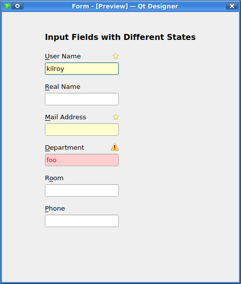
Mark input fields / combo boxes as required or optional.

The icons have tooltips: "Required field" or "Invalid input" in that example.
Notice that Qt does not easily support putting such status icons inside the input field, e.g. at the right side (this would mean not only a custom paintEvent do do that but also to ensure not overwriting user input with it, so it would make the input field wider to accomodate an icon when required). But on the same level as our usual caption works just nicely.
We'd have to make sure to either pick icons that are suitable both with our installation Qt style sheet and in the standard widget theme (used in the installed system), both a greyish theme and a dark theme (black or dark grey with bright text).
For different input field background colors we should add a flag that can be queried in our Qt style sheets so they can be set differently depending on the style sheets. To be researched.
Set the valid/invalid status from the application and display fields with invalid content in a special way (red backgrund / error icon).
Trivial to do in Qt.
lslezak: Use case: Package names
Compound widget on the libyui level that does the common thing for natural sizes:
  HVSquash(                         # reduce to minimum / preferred size
    HBox(
      VSpacing( desired_height ),   # force height
      VBox(
        HSpacing( desired_width ),  # force width
        VBox( content )
        )
      )
    )
Edit: As mvidner pointed out in the comments, most of this can be replaced with the MinSize widget, so this would be reduced to
HVSquash( MinSize( min_width, min_height, content ) )
In other cases, we might want the content to grow as large as possible, yet maintain some margins around it (at least in the Qt UI) for aesthetics:
MarginBox( 0.4, 0.4, content )
(the NCurses UI will round the fractional values to int and thus use the maximum screen space)
We might want to come up with a handfull of such templates for common layouts.
Right now the BarGraph widget is only used in the partitioner.
Maybe it's time to do something more specific for the partitioner; a dedicated special widget that can handle containers such as an extended partition or LVM volume groups.
Tooltips for more details might be useful here.
Do we need drag&drop there? It might imply very expensive operations (filesystem resize and move) caused by just a few mouse movements.
Discussion result: No drag & drop here to avoid initiating dangerous operations by accident.
libyui provides C++ classes with a full-fledged API for everything. For YCP, we used YCP bindings: A parser for YCP data types such as
- Primitives: YCPString, YCPInteger, YCPBoolean; YCPValue ("any")
- Containers: YCPList, YCPMap
- YCPTerm
We are still using that today, but slightly adapted for Ruby syntax.
We could use an object-oriented API instead. We have CWM which is yet another class hierarchy wrapping the UI widgets, but that leaves us with a completely different class hierarchy which means incompatibilities, different APIs and mismatching (or missing) documentation for many things.
We could use SWIG bindings to use the libyui classes directly: YWidgetFactory, YPushButton, YVBox, ...
We could also add a nice wrapper to use YAML (e.g. as here documents in the Ruby code) for the widget hierarchy if YWidgetFactory()->createXYWidget() etc. calls are too awkward.
Right now, we hang on to those very old YCPValue-based data types to have an easy to write and easy to read notation in our Ruby source code.
Do we need improvement in that area?
Should we / do we want to get rid of YCPValue & Co.?
Realistically, we have so much old code that we have to retain backwards compatibility to avoid breaking all that code. Would the benefits of a new / easier / more native / more natural API outweigh the cost of having to maintain both the old and those new bindings?
Hack week project by jreidinger:
https://github.com/libyui/ruby-ui
Unsolved so far: Save the focus status of interactive elements (hyperlinks) in the RichText widget and restore it on request.
No documentation found (so far) about the focus element. Unclear how this works, or if there even is an API to get and set that value. To be researched.
Discussion result: Nobody seems to really want this.
Right now all layout tasks are done with VBox / HBox and some helpers (Alignment, HVCenter, HVSquash, HSpacing / VSpacing). While this can do many things, it also has limits: In some cases, it is impossible to line up widgets with each other.
A grid layout would be desirable; very much like QGridLayout or the HTML table.
Refinement #1: Allow widgets to stretch over multiple cells in one dimension (horizontally or vertically).
Refinement #2: Allow widgets to stretchover multiple cells in both dimensions at the same time (horizontally and vertically).
Major challenge: How to write down such a layout in the code while maintaining the general style we have everywhere with YCPTerm.
GridLayout(
  GridRow(
    InputField("User Name"),
    PushButton("Suggest")
  ),
  GridRow(
    InputField("Real Name"),
    Empty()
  ),
  GridRow(
    Password("Password"),
    PushButton("Lock User")
  ),
  GridRow(
    Password("Repeat Password"),
    Empty()
  )
)
GridLayout(
  GridCell(0, 0, InputField("User Name")),
  GridCell(0, 1, InputField("Real Name")),
  GridCell(0, 2, Password("Password")),
  GridCell(0, 3, Password("Repeat Password")),
  GridCell(1, 0, PushButton("Suggest")),
  GridCell(1, 3, PushButton("Lock user"))
)
GridLayout(
  GridCol(
    InputField("User Name"),
    InputField("Real Name"),
    Password("Password"),
    Password("Repeat Password")
  ),
  GridCol(
    PushButton("Suggest"),
    Empty(),
    PushButton("Lock")
  )
)
In all cases, the GridLayout would determine the overall number of cells implicitly by the maximum number of rows and columns.
The preferred width of each column would be the maximum preferred width of the widest widget in that column. Likewise, the preferred height of each row would be the preferred height of the highest widget in that row.
Stretchability: A row or column would be stretchable if any widget in it would be stretchable. Excess space would be divided evenly among the stretchable rows or column.
Extension: Maybe add a stretch weight to prefer some rows or columns for that.
When there is not enough space, cutting off widgets would be considerably more difficult than in VBox/HBox. To be determined.
GridLayout(
  GridCell(2, 2, :opt(:rowStretch(3), :colStretch(2)), Table(...))
)
or
GridLayout(
  GridStretchCell(2, 2, 3, 2, Table(...))
)
Not really well readable: Which number is which?
Layout behavior: Other widgets would have to contribute to the layout constraints; if the stretchable cell has a preferred size of 300x200 pixels, in the above example we could only guess that we might want to evenly distribute that over the 3x2 cells that it occupies, i.e. 300/3 = 100 pixels wide and 200/2 high.
If another widget in its first column has a preferred width of 200, would we distribute the remaining 100 pixels among the other two cells, i.e. having one column of width 200 and two of 50?
The exact layout behaviour would need some deep thinking; probably also some experimenting with well-chosen typical examples.
It is doable, but it will not be trivial.
In the Qt UI, we use the QTextEdit widget which uses a QTextDocument. When we pass a string with a RichText, it is converted to a QTextDocument; this is pretty much an equivalent to a DOM tree in real HTML.
Side note: Qt now also has a real web browser embedded based on WebKit; we could even use that one for Qt. But it would be really hard to come up with a counterpart in NCurses.
To maintain compatibility with existing code and to minimize disruption with Qt vs. NCurses (and also the Gtk UI), we could create a diff between the old and the new content and use built-in text modification functions to avoid replacing the complete text, i.e. the complete QTextDocument. Then (hopefully) the widget will maintain context information such as the scroll position and the focussed object (hyperlink). To be verified!
We could either create a QTextDocument directly from our RichText string and then traverse the QTextObject tree and compare each of the QTextObjects OR simply do a brute-force diff of the previous RichText (which is stored in the YMultiLineEdit parent class anyway) and then only replace changed files.
There is this Diff class that was a byproduct of CommentedConfigFile for the EtcFstab class used in libstorage-ng:
- https://github.com/shundhammer/commented-config-file/blob/master/src/Diff.h
- https://github.com/shundhammer/commented-config-file/blob/master/src/Diff.cc
Reference:
- https://doc.qt.io/qt-5/qtextedit.html
- https://doc.qt.io/qt-5/qtextdocument.html
- https://doc.qt.io/qt-5/qtextobject.html
On second thought, the Qt API for that appears pretty complex: A RichText document is broken down into a lot of individual objects including QTextBlock, QTextList, QTextFragment and whatnot. Trying to apply such a diff might become very complicated really quickly.
-
Bug: System roles are not properly rendered in graphical installation
-
Bug: selection box auto scrolls incorrectly
-
Bug: UX regression in system role selection (mainly ncurses)


Re Dialog content area templates, isn't this what MinSize does already?