Created
May 25, 2022 08:10
-
-
Save smartherd/29c1e05e75d59953d0593039d06a0615 to your computer and use it in GitHub Desktop.
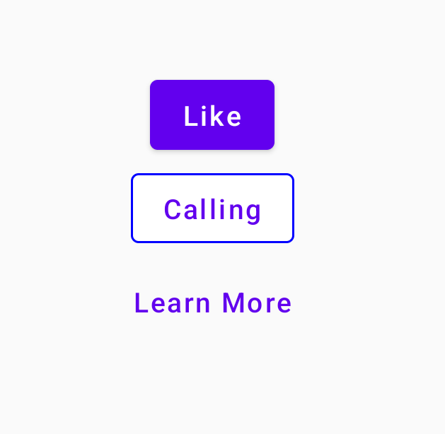
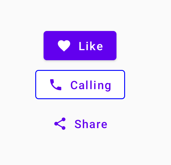
Button, OutlinedButton, and TextButton in Jetpack Compose
This file contains bidirectional Unicode text that may be interpreted or compiled differently than what appears below. To review, open the file in an editor that reveals hidden Unicode characters.
Learn more about bidirectional Unicode characters
| package com.sriyank.composecomponents | |
| import android.content.Context | |
| import android.os.Bundle | |
| import android.widget.Toast | |
| import androidx.activity.ComponentActivity | |
| import androidx.activity.compose.setContent | |
| import androidx.compose.foundation.BorderStroke | |
| import androidx.compose.foundation.layout.* | |
| import androidx.compose.material.* | |
| import androidx.compose.material.icons.Icons | |
| import androidx.compose.material.icons.filled.Favorite | |
| import androidx.compose.material.icons.filled.Phone | |
| import androidx.compose.material.icons.filled.Share | |
| import androidx.compose.runtime.Composable | |
| import androidx.compose.ui.Alignment | |
| import androidx.compose.ui.Modifier | |
| import androidx.compose.ui.graphics.Color | |
| import androidx.compose.ui.platform.LocalContext | |
| import androidx.compose.ui.tooling.preview.Preview | |
| import androidx.compose.ui.unit.dp | |
| import com.sriyank.composecomponents.ui.theme.ComposeComponentsTheme | |
| class MainActivity : ComponentActivity() { | |
| override fun onCreate(savedInstanceState: Bundle?) { | |
| super.onCreate(savedInstanceState) | |
| setContent { | |
| ComposeComponentsTheme { | |
| Column( | |
| modifier = Modifier.fillMaxSize(), | |
| verticalArrangement = Arrangement.Center, | |
| horizontalAlignment = Alignment.CenterHorizontally | |
| ) { | |
| MyNormalButton() | |
| MyOutlinedButton() | |
| MyTextButton() | |
| } | |
| } | |
| } | |
| } | |
| } | |
| fun showToast(context: Context, message: String) { | |
| Toast.makeText(context, message, Toast.LENGTH_SHORT).show() | |
| } | |
| @Composable | |
| fun MyNormalButton() { | |
| val context = LocalContext.current | |
| Button( | |
| onClick = { showToast(context, "Button Clicked") }, | |
| modifier = Modifier.width(width = 200.dp), | |
| elevation = ButtonDefaults.elevation(10.dp), | |
| colors = ButtonDefaults.buttonColors( | |
| backgroundColor = Color.Black, | |
| contentColor = Color.White | |
| ) | |
| ) { | |
| Icon( | |
| imageVector = Icons.Filled.Favorite, | |
| contentDescription = "Heart Icon", | |
| modifier = Modifier.size(ButtonDefaults.IconSize) | |
| ) | |
| Spacer(modifier = Modifier.size(ButtonDefaults.IconSpacing)) | |
| Text("Like") | |
| } | |
| } | |
| @Composable | |
| fun MyOutlinedButton() { | |
| val context = LocalContext.current | |
| OutlinedButton( | |
| onClick = { showToast(context, "Call Started") }, | |
| border = BorderStroke(1.dp, Color.Blue) | |
| ) { | |
| Icon( | |
| imageVector = Icons.Filled.Phone, | |
| contentDescription = "Phone Icon", | |
| modifier = Modifier.size(ButtonDefaults.IconSize) | |
| ) | |
| Spacer(modifier = Modifier.size(ButtonDefaults.IconSpacing)) | |
| Text("Call") | |
| } | |
| } | |
| @Composable | |
| fun MyTextButton() { | |
| val context = LocalContext.current | |
| TextButton(onClick = { showToast(context, "Sharing...") }) { | |
| Icon( | |
| imageVector = Icons.Filled.Share, | |
| contentDescription = "Share Icon", | |
| modifier = Modifier.size(ButtonDefaults.IconSize) | |
| ) | |
| Spacer(modifier = Modifier.size(ButtonDefaults.IconSpacing)) | |
| Text("Share") | |
| } | |
| } | |
| @Preview(showBackground = true) | |
| @Composable | |
| fun DefaultPreview() { | |
| ComposeComponentsTheme { | |
| MyNormalButton() | |
| } | |
| } |
Sign up for free
to join this conversation on GitHub.
Already have an account?
Sign in to comment
Sample code in Jetpack Compose for Button, OutlinedButton, and TextButton
Also, learn to customise the border color, background color, content color, elevation of button, add icon to button with Spacer composable widget.
Create Button with Icons
Create Buttons without Icons