| title | date |
|---|---|
Study Notes: CSS Grid Layout Module 1 - Chapter 7~8 |
2019-03-19 |
Original post by tae: Day 19~20 Reading CSS Grid Layout Module 1 - Chapter 7~8
Grid consists of two area, Explicit Grid and Implicit Grid
The three properties grid-template-rows, grid-template-columns, and grid-template-areas together define the explicit grid of a grid container.
The final grid may end up larger due to grid items placed outside the explicit grid; in this case implicit tracks will be created, these implicit tracks will be sized by the grid-auto-rows and grid-auto-columns properties.
There're a lot of ways to use grid style.
These properties specify, as a space-separated track list, the line names and track sizing functions of the grid. these properties determine Explicit grid area.
Authors also can name grid lines with the [<custom-ident>*] syntax
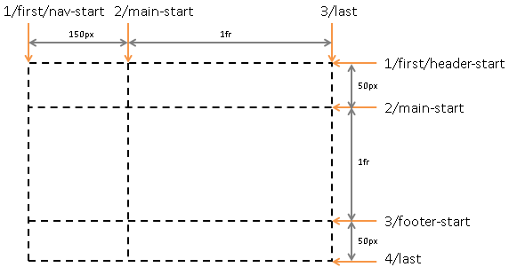
  #grid {
    display : grid;
    grid-template-columns : [first nav-start] 150px [main-start] 1fr [last]; /*the ident that has space means that line has multiple names.*/
    grid-template-rows: [first header-start] 50px [main-start] 1fr [footer-start] 50px [last];
  }
with repeat() notation, authors don't need to write down repeted fragment.
  grid-template-columns: 10px [col-start] 250px [col-end]
                         10px [col-start] 250px [col-end]
                         10px [col-start] 250px [col-end]
                         10px [col-start] 250px [col-end] 10px;
  /* same as above, except easier to write */
  grid-template-columns: repeat(4, 10px [col-start] 250px [col-end]) 10px;
Authors may not be able to know how much area will remain, then use auto-fill and auto-fit repetitions
.wrapper {
  display: grid;
  grid-template-columns: repeat(auto-fill, 200px);
}
In this example, the following code will create 200px grids that can fill columns
The auto-fit keyword behaves the same as auto-fill, except that after grid item placement any empty repeated tracks are collapsed.
these two properties are resolved value special case properties. [CSSOM] It means, authors can access to these values with js.
<script>
  var gridElement = document.getElementById("grid");
  getComputedStyle(gridElement).gridTemplateColumns;
  // [a] 50px [b] 320px [b c d] repeat(2, [e] 40px) repeat(4, 0px) 50px
</script>
This property specifies named grid areas, which are not associated with any particular grid item, but can be referenced from the grid-placement properties.
#grid {
  display: grid;
  grid-template-areas: "head head"
                       "nav  main"
                       "foot ...."
}
#grid > header { grid-area: head; }
#grid > nav    { grid-area: nav; }
#grid > main   { grid-area: main; }
#grid > footer { grid-area: foot; }
this property creates implicit named lines from the named grid areas in the template.
The grid-template property is a shorthand for setting grid-template-columns, grid-template-rows, and grid-template-areas in a single declaration.
grid-template: auto 1fr / auto 1fr auto;
/*is equivalent to*/

grid-template-rows: auto 1fr;
grid-template-columns: auto 1fr auto;
grid-template-areas: none;

grid-template: [header-top] "a   a   a"     [header-bottom]
                 [main-top] "b   b   b" 1fr [main-bottom]
                          / auto 1fr auto;
/*is equivalent to*/
grid-template-areas: "a a a"
                     "b b b";
grid-template-rows: [header-top] auto [header-bottom main-top] 1fr [main-bottom];
grid-template-columns: auto 1fr auto;
Simply, it's area that outside of explicit grid bound. Implict Grid is set by 3 properties : grid-auto-rows, grid-auto-columns, grid-auto-flow. also grid shorthand affects, too.
<style>
  #grid {
    display: grid;
    grid-template-columns: 20px;
    grid-auto-columns: 40px;
    grid-template-rows: 20px;
    grid-auto-rows: 40px;
  }
  #A { grid-column: 1; grid-row: 1; }
  #B { grid-column: 2; grid-row: 1; }
  #C { grid-column: 1; grid-row: 2; }
  #D { grid-column: 2; grid-row: 2; }
</style>

<div id="grid">
  <div id="A">A</div>
  <div id="B">B</div>
  <div id="C">C</div>
  <div id="D">D</div>
</div>

Value : [ row | column ] || dense
grid-auto-flow: row dense;
- dense : If specified, the auto-placement algorithm uses a “dense” packing algorithm, which attempts to fill in holes earlier in the grid if smaller items come up later.
- grid position : The grid item’s location in the grid in each axis. A grid position can be either definite (explicitly specified) or automatic (determined by auto-placement).
- grid span : How many grid tracks the grid item occupies in each axis. A grid item’s grid span is always definite, defaulting to 1 in each axis if it can’t be otherwise determined for that axis.

The grid-placement property longhands are organized into three shorthands
  /* 1. Named-area */
  article.one {
    grid-area: main;
    /* Places item into the named area "main". */
  }

  /* 2. Numeric Indexes and Spans */
  article.two {
    grid-row: 2 / span 5;
    /* Starts in the 2nd row,
     spans 5 rows down (ending in the 7th row). */
  }

  /* 3. Named Lines and Spans */
  article.three {
    grid-row: text 5 / span text 2;
    /* Same as grid-row: text 5 / text 7; - start at the 5th line named "text",
       then span across two more "text" lines, to the 7th. */
  }

  /* 4.Auto Placement */
  article.four {
    grid-area: auto; /* Initial value */
  }
  article.five {
    grid-area: span 2 / span 3;
    /* Auto-placed item, covering two rows and three columns. */
  }
grid-placement properties are not a substitute for correct source ordering.
the grid-row-start, grid-column-start, grid-row-end, and grid-column-end properties : Line-based Placement
  Value:	<grid-line>

  <grid-line> =
  auto |
  <custom-ident> |
  [ <integer> && <custom-ident>? ] |
  [ span && [ <integer> || <custom-ident> ] ]
Given a single-row, 8-column grid and the following 9 named lines:
1  2  3  4  5  6  7  8  9
+--+--+--+--+--+--+--+--+
|  |  |  |  |  |  |  |  |
A  B  C  A  B  C  A  B  C
|  |  |  |  |  |  |  |  |
+--+--+--+--+--+--+--+--+
The following declarations place the grid item between the lines indicated by index:

grid-column-start: 4; grid-column-end: auto;
/* Line 4 to line 5 */

grid-column-start: auto; grid-column-end: 6;
/* Line 5 to line 6 */

grid-column-start: C; grid-column-end: C -1;
/* Line 3 to line 9 */

grid-column-start: C; grid-column-end: span C;
/* Line 3 to line 6 */

grid-column-start: span C; grid-column-end: C -1;
/* Line 6 to line 9 */

grid-column-start: span C; grid-column-end: span C;
/* Error: The end span is ignored, and an auto-placed
   item can’t span to a named line.
   Equivalent to grid-column: span 1;. */

grid-column-start: 5; grid-column-end: C -1;
/* Line 5 to line 9 */

grid-column-start: 5; grid-column-end: span C;
/* Line 5 to line 6 */

grid-column-start: 8; grid-column-end: 8;
/* Error: line 8 to line 9 */

grid-column-start: B 2; grid-column-end: span 1;
/* Line 5 to line 6 */
- Generate anonymous grid items
- Position anything that’s not auto-positioned.
- Process the items locked to a given row. - through sparse/dense packing
- Determine the columns in the implicit grid.
#grid {
  display: grid;
  grid-template-columns: repeat(5, 100px);
  grid-auto-flow: row;
}
#grid-item {
  grid-column: 4 / span 3;
}
The number of columns needed is 6. The explicit grid provides its 5 columns (from grid-template-columns) with lines number 1 through 6, but #grid-item’s column position means it ends on line 7, which requires an additional column added to the end of the implicit grid.
- Position the remaining grid items.
A flexible length or <flex> is a dimension with the fr unit, which represents a fraction of the leftover space in the grid container.