| title | date |
|---|---|
Study Notes: CSS Grid Layout Module 1 - Chapter 1~3 |
2019-03-14 |
Original post by tae: Day 15~16 Reading CSS Grid Layout Module 1 - Chapter 1~3
I think type copied code is the best way to study some codes. so today I concentrate on coping examples.
Grid Layout is a new layout model for CSS that has powerful abilites to control the sizing and positioning of boxes and their contents. Grid Layout allows dramatic transformations in visual layout structure without requiring corresponding markup changes. (GGREATT)
| Grid | Flex | |
|---|---|---|
| be oriented | 2-dimensional | single-axis |
| the way to approach | top-down | bottom-up |
| remarks | allows explicit overlapping of items, and has more powerful spanning capabilites | content-size-based line-wrapping system to control its secondary axis. |
It provides a mechanism for authors to divide available space for layout into columns and rows using a set of predictable sizing behaviors. the following lists are some examples.
- Adapting Layouts to Available Space

- Source-order independence
 for portrait orientation.
 for landscape orientation.
Grid item placement and reordering must not be used as a substitute for correct source ordering, as that can ruin the accessbillity of the document
- fixed, flexible, and content-based track sizing functions
- explicit item placement via positive and negative numerical grid coordinates, named grid lines, and named grid areas.
- space sensitive track repetition and automatic addition for rows or columns to accommodate additional content
- control over alignment and spacing with margins, gutters, and the alignment properties.
- the ability to overlap content and control layering with 'z-index'
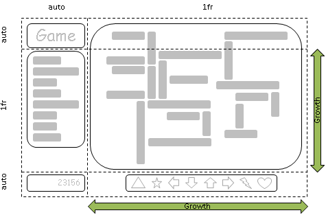
example 1.
  .grid {
    grid : 'H H '
           'A B '
           'F F ' 30px
           auto 1fr;
  }
auto - content based
1fr - unit of remaning space
30px - fixed size
example 2.
  .grid {
    grid : repeat(auto-fill, 5em) / auto-flow 1fr;
    height : 100vh;
  }
  @media (orientation : landscape) {
    .grid {
      grid : auto-flow 1fr / repeat(auto-fill, 5em);
    }
  }
a grid with as many rows of at least '5em' as will fit in the height of the grid container(100vh)
and columns are added as content is added, the resulting column widths are equalized(1fr)
when orientation changed to landscape, it alternates.
example 3.
  .grid {
    grid : auto 1fr auto / reapeat(5, 1fr);
    min-height:100vh;
  }
a grid with 5 evenly-sized columns and three rows, with the middle row taking up all remaining space.(and at least enough to fit its contents)
the way place grid items
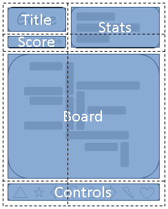
example 1 - with grid-area shorthand
  grid-area : a;
  grid-row : a; grid-column : a; /* it's equivalent to the above sentence (longhand)*/

  grid-area: 2/4;
  grid-row : 2; grid-column : 4;

  grid-area : 1 / 3 / -1;
  grid-row : 1/-1; grid-column : 3;
  grid-row-start : 1; grid-column-start : 3; grid-row-end : -1; gird-column-end:auto;

  grid-area : header-start / sidebar-start / footer-end / sidebar-start;
  grid-row : header-start/footer-end; grid-column : sidebar-start/footer-end
Once the grid items have been placed, the sizes of the grid tracks are calculated, accounting for the sizes of their contents and or avaliable space as specified in the grid definition.
example 1.
.grid {
  grid : auto-flow 1fr / repeat(auto-fill, 5em);
  min-height : 100vh;
  justify-content : space-between;
  align-content : safe center;
}
this source justifies all columns by distributing any extra space among them, and centers the grid in the grid container when it is smaller than 100vh.
composition of grid layout
- grid container - be laid out by positionin gand aligning it into a grid
- grid lines - devides the grid container's space in to grid area, two type exist. block axis(column axis) and inline axis(row axis)
- grid areas - logical space used to lay out one or more grid items.
- grid items - representing the grid container's content
- grid track - the space between two adjacent grid lines. Each grid track is assigned a sizing function. which controls how wide or tall the column or row may grow, and thus how far part its boudning grid lines are.
- grid cell - the intersection of a grid row and a grid column. it's the smallest unit of the grid that can be referenced when positioning grid items.
following two examples both create three column grid lines and four row grid lines. example 1. How an author would position a grid item using grid line numbers.
  #grid {
    display:grid;
    grid-template-columns : 150px 1fr;
    grid template-rows : 50px 1fr 50px;
  }

  #item1 { grid-column : 2; grid-row-start:1; grid-row-end :4; }
example 2. uses explicitly named grid lines
  #grid {
    display:grid;
    grid-template-columns : 150px [item1-start] 1fr [item1-end];
    grid-tempalte-rows : [item1-start] 50px 1fr 50px [item1-end];
  }

  #item1{
    grid-column : item1-start/item1-end;
    grid-row : item1-start / item1-end;
  }
A grid area can be named explicitly using the grid-template-area property of the grid container, or referenced implicitly by its bounding grid lines.
A grid item is assigned to a grid area using the grid-placement properties.
example 1.
  #grid {
    display : grid;
    grid-template-areas : '. a'
                          'b a'
                          '. a';
    grid-template-columns: 150px 1fr;
    grid-template-rows : 50px 1fr 50px;
  }

  #item1 { grid-area : a }
  #item2 { grid-area : b }
  #item3 { grid-area : b }

  #item2 { align-self : start; }
  #item3 { justify-self:end; align-self:end }
``