
Instagram | Twitter | LinkedIn
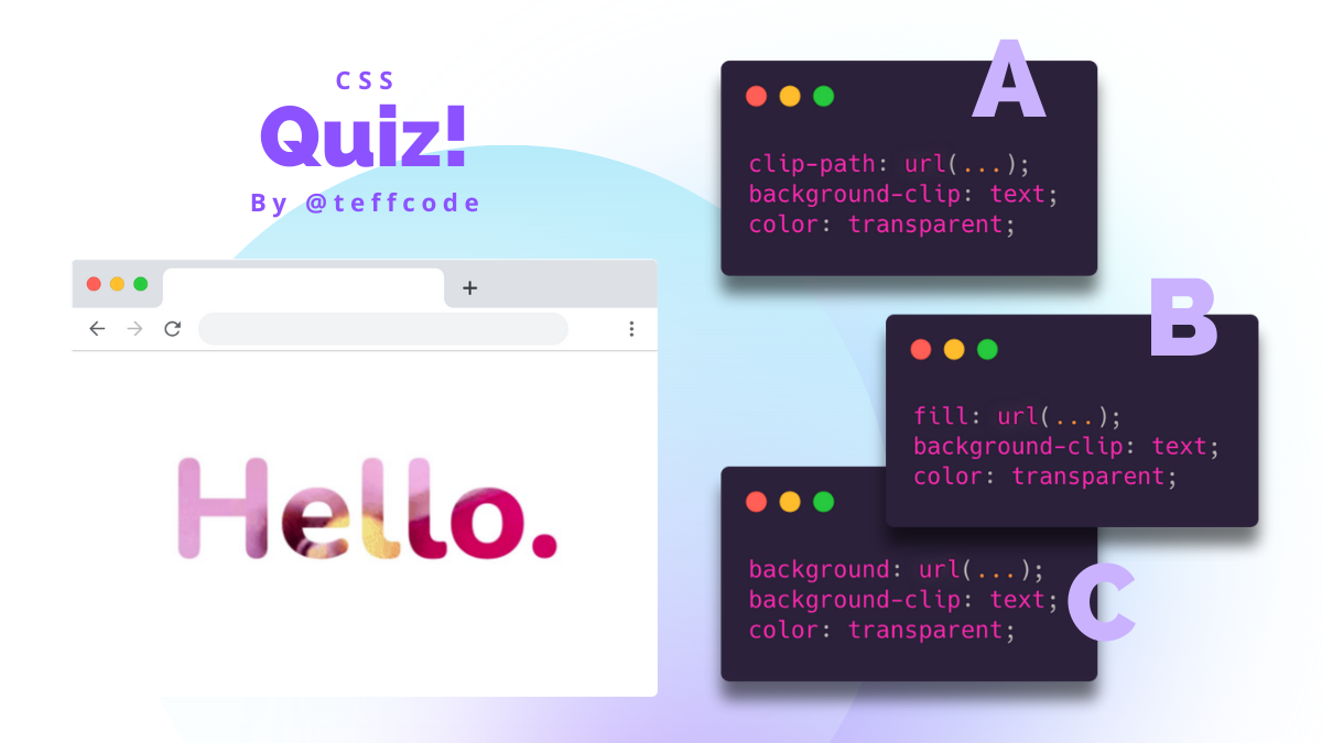
How we can create a text with a GIF: A, B or C ?
Click here to see the correct answer and explanation 👀
| Correct Answer | Explanation |
|---|---|
| C | The background-clip CSS property sets whether an element's background extends underneath its border box, padding box, or content box. If the element has no background-image or background-color, this property will only have a visual effect when the border has transparent regions or partially opaque regions (due to border-style or border-image); otherwise, the border masks the difference. |
Explanation based on 👉🏼 background-clip | MDN
Code:
HTML:
<p>Hello.</p>
CSS:
@import url('https://fonts.googleapis.com/css2?family=Nunito:wght@800&display=swap');

body {
  font-family: 'Nunito', sans-serif;
}

p {
  background: url(https://media.giphy.com/media/fsULJFFGv8X3G/giphy.gif);
  -webkit-background-clip: text;
  background-position: center;
  background-size: cover;
  color: transparent;
  font-size: 132px;
  text-align: center;
}
¿Cómo podemos crear un texto con un GIF: A, B o C?
Haz click aquí para ver la respuesta correcta y su explicación 👀
| Respuesta correcta | Explicación |
|---|---|
| C | La propiedad CSS background-clip especifica si el fondo de un elemento, ya sea el color o imagen, se extiende por debajo su borde. Si la imagen (background-image) o color (background-color) de fondo no esta definido, esta propiedad solo tendrá un efecto visual cuando el borde tenga regiones transparentes o regiones parcialmente opacas (debido a border-style o border-image); de lo contrario el borde cubre la diferencia. |
Explicación basada en 👉🏼 background-clip | MDN
Código completo:
HTML:
<p>Hello.</p>
CSS:
@import url('https://fonts.googleapis.com/css2?family=Nunito:wght@800&display=swap');

body {
  font-family: 'Nunito', sans-serif;
}

p {
  background: url(https://media.giphy.com/media/fsULJFFGv8X3G/giphy.gif);
  -webkit-background-clip: text;
  background-position: center;
  background-size: cover;
  color: transparent;
  font-size: 132px;
  text-align: center;
}
Hola @teffcode esta super cool no sabía que se podía hacer, vi el CodePen y te sugiero un cambiecito para este ejercicio en específico y es poner background-size: contain; en esta ocasión funciona mejor.
Gracias por hacer este espacio de los Quizzes esta super bueno 🤩