Last active
September 2, 2019 04:57
-
-
Save tim-evans/da90b2e3270c4a8a16bbf4836eeb9aa6 to your computer and use it in GitHub Desktop.
Apple News Format
This file contains bidirectional Unicode text that may be interpreted or compiled differently than what appears below. To review, open the file in an editor that reveals hidden Unicode characters.
Learn more about bidirectional Unicode characters
| declare module AppleNews { | |
| /** | |
| * Augmented reality (AR) creates user experiences that add 2D or 3D elements to the live view from a device’s camera in a way that makes those elements appear to inhabit the real world. ARKit combines device motion tracking, camera scene capture, advanced scene processing, and display conveniences to simplify the task of building an AR experience. See [ARKit](https://developer.apple.com/documentation/arkit). | |
| * | |
| * Displaying ARKit content in Apple News requires an iOS device with an A9 or later processor. | |
| * | |
| * Important | |
| * | |
| * The ARKit feature can't be previewed on iOS versions earlier than iOS 12. If you are using News Preview, ensure you have Xcode 9 or later installed. | |
| * @example | |
| * ```json | |
| * { | |
| * "components": [ | |
| * { | |
| * "role": "arkit", | |
| * "caption": "Lunar Lander", | |
| * "URL": "https://example.com/assets/lunar-lander/main.usdz" | |
| * } | |
| * ] | |
| * } | |
| * ``` | |
| * @see https://developer.apple.com/documentation/apple_news/arkit | |
| */ | |
| export interface ARKit { | |
| /** | |
| * A string that describes the contents of the ARKit stage. This text is also used by [VoiceOver for iOS](https://www.apple.com/accessibility/iphone/vision/) and [VoiceOver for macOS](https://www.apple.com/accessibility/mac/vision/), if `accessibilityCaption` text is not provided. | |
| */ | |
| caption: string; | |
| /** | |
| * Always `arkit` for this component. | |
| */ | |
| role: "arkit"; | |
| /** | |
| * A valid URL to a Universal Scene Description file (USD) file with extension .`usdz`, beginning with `http://`, `https://` or `bundle://`. | |
| */ | |
| URL: string; | |
| /** | |
| * A caption that describes the augmented reality experience. The text is used for [VoiceOver for iOS](https://www.apple.com/accessibility/iphone/vision/) and [VoiceOver for macOS](https://www.apple.com/accessibility/mac/vision/). If `accessibilityCaption` is not provided, the `caption` value is used for VoiceOver for iOS and VoiceOver for macOS. | |
| */ | |
| accessibilityCaption?: string; | |
| /** | |
| * An object that defines vertical alignment with another component. | |
| */ | |
| anchor?: Anchor; | |
| /** | |
| * A object that defines an animation to be applied to the component. | |
| * | |
| * The `none` value is used for conditional design elements. Adding it here has no effect. | |
| */ | |
| animation?: ComponentAnimation | "none"; | |
| /** | |
| * An object that defines [Behavior](https://developer.apple.com/documentation/apple_news/behavior) for a component, like [Parallax](https://developer.apple.com/documentation/apple_news/parallax) or [Springy](https://developer.apple.com/library/archive/documentation/General/Conceptual/Apple_News_Format_Ref/SpringyBehavior.html#//apple_ref/doc/uid/TP40015408-CH73). | |
| * | |
| * The `none` value is used for conditional design elements. Adding it here has no effect. | |
| */ | |
| behavior?: Behavior | "none"; | |
| /** | |
| * An instance or array of component properties that can be applied conditionally, and the conditions that cause them to be applied. | |
| */ | |
| conditional?: ConditionalComponent | ConditionalComponent[]; | |
| /** | |
| * This property indicates that the component may contain explicit or graphic content. | |
| */ | |
| explicitContent?: boolean; | |
| /** | |
| * A boolean value that determines whether the component is hidden. | |
| */ | |
| hidden?: boolean; | |
| /** | |
| * An optional unique identifier for this component. If used, this `identifier` must be unique across the entire document. You will need an `identifier` for your component if you want to anchor other components to it. | |
| */ | |
| identifier?: string; | |
| /** | |
| * An inline `ComponentLayout` object that contains layout information, or a string reference to a `ComponentLayout` object that is defined at the top level of the document. | |
| * | |
| * If `layout` is not defined, size and position will be based on various factors, such as the device type, the length of the content, and the `role` of this component. | |
| */ | |
| layout?: ComponentLayout | string; | |
| /** | |
| * An inline `ComponentStyle` object that defines the appearance of this component, or a string reference to a `ComponentStyle` object that is defined at the top level of the document. | |
| * | |
| * The `none` value is used for conditional design elements. Adding it here has no effect. | |
| */ | |
| style?: ComponentStyle | string | "none"; | |
| } | |
| /** | |
| * This is an abstract definition. Do not use this object type directly; use only the objects that extend it like [Link](https://developer.apple.com/documentation/apple_news/link). | |
| * @see https://developer.apple.com/documentation/apple_news/addition | |
| */ | |
| export interface Addition { | |
| /** | |
| * The type of addition. For example, [Link](https://developer.apple.com/documentation/apple_news/link). | |
| */ | |
| type: "link" | "calendar_event"; | |
| /** | |
| * The number of text characters that will be highlighted as the link. | |
| */ | |
| rangeLength?: number; | |
| /** | |
| * The starting character index for which the addition is meant. A range starts at `0` for the first character. | |
| * | |
| * If `rangeStart` is specified, `rangeLength` is required. | |
| */ | |
| rangeStart?: number; | |
| } | |
| /** | |
| * Use the `AdvertisementAutoPlacement` object to insert dynamic advertisements between [Body](https://developer.apple.com/documentation/apple_news/body), [Chapter](https://developer.apple.com/documentation/apple_news/chapter), [Section](https://developer.apple.com/documentation/apple_news/section), or [Container](https://developer.apple.com/documentation/apple_news/container) components in an article. | |
| * @example | |
| * ```json | |
| * { | |
| * "version": "1.9", | |
| * "identifier": "SampleArticle", | |
| * "language": "en", | |
| * "title": "Apple News", | |
| * "subtitle": "A look at the features of Apple News", | |
| * "layout": { | |
| * "columns": 7, | |
| * "width": 1024, | |
| * "margin": 75, | |
| * "gutter": 20 | |
| * }, | |
| * "autoplacement": { | |
| * "advertisement": { | |
| * "enabled": true, | |
| * "bannerType": "any", | |
| * "distanceFromMedia": "10vh", | |
| * "frequency": 10, | |
| * "layout": { | |
| * "margin": 10 | |
| * } | |
| * } | |
| * }, | |
| * … | |
| * } | |
| * ``` | |
| * @see https://developer.apple.com/documentation/apple_news/advertisementautoplacement | |
| */ | |
| export interface AdvertisementAutoPlacement { | |
| /** | |
| * A specific banner type that should be automatically inserted based on the `frequency` value. If advertisement placement is enabled, only banners of the defined size type are inserted. | |
| */ | |
| bannerType?: "any" | "standard" | "double_height" | "large"; | |
| /** | |
| * An instance or array of automatic placement properties that can be applied conditionally, and the conditions that cause them to take effect. | |
| */ | |
| conditional?: ConditionalAutoPlacement | ConditionalAutoPlacement[]; | |
| /** | |
| * The minimum required distance between automatically inserted advertisement components and media, such as [Video](https://developer.apple.com/documentation/apple_news/video) and [Photo](https://developer.apple.com/documentation/apple_news/photo). To maintain a minimum distance of half a screen height from your media content, use a value of around `50vh`. For more information, see [Specifying Measurements for Components](https://developer.apple.com/documentation/apple_news/apple_news_format/specifying_measurements_for_components). | |
| */ | |
| distanceFromMedia?: SupportedUnits | number; | |
| /** | |
| * A Boolean that defines whether placement of advertisements is enabled. | |
| */ | |
| enabled?: boolean; | |
| /** | |
| * A number from `0` to `10`, defining the frequency for automatically inserting [BannerAdvertisement](https://developer.apple.com/documentation/apple_news/banneradvertisement) components into articles. | |
| * | |
| * Setting this value to `1` automatically inserts a banner advertisement in the first possible location below the screen bounds. | |
| * | |
| * Setting this value to `2` inserts a banner advertisement in the first possible location below the screen bounds, and another between the first banner advertisement and the end of the article. | |
| * | |
| * Increasing the frequency value increases the frequency of banner advertisements below the first screen bounds. | |
| * | |
| * Setting this value to `0,` or omitting it, results in no inserted advertisements. | |
| */ | |
| frequency?: number; | |
| /** | |
| * The layout properties for automatically inserted components. | |
| */ | |
| layout?: AutoPlacementLayout; | |
| } | |
| /** | |
| * Define the margins for the [BannerAdvertisement](https://developer.apple.com/documentation/apple_news/banneradvertisement) components that are inserted automatically. This object is different from the [ComponentLayout](https://developer.apple.com/documentation/apple_news/componentlayout) object and supports only one property, `margin`. | |
| * | |
| * This object can be used in [AdvertisingSettings](https://developer.apple.com/documentation/apple_news/advertisingsettings). | |
| * @example | |
| * ```json | |
| * { | |
| * "advertisingSettings": { | |
| * "frequency": 10, | |
| * "layout": { | |
| * "margin": { | |
| * "top": 15, | |
| * "bottom": 20 | |
| * } | |
| * } | |
| * } | |
| * } | |
| * ``` | |
| * @see https://developer.apple.com/documentation/apple_news/advertisinglayout | |
| */ | |
| export interface AdvertisingLayout { | |
| /** | |
| * Describes margins on top and bottom as a single integer or as an object containing separate properties for top and bottom margins. | |
| * | |
| * Version 1.1 | |
| */ | |
| margin: Margin | number; | |
| } | |
| /** | |
| * Use the `AdvertisingSettings` object to insert dynamic advertisements between `Body`, `Chapter`, `Section`, or `Container `components in an article. | |
| * @example | |
| * ```json | |
| * { | |
| * "advertisingSettings": { | |
| * "frequency": 10, | |
| * "layout": { | |
| * "margin": { | |
| * "top": 15, | |
| * "bottom": 20 | |
| * } | |
| * } | |
| * } | |
| * } | |
| * ``` | |
| * @see https://developer.apple.com/documentation/apple_news/advertisingsettings | |
| */ | |
| export interface AdvertisingSettings { | |
| /** | |
| * The banner type that should be shown. | |
| */ | |
| bannerType?: "any" | "standard" | "double_height" | "large"; | |
| /** | |
| * Either a number in points or a string referring to a supported unit of measure that describes the minimum required distance between automatically inserted advertisement components and media, such as video, images, and embeds. | |
| * | |
| * For example, you can enter a value such as `50vh` to keep automatically inserted advertisements at 50% of the viewport height from your media content. | |
| * | |
| * Version 1.1 | |
| */ | |
| distanceFromMedia?: SupportedUnits | number; | |
| /** | |
| * A number between `0` and `10 `defining the frequency for automatically inserting advertising components into articles. | |
| * | |
| * Setting this value to `1` will automatically insert a banner advertisement in the first possible location below the screen bounds. Setting this value to `2` inserts a banner advertisement in the first possible location below the screen bounds, and a second banner advertisement is inserted between the first banner advertisement and the end of the article. Increasing the frequency increases the frequency of banner advertisements below the first screen bounds. | |
| * | |
| * To increase the likelihood of a banner advertisement getting inserted on every screen, set the frequency to `10`. To achieve the likelihood of every other screen, set the frequency to 5. | |
| * | |
| * Leaving this property out, or providing a value of `0` means that no advertisement will be inserted. | |
| * | |
| * Version 1.1 | |
| */ | |
| frequency?: number; | |
| /** | |
| * Layout object that currently supports margin only. An automatically inserted advertising component uses the surrounding margins to make sure it positions itself nicely in between components. If needed, the margins that will be created around these advertisements can be defined using this layout property. | |
| * | |
| * Version 1.1 | |
| * @deprecated | |
| */ | |
| layout?: AdvertisingLayout; | |
| } | |
| /** | |
| * Use the `Anchor` object to anchor one component (called the *origin*) to another component (called the *target*). An anchor can be used to align components vertically. For example, you can anchor a `caption` component to a `photo` component and choose whether you want the caption aligned to the top, bottom, or center of the photograph. You can also use an anchor to position a child component within its parent container. For information about using anchors within containers, see [Nesting Components in an Article](https://developer.apple.com/documentation/apple_news/apple_news_format/components/nesting_components_in_an_article). | |
| * | |
| * Note | |
| * | |
| * The vertical placement of the anchored components can vary on different devices depending on the size of the display area of the device. | |
| * | |
| * This object can be used in [Component](https://developer.apple.com/documentation/apple_news/component). | |
| * @example | |
| * ```json | |
| * { | |
| * "components": [ | |
| * { | |
| * "role": "container", | |
| * "layout": { | |
| * "minimumHeight": 100 | |
| * }, | |
| * "style": { | |
| * "backgroundColor": "goldenrod" | |
| * }, | |
| * "components": [ | |
| * { | |
| * "role": "title", | |
| * "text": "Article Title", | |
| * "anchor": { | |
| * "targetAnchorPosition": "bottom" | |
| * } | |
| * } | |
| * ] | |
| * } | |
| * ] | |
| * } | |
| * ``` | |
| * @see https://developer.apple.com/documentation/apple_news/anchor | |
| */ | |
| export interface Anchor { | |
| /** | |
| * Sets the anchor point in the target component, relative to the `originAnchorPosition`. Valid values: | |
| * | |
| * - `top`: The top of the target component should be aligned with or near the` originAnchorPosition`. | |
| * - `center`: The middle of the target component should be aligned with or near the `originAnchorPosition`. | |
| * - `bottom`: The bottom of the target component should be aligned with or near the `originAnchorPosition`. | |
| * | |
| * If a component is anchored to a range of text in a body component and is full-width (such as on an iPhone), the following rules are used to determine the spacing before and after the anchored component: | |
| * | |
| * - If the anchored component has explicitly defined margins, the defined margins will be applied to the component. | |
| * - If the anchored component does not have explicitly defined margins, space equaling half of the document gutter will be added before and after the component. | |
| * | |
| * Note the following: | |
| * | |
| * - If the component is anchored to a range of text near the beginning of the component and appears above all text in the body component, no space is added above it. | |
| * - If the component is anchored to a range of text near the end of the component and appears after all text in the body component, no space is added after it. | |
| * - If the component's `targetAnchorPosition` is `top`, no space is added above it. | |
| * - If the component’s `targetAnchorPosition` is `bottom`, no space is added after it. | |
| * | |
| * Example: To align the bottom of a component with the bottom of another component, both `originAnchorPosition` and `targetAnchorPosition `should be set to `bottom`. | |
| */ | |
| targetAnchorPosition: "top" | "center" | "bottom"; | |
| /** | |
| * Sets which point in the origin component will get anchored to the target component. The originating anchor will be positioned as closely as possible to the intended `targetAnchorPosition`. If this property is omitted, the value of `targetAnchorPosition` is used. | |
| */ | |
| originAnchorPosition?: "top" | "center" | "bottom"; | |
| /** | |
| * The length of the range of text the component should be anchored to. If `rangeLength` is specified, `rangeStart` is required. | |
| * | |
| * Maximum value: (`textLength` \- `rangeStart`) where `textLength` is the number of characters in the component, including spaces. | |
| * | |
| * The length of a text range cannot exceed the length of the text. | |
| */ | |
| rangeLength?: number; | |
| /** | |
| * The start index of the range of text the component should be anchored to. When a component is anchored to a component with a `role` of `body`, the text might be flowed around the component. | |
| * | |
| * If `rangeStart` is specified, `rangeLength` is required. | |
| */ | |
| rangeStart?: number; | |
| /** | |
| * The id or name attribute of an `HTML` element in another component. The component containing the target element must have format set to `html`. | |
| */ | |
| target?: string; | |
| /** | |
| * The identifier of the component to anchor to. `targetComponentIdentifier` cannot refer to the current component's parent, child components, or components in another container. When this property is omitted, the anchor will be applied to the parent component, if one exists. | |
| * | |
| * If a parent component does not exist and `targetComponentIdentifier` is not specified, the anchor is ignored. | |
| */ | |
| targetComponentIdentifier?: string; | |
| } | |
| /** | |
| * With this animation type the component starts out invisible and then simply appears. As the component enters the user’s view, it appears with a slight fade-in as shown in [this video](https://devimages-cdn.apple.com/news-publisher/videos/appear.mp4). | |
| * | |
| * See also [FadeInAnimation](https://developer.apple.com/documentation/apple_news/fadeinanimation), where you can set the initial appearance of the component. | |
| * @example | |
| * ```json | |
| * { | |
| * "components": [ | |
| * { | |
| * "role": "heading1", | |
| * "text": "2. Unbeatable Heat" | |
| * }, | |
| * { | |
| * "role": "figure", | |
| * "URL": "bundle://figure.jpg", | |
| * "animation": { | |
| * "type": "appear" | |
| * } | |
| * } | |
| * ] | |
| * } | |
| * ``` | |
| * @see https://developer.apple.com/documentation/apple_news/appearanimation | |
| */ | |
| export interface AppearAnimation { | |
| /** | |
| * This animation always has the type `appear`. | |
| */ | |
| type: "appear"; | |
| } | |
| /** | |
| * Every Apple News Format document must have the same filename: `article.json`. An `article.json` file must contain the `ArticleDocument` object. This is the object that is sent in [Create an Article](https://developer.apple.com/documentation/apple_news/create_an_article) and [Update an Article](https://developer.apple.com/documentation/apple_news/update_an_article) requests. | |
| * | |
| * Warning | |
| * | |
| * Every Apple News Format document must contain all items marked as required in the preceding Properties table. Omissions will result in errors in the Apple News API and [News Preview](https://developer.apple.com/news-preview/). See [Create an Article](https://developer.apple.com/documentation/apple_news/create_an_article) and [Update an Article](https://developer.apple.com/documentation/apple_news/update_an_article). | |
| * | |
| * In JSON, the order of properties in an object is not important; however, as you create your JSON document, you may find it useful to follow the order shown in the example that follows. | |
| * | |
| * To view this example in News Preview, copy the example code to a file named `article.json` and put a file named `image.jpg` in the same folder. (You can use any JPEG, GIF, or PNG file.) | |
| * @example | |
| * ```json | |
| * { | |
| * "version": "1.7", | |
| * "identifier": "SampleArticle", | |
| * "language": "en", | |
| * "title": "Apple News App", | |
| * "subtitle": "A look at the features of the News iOS app", | |
| * "layout": { | |
| * "columns": 7, | |
| * "width": 1024, | |
| * "margin": 75, | |
| * "gutter": 20 | |
| * }, | |
| * "components": [ | |
| * { | |
| * "role": "title", | |
| * "text": "Apple News App", | |
| * "textStyle": "title" | |
| * }, | |
| * { | |
| * "role": "body", | |
| * "text": "The Apple News Format allows publishers to craft beautiful editorial layouts. Galleries, audio, video, and fun interactions like animation make stories spring to life." | |
| * }, | |
| * { | |
| * "role": "photo", | |
| * "URL": "bundle://image.jpg" | |
| * } | |
| * ], | |
| * "documentStyle": { | |
| * "backgroundColor": "#F7F7F7" | |
| * }, | |
| * "componentTextStyles": { | |
| * "default": { | |
| * "fontName": "Helvetica", | |
| * "fontSize": 13, | |
| * "linkStyle": { | |
| * "textColor": "#428bca" | |
| * } | |
| * }, | |
| * "title": { | |
| * "fontName": "Helvetica-Bold", | |
| * "fontSize": 30, | |
| * "hyphenation": false | |
| * }, | |
| * "default-body": { | |
| * "fontName": "Helvetica", | |
| * "fontSize": 13 | |
| * } | |
| * } | |
| * } | |
| * ``` | |
| * @see https://developer.apple.com/documentation/apple_news/articledocument | |
| */ | |
| export interface ArticleDocument { | |
| /** | |
| * An array of components that form the content of this article. Components have different roles and types, such as [Photo](https://developer.apple.com/documentation/apple_news/photo) and [Music](https://developer.apple.com/documentation/apple_news/music). | |
| */ | |
| components: Component[]; | |
| /** | |
| * The component text styles that can be referred to by components in this document. Each `article.json` file must have, at minimum, a default component text style named `default`. Defaults by component role can also be set. See [Defining and Applying Text Styles](https://developer.apple.com/documentation/apple_news/apple_news_format/text_styles/defining_and_applying_text_styles). | |
| */ | |
| componentTextStyles: { | |
| [key: string]: ComponentTextStyle; | |
| }; | |
| /** | |
| * An unique, publisher-provided identifier for this article. This identifier must remain constant; it cannot change when the article is updated. | |
| * | |
| * This identifier can include the following: | |
| * | |
| * - Up to 64 characters | |
| * - Uppercase and lowercase letters | |
| * - Numbers | |
| * - Hyphens | |
| * - Underscores | |
| */ | |
| identifier: string; | |
| /** | |
| * A code that indicates the language of the article. Use the [IANA.org language subtag registry](https://www.iana.org/assignments/language-subtag-registry/language-subtag-registry) to find the appropriate code; e.g., `en` for English, or the more specific `en_UK` for English (U.K.) or `en_US` for English (U.S.). | |
| */ | |
| language: string; | |
| /** | |
| * The article’s column system. Apple News Format layouts make it possible to recreate print design on iPhone, iPad, iPod touch and Mac. Layout information is also used to calculate relative positioning and size for these devices. See [Planning the Layout for Your Article](https://developer.apple.com/documentation/apple_news/apple_news_format/planning_the_layout_for_your_article). | |
| */ | |
| layout: Layout; | |
| /** | |
| * The article title or headline. Should be plain text; formatted text (HTML or Markdown) is not supported. | |
| */ | |
| title: string; | |
| /** | |
| * The version of Apple News Format used in the JSON document. | |
| * | |
| * The value of the `version` property must not be earlier than the version number of any property that is used anywhere in the article. | |
| * | |
| * The current version of Apple News Format is 1.10.1. | |
| */ | |
| version: string; | |
| /** | |
| * An advertisement to be inserted at a position that is both possible and optimal. You can specify what `bannerType` you want to have automatically inserted. | |
| * | |
| * Note. This property is deprecated. Use the [AdvertisementAutoPlacement](https://developer.apple.com/documentation/apple_news/advertisementautoplacement) object instead. | |
| * @deprecated | |
| */ | |
| advertisingSettings?: AdvertisingSettings; | |
| /** | |
| * The metadata, appearance, and placement of advertising and related content components within Apple News Format articles. | |
| */ | |
| autoplacement?: AutoPlacement; | |
| /** | |
| * The article-level `ComponentLayout` objects that can be referred to by their key within the `ComponentLayouts` object. See [Positioning the Content in Your Article](https://developer.apple.com/documentation/apple_news/apple_news_format/positioning_the_content_in_your_article). | |
| */ | |
| componentLayouts?: { | |
| [key: string]: ComponentLayout; | |
| }; | |
| /** | |
| * The component styles that can be referred to by components within this document. See [Enhancing Your Articles with Styles](https://developer.apple.com/documentation/apple_news/apple_news_format/enhancing_your_articles_with_styles). | |
| */ | |
| componentStyles?: { | |
| [key: string]: ComponentStyle; | |
| }; | |
| /** | |
| * An object containing the background color of the article. | |
| */ | |
| documentStyle?: DocumentStyle; | |
| /** | |
| * The article's metadata, such as publication date, ad campaign data, and other information that is not part of the core article content. | |
| */ | |
| metadata?: Metadata; | |
| /** | |
| * The article subtitle. Should be plain text; formatted text (HTML or Markdown) is not supported. | |
| */ | |
| subtitle?: string; | |
| /** | |
| * The `TextStyle` objects available to use inline for text in `Text` components. See [Using HTML with Apple News Format](https://developer.apple.com/documentation/apple_news/apple_news_format/components/using_html_with_apple_news_format), [Using Markdown with Apple News Format](https://developer.apple.com/documentation/apple_news/apple_news_format/components/using_markdown_with_apple_news_format), and [InlineTextStyle](https://developer.apple.com/documentation/apple_news/inlinetextstyle). | |
| */ | |
| textStyles?: { | |
| [key: string]: TextStyle; | |
| }; | |
| } | |
| /** | |
| * Use the `ArticleLink` component to link a user to the article specified using the `articleIdentifier` property. Use [ArticleThumbnail](https://developer.apple.com/documentation/apple_news/articlethumbnail) and [ArticleTitle](https://developer.apple.com/documentation/apple_news/articletitle) as child components instead of [Image](https://developer.apple.com/documentation/apple_news/image) or [Text](https://developer.apple.com/documentation/apple_news/text) to provide semantic value to the linked article. You can use these components to provide content, styling, and layout, like you do with any other Apple News Format component. Apple News automatically populates the content based on nested child elements. A [ComponentAddition](https://developer.apple.com/documentation/apple_news/componentaddition) is automatically added to the component to allow the user to navigate to the referenced article. | |
| * @example | |
| * ```json | |
| * { | |
| * "components": [ | |
| * { | |
| * "role": "article_link", | |
| * "articleIdentifier": "https://apple.news/AT6kNQslCQy6EE4bF8hpOoQ", | |
| * "components": [ | |
| * { | |
| * "role": "article_thumbnail", | |
| * "aspectRatio": 1, | |
| * "fillMode": "cover", | |
| * "verticalAlignment": "top" | |
| * }, | |
| * { | |
| * "role": "article_title" | |
| * } | |
| * ] | |
| * } | |
| * ] | |
| * } | |
| * ``` | |
| * @see https://developer.apple.com/documentation/apple_news/articlelink | |
| */ | |
| export interface ArticleLink { | |
| /** | |
| * The shareable URL or CloudKit ID of an article that is navigated to, and that is used as the default title and thumbnail. | |
| */ | |
| articleIdentifier: string; | |
| /** | |
| * Always `article_link` for this component. | |
| */ | |
| role: "article_link"; | |
| /** | |
| * An array of `ComponentLink` objects. `additions` is automatically added to the `ArticleLink` container. Any link additions defined here or in any of the child components ([ArticleTitle](https://developer.apple.com/documentation/apple_news/articletitle) and [ArticleThumbnail](https://developer.apple.com/documentation/apple_news/articlethumbnail)) have no effect. | |
| */ | |
| additions?: ComponentLink[]; | |
| /** | |
| * An object that defines vertical alignment with another component. | |
| */ | |
| anchor?: Anchor; | |
| /** | |
| * An object that defines an animation to be applied to the component. | |
| * | |
| * The `none` value is used for conditional design elements. Adding it here has no effect. | |
| */ | |
| animation?: ComponentAnimation | "none"; | |
| /** | |
| * An object that defines behavior for a component, like [Parallax](https://developer.apple.com/documentation/apple_news/parallax) or [Springy](https://developer.apple.com/documentation/apple_news/springy). | |
| * | |
| * The `none` value is used for conditional design elements. Adding it here has no effect. | |
| */ | |
| behavior?: Behavior | "none"; | |
| /** | |
| * An array of components to display as child components. Child components are positioned and rendered relative to their parent component. | |
| */ | |
| components?: Component[]; | |
| /** | |
| * An instance or array of container properties that can be applied conditionally, and the conditions that cause them to be applied. | |
| */ | |
| conditional?: ConditionalContainer | ConditionalContainer[]; | |
| /** | |
| * An object that defines how to position child components within this container component. A [HorizontalStackDisplay](https://developer.apple.com/documentation/apple_news/horizontalstackdisplay), for example, allows for displaying child components side by side. | |
| * | |
| * The `none` value is used for conditional design elements. Adding it here has no effect. | |
| */ | |
| contentDisplay?: CollectionDisplay | HorizontalStackDisplay | "none"; | |
| /** | |
| * A Boolean value that determines whether the component is hidden. | |
| */ | |
| hidden?: boolean; | |
| /** | |
| * An optional unique identifier for this component. If used, this identifier must be unique across the entire document. You will need an identifier for your component if you want to anchor other components to it. See [Anchor](https://developer.apple.com/documentation/apple_news/anchor). | |
| */ | |
| identifier?: string; | |
| /** | |
| * An inline `ComponentLayout` object that contains layout information, or a string reference to a `ComponentLayout` object that is defined at the top level of the document. | |
| * | |
| * If `layout` is not defined, size and position are based on various factors, such as the device type, the length of the content, and the `role` of this component. | |
| */ | |
| layout?: ComponentLayout | string; | |
| /** | |
| * An inline `ComponentStyle` object that defines the appearance of this component, or a string reference to a `ComponentStyle` object that is defined at the top level of the document. | |
| * | |
| * The `none` value is used for conditional design elements. Adding it here has no effect. | |
| */ | |
| style?: ComponentStyle | string | "none"; | |
| } | |
| /** | |
| * Use the `ArticleThumbnail` object to display the thumbnail of an article. This component is used inside an [ArticleLink](https://developer.apple.com/documentation/apple_news/articlelink) component. The value of the `URL` property is automatically populated to reference the thumbnail image associated with the article (using the `articleIdentifier` property of the `ArticleLink` component). To provide a custom thumbnail, use another component, such as [Image](https://developer.apple.com/documentation/apple_news/image). | |
| * @example | |
| * ```json | |
| * { | |
| * "components": [ | |
| * { | |
| * "role": "article_link", | |
| * "articleIdentifier": "https://apple.news/AT6kNQslCQy6EE4bF8hpOoQ", | |
| * "components": [ | |
| * { | |
| * "role": "article_thumbnail", | |
| * "aspectRatio": 1, | |
| * "fillMode": "cover", | |
| * "verticalAlignment": "top" | |
| * }, | |
| * { | |
| * "role": "article_title" | |
| * } | |
| * ] | |
| * } | |
| * ] | |
| * } | |
| * ``` | |
| * @see https://developer.apple.com/documentation/apple_news/articlethumbnail | |
| */ | |
| export interface ArticleThumbnail { | |
| /** | |
| * Always `article_thumbnail` for this component. | |
| */ | |
| role: "article_thumbnail"; | |
| /** | |
| * A caption that describes the image. The text is used for [VoiceOver for iOS](https://www.apple.com/accessibility/iphone/vision/) and [VoiceOver for macOS](https://www.apple.com/accessibility/mac/vision/). If `accessibilityCaption` is not provided, the `caption` value is used instead. | |
| */ | |
| accessibilityCaption?: string; | |
| /** | |
| * Ignored for all children of [ArticleLink](https://developer.apple.com/documentation/apple_news/articlelink). | |
| */ | |
| additions?: ComponentLink[]; | |
| /** | |
| * An object that defines vertical alignment with another component. | |
| */ | |
| anchor?: Anchor; | |
| /** | |
| * An object that defines an animation to be applied to the component. | |
| * | |
| * The `none` value is used for conditional design elements. Adding it here has no effect. | |
| */ | |
| animation?: ComponentAnimation | "none"; | |
| /** | |
| * The aspect ratio of the component in which the article thumbnail is displayed. | |
| */ | |
| aspectRatio?: number; | |
| /** | |
| * An object that defines behavior for a component, like [Parallax](https://developer.apple.com/documentation/apple_news/parallax) or [Springy](https://developer.apple.com/library/archive/documentation/General/Conceptual/Apple_News_Format_Ref/SpringyBehavior.html#//apple_ref/doc/uid/TP40015408-CH73). | |
| * | |
| * The `none` value is used for conditional design elements. Adding it here has no effect. | |
| */ | |
| behavior?: Behavior | "none"; | |
| /** | |
| * A caption that describes the image. The text is seen when the image is in full screen. This text is also used by [VoiceOver for iOS](https://www.apple.com/accessibility/iphone/vision/) and [VoiceOver for macOS](https://www.apple.com/accessibility/mac/vision/), if `accessibilityCaption` text is not provided. The `caption` text does not appear in the main article view. To display a caption in the main article view, use the [Caption](https://developer.apple.com/documentation/apple_news/caption) component. | |
| */ | |
| caption?: CaptionDescriptor | string; | |
| /** | |
| * An instance or array of component properties that can be applied conditionally, and the conditions that cause them to be applied. | |
| */ | |
| conditional?: ConditionalComponent | ConditionalComponent[]; | |
| /** | |
| * A Boolean that indicates that the image may contain explicit content. | |
| */ | |
| explicitContent?: boolean; | |
| /** | |
| * A string that indicates how to display the image fill. | |
| * | |
| * Valid values: | |
| * | |
| * - `cover` (default). Scales the image by aspect ratio to completely fill the component. | |
| * - `fit`. Scales the image by aspect ratio to fit the component. | |
| */ | |
| fillMode?: "cover" | "fit"; | |
| /** | |
| * A Boolean that indicates whether the component is hidden. | |
| */ | |
| hidden?: boolean; | |
| /** | |
| * A string that sets the horizontal alignment of the image fill within its component. | |
| * | |
| * Valid values: | |
| * | |
| * - `left`. Aligns the left edge of the fill with the left edge of the component. | |
| * - `center` (default). Aligns the horizontal center of the fill with the center of the component. | |
| * - `right`. Aligns the right edge of the fill with the right edge of the component. | |
| * | |
| * You can use `fillMode` with `horizontalAlignment` to achieve the effect you want. For example, set `fillMode` to `fit` and `horizontalAlignment` to `left` to fit the image based on its aspect ratio and align the left edge of the fill with the left edge of the component. Or set `fillMode` to `cover` and `horizontalAlignment` to right to scale the image horizontally and align the right edge of the fill with the right edge of the component. | |
| */ | |
| horizontalAlignment?: "left" | "center" | "right"; | |
| /** | |
| * A unique identifier for this component. If used, the identifier must be unique across the entire document. An identifier is required if you want to anchor other components to this component. See [Anchor](https://developer.apple.com/documentation/apple_news/anchor). | |
| */ | |
| identifier?: string; | |
| /** | |
| * An inline `ComponentLayout` object that contains layout information, or a string reference to a `ComponentLayout` object that is defined at the top level of the document. | |
| * | |
| * If `layout` is not defined, size and position are based on various factors, such as the device type, the length of the content, and the `role` of this component. | |
| */ | |
| layout?: ComponentLayout | string; | |
| /** | |
| * An inline `ComponentStyle` object that defines the appearance of this component, or a string reference to a `ComponentStyle` object that is defined at the top level of the document. | |
| * | |
| * The `none` value is used for conditional design elements. Adding it here has no effect. | |
| */ | |
| style?: ComponentStyle | string | "none"; | |
| /** | |
| * The URL of an image file. | |
| * | |
| * If omitted, the thumbnail of the article referenced in the [ArticleLink](https://developer.apple.com/documentation/apple_news/articlelink) component is used. Images should be high-resolution so they can be smoothly scaled down. | |
| * | |
| * Image URLs can begin with http://, https://, or bundle://. If the image URL begins with bundle://, the image file must be in the same directory as the document. | |
| * | |
| * Image filenames should be properly encoded as URLs. | |
| * | |
| * See [Preparing Image, Video, Audio, Music, and ARKit Assets](https://developer.apple.com/documentation/apple_news/apple_news_format/preparing_image_video_audio_music_and_arkit_assets). | |
| */ | |
| URL?: string; | |
| /** | |
| * A string that defines the vertical alignment of the article thumbnail within the component. | |
| */ | |
| verticalAlignment?: "top" | "center" | "bottom"; | |
| } | |
| /** | |
| * Use the `ArticleTitle` object to display the title of the linked article. `ArticleTitle` is used in combination with the [ArticleLink](https://developer.apple.com/documentation/apple_news/articlelink) component and is used by [VoiceOver for iOS](https://www.apple.com/accessibility/iphone/vision/) and [VoiceOver for macOS](https://www.apple.com/accessibility/mac/vision/) to make content more accessible. | |
| * @example | |
| * ```json | |
| * { | |
| * "components": [ | |
| * { | |
| * "role": "article_link", | |
| * "articleIdentifier": "https://apple.news/AT6kNQslCQy6EE4bF8hpOoQ", | |
| * "components": [ | |
| * { | |
| * "role": "article_thumbnail", | |
| * "aspectRatio": 1, | |
| * "fillMode": "cover", | |
| * "verticalAlignment": "top" | |
| * }, | |
| * { | |
| * "role": "article_title" | |
| * } | |
| * ] | |
| * } | |
| * ] | |
| * } | |
| * ``` | |
| * @see https://developer.apple.com/documentation/apple_news/articletitle | |
| */ | |
| export interface ArticleTitle { | |
| /** | |
| * Always `article_title` for this object. | |
| */ | |
| role: "article_title"; | |
| /** | |
| * Ignored for all children of [ArticleLink](https://developer.apple.com/documentation/apple_news/articlelink). | |
| */ | |
| additions?: Addition[]; | |
| /** | |
| * An object that defines vertical alignment with another component. | |
| */ | |
| anchor?: Anchor; | |
| /** | |
| * An object that defines an animation to be applied to the component. | |
| * | |
| * The `none` value is used for conditional design elements. Adding it here has no effect. | |
| */ | |
| animation?: ComponentAnimation | "none"; | |
| /** | |
| * An object that defines behavior for a component, like [Parallax](https://developer.apple.com/documentation/apple_news/parallax) or [Springy](https://developer.apple.com/documentation/apple_news/springy). | |
| * | |
| * The `none` value is used for conditional design elements. Adding it here has no effect. | |
| */ | |
| behavior?: Behavior | "none"; | |
| /** | |
| * An instance or array of text properties that can be applied conditionally, and the conditions that cause them to be applied. | |
| */ | |
| conditional?: ConditionalText | ConditionalText[]; | |
| /** | |
| * The formatting or markup method applied to the text. | |
| * | |
| * Valid values: | |
| * | |
| * - `html`. See [Using HTML with Apple News Format](https://developer.apple.com/documentation/apple_news/apple_news_format/components/using_html_with_apple_news_format). | |
| * - `markdown`. See [Using Markdown with Apple News Format](https://developer.apple.com/documentation/apple_news/apple_news_format/components/using_markdown_with_apple_news_format). | |
| * - `none` (default). Styles (`inlineTextStyles)` and `additions` need to be defined to create links or change text styling for ranges of text. | |
| * | |
| * Inline styling and additions with ranges (using `inlineTextStyles` and `additions` properties) are only supported when `forma`t is `none`. | |
| */ | |
| format?: "markdown" | "html" | "none"; | |
| /** | |
| * A Boolean value that determines whether the component is hidden. | |
| */ | |
| hidden?: boolean; | |
| /** | |
| * A unique identifier for this component. If used, the identifier must be unique across the entire document. An identifier is required if you want to anchor other components to this component. See [Anchor](https://developer.apple.com/documentation/apple_news/anchor). | |
| */ | |
| identifier?: string; | |
| /** | |
| * An array of `InlineTextStyle` objects you can use to apply different text styles to ranges of text. For each `InlineTextStyle `object, supply `rangeStart` and `rangeLength` values, and either a [TextStyle](https://developer.apple.com/documentation/apple_news/textstyle) object or the identifier of a text style that is defined at the top level of the document. | |
| * | |
| * Inline text styles are ignored when the `format` is set to `markdown` or `html`. | |
| * | |
| * The `none` value is used for conditional design elements. Adding it here has no effect. | |
| */ | |
| inlineTextStyles?: InlineTextStyle[] | "none"; | |
| /** | |
| * Either an inline `ComponentLayout` object that contains layout information, or a string reference to a `ComponentLayout` object that is defined at the top level of the document. | |
| * | |
| * If `layou`t is not defined, size and position are based on various factors, such as the device type, the length of the content, and the `role` of this component. | |
| */ | |
| layout?: ComponentLayout | string; | |
| /** | |
| * An inline `ComponentStyle` object that defines the appearance of this component, or a string reference to a `ComponentStyle` object that is defined at the top level of the document. | |
| * | |
| * The `none` value is used for conditional design elements. Adding it here has no effect. | |
| */ | |
| style?: ComponentStyle | string | "none"; | |
| /** | |
| * The text, styled according to the `textStyle` definition. You can also use a subset of HTML syntax by setting `format` to `html`. See [Using HTML with Apple News Format](https://developer.apple.com/documentation/apple_news/apple_news_format/components/using_html_with_apple_news_format). | |
| */ | |
| text?: string; | |
| /** | |
| * An inline `ComponentTextStyle` object that contains styling information, or a string reference to a `ComponentTextStyle` object that is defined at the top level of the document. | |
| */ | |
| textStyle?: ComponentTextStyle | string; | |
| } | |
| /** | |
| * Use an `aside` component to hold information not directly related to your article. Use an `aside` to help Siri make the most informed content recommendations to News users and to provide better accuracy for placing your content within the For You and topic feeds. | |
| * | |
| * When News recommends content, it ignores any content in the `aside` component, so you can put content there that is not directly related to the article, such as promotional content, links to other articles, or author biographies. | |
| * @example | |
| * ```json | |
| * { | |
| * "components": [ | |
| * { | |
| * "role": "aside", | |
| * "components": [ | |
| * { | |
| * "role": "body", | |
| * "text": "<a href=\"https://www.apple.com/newsroom/2017/06/swift-playgrounds-expands-coding-education-to-robots-drones-and-musical-instruments/\">Swift Playgrounds expands coding education to robots, drones and musical instruments</a>", | |
| * "format": "html" | |
| * } | |
| * ] | |
| * } | |
| * ] | |
| * } | |
| * ``` | |
| * @see https://developer.apple.com/documentation/apple_news/aside | |
| */ | |
| export interface Aside { | |
| /** | |
| * Always `aside` for this component. | |
| */ | |
| role: "aside"; | |
| /** | |
| * An array of `ComponentLink` objects. This can be used to create a [ComponentLink](https://developer.apple.com/documentation/apple_news/componentlink), allowing a link to anywhere in News. Adding a link to an `aside` component will make the entire component interactable. Any links used in its child components are not interactable. | |
| */ | |
| additions?: ComponentLink[]; | |
| /** | |
| * An object that defines vertical alignment with another component. | |
| */ | |
| anchor?: Anchor; | |
| /** | |
| * An object that defines an animation to be applied to the component. | |
| * | |
| * The `none` value is used for conditional design elements. Adding it here has no effect. | |
| */ | |
| animation?: ComponentAnimation | "none"; | |
| /** | |
| * An object that defines behavior for a component, like [Parallax](https://developer.apple.com/documentation/apple_news/parallax) or [Springy](https://developer.apple.com/documentation/apple_news/springy). | |
| * | |
| * The `none` value is used for conditional design elements. Adding it here has no effect. | |
| */ | |
| behavior?: Behavior | "none"; | |
| /** | |
| * An array of components to display as child components. Child components are positioned and rendered relative to their parent component. | |
| */ | |
| components?: Component[]; | |
| /** | |
| * An instance or array of container properties that can be applied conditionally, and the conditions that cause them to be applied. | |
| */ | |
| conditional?: ConditionalContainer | ConditionalContainer[]; | |
| /** | |
| * Defines how child components are positioned within this `aside` component. For example, this property can allow for displaying child components side-by-side and can make sure they are sized equally. | |
| * | |
| * The `none` value is used for conditional design elements. Adding it here has no effect. | |
| * | |
| * On versions of News prior to iOS 11, child components will be positioned as if `contentDisplay` were not defined. | |
| */ | |
| contentDisplay?: CollectionDisplay | HorizontalStackDisplay | "none"; | |
| /** | |
| * A Boolean value that determines whether the component is hidden. | |
| */ | |
| hidden?: boolean; | |
| /** | |
| * An optional unique identifier for this component. If used, this `identifier` must be unique across the entire document. You will need an `identifier` for your component if you want to anchor other components to it. | |
| */ | |
| identifier?: string; | |
| /** | |
| * An inline `ComponentLayout` object that contains layout information, or a string reference to a `ComponentLayout` object that is defined at the top level of the document. | |
| * | |
| * If `layout` is not defined, size and position are based on various factors, such as the device type, the length of the content, and the `role` of this component. | |
| */ | |
| layout?: ComponentLayout | string; | |
| /** | |
| * An inline `ComponentStyle` object that defines the appearance of this component, or a string reference to a `ComponentStyle` object that is defined at the top level of the document. | |
| * | |
| * The `none` value is used for conditional design elements. Adding it here has no effect. | |
| */ | |
| style?: ComponentStyle | string | "none"; | |
| } | |
| /** | |
| * `Audio` is the abstract definition for all audio components. You can also include an image that represents your audio file. | |
| * | |
| * See [Preparing Image, Video, Audio, Music, and ARKit Assets](https://developer.apple.com/documentation/apple_news/apple_news_format/preparing_image_video_audio_music_and_arkit_assets). | |
| * @example | |
| * ```json | |
| * { | |
| * "components": [ | |
| * { | |
| * "role": "audio", | |
| * "URL": "http://example.com/files/sample.mp3", | |
| * "caption": "Listen up!" | |
| * } | |
| * ] | |
| * } | |
| * ``` | |
| * @see https://developer.apple.com/documentation/apple_news/audio | |
| */ | |
| export interface Audio { | |
| /** | |
| * Always `audio` for this component. | |
| */ | |
| role: "audio"; | |
| /** | |
| * The `URL` of an audio file (`http` or `https` only). This component supports all [`AVPlayer`](https://developer.apple.com/documentation/avfoundation/avplayer) audio formats, including the following: | |
| * | |
| * - MP3: MPEG-1 audio layer 3 | |
| * - AAC: MPEG-4 Advanced Audio Coding | |
| * - ALAC: Apple Lossless | |
| * - HE-AAC: MPEG-4 High Efficiency AAC | |
| */ | |
| URL: string; | |
| /** | |
| * A caption that describes the content of the audio file. The text is used for [VoiceOver for iOS](https://www.apple.com/accessibility/iphone/vision/) and [VoiceOver for macOS](https://www.apple.com/accessibility/mac/vision/). If `accessibilityCaption` is not provided, the `caption` value is used for VoiceOver for iOS and VoiceOver for macOS. | |
| */ | |
| accessibilityCaption?: string; | |
| /** | |
| * An object that defines vertical alignment with another component. | |
| */ | |
| anchor?: Anchor; | |
| /** | |
| * An object that defines an animation to be applied to the component. | |
| * | |
| * The `none` value is used for conditional design elements. Adding it here has no effect. | |
| */ | |
| animation?: ComponentAnimation | "none"; | |
| /** | |
| * An object that defines behavior for a component, like [Parallax](https://developer.apple.com/documentation/apple_news/parallax) or [Springy](https://developer.apple.com/documentation/apple_news/springy). | |
| * | |
| * The `none` value is used for conditional design elements. Adding it here has no effect. | |
| */ | |
| behavior?: Behavior | "none"; | |
| /** | |
| * A caption that describes the content of the audio file. This text is also used by [VoiceOver for iOS](https://www.apple.com/accessibility/iphone/vision/) and [VoiceOver for macOS](https://www.apple.com/accessibility/mac/vision/) if `accessibilityCaption` is not provided, or it can be shown when the audio cannot be played. | |
| */ | |
| caption?: string; | |
| /** | |
| * An instance or array of component properties that can be applied conditionally, and the conditions that cause them to be applied. | |
| */ | |
| conditional?: ConditionalComponent | ConditionalComponent[]; | |
| /** | |
| * A Boolean value that indicates the audio may contain explicit content. | |
| */ | |
| explicitContent?: boolean; | |
| /** | |
| * A Boolean value that determines whether the component is hidden. | |
| */ | |
| hidden?: boolean; | |
| /** | |
| * An optional unique identifier for this component. If used, this `identifier` must be unique across the entire document. You will need an `identifier` for your component if you want to anchor other components to it. | |
| */ | |
| identifier?: string; | |
| /** | |
| * The `URL` of an image file that represents the audio file, such as a cover image. | |
| * | |
| * Image URLs can begin with `http://`, `https://`, or `bundle://`. If the image URL begins with `bundle://`, the image file must be in the same directory as the document. | |
| * | |
| * Image filenames should be properly encoded as `URLs`. | |
| * | |
| * See [Preparing Image, Video, Audio, Music, and ARKit Assets](https://developer.apple.com/documentation/apple_news/apple_news_format/preparing_image_video_audio_music_and_arkit_assets). | |
| */ | |
| imageURL?: string; | |
| /** | |
| * An inline `ComponentLayout` object that contains layout information, or a string reference to a `ComponentLayout` object that is defined at the top level of the document. | |
| * | |
| * If `layout` is not defined, size and position will be based on various factors, such as the device type, the length of the content, and the `role` of this component. | |
| */ | |
| layout?: ComponentLayout | string; | |
| /** | |
| * An inline `ComponentStyle` object that defines the appearance of this component, or a string reference to a `ComponentStyle` object that is defined at the top level of the document. | |
| * | |
| * The `none` value is used for conditional design elements. Adding it here has no effect. | |
| */ | |
| style?: ComponentStyle | string | "none"; | |
| } | |
| /** | |
| * Use an `Author` component to include the name of one of the authors of the article. Alternatively, you can use the [Byline](https://developer.apple.com/documentation/apple_news/byline) component for adding contributors to your article. | |
| * | |
| * Note | |
| * | |
| * This is not the same as the `authors` property in Article [Metadata](https://developer.apple.com/documentation/apple_news/metadata). | |
| * @example | |
| * ```json | |
| * { | |
| * "components": [ | |
| * { | |
| * "role": "title", | |
| * "text": "Article Title" | |
| * }, | |
| * { | |
| * "role": "author", | |
| * "text": "Michael Burns", | |
| * "layout": { | |
| * "columnStart": 0, | |
| * "columnSpan": 7, | |
| * "margin": { | |
| * "top": 10, | |
| * "bottom": 5 | |
| * } | |
| * } | |
| * } | |
| * ] | |
| * } | |
| * ``` | |
| * @see https://developer.apple.com/documentation/apple_news/author | |
| */ | |
| export interface Author { | |
| /** | |
| * Always `author` for this component. | |
| */ | |
| role: "author"; | |
| /** | |
| * The text to display in the article, including any formatting tags depending on the `format` property. | |
| * | |
| * You can also use a subset of HTML tags or Markdown syntax by setting `format` to `html` or `markdown`, respectively. See [Using HTML with Apple News Format](https://developer.apple.com/documentation/apple_news/apple_news_format/components/using_html_with_apple_news_format). Alternatively, you can style ranges of text individually using the [InlineTextStyle](https://developer.apple.com/documentation/apple_news/inlinetextstyle) object. | |
| */ | |
| text: string; | |
| /** | |
| * An array of all the additions that should be applied to ranges of the component's text. | |
| * | |
| * Additions are ignored when `format` is set to `html` or `markdown`. | |
| */ | |
| additions?: Addition[]; | |
| /** | |
| * An object that defines vertical alignment with another component. | |
| */ | |
| anchor?: Anchor; | |
| /** | |
| * An object that defines an animation to be applied to the component. | |
| * | |
| * The `none` value is used for conditional design elements. Adding it here has no effect. | |
| */ | |
| animation?: ComponentAnimation | "none"; | |
| /** | |
| * An object that defines behavior for a component, like [Parallax](https://developer.apple.com/documentation/apple_news/parallax) or [Springy](https://developer.apple.com/documentation/apple_news/springy). | |
| * | |
| * The `none` value is used for conditional design elements. Adding it here has no effect. | |
| */ | |
| behavior?: Behavior | "none"; | |
| /** | |
| * An instance or array of text components that can be applied conditionally, and the conditions that cause them to be applied. | |
| */ | |
| conditional?: ConditionalText | ConditionalText[]; | |
| /** | |
| * The formatting or markup method applied to the text. | |
| * | |
| * If format is set to html or markdown, neither Additions nor InlineTextStyles are supported. | |
| */ | |
| format?: "markdown" | "html" | "none"; | |
| /** | |
| * A Boolean value that determines whether the component is hidden. | |
| */ | |
| hidden?: boolean; | |
| /** | |
| * An optional unique identifier for this component. If used, this `identifier` must be unique across the entire document. You will need an `identifier` for your component if you want to anchor other components to it. | |
| */ | |
| identifier?: string; | |
| /** | |
| * An array of `InlineTextStyle` objects that you can use to apply different text styles to ranges of text. For each `InlineTextStyle`, you should supply a `rangeStart`, a `rangeLength`, and either a `TextStyle` object or the `identifier` of a `TextStyle` that is defined at the top level of the document. | |
| * | |
| * Inline text styles are ignored when `format` is set to `markdown` or `html`. | |
| * | |
| * The `none` value is used for conditional design elements. Adding it here has no effect. | |
| */ | |
| inlineTextStyles?: InlineTextStyle[] | "none"; | |
| /** | |
| * An inline `ComponentLayout` object that contains layout information, or a string reference to a `ComponentLayout` object that is defined at the top level of the document. | |
| * | |
| * If `layout` is not defined, size and position are based on various factors, such as the device type, the length of the content, and the `role` of this component. | |
| */ | |
| layout?: ComponentLayout | string; | |
| /** | |
| * An inline `ComponentStyle` object that defines the appearance of this component, or a string reference to a `ComponentStyle` object that is defined at the top level of the document. | |
| * | |
| * The `none` value is used for conditional design elements. Adding it here has no effect. | |
| */ | |
| style?: ComponentStyle | string | "none"; | |
| /** | |
| * An inline `ComponentTextStyle` object that contains styling information, or a string reference to a `ComponentTextStyle` object that is defined at the top level of the document. | |
| */ | |
| textStyle?: ComponentTextStyle | string; | |
| } | |
| /** | |
| * Use the `AutoPlacement` object to define the metadata, appearance, and placement of advertising components within Apple News Format articles. | |
| * @example | |
| * ```json | |
| * { | |
| * "version": "1.9", | |
| * "identifier": "SampleArticle", | |
| * "language": "en", | |
| * "title": "Apple News", | |
| * "subtitle": "A look at the features of Apple News", | |
| * "layout": { | |
| * "columns": 7, | |
| * "width": 1024, | |
| * "margin": 75, | |
| * "gutter": 20 | |
| * }, | |
| * "autoplacement": { | |
| * "advertisement": { | |
| * "enabled": true, | |
| * "bannerType": "any", | |
| * "distanceFromMedia": "10vh", | |
| * "frequency": 10, | |
| * "layout": { | |
| * "margin": 10 | |
| * } | |
| * } | |
| * }, | |
| * … | |
| * } | |
| * ``` | |
| * @see https://developer.apple.com/documentation/apple_news/autoplacement | |
| */ | |
| export interface AutoPlacement { | |
| /** | |
| * The automatic placement of advertisement components. By default, no advertising is automatically inserted. | |
| */ | |
| advertisement?: AdvertisementAutoPlacement; | |
| } | |
| /** | |
| * Use the `AutoPlacementLayout` object to define the margins for the [BannerAdvertisement](https://developer.apple.com/documentation/apple_news/banneradvertisement) components that are inserted automatically. This object is different from the [ComponentLayout](https://developer.apple.com/documentation/apple_news/componentlayout) object and supports only one property, `margin`. | |
| * | |
| * This object can be used in [AdvertisementAutoPlacement](https://developer.apple.com/documentation/apple_news/advertisementautoplacement). | |
| * @example | |
| * ```json | |
| * { | |
| * "version": "1.9", | |
| * "identifier": "SampleArticle", | |
| * "language": "en", | |
| * "title": "Apple News", | |
| * "subtitle": "A look at the features of Apple News", | |
| * "layout": { | |
| * "columns": 7, | |
| * "width": 1024, | |
| * "margin": 75, | |
| * "gutter": 20 | |
| * }, | |
| * "autoplacement": { | |
| * "advertisement": { | |
| * "enabled": true, | |
| * "bannerType": "any", | |
| * "distanceFromMedia": "10vh", | |
| * "frequency": 10, | |
| * "layout": { | |
| * "margin": 10 | |
| * } | |
| * } | |
| * }, | |
| * … | |
| * } | |
| * ``` | |
| * @see https://developer.apple.com/documentation/apple_news/autoplacementlayout | |
| */ | |
| export interface AutoPlacementLayout { | |
| /** | |
| * The top and bottom margin in points, or in any other unit of measure for components. See [Specifying Measurements for Components](https://developer.apple.com/documentation/apple_news/apple_news_format/specifying_measurements_for_components). | |
| */ | |
| margin?: Margin | number; | |
| } | |
| /** | |
| * When you apply the `BackgroundMotion` behavior to a component, the background of the component moves in the opposite direction of the device motion—much like the background image on an iPhone home screen. [This video](https://devimages-cdn.apple.com/news-publisher/videos/background-motion.mp4) shows an example of the BackgroundMotion behavior. | |
| * @example | |
| * ```json | |
| * { | |
| * "components": [ | |
| * { | |
| * "role": "container", | |
| * "behavior": { | |
| * "type": "background_motion" | |
| * }, | |
| * "style": { | |
| * "fill": { | |
| * "type": "image", | |
| * "URL": "bundle://summer.jpg", | |
| * "fillMode": "cover", | |
| * "verticalAlignment": "top" | |
| * } | |
| * }, | |
| * "layout": { | |
| * "minimumHeight": "77.2cw" | |
| * } | |
| * } | |
| * ] | |
| * } | |
| * ``` | |
| * @see https://developer.apple.com/documentation/apple_news/backgroundmotion | |
| */ | |
| export interface BackgroundMotion { | |
| /** | |
| * This behavior always has the type `background_motion`. | |
| * | |
| * Version 1.0 | |
| */ | |
| type: "background_motion"; | |
| } | |
| /** | |
| * When you apply the `BackgroundParallax` behavior to a component, the background of the component moves slightly more slowly than the user’s scroll speed, as shown in [this video](https://devimages-cdn.apple.com/news-publisher/videos/background-parallax.mp4). | |
| * @example | |
| * ```json | |
| * { | |
| * "components": [ | |
| * { | |
| * "role": "container", | |
| * "behavior": { | |
| * "type": "background_parallax" | |
| * }, | |
| * "style": { | |
| * "fill": { | |
| * "type": "image", | |
| * "URL": "bundle://image.jpg", | |
| * "fillMode": "cover", | |
| * "verticalAlignment": "top" | |
| * } | |
| * }, | |
| * "layout": { | |
| * "minimumHeight": "77.2cw" | |
| * } | |
| * } | |
| * ] | |
| * } | |
| * ``` | |
| * @see https://developer.apple.com/documentation/apple_news/backgroundparallax | |
| */ | |
| export interface BackgroundParallax { | |
| /** | |
| * This behavior always has the type `background_parallax`. | |
| */ | |
| type: "background_parallax"; | |
| } | |
| /** | |
| * `The BannerAdvertisement` object spans the full width of your display. A range of different banner heights are available depending on the availability of advertising content through Advertising Platforms.(An advertisement can appear inside a `Container` component only if the container is full-width.) | |
| * | |
| * Keep these points in mind when including a banner advertisement in your article: | |
| * | |
| * - Do not apply animations, scenes, or behaviors to advertisement components. | |
| * - Advertisements placed on the first "screen" of the article will not be rendered—with one exception: short articles that are only one screen can render one ad. | |
| * - The dimensions of visible areas vary with screen size and text size. | |
| * - If two or more advertising components are placed on the same screen, only the first will be rendered. | |
| * - Do not position advertising components immediately before or after images. | |
| * - For the `bannerType` property, choose only one value. The default value, `any`, allows any standard, double-height or large-banner advertisement to serve within a specific placement, based on availability. | |
| * | |
| * For information about medium, fixed-sized advertisements, see [MediumRectangleAdvertisement](https://developer.apple.com/documentation/apple_news/mediumrectangleadvertisement). | |
| * @example | |
| * ```json | |
| * { | |
| * "components": [ | |
| * { | |
| * "role": "banner_advertisement", | |
| * "bannerType": "standard" | |
| * } | |
| * ] | |
| * } | |
| * ``` | |
| * @see https://developer.apple.com/documentation/apple_news/banneradvertisement | |
| */ | |
| export interface BannerAdvertisement { | |
| /** | |
| * Always `banner_advertisement` for this component. | |
| */ | |
| role: "banner_advertisement"; | |
| /** | |
| * An object that defines vertical alignment with another component. | |
| */ | |
| anchor?: Anchor; | |
| /** | |
| * An object that defines an animation to be applied to the component. | |
| * | |
| * The `none` value is used for conditional design elements. Adding it here has no effect. | |
| */ | |
| animation?: ComponentAnimation | "none"; | |
| /** | |
| * The type of banner to show. | |
| */ | |
| bannerType?: "any" | "standard" | "double_height" | "large"; | |
| /** | |
| * An object that defines behavior for a component, like [Parallax](https://developer.apple.com/documentation/apple_news/parallax) or [Springy](https://developer.apple.com/documentation/apple_news/springy). | |
| * | |
| * The `none` value is used for conditional design elements. Adding it here has no effect. | |
| */ | |
| behavior?: Behavior | "none"; | |
| /** | |
| * An instance or array of component properties that can be applied conditionally, and the conditions that cause them to be applied. | |
| */ | |
| conditional?: ConditionalComponent | ConditionalComponent[]; | |
| /** | |
| * A Boolean value that determines whether the component is hidden. | |
| */ | |
| hidden?: boolean; | |
| /** | |
| * An optional unique identifier for this component. If used, this `identifier` must be unique across the entire document. You will need an `identifier` for your component if you want to anchor other components to it. | |
| */ | |
| identifier?: string; | |
| /** | |
| * An inline `ComponentLayout` object that contains layout information, or a string reference to a `ComponentLayout` object that is defined at the top level of the document. | |
| * | |
| * If `layout` is not defined, size and position will be based on various factors, such as the device type, the length of the content, and the `role` of this component. | |
| */ | |
| layout?: ComponentLayout | string; | |
| /** | |
| * An inline `ComponentStyle` object that defines the appearance of this component, or a string reference to a `ComponentStyle` object that is defined at the top level of the document. | |
| * | |
| * The `none` value is used for conditional design elements. Adding it here has no effect. | |
| */ | |
| style?: ComponentStyle | string | "none"; | |
| } | |
| /** | |
| * A behavior defines the physics of a component and its context. The effect of a component behavior is persistent and occurs every time the user views the article. Compare that with an animation which happens just once each time a user views the component in your article. | |
| * | |
| * Important | |
| * | |
| * You do not use the `Behavior` object directly; instead, use the specific objects that extend it. | |
| * | |
| * This object can be used in [Component](https://developer.apple.com/documentation/apple_news/component). | |
| * @see https://developer.apple.com/documentation/apple_news/behavior | |
| */ | |
| export type Behavior = BackgroundMotion | BackgroundParallax | Motion | Parallax | Springy; | |
| /** | |
| * An article can have multiple `body` components. One `body` component can contain multiple paragraphs. | |
| * @example | |
| * ```json | |
| * { | |
| * "components": [ | |
| * { | |
| * "role": "body", | |
| * "text": "Apple News Format allows publishers to craft beautiful editorial layouts. Galleries, audio, video, and fun interactions like animation make stories spring to life." | |
| * } | |
| * ] | |
| * } | |
| * ``` | |
| * @see https://developer.apple.com/documentation/apple_news/body | |
| */ | |
| export interface Body { | |
| /** | |
| * Always `body` for this component. | |
| */ | |
| role: "body"; | |
| /** | |
| * The text to display in the article, including any formatting tags depending on the `format` property. | |
| * | |
| * You can also use a subset of HTML tags or Markdown syntax by setting `format` to `html` or `markdown`, respectively. See [Using HTML with Apple News Format](https://developer.apple.com/documentation/apple_news/apple_news_format/components/using_html_with_apple_news_format). Alternatively, you can style ranges of text individually using the [InlineTextStyle](https://developer.apple.com/documentation/apple_news/inlinetextstyle) object. | |
| */ | |
| text: string; | |
| /** | |
| * An array of all the additions that should be applied to ranges of the component's text. | |
| * | |
| * Additions are ignored when f`ormat` is set to `html` or `markdown`. | |
| */ | |
| additions?: Addition[]; | |
| /** | |
| * An object that defines vertical alignment with another component. | |
| */ | |
| anchor?: Anchor; | |
| /** | |
| * An object that defines an animation to be applied to the component. | |
| * | |
| * The `none` value is used for conditional design elements. Adding it here has no effect. | |
| */ | |
| animation?: ComponentAnimation | "none"; | |
| /** | |
| * An object that defines behavior for a component, like [Parallax](https://developer.apple.com/documentation/apple_news/parallax) or [Springy](https://developer.apple.com/documentation/apple_news/springy). | |
| * | |
| * The `none` value is used for conditional design elements. Adding it here has no effect. | |
| */ | |
| behavior?: Behavior | "none"; | |
| /** | |
| * An instance or array of text components that can be applied conditionally, and the conditions that cause them to be applied. | |
| */ | |
| conditional?: ConditionalText | ConditionalText[]; | |
| /** | |
| * The formatting or markup method applied to the text. | |
| * | |
| * If format is set to `html` or `markdown`, neither `Additions` nor `InlineTextStyles` are supported. | |
| */ | |
| format?: "markdown" | "html" | "none"; | |
| /** | |
| * A Boolean value that determines whether the component is hidden. | |
| */ | |
| hidden?: boolean; | |
| /** | |
| * An optional unique identifier for this component. If used, this `identifier` must be unique across the entire document. You will need an identifier for your component if you want to anchor other components to it. | |
| */ | |
| identifier?: string; | |
| /** | |
| * An array of `InlineTextStyle` objects that you can use to apply different text styles to ranges of text. For each `InlineTextStyle`, you should supply a `rangeStart`, a `rangeLength`, and either a `TextStyle` object or the i`dentifier` of a `TextStyle` that is defined at the top level of the document. | |
| * | |
| * Inline text styles are ignored when format is set to `markdown` or `html`. | |
| * | |
| * The `none` value is used for conditional design elements. Adding it here has no effect. | |
| */ | |
| inlineTextStyles?: InlineTextStyle[] | "none"; | |
| /** | |
| * An inline `ComponentLayout` object that contains layout information, or a string reference to a `ComponentLayout` that is defined at the top level of the document. | |
| * | |
| * If `layout` is not defined, size and position are based on various factors, such as the device type, the length of the content, and the `role` of this component. | |
| */ | |
| layout?: ComponentLayout | string; | |
| /** | |
| * An inline `ComponentStyle` object that defines the appearance of this component, or a string reference to a `ComponentStyle` that is defined at the top level of the document. | |
| * | |
| * The `none` value is used for conditional design elements. Adding it here has no effect. | |
| */ | |
| style?: ComponentStyle | string | "none"; | |
| /** | |
| * An inline `ComponentTextStyle` object that contains styling information, or a string reference to a `ComponentTextStyle` object that is defined at the top level of the document. | |
| */ | |
| textStyle?: ComponentTextStyle | string; | |
| } | |
| /** | |
| * The `Border` object defines a component or a table cell border, including the border stroke style. The border style is the same for all sides of the component or table cell. Use a value of `false` for any side of a border that you do not want to show. | |
| * | |
| * This object can be used in [ComponentStyle](https://developer.apple.com/documentation/apple_news/componentstyle), [TableCellStyle](https://developer.apple.com/documentation/apple_news/tablecellstyle), and [ConditionalTableCellStyle](https://developer.apple.com/documentation/apple_news/conditionaltablecellstyle). | |
| * @example | |
| * ```json | |
| * { | |
| * "componentStyles": { | |
| * "exampleComponentStyle": { | |
| * "border": { | |
| * "all": { | |
| * "width": 1, | |
| * "color": "#ddd" | |
| * }, | |
| * "left": false, | |
| * "right": false | |
| * } | |
| * } | |
| * } | |
| * } | |
| * ``` | |
| * @see https://developer.apple.com/documentation/apple_news/border | |
| */ | |
| export interface Border { | |
| /** | |
| * Defines the stroke properties of the border. Stroke properties cannot be set for each side; the border can only be disabled or enabled for each side. | |
| */ | |
| all?: StrokeStyle; | |
| /** | |
| * Indicates whether the border should be applied to the bottom. | |
| */ | |
| bottom?: boolean; | |
| /** | |
| * Indicates whether the border should be applied to the left side. | |
| */ | |
| left?: boolean; | |
| /** | |
| * Indicates whether the border should be applied to the right side. | |
| */ | |
| right?: boolean; | |
| /** | |
| * Indicates whether the border should be applied to the top. | |
| */ | |
| top?: boolean; | |
| } | |
| /** | |
| * Use a `Byline` component to indicate more than one contributor to the article. A `byline` could include the word “by” or “from” as well as the contributors' names and may also include the date of publication, as text. Components are also available for [Illustrator](https://developer.apple.com/documentation/apple_news/illustrator), [Photographer](https://developer.apple.com/documentation/apple_news/photographer) and [Author](https://developer.apple.com/documentation/apple_news/author) attributions. | |
| * @example | |
| * ```json | |
| * { | |
| * "components": [ | |
| * { | |
| * "role": "byline", | |
| * "text": "by MICHAEL BURNS | October 25, 2015 | 11:15 AM", | |
| * "layout": { | |
| * "columnStart": 0, | |
| * "columnSpan": 7, | |
| * "margin": { | |
| * "top": 20, | |
| * "bottom": 10 | |
| * } | |
| * } | |
| * } | |
| * ] | |
| * } | |
| * ``` | |
| * @see https://developer.apple.com/documentation/apple_news/byline | |
| */ | |
| export interface Byline { | |
| /** | |
| * Always `byline` for this component. | |
| */ | |
| role: "byline"; | |
| /** | |
| * The text to display in the article, including any formatting tags depending on the `format` property. | |
| * | |
| * You can also use a subset of HTML tags or Markdown syntax by setting format to `html` or `markdown`, respectively. See [Using HTML with Apple News Format](https://developer.apple.com/documentation/apple_news/apple_news_format/components/using_html_with_apple_news_format). Alternatively, you can style ranges of text individually using the [InlineTextStyle](https://developer.apple.com/documentation/apple_news/inlinetextstyle) object. | |
| */ | |
| text: string; | |
| /** | |
| * An array of all the additions that should be applied to ranges of the component's text. | |
| * | |
| * Additions are ignored when `format` is set to `html` or `markdown`. | |
| */ | |
| additions?: Addition[]; | |
| /** | |
| * An object that defines vertical alignment with another component. | |
| */ | |
| anchor?: Anchor; | |
| /** | |
| * An object that defines an animation to be applied to the component. | |
| * | |
| * The `none` value is used for conditional design elements. Adding it here has no effect. | |
| */ | |
| animation?: ComponentAnimation | "none"; | |
| /** | |
| * An object that defines behavior for a component, like [Parallax](https://developer.apple.com/documentation/apple_news/parallax) or [Springy](https://developer.apple.com/documentation/apple_news/springy). | |
| * | |
| * The `none` value is used for conditional design elements. Adding it here has no effect. | |
| */ | |
| behavior?: Behavior | "none"; | |
| /** | |
| * An instance or array of text components that can be applied conditionally, and the conditions that cause them to be applied. | |
| */ | |
| conditional?: ConditionalText | ConditionalText[]; | |
| /** | |
| * The formatting or markup method applied to the text. | |
| * | |
| * If `format` is set to `html` or `markdown`, neither `Additions` nor `InlineTextStyles` are supported. | |
| */ | |
| format?: "markdown" | "html" | "none"; | |
| /** | |
| * A Boolean value that determines whether the component is hidden. | |
| */ | |
| hidden?: boolean; | |
| /** | |
| * An optional unique identifier for this component. If used, this `identifier` must be unique across the entire document. You will need an `identifier` for your component if you want to anchor other components to it. | |
| */ | |
| identifier?: string; | |
| /** | |
| * An array of `InlineTextStyle` objects that you can use to apply different text styles to ranges of text. For each `InlineTextStyle`, you should supply a `rangeStart`, `rangeLength`, and either a `TextStyle` object or the `identifier` of a `TextStyle` that is defined at the top level of the document. | |
| * | |
| * Inline text styles are ignored when `format` is set to `markdown` or `html`. | |
| * | |
| * The `none` value is used for conditional design elements. Adding it here has no effect. | |
| */ | |
| inlineTextStyles?: InlineTextStyle[] | "none"; | |
| /** | |
| * An inline `ComponentLayout` object that contains layout information, or a string reference to a `ComponentLayout` that is defined at the top level of the document. | |
| * | |
| * If `layout` is not defined, size and position are be based on various factors, such as the device type, the length of the content, and the `role` of this component. | |
| */ | |
| layout?: ComponentLayout | string; | |
| /** | |
| * An inline `ComponentStyle` object that defines the appearance of this component, or a string reference to a `ComponentStyle` object that is defined at the top level of the document. | |
| * | |
| * The `none` value is used for conditional design elements. Adding it here has no effect. | |
| */ | |
| style?: ComponentStyle | string | "none"; | |
| /** | |
| * An inline `ComponentTextStyle` object that contains styling information, or a string reference to a `ComponentTextStyle` object that is defined at the top level of the document. | |
| */ | |
| textStyle?: ComponentTextStyle | string; | |
| } | |
| /** | |
| * Use a `Caption` component to include a description for media components like `photo`, `gallery`, `video`, `map`, and so on. Captions are usually displayed under the media component, but can also be added above. | |
| * | |
| * Note | |
| * | |
| * This component creates caption text in the main article view. To add caption text in the full-screen view, use the `caption` property of the individual media component, such as [Photo](https://developer.apple.com/documentation/apple_news/photo). | |
| * @example | |
| * ```json | |
| * { | |
| * "components": [ | |
| * { | |
| * "role": "title", | |
| * "text": "Apple News Format" | |
| * }, | |
| * { | |
| * "role": "body", | |
| * "text": "Apple News Format allows publishers to craft beautiful editorial layouts. Galleries, audio, video, and fun interactions like animation make stories spring to life." | |
| * }, | |
| * { | |
| * "role": "photo", | |
| * "URL": "bundle://image.jpg" | |
| * }, | |
| * { | |
| * "role": "caption", | |
| * "text": "Failure is not an option" | |
| * } | |
| * ] | |
| * } | |
| * ``` | |
| * @see https://developer.apple.com/documentation/apple_news/caption | |
| */ | |
| export interface Caption { | |
| /** | |
| * Always `caption` for this component. | |
| */ | |
| role: "caption"; | |
| /** | |
| * The text to display in the article, including any formatting tags depending on the `format` property. | |
| * | |
| * You can also use a subset of HTML tags or Markdown syntax by setting `format` to `html` or `markdown`, respectively. See [Using HTML with Apple News Format](https://developer.apple.com/documentation/apple_news/apple_news_format/components/using_html_with_apple_news_format). Alternatively, you can style ranges of text individually using the [InlineTextStyle](https://developer.apple.com/documentation/apple_news/inlinetextstyle) object. | |
| */ | |
| text: string; | |
| /** | |
| * An array of all the additions that should be applied to ranges of the component's text. | |
| * | |
| * Additions are ignored when `format` is set to `html` or `markdown`. | |
| */ | |
| additions?: Addition[]; | |
| /** | |
| * An object that defines vertical alignment with another component. | |
| */ | |
| anchor?: Anchor; | |
| /** | |
| * An object that defines an animation to be applied to the component. | |
| * | |
| * The `none` value is used for conditional design elements. Adding it here has no effect. | |
| */ | |
| animation?: ComponentAnimation | "none"; | |
| /** | |
| * An object that defines behavior for a component, like [Parallax](https://developer.apple.com/documentation/apple_news/parallax) or [Springy](https://developer.apple.com/documentation/apple_news/springy). | |
| * | |
| * The `none` value is used for conditional design elements. Adding it here has no effect. | |
| */ | |
| behavior?: Behavior | "none"; | |
| /** | |
| * An instance or array of text components that can be applied conditionally, and the conditions that cause them to be applied. | |
| */ | |
| conditional?: ConditionalText | ConditionalText[]; | |
| /** | |
| * The formatting or markup method applied to the text. | |
| * | |
| * If `format` is set to `html` or `markdown`, neither `Additions` nor `InlineTextStyles` are supported. | |
| */ | |
| format?: "markdown" | "html" | "none"; | |
| /** | |
| * A Boolean value that determines whether the component is hidden. | |
| */ | |
| hidden?: boolean; | |
| /** | |
| * An optional unique identifier for this component. If used, this `identifier` must be unique across the entire document. You will need an `identifier` for your component if you want to anchor other components to it. | |
| */ | |
| identifier?: string; | |
| /** | |
| * An array of `InlineTextStyle` objects that you can use to apply different text styles to ranges of text. For each `InlineTextStyle`, you should supply a `rangeStart`, a `rangeLength`, and either a `TextStyle` object or the `identifier` of a `TextStyle` that is defined at the top level of the document. | |
| * | |
| * Inline text styles are ignored when `format` is set to `markdown` or `html`. | |
| * | |
| * The `none` value is used for conditional design elements. Adding it here has no effect. | |
| */ | |
| inlineTextStyles?: InlineTextStyle[] | "none"; | |
| /** | |
| * An inline `ComponentLayout` object that contains layout information, or a string reference to a `ComponentLayout` object that is defined at the top level of the document. | |
| * | |
| * If `layout `is not defined, size and position are based on various factors, such as the device type, the length of the content, and the `role` of this component. | |
| */ | |
| layout?: ComponentLayout | string; | |
| /** | |
| * An inline ComponentStyle object that defines the appearance of this component, or a string reference to a `ComponentStyle` object that is defined at the top level of the document. | |
| * | |
| * The `none` value is used for conditional design elements. Adding it here has no effect. | |
| */ | |
| style?: ComponentStyle | string | "none"; | |
| /** | |
| * An inline `ComponentTextStyle` object that contains styling information, or a string reference to a `ComponentTextStyle` object that is defined at the top level of the document. | |
| */ | |
| textStyle?: ComponentTextStyle | string; | |
| } | |
| /** | |
| * Use a `CaptionDescriptor` object to provide a caption or attribution for an image that’s displayed full screen. You can use a caption descriptor with a [Figure](https://developer.apple.com/documentation/apple_news/figure), [Portrait](https://developer.apple.com/documentation/apple_news/portrait), or [Photo](https://developer.apple.com/documentation/apple_news/photo) component, and also with the individual items in a [Gallery](https://developer.apple.com/documentation/apple_news/gallery) or [Mosaic](https://developer.apple.com/documentation/apple_news/mosaic) component. | |
| * | |
| * This object can be used in [Figure](https://developer.apple.com/documentation/apple_news/figure), [Portrait](https://developer.apple.com/documentation/apple_news/portrait), [Photo](https://developer.apple.com/documentation/apple_news/photo), and [Gallery Item](https://developer.apple.com/library/archive/documentation/General/Conceptual/Apple_News_Format_Ref/GalleryItem.html#//apple_ref/doc/uid/TP40015408-CH63). | |
| * @example | |
| * ```json | |
| * { | |
| * "components": [ | |
| * { | |
| * "role": "gallery", | |
| * "items": [ | |
| * { | |
| * "URL": "bundle://gallery-01.jpg", | |
| * "caption": "Thanks to the record drought, mountain lions have begun to descend from the peaks, sometimes into urban settings." | |
| * }, | |
| * { | |
| * "URL": "bundle://gallery-02.jpg", | |
| * "caption": "Coyotes are also seen in cities more often." | |
| * }, | |
| * { | |
| * "URL": "bundle://gallery-03.jpg", | |
| * "caption": { | |
| * "text": "<i>Steenbok</i> typically lie low in vegetation cover at the first sign of threat.", | |
| * "format": "html" | |
| * } | |
| * } | |
| * ] | |
| * } | |
| * ] | |
| * } | |
| * ``` | |
| * @see https://developer.apple.com/documentation/apple_news/captiondescriptor | |
| */ | |
| export interface CaptionDescriptor { | |
| /** | |
| * The text to display in the caption, including any formatting tags or markup, depending on the format property. | |
| */ | |
| text: string; | |
| /** | |
| * An array of `Link` objects that provide additional information for ranges of the caption text in the text property. | |
| * | |
| * Additions are ignored when `format` is set to `html` or `markdown`. | |
| */ | |
| additions?: Addition[]; | |
| /** | |
| * The formatting or markup method applied to the text. | |
| * | |
| * If `format` is set to `html` or `markdown`, neither `additons` nor `InlineTextStyles` are supported. | |
| */ | |
| format?: "markdown" | "html" | "none"; | |
| /** | |
| * An array of `InlineTextStyle` objects to be applied to ranges of the caption’s text. | |
| * | |
| * `InlineTextStyles` are ignored when `format` is set to `html` or `markdown`. | |
| */ | |
| inlineTextStyles?: InlineTextStyle[]; | |
| /** | |
| * An inline `ComponentTextStyle` object that contains styling information, or a string reference to a component text style object that is defined at the top level of the document. | |
| */ | |
| textStyle?: ComponentTextStyle | string; | |
| } | |
| /** | |
| * A `chapter` is a full-width container component that lets you nest components so you can divide a large article into separate parts with potentially different styling. The c`hapter` component is a structural component intended to organize an entire article, so you generally use it in the `components` array in the [ArticleDocument](https://developer.apple.com/documentation/apple_news/articledocument) properties. The overall height of a chapter is determined by the height of its child components. | |
| * | |
| * Note | |
| * | |
| * The `chapter` component has the same properties as the `section` component, so you can use the one that fits best for your content. | |
| * @example | |
| * ```json | |
| * { | |
| * "components": [ | |
| * { | |
| * "role": "chapter", | |
| * "components": [ | |
| * { | |
| * "role": "quote", | |
| * "text": "The squall! the squall! jump, my jollies! (<i>They scatter.</i>)", | |
| * "format": "html" | |
| * } | |
| * ] | |
| * } | |
| * ] | |
| * } | |
| * ``` | |
| * @see https://developer.apple.com/documentation/apple_news/chapter | |
| */ | |
| export interface Chapter { | |
| /** | |
| * Always `chapter` for this component. | |
| */ | |
| role: "chapter"; | |
| /** | |
| * An array of `ComponentLink` objects. This can be used to create a [ComponentLink](https://developer.apple.com/documentation/apple_news/componentlink), allowing a link to anywhere in News. Adding a link to a chapter component will make the entire component interactable. Any links used in its child components are not interactable. | |
| */ | |
| additions?: ComponentLink[]; | |
| /** | |
| * An object that defines vertical alignment with another component. | |
| */ | |
| anchor?: Anchor; | |
| /** | |
| * An object that defines an animation to be applied to the component. | |
| * | |
| * The `none` value is used for conditional design elements. Adding it here has no effect. | |
| */ | |
| animation?: ComponentAnimation | "none"; | |
| /** | |
| * An object that defines behavior for a component, like [Parallax](https://developer.apple.com/documentation/apple_news/parallax) or [Springy](https://developer.apple.com/documentation/apple_news/springy). | |
| * | |
| * The `none` value is used for conditional design elements. Adding it here has no effect. | |
| */ | |
| behavior?: Behavior | "none"; | |
| /** | |
| * An array of components to display as child components. Child components are positioned and rendered relative to their parent component. | |
| */ | |
| components?: Component[]; | |
| /** | |
| * An instance or array of section properties that can be applied conditionally, and the conditions that cause them to be applied. | |
| */ | |
| conditional?: ConditionalSection | ConditionalSection[]; | |
| /** | |
| * A value that defines how child components are positioned within this chapter component. For example, this property can allow for displaying child components side-by-side and can make sure they are sized equally. | |
| * | |
| * The `none` value is used for conditional design elements. Adding it here has no effect. | |
| * | |
| * On versions of News prior to iOS 11, child components will be positioned as if `contentDisplay` were not defined. | |
| */ | |
| contentDisplay?: CollectionDisplay | HorizontalStackDisplay | "none"; | |
| /** | |
| * A Boolean value that determines whether the component is hidden. | |
| */ | |
| hidden?: boolean; | |
| /** | |
| * An optional unique identifier for this component. If used, this `identifier` must be unique across the entire document. You will need an `identifier` for your component if you want to anchor other components to it. | |
| */ | |
| identifier?: string; | |
| /** | |
| * An inline `ComponentLayout` object that contains layout information, or a string reference to a `ComponentLayout` object that is defined at the top level of the document. | |
| * | |
| * If `layout` is not defined, size and position are based on various factors, such as the device type, the length of the content, and the `role` of this component. | |
| */ | |
| layout?: ComponentLayout | string; | |
| /** | |
| * A set of animations applied to any `header` component that is a child of this chapter. | |
| */ | |
| scene?: Scene; | |
| /** | |
| * An inline `ComponentStyle` object that defines the appearance of this component, or a string reference to a `ComponentStyle` object that is defined at the top level of the document. | |
| * | |
| * The `none` value is used for conditional design elements. Adding it here has no effect. | |
| */ | |
| style?: ComponentStyle | string | "none"; | |
| } | |
| /** | |
| * This image shows a `CollectionDisplay` with a `distribution` property of `wide`. | |
| * | |
| * 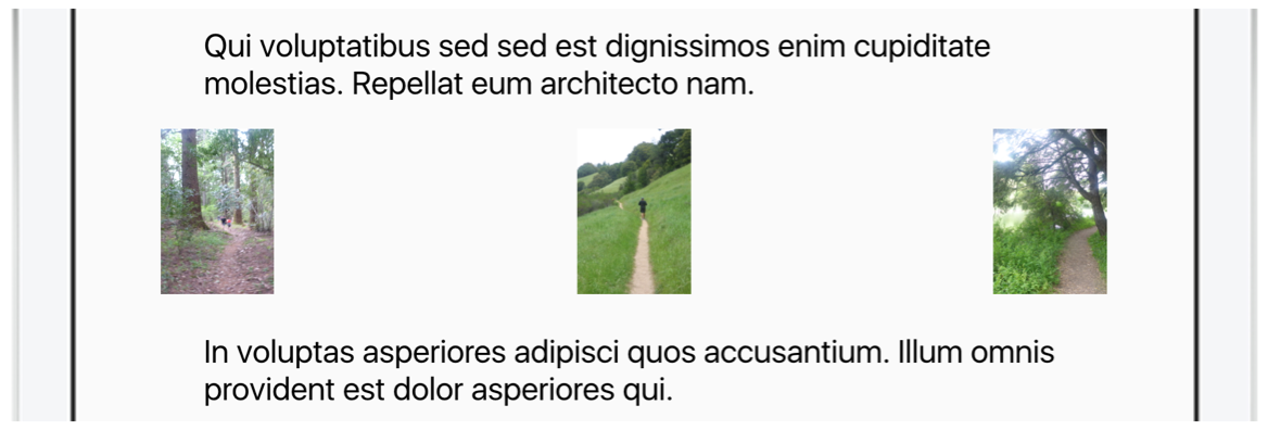This image shows a `CollectionDisplay` with a `distribution` property of `narrow`. | |
| * | |
| * 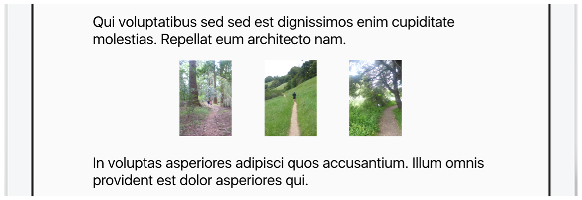This object can be used in [Header](https://developer.apple.com/documentation/apple_news/header), [Container](https://developer.apple.com/documentation/apple_news/container), [Section](https://developer.apple.com/documentation/apple_news/section-ka8), [Chapter](https://developer.apple.com/documentation/apple_news/chapter), [Aside](https://developer.apple.com/documentation/apple_news/aside), and [ArticleLink](https://developer.apple.com/documentation/apple_news/articlelink). | |
| * @example | |
| * ```json | |
| * { | |
| * "components": [ | |
| * { | |
| * "role": "container", | |
| * "contentDisplay": { | |
| * "type": "collection", | |
| * "minimumWidth": 150, | |
| * "gutter": "15", | |
| * "rowSpacing": "30", | |
| * "distribution": "wide" | |
| * }, | |
| * "components": [ | |
| * { | |
| * "role": "image", | |
| * "URL": "bundle://gallery-02.jpg", | |
| * "caption": "Coyotes are also seen in cities more often." | |
| * }, | |
| * { | |
| * "role": "image", | |
| * "URL": "bundle://gallery-03.jpg", | |
| * "explicitContent": true | |
| * } | |
| * ] | |
| * } | |
| * ] | |
| * } | |
| * ``` | |
| * @see https://developer.apple.com/documentation/apple_news/collectiondisplay | |
| */ | |
| export interface CollectionDisplay { | |
| /** | |
| * Always `collection` for this object. | |
| */ | |
| type: "collection"; | |
| /** | |
| * A string that defines how components are aligned within their rows. This is especially visible when `distribution` is set to `narrow`. | |
| * | |
| * Valid values: | |
| * | |
| * - `left` (default). The group of components is left-aligned within the available space. Remaining space is added at the right of the row. | |
| * - `center`. The group of components is centered within the available space. Remaining space is added at both sides of the row. | |
| * - `right`. The group of components is right-aligned within the available space. Remaining space is added at the left of the row. | |
| */ | |
| alignment?: "left" | "center" | "right"; | |
| /** | |
| * A string that defines how components should be distributed horizontally in a row. | |
| * | |
| * Valid values: | |
| * | |
| * - `wide` (default). Components are spread across the full width of the component. Whitespace is equally distributed into the space between components. | |
| * - `narrow`. Components are placed next to each other as closely as possible, separated by the width defined in the `gutter` property. Any remaining whitespace is applied to the left and right of the collection. | |
| */ | |
| distribution?: "wide" | "narrow"; | |
| /** | |
| * A number in points or a string referring to a supported unit of measure defining the vertical gutter between components. | |
| * | |
| * See [Specifying Measurements for Components](https://developer.apple.com/documentation/apple_news/apple_news_format/specifying_measurements_for_components). | |
| * | |
| * This value cannot be negative. | |
| */ | |
| gutter?: SupportedUnits | number; | |
| /** | |
| * A number in points or a string referring to a supported unit of measure defining the maximum width of each child component inside the collection. | |
| * | |
| * If the `maximumWidth` is smaller than the `minimumWidth`, the `minimumWidth` is used. | |
| * | |
| * If no `maximumWidth` is provided, a default of `100cw` is used. | |
| * | |
| * See [Specifying Measurements for Components](https://developer.apple.com/documentation/apple_news/apple_news_format/specifying_measurements_for_components). | |
| */ | |
| maximumWidth?: SupportedUnits | number; | |
| /** | |
| * A number in points or a string referring to a supported unit of measure defining the minimum width of each child component inside the collection. | |
| * | |
| * `minimumWidth` should not exceed the `maximumWidth` value. A child component will never be larger than the width of its parent. If no `minimumWidth` has been provided, News attempts to decide the optimal size for each child component based on its contents. See [Specifying Measurements for Components](https://developer.apple.com/documentation/apple_news/apple_news_format/specifying_measurements_for_components). | |
| * | |
| * This value cannot be negative. | |
| */ | |
| minimumWidth?: SupportedUnits | number; | |
| /** | |
| * A number in points or a string referring to a supported unit of measure defining the horizontal spacing between rows. See [Specifying Measurements for Components](https://developer.apple.com/documentation/apple_news/apple_news_format/specifying_measurements_for_components). | |
| * | |
| * This value cannot be negative. | |
| */ | |
| rowSpacing?: SupportedUnits | number; | |
| /** | |
| * A Boolean value that defines whether the components’ area is allowed to be sized differently per row. | |
| * | |
| * If `true`, individual rows might have different widths for their components to make use of the entire available width. | |
| * | |
| * If `false`, all components in the collection will have the same width. | |
| */ | |
| variableSizing?: boolean; | |
| /** | |
| * A string that defines the approach to prevent the collection from having component widows. | |
| * | |
| * Valid values: | |
| * | |
| * - `equalize`. Every row contains an equal amount of components. When provided with an uneven amount of components, each row consists of 1 component. | |
| * - `optimize` (default). Looks for the most optimal distribution of components, but allows each row to have a different amount of components. | |
| */ | |
| widows?: "equalize" | "optimize"; | |
| } | |
| /** | |
| * You can define colors in different ways in Apple News Format. | |
| * | |
| * ### 3-character RGB | |
| * Use three characters to define red, green and blue (RGB). For example, a value of `#c00` is short for `#cc0000` and makes red. | |
| * | |
| * ### 4-character RGBA | |
| * Use four characters to define RGB and alpha (opacity). For example, a value of `#fc0a` is short for `#ffcc00aa`. | |
| * | |
| * ### 6-character RGB | |
| * Use six characters to define two-character values for each of red, green, and blue. For example, a value of `#0000ff` makes blue. | |
| * | |
| * ### 8-character RGBA | |
| * Use eight characters to define RGBA. For example, in a value of `#000000aa`, the first six characters define RGB, and the last characters define alpha. `#00000000` represents black but fully transparent, while `#000000ff` is fully opaque. | |
| * | |
| * ### Color Names | |
| * Use any of the available color names like `red`, `lightgreen,` or `rebeccapurple`. See [Supported Color Names](https://developer.apple.com/documentation/apple_news/apple_news_format/supported_color_names). | |
| * @see https://developer.apple.com/documentation/apple_news/color | |
| */ | |
| export type Color = string; | |
| /** | |
| * In Apple News Format, every component has a property named `role` that conveys the component’s semantic value and it’s function in the article. For example, a `role` property that has a value of `body` indicates a `body` component, which means that its content will be part of the article’s body text. A component whose `role` property has a value of `photo` represents one of the images in the article. | |
| * | |
| * Important | |
| * | |
| * Don't use this object type directly. Instead, use objects (such as `author,` `title`, `figure`, and so on) that extend the `Component` object. | |
| * | |
| * This object can be used in [ArticleDocument](https://developer.apple.com/documentation/apple_news/articledocument) and [Container](https://developer.apple.com/documentation/apple_news/container). | |
| * @see https://developer.apple.com/documentation/apple_news/component | |
| */ | |
| export type Component = ARKit | ArticleLink | ArticleThumbnail | ArticleTitle | Aside | Audio | Author | BannerAdvertisement | Body | Byline | Caption | Chapter | Container | DataTable | Divider | EmbedWebVideo | FacebookPost | Figure | Gallery | HTMLTable | Header | Heading | Illustrator | Image | Instagram | Intro | Logo | Map | MediumRectangleAdvertisement | Mosaic | Music | Photo | Photographer | Place | Portrait | PullQuote | Quote | ReplicaAdvertisement | Section | Title | Tweet | Video; | |
| /** | |
| * Apply an animation to a component to add movement and interest to your article. | |
| * | |
| * Important | |
| * | |
| * Don't use this object type directly. Instead, use objects (such as [AppearAnimation](https://developer.apple.com/documentation/apple_news/appearanimation), [FadeInAnimation](https://developer.apple.com/documentation/apple_news/fadeinanimation), [MoveInAnimation](https://developer.apple.com/documentation/apple_news/moveinanimation), and [ScaleFadeAnimation](https://developer.apple.com/documentation/apple_news/scalefadeanimation)) that extend animation. | |
| * | |
| * Apple News Format applies a `ComponentAnimation` just once each time a user views your article. (Compare that with component behaviors whose effects are persistent and happen every time a user sees the component in your article.) | |
| * | |
| * Some animations can be controlled by the user with an optional `userControllable` property. | |
| * | |
| * This object can be used in [Component](https://developer.apple.com/documentation/apple_news/component). | |
| * @see https://developer.apple.com/documentation/apple_news/componentanimation | |
| */ | |
| export type ComponentAnimation = AppearAnimation | FadeInAnimation | MoveInAnimation | ScaleFadeAnimation; | |
| /** | |
| * Use the `ComponentLayout` object to define a position for a specific component within the column system defined using the [Layout](https://developer.apple.com/documentation/apple_news/layout) object. | |
| * | |
| * For information on setting the units for the width and height, see [Specifying Measurements for Components](https://developer.apple.com/documentation/apple_news/apple_news_format/specifying_measurements_for_components). For information on aligning components, see [Anchor](https://developer.apple.com/documentation/apple_news/anchor). | |
| * | |
| * Note | |
| * | |
| * If two components refer to the same `ComponentLayout` object, but they exist in containers of different column spans, both components adopt the width of the narrower component. This occur even if the referenced `ComponentLayout` does not explicitly declare `columnStart` or `columnSpan`. In this situation, the child components should have separate layouts. | |
| * | |
| * This object can be used in [ArticleDocument](https://developer.apple.com/documentation/apple_news/articledocument). | |
| * @example | |
| * ```json | |
| * { | |
| * "components": [ | |
| * { | |
| * "role": "heading1", | |
| * "layout": "heading1Layout", | |
| * "text": "Heading Text" | |
| * }, | |
| * { | |
| * "role": "body", | |
| * "text": "Apple News Format allows publishers to craft beautiful editorial layouts. Galleries, audio, video, and fun interactions like animation make stories spring to life." | |
| * } | |
| * ], | |
| * "componentLayouts": { | |
| * "heading1Layout": { | |
| * "columnStart": 0, | |
| * "columnSpan": 7, | |
| * "margin": { | |
| * "top": 24, | |
| * "bottom": 10 | |
| * } | |
| * } | |
| * } | |
| * } | |
| * ``` | |
| * @see https://developer.apple.com/documentation/apple_news/componentlayout | |
| */ | |
| export interface ComponentLayout { | |
| /** | |
| * A number that indicates how many columns the component spans, based on the number of columns in the document. | |
| * | |
| * By default, the component spans the entire width of the document or the width of its container component. | |
| */ | |
| columnSpan?: number; | |
| /** | |
| * A number that indicates which column the component‘s start position is in, based on the number of columns in the document or parent container. | |
| * | |
| * By default, the component starts in the first column (note that the first column is 0, not 1). | |
| */ | |
| columnStart?: number; | |
| /** | |
| * An instance or array of component layout properties that can be applied conditionally, and the conditions that cause them to be applied. | |
| */ | |
| conditional?: ConditionalComponentLayout | ConditionalComponentLayout[]; | |
| /** | |
| * A value that defines a content inset for the component. If applied, the inset is equivalent to half the document gutter. For example, if the article's layout sets the document gutter to `40pt`, the content inset is `20` points. | |
| * | |
| * The contentInset can be a Boolean or `contentInset` object that defines the inset for each side separately. By default, no inset is applied. | |
| * | |
| * Note. This property is deprecated. Use the `padding` property instead. | |
| * @deprecated | |
| */ | |
| contentInset?: ContentInset | boolean; | |
| /** | |
| * A string value that sets the alignment of the content within the component. This property applies only when the width of the content is less than the width of the component. | |
| * | |
| * This property is supported for [Image](https://developer.apple.com/documentation/apple_news/image), [Logo](https://developer.apple.com/documentation/apple_news/logo), [Divider](https://developer.apple.com/documentation/apple_news/divider), and [MediumRectangleAdvertisement](https://developer.apple.com/documentation/apple_news/mediumrectangleadvertisement). All other components ignore this property. | |
| */ | |
| horizontalContentAlignment?: "left" | "center" | "right"; | |
| /** | |
| * A value that indicates whether the gutters (if any) to the left and right of the component should be ignored. The gutter size is defined in the `Layout` object at the root level of the document. | |
| * | |
| * Use this option if you want to position two components right next to each other without a gutter between them. This property applies only when a gutter actually exists to the left or right of the component. The first column does not have a left gutter, and the last column does not have a right gutter. | |
| * | |
| * Valid values: | |
| * | |
| * - `none` (default). Gutters are not ignored. | |
| * - `left`. Left gutter is ignored. | |
| * - `right`. Right gutter is ignored. | |
| * - `both`. Gutters on both sides (if any) are ignored. | |
| * | |
| * You can also set this property to `true` to indicate that both gutters should be ignored, or set it to `false` to ignore none of the gutters. By default, none of the gutters are ignored. | |
| */ | |
| ignoreDocumentGutter?: boolean | "none" | "left" | "right" | "both"; | |
| /** | |
| * Note | |
| * | |
| * New behavior in iOS 13 beta and macOS 10.15 beta. | |
| * | |
| * A value that indicates whether the component should respect or ignore the document’s margins. Ignoring document margins positions the component based on the document's width and margin. | |
| * | |
| * Valid values: | |
| * | |
| * - `none` (default). Margins are not ignored. | |
| * - `left`. Left margin is ignored. | |
| * - `right`. Right margin is ignored. | |
| * - `both`. Margins, if any, on both sides are ignored. | |
| * | |
| * Instead of specifying margins, you can set this property to `true` to indicate that both margins should be ignored, or set it to `false` to ignore neither of the margins. By default, neither margin is ignored. | |
| * | |
| * The layout of a parent component will always constrain any child components. As such, setting `ignoreDocumentMargin` to `true` for a component will have no effect if it is inside of a container with `ignoreDocumentMargin` set to `false`. | |
| * | |
| * Specifying a value other than `none` for `ignoreViewportPadding `will take precedence over any value defined for `ignoreDocumentMargin`. | |
| * | |
| * On a device with screen size wider than the document `width` and `margin` combined, a component with `ignoreDocumentMargin` property set to `true` will extend the width of the document plus the margin, but will not extend into the viewport padding. | |
| */ | |
| ignoreDocumentMargin?: boolean | "none" | "left" | "right" | "both"; | |
| /** | |
| * | |
| * | |
| * Note | |
| * | |
| * Available in iOS 13 beta and macOS 10.15 beta. | |
| * | |
| * A value that indicates whether the component should respect or ignore the viewport padding. Ignoring viewport padding positions the component at the edge of the display screen. This property affects the layout only if the component is in the first or last column. | |
| * | |
| * Valid values: | |
| * | |
| * - `none` (default). Padding is not ignored. | |
| * - `left`. Left padding is ignored. | |
| * - `right`. Right padding is ignored. | |
| * - `both`. Padding, if any, on both sides is ignored. | |
| * | |
| * Instead of specifying padding, you can set this property to `true` to indicate that paddings on both sides should be ignored, or set it to `false` to ignore neither padding. By default, neither padding is ignored. | |
| * | |
| * The layout of a parent component will always constrain any child components. Setting `ignoreViewportPadding` to `true` for a component will have no effect if it is inside of a container with `ignoreViewportPadding` set to `false`. | |
| * | |
| * If `ignoreViewportPadding` is set to `true`, `left`, `right`, or `both` it overrides the layout’s `ignoreDocumentMargin` value and spans the entire screen. | |
| * | |
| * If `ignoreViewportPadding` is set to `none`, the value of `ignoreDocumentMargin` is accepted. | |
| * | |
| * By default, components do not ignore the viewport padding, even if you previously specified `ignoreDocumentMargin` to span the entire width of the screen. To achieve the same functionality, you must update your article to use `ignoreViewportPadding`. | |
| */ | |
| ignoreViewportPadding?: boolean | "none" | "left" | "right" | "both"; | |
| /** | |
| * A value that sets the margins for the top and bottom of the component, as a single integer that gets applied to the top and bottom margins, or as an object containing separate properties for top and bottom. | |
| */ | |
| margin?: Margin | number; | |
| /** | |
| * A value that sets the maximum width of the content within the component. Specify this value as an integer in points or using one of the available units of measure for components. See [Specifying Measurements for Components](https://developer.apple.com/documentation/apple_news/apple_news_format/specifying_measurements_for_components). | |
| * | |
| * This property is supported for [Image](https://developer.apple.com/documentation/apple_news/image)`,`[Logo](https://developer.apple.com/documentation/apple_news/logo)`,`[Divider](https://developer.apple.com/documentation/apple_news/divider)`,` and` `[MediumRectangleAdvertisement](https://developer.apple.com/documentation/apple_news/mediumrectangleadvertisement). All other components ignore this property. | |
| */ | |
| maximumContentWidth?: SupportedUnits | number; | |
| /** | |
| * A value that defines the maximum width of the layout when used within a [Container](https://developer.apple.com/documentation/apple_news/container) with [HorizontalStackDisplay](https://developer.apple.com/documentation/apple_news/horizontalstackdisplay) as the specified `contentDisplay` type. The maximum width can be defined as an integer in points or using one of the available units of measure for components. See [Specifying Measurements for Components](https://developer.apple.com/documentation/apple_news/apple_news_format/specifying_measurements_for_components). | |
| */ | |
| maximumWidth?: SupportedUnits | number; | |
| /** | |
| * A value that sets the minimum height of the component. A component is taller than its defined `minimumHeight` when the contents require the component to be taller. The minimum height can be defined as an integer in points or using one of the available units of measure for components. See [Specifying Measurements for Components](https://developer.apple.com/documentation/apple_news/apple_news_format/specifying_measurements_for_components). | |
| */ | |
| minimumHeight?: SupportedUnits | number; | |
| /** | |
| * A value that defines the minimum width of the layout when used within a [Container](https://developer.apple.com/documentation/apple_news/container) with [HorizontalStackDisplay](https://developer.apple.com/documentation/apple_news/horizontalstackdisplay) as the specified `contentDisplay` type. The minimum width can be defined as an integer in points or using one of the available units of measure for components. See [Specifying Measurements for Components](https://developer.apple.com/documentation/apple_news/apple_news_format/specifying_measurements_for_components). | |
| */ | |
| minimumWidth?: SupportedUnits | number; | |
| /** | |
| * A value that defines the padding between the content of the component and the edges of the component. Padding can be defined as an integer in points or using one of the available units of measure for components. See [Specifying Measurements for Components](https://developer.apple.com/documentation/apple_news/apple_news_format/specifying_measurements_for_components). | |
| */ | |
| padding?: SupportedUnits | Padding | number; | |
| } | |
| /** | |
| * Use the `ComponentLink` object to define a link for a component by specifying the URL. The following URLs are supported: | |
| * | |
| * - Valid Apple News URL beginning with `https://apple.news/`. | |
| * - URL that is associated with an Apple News article by its `canonicalURL` in [Metadata](https://developer.apple.com/documentation/apple_news/metadata). | |
| * - Links to the iTunes Store, the App Store, the iBooks Store, or Apple Podcasts created using [Link Maker](https://linkmaker.itunes.apple.com/). | |
| * - Links to Apple Music created using [Apple Music Toolbox](https://tools.applemusic.com). | |
| * | |
| * Note | |
| * | |
| * Links that cannot be resolved to a valid entity are ignored. | |
| * | |
| * This object can be used in [Aside](https://developer.apple.com/documentation/apple_news/aside), [Chapter](https://developer.apple.com/documentation/apple_news/chapter), [Container](https://developer.apple.com/documentation/apple_news/container), [Logo](https://developer.apple.com/documentation/apple_news/logo), [Image](https://developer.apple.com/documentation/apple_news/image), and [Section](https://developer.apple.com/documentation/apple_news/section-ka8). | |
| * @example | |
| * ```json | |
| * { | |
| * "components": [ | |
| * { | |
| * "role": "image", | |
| * "URL": "bundle://image.jpg", | |
| * "additions": [ | |
| * { | |
| * "type": "link", | |
| * "URL": "https://apple.news/TqT-jfrI0QXaYqGoz68HYeQ" | |
| * } | |
| * ] | |
| * } | |
| * ] | |
| * } | |
| * ``` | |
| * @see https://developer.apple.com/documentation/apple_news/componentlink | |
| */ | |
| export interface ComponentLink { | |
| /** | |
| * The type of addition should be `link` for a Component Link. | |
| */ | |
| type: "link"; | |
| /** | |
| * The URL that should be opened when a user interacts with the component. Use a valid Apple News URL beginning with `https://apple.news/`, or a URL that is associated with an Apple News article by its `canonicalURL` in [Metadata](https://developer.apple.com/documentation/apple_news/metadata), or a URL to the iTunes Store, the App Store, the iBooks Store, Apple Podcasts, and Apple Music. | |
| */ | |
| URL: string; | |
| } | |
| /** | |
| * Note | |
| * | |
| * Available in iOS 13 beta and macOS 10.15 beta. | |
| * | |
| * Use a `ComponentShadow` object to define a shadow that can be applied to components as part of [ComponentStyle](https://developer.apple.com/documentation/apple_news/componentstyle). | |
| * @example | |
| * ```json | |
| * { | |
| * "componentStyles": { | |
| * "exampleStyle": { | |
| * "backgroundColor": "#FFF", | |
| * "shadow": { | |
| * "color": "#33333350", | |
| * "opacity": 0.33, | |
| * "radius": "10cw", | |
| * "offset": { | |
| * "x": 2, | |
| * "y": "10cw" | |
| * } | |
| * } | |
| * } | |
| * } | |
| * } | |
| * ``` | |
| * @see https://developer.apple.com/documentation/apple_news/componentshadow | |
| */ | |
| export interface ComponentShadow { | |
| /** | |
| * The component shadow color. | |
| */ | |
| color: Color; | |
| /** | |
| * The shadow’s radius. | |
| */ | |
| radius: SupportedUnits; | |
| /** | |
| * The shadow’s offset. | |
| */ | |
| offset?: ComponentShadowOffset; | |
| /** | |
| * The opacity of the shadow as a value between `0` and `1`. | |
| */ | |
| opacity?: number; | |
| } | |
| /** | |
| * Note | |
| * | |
| * Available in iOS 13 beta and macOS 10.15 beta. | |
| * | |
| * Use the `ComponentShadowOffset` object to define an offset. A positive `x` value moves the content to the left, and a negative `x` value moves the content to the right. A positive `y` value moves the content up, and a negative `y` value moves the content down. | |
| * @example | |
| * ```json | |
| * { | |
| * "componentStyles": { | |
| * "exampleStyle": { | |
| * "backgroundColor": "#FFF", | |
| * "shadow": { | |
| * "color": "#33333350", | |
| * "opacity": 0.33, | |
| * "radius": "10cw", | |
| * "offset": { | |
| * "x": 2, | |
| * "y": "10cw" | |
| * } | |
| * } | |
| * } | |
| * } | |
| * } | |
| * ``` | |
| * @see https://developer.apple.com/documentation/apple_news/componentshadowoffset | |
| */ | |
| export interface ComponentShadowOffset { | |
| /** | |
| * The `x` offset, as a value in [`SupportedUnits`](https://developer.apple.com/documentation/apple_news/supportedunits). Implementation is device dependent. | |
| */ | |
| x?: SupportedUnits | number; | |
| /** | |
| * The `y` offset, as a value in [`SupportedUnits`](https://developer.apple.com/documentation/apple_news/supportedunits). Implementation is device dependent. | |
| */ | |
| y?: SupportedUnits | number; | |
| } | |
| /** | |
| * Use the `ComponentStyle` object to define the visual appearance of a component, including its background color, fill, opacity, borders, and table style. | |
| * | |
| * This object can be used in [Component](https://developer.apple.com/documentation/apple_news/component) and [ArticleDocument.componentStyles](https://developer.apple.com/documentation/apple_news/articledocument/componentstyles). | |
| * @example | |
| * ```json | |
| * { | |
| * "components": [ | |
| * { | |
| * "role": "container", | |
| * "style": "exampleComponentStyle", | |
| * "components": [ | |
| * { | |
| * "role": "title", | |
| * "text": "Drought" | |
| * } | |
| * ] | |
| * } | |
| * ], | |
| * "componentStyles": { | |
| * "exampleComponentStyle": { | |
| * "backgroundColor": "#FFFFFF", | |
| * "opacity": 1, | |
| * "border": { | |
| * "all": { | |
| * "width": 1, | |
| * "color": "#333" | |
| * }, | |
| * "left": false, | |
| * "right": false | |
| * } | |
| * } | |
| * } | |
| * } | |
| * ``` | |
| * @see https://developer.apple.com/documentation/apple_news/componentstyle | |
| */ | |
| export interface ComponentStyle { | |
| /** | |
| * The component's background color. The value defaults to transparent. | |
| * | |
| * The `none` value is used for conditional design elements. Adding it here has no effect. | |
| */ | |
| backgroundColor?: Color | "none"; | |
| /** | |
| * The border for the component. Because the border is drawn inside the component, it affects the size of the content within the component. The bigger the border, the less available space for content. | |
| * | |
| * The `none` value is used for conditional design elements. Adding it here has no effect. | |
| */ | |
| border?: Border | "none"; | |
| /** | |
| * An instance or array of component style properties that are applied conditionally, and the conditions that cause them to be applied. | |
| */ | |
| conditional?: ConditionalComponentStyle | ConditionalComponentStyle[]; | |
| /** | |
| * A `Fill` object, such as an [ImageFill](https://developer.apple.com/documentation/apple_news/imagefill), that will be applied on top of the specified `backgroundColor`. | |
| * | |
| * By default, no fill is applied. | |
| * | |
| * The `none` value is used for conditional design elements. Adding it here has no effect. | |
| */ | |
| fill?: Fill | "none"; | |
| /** | |
| * The object that defines a mask that clips the contents of the component to the specified masking behavior. | |
| * | |
| * The `none` value is used for conditional design elements. Adding it here has no effect. | |
| */ | |
| mask?: CornerMask | "none"; | |
| /** | |
| * The opacity of the component, set as a float value between `0` (completely transparent) and `1` (completely opaque). The effects of the component’s opacity are inherited by any child components. See [Nesting Components in an Article](https://developer.apple.com/documentation/apple_news/apple_news_format/components/nesting_components_in_an_article). | |
| */ | |
| opacity?: number; | |
| /** | |
| * The object that defines a component shadow. | |
| */ | |
| shadow?: ComponentShadow; | |
| /** | |
| * The styling for the rows, columns, and cells of the component, if it is a [DataTable](https://developer.apple.com/documentation/apple_news/datatable) or [HTMLTable](https://developer.apple.com/documentation/apple_news/htmltable) component. | |
| * | |
| * The `none` value is used for conditional design elements. Adding it here has no effect. | |
| */ | |
| tableStyle?: TableStyle | "none"; | |
| } | |
| /** | |
| * Use a `ComponentTextStyle` object to define the text style for an entire text component (such as `body` or `heading`). A `ComponentTextStyle` object can have the same properties as a `TextStyle` object, as well as some additional properties such as a drop cap and text alignment. | |
| * | |
| * To use a `ComponentTextStyle` once: | |
| * | |
| * - Include a `ComponentTextStyle` object as the value of the individual component’s `style` property. | |
| * | |
| * To define a style that can be used by multiple components: | |
| * | |
| * 1. Include a property, with a name that you define and a `ComponentTextStyle` object value, in the [ArticleDocument.componentTextStyles](https://developer.apple.com/documentation/apple_news/articledocument/componenttextstyles) object. | |
| * 2. Use the name you created as the value of the individual component’s `textStyle` property. | |
| * | |
| * To create a default text style for the article: | |
| * | |
| * - Define a componen text style in [ArticleDocument.componentTextStyles](https://developer.apple.com/documentation/apple_news/articledocument/componenttextstyles) object and use the key `default`. | |
| * | |
| * To create a default component text style for a `role`: | |
| * | |
| * - Define a component text style in [ArticleDocument.componentTextStyles](https://developer.apple.com/documentation/apple_news/articledocument/componenttextstyles) and use the key `default-`. For example, if you define a component text style with the key `default-title`, all components with a `role` of `title` will use that style, unless you override it. | |
| * | |
| * For more about properties, objects, keys, and values, see [JSON Concepts and Article Structure](https://developer.apple.com/documentation/apple_news/apple_news_format/json_concepts_and_article_structure). For more about components and roles, see [Components](https://developer.apple.com/documentation/apple_news/apple_news_format/components). | |
| * | |
| * This object can be used in [Text](https://developer.apple.com/documentation/apple_news/text) and [ArticleDocument.componentTextStyles](https://developer.apple.com/documentation/apple_news/articledocument/componenttextstyles). | |
| * @example | |
| * ```json | |
| * { | |
| * "componentTextStyles": { | |
| * "exampleStyle": { | |
| * "fontName": "HelveticaNeue", | |
| * "fontSize": 20, | |
| * "dropCapStyle": { | |
| * "numberOfLines": 3, | |
| * "numberOfRaisedLines": 2, | |
| * "numberOfCharacters": 1, | |
| * "fontName": "HelveticaNeue", | |
| * "textColor": "#FFF", | |
| * "backgroundColor": "#000", | |
| * "padding": 5 | |
| * } | |
| * } | |
| * }, | |
| * "components": [ | |
| * { | |
| * "role": "body", | |
| * "text": "This is body text", | |
| * "textStyle": "exampleStyle" | |
| * } | |
| * ] | |
| * } | |
| * ``` | |
| * @see https://developer.apple.com/documentation/apple_news/componenttextstyle | |
| */ | |
| export interface ComponentTextStyle { | |
| /** | |
| * The background color for text lines. The value defaults to transparent. | |
| * | |
| * The `none` value is used for conditional design elements. Adding it here has no effect. | |
| */ | |
| backgroundColor?: Color | "none"; | |
| /** | |
| * An instance or array of component text style properties that can be applied conditionally, and the conditions that cause them to be applied. | |
| */ | |
| conditional?: ConditionalComponentTextStyle | ConditionalComponentTextStyle[]; | |
| /** | |
| * The style of drop cap to apply to the first paragraph of the component. | |
| * | |
| * The `none` value is used for conditional design elements. Adding it here has no effect. | |
| */ | |
| dropCapStyle?: DropCapStyle | "none"; | |
| /** | |
| * The indent of the first line of each paragraph in points. | |
| */ | |
| firstLineIndent?: number; | |
| /** | |
| * The font family to use for text rendering; for example, `Gill` `Sans`. Using a combination of `fontFamily`, `fontWidth`, `fontWeight`, and `fontStyle`, you can define the appearance of the text. Apple News automatically selects the appropriate font variant from the available variants in that family. See [About Apple News Format Fonts](https://developer.apple.com/documentation/apple_news/apple_news_format/text_styles/about_apple_news_format_fonts). | |
| * | |
| * Note | |
| * | |
| * Available in iOS 13 beta and macOS 10.15 beta. | |
| * | |
| * In iOS 13 and macOS 10.15, you can use the value `system` to show text in the default font used by the operating system. | |
| */ | |
| fontFamily?: string | "system"; | |
| /** | |
| * The `fontName` to refer to an explicit font variant’s Postscript name, such as `GillSans-Bold`. Alternatively, you can use a combination of `fontFamily`, `fontWeight`, `fontWidth` and/or `fontStyle` to have News automatically select the appropriate variant depending on the text formatting used. | |
| * | |
| * See [About Apple News Format Fonts](https://developer.apple.com/documentation/apple_news/apple_news_format/text_styles/about_apple_news_format_fonts). | |
| */ | |
| fontName?: string; | |
| /** | |
| * Note | |
| * | |
| * Available in iOS 13 beta and macOS 10.15 beta. | |
| * | |
| * A Boolean value that indicates whether scaling of font sizes for various screen sizes is enabled. By default, all font sizes in Apple News Format are scaled down on smaller screen sizes. | |
| */ | |
| fontScaling?: boolean; | |
| /** | |
| * The size of the font, in points. By default, the font size will be inherited from a parent component or a default style. As a best practice, try not to go below 16 points for body text. The `fontSize` may be automatically resized for different device sizes or for iOS devices with Larger Accessibility Sizes enabled. | |
| */ | |
| fontSize?: number; | |
| /** | |
| * The font style to apply. | |
| * | |
| * Valid values: | |
| * | |
| * - `normal`. Selects from the font family a font that is defined as normal | |
| * - `italic`. Selects from the font family a font that is defined as italic. If the family does not contain an italic font variant, but contains an oblique variant, then `oblique` is selected instead. | |
| * - `oblique`. Selects from the font family a font that is defined as oblique. If the family does not contain an oblique font variant, but contains an italic variant, then `italic` is selected. | |
| */ | |
| fontStyle?: "normal" | "italic" | "oblique"; | |
| /** | |
| * The font weight to apply for font selection. In addition to explicit weights (named or numerical), `lighter` and `bolder` are available, to set text in a lighter or bolder font as compared to its surrounding text. | |
| * | |
| * If a font variant with the given specifications cannot be found in the provided font family, an alternative is selected that has the closest match. If no bold/bolder font is found, News will not create a faux-bold alternative, but will fall back to the closest match. Similarly, if no italic or oblique font variant is found, text will not be slanted to make text appear italicized. | |
| * | |
| * Valid values: | |
| * | |
| * - `thin` or `100`. Thin/hairline weight. | |
| * - `extra-light`, `ultra-light` or `200`. Extra-light/ultra-light weight. | |
| * - `light` or `300`. Light weight. | |
| * - `regular`, `normal`, `book`, `roman` or `400` (default). Regular weight. This is the default weight if no weight is defined or inherited. | |
| * - `medium` or `500`. Medium weight. | |
| * - `semi-bold`, `demi-bold` `or` `600`. Semi-bold/demi-bold weight. | |
| * - `bold` or `700`. Bold weight. This is the default when using `<strong>` or `<b>` tags in HTML formatted text with default `fontWeight`. | |
| * - `extra-bold`, `ultra-bold` or `800`. Extra-bold/ultra-bold weight. | |
| * - `black`, `heavy` or `900`. Black/heavy weight. | |
| * - `lighter`. A weight lighter than its surrounding text. When surrounding text is made bold, a value of `lighter` would make it medium. | |
| * - `bolder`. A weight heavier than its surrounding text. When surrounding text is made light, a value of `bolder` would make it regular. | |
| */ | |
| fontWeight?: number | string; | |
| /** | |
| * The font width to apply for font selection (known in CSS as `font-stretch`) defines the width characteristics of a font variant between `normal`, `condensed` and `expanded`. Some font families have separate families assigned for different widths (for example, `Avenir Next` and `Avenir Next Condensed`), so make sure that the `fontFamily` you select supports the specified `fontWidth`. | |
| * | |
| * Valid values: | |
| * | |
| * - `ultra-condensed`. Specifies the most condensed variant. | |
| * - `extra-condensed`. Specifies a very condensed variant. | |
| * - `condensed`. Specifies a condensed variant. | |
| * - `semi-condensed`. Specifies a semi-condensed variant.` ` | |
| * - `normal` (default). Specifies the font variant classified as normal. | |
| * - `semi-expanded`. Specifies a semi-expanded variant.` ` | |
| * - `expanded`. Specifies an expanded variant. | |
| * - `extra-expanded`. Specifies a very expanded variant.` ` | |
| * - `ultra-expanded`. Specifies the most expanded variant. | |
| */ | |
| fontWidth?: "ultra-condensed" | "extra-condensed" | "condensed" | "semi-condensed" | "normal" | "semi-expanded" | "expanded" | "extra-expanded" | "ultra-expanded"; | |
| /** | |
| * A Boolean value that defines whether punctuation should be positioned outside the margins of the text. | |
| */ | |
| hangingPunctuation?: boolean; | |
| /** | |
| * A Boolean value that indicates whether text should be hyphenated when necessary. By default, only components with a `role` of `body` or `intro` have hyphenation enabled. All other components default to `false`. | |
| */ | |
| hyphenation?: boolean; | |
| /** | |
| * A number that provides the default line height, in points. The `lineHeigh`t is recalculated as necessary, relative to the `fontSize`. For example, when the font is automatically resized to fit a smaller screen, the line height will also be adjusted accordingly. | |
| */ | |
| lineHeight?: number; | |
| /** | |
| * An object that provides text styling for all links within a text component. | |
| * | |
| * The `none` value is used for conditional design elements. Adding it here has no effect. | |
| */ | |
| linkStyle?: TextStyle | "none"; | |
| /** | |
| * An object for use with text components with HTML markup. You can create text styles containing an `orderedListItems` definition to configure how list items inside `<ol>` tags should be displayed. | |
| * | |
| * The `none` value is used for conditional design elements. Adding it here has no effect. | |
| */ | |
| orderedListItems?: ListItemStyle | "none"; | |
| /** | |
| * A number that defines the spacing after each paragraph in points relative to the `lineHeight`. | |
| */ | |
| paragraphSpacingAfter?: number; | |
| /** | |
| * A number that defines the spacing before each paragraph in points relative to the `lineHeight`. | |
| */ | |
| paragraphSpacingBefore?: number; | |
| /** | |
| * The text strikethrough. Set `strikethrough` to `true` to use the text color inherited from the `textColor` property as the strikethrough color, or provide a text decoration definition with a different color. | |
| */ | |
| strikethrough?: TextDecoration | boolean; | |
| /** | |
| * The `stroke` style for the text outline. By default, `stroke` will be omitted. | |
| * | |
| * The `none` value is used for conditional design elements. Adding it here has no effect. | |
| */ | |
| stroke?: TextStrokeStyle | "none"; | |
| /** | |
| * The justification for all text within the component. | |
| * | |
| * If `textAlignment` is omitted or set to `none`, the justification will be determined by the text direction (left-to-right text will be aligned to the left and right-to-left text will be aligned to the right). | |
| */ | |
| textAlignment?: "left" | "center" | "right" | "justified" | "none"; | |
| /** | |
| * The text color. | |
| */ | |
| textColor?: Color; | |
| /** | |
| * The text shadow for this style. | |
| * | |
| * The `none` value is used for conditional design elements. Adding it here has no effect. | |
| */ | |
| textShadow?: TextShadow | "none"; | |
| /** | |
| * The transform to apply to the text. | |
| * | |
| * Valid values: | |
| * | |
| * - `uppercase` | |
| * - `lowercase` | |
| * - `capitalize`. `C`apitalizes the first letter of all words in the string. | |
| * - `none` (default) | |
| */ | |
| textTransform?: "uppercase" | "lowercase" | "capitalize" | "none"; | |
| /** | |
| * The amount of tracking (spacing between characters) in text, as a percentage of the `fontSize`. The actual spacing between letters is determined by combining information from the font and font size. | |
| * | |
| * Example: Set `tracking` to `0.5` to make the distance between characters increase by 50% of the `fontSize`. With a font size of 10, the additional space between characters is 5 points. | |
| */ | |
| tracking?: number; | |
| /** | |
| * The text underlining. This style can be used for links. Set `underline` to `true` to use the text color as the underline color, or provide a text decoration with a different color. | |
| */ | |
| underline?: TextDecoration | boolean; | |
| /** | |
| * The object for use with text components with HTML markup. You can create text styles containing an `unorderedListItems` definition to configure how list items inside `<ul>` tags should be displayed. | |
| * | |
| * The `none` value is used for conditional design elements. Adding it here has no effect. | |
| */ | |
| unorderedListItems?: ListItemStyle | "none"; | |
| /** | |
| * The vertical alignment of the text. You can use this property for superscripts and subscripts. | |
| * | |
| * To override values specified in parent text styles, use `baseline`. | |
| * | |
| * Defaults to `baseline` when unspecified, and inherits the value specified in a `TextStyle` applied to the same range. | |
| * | |
| * The values `superscript` and `subscript` also adjust the font size to 2/3 of the size defined for that character range. | |
| */ | |
| verticalAlignment?: "superscript" | "subscript" | "baseline"; | |
| } | |
| /** | |
| * Use the `Condition` object to define the condition under which the associated properties are applied. | |
| * | |
| * This object is used in [ConditionalComponent](https://developer.apple.com/documentation/apple_news/conditionalcomponent), [ConditionalContainer](https://developer.apple.com/documentation/apple_news/conditionalcontainer), [ConditionalSection](https://developer.apple.com/documentation/apple_news/conditionalsection), [ConditionalText](https://developer.apple.com/documentation/apple_news/conditionaltext), [ConditionalComponentLayout](https://developer.apple.com/documentation/apple_news/conditionalcomponentlayout), [ConditionalComponentStyle](https://developer.apple.com/documentation/apple_news/conditionalcomponentstyle), [ConditionalComponentTextStyle](https://developer.apple.com/documentation/apple_news/conditionalcomponenttextstyle), [ConditionalTextStyle](https://developer.apple.com/documentation/apple_news/conditionaltextstyle) and [ConditionalAutoPlacement](https://developer.apple.com/documentation/apple_news/conditionalautoplacement). | |
| * @example | |
| * ```json | |
| * { | |
| * "components": [ | |
| * { | |
| * "role": "photo", | |
| * "URL": "bundle://summer.jpg", | |
| * "layout": "exampleLayout", | |
| * "caption": "Thanks to the record drought, mountain lions have begun to descend from the peaks.", | |
| * "hidden": false, | |
| * "conditional": { | |
| * "hidden": true, | |
| * "conditions": { | |
| * "maxViewportWidth": 320 | |
| * } | |
| * } | |
| * } | |
| * ], | |
| * "componentLayouts": { | |
| * "exampleLayout": { | |
| * "ignoreDocumentMargin": true, | |
| * "conditional": [ | |
| * { | |
| * "ignoreDocumentMargin": false, | |
| * "conditions": [ | |
| * { | |
| * "minViewportWidth": 768 | |
| * } | |
| * ] | |
| * } | |
| * ] | |
| * } | |
| * } | |
| * } | |
| * ``` | |
| * @see https://developer.apple.com/documentation/apple_news/condition | |
| */ | |
| export interface Condition { | |
| /** | |
| * A string describing the width at which the article is displayed. The value indicates whether the article width is considered constrained (`compact`) or expansive (r`egular`) by iOS. When the article is displayed at the specified size class, the conditional properties are in effect. The horizontal size class is always `regular` in macOS. | |
| */ | |
| horizontalSizeClass?: "any" | "regular" | "compact"; | |
| /** | |
| * The maximum number of columns in which the article is displayed. When the article is viewed with the specified number of columns or fewer, the conditional properties are in effect. For more information about the column system, see [Planning the Layout for Your Article](https://developer.apple.com/documentation/apple_news/apple_news_format/planning_the_layout_for_your_article). | |
| */ | |
| maxColumns?: number; | |
| /** | |
| * A string indicating a dynamic type size at which text in the article is displayed. When the article is displayed at the specified size or smaller, the conditional properties are in effect. The default content size category in iOS and macOS is `L`. | |
| */ | |
| maxContentSizeCategory?: "XS" | "S" | "M" | "L" | "XL" | "XXL" | "XXXL" | "AX-M" | "AX-L" | "AX-XL" | "AX-XXL" | "AX-XXXL"; | |
| /** | |
| * An Apple News Format version that can be used by an Apple News client that is displaying an article. When the Apple News Format version is equal to or less than the specified value, the conditional properties are in effect. | |
| */ | |
| maxSpecVersion?: string; | |
| /** | |
| * A number indicating a width divided by a height. When the aspect ratio of the user’s viewport is the specified value or smaller, the conditional properties are in effect. | |
| */ | |
| maxViewportAspectRatio?: number; | |
| /** | |
| * A number indicating width in points. When the width of the user’s viewport is the specified value or smaller, the conditional properties are in effect. | |
| */ | |
| maxViewportWidth?: number; | |
| /** | |
| * The minimum number of columns in which the article is displayed. When the article is viewed with the specified number of columns or more, the conditional properties are in effect. For more information about the column system, see [Planning the Layout for Your Article](https://developer.apple.com/documentation/apple_news/apple_news_format/planning_the_layout_for_your_article). | |
| */ | |
| minColumns?: number; | |
| /** | |
| * A string indicating a dynamic type size at which text in the article is displayed. When the article is displayed at the specified dynamic type size or greater, the conditional properties are in effect. The default content size category in iOS and macOS is `L`. | |
| */ | |
| minContentSizeCategory?: "XS" | "S" | "M" | "L" | "XL" | "XXL" | "XXXL" | "AX-M" | "AX-L" | "AX-XL" | "AX-XXL" | "AX-XXXL"; | |
| /** | |
| * An Apple News Format version that can be used by an Apple News client that is displaying an article. When the Apple News Format version is equal to or greater than the specified value, the conditional properties are in effect. | |
| */ | |
| minSpecVersion?: string; | |
| /** | |
| * A number indicating a width divided by a height. When the aspect ratio of the user’s viewport is the specified value or greater, the conditional properties are in effect. | |
| */ | |
| minViewportAspectRatio?: number; | |
| /** | |
| * A number indicating the width in points. When the width of the user’s viewport is the specified value or greater, the conditional properties are in effect. | |
| */ | |
| minViewportWidth?: number; | |
| /** | |
| * A platform on which an article can be viewed. When the article is viewed on the specified platform, the conditional properties are in effect. | |
| */ | |
| platform?: "any" | "ios" | "macos" | "web"; | |
| /** | |
| * Note | |
| * | |
| * Available in iOS 13 beta and macOS 10.15 beta. | |
| * | |
| * A string describing the user's preferred color theme for the system. | |
| * | |
| * Valid values: | |
| * | |
| * - `any`. The user has no preference. | |
| * - `light`. The user has not enabled Dark Mode. | |
| * - `dark`. The user has enabled Dark Mode. | |
| */ | |
| preferredColorScheme?: "any" | "light" | "dark"; | |
| /** | |
| * The type of subscription the user has. When the subscription is of the specified type, the conditional properties are in effect. | |
| */ | |
| subscriptionStatus?: "bundle" | "subscribed"; | |
| /** | |
| * A string describing the height at which the article is displayed. The value indicates whether the article width is considered constrained (`compact`) or expansive (`regular`) by iOS. When the article is displayed at the specified size class, the conditional properties are in effect. The vertical size class is always `regular` in macOS. | |
| */ | |
| verticalSizeClass?: "any" | "regular" | "compact"; | |
| /** | |
| * The context of the article. When the context is of the specified type, the conditional properties are in effect. | |
| */ | |
| viewLocation?: "any" | "article" | "issue_table_of_contents" | "issue"; | |
| } | |
| /** | |
| * Use the `ConditionalAutoPlacement` object to define an array of conditional automatic placement properties and the conditions under which to apply them. When a condition is met, the value of a property in `ConditionalAutoPlacement` overrides the value of the same property if defined in the parent `AdvertisementAutoPlacement` object. See [AdvertisementAutoPlacement](https://developer.apple.com/documentation/apple_news/advertisementautoplacement). | |
| * @example | |
| * ```json | |
| * { | |
| * "version": "1.9", | |
| * "identifier": "SampleArticle", | |
| * "language": "en", | |
| * "title": "Apple News", | |
| * "subtitle": "A look at the features of Apple News", | |
| * "layout": { | |
| * "columns": 7, | |
| * "width": 1024, | |
| * "margin": 75, | |
| * "gutter": 20 | |
| * }, | |
| * "autoplacement": { | |
| * "advertisement": { | |
| * "enabled": true, | |
| * "bannerType": "any", | |
| * "distanceFromMedia": "50vh", | |
| * "frequency": 10, | |
| * "layout": { | |
| * "margin": 10 | |
| * }, | |
| * "conditional": [ | |
| * { | |
| * "enabled": false, | |
| * "conditions": [ | |
| * { | |
| * "verticalSizeClass": "compact" | |
| * } | |
| * ] | |
| * } | |
| * ] | |
| * } | |
| * }, | |
| * … | |
| * } | |
| * ``` | |
| * @see https://developer.apple.com/documentation/apple_news/conditionalautoplacement | |
| */ | |
| export interface ConditionalAutoPlacement { | |
| /** | |
| * An instance or array of conditions that, when met, cause the conditional automatic placement properties to take effect. | |
| */ | |
| conditions: Condition | Condition[]; | |
| /** | |
| * A Boolean that defines whether placement of advertisements is enabled. | |
| */ | |
| enabled?: boolean; | |
| /** | |
| * A value that defines the layout properties for the automatically inserted components. | |
| */ | |
| layout?: AutoPlacementLayout; | |
| } | |
| /** | |
| * Use the `ConditionalComponent` object to define an array of conditional component properties and the conditions under which to apply them. When a condition is met, the value of a property in `ConditionalComponent` overrides the value of the same property if defined in the parent component. See [Component](https://developer.apple.com/documentation/apple_news/component). | |
| * @example | |
| * ```json | |
| * { | |
| * "components": [ | |
| * { | |
| * "role": "title", | |
| * "text": "Article Title", | |
| * "style": "red-background", | |
| * "textStyle": { | |
| * "textAlignment": "center" | |
| * }, | |
| * "layout": "short-header", | |
| * "conditional": [ | |
| * { | |
| * "style": "blue-background", | |
| * "textStyle": { | |
| * "textAlignment": "left" | |
| * }, | |
| * "layout": "tall-header", | |
| * "conditions": [ | |
| * { | |
| * "minViewportWidth": 415 | |
| * } | |
| * ] | |
| * } | |
| * ] | |
| * } | |
| * ], | |
| * "componentStyles": { | |
| * "red-background": { | |
| * "backgroundColor": "red" | |
| * }, | |
| * "blue-background": { | |
| * "backgroundColor": "blue" | |
| * } | |
| * }, | |
| * "componentLayouts": { | |
| * "short-header": { | |
| * "minimumHeight": 100 | |
| * }, | |
| * "tall-header": { | |
| * "minimumHeight": 200 | |
| * } | |
| * } | |
| * } | |
| * ``` | |
| * @see https://developer.apple.com/documentation/apple_news/conditionalcomponent | |
| */ | |
| export interface ConditionalComponent { | |
| /** | |
| * An instance or array of conditions that, when met, cause the conditional component properties to take effect. | |
| */ | |
| conditions: Condition | Condition[]; | |
| /** | |
| * An object that defines vertical alignment with another component. | |
| */ | |
| anchor?: Anchor; | |
| /** | |
| * An object that defines an animation to be applied to the component. | |
| * | |
| * To remove a previously set condition, use `none`. | |
| */ | |
| animation?: ComponentAnimation | "none"; | |
| /** | |
| * An object that defines behavior for a component, like [Parallax](https://developer.apple.com/documentation/apple_news/parallax) or [Springy](https://developer.apple.com/documentation/apple_news/springy). | |
| * | |
| * To remove a previously set condition, use `none`. | |
| */ | |
| behavior?: Behavior | "none"; | |
| /** | |
| * A Boolean value that determines whether the component is hidden. | |
| */ | |
| hidden?: boolean; | |
| /** | |
| * An inline `ComponentLayout` object that contains layout information, or a string reference to a `ComponentLayout` object that is defined at the top level of the document. | |
| * | |
| * If layout is not defined, size and position are based on various factors, such as the device type, the length of the content, and the `role` of this component. | |
| */ | |
| layout?: ComponentLayout | string; | |
| /** | |
| * An inline `ComponentStyle` object that defines the appearance of this component, or a string reference to a `ComponentStyle` object that is defined at the top level of the document. | |
| * | |
| * To remove a previously set condition, use `none`. | |
| */ | |
| style?: ComponentStyle | string | "none"; | |
| } | |
| /** | |
| * Use the `ConditionalComponentLayout` object to define an array of conditional component layout properties and the conditions under which to apply them. When a condition is met, the value of a property in `ConditionalComponentLayout` overrides the value of the same property if defined in the parent `ComponentLayout` object. See [ComponentLayout](https://developer.apple.com/documentation/apple_news/componentlayout). | |
| * @example | |
| * ```json | |
| * { | |
| * "components": [ | |
| * { | |
| * "role": "photo", | |
| * "URL": "bundle://summer.jpg", | |
| * "layout": "exampleLayout", | |
| * "caption": "Thanks to the record drought, mountain lions have begun to descend from the peaks." | |
| * } | |
| * ], | |
| * "componentLayouts": { | |
| * "exampleLayout": { | |
| * "ignoreDocumentMargin": true, | |
| * "conditional": [ | |
| * { | |
| * "ignoreDocumentMargin": false, | |
| * "conditions": [ | |
| * { | |
| * "minViewportWidth": 415 | |
| * } | |
| * ] | |
| * } | |
| * ] | |
| * } | |
| * } | |
| * } | |
| * ``` | |
| * @see https://developer.apple.com/documentation/apple_news/conditionalcomponentlayout | |
| */ | |
| export interface ConditionalComponentLayout { | |
| /** | |
| * An instance or array of conditions that, when met, cause the conditional component layout properties to take effect. | |
| */ | |
| conditions: Condition | Condition[]; | |
| /** | |
| * A number that indicates how many columns the component spans, based on the number of columns in the document. | |
| * | |
| * By default, the component spans the entire width of the document or the width of its container component. | |
| */ | |
| columnSpan?: number; | |
| /** | |
| * A number that indicates which column the component's start position is in, based on the number of columns in the document or parent container. | |
| * | |
| * By default, the component starts in the first column (note that the first column is `0`, not `1`). | |
| */ | |
| columnStart?: number; | |
| /** | |
| * A value that defines a content inset for the component. If applied, the inset is equivalent to half the document gutter. For example, if the article's layout sets the document gutter to `40pt`, the content inset is `20` points. | |
| * | |
| * The `contentInset` can be a` boolean` or `contentInset` object that defines the inset for each side separately. By default, no inset is applied. | |
| * | |
| * Note: This property is deprecated. Use the `padding` property instead. | |
| * @deprecated | |
| */ | |
| contentInset?: ContentInset | boolean; | |
| /** | |
| * The alignment of the content within the component. This property applies only when the width of the content is less than the width of the component. | |
| * | |
| * This property is supported for [Image](https://developer.apple.com/documentation/apple_news/image), [Logo](https://developer.apple.com/documentation/apple_news/logo), [Divider](https://developer.apple.com/documentation/apple_news/divider), and [MediumRectangleAdvertisement](https://developer.apple.com/documentation/apple_news/mediumrectangleadvertisement) components. All other components ignore this property. | |
| */ | |
| horizontalContentAlignment?: "left" | "center" | "right"; | |
| /** | |
| * A value that indicates whether the gutters (if any) to the left and right of the component should be ignored. The gutter size is defined in the `Layout` object at the root level of the document. | |
| * | |
| * Use this option to position two components next to each other without a gutter between them. This property applies only when a gutter actually exists to the left or right of the component. The first column does not have a left gutter, and the last column does not have a right gutter. | |
| * | |
| * Valid values: | |
| * | |
| * - `none` (default). Gutters are not ignored. | |
| * - `left`. Left gutter is ignored. | |
| * - `right`. Right gutter is ignored. | |
| * - `both`. Gutters on both sides (if any) are ignored. | |
| * | |
| * You can also set this property to `true` to indicate that you want to ignore `both` gutters, or set it to `false` to ignore none of the gutters. By default, `none` of the gutters are ignored. | |
| */ | |
| ignoreDocumentGutter?: boolean | "none" | "left" | "right" | "both"; | |
| /** | |
| * A value that indicates whether a document’s margins should be respected or ignored by the parent container. Ignoring document margins positions the component at the edge of the display. This property affects the layout only if the component is in the first or last column. | |
| * | |
| * Valid values: | |
| * | |
| * - `none` (default). Margins are not ignored. | |
| * - `left`. Left margin is ignored. | |
| * - `right`. Right margin is ignored. | |
| * - `both`. Margins on both sides (if any) are ignored. | |
| * | |
| * Instead of specifying margins, you can set this property to `true` to indicate that both margins should be ignored, or set it to `false` to ignore none of the gutters. By default, none of the document margins are ignored. | |
| */ | |
| ignoreDocumentMargin?: boolean | "none" | "left" | "right" | "both"; | |
| /** | |
| * The margins for the top and bottom of the component, as a single integer that is applied to the top and bottom margins, or as an object containing separate properties for top and bottom. | |
| */ | |
| margin?: Margin | number; | |
| /** | |
| * The maximum width of the content within the component. Specify this value as an integer in points, or use one of the available units of measure for components. See [Specifying Measurements for Components](https://developer.apple.com/documentation/apple_news/apple_news_format/specifying_measurements_for_components). | |
| * | |
| * This property is supported for [Image](https://developer.apple.com/documentation/apple_news/image), [Logo](https://developer.apple.com/documentation/apple_news/logo), [Divider](https://developer.apple.com/documentation/apple_news/divider), and [MediumRectangleAdvertisement](https://developer.apple.com/documentation/apple_news/mediumrectangleadvertisement) components. All other components ignore this property. | |
| */ | |
| maximumContentWidth?: SupportedUnits | number; | |
| /** | |
| * The maximum width of the layout when used within a [Container](https://developer.apple.com/documentation/apple_news/container) with [HorizontalStackDisplay](https://developer.apple.com/documentation/apple_news/horizontalstackdisplay) as the specified `contentDisplay` type. | |
| */ | |
| maximumWidth?: SupportedUnits | number; | |
| /** | |
| * The minimum height of the component. A component is taller than its defined `minimumHeight` when the contents require it. Specify this value as an integer in points, or use one of the available units of measure for components. See [Specifying Measurements for Components](https://developer.apple.com/documentation/apple_news/apple_news_format/specifying_measurements_for_components). | |
| */ | |
| minimumHeight?: SupportedUnits | number; | |
| /** | |
| * The minimum width of the layout when used within a container with [HorizontalStackDisplay](https://developer.apple.com/documentation/apple_news/horizontalstackdisplay) as the specified `contentDisplay` type. | |
| */ | |
| minimumWidth?: SupportedUnits | number; | |
| /** | |
| * The padding between the content of the component and the edges of the component. | |
| */ | |
| padding?: SupportedUnits | Padding | number; | |
| } | |
| /** | |
| * Use the` ConditionalComponentStyle` object to define an array of conditional component style properties and the conditions under which to apply them. When a condition is met, the value of a property in `ConditionalComponentStyle` overrides the value of the same property if defined in the parent `ComponentStyle` object. See [ComponentStyle](https://developer.apple.com/documentation/apple_news/componentstyle). | |
| * @example | |
| * ```json | |
| * { | |
| * "components": [ | |
| * { | |
| * "role": "body", | |
| * "text": "Lorem ipsum dolor sit amet, consectetur adipiscing elit.", | |
| * "style": "exampleStyle" | |
| * } | |
| * ], | |
| * "componentStyles": { | |
| * "exampleStyle": { | |
| * "backgroundColor": "#e3e3e3", | |
| * "conditional": [ | |
| * { | |
| * "backgroundColor": "goldenrod", | |
| * "conditions": [ | |
| * { | |
| * "verticalSizeClass": "compact" | |
| * } | |
| * ] | |
| * } | |
| * ] | |
| * } | |
| * } | |
| * } | |
| * ``` | |
| * @see https://developer.apple.com/documentation/apple_news/conditionalcomponentstyle | |
| */ | |
| export interface ConditionalComponentStyle { | |
| /** | |
| * An instance or array of conditions that, when met, cause the conditional component style properties to take effect. | |
| */ | |
| conditions: Condition | Condition[]; | |
| /** | |
| * The component's background color. This value defaults to transparent. | |
| * | |
| * To remove a previously set condition, use `none`. | |
| */ | |
| backgroundColor?: Color | "none"; | |
| /** | |
| * The border for the component. Because the border is drawn inside the component, it affects the size of the content within the component. The bigger the border, the less available space for content. | |
| * | |
| * To remove a previously set condition, use `none`. | |
| */ | |
| border?: Border | "none"; | |
| /** | |
| * A fill object, such as an [ImageFill](https://developer.apple.com/documentation/apple_news/imagefill), that is applied on top of the specified `backgroundColor`. | |
| * | |
| * By default, no fill is applied. | |
| * | |
| * To remove a previously set condition, use `none`. | |
| */ | |
| fill?: Fill | "none"; | |
| /** | |
| * A mask that clips the contents of the component to the specified masking behavior. | |
| * | |
| * To remove a previously set condition, use `none`. | |
| */ | |
| mask?: CornerMask | "none"; | |
| /** | |
| * The opacity of the component, set as a `float` value between `0` (completely transparent) and `1` (completely opaque). The effects of the component's opacity are inherited by any child components. See [Nesting Components in an Article](https://developer.apple.com/documentation/apple_news/apple_news_format/components/nesting_components_in_an_article). | |
| */ | |
| opacity?: number; | |
| /** | |
| * The object for creating a component shadow. | |
| */ | |
| shadow?: ComponentShadow; | |
| /** | |
| * The styling for the rows, columns, and cells of the component, if it is a [DataTable](https://developer.apple.com/documentation/apple_news/datatable) or [HTMLTable](https://developer.apple.com/documentation/apple_news/htmltable) component. | |
| * | |
| * To remove a previously set condition, use `none`. | |
| */ | |
| tableStyle?: TableStyle | "none"; | |
| } | |
| /** | |
| * Use the `ConditionalComponentTextStyle` object to define an array of conditional component text style properties and the conditions under which to apply them. When a condition is met, the value of a property in `ConditionalComponentTextStyle` overrides the value of the same property if defined in the parent `ComponentTextStyle` object. See [ComponentTextStyle](https://developer.apple.com/documentation/apple_news/componenttextstyle). | |
| * @example | |
| * ```json | |
| * { | |
| * "components": [ | |
| * { | |
| * "role": "title", | |
| * "text": "Lorem Ipsum Dolor Sit Amet", | |
| * "textStyle": "exampleTextStyle" | |
| * } | |
| * ], | |
| * "componentTextStyles": { | |
| * "exampleTextStyle": { | |
| * "fontSize": 24, | |
| * "conditional": [ | |
| * { | |
| * "fontSize": 24, | |
| * "conditions": [ | |
| * { | |
| * "minViewportWidth": 0 | |
| * } | |
| * ] | |
| * }, | |
| * { | |
| * "fontSize": 48, | |
| * "conditions": [ | |
| * { | |
| * "minViewportWidth": 415 | |
| * } | |
| * ] | |
| * }, | |
| * { | |
| * "fontSize": 64, | |
| * "conditions": [ | |
| * { | |
| * "minViewportWidth": 769 | |
| * } | |
| * ] | |
| * } | |
| * ] | |
| * } | |
| * } | |
| * } | |
| * ``` | |
| * @see https://developer.apple.com/documentation/apple_news/conditionalcomponenttextstyle | |
| */ | |
| export interface ConditionalComponentTextStyle { | |
| /** | |
| * An instance or array of conditions that, when met, cause the conditional component text style properties to take effect. | |
| */ | |
| conditions: Condition | Condition[]; | |
| /** | |
| * The background color for text lines. This value defaults to transparent. | |
| * | |
| * To remove a previously set condition, use `none`. | |
| */ | |
| backgroundColor?: Color | "none"; | |
| /** | |
| * The style of drop cap to apply to the first paragraph of the component. | |
| * | |
| * To remove a previously set condition, use `none`. | |
| */ | |
| dropCapStyle?: DropCapStyle | "none"; | |
| /** | |
| * The indent, in points, of the first line of each paragraph. | |
| */ | |
| firstLineIndent?: number; | |
| /** | |
| * The font family to use for text rendering; for example, `Gill` `Sans`. Using a combination of `fontFamily`, `fontWeight`, and `fontStyle`, you can define the appearance of the text. Apple News automatically selects the appropriate font variant from the available variants in that family. See [About Apple News Format Fonts](https://developer.apple.com/documentation/apple_news/apple_news_format/text_styles/about_apple_news_format_fonts). | |
| * | |
| * Note | |
| * | |
| * Available in iOS 13 beta and macOS 10.15 beta. | |
| * | |
| * In iOS 13 and macOS 10.15, you can use the value `system` to show text in the default font used by the operating system. | |
| */ | |
| fontFamily?: string | "system"; | |
| /** | |
| * The font name to use to refer to an explicit font variant's PostScript name, such as `GillSans-Bold`. Alternatively, you can use a combination of `fontFamily`, `fontWeight`, and `fontStyle` to have Apple News automatically select the appropriate variant depending on the text formatting used. | |
| * | |
| * See [About Apple News Format Fonts](https://developer.apple.com/documentation/apple_news/apple_news_format/text_styles/about_apple_news_format_fonts). | |
| */ | |
| fontName?: string; | |
| /** | |
| * Note | |
| * | |
| * Available in iOS 13 beta and macOS 10.15 beta. | |
| * | |
| * A Boolean value that indicates whether scaling of font sizes for various screen sizes is enabled. By default, all font sizes in Apple News Format are scaled down on smaller screen sizes. | |
| */ | |
| fontScaling?: boolean; | |
| /** | |
| * The size of the font, in points. By default, the font size is inherited from a parent component or a default style. As a best practice, try not to go below 16 points for body text. The `fontSize` may be automatically resized for different device sizes or for iOS devices with Larger Accessibility Sizes enabled. | |
| */ | |
| fontSize?: number; | |
| /** | |
| * The font style to apply for the selected font. | |
| * | |
| * Valid values: | |
| * | |
| * - `normal`. Selects from the font family a font that is defined as normal. | |
| * - `italic`. Selects from the font family a font that is defined as italic. If the family does not contain an italic font variant, but contains an oblique variant, `oblique` is selected instead. | |
| * - `oblique`. Selects from the font family a font that is defined as oblique. If the family does not contain an oblique font variant, but contains an italic variant, `italic` is selected. | |
| */ | |
| fontStyle?: "normal" | "italic" | "oblique"; | |
| /** | |
| * The font weight to apply for the selected font. In addition to explicit weights (named or numerical), `lighter` and `bolder `are available, to set text in a lighter or bolder font as compared to the surrounding text. | |
| * | |
| * If a font variant with the given specifications cannot be found in the provided font family, the closest match is selected. If no bold or bolder font is found, Apple News does not create a faux-bold alternative, but falls back to the closest match. Similarly, if no italic or oblique font variant can be found, text is not slanted to make it appear italicized. | |
| * | |
| * Valid values: | |
| * | |
| * - `thin` or `100`. Thin or hairline weight. | |
| * - `extra-light`, `ultra-light` or `200`. Extra-light or ultra-light weight. | |
| * - `light` or `300`. Light weight. | |
| * - `regular`, `normal`, `book`, `roman`, or `400`. Regular weight. This is the default if no weight is defined or inherited. | |
| * - `medium` or `500`. Medium weight. | |
| * - `semi-bold`, `demi-bold`, or `600`. Semi-bold or demi-bold weight. | |
| * - `bold` or `700`. Bold weight. This is the default when using `<strong>` or `<b>` tags in HTML with default `fontWeight`. | |
| * - `extra-bold`, `ultra-bold`, or `800`. Extra-bold or ultra-bold weight. | |
| * - `black`, `heavy`, or `900`. Black or heavy weight. | |
| * - `lighter`. A weight lighter than its surrounding text. When surrounding text is made bold, a value of `lighter` makes it medium. | |
| * - `bolder`. A weight heavier than its surrounding text. When surrounding text is made light, a value of `bolder` makes it regular. | |
| */ | |
| fontWeight?: number | string; | |
| /** | |
| * The font width for the selected font (known in CSS as font-stretch). This value defines the width characteristics of a font variant between normal, condensed, and expanded. Some font families are categorized by width (for example, `Avenir Next` and `Avenir Next Condensed`), so make sure that the font family you select supports the specified font width. | |
| * | |
| * Valid values: | |
| * | |
| * - `ultra-condensed`. The most condensed variant. | |
| * - `extra-condensed`. A very condensed variant. | |
| * - `condensed`. A condensed variant. | |
| * - `semi-condensed`. A semi-condensed variant. | |
| * - `normal` (default). The font variant classified as normal. | |
| * - `semi-expanded`. A semi-expanded variant. | |
| * - `expanded`. An expanded variant. | |
| * - `extra-expanded`. A very expanded variant. | |
| * - `ultra-expanded`. The most expanded variant. | |
| */ | |
| fontWidth?: "ultra-condensed" | "extra-condensed" | "condensed" | "semi-condensed" | "normal" | "semi-expanded" | "expanded" | "extra-expanded" | "ultra-expanded"; | |
| /** | |
| * A Boolean that defines whether punctuation should be positioned outside the margins of the body text. | |
| */ | |
| hangingPunctuation?: boolean; | |
| /** | |
| * A Boolean that indicates whether text should be hyphenated when necessary. By default, only components with the role `body` or `intro` have hyphenation enabled. All other components default to `false`. | |
| */ | |
| hyphenation?: boolean; | |
| /** | |
| * The default line height, in `points`. The line height is recalculated as necessary, relative to the font size. For example, when the font is automatically resized to fit a smaller screen, the line height is also adjusted accordingly. | |
| */ | |
| lineHeight?: number; | |
| /** | |
| * Text styling for all links within a text component. | |
| * | |
| * To remove a previously set condition, use `none`. | |
| */ | |
| linkStyle?: TextStyle | "none"; | |
| /** | |
| * An object for use with text components with HTML markup. You can create text styles containing an `orderedListItems` definition to configure how to display list items inside `<ol>` tags. | |
| * | |
| * To remove a previously set condition, use `none`. | |
| */ | |
| orderedListItems?: ListItemStyle | "none"; | |
| /** | |
| * An object that defines the spacing, in points, after each paragraph, relative to the line height. | |
| */ | |
| paragraphSpacingAfter?: number; | |
| /** | |
| * An object that defines the spacing, in points, before each paragraph, relative to the line height. | |
| */ | |
| paragraphSpacingBefore?: number; | |
| /** | |
| * The text strikethrough. Set `strikethrough` to `true` to use the text color inherited from the `textColor` property as the strikethrough color, or provide a text decoration definition with a different color. By default, `strikethrough` is omitted (`false`). | |
| */ | |
| strikethrough?: TextDecoration | boolean; | |
| /** | |
| * The stroke style for the text outline. By default, `stroke` is omitted. | |
| * | |
| * To remove a previously set condition, use `none`. | |
| */ | |
| stroke?: TextStrokeStyle | "none"; | |
| /** | |
| * The justification for all text within the component. | |
| * | |
| * If `textAlignment` is omitted or set to `none`, the justification is determined by the text direction (left-to-right text is aligned to the left, and right-to-left text is aligned to the right). | |
| */ | |
| textAlignment?: "left" | "center" | "right" | "justified" | "none"; | |
| /** | |
| * The text color to apply to the selected text. | |
| */ | |
| textColor?: Color; | |
| /** | |
| * The text shadow for this style. | |
| * | |
| * To remove a previously set condition, use `none`. | |
| */ | |
| textShadow?: TextShadow | "none"; | |
| /** | |
| * The transform to apply to the text. | |
| * | |
| * Valid values: | |
| * | |
| * - `uppercase` | |
| * - `lowercase` | |
| * - `capitalize`. Capitalizes the first letter of all words in the string. | |
| * - `none` (default) | |
| */ | |
| textTransform?: "uppercase" | "lowercase" | "capitalize" | "none"; | |
| /** | |
| * The amount of tracking (spacing between characters) in text, as a percentage of the font size. The actual spacing between letters is determined by combining information from the font and font size. | |
| * | |
| * Example: Set `tracking` to 0.5 to make the distance between characters increase by 50% of the `fontSize`. With a font size of 10, the additional space between characters is 5 points. | |
| */ | |
| tracking?: number; | |
| /** | |
| * The text underlining. You can use this style for links. Set `underline` to `true` to use the text color as the underline color, or provide a text decoration with a different color. By default, underline is omitted (`false`). | |
| */ | |
| underline?: TextDecoration | boolean; | |
| /** | |
| * An object for use with text components with HTML markup. You can create text styles containing an `unorderedListItems` definition to configure how to display list items inside `<ul>` tags. | |
| * | |
| * To remove a previously set condition, use `none`. | |
| */ | |
| unorderedListItems?: ListItemStyle | "none"; | |
| /** | |
| * The vertical alignment of the text. You can use this property for superscript and subscript. | |
| * | |
| * To override values specified in parent text styles, use `baseline`. | |
| * | |
| * Defaults to `baseline` when unspecified, and inherits the value specified in a `TextStyle` applied to the same range. | |
| * | |
| * The values `superscript` and `subscript` also adjust the font size to 2/3 of the size defined for that character range. | |
| */ | |
| verticalAlignment?: "superscript" | "subscript" | "baseline"; | |
| } | |
| /** | |
| * Use the `ConditionalContainer` object to define an array of conditional container properties and the conditions under which to apply them. When a condition is met, the value of a property in `ConditionalContainer` overrides the value of the same property if defined in the parent `Container` component. See [Container](https://developer.apple.com/documentation/apple_news/container). | |
| * @example | |
| * ```json | |
| * { | |
| * "components": [ | |
| * { | |
| * "role": "container", | |
| * "components": [ | |
| * { | |
| * "role": "container", | |
| * "style": { | |
| * "backgroundColor": "#DDD" | |
| * }, | |
| * "additions": [ | |
| * { | |
| * "type": "link", | |
| * "URL": "https://apple.news/TqT-jfrI0QXaYqGoz68HYeQ" | |
| * } | |
| * ], | |
| * "components": [ | |
| * { | |
| * "role": "heading", | |
| * "layout": { | |
| * "padding": 25 | |
| * }, | |
| * "textStyle": { | |
| * "textAlignment": "center" | |
| * }, | |
| * "text": "Top Stories" | |
| * } | |
| * ], | |
| * "hidden": true, | |
| * "conditional": [ | |
| * { | |
| * "hidden": false, | |
| * "conditions": [ | |
| * { | |
| * "maxViewportWidth": 415 | |
| * } | |
| * ] | |
| * } | |
| * ] | |
| * }, | |
| * { | |
| * "role": "container", | |
| * "style": { | |
| * "backgroundColor": "#c6c6c6" | |
| * }, | |
| * "additions": [ | |
| * { | |
| * "type": "link", | |
| * "URL": "https://apple.news/TEa7q5ujiSdm1_YFSrEYYSw" | |
| * } | |
| * ], | |
| * "components": [ | |
| * { | |
| * "role": "heading", | |
| * "layout": { | |
| * "padding": 25 | |
| * }, | |
| * "textStyle": { | |
| * "textAlignment": "center" | |
| * }, | |
| * "text": "Top Videos" | |
| * } | |
| * ], | |
| * "hidden": true, | |
| * "conditional": [ | |
| * { | |
| * "hidden": false, | |
| * "conditions": [ | |
| * { | |
| * "minViewportWidth": 416 | |
| * } | |
| * ] | |
| * } | |
| * ] | |
| * } | |
| * ] | |
| * } | |
| * ] | |
| * } | |
| * ``` | |
| * @see https://developer.apple.com/documentation/apple_news/conditionalcontainer | |
| */ | |
| export interface ConditionalContainer { | |
| /** | |
| * An instance or array of conditions that, when met, cause the conditional container properties to take effect. | |
| */ | |
| conditions: Condition | Condition[]; | |
| /** | |
| * An object that defines vertical alignment with another component. | |
| */ | |
| anchor?: Anchor; | |
| /** | |
| * An object that defines an animation to be applied to the component. | |
| * | |
| * To remove a previously set condition, use `none`. | |
| */ | |
| animation?: ComponentAnimation | "none"; | |
| /** | |
| * An object that defines behavior for a component, like [Parallax](https://developer.apple.com/documentation/apple_news/parallax) or [Springy](https://developer.apple.com/documentation/apple_news/springy). | |
| * | |
| * To remove a previously set condition, use `none`. | |
| */ | |
| behavior?: Behavior | "none"; | |
| /** | |
| * Defines how child components are positioned within this container component. For example, this property can allow for displaying child components side-by-side and can make sure they are sized equally. | |
| * | |
| * To remove a previously set condition, use `none`. | |
| * | |
| * On versions of News prior to iOS 11, child components will be positioned as if `contentDisplay` were not defined. | |
| */ | |
| contentDisplay?: CollectionDisplay | HorizontalStackDisplay | "none"; | |
| /** | |
| * A `Boolean` value that determines whether the component is hidden. | |
| */ | |
| hidden?: boolean; | |
| /** | |
| * An inline `ComponentLayout` object that contains layout information, or a string reference to a `ComponentLayout` object that is defined at the top level of the document. | |
| * | |
| * If `layout` is not defined, size and position are based on various factors, such as the device type, the length of the content, and the `role` of this component. | |
| */ | |
| layout?: ComponentLayout | string; | |
| /** | |
| * An inline `ComponentStyle` object that defines the appearance of this component, or a string reference to a `ComponentStyle` that is defined at the top level of the document. | |
| * | |
| * To remove a previously set condition, use `none`. | |
| */ | |
| style?: ComponentStyle | string | "none"; | |
| } | |
| /** | |
| * Note | |
| * | |
| * Available in iOS 13 beta and macOS 10.15 beta. | |
| * | |
| * Use the `ConditionalDivider` object to define an array of conditional divider properties and the conditions under which to apply them. When a condition is met, the value of a property in `ConditionalDivider` overrides the value of the same property if defined in the parent `Divider` component. See [Divider](https://developer.apple.com/documentation/apple_news/divider). | |
| * @example | |
| * ```json | |
| * { | |
| * "components": [ | |
| * { | |
| * "role": "heading1", | |
| * "text": "Heading" | |
| * }, | |
| * { | |
| * "role": "divider", | |
| * "stroke": { | |
| * "width": 3, | |
| * "color": "#D5B327" | |
| * }, | |
| * "conditional": { | |
| * "stroke": { | |
| * "color": "#d5263e" | |
| * }, | |
| * "conditions": { | |
| * "platform": "macos" | |
| * } | |
| * } | |
| * } | |
| * ] | |
| * } | |
| * ``` | |
| * @see https://developer.apple.com/documentation/apple_news/conditionaldivider | |
| */ | |
| export interface ConditionalDivider { | |
| /** | |
| * An instance or array of conditions that, when met, cause the conditional divider component properties to take effect. | |
| */ | |
| conditions: Condition | Condition[]; | |
| /** | |
| * An object that defines vertical alignment with another component. | |
| */ | |
| anchor?: Anchor; | |
| /** | |
| * An object that defines an animation to be applied to the component. | |
| * | |
| * To remove a previously set condition, use none. | |
| */ | |
| animation?: ComponentAnimation | "none"; | |
| /** | |
| * An object that defines behavior for a component, like [Parallax](https://developer.apple.com/documentation/apple_news/parallax) or [Springy](https://developer.apple.com/documentation/apple_news/springy). | |
| * | |
| * To remove a previously set condition, use `none`. | |
| */ | |
| behavior?: Behavior | "none"; | |
| /** | |
| * A Boolean value that determines whether the component is hidden. | |
| */ | |
| hidden?: boolean; | |
| /** | |
| * An inline [ComponentLayout](https://developer.apple.com/documentation/apple_news/componentlayout) object that contains layout information, or a string reference to a `ComponentLayout` object that is defined at the top level of the document. | |
| * | |
| * If `layout` is not defined, size and position are based on various factors, such as the device type, the length of the content, and the `role` of this component. | |
| */ | |
| layout?: ComponentLayout | string; | |
| /** | |
| * An object that defines the color, width, and style of a divider. | |
| * | |
| * To remove a previously set condition, use `none`. | |
| */ | |
| stroke?: StrokeStyle | "none"; | |
| /** | |
| * An inline [ComponentStyle](https://developer.apple.com/documentation/apple_news/componentstyle) object that defines the appearance of this component, or a string reference to a `ComponentStyle` object that is defined at the top level of the document. | |
| * | |
| * To remove a previously set condition, use `none`. | |
| */ | |
| style?: ComponentStyle | string | "none"; | |
| } | |
| /** | |
| * Use the `ConditionalDocumentStyle` object to define an array of conditional document-style properties and the conditions under which to apply them. When a condition is met, the value of a property in `ConditionalDocumentStyle` overrides the value of the same property if defined in the parent `DocumentStyle` object. See [DocumentStyle](https://developer.apple.com/documentation/apple_news/documentstyle). | |
| * @example | |
| * ```json | |
| * { | |
| * "documentStyle": { | |
| * "backgroundColor": "#FFF", | |
| * "conditional": [ | |
| * { | |
| * "backgroundColor": "#000", | |
| * "conditions": [ | |
| * { | |
| * "preferredColorScheme": "dark" | |
| * } | |
| * ] | |
| * } | |
| * ] | |
| * }, | |
| * "components": [ | |
| * { | |
| * "role": "title", | |
| * "text": "Apple News Format" | |
| * }, | |
| * { | |
| * "role": "body", | |
| * "text": "Apple News Format allows publishers to craft beautiful editorial layouts. Galleries, audio, video, and fun interactions like animation make stories spring to life." | |
| * }, | |
| * { | |
| * "role": "photo", | |
| * "URL": "bundle://image.jpg" | |
| * } | |
| * ] | |
| * } | |
| * ``` | |
| * @see https://developer.apple.com/documentation/apple_news/conditionaldocumentstyle | |
| */ | |
| export interface ConditionalDocumentStyle { | |
| /** | |
| * An instance or array of conditions that, when met, cause the conditional document style properties to take effect. | |
| */ | |
| conditions: Condition | Condition[]; | |
| /** | |
| * The document's background color. The value defaults to white. | |
| */ | |
| backgroundColor?: Color; | |
| } | |
| /** | |
| * Use the `ConditionalSection` object to define an array of conditional section properties and the conditions under which to apply them. When a condition is met, the value of a property in `ConditionalSection` overrides the value of the same property if defined in the parent `Section` component. See [Section](https://developer.apple.com/documentation/apple_news/section-ka8). | |
| * @example | |
| * ```json | |
| * { | |
| * "components": [ | |
| * { | |
| * "role": "section", | |
| * "components": [ | |
| * { | |
| * "role": "photo", | |
| * "URL": "bundle://header.jpg" | |
| * }, | |
| * { | |
| * "role": "title", | |
| * "text": "Section Title Beneath Image" | |
| * } | |
| * ], | |
| * "hidden": true, | |
| * "conditional": [ | |
| * { | |
| * "hidden": false, | |
| * "conditions": [ | |
| * { | |
| * "maxViewportWidth": 415 | |
| * } | |
| * ] | |
| * } | |
| * ] | |
| * }, | |
| * { | |
| * "role": "section", | |
| * "components": [ | |
| * { | |
| * "role": "header", | |
| * "style": { | |
| * "fill": { | |
| * "type": "image", | |
| * "URL": "bundle://header.jpg" | |
| * } | |
| * }, | |
| * "layout": { | |
| * "minimumHeight": "75cw" | |
| * }, | |
| * "components": [ | |
| * { | |
| * "role": "title", | |
| * "text": "Section Title Overlay", | |
| * "anchor": { | |
| * "targetAnchorPosition": "center" | |
| * } | |
| * } | |
| * ] | |
| * } | |
| * ], | |
| * "hidden": true, | |
| * "conditional": [ | |
| * { | |
| * "hidden": false, | |
| * "conditions": [ | |
| * { | |
| * "minViewportWidth": 416 | |
| * } | |
| * ] | |
| * } | |
| * ] | |
| * } | |
| * ] | |
| * } | |
| * ``` | |
| * @see https://developer.apple.com/documentation/apple_news/conditionalsection | |
| */ | |
| export interface ConditionalSection { | |
| /** | |
| * An instance or array of conditions that, when met, cause the conditional section component properties to take effect. | |
| */ | |
| conditions: Condition | Condition[]; | |
| /** | |
| * An object that defines vertical alignment with another component. | |
| */ | |
| anchor?: Anchor; | |
| /** | |
| * An object that defines an animation to be applied to the component. | |
| * | |
| * To remove a previously set condition, use `none`. | |
| */ | |
| animation?: ComponentAnimation | "none"; | |
| /** | |
| * An object that defines behavior for a component, like [Parallax](https://developer.apple.com/documentation/apple_news/parallax) or [Springy](https://developer.apple.com/documentation/apple_news/springy). | |
| * | |
| * To remove a previously set condition, use `none`. | |
| */ | |
| behavior?: Behavior | "none"; | |
| /** | |
| * Defines how child components are positioned within this container component. For example, this property can allow for displaying child components side-by-side and can make sure they are sized equally. | |
| * | |
| * To remove a previously set condition, use `none`. | |
| * | |
| * On versions of News prior to iOS 11, child components will be positioned as if contentDisplay were not defined. | |
| */ | |
| contentDisplay?: CollectionDisplay | HorizontalStackDisplay | "none"; | |
| /** | |
| * A Boolean value that determines whether the component is hidden. | |
| */ | |
| hidden?: boolean; | |
| /** | |
| * An inline [ComponentLayout](https://developer.apple.com/documentation/apple_news/componentlayout) object that contains layout information, or a string reference to a `ComponentLayout` object that is defined at the top level of the document. | |
| * | |
| * If `layout` is not defined, size and position are based on various factors, such as the device type, the length of the content, and the `role` of this component. | |
| */ | |
| layout?: ComponentLayout | string; | |
| /** | |
| * A set of animations applied to any header component that is a child of this section. | |
| * | |
| * To remove a previously set condition, use `none`. | |
| */ | |
| scene?: Scene | "none"; | |
| /** | |
| * An inline [ComponentStyle](https://developer.apple.com/documentation/apple_news/componentstyle) object that defines the appearance of this component, or a string reference to a `ComponentStyle` object that is defined at the top level of the document. | |
| * | |
| * To remove a previously set condition, use `none`. | |
| */ | |
| style?: ComponentStyle | string | "none"; | |
| } | |
| /** | |
| * Cells in Data Table components and HTML Table components can have conditional styles—styles that are applied only to cell that meet certain conditions. Any table cell style can be used as a conditional style. | |
| * | |
| * For example, you might define a conditional table cell style that changes the background color for a cell at a specific location. | |
| * @example | |
| * ```json | |
| * { | |
| * "components": [ | |
| * { | |
| * "role": "datatable", | |
| * "style": "bookTableStyle", | |
| * "showDescriptorLabels": true, | |
| * "sortBy": [ | |
| * { | |
| * "descriptor": "id-publication-date", | |
| * "direction": "ascending" | |
| * } | |
| * ], | |
| * "data": { | |
| * "descriptors": [ | |
| * { | |
| * "identifier": "id-publication-date", | |
| * "key": "publicationDate", | |
| * "label": "Date", | |
| * "dataType": "string" | |
| * }, | |
| * { | |
| * "identifier": "id-title", | |
| * "key": "title", | |
| * "label": "Title", | |
| * "dataType": "string" | |
| * }, | |
| * { | |
| * "identifier": "id-publisher", | |
| * "key": "publisher", | |
| * "label": "Publisher", | |
| * "dataType": "string" | |
| * } | |
| * ], | |
| * "records": [ | |
| * { | |
| * "title": "Mardi", | |
| * "publicationDate": "1849", | |
| * "publisher": "Harper & Brothers" | |
| * }, | |
| * { | |
| * "title": "Typee", | |
| * "publicationDate": "1846", | |
| * "publisher": "Wiley and Putnam" | |
| * }, | |
| * { | |
| * "title": "White-Jacket", | |
| * "publicationDate": "1850", | |
| * "publisher": "Harper & Brothers" | |
| * }, | |
| * { | |
| * "title": "Omoo", | |
| * "publicationDate": "1847", | |
| * "publisher": "Harper & Brothers" | |
| * }, | |
| * { | |
| * "title": "Redburn", | |
| * "publicationDate": "1849", | |
| * "publisher": "Harper & Brothers" | |
| * }, | |
| * { | |
| * "title": "Moby-Dick", | |
| * "publicationDate": "1851", | |
| * "publisher": "Harper & Brothers" | |
| * } | |
| * ] | |
| * } | |
| * } | |
| * ], | |
| * "componentStyles": { | |
| * "bookTableStyle": { | |
| * "tableStyle": { | |
| * "headerCells": { | |
| * "padding": 5, | |
| * "textStyle": { | |
| * "fontWeight": "bold", | |
| * "fontStyle": "normal" | |
| * } | |
| * }, | |
| * "cells": { | |
| * "padding": 2, | |
| * "conditional": [ | |
| * { | |
| * "selectors": [ | |
| * { | |
| * "columnIndex": 1 | |
| * } | |
| * ], | |
| * "textStyle": { | |
| * "fontStyle": "italic" | |
| * } | |
| * } | |
| * ] | |
| * } | |
| * } | |
| * } | |
| * } | |
| * } | |
| * ``` | |
| * @see https://developer.apple.com/documentation/apple_news/conditionaltablecellstyle | |
| */ | |
| export interface ConditionalTableCellStyle { | |
| /** | |
| * An array of one or more selectors, each of which specifies one or more conditions. | |
| * | |
| * This conditional table cell style is applied to cells that meet all of the conditions of at least one of the selectors. | |
| */ | |
| selectors: TableCellSelector[]; | |
| /** | |
| * The background color for the cell. | |
| * | |
| * If this property is omitted, the background is transparent. | |
| * | |
| * The cell background color is highest priority, followed by the column, and finally the row. All three colors are applied, meaning that non-opaque values can cause combined colors. For example, using a red row together with a blue column, both with 50% opacity, creates a purple cell. | |
| */ | |
| backgroundColor?: Color; | |
| /** | |
| * The border for the cell. Because the border is drawn inside the cell, it affects the size of the content within the cell. The bigger the border, the less available space for content. | |
| */ | |
| border?: TableBorder; | |
| /** | |
| * The height of the cell and its row, as an integer in points, or using one of the available units of measure for components. | |
| * | |
| * By default, the height of each row is determined by the height of the content in that row. See [Specifying Measurements for Components](https://developer.apple.com/documentation/apple_news/apple_news_format/specifying_measurements_for_components). | |
| */ | |
| height?: SupportedUnits | number; | |
| /** | |
| * The horizontal alignment of content inside cells. | |
| */ | |
| horizontalAlignment?: "left" | "center" | "right"; | |
| /** | |
| * The minimum width of the cell and its column, as an integer in points or using one of the available units of measure for components. | |
| */ | |
| minimumWidth?: SupportedUnits | number; | |
| /** | |
| * The space around the content in a table cell in points, supported units, or a [Padding](https://developer.apple.com/documentation/apple_news/padding) object that specifies padding for each side separately. | |
| */ | |
| padding?: SupportedUnits | Padding | number; | |
| /** | |
| * The name string of one of your styles in the Article [ArticleDocument.componentTextStyles](https://developer.apple.com/documentation/apple_news/articledocument/componenttextstyles) object. | |
| */ | |
| textStyle?: ComponentTextStyle | string; | |
| /** | |
| * Defines the vertical alignment of content inside cells. | |
| */ | |
| verticalAlignment?: "top" | "center" | "bottom"; | |
| /** | |
| * The column width, as a percentage only. This property only indicates proportionate width and cannot be used to control exact width. See `minimumWidth`. | |
| */ | |
| width?: number; | |
| } | |
| /** | |
| * Table columns can have conditional styles—styles that are applied to columns that meet certain conditions. Any table column style can be used as a conditional style. | |
| * | |
| * For example, you might define a conditional table column style that changes the background color for all odd-numbered columns. | |
| * | |
| * This object can be used in [TableColumnStyle](https://developer.apple.com/documentation/apple_news/tablecolumnstyle). | |
| * @example | |
| * ```json | |
| * { | |
| * "components": [ | |
| * { | |
| * "role": "datatable", | |
| * "style": "bookTableStyle", | |
| * "showDescriptorLabels": true, | |
| * "sortBy": [ | |
| * { | |
| * "descriptor": "id-publication-date", | |
| * "direction": "ascending" | |
| * } | |
| * ], | |
| * "data": { | |
| * "descriptors": [ | |
| * { | |
| * "identifier": "id-publication-date", | |
| * "key": "publicationDate", | |
| * "label": "Date", | |
| * "dataType": "string" | |
| * }, | |
| * { | |
| * "identifier": "id-title", | |
| * "key": "title", | |
| * "label": "Title", | |
| * "dataType": "string" | |
| * }, | |
| * { | |
| * "identifier": "id-publisher", | |
| * "key": "publisher", | |
| * "label": "Publisher", | |
| * "dataType": "string" | |
| * } | |
| * ], | |
| * "records": [ | |
| * { | |
| * "title": "Mardi", | |
| * "publicationDate": "1849", | |
| * "publisher": "Harper & Brothers" | |
| * }, | |
| * { | |
| * "title": "Typee", | |
| * "publicationDate": "1846", | |
| * "publisher": "Wiley and Putnam" | |
| * }, | |
| * { | |
| * "title": "White-Jacket", | |
| * "publicationDate": "1850", | |
| * "publisher": "Harper & Brothers" | |
| * }, | |
| * { | |
| * "title": "Omoo", | |
| * "publicationDate": "1847", | |
| * "publisher": "Harper & Brothers" | |
| * }, | |
| * { | |
| * "title": "Redburn", | |
| * "publicationDate": "1849", | |
| * "publisher": "Harper & Brothers" | |
| * }, | |
| * { | |
| * "title": "Moby-Dick", | |
| * "publicationDate": "1851", | |
| * "publisher": "Harper & Brothers" | |
| * } | |
| * ] | |
| * } | |
| * } | |
| * ], | |
| * "componentStyles": { | |
| * "bookTableStyle": { | |
| * "tableStyle": { | |
| * "columns": { | |
| * "backgroundColor": "#eeeeee", | |
| * "conditional": [ | |
| * { | |
| * "selectors": [ | |
| * { | |
| * "columnIndex": 0 | |
| * } | |
| * ], | |
| * "backgroundColor": "#dddddd" | |
| * } | |
| * ] | |
| * }, | |
| * "headerCells": { | |
| * "padding": 5, | |
| * "textStyle": { | |
| * "fontWeight": "bold" | |
| * } | |
| * }, | |
| * "cells": { | |
| * "padding": 2 | |
| * } | |
| * } | |
| * } | |
| * } | |
| * } | |
| * ``` | |
| * @see https://developer.apple.com/documentation/apple_news/conditionaltablecolumnstyle | |
| */ | |
| export interface ConditionalTableColumnStyle { | |
| /** | |
| * An array of one or more selectors, each of which specifies one or more conditions. | |
| * | |
| * This conditional table column style will be applied to columns that meet all of the conditions of at least one of the selectors. | |
| */ | |
| selectors: TableColumnSelector[]; | |
| /** | |
| * The background color for the column. | |
| * | |
| * If this property is omitted, the background is transparent. | |
| * | |
| * The cell’s background color is highest priority, followed by column, and finally row. All three colors are applied, meaning that non-opaque values can cause combined colors. For example, using a red row together with a blue column, both with 50% opacity, creates a purple cell. | |
| */ | |
| backgroundColor?: Color; | |
| /** | |
| * The stroke style for the divider line to the right of the column. | |
| */ | |
| divider?: TableStrokeStyle; | |
| /** | |
| * The minimum width of the column as an integer in points or in one of the available units of measure for components. See [Specifying Measurements for Components](https://developer.apple.com/documentation/apple_news/apple_news_format/specifying_measurements_for_components). | |
| */ | |
| minimumWidth?: SupportedUnits | number; | |
| /** | |
| * The relative column width. This value influences the distribution of column width but does not dictate any exact values. To set an exact minimum width, use `minimumWidth` instead. | |
| * | |
| * It might be useful to think of the value of `width` as a percentage of the component’s width. For example, if you know that one column’s width should be about half that of the whole component, and another should be about a quarter of the component width, use values of `50` and `25`. | |
| */ | |
| width?: number; | |
| } | |
| /** | |
| * Table rows can have conditional styles—styles that are applied only to rows that meet certain conditions. Any table row style can be used as a conditional style. | |
| * | |
| * For example, you might define a conditional table row style that changes the background color for all even-numbered rows. | |
| * | |
| * This object can be used in [TableRowStyle](https://developer.apple.com/documentation/apple_news/tablerowstyle). | |
| * @example | |
| * ```json | |
| * { | |
| * "components": [ | |
| * { | |
| * "role": "datatable", | |
| * "style": "exampleTableStyle", | |
| * "showDescriptorLabels": true, | |
| * "sortBy": [ | |
| * { | |
| * "descriptor": "id-name", | |
| * "direction": "descending" | |
| * } | |
| * ], | |
| * "data": { | |
| * "descriptors": [ | |
| * { | |
| * "identifier": "id-name", | |
| * "key": "name", | |
| * "label": { | |
| * "type": "formatted_text", | |
| * "text": "Name", | |
| * "textStyle": { | |
| * "textColor": "black" | |
| * } | |
| * }, | |
| * "dataType": "string" | |
| * }, | |
| * { | |
| * "identifier": "id-occupation", | |
| * "key": "occupation", | |
| * "label": "Occupation", | |
| * "dataType": "string" | |
| * } | |
| * ], | |
| * "records": [ | |
| * { | |
| * "name": "Amelia Earhart", | |
| * "occupation": "Pilot" | |
| * }, | |
| * { | |
| * "name": "Grace Hopper", | |
| * "occupation": "Computer Scientist" | |
| * } | |
| * ] | |
| * } | |
| * } | |
| * ], | |
| * "componentStyles": { | |
| * "exampleTableStyle": { | |
| * "tableStyle": { | |
| * "rows": { | |
| * "backgroundColor": "#fff", | |
| * "divider": { | |
| * "width": 1, | |
| * "color": "#ddd" | |
| * }, | |
| * "conditional": [ | |
| * { | |
| * "selectors": [ | |
| * { | |
| * "even": true | |
| * } | |
| * ], | |
| * "backgroundColor": "#eeeeee" | |
| * } | |
| * ] | |
| * }, | |
| * "headerRows": { | |
| * "backgroundColor": "#ccc", | |
| * "divider": { | |
| * "width": 2, | |
| * "color": "#999" | |
| * } | |
| * }, | |
| * "cells": { | |
| * "padding": 6, | |
| * "verticalAlignment": "top" | |
| * } | |
| * } | |
| * } | |
| * } | |
| * } | |
| * ``` | |
| * @see https://developer.apple.com/documentation/apple_news/conditionaltablerowstyle | |
| */ | |
| export interface ConditionalTableRowStyle { | |
| /** | |
| * An array of one or more selectors, each of which specifies one or more conditions. | |
| * | |
| * This conditional table row style will be applied to rows that meet all of the conditions of at least one of these selectors. | |
| */ | |
| selectors: TableRowSelector[]; | |
| /** | |
| * The background color for the row. | |
| * | |
| * If this property is omitted, the background is transparent. | |
| * | |
| * The cell’s background color is highest priority, followed by column, and finally row. All three colors are applied, meaning that non-opaque values can cause combined colors. For example, using a red row together with a blue column, both with 50% opacity, creates a purple cell. | |
| */ | |
| backgroundColor?: Color; | |
| /** | |
| * The stroke style for the divider line below the row. | |
| */ | |
| divider?: TableStrokeStyle; | |
| /** | |
| * The height of the row, as an integer in points, or using one of the available units of measure for components. See [Specifying Measurements for Components](https://developer.apple.com/documentation/apple_news/apple_news_format/specifying_measurements_for_components). | |
| * | |
| * By default, the height of each row is determined by the height of the content in that row. | |
| */ | |
| height?: SupportedUnits | number; | |
| } | |
| /** | |
| * Use the `ConditionalText` object to define an array of conditional text properties and the conditions under which to apply them. When a condition is met, the value of a property in `ConditionalText` overrides the value of the same property if defined in the parent `Text` component. See [Text](https://developer.apple.com/documentation/apple_news/text). | |
| * @example | |
| * ```json | |
| * { | |
| * "components": [ | |
| * { | |
| * "role": "text", | |
| * "textStyle": "exampleTextStyleSmall", | |
| * "text": "Apple News Format allows publishers to craft beautiful editorial layouts. Galleries, audio, video, and fun interactions like animation make stories spring to life.", | |
| * "conditional": [ | |
| * { | |
| * "textStyle": "exampleTextStyleMedium", | |
| * "conditions": [ | |
| * { | |
| * "minViewportWidth": 415 | |
| * } | |
| * ] | |
| * }, | |
| * { | |
| * "textStyle": "exampleTextStyleLarge", | |
| * "conditions": [ | |
| * { | |
| * "minViewportWidth": 769 | |
| * } | |
| * ] | |
| * } | |
| * ] | |
| * } | |
| * ], | |
| * "componentTextStyles": { | |
| * "exampleTextStyleSmall": { | |
| * "fontSize": 16 | |
| * }, | |
| * "exampleTextStyleMedium": { | |
| * "fontSize": 24 | |
| * }, | |
| * "exampleTextStyleLarge": { | |
| * "fontSize": 48 | |
| * } | |
| * } | |
| * } | |
| * ``` | |
| * @see https://developer.apple.com/documentation/apple_news/conditionaltext | |
| */ | |
| export interface ConditionalText { | |
| /** | |
| * An instance or array of conditions that, when met, cause the conditional text component properties to take effect. | |
| */ | |
| conditions: Condition | Condition[]; | |
| /** | |
| * An object that defines vertical alignment with another component. | |
| */ | |
| anchor?: Anchor; | |
| /** | |
| * An object that defines an animation to be applied to the component. | |
| * | |
| * To remove a previously set condition, use `none`. | |
| */ | |
| animation?: ComponentAnimation | "none"; | |
| /** | |
| * An object that defines behavior for a component, like [Parallax](https://developer.apple.com/documentation/apple_news/parallax) or [Springy](https://developer.apple.com/documentation/apple_news/springy). | |
| * | |
| * To remove a previously set condition, use `none`. | |
| */ | |
| behavior?: Behavior | "none"; | |
| /** | |
| * A Boolean value that determines whether the component is hidden. | |
| */ | |
| hidden?: boolean; | |
| /** | |
| * An array of `InlineTextStyle` objects that you can use to apply different text styles to ranges of text. For each `InlineTextStyle` object`,` supply `rangeStart` and r`angeLength` values, and either a text style or the identifier of a text style that is defined at the top level of the document. | |
| * | |
| * Inline text styles are ignored when the `format` is set to `html` or `markdown`. | |
| * | |
| * To remove a previously set condition, use `none`. | |
| */ | |
| inlineTextStyles?: InlineTextStyle[] | "none"; | |
| /** | |
| * An inline [ComponentLayout](https://developer.apple.com/documentation/apple_news/componentlayout) object that contains layout information, or a string reference to a `ComponentLayout` object that is defined at the top level of the document. | |
| * | |
| * If `layout` is not defined, size and position are based on various factors, such as the device type, the length of the content, and the `role` of this component. | |
| */ | |
| layout?: ComponentLayout | string; | |
| /** | |
| * An inline `ComponentStyle` object that defines the appearance of this component, or a string reference to a `ComponentStyle` object that is defined at the top level of the document. | |
| * | |
| * To remove a previously set condition, use `none`. | |
| */ | |
| style?: ComponentStyle | string | "none"; | |
| /** | |
| * An inline `ComponentTextStyle` object that contains styling information, or a string reference to a `ComponentTextStyle` object that is defined at the top level of the document. | |
| */ | |
| textStyle?: ComponentTextStyle | string; | |
| } | |
| /** | |
| * Use the `ConditionalTextStyle` object to define an array of conditional text style properties and the conditions under which to apply them. When a condition is met, the value of a property in `ConditionalTextStyle` overrides the value of the same property if defined in the parent `TextStyle` object. See [TextStyle](https://developer.apple.com/documentation/apple_news/textstyle). | |
| * @example | |
| * ```json | |
| * { | |
| * "components": [ | |
| * { | |
| * "role": "body", | |
| * "text": "Lorem ipsum dolor sit amet, <span data-anf-textstyle='exampleTextStyle'>consectetur adipiscing elit.</span>", | |
| * "format": "html" | |
| * } | |
| * ], | |
| * "textStyles": { | |
| * "exampleTextStyle": { | |
| * "textColor": "#FF0000", | |
| * "conditional": [ | |
| * { | |
| * "underline": true, | |
| * "textColor": "#000", | |
| * "conditions": [ | |
| * { | |
| * "minContentSizeCategory": "XXXL" | |
| * } | |
| * ] | |
| * } | |
| * ] | |
| * } | |
| * } | |
| * } | |
| * ``` | |
| * @see https://developer.apple.com/documentation/apple_news/conditionaltextstyle | |
| */ | |
| export interface ConditionalTextStyle { | |
| /** | |
| * An instance or array of conditions that, when met, cause the conditional text style properties to take effect. | |
| */ | |
| conditions: Condition | Condition[]; | |
| /** | |
| * The background color for text lines. This value defaults to transparent. | |
| * | |
| * To remove a previously set condition, use `none`. | |
| */ | |
| backgroundColor?: Color | "none"; | |
| /** | |
| * The font family to use for text rendering; for example, `Gill` `Sans`. Using a combination of `fontFamily`, `fontWeight`, and `fontStyle`, you can define the appearance of the text. Apple News automatically selects the appropriate font variant from the available variants in that family. See [About Apple News Format Fonts](https://developer.apple.com/documentation/apple_news/apple_news_format/text_styles/about_apple_news_format_fonts). | |
| * | |
| * Note | |
| * | |
| * Available in iOS 13 beta and macOS 10.15 beta. | |
| * | |
| * In iOS 13 and macOS 10.15, you can use the value `system` to show text in the default font used by the operating system. | |
| */ | |
| fontFamily?: string | "system"; | |
| /** | |
| * The font name to use to refer to an explicit font variant's PostScript name, such as `GillSans-Bold`. Alternatively, you can use a combination of `fontFamily`, `fontWeight`, and `fontStyle` to have Apple News automatically select the appropriate variant depending on the text formatting used. | |
| * | |
| * See [About Apple News Format Fonts](https://developer.apple.com/documentation/apple_news/apple_news_format/text_styles/about_apple_news_format_fonts). | |
| */ | |
| fontName?: string; | |
| /** | |
| * The size of the font, in points. By default, the font size is inherited from a parent component or a default style. As a best practice, try not to go below 16 points for body text. The `fontSize` may be automatically resized for different device sizes or for iOS devices with Larger Accessibility Sizes enabled. | |
| */ | |
| fontSize?: number; | |
| /** | |
| * The font style to apply for the selected font. | |
| * | |
| * Valid values: | |
| * | |
| * - `normal`. Selects from the font family a font that is defined as normal. | |
| * - `italic`. Selects from the font family a font that is defined as italic. If the family does not contain an italic font variant, but contains an oblique variant, `oblique` is selected instead. | |
| * - `oblique`. Selects from the font family a font that is defined as oblique. If the family does not contain an oblique font variant, but contains an italic variant, `italic` is selected. | |
| */ | |
| fontStyle?: "normal" | "italic" | "oblique"; | |
| /** | |
| * The font weight to apply for the selected font. In addition to explicit weights (named or numerical), `lighter` and `bolder` are available, to set text in a lighter or bolder font as compared to the surrounding text. | |
| * | |
| * If a font variant with the given specifications cannot be found in the provided font family, the closest match is selected. If no bold or bolder font is found, Apple News does not create a faux-bold alternative, but falls back to the closest match. Similarly, if no italic or oblique font variant can be found, text is not slanted to make it appear italicized. | |
| * | |
| * Valid values: | |
| * | |
| * - `thin` or `100`. Thin or hairline weight. | |
| * - `extra-light`, `ultra-light`, or `200`. Extra-light or ultra-light weight. | |
| * - `light` or `300`. Light weight. | |
| * - `regular`, `normal`, `book`, `roman`, or `400`. Regular weight. This is the default if no weight is defined or inherited. | |
| * - `medium` or `500`. Medium weight. | |
| * - `semi-bold`, `demi-bold`, or `600`. Semi-bold or demi-bold weight. | |
| * - `bold` or `700`. Bold weight. This is the default when using `<strong>` or `<b>` tags in HTML with default `fontWeight`. | |
| * - `extra-bold`, `ultra-bold`, or `800`. Extra-bold or ultra-bold weight. | |
| * - `black`, `heavy`, or `900`. Black or heavy weight. | |
| * - `lighter`. A weight lighter than its surrounding text. When surrounding text is made bold, a value of `lighter` makes it medium. | |
| * - `bolder`. A weight heavier than its surrounding text. When surrounding text is made light, a value of `bolder` makes it regular. | |
| */ | |
| fontWeight?: number | string; | |
| /** | |
| * The font width for the selected font (known in CSS as font-stretch). This value defines the width characteristics of a font variant between normal, condensed, and expanded. Some font families are categorized by width (for example, `Avenir Next` and `Avenir Next Condensed`), so make sure that the font family you select supports the specified font width. | |
| * | |
| * Valid values: | |
| * | |
| * - `ultra-condensed`. The most condensed variant. | |
| * - `extra-condensed`. A very condensed variant. | |
| * - `condensed`. A condensed variant. | |
| * - `semi-condensed`. A semi-condensed variant. | |
| * - `normal` (default). The font variant classified as normal. | |
| * - `semi-expanded`. A semi-expanded variant. | |
| * - `expanded`. An expanded variant. | |
| * - `extra-expanded`. A very expanded variant. | |
| * - `ultra-expanded`. The most expanded variant. | |
| */ | |
| fontWidth?: "ultra-condensed" | "extra-condensed" | "condensed" | "semi-condensed" | "normal" | "semi-expanded" | "expanded" | "extra-expanded" | "ultra-expanded"; | |
| /** | |
| * An object for use with text components with HTML markup. You can create text styles containing an `orderedListItems` definition to configure how to display list items inside `<ol>` tags. | |
| * | |
| * To remove a previously set condition, use `none`. | |
| */ | |
| orderedListItems?: ListItemStyle | "none"; | |
| /** | |
| * The text strikethrough. Set `strikethrough` to `true` to use the text color inherited from the `textColor` property as the strikethrough color, or provide a text decoration definition with a different color. By default, strikethrough is omitted (`false`). | |
| */ | |
| strikethrough?: TextDecoration | boolean; | |
| /** | |
| * The stroke style for the text outline. By default, `stroke` is omitted. | |
| * | |
| * To remove a previously set condition, use `none`. | |
| */ | |
| stroke?: TextStrokeStyle | "none"; | |
| /** | |
| * The text color. | |
| */ | |
| textColor?: Color; | |
| /** | |
| * The text shadow for this style. | |
| * | |
| * To remove a previously set condition, use `none`. | |
| */ | |
| textShadow?: TextShadow | "none"; | |
| /** | |
| * The transform to apply to the text. | |
| * | |
| * Valid values: | |
| * | |
| * - `uppercase` | |
| * - `lowercase` | |
| * - `capitalize`. Capitalizes the first letter of all words in the string. | |
| * - `none` (default) | |
| */ | |
| textTransform?: "uppercase" | "lowercase" | "capitalize" | "none"; | |
| /** | |
| * The amount of tracking (spacing between characters) in text, as a percentage of the font size. The actual spacing between letters is determined by combining information from the font and font size. | |
| * | |
| * Example: Set tracking to `0.5` to make the distance between characters increase by 50% of the `fontSize`. With a font size of `10`, the additional space between characters is `5` points. | |
| */ | |
| tracking?: number; | |
| /** | |
| * The text underlining. You can use this style for links. Set underline to `true` to use the text color as the underline color, or provide a text decoration with a different color. By default, underline is omitted (`false`). | |
| */ | |
| underline?: TextDecoration | boolean; | |
| /** | |
| * An object for use with text components with HTML markup. You can create text styles containing an `unorderedListItems` definition to configure how to display list items inside `<ul>` tags. | |
| * | |
| * To remove a previously set condition, use none. | |
| */ | |
| unorderedListItems?: ListItemStyle | "none"; | |
| /** | |
| * The vertical alignment of the text. You can use this property for superscripts and subscripts. | |
| * | |
| * Overrides values specified in parent text styles. | |
| * | |
| * Default value: `baseline` when unspecified, or the value specified in a `TextStyle` object applied to the same range. | |
| * | |
| * The values `superscript` and `subscript` also adjust the font size to two-thirds of the size defined for that character range. | |
| */ | |
| verticalAlignment?: "superscript" | "subscript" | "baseline"; | |
| } | |
| /** | |
| * A `container` component is a structural component that holds other components and allows for logical grouping to use for layout and styling information. Child components of container are positioned and rendered relative to the parent component. The minimum size of a container component is determined by the size of its child components. | |
| * @example | |
| * ```json | |
| * { | |
| * "components": [ | |
| * { | |
| * "role": "container", | |
| * "components": [ | |
| * { | |
| * "role": "container", | |
| * "style": { | |
| * "backgroundColor": "#DDD" | |
| * }, | |
| * "additions": [ | |
| * { | |
| * "type": "link", | |
| * "URL": "https://apple.news/TqT-jfrI0QXaYqGoz68HYeQ" | |
| * } | |
| * ], | |
| * "components": [ | |
| * { | |
| * "role": "heading", | |
| * "layout": { | |
| * "contentInset": true | |
| * }, | |
| * "textStyle": { | |
| * "textAlignment": "center" | |
| * }, | |
| * "text": "Top Stories" | |
| * } | |
| * ] | |
| * }, | |
| * { | |
| * "role": "container", | |
| * "style": { | |
| * "backgroundColor": "#c6c6c6" | |
| * }, | |
| * "additions": [ | |
| * { | |
| * "type": "link", | |
| * "URL": "https://apple.news/TEa7q5ujiSdm1_YFSrEYYSw" | |
| * } | |
| * ], | |
| * "components": [ | |
| * { | |
| * "role": "heading", | |
| * "layout": { | |
| * "contentInset": true | |
| * }, | |
| * "textStyle": { | |
| * "textAlignment": "center" | |
| * }, | |
| * "text": "Top Videos" | |
| * } | |
| * ] | |
| * } | |
| * ] | |
| * } | |
| * ] | |
| * } | |
| * ``` | |
| * @see https://developer.apple.com/documentation/apple_news/container | |
| */ | |
| export interface Container { | |
| /** | |
| * Always `container` for this component. | |
| */ | |
| role: "container"; | |
| /** | |
| * An array of `ComponentLink` objects. This can be used to create a [ComponentLink](https://developer.apple.com/documentation/apple_news/componentlink), allowing a link to anywhere in News. Adding a link to a container component makes the entire component interactable. Any links used in its child components are not interactable. | |
| */ | |
| additions?: ComponentLink[]; | |
| /** | |
| * An object that defines vertical alignment with another component. | |
| */ | |
| anchor?: Anchor; | |
| /** | |
| * An object that defines an animation to be applied to the component. | |
| * | |
| * The `none` value is used for conditional design elements. Adding it here has no effect. | |
| */ | |
| animation?: ComponentAnimation | "none"; | |
| /** | |
| * An object that defines behavior for a component, like [Parallax](https://developer.apple.com/documentation/apple_news/parallax) or [Springy](https://developer.apple.com/documentation/apple_news/springy). | |
| * | |
| * The `none` value is used for conditional design elements. Adding it here has no effect. | |
| */ | |
| behavior?: Behavior | "none"; | |
| /** | |
| * An array of components to display as child components. Child components are positioned and rendered relative to their parent component. | |
| */ | |
| components?: Component[]; | |
| /** | |
| * An instance or array of container properties that can be applied conditionally, and the conditions that cause them to be applied. | |
| */ | |
| conditional?: ConditionalContainer | ConditionalContainer[]; | |
| /** | |
| * The object that defines the way child components should be positioned within this container component. A [HorizontalStackDisplay](https://developer.apple.com/documentation/apple_news/horizontalstackdisplay) for example, allows for displaying child components side-by-side. | |
| * | |
| * Note. On older versions of iOS (prior to iOS 11), child properties are not affected by defining the new `horizontal_stack` property. | |
| * | |
| * The `none` value is used for conditional design elements. Adding it here has no effect. | |
| */ | |
| contentDisplay?: CollectionDisplay | HorizontalStackDisplay | "none"; | |
| /** | |
| * A Boolean value that determines whether the component is hidden. | |
| */ | |
| hidden?: boolean; | |
| /** | |
| * An optional unique identifier for this component. If used, this `identifier` must be unique across the entire document. You will need an `identifier` for your component if you want to anchor other components to it. | |
| */ | |
| identifier?: string; | |
| /** | |
| * An inline `ComponentLayout` object that contains layout information, or a string reference to a `ComponentLayout` object that is defined at the top level of the document. | |
| * | |
| * If `layout` is not defined, size and position are based on various factors, such as the device type, the length of the content, and the `role` of this component. | |
| */ | |
| layout?: ComponentLayout | string; | |
| /** | |
| * An inline `ComponentStyle` object that defines the appearance of this component, or a string reference to a `ComponentStyle` object that is defined at the top level of the document. | |
| * | |
| * The `none` value is used for conditional design elements. Adding it here has no effect. | |
| */ | |
| style?: ComponentStyle | string | "none"; | |
| } | |
| /** | |
| * | |
| * | |
| * Use the `ContentInset` object to create space between the outer edge of a component and that component’s content. You can apply `ContentInset` style to each side separately, or you can use `contentInset` property with a value of `true` to apply the style to all four sides. | |
| * | |
| * This object can be used in [ComponentLayout](https://developer.apple.com/documentation/apple_news/componentlayout). | |
| * @example | |
| * ```json | |
| * { | |
| * "componentLayouts": { | |
| * "heading1Layout": { | |
| * "columnStart": 0, | |
| * "columnSpan": 7, | |
| * "contentInset": { | |
| * "left": true, | |
| * "right": true | |
| * }, | |
| * "margin": { | |
| * "top": 24, | |
| * "bottom": 10 | |
| * } | |
| * } | |
| * } | |
| * } | |
| * ``` | |
| * @see https://developer.apple.com/documentation/apple_news/contentinset | |
| */ | |
| export interface ContentInset { | |
| /** | |
| * Applies an inset to the bottom of the component. | |
| * | |
| * Version 1.0 | |
| */ | |
| bottom?: boolean; | |
| /** | |
| * Applies an inset to the left side of the component. | |
| * | |
| * Version 1.0 | |
| */ | |
| left?: boolean; | |
| /** | |
| * Applies an inset to the right side of the component. | |
| * | |
| * Version 1.0 | |
| */ | |
| right?: boolean; | |
| /** | |
| * Applies an inset to the top of the component. | |
| * | |
| * Version 1.0 | |
| */ | |
| top?: boolean; | |
| } | |
| /** | |
| * Use the `CornerMas`k object to specify the corner radius for a component, and enable or disable the effect on a per-corner basis (`topRight`, `topLeft`, `bottomRight`, and `bottomLeft`). All corners are enabled by default. When you specify a border alongside a corner radius, the borders take into account the radius of the mask and are drawn within the unmasked area of the component. | |
| * | |
| * This object can be used in [ComponentStyle](https://developer.apple.com/documentation/apple_news/componentstyle). | |
| * @example | |
| * ```json | |
| * { | |
| * "components": [ | |
| * { | |
| * "role": "container", | |
| * "style": "exampleComponentStyle", | |
| * "components": [ | |
| * { | |
| * "role": "title", | |
| * "text": "Drought" | |
| * } | |
| * ] | |
| * } | |
| * ], | |
| * "componentStyles": { | |
| * "exampleComponentStyle": { | |
| * "backgroundColor": "#FF0000", | |
| * "mask": { | |
| * "type": "corners", | |
| * "radius": 25, | |
| * "topRight": false, | |
| * "bottomRight": false | |
| * } | |
| * } | |
| * } | |
| * } | |
| * ``` | |
| * @see https://developer.apple.com/documentation/apple_news/cornermask | |
| */ | |
| export interface CornerMask { | |
| /** | |
| * A Boolean that indicates whether the bottom-left corner should be masked. | |
| */ | |
| bottomLeft?: boolean; | |
| /** | |
| * A Boolean that indicates whether the bottom-right corner should be masked. | |
| */ | |
| bottomRight?: boolean; | |
| /** | |
| * Note | |
| * | |
| * Available in OS 13 beta and macOS 10.15 beta. | |
| * | |
| * The type of curve to use for rendering the mask’s corner. | |
| * | |
| * Valid values: | |
| * | |
| * - `circular`. Creates a rounded corner. | |
| * - `continuous`. Creates a continuous corner. | |
| */ | |
| curve?: "circular" | "continuous"; | |
| /** | |
| * A supported unit or integer that describes the radius of the corners in points. Corner radius cannot exceed half the component width or height, whichever is smaller. | |
| */ | |
| radius?: SupportedUnits | number; | |
| /** | |
| * A Boolean that indicates whether the top-left corner should be masked. | |
| */ | |
| topLeft?: boolean; | |
| /** | |
| * A Boolean that indicates whether the top-right corner should be masked. | |
| */ | |
| topRight?: boolean; | |
| /** | |
| * The type of mask. The value is always `corners`. | |
| */ | |
| type?: "corners"; | |
| } | |
| /** | |
| * A `DataDescriptor` object defines the data in a table by including basic information such as data type, data format, and a name for this set of data that identifies the kind of information it is. For example, the name could be "product number" or "release year". An array of all the data descriptors for a table is located in the table’s [RecordStore](https://developer.apple.com/documentation/apple_news/recordstore). | |
| * @example | |
| * ```json | |
| * { | |
| * "components": [ | |
| * { | |
| * "role": "datatable", | |
| * "showDescriptorLabels": true, | |
| * "sortBy": [ | |
| * { | |
| * "descriptor": "id-name", | |
| * "direction": "descending" | |
| * } | |
| * ], | |
| * "data": { | |
| * "descriptors": [ | |
| * { | |
| * "identifier": "id-image", | |
| * "key": "image", | |
| * "label": { | |
| * "type": "formatted_text", | |
| * "text": "Image" | |
| * }, | |
| * "format": { | |
| * "type": "image", | |
| * "maximumWidth": "50pt" | |
| * }, | |
| * "dataType": "image" | |
| * }, | |
| * { | |
| * "identifier": "id-name", | |
| * "key": "name", | |
| * "label": { | |
| * "type": "formatted_text", | |
| * "text": "Name" | |
| * }, | |
| * "dataType": "string" | |
| * }, | |
| * { | |
| * "identifier": "id-occupation", | |
| * "key": "occupation", | |
| * "label": "Occupation", | |
| * "dataType": "string" | |
| * } | |
| * ], | |
| * "records": [ | |
| * { | |
| * "image": "bundle://image-1.jpg", | |
| * "name": "Amelia Earhart", | |
| * "occupation": "Pilot" | |
| * }, | |
| * { | |
| * "image": "bundle://image-2.jpg", | |
| * "name": "Grace Hopper", | |
| * "occupation": "Computer Scientist" | |
| * } | |
| * ] | |
| * } | |
| * } | |
| * ] | |
| * } | |
| * ``` | |
| * @see https://developer.apple.com/documentation/apple_news/datadescriptor | |
| */ | |
| export interface DataDescriptor { | |
| /** | |
| * The data type. | |
| * | |
| * Valid values: | |
| * | |
| * - `string`. Short text values, shorter than a typical sentence. Column widths are calculated differently for `string` and `text` data. `string` supports data values that are provided as strings or as [FormattedText](https://developer.apple.com/documentation/apple_news/formattedtext). | |
| * - `text`. Long text values, as long as a typical sentence or longer. Column widths are calculated differently for `string` and `text` data. `text` supports data values that are provided as strings or as [FormattedText](https://developer.apple.com/documentation/apple_news/formattedtext). | |
| * - `image`. Image URLs, starting with `bundle://` for an image provided in the same location as `article.json`, or starting with `http://` or `https://` for remote images. The images are displayed in the table. See [Preparing Image, Video, Audio, Music, and ARKit Assets](https://developer.apple.com/documentation/apple_news/apple_news_format/preparing_image_video_audio_music_and_arkit_assets). To control image size, use a [ImageDataFormat](https://developer.apple.com/documentation/apple_news/imagedataformat) object as the value of the `format` property. | |
| * - `number`. Numerical values where the more specific data type is not known. | |
| * - `integer`. Integer values. | |
| * - `float`. Floating-point values. To format the value, use a [FloatDataFormat](https://developer.apple.com/documentation/apple_news/floatdataformat) in the `format` property. | |
| */ | |
| dataType: "string" | "text" | "image" | "number" | "integer" | "float"; | |
| /** | |
| * The name of this data descriptor. In a data record, you use this name as the key in a key-value pair, where the value is the data itself. This key must be unique across data descriptors in this data record store. See [RecordStore](https://developer.apple.com/documentation/apple_news/recordstore). | |
| */ | |
| key: string; | |
| /** | |
| * The text to appear in the table header for this data category. This text can be provided as a string or a [FormattedText](https://developer.apple.com/documentation/apple_news/formattedtext) object. | |
| */ | |
| label: FormattedText | string; | |
| /** | |
| * The object that sets some additional formatting preferences if you are using the `float` or `image` data type. For example, use a [FloatDataFormat](https://developer.apple.com/documentation/apple_news/floatdataformat) object in this property to control rounding, or use an [ImageDataFormat](https://developer.apple.com/documentation/apple_news/imagedataformat) to control image size. | |
| */ | |
| format?: DataFormat; | |
| /** | |
| * A unique identifier for this data descriptor. If used, identifiers must be unique across descriptors in this data record store. An identifier is required if you want to sort your table by any order other than the order in which the records are provided. | |
| */ | |
| identifier?: string; | |
| } | |
| /** | |
| * This object can be used in [DataDescriptor](https://developer.apple.com/documentation/apple_news/datadescriptor). | |
| * @see https://developer.apple.com/documentation/apple_news/dataformat | |
| */ | |
| export interface DataFormat { | |
| /** | |
| * The type of format. This must be `float` for a [FloatDataFormat](https://developer.apple.com/documentation/apple_news/floatdataformat) object or `image` for an [ImageDataFormat](https://developer.apple.com/documentation/apple_news/imagedataformat) object. | |
| */ | |
| type: "float" | "image"; | |
| } | |
| /** | |
| * Add a` DataTable` component that uses table data provided in a JSON format. Information about the table, including the data itself, is provided by the `data` property, whose value is a [RecordStore](https://developer.apple.com/documentation/apple_news/recordstore) object that contains both the table data and information about the data, such as data types and header labels. | |
| * | |
| * You can apply styles to table rows, columns, and cells using a [ComponentStyle](https://developer.apple.com/documentation/apple_news/componentstyle) object that has a [TableStyle](https://developer.apple.com/documentation/apple_news/tablestyle) defined. | |
| * @example | |
| * ```json | |
| * { | |
| * "components": [ | |
| * { | |
| * "role": "datatable", | |
| * "showDescriptorLabels": true, | |
| * "sortBy": [ | |
| * { | |
| * "descriptor": "id-name", | |
| * "direction": "descending" | |
| * } | |
| * ], | |
| * "data": { | |
| * "descriptors": [ | |
| * { | |
| * "identifier": "id-name", | |
| * "key": "name", | |
| * "label": { | |
| * "type": "formatted_text", | |
| * "text": "Name", | |
| * "textStyle": { | |
| * "textColor": "black" | |
| * } | |
| * }, | |
| * "dataType": "string" | |
| * }, | |
| * { | |
| * "identifier": "id-occupation", | |
| * "key": "occupation", | |
| * "label": "Occupation", | |
| * "dataType": "string" | |
| * } | |
| * ], | |
| * "records": [ | |
| * { | |
| * "name": "Amelia Earhart", | |
| * "occupation": "Pilot" | |
| * }, | |
| * { | |
| * "name": "Grace Hopper", | |
| * "occupation": "Computer Scientist" | |
| * } | |
| * ] | |
| * }, | |
| * "style": { | |
| * "tableStyle": { | |
| * "rows": { | |
| * "backgroundColor": "#fff", | |
| * "divider": { | |
| * "width": 1, | |
| * "color": "#ddd" | |
| * } | |
| * }, | |
| * "headerRows": { | |
| * "backgroundColor": "#ccc", | |
| * "divider": { | |
| * "width": 2, | |
| * "color": "#999" | |
| * } | |
| * }, | |
| * "cells": { | |
| * "padding": 6, | |
| * "verticalAlignment": "top" | |
| * } | |
| * } | |
| * }, | |
| * "layout": { | |
| * "columnStart": 0, | |
| * "columnSpan": 7, | |
| * "margin": 20 | |
| * } | |
| * } | |
| * ] | |
| * } | |
| * ``` | |
| * @see https://developer.apple.com/documentation/apple_news/datatable | |
| */ | |
| export interface DataTable { | |
| /** | |
| * An object that provides data for the table. This property also provides information about the data, such as data types and header labels, in the form of the data descriptor. | |
| */ | |
| data: RecordStore; | |
| /** | |
| * Always `datatable` for this component. | |
| */ | |
| role: "datatable"; | |
| /** | |
| * An object that defines vertical alignment with another component. | |
| */ | |
| anchor?: Anchor; | |
| /** | |
| * An object that defines an animation to be applied to the component. | |
| * | |
| * The `none` value is used for conditional design elements. Adding it here has no effect. | |
| */ | |
| animation?: ComponentAnimation | "none"; | |
| /** | |
| * An object that defines behavior for a component, like [Parallax](https://developer.apple.com/documentation/apple_news/parallax) or [Springy](https://developer.apple.com/documentation/apple_news/springy). | |
| * | |
| * The `none` value is used for conditional design elements. Adding it here has no effect. | |
| */ | |
| behavior?: Behavior | "none"; | |
| /** | |
| * An instance or array of component properties that can be applied conditionally, and the conditions that cause them to be applied. | |
| */ | |
| conditional?: ConditionalComponent | ConditionalComponent[]; | |
| /** | |
| * A string value that determines the table orientation. | |
| * | |
| * Valid values: | |
| * | |
| * - `vertical`. The headers are a row at the top of the table, and each data record is a column. | |
| * - `horizontal`. The headers are a column at the left of the table, and each data record is a row. | |
| */ | |
| dataOrientation?: "horizontal" | "vertical"; | |
| /** | |
| * A Boolean value that determines whether the component is hidden. | |
| */ | |
| hidden?: boolean; | |
| /** | |
| * An optional unique identifier for this component. If used, this `identifier` must be unique across the entire document. You will need an `identifier` for your component if you want to anchor other components to it. | |
| */ | |
| identifier?: string; | |
| /** | |
| * An inline `ComponentLayout` object that contains layout information, or a string reference to a `ComponentLayout` object that is defined at the top level of the document. | |
| * | |
| * If `layout` is not defined, size and position will be based on various factors, such as the device type, the length of the content, and the `role` of this component. | |
| */ | |
| layout?: ComponentLayout | string; | |
| /** | |
| * A Boolean value that determines whether the headers are shown. If `true`, the headers are visible, with the labels defined in the [RecordStore](https://developer.apple.com/documentation/apple_news/recordstore). If `false`, the headers are not visible. | |
| */ | |
| showDescriptorLabels?: boolean; | |
| /** | |
| * An array that determines how table data is sorted. Rules are applied in the order in which they are provided in the array. | |
| * | |
| * If this property is not defined, data records are displayed in the order in which they are provided in the data [RecordStore](https://developer.apple.com/documentation/apple_news/recordstore). | |
| */ | |
| sortBy?: DataTableSorting[]; | |
| /** | |
| * An inline `ComponentStyle` object that defines the appearance of this component or a string reference to a `ComponentStyle` object that is defined at the top level of the document. | |
| * | |
| * If this property is omitted, the table is styled according to a component style called `default-datatable`. If `default-datatable` doesn’t exist or doesn’t define table styling, the table is styled according to a component style called `default`. If no table styling is defined in any of these places, Apple News uses its built-in default table styling. | |
| * | |
| * The `none` value is used for conditional design elements. Adding it here has no effect. | |
| */ | |
| style?: ComponentStyle | string | "none"; | |
| } | |
| /** | |
| * In a `DataTable` object, use the `sortBy` property to sort data already in a table. You can specify which data is to be sorted and the order (ascending or descending). If this property is not defined, data is displayed in the order it is provided in the [RecordStore](https://developer.apple.com/documentation/apple_news/recordstore). | |
| * | |
| * This object can be used in [DataTable](https://developer.apple.com/documentation/apple_news/datatable). | |
| * @example | |
| * ```json | |
| * { | |
| * "components": [ | |
| * { | |
| * "role": "datatable", | |
| * "showDescriptorLabels": true, | |
| * "sortBy": [ | |
| * { | |
| * "descriptor": "id-name", | |
| * "direction": "descending" | |
| * } | |
| * ], | |
| * "data": { | |
| * "descriptors": [ | |
| * { | |
| * "identifier": "id-name", | |
| * "key": "name", | |
| * "label": { | |
| * "type": "formatted_text", | |
| * "text": "Name", | |
| * "textStyle": { | |
| * "textColor": "black" | |
| * } | |
| * }, | |
| * "dataType": "string" | |
| * }, | |
| * { | |
| * "identifier": "id-occupation", | |
| * "key": "occupation", | |
| * "label": "Occupation", | |
| * "dataType": "string" | |
| * } | |
| * ], | |
| * "records": [ | |
| * { | |
| * "name": "Amelia Earhart", | |
| * "occupation": "Pilot" | |
| * }, | |
| * { | |
| * "name": "Grace Hopper", | |
| * "occupation": "Computer Scientist" | |
| * } | |
| * ] | |
| * } | |
| * } | |
| * ] | |
| * } | |
| * ``` | |
| * @see https://developer.apple.com/documentation/apple_news/datatablesorting | |
| */ | |
| export interface DataTableSorting { | |
| /** | |
| * The `identifier` property of one of the table’s data descriptors. See [DataDescriptor](https://developer.apple.com/documentation/apple_news/datadescriptor). | |
| */ | |
| descriptor: string; | |
| /** | |
| * The data sorting direction. | |
| */ | |
| direction: "ascending" | "descending"; | |
| } | |
| /** | |
| * A `divider` component appears as a horizontal line to create a visual division. The `divider` component can be used to separate title components and section components, and so on. | |
| * @example | |
| * ```json | |
| * { | |
| * "components": [ | |
| * { | |
| * "role": "heading1", | |
| * "text": "Heading" | |
| * }, | |
| * { | |
| * "role": "divider", | |
| * "stroke": { | |
| * "width": 3, | |
| * "color": "#D5B327" | |
| * } | |
| * } | |
| * ] | |
| * } | |
| * ``` | |
| * @see https://developer.apple.com/documentation/apple_news/divider | |
| */ | |
| export interface Divider { | |
| /** | |
| * Always `divider` for this component. | |
| */ | |
| role: "divider"; | |
| /** | |
| * An object that defines vertical alignment with another component. | |
| */ | |
| anchor?: Anchor; | |
| /** | |
| * An object that defines an animation to be applied to the component. | |
| * | |
| * The `none` value is used for conditional design elements. Adding it here has no effect. | |
| */ | |
| animation?: ComponentAnimation | "none"; | |
| /** | |
| * An object that defines behavior for a component, like [Parallax](https://developer.apple.com/documentation/apple_news/parallax) or [Springy](https://developer.apple.com/documentation/apple_news/springy). | |
| * | |
| * The `none` value is used for conditional design elements. Adding it here has no effect. | |
| */ | |
| behavior?: Behavior | "none"; | |
| /** | |
| * An instance or array of component properties that can be applied conditionally, and the conditions that cause them to be applied. | |
| */ | |
| conditional?: ConditionalDivider | ConditionalDivider[]; | |
| /** | |
| * A Boolean value that determines whether the component is hidden. | |
| */ | |
| hidden?: boolean; | |
| /** | |
| * An optional unique identifier for this component. If used, this `identifier` must be unique across the entire document. You will need an `identifier` for your component if you want to anchor other components to it. | |
| */ | |
| identifier?: string; | |
| /** | |
| * An inline `ComponentLayout` object that contains layout information, or a string reference to a `ComponentLayout` object that is defined at the top level of the document. | |
| * | |
| * If `layout` is not defined, size and position are based on various factors, such as the device type, the length of the content, and the `role` of this component. | |
| */ | |
| layout?: ComponentLayout | string; | |
| /** | |
| * The stroke properties to apply to the horizontal line. | |
| * | |
| * The `none` value is used for conditional design elements. Adding it here has no effect. | |
| */ | |
| stroke?: StrokeStyle | "none"; | |
| /** | |
| * An inline` ComponentStyle` object that defines the appearance of this component, or a string reference to a `ComponentStyle` object that is defined at the top level of the document. | |
| * | |
| * The `none` value is used for conditional design elements. Adding it here has no effect. | |
| */ | |
| style?: ComponentStyle | string | "none"; | |
| } | |
| /** | |
| * Use the `DocumentStyle` object to set the background color for the entire article. | |
| * | |
| * This object can be used in [ArticleDocument](https://developer.apple.com/documentation/apple_news/articledocument). | |
| * @example | |
| * ```json | |
| * { | |
| * "documentStyle": { | |
| * "backgroundColor": "#F7F7F7" | |
| * }, | |
| * "components": [ | |
| * { | |
| * "role": "title", | |
| * "text": "Apple News Format" | |
| * }, | |
| * { | |
| * "role": "body", | |
| * "text": "Apple News Format allows publishers to craft beautiful editorial layouts. Galleries, audio, video, and fun interactions like animation make stories spring to life." | |
| * }, | |
| * { | |
| * "role": "photo", | |
| * "URL": "bundle://image.jpg" | |
| * } | |
| * ] | |
| * } | |
| * ``` | |
| * @see https://developer.apple.com/documentation/apple_news/documentstyle | |
| */ | |
| export interface DocumentStyle { | |
| /** | |
| * The article’s background color. The value defaults to white. | |
| */ | |
| backgroundColor?: Color; | |
| /** | |
| * An instance or array of document style properties that can be applied conditionally, and the conditions that cause them to be applied. | |
| */ | |
| conditional?: ConditionalDocumentStyle | ConditionalDocumentStyle[]; | |
| } | |
| /** | |
| * Use a `DropCapStyle` object to define a drop cap that can be used by a [ComponentTextStyle](https://developer.apple.com/documentation/apple_news/componenttextstyle) object. Drop caps can be applied to the first paragraph of the following components: | |
| * | |
| * - [Author](https://developer.apple.com/documentation/apple_news/author) | |
| * - [Body](https://developer.apple.com/documentation/apple_news/body) | |
| * - [Byline](https://developer.apple.com/documentation/apple_news/byline) | |
| * - [Caption](https://developer.apple.com/documentation/apple_news/caption) | |
| * - [Heading](https://developer.apple.com/documentation/apple_news/heading) | |
| * - [Illustrator](https://developer.apple.com/documentation/apple_news/illustrator) | |
| * - [Intro](https://developer.apple.com/documentation/apple_news/intro) | |
| * - [Photographer](https://developer.apple.com/documentation/apple_news/photographer) | |
| * - [PullQuote](https://developer.apple.com/documentation/apple_news/pullquote) | |
| * | |
| * Note | |
| * | |
| * Using a divider between paragraphs splits text into separate components. This affects the rendering of `dropCapStyle`. If you want to include a divider between paragraphs and you don’t want the paragraph after the divider to have a drop cap, use separate text components for the block of text before and after the divider. Then make sure that you don’t have `dropCapStyle` in the text component following the divider. | |
| * | |
| * This object can be used in [TextStyle](https://developer.apple.com/documentation/apple_news/textstyle) and [ComponentTextStyle](https://developer.apple.com/documentation/apple_news/componenttextstyle). | |
| * @example | |
| * ```json | |
| * { | |
| * "componentTextStyles": { | |
| * "exampleStyle": { | |
| * "fontName": "HelveticaNeue", | |
| * "fontSize": 20, | |
| * "dropCapStyle": { | |
| * "numberOfLines": 5, | |
| * "numberOfRaisedLines": 2, | |
| * "numberOfCharacters": 1, | |
| * "fontName": "HelveticaNeue", | |
| * "textColor": "#FFF", | |
| * "backgroundColor": "#000", | |
| * "padding": 5 | |
| * } | |
| * } | |
| * } | |
| * } | |
| * ``` | |
| * @see https://developer.apple.com/documentation/apple_news/dropcapstyle | |
| */ | |
| export interface DropCapStyle { | |
| /** | |
| * The approximate number of text lines this drop cap should span. For example, if `numberOfLines` is set to `3`, and the top of the drop cap is aligned with the top of the first line, the bottom of the drop cap will drop to the bottom of the third line, although the actual drop amount can vary depending on the device and its orientation. | |
| * | |
| * - Minimum: `2` | |
| * - Maximum: `10` | |
| */ | |
| numberOfLines: number; | |
| /** | |
| * The background color of the drop cap. By default, no background color is applied, making the background effectively transparent. | |
| */ | |
| backgroundColor?: Color; | |
| /** | |
| * The PostScript name of the font to use for the drop cap. By default, the drop cap inherits the font of the component it’s in. | |
| */ | |
| fontName?: string; | |
| /** | |
| * A number that indicates the characters to render in the drop cap style. | |
| * | |
| * - `</span>`Minimum: `1 ` | |
| * - `</span>`Maximum: `4` | |
| * | |
| * Default value`: 1` | |
| */ | |
| numberOfCharacters?: number; | |
| /** | |
| * The number of text lines this drop cap should raise. For example: When `numberOfRaisedLines` is `3`, and `numberOfLines` is `5`, the top of the drop cap is raised above the first line by 3 lines and and the bottom of the drop cap drops to the bottom of the second line. | |
| */ | |
| numberOfRaisedLines?: number; | |
| /** | |
| * A number thay sets the padding of the drop cap in points. When padding is applied, the drop cap is smaller than the box that surrounds it. | |
| * | |
| * Default value: `0` | |
| */ | |
| padding?: number; | |
| /** | |
| * The color of the drop cap. The color defaults to the color of the associated text. | |
| */ | |
| textColor?: Color; | |
| } | |
| /** | |
| * Use the `embedwebvideo` component to include a video from YouTube or Vimeo by specifying a URL for the video. Users can control playback and watch the video from inside the article. To include other types of videos in your article, use the [Video](https://developer.apple.com/documentation/apple_news/video) component. | |
| * @example | |
| * ```json | |
| * { | |
| * "components": [ | |
| * { | |
| * "role": "embedwebvideo", | |
| * "aspectRatio": 1.777, | |
| * "URL": "https://www.youtube.com/embed/_p8AsQhaVKI", | |
| * "caption": "Apple - WWDC 2015", | |
| * "accessibilityCaption": "See the announcement of Apple Music, get a preview of OS X v10.11 and iOS 9, and learn what’s next for Apple Watch and developers." | |
| * } | |
| * ] | |
| * } | |
| * ``` | |
| * @see https://developer.apple.com/documentation/apple_news/embedwebvideo | |
| */ | |
| export interface EmbedWebVideo { | |
| /** | |
| * Always `embedwebvideo` or `embedvideo` for this component. | |
| */ | |
| role: "embedwebvideo" | "embedvideo"; | |
| /** | |
| * The URL of the embeddable video to display (the YouTube or Vimeo embed link). The embed `URL` is usually different from the standard video `URL`. | |
| * | |
| * A Vimeo embed `URL` typically looks like this: `https://player.vimeo.com/video/121450839` | |
| * | |
| * A YouTube embed `URL` typically looks like this: `https://www.youtube.com/embed/0qwALOOvUik` | |
| */ | |
| URL: string; | |
| /** | |
| * A caption that describes the content of the video. The text is used for [VoiceOver for iOS](https://www.apple.com/accessibility/iphone/vision/) and [VoiceOver for macOS](https://www.apple.com/accessibility/mac/vision/). If `accessibilityCaption` is not provided, the `caption` value is used for VoiceOver for iOS and VoiceOver for macOS. | |
| */ | |
| accessibilityCaption?: string; | |
| /** | |
| * An object that defines vertical alignment with another component. | |
| */ | |
| anchor?: Anchor; | |
| /** | |
| * An object that defines an animation to be applied to the component. | |
| * | |
| * The `none` value is used for conditional design elements. Adding it here has no effect. | |
| */ | |
| animation?: ComponentAnimation | "none"; | |
| /** | |
| * The aspect ratio of the video: width divided by height. The aspect ratio determines the height of the video player. | |
| * | |
| * When this property is omitted, the video player will have a 16:9 aspect ratio (1.777), and videos with ratios other than 16:9 will automatically be letterboxed. | |
| */ | |
| aspectRatio?: number; | |
| /** | |
| * An object that defines behavior for a component, like [Parallax](https://developer.apple.com/documentation/apple_news/parallax) or [Springy](https://developer.apple.com/documentation/apple_news/springy). | |
| * | |
| * The `none` value is used for conditional design elements. Adding it here has no effect. | |
| */ | |
| behavior?: Behavior | "none"; | |
| /** | |
| * A caption that describes the content of the video. This text is also used by [VoiceOver for iOS](https://www.apple.com/accessibility/iphone/vision/) and [VoiceOver for macOS](https://www.apple.com/accessibility/mac/vision/) if `accessibilityCaption` is not provided, or it when the video cannot be played. | |
| */ | |
| caption?: string; | |
| /** | |
| * An instance or array of component properties that can be applied conditionally, and the conditions that cause them to be applied. | |
| */ | |
| conditional?: ConditionalComponent | ConditionalComponent[]; | |
| /** | |
| * A Boolean value that indicates that the embedded web video may contain explicit content. | |
| */ | |
| explicitContent?: boolean; | |
| /** | |
| * A Boolean value that determines whether the component is hidden. | |
| */ | |
| hidden?: boolean; | |
| /** | |
| * An optional unique identifier for this component. If used, this `identifier` must be unique across the entire document. You will need an `identifier` for your component if you want to anchor other components to it. See [Anchor](https://developer.apple.com/documentation/apple_news/anchor). | |
| */ | |
| identifier?: string; | |
| /** | |
| * An inline `ComponentLayout` object that contains layout information, or a string reference to a `ComponentLayout` object that is defined at the top level of the document. | |
| * | |
| * If l`ayout` is not defined, size and position will be based on various factors, such as the device type, the length of the content, and the `role` of this component. | |
| */ | |
| layout?: ComponentLayout | string; | |
| /** | |
| * An inline `ComponentStyle` object that defines the appearance of this component, or a string reference to a `ComponentStyle` object that is defined at the top level of the document. | |
| * | |
| * The `none` value is used for conditional design elements. Adding it here has no effect. | |
| */ | |
| style?: ComponentStyle | string | "none"; | |
| } | |
| /** | |
| * Use the `facebook_post` object to include a facebook post in an article by specifying a URL of a publicly available Facebook post. | |
| * @example | |
| * ```json | |
| * { | |
| * "components": [ | |
| * { | |
| * "role": "title", | |
| * "text": "Apple Music" | |
| * }, | |
| * { | |
| * "role": "body", | |
| * "text": "Lose yourself in 50 million songs." | |
| * }, | |
| * { | |
| * "role": "heading2", | |
| * "text": "Facebook" | |
| * }, | |
| * { | |
| * "role": "facebook_post", | |
| * "URL": "https://www.facebook.com/applemusic/posts/2678727315476302" | |
| * } | |
| * ] | |
| * } | |
| * ``` | |
| * @see https://developer.apple.com/documentation/apple_news/facebookpost | |
| */ | |
| export interface FacebookPost { | |
| /** | |
| * Always `facebook_post` for this component. | |
| */ | |
| role: "facebook_post"; | |
| /** | |
| * The URL of the Facebook post you want to embed. URLs for Facebook posts must include the identifier for the post. | |
| * | |
| * The following is an example of a Facebook post URL: | |
| * | |
| * `https://www.facebook.com/applemusic/posts/1372231696125877` | |
| * | |
| * The following is a list of supported URL formats for Facebook posts: | |
| * | |
| * - `https://www.facebook.com/{page-name}/posts/{post-id}` | |
| * - `https://www.facebook.com/{username}/posts/{post-id} ` | |
| * - `https://www.facebook.com/{username}/activity/{activity-id} ` | |
| * - `https://www.facebook.com/photo.php?fbid={photo-id} ` | |
| * - `https://www.facebook.com/photos/{photo-id} ` | |
| * - `https://www.facebook.com/permalink.php?story_fbid={post-id}` | |
| */ | |
| URL: string; | |
| /** | |
| * An object that defines vertical alignment with another component. | |
| */ | |
| anchor?: Anchor; | |
| /** | |
| * An object that defines an animation to be applied to the component. | |
| * | |
| * The `none` value is used for conditional design elements. Adding it here has no effect. | |
| */ | |
| animation?: ComponentAnimation | "none"; | |
| /** | |
| * An object that defines behavior for a component, like [Parallax](https://developer.apple.com/documentation/apple_news/parallax) or [Springy](https://developer.apple.com/documentation/apple_news/springy). | |
| * | |
| * The `none` value is used for conditional design elements. Adding it here has no effect. | |
| */ | |
| behavior?: Behavior | "none"; | |
| /** | |
| * An instance or array of component properties that can be applied conditionally, and the conditions that cause them to be applied. | |
| */ | |
| conditional?: ConditionalComponent | ConditionalComponent[]; | |
| /** | |
| * A Boolean value that determines whether the component is hidden. | |
| */ | |
| hidden?: boolean; | |
| /** | |
| * An optional unique identifier for this component. If used, this `identifier` must be unique across the entire document. You will need an `identifier` for your component if you want to anchor other components to it. | |
| */ | |
| identifier?: string; | |
| /** | |
| * An inline `ComponentLayout` object that contains layout information, or a string reference to a `ComponentLayout` object that is defined at the top level of the document. | |
| * | |
| * If `layout` is not defined, size and position will be based on various factors, such as the device type, the length of the content, and the `role` of this component. | |
| */ | |
| layout?: ComponentLayout | string; | |
| /** | |
| * An inline `ComponentStyle` object that defines the appearance of this component, or a string reference to a `ComponentStyle` object that is defined at the top level of the document. | |
| * | |
| * The `none` value is used for conditional design elements. Adding it here has no effect. | |
| */ | |
| style?: ComponentStyle | string | "none"; | |
| } | |
| /** | |
| * With this animation type the component fades in as it enters the user’s view. The initial transparency (alpha value) of the component is configurable. A `FadeInAnimation` with the `userControllable` property set to `true` is shown in [this video](https://devimages-cdn.apple.com/news-publisher/videos/fade-in-true.mp4). | |
| * @example | |
| * ```json | |
| * { | |
| * "components": [ | |
| * { | |
| * "role": "heading1", | |
| * "text": "2. Unbeatable Heat" | |
| * }, | |
| * { | |
| * "role": "figure", | |
| * "URL": "bundle://figure.jpg", | |
| * "animation": { | |
| * "type": "fade_in", | |
| * "userControllable": false, | |
| * "initialAlpha": 0 | |
| * } | |
| * } | |
| * ] | |
| * } | |
| * ``` | |
| * @see https://developer.apple.com/documentation/apple_news/fadeinanimation | |
| */ | |
| export interface FadeInAnimation { | |
| /** | |
| * This animation always has the type `fade_in`. | |
| */ | |
| type: "fade_in"; | |
| /** | |
| * The initial transparency of the component (and the animation). Set `initialAlpha` to a value between `0` (completely transparent) and `1` (completely visible). | |
| */ | |
| initialAlpha?: number; | |
| /** | |
| * Indicates whether the animation is controlled by user action (`true`) like scrolling, or happens when the component is within the visible area of the document (`false`). | |
| */ | |
| userControllable?: boolean; | |
| } | |
| /** | |
| * Use the `figure` component to display illustrations such as graphs, diagrams, drawings and so on. Other components are available for other types of images, such as [Photo](https://developer.apple.com/documentation/apple_news/photo), [Portrait](https://developer.apple.com/documentation/apple_news/portrait), and [Logo](https://developer.apple.com/documentation/apple_news/logo). | |
| * | |
| * See [Preparing Image, Video, Audio, Music, and ARKit Assets](https://developer.apple.com/documentation/apple_news/apple_news_format/preparing_image_video_audio_music_and_arkit_assets). | |
| * @example | |
| * ```json | |
| * { | |
| * "components": [ | |
| * { | |
| * "role": "heading1", | |
| * "text": "1. Four Years, Little Rain" | |
| * }, | |
| * { | |
| * "role": "figure", | |
| * "URL": "bundle://figure.jpg" | |
| * } | |
| * ] | |
| * } | |
| * ``` | |
| * @see https://developer.apple.com/documentation/apple_news/figure | |
| */ | |
| export interface Figure { | |
| /** | |
| * Always `figure` for this component. | |
| */ | |
| role: "figure"; | |
| /** | |
| * The `URL` of an image file. | |
| * | |
| * Image URLs can begin with `http://`, `https://`, or `bundle://`. If the image URL begins with `bundle://`, the image file must be in the same directory as the document. | |
| * | |
| * Image filenames should be properly encoded as `URLs`. | |
| * | |
| * See [Preparing Image, Video, Audio, Music, and ARKit Assets](https://developer.apple.com/documentation/apple_news/apple_news_format/preparing_image_video_audio_music_and_arkit_assets). | |
| */ | |
| URL: string; | |
| /** | |
| * A caption that describes the image. The text is used for [VoiceOver for iOS](https://www.apple.com/accessibility/iphone/vision/) and [VoiceOver for macOS](https://www.apple.com/accessibility/mac/vision/). If `accessibilityCaption` is not provided, the `caption` value is used for VoiceOver for iOS and VoiceOver for macOS. | |
| */ | |
| accessibilityCaption?: string; | |
| /** | |
| * An array of `ComponentLink` objects. This can be used to create a `ComponentLink`, allowing a link to anywhere in News. | |
| */ | |
| additions?: ComponentLink[]; | |
| /** | |
| * An object that defines vertical alignment with another component. | |
| */ | |
| anchor?: Anchor; | |
| /** | |
| * An object that defines an animation to be applied to the component. | |
| * | |
| * The `none` value is used for conditional design elements. Adding it here has no effect. | |
| */ | |
| animation?: ComponentAnimation | "none"; | |
| /** | |
| * An object that defines behavior for a component, like [Parallax](https://developer.apple.com/documentation/apple_news/parallax) or [Springy](https://developer.apple.com/documentation/apple_news/springy). | |
| * | |
| * The `none` value is used for conditional design elements. Adding it here has no effect. | |
| */ | |
| behavior?: Behavior | "none"; | |
| /** | |
| * A caption that describes the image. The text is seen when the image is in full screen. This text is also used by [VoiceOver for iOS](https://www.apple.com/accessibility/iphone/vision/) and [VoiceOver for macOS](https://www.apple.com/accessibility/mac/vision/), if `accessibilityCaption` text is not provided. The caption text does not appear in the main article view. To display a caption in the main article view, use the [Caption](https://developer.apple.com/documentation/apple_news/caption) component. | |
| */ | |
| caption?: CaptionDescriptor | string; | |
| /** | |
| * An instance or array of component properties that can be applied conditionally, and the conditions that cause them to be applied. | |
| */ | |
| conditional?: ConditionalComponent | ConditionalComponent[]; | |
| /** | |
| * A Boolean value that indicates the image may contain explicit content. | |
| */ | |
| explicitContent?: boolean; | |
| /** | |
| * A Boolean value that determines whether the component is hidden. | |
| */ | |
| hidden?: boolean; | |
| /** | |
| * An optional unique identifier for this component. If used, this i`dentifier` must be unique across the entire document. You will need an identifier for your component if you want to anchor other components to it. | |
| */ | |
| identifier?: string; | |
| /** | |
| * An inline [ComponentLayout](https://developer.apple.com/documentation/apple_news/componentlayout) object that contains layout information, or a string reference to a `ComponentLayout` that is defined at the top level of the document. | |
| * | |
| * If `layout` is not defined, size and position are based on various factors, such as the device type, the length of the content, and the `role` of this component. | |
| */ | |
| layout?: ComponentLayout | string; | |
| /** | |
| * An inline `ComponentStyle` object that defines the appearance of this component, or a string reference to a `ComponentStyle` object that is defined at the top level of the document. | |
| * | |
| * The `none` value is used for conditional design elements. Adding it here has no effect. | |
| */ | |
| style?: ComponentStyle | string | "none"; | |
| } | |
| /** | |
| * This is an abstract definition. Do not use this object type directly; use only the objects that extend `Fill,` for example [GradientFill](https://developer.apple.com/documentation/apple_news/gradientfill)`,` [ImageFill](https://developer.apple.com/documentation/apple_news/imagefill) `and` [VideoFill](https://developer.apple.com/documentation/apple_news/videofill). | |
| * @see https://developer.apple.com/documentation/apple_news/fill | |
| */ | |
| export interface Fill { | |
| /** | |
| * The type of fill to apply. | |
| */ | |
| type: "linear_gradient" | "image" | "repeatable_image" | "video"; | |
| /** | |
| * Indicates how the fill should behave when a user scrolls. | |
| * | |
| * Valid values: | |
| * | |
| * - `scroll` (default): The fill scrolls along with its component. | |
| * - `fixed`: The fill stays at a fixed position within the viewport. | |
| */ | |
| attachment?: "fixed" | "scroll"; | |
| } | |
| /** | |
| * Use a `FormattedText` object to provide the content and style for text strings used in data tables and as caption descriptors. You can use a `FormattedText` object for: | |
| * | |
| * - Row and column headers (the value of the `label` property in [DataDescriptor](https://developer.apple.com/documentation/apple_news/datadescriptor)) | |
| * - Data in JSON tables (the value of a key-value pair in a record in [RecordStore](https://developer.apple.com/documentation/apple_news/recordstore)) | |
| * | |
| * To apply a style to a `FormattedText` object, you can use a [ComponentTextStyle](https://developer.apple.com/documentation/apple_news/componenttextstyle). You can also use either HTML or [InlineTextStyle](https://developer.apple.com/documentation/apple_news/inlinetextstyle) objects to further customize ranges of text. See [Using HTML with Apple News Format](https://developer.apple.com/documentation/apple_news/apple_news_format/components/using_html_with_apple_news_format). | |
| * | |
| * Note | |
| * | |
| * `FormattedText` objects do not support Markdown syntax. | |
| * | |
| * This object can be used in [DataDescriptor](https://developer.apple.com/documentation/apple_news/datadescriptor), [RecordStore](https://developer.apple.com/documentation/apple_news/recordstore), and [CaptionDescriptor](https://developer.apple.com/documentation/apple_news/captiondescriptor). | |
| * @example | |
| * ```json | |
| * { | |
| * "components": [ | |
| * { | |
| * "role": "datatable", | |
| * "data": { | |
| * "descriptors": [ | |
| * { | |
| * "identifier": "id-title", | |
| * "key": "title", | |
| * "dataType": "text", | |
| * "label": "Title" | |
| * } | |
| * ], | |
| * "records": [ | |
| * { | |
| * "title": { | |
| * "type": "formatted_text", | |
| * "text": "<strong>Name</strong>", | |
| * "format": "html" | |
| * } | |
| * } | |
| * ] | |
| * } | |
| * } | |
| * ] | |
| * } | |
| * ``` | |
| * @see https://developer.apple.com/documentation/apple_news/formattedtext | |
| */ | |
| export interface FormattedText { | |
| /** | |
| * The text, including any HTML tags. | |
| */ | |
| text: string; | |
| /** | |
| * The `type` must be `formatted_text.` | |
| */ | |
| type: "formatted_text"; | |
| /** | |
| * An array of addition objects that supply additional information for ranges of text in the `text` property. | |
| * | |
| * This property is ignored when `format` is set to `html`. | |
| */ | |
| additions?: Addition[]; | |
| /** | |
| * The formatting or markup method applied to the text. If `format` is set to `html`, neither `additions` nor `inlineTextStyles` `is` supported. | |
| */ | |
| format?: "html" | "none"; | |
| /** | |
| * An array specifying ranges of characters and a [TextStyle](https://developer.apple.com/documentation/apple_news/textstyle) object to apply to each range. | |
| * | |
| * This property is ignored when `format` is set to `html`. | |
| */ | |
| inlineTextStyles?: InlineTextStyle[]; | |
| /** | |
| * Either a component text style object, or the name string of one of your styles in the [ArticleDocument.componentTextStyles](https://developer.apple.com/documentation/apple_news/articledocument/componenttextstyles) object. | |
| */ | |
| textStyle?: ComponentTextStyle | string; | |
| } | |
| /** | |
| * Use the `Gallery` component for sequences of images where the ordering of the items is important to the story. To display images in no specific order, use the [Mosaic](https://developer.apple.com/documentation/apple_news/mosaic) component. Users can swipe to view the images in a gallery as shown in this example: | |
| * | |
| * 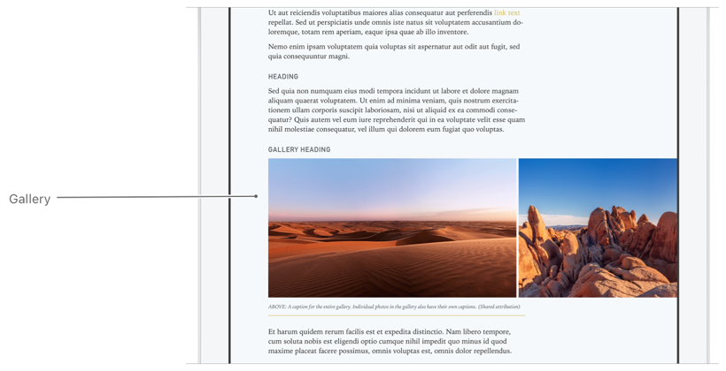 | |
| * @example | |
| * ```json | |
| * { | |
| * "components": [ | |
| * { | |
| * "role": "gallery", | |
| * "items": [ | |
| * { | |
| * "URL": "bundle://gallery-01.jpg", | |
| * "caption": "Thanks to the record drought, mountain lions have begun to descend from the peaks, sometimes into urban settings." | |
| * }, | |
| * { | |
| * "URL": "bundle://gallery-02.jpg", | |
| * "caption": "Coyotes are also seen in cities more often." | |
| * }, | |
| * { | |
| * "URL": "bundle://gallery-03.jpg", | |
| * "explicitContent": true | |
| * } | |
| * ] | |
| * } | |
| * ] | |
| * } | |
| * ``` | |
| * @see https://developer.apple.com/documentation/apple_news/gallery | |
| */ | |
| export interface Gallery { | |
| /** | |
| * An array of the images that appear in the gallery. The order used in the array is the order of the images in the gallery. Gallery items can be `JPEG` (with `.jpg` or .`jpeg` extension), `PNG`, or GIF images. | |
| */ | |
| items: GalleryItem[]; | |
| /** | |
| * Always `gallery` for this component. | |
| */ | |
| role: "gallery"; | |
| /** | |
| * An object that defines vertical alignment with another component. | |
| */ | |
| anchor?: Anchor; | |
| /** | |
| * An object that defines an animation to be applied to the component. | |
| * | |
| * The `none` value is used for conditional design elements. Adding it here has no effect. | |
| */ | |
| animation?: ComponentAnimation | "none"; | |
| /** | |
| * An object that defines behavior for a component, like [Parallax](https://developer.apple.com/documentation/apple_news/parallax) or [Springy](https://developer.apple.com/documentation/apple_news/springy). | |
| * | |
| * The `none` value is used for conditional design elements. Adding it here has no effect. | |
| */ | |
| behavior?: Behavior | "none"; | |
| /** | |
| * An instance or array of component properties that can be applied conditionally, and the conditions that cause them to be applied. | |
| * | |
| * The `none` value is used for conditional design elements. Adding it here has no effect. | |
| */ | |
| conditional?: ConditionalComponent | ConditionalComponent[]; | |
| /** | |
| * A Boolean value that determines whether the component is hidden. | |
| */ | |
| hidden?: boolean; | |
| /** | |
| * An optional unique identifier for this component. If used, this `identifier` must be unique across the entire document. You will need an `identifier` for your component if you want to anchor other components to it. | |
| */ | |
| identifier?: string; | |
| /** | |
| * An inline `ComponentLayout` object that contains layout information, or a string reference to a `ComponentLayout` object that is defined at the top level of the document. | |
| * | |
| * If `layout` is not defined, size and position will be based on various factors, such as the device type, the length of the content, and the `role` of this component. | |
| */ | |
| layout?: ComponentLayout | string; | |
| /** | |
| * An inline `ComponentStyle` object that defines the appearance of this component, or a string reference to a `ComponentStyle` object that is defined at the top level of the document. | |
| * | |
| * The `none` value is used for conditional design elements. Adding it here has no effect. | |
| */ | |
| style?: ComponentStyle | string | "none"; | |
| } | |
| /** | |
| * Use an array of `GalleryItem` objects to define the individual items used in a gallery or mosaic component. When the user taps an image in a gallery or mosaic to see it full-screen When the user taps an image in a gallery or mosaic to see it full-screen (as shown in the following figure), the caption from the caption descriptor property is shown. Note that this is different from the [Caption](https://developer.apple.com/documentation/apple_news/caption) component. | |
| * | |
| *  | |
| * | |
| * This object can be used in [Gallery](https://developer.apple.com/documentation/apple_news/gallery) and [Mosaic](https://developer.apple.com/documentation/apple_news/mosaic). | |
| * @example | |
| * ```json | |
| * { | |
| * "components": [ | |
| * { | |
| * "role": "gallery", | |
| * "items": [ | |
| * { | |
| * "URL": "bundle://gallery-01.jpg", | |
| * "caption": "Thanks to the record drought, mountain lions have begun to descend from the peaks, sometimes into urban settings." | |
| * }, | |
| * { | |
| * "URL": "bundle://gallery-02.jpg", | |
| * "caption": "Coyotes are also seen in cities more often." | |
| * }, | |
| * { | |
| * "URL": "bundle://gallery-03.jpg", | |
| * "explicitContent": true | |
| * } | |
| * ] | |
| * } | |
| * ] | |
| * } | |
| * ``` | |
| * @see https://developer.apple.com/documentation/apple_news/galleryitem | |
| */ | |
| export interface GalleryItem { | |
| /** | |
| * The `URL` of an image to display in a gallery or mosaic. | |
| * | |
| * Image URLs can begin with `http://`, `https://`, or `bundle://`. If the image URL begins with `bundle://`, the image file must be in the same directory as the document. | |
| * | |
| * Image filenames should be properly encoded as URLs. | |
| * | |
| * See [Preparing Image, Video, Audio, Music, and ARKit Assets](https://developer.apple.com/documentation/apple_news/apple_news_format/preparing_image_video_audio_music_and_arkit_assets). | |
| */ | |
| URL: string; | |
| /** | |
| * A caption that describes the image. The text is used for [VoiceOver for iOS](https://www.apple.com/accessibility/iphone/vision/) and [VoiceOver for macOS](https://www.apple.com/accessibility/mac/vision/). If `accessibilityCaption` is not provided, the `caption` value is used for VoiceOver for iOS and VoiceOver for macOS. | |
| */ | |
| accessibilityCaption?: string; | |
| /** | |
| * A caption that describes the image. The text is seen when the image is in full screen. This text is also used by [VoiceOver for iOS](https://www.apple.com/accessibility/iphone/vision/) and [VoiceOver for macOS](https://www.apple.com/accessibility/mac/vision/), if `accessibilityCaption` text is not provided. The caption text does not appear in the main article view. To display a caption in the main article view, use the [Caption](https://developer.apple.com/documentation/apple_news/caption) component. | |
| */ | |
| caption?: CaptionDescriptor | string; | |
| /** | |
| * A Boolean value that indicates the image may contain explicit content. | |
| */ | |
| explicitContent?: boolean; | |
| } | |
| /** | |
| * To add a table with HTML data, create a component with a `role` of `htmltable`. The required `html` property holds all the data and tags for an HTML table. | |
| * @example | |
| * ```json | |
| * { | |
| * "components": [ | |
| * { | |
| * "role": "htmltable", | |
| * "html": "<table><tr><th>Name</th><th>Occupation</th></tr><tr><td><strong>Grace Hopper</strong></td><td>Computer Scientist</td></tr><tr><td><strong>Amelia Earhart</strong></td><td>Pilot</td></tr></table>", | |
| * "style": { | |
| * "tableStyle": { | |
| * "rows": { | |
| * "backgroundColor": "#fff", | |
| * "conditional": [ | |
| * { | |
| * "selectors": [ | |
| * { | |
| * "odd": true | |
| * } | |
| * ], | |
| * "backgroundColor": "#f7f7f7" | |
| * } | |
| * ] | |
| * } | |
| * } | |
| * } | |
| * } | |
| * ] | |
| * } | |
| * ``` | |
| * @see https://developer.apple.com/documentation/apple_news/htmltable | |
| */ | |
| export interface HTMLTable { | |
| /** | |
| * The HTML for the table. This HTML must begin with `<table>` and end with `</table>`. | |
| */ | |
| html: string; | |
| /** | |
| * Always `htmltable` for this component. | |
| */ | |
| role: "htmltable"; | |
| /** | |
| * An object that defines vertical alignment with another component. | |
| */ | |
| anchor?: Anchor; | |
| /** | |
| * An object that defines an animation to be applied to the component. | |
| * | |
| * The `none` value is used for conditional design elements. Adding it here has no effect. | |
| */ | |
| animation?: ComponentAnimation | "none"; | |
| /** | |
| * An object that defines behavior for a component, like [Parallax](https://developer.apple.com/documentation/apple_news/parallax) or [Springy](https://developer.apple.com/documentation/apple_news/springy). | |
| * | |
| * The `none` value is used for conditional design elements. Adding it here has no effect. | |
| */ | |
| behavior?: Behavior | "none"; | |
| /** | |
| * An instance or array of component properties that can be applied conditionally. | |
| */ | |
| conditional?: ConditionalComponent | ConditionalComponent[]; | |
| /** | |
| * A Boolean value that determines whether the component is hidden. | |
| */ | |
| hidden?: boolean; | |
| /** | |
| * An optional unique identifier for this component. If used, this `identifier` must be unique across the entire document. You will need an `identifier` for your component if you want to anchor other components to it. | |
| */ | |
| identifier?: string; | |
| /** | |
| * An inline `ComponentLayout` object that contains layout information, or a string reference to a `ComponentLayout` object that is defined at the top level of the document. | |
| * | |
| * If `layout` is not defined, size and position will be based on various factors, such as the device type, the length of the content, and the role of this component. | |
| */ | |
| layout?: ComponentLayout | string; | |
| /** | |
| * An inline `ComponentStyle` object that defines the appearance of this component, or a string reference to a `ComponentStyle` object that is defined at the top level of the document. | |
| * | |
| * The `none` value is used for conditional design elements. Adding it here has no effect. | |
| */ | |
| style?: ComponentStyle | string | "none"; | |
| } | |
| /** | |
| * A header is a structural component used to define the top area of an article or the top part of a [Section](https://developer.apple.com/documentation/apple_news/section-ka8) or [Chapter](https://developer.apple.com/documentation/apple_news/chapter) component. A header can contain child components—such as a [Title](https://developer.apple.com/documentation/apple_news/title) or [Heading](https://developer.apple.com/documentation/apple_news/heading)—and is often used to layer titles and headings over a background image. (You specify the image in the `style` property with an [ImageFill](https://developer.apple.com/documentation/apple_news/imagefill) style.) The minimum size of a header component is determined by the size of its child components. | |
| * @example | |
| * ```json | |
| * { | |
| * "components": [ | |
| * { | |
| * "role": "header", | |
| * "components": [ | |
| * { | |
| * "role": "title", | |
| * "text": "Article Title", | |
| * "style": { | |
| * "fill": { | |
| * "type": "image", | |
| * "URL": "bundle://header.jpg", | |
| * "fillMode": "cover", | |
| * "verticalAlignment": "top", | |
| * "horizontalAlignment": "center" | |
| * } | |
| * } | |
| * } | |
| * ] | |
| * } | |
| * ] | |
| * } | |
| * ``` | |
| * @see https://developer.apple.com/documentation/apple_news/header | |
| */ | |
| export interface Header { | |
| /** | |
| * Always `header` for this component. | |
| */ | |
| role: "header"; | |
| /** | |
| * An array of additions. This can be used to create a [ComponentLink](https://developer.apple.com/documentation/apple_news/componentlink), allowing links to anywhere in News. | |
| * | |
| * Adding a link to a [Container](https://developer.apple.com/documentation/apple_news/container) component makes the entire component tappable. Any links used in its child components are not tappable. | |
| */ | |
| additions?: ComponentLink[]; | |
| /** | |
| * An object that defines vertical alignment with another component. | |
| */ | |
| anchor?: Anchor; | |
| /** | |
| * A object that defines an animation to be applied to the component. | |
| * | |
| * The `none` value is used for conditional design elements. Adding it here has no effect. | |
| */ | |
| animation?: ComponentAnimation | "none"; | |
| /** | |
| * An object that defines behavior for a component, like [Parallax](https://developer.apple.com/documentation/apple_news/parallax) or [Springy](https://developer.apple.com/documentation/apple_news/springy). | |
| * | |
| * The `none` value is used for conditional design elements. Adding it here has no effect. | |
| */ | |
| behavior?: Behavior | "none"; | |
| /** | |
| * An array of components to display as child components. Child components are positioned and rendered relative to their parent component. | |
| */ | |
| components?: Component[]; | |
| /** | |
| * An instance or array of container properties that can be applied conditionally, and the conditions that cause them to be applied. | |
| */ | |
| conditional?: ConditionalContainer | ConditionalContainer[]; | |
| /** | |
| * An object that defines how to position child components within this container component. A [HorizontalStackDisplay](https://developer.apple.com/documentation/apple_news/horizontalstackdisplay), for example, allows for displaying child components side by side. | |
| * | |
| * On versions of News prior to iOS 11, child components are positioned as if `contentDisplay` were not defined. | |
| * | |
| * The `none` value is used for conditional design elements. Adding it here has no effect. | |
| */ | |
| contentDisplay?: CollectionDisplay | HorizontalStackDisplay | "none"; | |
| /** | |
| * A Boolean value that determines whether the component is hidden. | |
| */ | |
| hidden?: boolean; | |
| /** | |
| * An optional unique identifier for this component. If used, this `identifier` must be unique across the entire document. You will need an `identifier` for your component if you want to anchor other components to it. See [Anchor](https://developer.apple.com/documentation/apple_news/anchor). | |
| */ | |
| identifier?: string; | |
| /** | |
| * An inline `ComponentLayout` object that contains layout information, or a string reference to a `ComponentLayout `object that is defined at the top level of the document. | |
| * | |
| * If `layout` is not defined, size and position are be based on various factors, such as the device type, the length of the content, and the `role` of this component. | |
| */ | |
| layout?: ComponentLayout | string; | |
| /** | |
| * An inline `ComponentStyle` object that defines the appearance of this component, or a string reference to a `ComponentStyle` object that is defined at the top level of the document. | |
| * | |
| * The `none` value is used for conditional design elements. Adding it here has no effect. | |
| */ | |
| style?: ComponentStyle | string | "none"; | |
| } | |
| /** | |
| * Use a `Heading` component to define a heading. There are six levels of headings. The `role` strings for the supported heading levels are `heading`, `heading1`, `heading2`, `heading3`, `heading4`, `heading5` and `heading6`. | |
| * @example | |
| * ```json | |
| * { | |
| * "components": [ | |
| * { | |
| * "role": "heading", | |
| * "text": "Not only on Mars" | |
| * } | |
| * ] | |
| * } | |
| * ``` | |
| * @see https://developer.apple.com/documentation/apple_news/heading | |
| */ | |
| export interface Heading { | |
| /** | |
| * Always one of these roles for this component: `heading`, `heading1`, `heading2`, `heading3`, `heading4`, `heading5`, or `heading6`. | |
| */ | |
| role: "heading" | "heading1" | "heading2" | "heading3" | "heading4" | "heading5" | "heading6"; | |
| /** | |
| * The text to display in the article, including any formatting tags depending on the `format` property. | |
| * | |
| * You can also use a subset of HTML tags or Markdown syntax by setting `format` to `html` or `markdown`, respectively. See [Using HTML with Apple News Format](https://developer.apple.com/documentation/apple_news/apple_news_format/components/using_html_with_apple_news_format). Alternatively, you can style ranges of text individually using the [InlineTextStyle](https://developer.apple.com/documentation/apple_news/inlinetextstyle) object. | |
| */ | |
| text: string; | |
| /** | |
| * An array of all the additions that should be applied to ranges of the component's text. | |
| * | |
| * Additions are ignored when `format` is set to `html` or `markdow`n. | |
| */ | |
| additions?: Addition[]; | |
| /** | |
| * An object that defines vertical alignment with another component. | |
| */ | |
| anchor?: Anchor; | |
| /** | |
| * An object that defines an animation to be applied to the component. | |
| * | |
| * The `none` value is used for conditional design elements. Adding it here has no effect. | |
| */ | |
| animation?: ComponentAnimation | "none"; | |
| /** | |
| * An object that defines behavior for a component, like [Parallax](https://developer.apple.com/documentation/apple_news/parallax) or [Springy](https://developer.apple.com/documentation/apple_news/springy). | |
| * | |
| * The `none` value is used for conditional design elements. Adding it here has no effect. | |
| */ | |
| behavior?: Behavior | "none"; | |
| /** | |
| * An instance or array of text components that can be applied conditionally, and the conditions that cause them to be applied. | |
| */ | |
| conditional?: ConditionalText | ConditionalText[]; | |
| /** | |
| * The formatting or markup method applied to the text. | |
| * | |
| * If `format` is set to `html` or `markdown`, neither `Additions` nor `InlineTextStyles` are supported. | |
| */ | |
| format?: "markdown" | "html" | "none"; | |
| /** | |
| * A Boolean value that determines whether the component is hidden. | |
| */ | |
| hidden?: boolean; | |
| /** | |
| * An optional unique identifier for this component. If used, this `identifier` must be unique across the entire document. You will need an `identifier` for your component if you want to anchor other components to it. | |
| */ | |
| identifier?: string; | |
| /** | |
| * An array of `InlineTextStyle` objects that you can use to apply different text styles to ranges of text. For each `InlineTextStyle`, you should supply a `rangeStart`, a `rangeLength`, and either a `TextStyle` object or the `identifier` of a `TextStyle` that is defined at the top level of the document. | |
| * | |
| * Inline text styles are ignored when format is set to `markdown` or `html`. | |
| * | |
| * The `none` value is used for conditional design elements. Adding it here has no effect. | |
| */ | |
| inlineTextStyles?: InlineTextStyle[] | "none"; | |
| /** | |
| * An inline `ComponentLayout` object that contains layout information, or a string reference to a `ComponentLayout` that is defined at the top level of the document. | |
| * | |
| * If `layout` is not defined, size and position are based on various factors, such as the device type, the length of the content, and the `role` of this component. | |
| */ | |
| layout?: ComponentLayout | string; | |
| /** | |
| * An inline `ComponentStyle` object that defines the appearance of this component, or a string reference to a `ComponentStyle` that is defined at the top level of the document. | |
| * | |
| * The `none` value is used for conditional design elements. Adding it here has no effect. | |
| */ | |
| style?: ComponentStyle | string | "none"; | |
| /** | |
| * An inline `ComponentTextStyle` object that contains styling information, or a string reference to a `ComponentTextStyle` object that is defined at the top level of the document. | |
| */ | |
| textStyle?: ComponentTextStyle | string; | |
| } | |
| /** | |
| * Use the `HorizontalStackDisplay` object in a container component for displaying components side by side. | |
| * | |
| * Use `HorizontalStackDisplay` if you wish to specify what percent of the width the individual children should use. Use [CollectionDisplay](https://developer.apple.com/documentation/apple_news/collectiondisplay) if you wish to make all child components to have the same width. | |
| * | |
| * To redistribute the empty space inside a horizontal stack collection, use the [FlexibleSpacer](https://developer.apple.com/documentation/apple_news/flexiblespacer) object. | |
| * | |
| * Note | |
| * | |
| * In versions of iOS before iOS 12, child components are vertically stacked if the container’s `contentDisplay` property is defined as the new `horizontal_stack` type. | |
| * | |
| * This object can be used in [Header](https://developer.apple.com/documentation/apple_news/header), [Container](https://developer.apple.com/documentation/apple_news/container), [Section](https://developer.apple.com/documentation/apple_news/section-ka8), [Chapter](https://developer.apple.com/documentation/apple_news/chapter), [Aside](https://developer.apple.com/documentation/apple_news/aside), and [ArticleLink](https://developer.apple.com/documentation/apple_news/articlelink). | |
| * @example | |
| * ```json | |
| * { | |
| * "components": [ | |
| * { | |
| * "role": "container", | |
| * "contentDisplay": { | |
| * "type": "horizontal_stack" | |
| * }, | |
| * "components": [ | |
| * { | |
| * "role": "title", | |
| * "text": "Sample article", | |
| * "layout": { | |
| * "minimumWidth": "60cw", | |
| * "maximumWidth": "60cw" | |
| * } | |
| * }, | |
| * { | |
| * "role": "spacer" | |
| * }, | |
| * { | |
| * "role": "image", | |
| * "URL": "bundle://image-1.jpg", | |
| * "layout": { | |
| * "minimumWidth": "35cw", | |
| * "maximumWidth": "35cw" | |
| * } | |
| * } | |
| * ] | |
| * } | |
| * ] | |
| * } | |
| * ``` | |
| * @see https://developer.apple.com/documentation/apple_news/horizontalstackdisplay | |
| */ | |
| export interface HorizontalStackDisplay { | |
| /** | |
| * Always `horizontal_stack` for this object. | |
| */ | |
| type: "horizontal_stack"; | |
| } | |
| /** | |
| * Use the `Illustrator` component to indicate the name of the contributor whose illustrations appear in the article. For photo attributions, you can use the [Photographer](https://developer.apple.com/documentation/apple_news/photographer) component. | |
| * @example | |
| * ```json | |
| * { | |
| * "components": [ | |
| * { | |
| * "role": "byline", | |
| * "text": "by MICHAEL BURNS | October 25, 2015 | 11:15 AM", | |
| * "layout": { | |
| * "columnStart": 0, | |
| * "columnSpan": 7, | |
| * "margin": { | |
| * "top": 20, | |
| * "bottom": 10 | |
| * } | |
| * } | |
| * }, | |
| * { | |
| * "role": "illustrator", | |
| * "text": "Illustrations by URNA SEMPER", | |
| * "layout": { | |
| * "columnStart": 0, | |
| * "columnSpan": 7, | |
| * "margin": { | |
| * "bottom": 15 | |
| * } | |
| * } | |
| * } | |
| * ] | |
| * } | |
| * ``` | |
| * @see https://developer.apple.com/documentation/apple_news/illustrator | |
| */ | |
| export interface Illustrator { | |
| /** | |
| * Always `illustrator` for this component. | |
| */ | |
| role: "illustrator"; | |
| /** | |
| * The text to display in the article, including any formatting tags depending on the `format` property. | |
| * | |
| * You can also use a subset of HTML tags or Markdown syntax by setting format to `html` or `markdown`, respectively. See [Using HTML with Apple News Format](https://developer.apple.com/documentation/apple_news/apple_news_format/components/using_html_with_apple_news_format). Alternatively, you can style ranges of text individually using the [InlineTextStyle](https://developer.apple.com/documentation/apple_news/inlinetextstyle) object. | |
| */ | |
| text: string; | |
| /** | |
| * An array of all the additions that should be applied to ranges of the component's text. | |
| * | |
| * Additions are ignored when `format` is set to `html` or `markdown`. | |
| */ | |
| additions?: Addition[]; | |
| /** | |
| * An object that defines vertical alignment with another component. | |
| */ | |
| anchor?: Anchor; | |
| /** | |
| * An object that defines an animation to be applied to the component. | |
| * | |
| * The `none` value is used for conditional design elements. Adding it here has no effect. | |
| */ | |
| animation?: ComponentAnimation | "none"; | |
| /** | |
| * An object that define behavior for a component, like [Parallax](https://developer.apple.com/documentation/apple_news/parallax) or [Springy](https://developer.apple.com/documentation/apple_news/springy). | |
| * | |
| * The `none` value is used for conditional design elements. Adding it here has no effect. | |
| */ | |
| behavior?: Behavior | "none"; | |
| /** | |
| * An instance or array of text components that can be applied conditionally, and the conditions that cause them to be applied. | |
| */ | |
| conditional?: ConditionalText | ConditionalText[]; | |
| /** | |
| * The formatting or markup method applied to the text. | |
| * | |
| * If `format` is set to `html` or `markdown`, neither `Additions` nor `InlineTextStyles` are supported. | |
| */ | |
| format?: "markdown" | "html" | "none"; | |
| /** | |
| * A Boolean value that determines whether the component is hidden. | |
| */ | |
| hidden?: boolean; | |
| /** | |
| * An optional unique identifier for this component. If used, this `identifier` must be unique across the entire document. You will need an `identifier` for your component if you want to anchor other components to it. | |
| */ | |
| identifier?: string; | |
| /** | |
| * An array of `InlineTextStyle` objects that you can use to apply different text styles to ranges of text. For each `InlineTextStyle`, you should supply a `rangeStart`, `rangeLength`, and either a `TextStyle` object or the `identifier` of a `TextStyle` that is defined at the top level of the document. | |
| * | |
| * Inline text styles are ignored when `format` is set to `markdown` or `html`. | |
| * | |
| * The `none` value is used for conditional design elements. Adding it here has no effect. | |
| */ | |
| inlineTextStyles?: InlineTextStyle[] | "none"; | |
| /** | |
| * An inline `ComponentLayout` object that contains layout information, or a string reference to a `ComponentLayout` object` `that is defined at the top level of the document. | |
| * | |
| * If `layout` is not defined, size and position are based on various factors, such as the device type, the length of the content, and the `role` of this component. | |
| */ | |
| layout?: ComponentLayout | string; | |
| /** | |
| * An inline `ComponentStyle` object that defines the appearance of this component, or a string reference to a `ComponentStyle` object that is defined at the top level of the document. | |
| * | |
| * The `none` value is used for conditional design elements. Adding it here has no effect. | |
| */ | |
| style?: ComponentStyle | string | "none"; | |
| /** | |
| * An inline `ComponentTextStyle` object that contains styling information, or a string reference to a `ComponentTextStyle` object that is defined at the top level of the document. | |
| */ | |
| textStyle?: ComponentTextStyle | string; | |
| } | |
| /** | |
| * Image is the general component for images in an article. If possible, choose one of the more-specific image related components such as [Figure](https://developer.apple.com/documentation/apple_news/figure), [Logo](https://developer.apple.com/documentation/apple_news/logo), [Portrait](https://developer.apple.com/documentation/apple_news/portrait), or [Photo](https://developer.apple.com/documentation/apple_news/photo). | |
| * | |
| * See [Preparing Image, Video, Audio, Music, and ARKit Assets](https://developer.apple.com/documentation/apple_news/apple_news_format/preparing_image_video_audio_music_and_arkit_assets). | |
| * @example | |
| * ```json | |
| * { | |
| * "components": [ | |
| * { | |
| * "role": "title", | |
| * "text": "Article Title" | |
| * }, | |
| * { | |
| * "role": "image", | |
| * "URL": "bundle://summer.jpg", | |
| * "caption": "Thanks to the record drought, mountain lions have begun to descend from the peaks." | |
| * } | |
| * ] | |
| * } | |
| * ``` | |
| * @see https://developer.apple.com/documentation/apple_news/image | |
| */ | |
| export interface Image { | |
| /** | |
| * Always `image` for this component. | |
| */ | |
| role: "image"; | |
| /** | |
| * The `URL` of an image file. | |
| * | |
| * Image URLs can begin with `http://`, `https://`, or `bundle://`. If the image URL begins with `bundle://`, the image file must be in the same directory as the document. | |
| * | |
| * Image filenames should be properly encoded as `URLs`. | |
| * | |
| * See [Preparing Image, Video, Audio, Music, and ARKit Assets](https://developer.apple.com/documentation/apple_news/apple_news_format/preparing_image_video_audio_music_and_arkit_assets). | |
| */ | |
| URL: string; | |
| /** | |
| * A caption that describes the image. The text is used for [VoiceOver for iOS](https://www.apple.com/accessibility/iphone/vision/) and [VoiceOver for macOS](https://www.apple.com/accessibility/mac/vision/). If `accessibilityCaption` is not provided, the `caption` value is used for VoiceOver for iOS and VoiceOver for macOS. | |
| */ | |
| accessibilityCaption?: string; | |
| /** | |
| * An array of `ComponentLink` objects. This can be used to create a `ComponentLink`, allowing a link to anywhere in News. | |
| */ | |
| additions?: ComponentLink[]; | |
| /** | |
| * An object that defines vertical alignment with another component. | |
| */ | |
| anchor?: Anchor; | |
| /** | |
| * An object that defines an animation to be applied to the component. | |
| * | |
| * The `none` value is used for conditional design elements. Adding it here has no effect. | |
| */ | |
| animation?: ComponentAnimation | "none"; | |
| /** | |
| * An object that defines behavior for a component, like [Parallax](https://developer.apple.com/documentation/apple_news/parallax) or [Springy](https://developer.apple.com/documentation/apple_news/springy). | |
| * | |
| * The `none` value is used for conditional design elements. Adding it here has no effect. | |
| */ | |
| behavior?: Behavior | "none"; | |
| /** | |
| * A caption that describes the image. The text is seen when the image is in full screen. This text is also used by [VoiceOver for iOS](https://www.apple.com/accessibility/iphone/vision/) and [VoiceOver for macOS](https://www.apple.com/accessibility/mac/vision/), if `accessibilityCaption` text is not provided. The caption text does not appear in the main article view. To display a caption in the main article view, use the [Caption](https://developer.apple.com/documentation/apple_news/caption) component. | |
| */ | |
| caption?: CaptionDescriptor | string; | |
| /** | |
| * An instance or array of component properties that can be applied conditionally, and the conditions that cause them to be applied. | |
| */ | |
| conditional?: ConditionalComponent | ConditionalComponent[]; | |
| /** | |
| * A Boolean value that indicates the image may contain explicit content. | |
| */ | |
| explicitContent?: boolean; | |
| /** | |
| * A Boolean value that determines whether the component is hidden. | |
| */ | |
| hidden?: boolean; | |
| /** | |
| * An optional unique identifier for this component. If used, this `identifier` must be unique across the entire document. You will need an `identifier` for your component if you want to anchor other components to it. | |
| */ | |
| identifier?: string; | |
| /** | |
| * An inline `ComponentLayout` object that contains layout information, or a string reference to a `ComponentLayout` object that is defined at the top level of the document. | |
| * | |
| * If `layout` is not defined, size and position are based on various factors, such as the device type, the length of the content, and the `role` of this component. | |
| */ | |
| layout?: ComponentLayout | string; | |
| /** | |
| * An inline `ComponentStyle` object that defines the appearance of this component, or a string reference to a `ComponentStyle` object that is defined at the top level of the document. | |
| * | |
| * The `none` value is used for conditional design elements. Adding it here has no effect. | |
| */ | |
| style?: ComponentStyle | string | "none"; | |
| } | |
| /** | |
| * Use an `InlineTextStyle` object to apply text stylings (such as color, underline, font size, and font weight) to a specific range of text. The `InlineTextStyle` object contains either a [TextStyle](https://developer.apple.com/documentation/apple_news/textstyle) object or a reference to a text style that’s been defined in the in the [ArticleDocument.textStyles](https://developer.apple.com/documentation/apple_news/articledocument/textstyles) object. Only properties that have values will override the component text style and defaults. | |
| * | |
| * This object can be used in [Text](https://developer.apple.com/documentation/apple_news/text). | |
| * @example | |
| * ```json | |
| * { | |
| * "components": [ | |
| * { | |
| * "role": "pullquote", | |
| * "text": "The text of the pullquote.", | |
| * "textStyle": "pullquote-medium", | |
| * "inlineTextStyles": [ | |
| * { | |
| * "rangeStart": 4, | |
| * "rangeLength": 4, | |
| * "textStyle": { | |
| * "textColor": "#FF0000", | |
| * "backgroundColor": "#000" | |
| * } | |
| * } | |
| * ] | |
| * } | |
| * ] | |
| * } | |
| * ``` | |
| * @see https://developer.apple.com/documentation/apple_news/inlinetextstyle | |
| */ | |
| export interface InlineTextStyle { | |
| /** | |
| * The length (in characters) of the portion of text to which the alternative styling should be applied. | |
| */ | |
| rangeLength: number; | |
| /** | |
| * The starting point of the text to which the alternative styling should be applied. Note: the first available character is at `0`, not `1`. | |
| */ | |
| rangeStart: number; | |
| /** | |
| * Either a text style object or the name of a [TextStyle](https://developer.apple.com/documentation/apple_news/textstyle) object defined in the [ArticleDocument.textStyles](https://developer.apple.com/documentation/apple_news/articledocument/textstyles) object. | |
| */ | |
| textStyle: TextStyle | string; | |
| } | |
| /** | |
| * Use the `instagram` object to include an Instagram post by specifying a `URL` for the post. | |
| * @example | |
| * ```json | |
| * { | |
| * "components": [ | |
| * { | |
| * "role": "title", | |
| * "text": "iTunes" | |
| * }, | |
| * { | |
| * "role": "body", | |
| * "text": "iTunes is the best way to organize and enjoy the music, movies, and TV shows you already have — and shop for the ones you want." | |
| * }, | |
| * { | |
| * "role": "heading2", | |
| * "text": "Instagram" | |
| * }, | |
| * { | |
| * "role": "instagram", | |
| * "URL": "https://www.instagram.com/p/BpiRTBYlkY5/" | |
| * } | |
| * ] | |
| * } | |
| * ``` | |
| * @see https://developer.apple.com/documentation/apple_news/instagram | |
| */ | |
| export interface Instagram { | |
| /** | |
| * Always `instagram` for this component. | |
| */ | |
| role: "instagram"; | |
| /** | |
| * The URL of the Instagram post you want to embed. | |
| */ | |
| URL: string; | |
| /** | |
| * An object that defines vertical alignment with another component. | |
| */ | |
| anchor?: Anchor; | |
| /** | |
| * An object that defines an animation to be applied to the component. | |
| * | |
| * The `none` value is used for conditional design elements. Adding it here has no effect. | |
| */ | |
| animation?: ComponentAnimation | "none"; | |
| /** | |
| * An object that defines behavior for a component, like [Parallax](https://developer.apple.com/documentation/apple_news/parallax) or [Springy](https://developer.apple.com/documentation/apple_news/springy). | |
| * | |
| * The `none` value is used for conditional design elements. Adding it here has no effect. | |
| */ | |
| behavior?: Behavior | "none"; | |
| /** | |
| * An instance or array of component properties that can be applied conditionally, and the conditions that cause them to be applied. | |
| */ | |
| conditional?: ConditionalComponent | ConditionalComponent[]; | |
| /** | |
| * A Boolean value that determines whether the component is hidden. | |
| */ | |
| hidden?: boolean; | |
| /** | |
| * An optional unique identifier for this component. If used, this `identifier` must be unique across the entire document. You will need an `identifier` for your component if you want to anchor other components to it. | |
| */ | |
| identifier?: string; | |
| /** | |
| * An inline `ComponentLayout` object that contains layout information, or a string reference to a `ComponentLayout` object that is defined at the top level of the document. | |
| * | |
| * If `layout` is not defined, size and position will be based on various factors, such as the device type, the length of the content, and the `role` of this component. | |
| */ | |
| layout?: ComponentLayout | string; | |
| /** | |
| * An inline `ComponentStyle` object that defines the appearance of this component, or a string reference to a `ComponentStyle` object that is defined at the top level of the document. | |
| * | |
| * The `none` value is used for conditional design elements. Adding it here has no effect. | |
| */ | |
| style?: ComponentStyle | string | "none"; | |
| } | |
| /** | |
| * Use an `Intro` component to indicate introductory or other preliminary text. | |
| * @example | |
| * ```json | |
| * { | |
| * "components": [ | |
| * { | |
| * "role": "title", | |
| * "text": "Article Title" | |
| * }, | |
| * { | |
| * "role": "intro", | |
| * "text": "Apple News Format allows publishers to craft beautiful editorial layouts." | |
| * } | |
| * ] | |
| * } | |
| * ``` | |
| * @see https://developer.apple.com/documentation/apple_news/intro | |
| */ | |
| export interface Intro { | |
| /** | |
| * Always `intro` for this component. | |
| */ | |
| role: "intro"; | |
| /** | |
| * The text to display in the article, including any formatting tags depending on the `format` property. | |
| * | |
| * You can also use a subset of HTML tags or Markdown syntax by setting `format` to `html` or `markdown`, respectively. See [Using HTML with Apple News Format](https://developer.apple.com/documentation/apple_news/apple_news_format/components/using_html_with_apple_news_format). Alternatively, you can style ranges of text individually using the [InlineTextStyle](https://developer.apple.com/documentation/apple_news/inlinetextstyle) object. | |
| */ | |
| text: string; | |
| /** | |
| * An array of all the additions that should be applied to ranges of the component's text. | |
| * | |
| * Additions are ignored when `format` is set to `html` or `markdown`. | |
| */ | |
| additions?: Addition[]; | |
| /** | |
| * An object that defines vertical alignment with another component. | |
| */ | |
| anchor?: Anchor; | |
| /** | |
| * An object that defines an animation to be applied to the component. | |
| * | |
| * The `none` value is used for conditional design elements. Adding it here has no effect. | |
| */ | |
| animation?: ComponentAnimation | "none"; | |
| /** | |
| * An object that defines behavior for a component, like [Parallax](https://developer.apple.com/documentation/apple_news/parallax) or [Springy](https://developer.apple.com/documentation/apple_news/springy). | |
| * | |
| * The `none` value is used for conditional design elements. Adding it here has no effect. | |
| */ | |
| behavior?: Behavior | "none"; | |
| /** | |
| * An instance or array of text components that can be applied conditionally, and the conditions that cause them to be applied. | |
| */ | |
| conditional?: ConditionalText | ConditionalText[]; | |
| /** | |
| * The formatting or markup method applied to the text. | |
| * | |
| * If `format` is set to `html` or `markdown`, neither `Additions` nor `InlineTextStyles` are supported. | |
| */ | |
| format?: "markdown" | "html" | "none"; | |
| /** | |
| * A Boolean value that determines whether the component is hidden. | |
| */ | |
| hidden?: boolean; | |
| /** | |
| * An optional unique identifier for this component. If used, this `identifier` must be unique across the entire document. You will need an `identifier` for your component if you want to anchor other components to it. | |
| */ | |
| identifier?: string; | |
| /** | |
| * An array of `InlineTextStyle` objects that you can use to apply different text styles to ranges of text. For each `InlineTextStyle`, you should supply a `rangeStart`, a `rangeLength`, and either a `TextStyle` object or the `identifier` of a `TextStyle` that is defined at the top level of the document. | |
| * | |
| * Inline text styles are ignored when `format` is set to `markdown` or `html`. | |
| * | |
| * The `none` value is used for conditional design elements. Adding it here has no effect. | |
| */ | |
| inlineTextStyles?: InlineTextStyle[] | "none"; | |
| /** | |
| * An inline `ComponentLayout` object that contains layout information, or a string reference to a `ComponentLayout` object that is defined at the top level of the document. | |
| * | |
| * If `layout` is not defined, size and position are based on various factors, such as the device type, the length of the content, and the `role` of this component. | |
| */ | |
| layout?: ComponentLayout | string; | |
| /** | |
| * An inline `ComponentStyle` object that defines the appearance of this component, or a string reference to a `ComponentStyle` object that is defined at the top level of the document. | |
| * | |
| * The `none` value is used for conditional design elements. Adding it here has no effect. | |
| */ | |
| style?: ComponentStyle | string | "none"; | |
| /** | |
| * An inline `ComponentTextStyle` object that contains styling information, or a string reference to a `ComponentTextStyle` object that is defined at the top level of the document. | |
| */ | |
| textStyle?: ComponentTextStyle | string; | |
| } | |
| /** | |
| * Use the `Layou`t object to define the column-system rules for the components in your document. The column system controls the horizontal position and spacing of your components. This information is used by the News app to automatically resize your article for different screen sizes. | |
| * | |
| * After you define the layout for your article, add the components of your article to [ArticleDocument.componentLayouts](https://developer.apple.com/documentation/apple_news/articledocument/componentlayouts) and then position each component using a [ComponentLayout](https://developer.apple.com/documentation/apple_news/componentlayout) object. | |
| * | |
| * This object can be used in [ArticleDocument](https://developer.apple.com/documentation/apple_news/articledocument). | |
| * @example | |
| * ```json | |
| * { | |
| * "version": "1.7", | |
| * "identifier": "SampleArticle", | |
| * "language": "en", | |
| * "title": "Apple News", | |
| * "subtitle": "A look at the features of Apple News", | |
| * "layout": { | |
| * "columns": 7, | |
| * "width": 1024, | |
| * "margin": 75, | |
| * "gutter": 20 | |
| * }, | |
| * … | |
| * } | |
| * ``` | |
| * @see https://developer.apple.com/documentation/apple_news/layout | |
| */ | |
| export interface Layout { | |
| /** | |
| * The number of columns this article was designed for. You must have at least one column. | |
| * | |
| * Using a 7-column design allows components to start in columns 0 to 6, and be between 1 and 7 columns wide. An article that is designed with 7 columns provides sufficient layout information to automatically resize for iPad and iPhone sizes. An article designed for 10 columns provides a little more detail for the layout system. Below 5 columns there may not be sufficient information for the layout system to automatically maintain your intended design when scaling down to smaller devices. | |
| */ | |
| columns: number; | |
| /** | |
| * The `width` (in points) this article was designed for. This property is used to calculate down-scaling scenarios for smaller devices. | |
| * | |
| * The width of the document must be sufficient to fit two margin values and the gutter values that will be needed between each of the columns. | |
| * | |
| * The `width` cannot be negative or `0`. As a best practice, set the width to the width of the iPad device. This helps you see the effects of positioning components in different columns. | |
| * | |
| * This property is used to automatically scale down article content for smaller devices. With a 7-column design and a width of `1024` points, the design is optimal for a landscape aspect ratio on an iPad device and will scale down on iPhones. | |
| */ | |
| width: number; | |
| /** | |
| * The gutter size for the article (in points). The gutter provides spacing between columns. This property should always be an even number; odd numbers are rounded up to the next even number. If this property is omitted, a default gutter size of 20 is applied. If the gutter is negative, the number will be set to 0. | |
| * | |
| * Note that the first column does not have a left gutter, and the last column does not have a right gutter. | |
| * | |
| * The width of the document must be sufficient to fit two margin values and the gutter values that will be needed between each of the columns. | |
| * | |
| * Note that when using a width of 1024, a margin of 60, and 7 columns, the gutter cannot be greater than 150. | |
| */ | |
| gutter?: number; | |
| /** | |
| * The outer (left and right) margins of the article, in points. If this property is omitted, a default article margin of 60 is applied. If the margin is negative, the number will be set to 0. If the margin is greater than or equal to the width/2, the article delivery will fail. | |
| * | |
| * The margins will be sized down slightly when the article is automatically scaled down for smaller devices. | |
| */ | |
| margin?: number; | |
| } | |
| /** | |
| * You can control lists of links that users see in articles by using the `links` array in [Metadata](https://developer.apple.com/documentation/apple_news/metadata). If you are linking to a sponsored article, ensure that the [Create an Article](https://developer.apple.com/documentation/apple_news/create_an_article) request uses the `isSponsored` flag. | |
| * @example | |
| * ```json | |
| * { | |
| * "metadata": { | |
| * "excerpt": "2018 Super Bowl", | |
| * "thumbnailURL": "bundle://SuperBowl.jpg", | |
| * "datePublished": "2018-09-09T14:45:45+00:00", | |
| * "dateCreated": "2018-09-08T12:41:00+00:00", | |
| * "dateModified": "2018-09-10T12:41:00+00:00", | |
| * "authors": [ | |
| * "Anne Johnson" | |
| * ], | |
| * "campaignData": { | |
| * "sport": [ | |
| * "football" | |
| * ], | |
| * "event": [ | |
| * "Superbowl" | |
| * ], | |
| * "author": [ | |
| * "John Appleseed" | |
| * ] | |
| * }, | |
| * "generatorName": "Generator", | |
| * "generatorVersion": "1.0", | |
| * "canonicalURL": "https://example.com/articles/2015/original-article.html", | |
| * "links": [ | |
| * { | |
| * "URL": "https://apple.news/AT6kNQslCQy6EE4bF8hpOoQ", | |
| * "relationship": "related" | |
| * } | |
| * ] | |
| * } | |
| * } | |
| * ``` | |
| * @see https://developer.apple.com/documentation/apple_news/linkedarticle | |
| */ | |
| export interface LinkedArticle { | |
| /** | |
| * The type of relationship between the article and the linked document. | |
| * | |
| * Valid values: | |
| * | |
| * - `related`. The linked article is an article on the same topic, part of the same dossier, or provides more information about the subjects discussed. | |
| * - `promoted`. The linked article is not directly related, but deserves additional promotion because the article covers another important topic. This value will also put the article at the top of the channel feed. | |
| */ | |
| relationship: "related" | "promoted"; | |
| /** | |
| * The URL for the link. Can be either an Apple News link, like `https://apple.news/[article_id]`, or a link to an article on your website, as long as the website link matches the `canonicalURL` metadata property of the linked article. For more information about `canonicalURL`, see [Metadata](https://developer.apple.com/documentation/apple_news/metadata). | |
| */ | |
| URL: string; | |
| } | |
| /** | |
| * Use the `ListItemStyle` object to define text formatting for a bulleted (unordered) or numbered (ordered) list. Put `listItemStyle` inside a [TextStyle](https://developer.apple.com/documentation/apple_news/textstyle) object or [ComponentTextStyle](https://developer.apple.com/documentation/apple_news/componenttextstyle) object and set the text component’s `format` property to `html`. See [Using HTML with Apple News Format](https://developer.apple.com/documentation/apple_news/apple_news_format/components/using_html_with_apple_news_format). | |
| * | |
| * This object can be used in [TextStyle](https://developer.apple.com/documentation/apple_news/textstyle) and [ComponentTextStyle](https://developer.apple.com/documentation/apple_news/componenttextstyle). | |
| * @example | |
| * ```json | |
| * { | |
| * "componentTextStyles": { | |
| * "exampleStyle": { | |
| * … | |
| * "unorderedListItems": { | |
| * "type": "character", | |
| * "character": "✓" | |
| * } | |
| * } | |
| * } | |
| * } | |
| * ``` | |
| * @see https://developer.apple.com/documentation/apple_news/listitemstyle | |
| */ | |
| export interface ListItemStyle { | |
| /** | |
| * The type of list item indicator to use. | |
| * | |
| * Allowed options are: | |
| * | |
| * - `bullet`: Prepends a bullet before each list item. This is the default for unordered lists. | |
| * - `decimal`: Prepends each list item with an incremental number. This is the default for ordered lists. | |
| * - `lower_alphabetical`: Prepends list items with a lowercase letter. | |
| * - `upper_alphabetical`: Prepends list items with an uppercase letter. | |
| * - `lower_roman`: Prepends list items with a lowercase Roman numeral. | |
| * - `upper_roman`: Prepends list items with an uppercase Roman numeral. | |
| * - `character`: Prepends list items with a custom character. Use the `character` property to specify a character. | |
| * - `none`: Will not prepend any indicator for list items. Indenting will still be in effect. | |
| */ | |
| type: "bullet" | "decimal" | "lower_roman" | "upper_roman" | "lower_alphabetical" | "upper_alphabetical" | "character" | "none"; | |
| /** | |
| * If `type` is set to `character`, provide the character to use as the list item indicator. Only a single character is supported. | |
| */ | |
| character?: string; | |
| } | |
| /** | |
| * Use the `logo` component to display an image that identifies a brand, company, or publication. (Other components are available for other types of images, such as [Figure](https://developer.apple.com/documentation/apple_news/figure), [Portrait](https://developer.apple.com/documentation/apple_news/portrait), and [Photo](https://developer.apple.com/documentation/apple_news/photo).) | |
| * | |
| * See [Preparing Image, Video, Audio, Music, and ARKit Assets](https://developer.apple.com/documentation/apple_news/apple_news_format/preparing_image_video_audio_music_and_arkit_assets). | |
| * @example | |
| * ```json | |
| * { | |
| * "components": [ | |
| * { | |
| * "role": "title", | |
| * "text": "Apple News Format" | |
| * }, | |
| * { | |
| * "role": "body", | |
| * "text": "Apple News Format allows publishers to craft beautiful editorial layouts. Galleries, audio, video, and fun interactions like animation make stories spring to life." | |
| * }, | |
| * { | |
| * "role": "logo", | |
| * "URL": "bundle://apple-logo.png", | |
| * "layout": { | |
| * "columnStart": 1, | |
| * "columnSpan": 3, | |
| * "ignoreDocumentMargin": true, | |
| * "margin": { | |
| * "top": 15, | |
| * "bottom": 15 | |
| * } | |
| * } | |
| * } | |
| * ] | |
| * } | |
| * ``` | |
| * @see https://developer.apple.com/documentation/apple_news/logo | |
| */ | |
| export interface Logo { | |
| /** | |
| * Always `logo` for this component. | |
| */ | |
| role: "logo"; | |
| /** | |
| * The `URL` of an image file. | |
| * | |
| * Image URLs can begin with `http://`, `https://`, or `bundle://`. If the image `URL` begins with `bundle://`, the image file must be in the same directory as the document. | |
| * | |
| * Image filenames should be properly encoded as `URLs`. | |
| * | |
| * See [Preparing Image, Video, Audio, Music, and ARKit Assets](https://developer.apple.com/documentation/apple_news/apple_news_format/preparing_image_video_audio_music_and_arkit_assets). | |
| */ | |
| URL: string; | |
| /** | |
| * A caption that describes the image. The text is used for [VoiceOver for iOS](https://www.apple.com/accessibility/iphone/vision/) and [VoiceOver for macOS](https://www.apple.com/accessibility/mac/vision/). If `accessibilityCaption` is not provided, the `caption` value is used for VoiceOver for iOS and VoiceOver for macOS. | |
| */ | |
| accessibilityCaption?: string; | |
| /** | |
| * An array of `ComponentLink` objects. This can be used to create a `ComponentLink`, allowing links to anywhere in News. | |
| */ | |
| additions?: ComponentLink[]; | |
| /** | |
| * An object that defines vertical alignment with another component. | |
| */ | |
| anchor?: Anchor; | |
| /** | |
| * An object that defines an animation to be applied to the component. | |
| * | |
| * The `none` value is used for conditional design elements. Adding it here has no effect. | |
| */ | |
| animation?: ComponentAnimation | "none"; | |
| /** | |
| * An object that defines behavior for a component, like [Parallax](https://developer.apple.com/documentation/apple_news/parallax) or [Springy](https://developer.apple.com/documentation/apple_news/springy). | |
| * | |
| * The `none` value is used for conditional design elements. Adding it here has no effect. | |
| */ | |
| behavior?: Behavior | "none"; | |
| /** | |
| * A caption that describes the image. The text is seen when the image is in full screen. This text is also used by [VoiceOver for iOS](https://www.apple.com/accessibility/iphone/vision/) and [VoiceOver for macOS](https://www.apple.com/accessibility/mac/vision/), if `accessibilityCaption` text is not provided. The caption text does not appear in the main article view. To display a caption in the main article view, use the [Caption](https://developer.apple.com/documentation/apple_news/caption) component. | |
| */ | |
| caption?: CaptionDescriptor | string; | |
| /** | |
| * An instance or array of component properties that can be applied conditionally, and the conditions that cause them to be applied. | |
| */ | |
| conditional?: ConditionalComponent | ConditionalComponent[]; | |
| /** | |
| * A Boolean value that indicates the image may contain explicit content. | |
| */ | |
| explicitContent?: boolean; | |
| /** | |
| * A Boolean value that determines whether the component is hidden. | |
| */ | |
| hidden?: boolean; | |
| /** | |
| * An optional unique identifier for this component. If used, this `identifier` must be unique across the entire document. You will need an identifier for your component if you want to anchor other components to it. | |
| */ | |
| identifier?: string; | |
| /** | |
| * An inline `ComponentLayout` object that contains layout information, or a string reference to a `ComponentLayout` object that is defined at the top level of the document. | |
| * | |
| * If `layout` is not defined, size and position are based on various factors, such as the device type, the length of the content, and the role of this component. | |
| */ | |
| layout?: ComponentLayout | string; | |
| /** | |
| * An inline `ComponentStyle` object that defines the appearance of this component, or a string reference to a `ComponentStyle` object that is defined at the top level of the document. | |
| * | |
| * The `none` value is used for conditional design elements. Adding it here has no effect. | |
| */ | |
| style?: ComponentStyle | string | "none"; | |
| } | |
| /** | |
| * Use the `Map` component to display a location or geographical area on a map. You can display multiple pins on a map by setting the `items` property. (To display a specific point of interest, use the [Place](https://developer.apple.com/documentation/apple_news/place) component.) | |
| * | |
| * You can omit the `latitude` and `longitude` properties for map if at least one item is added to the array of items that defines the location you want to display on the map. | |
| * | |
| * Note | |
| * | |
| * To add a map using Markdown, see [Maps](https://developer.apple.com/documentation/apple_news/apple_news_format/components/using_markdown_with_apple_news_format#2975766). | |
| * @example | |
| * ```json | |
| * { | |
| * "components": [ | |
| * { | |
| * "role": "title", | |
| * "text": "Maps" | |
| * }, | |
| * { | |
| * "role": "body", | |
| * "text": "With turn-by-turn spoken directions, interactive 3D views, proactive suggestions, lane guidance, and more, Maps gets you where you need to go." | |
| * }, | |
| * { | |
| * "role": "heading2", | |
| * "text": "Map Heading" | |
| * }, | |
| * { | |
| * "role": "map", | |
| * "mapType": "hybrid", | |
| * "latitude": 35.065908, | |
| * "longitude": -109.781623 | |
| * } | |
| * ] | |
| * } | |
| * ``` | |
| * @see https://developer.apple.com/documentation/apple_news/map | |
| */ | |
| export interface Map { | |
| /** | |
| * The latitude of the map’s center. Provide both a `latitude` and `longitude`, or an array of `items`. | |
| * | |
| * If no center latitude/longitude has been provided, but one or more map items have been provided, the map automatically determines the center location of the map from the map items. | |
| */ | |
| latitude: number; | |
| /** | |
| * The `longitude` of the map’s center. Provide both a `latitude` and `longitude`, or an array of `items`. | |
| * | |
| * If no center latitude/longitude has been provided, but one or more map items have been provided, the map automatically determines the center location of the map from the map items. | |
| */ | |
| longitude: number; | |
| /** | |
| * Always `map` for this component. | |
| */ | |
| role: "map"; | |
| /** | |
| * The caption that describes what is visible on the map. The text is used for [VoiceOver for iOS](https://www.apple.com/accessibility/iphone/vision/) and [VoiceOver for macOS](https://www.apple.com/accessibility/mac/vision/). The value in this property should describe the contents of the map for non-sighted users. If `accessibilityCaption` is not provided the `caption` value is used for VoiceOver for iOS and VoiceOver for macOS. | |
| */ | |
| accessibilityCaption?: string; | |
| /** | |
| * An object that defines vertical alignment with another component. | |
| */ | |
| anchor?: Anchor; | |
| /** | |
| * An object that defines an animation to be applied to the component. | |
| * | |
| * The `none` value is used for conditional design elements. Adding it here has no effect. | |
| */ | |
| animation?: ComponentAnimation | "none"; | |
| /** | |
| * An object that defines behavior for a component, like [Parallax](https://developer.apple.com/documentation/apple_news/parallax) or [Springy](https://developer.apple.com/documentation/apple_news/springy). | |
| * | |
| * The `none` value is used for conditional design elements. Adding it here has no effect. | |
| */ | |
| behavior?: Behavior | "none"; | |
| /** | |
| * A string that describes what is displayed on the map. The caption is displayed in the full screen version of the map. This text is also used by [VoiceOver for iOS](https://www.apple.com/accessibility/iphone/vision/) and [VoiceOver for macOS](https://www.apple.com/accessibility/mac/vision/), if `accessibilityCaption` text is not provided. | |
| */ | |
| caption?: string; | |
| /** | |
| * An instance or array of component properties that can be applied conditionally, and the conditions that cause them to be applied. | |
| */ | |
| conditional?: ConditionalComponent | ConditionalComponent[]; | |
| /** | |
| * A Boolean value that determines whether the component is hidden. | |
| */ | |
| hidden?: boolean; | |
| /** | |
| * An optional unique identifier for this component. If used, this `identifier` must be unique across the entire document. You will need an `identifier` for your component if you want to anchor other components to it. | |
| */ | |
| identifier?: string; | |
| /** | |
| * An array of `MapItems`. If `latitude` and `longitude` are not set, at least one item containing `latitude` and `longitude` should be added to the `items` array. | |
| */ | |
| items?: MapItem[]; | |
| /** | |
| * An inline `ComponentLayout `object that contains layout information, or a string reference to a `ComponentLayout` object that is defined at the top level of the document. | |
| * | |
| * If `layout` is not defined, size and position will be based on various factors, such as the device type, the length of the content, and the `role` of this component. | |
| */ | |
| layout?: ComponentLayout | string; | |
| /** | |
| * A string that defines the type of map to display by default. | |
| * | |
| * Valid values: | |
| * | |
| * - `standard` (default). Displays the standard map. | |
| * - `hybrid`. Displays a map with satellite imagery with standard features overlaid. | |
| * - `satellite`. Displays satellite imagery only. | |
| */ | |
| mapType?: "standard" | "hybrid" | "satellite"; | |
| /** | |
| * An object for defining the visible area of a map, relative to its center. A span is defined in deltas for latitude and longitude. | |
| */ | |
| span?: MapSpan; | |
| /** | |
| * An inline `ComponentStyle` object that defines the appearance of this component, or a string reference to a `ComponentStyle` object that is defined at the top level of the document. | |
| * | |
| * The `none` value is used for conditional design elements. Adding it here has no effect. | |
| */ | |
| style?: ComponentStyle | string | "none"; | |
| } | |
| /** | |
| * In the `Map` component, use an array of items to specify the location (`latitude` and `longitude`) for the pins you want displayed on the map. See [Map](https://developer.apple.com/documentation/apple_news/map). | |
| * @example | |
| * ```json | |
| * { | |
| * "components": [ | |
| * { | |
| * "role": "map", | |
| * "caption": "Apple Headquarters", | |
| * "items": [ | |
| * { | |
| * "caption": "Apple Headquarters", | |
| * "latitude": 37.3315294, | |
| * "longitude": -122.0183063 | |
| * } | |
| * ] | |
| * } | |
| * ] | |
| * } | |
| * ``` | |
| * @see https://developer.apple.com/documentation/apple_news/mapitem | |
| */ | |
| export interface MapItem { | |
| /** | |
| * The latitude of the map item. | |
| */ | |
| latitude: number; | |
| /** | |
| * The longitude of the map item. | |
| */ | |
| longitude: number; | |
| /** | |
| * The name of the map item. This caption will be displayed when a user taps on a map pin. | |
| */ | |
| caption?: string; | |
| } | |
| /** | |
| * Use the `MapSpan` object to define the visible bounds of a map using deltas from a defined center coordinate. | |
| * | |
| * This object can be used in [Map](https://developer.apple.com/documentation/apple_news/map) and [Place](https://developer.apple.com/documentation/apple_news/place). | |
| * @example | |
| * ```json | |
| * { | |
| * "components": [ | |
| * { | |
| * "role": "map", | |
| * "caption": "Apple Headquarters", | |
| * "latitude": 37.3315294, | |
| * "longitude": -122.0183063, | |
| * "mapSpan": { | |
| * "latitudeDelta": 0.1, | |
| * "longitudeDelta": 0.1 | |
| * } | |
| * } | |
| * ] | |
| * } | |
| * ``` | |
| * @see https://developer.apple.com/documentation/apple_news/mapspan | |
| */ | |
| export interface MapSpan { | |
| /** | |
| * A float value between 0.0 and 90.0. | |
| */ | |
| latitudeDelta: number; | |
| /** | |
| * A float value between 0.0 and 180.0. | |
| */ | |
| longitudeDelta: number; | |
| } | |
| /** | |
| * Use the `margin` object to specify top and bottom margins to designate space above and below a component. For information on the units, see [Specifying Measurements for Components](https://developer.apple.com/documentation/apple_news/apple_news_format/specifying_measurements_for_components). | |
| * | |
| * This object can be used in [ComponentLayout](https://developer.apple.com/documentation/apple_news/componentlayout) and [AutoPlacementLayout](https://developer.apple.com/documentation/apple_news/autoplacementlayout). | |
| * @example | |
| * ```json | |
| * { | |
| * "components": [ | |
| * { | |
| * "role": "header", | |
| * "layout": "headerLayout", | |
| * "components": [ | |
| * { | |
| * "role": "title", | |
| * "text": "Article Title" | |
| * } | |
| * ] | |
| * } | |
| * ], | |
| * "componentLayouts": { | |
| * "headerLayout": { | |
| * "margin": { | |
| * "top": 50, | |
| * "bottom": 50 | |
| * } | |
| * } | |
| * } | |
| * } | |
| * ``` | |
| * @see https://developer.apple.com/documentation/apple_news/margin | |
| */ | |
| export interface Margin { | |
| /** | |
| * The bottom margin in `points`, or with any of the units of measure for components. See [Specifying Measurements for Components](https://developer.apple.com/documentation/apple_news/apple_news_format/specifying_measurements_for_components). | |
| */ | |
| bottom?: SupportedUnits | number; | |
| /** | |
| * The top margin in `points`, or with any of the units of measure for components. See [Specifying Measurements for Components](https://developer.apple.com/documentation/apple_news/apple_news_format/specifying_measurements_for_components). | |
| */ | |
| top?: SupportedUnits | number; | |
| } | |
| /** | |
| * The `MediumRectangleAdvertisement` object has a fixed size of 300 x 250 points. You can embed this component within the text content or at the end of your article. (Medium rectangle advertisements can appear inside a [Container](https://developer.apple.com/documentation/apple_news/container) only if the container is full-width.) | |
| * | |
| * Keep these points in mind when including medium rectangle ads in your article: | |
| * | |
| * - Do not apply animations, scenes, or behaviors to ad components. | |
| * - Ads placed on the first “screen” of an article will not be rendered. | |
| * - The dimensions of visible areas vary with screen size and text size. | |
| * - If two or more ad components are placed on the same screen, News renders only the first component. | |
| * - Do not position ads immediately before or after an image. | |
| * | |
| * For advertisements that span the full width of the display, see [BannerAdvertisement](https://developer.apple.com/documentation/apple_news/banneradvertisement). | |
| * @example | |
| * ```json | |
| * { | |
| * "components": [ | |
| * { | |
| * "role": "medium_rectangle_advertisement" | |
| * } | |
| * ] | |
| * } | |
| * ``` | |
| * @see https://developer.apple.com/documentation/apple_news/mediumrectangleadvertisement | |
| */ | |
| export interface MediumRectangleAdvertisement { | |
| /** | |
| * Always `medium_rectangle_advertisement` for this component. | |
| */ | |
| role: "medium_rectangle_advertisement"; | |
| /** | |
| * An object that defines vertical alignment with another component. | |
| */ | |
| anchor?: Anchor; | |
| /** | |
| * An object that defines an animation to be applied to the component. | |
| * | |
| * The `none` value is used for conditional design elements. Adding it here has no effect. | |
| */ | |
| animation?: ComponentAnimation | "none"; | |
| /** | |
| * An object that defines behavior for a component, like [Parallax](https://developer.apple.com/documentation/apple_news/parallax) or [Springy](https://developer.apple.com/documentation/apple_news/springy). | |
| * | |
| * The `none` value is used for conditional design elements. Adding it here has no effect. | |
| */ | |
| behavior?: Behavior | "none"; | |
| /** | |
| * An instance or array of component properties that can be applied conditionally, and the conditions that cause them to be applied. | |
| */ | |
| conditional?: ConditionalComponent | ConditionalComponent[]; | |
| /** | |
| * A boolean value that determines whether the component is hidden. | |
| */ | |
| hidden?: boolean; | |
| /** | |
| * An optional unique identifier for this component. If used, this `identifier` must be unique across the entire document. You will need an `identifier` for your component if you want to anchor other components to it. | |
| */ | |
| identifier?: string; | |
| /** | |
| * An inline `ComponentLayout` object that contains layout information, or a string reference to a `ComponentLayout` object that is defined at the top level of the document. | |
| * | |
| * If `layout` is not defined, size and position will be based on various factors, such as the device type, the length of the content, and the `role` of this component. | |
| */ | |
| layout?: ComponentLayout | string; | |
| /** | |
| * An inline [ComponentStyle](https://developer.apple.com/documentation/apple_news/componentstyle) object that defines the appearance of this component, or a string reference to a `ComponentStyle` object that is defined at the top level of the document. | |
| * | |
| * The `none` value is used for conditional design elements. Adding it here has no effect. | |
| */ | |
| style?: ComponentStyle | string | "none"; | |
| } | |
| /** | |
| * For best results, include as many properties as you can even though they are not required. | |
| * @example | |
| * ```json | |
| * { | |
| * "metadata": { | |
| * "excerpt": "2018 Super Bowl", | |
| * "thumbnailURL": "bundle://SuperBowl.jpg", | |
| * "datePublished": "2018-09-09T14:45:45+00:00", | |
| * "dateCreated": "2018-09-08T12:41:00+00:00", | |
| * "dateModified": "2018-09-10T12:41:00+00:00", | |
| * "authors": [ | |
| * "Anne Johnson" | |
| * ], | |
| * "campaignData": { | |
| * "sport": [ | |
| * "football" | |
| * ], | |
| * "event": [ | |
| * "Superbowl" | |
| * ] | |
| * }, | |
| * "generatorName": "Generator", | |
| * "generatorVersion": "1.0", | |
| * "canonicalURL": "https://example.com/articles/2015/original-article.html", | |
| * "links": [ | |
| * { | |
| * "URL": "https://apple.news/AT6kNQslCQy6EE4bF8hpOoQ", | |
| * "relationship": "related" | |
| * } | |
| * ] | |
| * } | |
| * } | |
| * ``` | |
| * @see https://developer.apple.com/documentation/apple_news/metadata | |
| */ | |
| export interface Metadata { | |
| /** | |
| * The authors of this article, who may or may not be shown in the b`yline` component. | |
| * | |
| * Note that this is not the same as the `author` component. | |
| * | |
| * This is the default value for the Accessory Text in the article tile in channel feeds and section feeds. It can be overridden by `accessoryText` in the metadata of the [Create an Article](https://developer.apple.com/documentation/apple_news/create_an_article) request. See [Create Article Metadata Fields](https://developer.apple.com/documentation/apple_news/create_article_metadata_fields) and [Changing the Appearance of Your Article Tile in Feeds](https://developer.apple.com/documentation/apple_news/apple_news_format/changing_the_appearance_of_your_article_tile_in_feeds). | |
| */ | |
| authors?: string[]; | |
| /** | |
| * A set of key-value pairs that can be leveraged to target your advertising campaigns to specific articles or groups of articles. See [Targeting](https://developer.apple.com/library/archive/documentation/General/Conceptual/News_Advertising/ToolsforSupporting.html#//apple_ref/doc/uid/TP40016664-CH6-SW1) in the [Advertising Guide for News Publishers](https://developer.apple.com/library/content/documentation/General/Conceptual/News_Advertising/index.html#//apple_ref/doc/uid/TP40016664-CH1-SW1). | |
| */ | |
| campaignData?: any; | |
| /** | |
| * The canonical URL of a web version of this article. If this Apple News Format document corresponds to a web version of this article, set this property to the URL of the web article. This property can be used to point to one version of the article as well as to redirect devices that do not support News content. | |
| * | |
| * If `canonicalURL` is omitted, devices that do not support News cannot display the article. | |
| */ | |
| canonicalURL?: string; | |
| /** | |
| * The UTC date in ISO 8601 format (`YYYY-MM-DDTHH:mm:ss±ZZ:ZZ`) on which this article was created. This value may or may not be the same as `datePublished`. | |
| */ | |
| dateCreated?: string; | |
| /** | |
| * The UTC date in ISO 8601 format (`YYYY-MM-DDTHH:mm:ss±ZZ:ZZ`) on which this article was last modified after it was published. | |
| * | |
| * This date is used instead of `datePublished` in the article tile if it is later than `datePublished` by less than 48 hours. `dateModified` does not affect the feed order. See [Changing the Appearance of Your Article Tile in Feeds](https://developer.apple.com/documentation/apple_news/apple_news_format/changing_the_appearance_of_your_article_tile_in_feeds). | |
| */ | |
| dateModified?: string; | |
| /** | |
| * The UTC date in ISO 8601 format (`YYYY-MM-DDTHH:mm:ss±ZZ:ZZ`) on which this article was first published. This date is used in the feed. Include this date when posting older content to make sure the articles don’t appear at the top of your feed. | |
| */ | |
| datePublished?: string; | |
| /** | |
| * Some text representing your article. Typically it matches the first portion of the article content. It can also be an article summary. Although this property is optional, it’s best to define it in all of your Apple News Format documents. | |
| * | |
| * This text may appear in the article tile in feeds. It can also appear when an article is shared. | |
| * | |
| * See [Changing the Appearance of Your Article Tile in Feeds](https://developer.apple.com/documentation/apple_news/apple_news_format/changing_the_appearance_of_your_article_tile_in_feeds). | |
| * | |
| * Do not use HTML tags or Markdown syntax for this property. | |
| */ | |
| excerpt?: string; | |
| /** | |
| * A unique identifier for the generator used to create or provide this JSON document. | |
| */ | |
| generatorIdentifier?: string; | |
| /** | |
| * The name of the generator or system that was used to create the JSON document. | |
| */ | |
| generatorName?: string; | |
| /** | |
| * The version “number,” as a string, of the generator used to create the JSON document. | |
| */ | |
| generatorVersion?: string; | |
| /** | |
| * The keywords that describe this article. You can define up to 50 keywords. | |
| */ | |
| keywords?: string[]; | |
| /** | |
| * An array of links to other articles in Apple News. | |
| */ | |
| links?: LinkedArticle[]; | |
| /** | |
| * The URL of an image that can represent this article in a News feed view (channel, topic, or For You). For best results, provide a high-resolution image. The image is automatically scaled down to the correct size. | |
| * | |
| * Supported image types are JPEG (`.jpeg` or `.jpg`) GIF, or PNG. GIF images provided as `thumbnailURL` are converted to JPEG for use as an article thumbnail. | |
| * | |
| * The minimum size of the image must be 300 px wide x 300 px high. | |
| * | |
| * The aspect ratio (width ÷ height) must be between 0.5 and 3.0. | |
| * | |
| * To improve the loading time of the article, use one of the images in the article as the thumbnail image. If you use the same images in both places and the image appears on the first screen of the article, the image moves with an animated effect from the feed to the article. See [Preparing Image, Video, Audio, Music, and ARKit Assets](https://developer.apple.com/documentation/apple_news/apple_news_format/preparing_image_video_audio_music_and_arkit_assets) | |
| */ | |
| thumbnailURL?: string; | |
| /** | |
| * A boolean value that indicates whether this article should be shown with a transparent top toolbar that is overlaid on the the top portion of the article. | |
| * | |
| * If you set this property to `true`, make sure to leave some room between the top of the article and the first readable component, and make sure the top portion of the article is predominantly dark or predominantly light. | |
| */ | |
| transparentToolbar?: boolean; | |
| /** | |
| * The URL for the video that represents this article. A glyph appears on the thumbnail of the article tile, allowing the video to be playable from For You, topic, and channel feeds. | |
| * | |
| * The `videoURL` should be the same as the URL for one of the [Video](https://developer.apple.com/documentation/apple_news/video) components in the article. For the best results or continuous playback for an opened article with a `videoURL`, make sure that the `thumbnailURL `property in metadata uses the same image file as the video component’s `stillURL`. | |
| * | |
| * Video URL must begin with `http://` or preferably `https://`. The video must be in one of the supported HTTP Live Streaming (HLS) formats. Streaming using the M3U playlist format is highly recommended. See [Preparing Image, Video, Audio, Music, and ARKit Assets](https://developer.apple.com/documentation/apple_news/apple_news_format/preparing_image_video_audio_music_and_arkit_assets). | |
| * | |
| * For more information on HLS, refer to the iOS developer documentation on [HTTP Live Streaming](https://developer.apple.com/streaming/), especially the following sections of the [HTTP Live Streaming Overview](https://developer.apple.com/library/ios/documentation/NetworkingInternet/Conceptual/StreamingMediaGuide/Introduction/Introduction.html): | |
| * | |
| * - [Frequently Asked Questions](https://developer.apple.com/library/ios/documentation/NetworkingInternet/Conceptual/StreamingMediaGuide/FrequentlyAskedQuestions/FrequentlyAskedQuestions.html) (includes supported formats and encoders) | |
| * - [Preparing Media for Delivery to iOS-Based Devices](https://developer.apple.com/library/ios/documentation/NetworkingInternet/Conceptual/StreamingMediaGuide/UsingHTTPLiveStreaming/UsingHTTPLiveStreaming.html#//apple_ref/doc/uid/TP40008332-CH102-SW8) | |
| * - [Adding Closed Captions](https://developer.apple.com/library/ios/documentation/NetworkingInternet/Conceptual/StreamingMediaGuide/UsingHTTPLiveStreaming/UsingHTTPLiveStreaming.html#//apple_ref/doc/uid/TP40008332-CH102-SW23) | |
| */ | |
| videoURL?: string; | |
| } | |
| /** | |
| * Use the `Mosaic` component to display a group of images in no particular order. (To display a group of images in a particular order, use the `Gallery` component.) Users can tap an image in a mosaic to see a full-screen version. | |
| * | |
| * Note | |
| * | |
| * If you use an animated GIF as an image in a Mosaic, the animation plays only when the image is full screen. | |
| * | |
| * | |
| * | |
| * 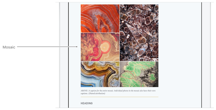 | |
| * @example | |
| * ```json | |
| * { | |
| * "components": [ | |
| * { | |
| * "role": "title", | |
| * "text": "Article Title" | |
| * }, | |
| * { | |
| * "role": "body", | |
| * "format": "html", | |
| * "text": "Apple News Format allows publishers to craft beautiful editorial layouts. Galleries, audio, video, and fun interactions like animation make stories spring to life." | |
| * }, | |
| * { | |
| * "role": "mosaic", | |
| * "items": [ | |
| * { | |
| * "URL": "bundle://mosaic-01.jpg", | |
| * "caption": "A caption for the first image in the mosaic." | |
| * }, | |
| * { | |
| * "URL": "bundle://mosaic-02.jpg", | |
| * "caption": "A caption for the second image in the mosaic." | |
| * }, | |
| * { | |
| * "URL": "bundle://mosaic-03.jpg", | |
| * "caption": "A caption for the third image in the mosaic." | |
| * }, | |
| * { | |
| * "URL": "bundle://mosaic-04.jpg", | |
| * "caption": "A caption for the fourth image in the mosaic." | |
| * }, | |
| * { | |
| * "URL": "bundle://mosaic-05.jpg", | |
| * "caption": "A caption for the fifth image in the mosaic." | |
| * } | |
| * ] | |
| * } | |
| * ] | |
| * } | |
| * ``` | |
| * @see https://developer.apple.com/documentation/apple_news/mosaic | |
| */ | |
| export interface Mosaic { | |
| /** | |
| * An array of the images that will appear in the mosaic. The order used in the array may affect layout and positioning in the mosaic, depending on the device or width. Gallery items can be JPEG (with `.jpg` or `.jpeg` extension), PNG, or GIF images. If the GIF is animated, the animation plays only in full screen. | |
| */ | |
| items: GalleryItem[]; | |
| /** | |
| * Always `mosaic` for this component. | |
| */ | |
| role: "mosaic"; | |
| /** | |
| * An object that defines vertical alignment with another component. | |
| */ | |
| anchor?: Anchor; | |
| /** | |
| * An object that defines an animation to be applied to the component. | |
| * | |
| * The `none` value is used for conditional design elements. Adding it here has no effect. | |
| */ | |
| animation?: ComponentAnimation | "none"; | |
| /** | |
| * An object that defines behavior for a component, like [Parallax](https://developer.apple.com/documentation/apple_news/parallax) or [Springy](https://developer.apple.com/documentation/apple_news/springy). | |
| * | |
| * The `none` value is used for conditional design elements. Adding it here has no effect. | |
| */ | |
| behavior?: Behavior | "none"; | |
| /** | |
| * An instance or array of component properties that can be applied conditionally, and the conditions that cause them to be applied. | |
| */ | |
| conditional?: ConditionalComponent | ConditionalComponent[]; | |
| /** | |
| * A Boolean value that determines whether the component is hidden. | |
| */ | |
| hidden?: boolean; | |
| /** | |
| * An optional unique identifier for this component. If used, this `identifier` must be unique across the entire document. You will need an `identifier` for your component if you want to anchor other components to it. | |
| */ | |
| identifier?: string; | |
| /** | |
| * An inline `ComponentLayout` object that contains layout information, or a string reference to a `ComponentLayout` object that is defined at the top level of the document. | |
| * | |
| * If `layout` is not defined, size and position will be based on various factors, such as the device type, the length of the content, and the `role` of this component. | |
| */ | |
| layout?: ComponentLayout | string; | |
| /** | |
| * An inline `ComponentStyle` object that defines the appearance of this component, or a string reference to a `ComponentStyle` object that is defined at the top level of the document. | |
| * | |
| * The `none` value is used for conditional design elements. Adding it here has no effect. | |
| */ | |
| style?: ComponentStyle | string | "none"; | |
| } | |
| /** | |
| * When you apply the `Motion` behavior to a component, the component reacts to the movement of the device. For example, when the user tilts the device, the component moves in the same direction. [This video](https://devimages-cdn.apple.com/news-publisher/videos/motion.mp4) shows an example of the `motion` behavior. | |
| * @example | |
| * ```json | |
| * { | |
| * "components": [ | |
| * { | |
| * "role": "figure", | |
| * "behavior": { | |
| * "type": "motion" | |
| * }, | |
| * "URL": "bundle://figure.jpg" | |
| * } | |
| * ] | |
| * } | |
| * ``` | |
| * @see https://developer.apple.com/documentation/apple_news/motion | |
| */ | |
| export interface Motion { | |
| /** | |
| * This behavior always has the type motion. | |
| */ | |
| type: "motion"; | |
| } | |
| /** | |
| * With this animation type the component moves into view from the left or right side of the screen. Initially, the component is out of view as shown in [this video](https://devimages-cdn.apple.com/news-publisher/videos/move-in.mp4). | |
| * | |
| * You can configure a preferred starting position, but the position is not guaranteed. For example, if another component is blocking the preferred position, the `MoveInAnimation` will attempt to start from the opposite side. If both sides are covered by other components, the MoveInAnimation will not be applied. | |
| * @example | |
| * ```json | |
| * { | |
| * "components": [ | |
| * { | |
| * "role": "heading1", | |
| * "text": "2. Unbeatable Heat" | |
| * }, | |
| * { | |
| * "role": "figure", | |
| * "URL": "bundle://figure.jpg", | |
| * "animation": { | |
| * "type": "move_in", | |
| * "preferredStartingPosition": "left" | |
| * } | |
| * } | |
| * ] | |
| * } | |
| * ``` | |
| * @see https://developer.apple.com/documentation/apple_news/moveinanimation | |
| */ | |
| export interface MoveInAnimation { | |
| /** | |
| * This animation always has the type `move_in`. | |
| */ | |
| type: "move_in"; | |
| /** | |
| * Indicates which side of the screen should be the starting point of the animation. Valid values: | |
| * | |
| * - `left`: Move the component in from the left side of the screen. | |
| * - `right`: Move the component in from the right side of the screen. | |
| * | |
| * By default, the animation will start on the side that is closest to the component. | |
| */ | |
| preferredStartingPosition?: "left" | "right"; | |
| /** | |
| * Indicates whether the animation is controlled by (is in response to) user action (`true`) or happens automatically (`false`). | |
| */ | |
| userControllable?: boolean; | |
| } | |
| /** | |
| * Use the `Music` component to play an audio file. You can also include album art (or another image that represents the music). | |
| * | |
| * See [Preparing Image, Video, Audio, Music, and ARKit Assets](https://developer.apple.com/documentation/apple_news/apple_news_format/preparing_image_video_audio_music_and_arkit_assets). | |
| * @example | |
| * ```json | |
| * { | |
| * "components": [ | |
| * { | |
| * "role": "music", | |
| * "URL": "http://www.example.com/files/sample.mp3", | |
| * "imageURL": "bundle://album_cover.jpg", | |
| * "caption": "Cosmic-Karmic by Retake Chorus" | |
| * } | |
| * ] | |
| * } | |
| * ``` | |
| * @see https://developer.apple.com/documentation/apple_news/music | |
| */ | |
| export interface Music { | |
| /** | |
| * Always `music` for this component. | |
| */ | |
| role: "music"; | |
| /** | |
| * The URL of an audio file (HTTP or HTTPS only). This component supports all [`AVPlayer`](https://developer.apple.com/documentation/avfoundation/avplayer) audio formats, including the following: | |
| * | |
| * - MP3: MPEG-1 audio layer 3 | |
| * - AAC: MPEG-4 Advanced Audio Coding | |
| * - ALAC: Apple Lossless | |
| * - HE-AAC: MPEG-4 High Efficiency AAC | |
| */ | |
| URL: string; | |
| /** | |
| * A caption that describes the content of the audio file. The text is used for [VoiceOver for iOS](https://www.apple.com/accessibility/iphone/vision/) and [VoiceOver for macOS](https://www.apple.com/accessibility/mac/vision/). If `accessibilityCaption` is not provided, the caption value is used for VoiceOver for iOS and VoiceOver for macOS. | |
| */ | |
| accessibilityCaption?: string; | |
| /** | |
| * An object that defines vertical alignment with another component. | |
| */ | |
| anchor?: Anchor; | |
| /** | |
| * An object that defines an animation to be applied to the component. | |
| * | |
| * The `none` value is used for conditional design elements. Adding it here has no effect. | |
| */ | |
| animation?: ComponentAnimation | "none"; | |
| /** | |
| * An object that defines behavior for a component, like [Parallax](https://developer.apple.com/documentation/apple_news/parallax) or [Springy](https://developer.apple.com/documentation/apple_news/springy). | |
| * | |
| * The `none` value is used for conditional design elements. Adding it here has no effect. | |
| */ | |
| behavior?: Behavior | "none"; | |
| /** | |
| * A caption that describes the content of the audio file. This text is also used by [VoiceOver for iOS](https://www.apple.com/accessibility/iphone/vision/) and [VoiceOver for macOS](https://www.apple.com/accessibility/mac/vision/) if `accessibilityCaption` is not provided, or it can be shown when the audio cannot be played. | |
| */ | |
| caption?: string; | |
| /** | |
| * An instance or array of component properties that can be applied conditionally, and the conditions that cause them to be applied. | |
| */ | |
| conditional?: ConditionalComponent | ConditionalComponent[]; | |
| /** | |
| * A Boolean value that indicates that the audio may contain explicit content. | |
| */ | |
| explicitContent?: boolean; | |
| /** | |
| * A Boolean value that determines whether the component is hidden. | |
| */ | |
| hidden?: boolean; | |
| /** | |
| * An optional unique identifier for this component. If used, this `identifier` must be unique across the entire document. You will need an identifier for your component if you want to anchor other components to it. | |
| */ | |
| identifier?: string; | |
| /** | |
| * The URL of an image file that represents the audio file, such as a cover image. | |
| * | |
| * Image URLs can begin with `http://`, `https://`, or `bundle://`. If the image URL begins with `bundle://`, the image file must be in the same directory as the document. | |
| * | |
| * Image filenames should be properly encoded as URLs. | |
| * | |
| * See [Preparing Image, Video, Audio, Music, and ARKit Assets](https://developer.apple.com/documentation/apple_news/apple_news_format/preparing_image_video_audio_music_and_arkit_assets). | |
| */ | |
| imageURL?: string; | |
| /** | |
| * An inline `ComponentLayout` object that contains layout information, or a string reference to a `ComponentLayout` object that is defined at the top level of the document. | |
| * | |
| * If `layout` is not defined, size and position will be based on various factors, such as the device type, the length of the content, and the `role` of this component. | |
| */ | |
| layout?: ComponentLayout | string; | |
| /** | |
| * An inline `ComponentStyle` object that defines the appearance of this component, or a string reference to a `ComponentStyle` object that is defined at the top level of the document. | |
| * | |
| * The `none` value is used for conditional design elements. Adding it here has no effect. | |
| */ | |
| style?: ComponentStyle | string | "none"; | |
| } | |
| /** | |
| * Use cell padding to add space around the content in the cell. For example, you can set the amount of padding between the right side of the cell and the content, or the left side of the cell and the content. | |
| * | |
| * This object can be used in [TableCellStyle](https://developer.apple.com/documentation/apple_news/tablecellstyle) and [ConditionalTableCellStyle](https://developer.apple.com/documentation/apple_news/conditionaltablecellstyle). | |
| * @example | |
| * ```json | |
| * { | |
| * "componentStyles": { | |
| * "exampleForTables": { | |
| * "tableStyle": { | |
| * "cells": { | |
| * "verticalAlignment": "top", | |
| * "padding": { | |
| * "left": 6, | |
| * "right": 6, | |
| * "bottom": 4, | |
| * "top": 2 | |
| * } | |
| * } | |
| * } | |
| * } | |
| * } | |
| * } | |
| * ``` | |
| * @see https://developer.apple.com/documentation/apple_news/padding | |
| */ | |
| export interface Padding { | |
| /** | |
| * The amount of padding between the bottom of the cell and the content, as an integer in points or using the available units for components. See [Specifying Measurements for Components](https://developer.apple.com/documentation/apple_news/apple_news_format/specifying_measurements_for_components). | |
| */ | |
| bottom?: SupportedUnits | number; | |
| /** | |
| * The amount of padding between the left side of the cell and the content, as an integer in points or using the available units for components.See [Specifying Measurements for Components](https://developer.apple.com/documentation/apple_news/apple_news_format/specifying_measurements_for_components). | |
| */ | |
| left?: SupportedUnits | number; | |
| /** | |
| * The amount of padding between the right side of the cell and the content, as an integer in points or using the available units for components.See [Specifying Measurements for Components](https://developer.apple.com/documentation/apple_news/apple_news_format/specifying_measurements_for_components). | |
| */ | |
| right?: SupportedUnits | number; | |
| /** | |
| * The amount of padding between the top of the cell and the content, as an integer in points or using the available units for components. See [Specifying Measurements for Components](https://developer.apple.com/documentation/apple_news/apple_news_format/specifying_measurements_for_components). | |
| */ | |
| top?: SupportedUnits | number; | |
| } | |
| /** | |
| * When you apply the `Parallax` behavior to a component, the component moves at a different speed than the scroll speed. Use the `factor` property to set the speed of the component. [This video](https://devimages-cdn.apple.com/news-publisher/videos/parallax.mp4) shows an example of the `parallax` behavior. | |
| * | |
| * Tip | |
| * | |
| * When you use parallax behavior, you might notice text becoming illegible as it covers an image. You can fix this easily, and create a cleaner, more legible article, by adding a background color. | |
| * @example | |
| * ```json | |
| * { | |
| * "components": [ | |
| * { | |
| * "role": "figure", | |
| * "behavior": { | |
| * "type": "parallax", | |
| * "factor": 0.8 | |
| * }, | |
| * "URL": "bundle://figure.jpg" | |
| * } | |
| * ] | |
| * } | |
| * ``` | |
| * @see https://developer.apple.com/documentation/apple_news/parallax | |
| */ | |
| export interface Parallax { | |
| /** | |
| * This behavior always has the type parallax. | |
| */ | |
| type: "parallax"; | |
| /** | |
| * The speed of the component, as a factor of the scroll speed.The value of factor must be between `0.5` and `2.0`. Values outside this range will be reset to the minimum or maximum value. | |
| * | |
| * The parallax factor `1.0` is equal to the scroll speed. | |
| * | |
| * A factor lower than `1.0 `makes the component move more slowly than the scrolling speed. | |
| * | |
| * A factor higher than `1.0` makes the component move more quickly than the scrolling speed. | |
| */ | |
| factor?: number; | |
| } | |
| /** | |
| * Use the `photo` component to display a photograph in an article. A `photo` component is optimized for displaying photographs. Other components are available for other types of images, such as [Figure](https://developer.apple.com/documentation/apple_news/figure), [Portrait](https://developer.apple.com/documentation/apple_news/portrait), and [Logo](https://developer.apple.com/documentation/apple_news/logo). | |
| * | |
| * See [Preparing Image, Video, Audio, Music, and ARKit Assets](https://developer.apple.com/documentation/apple_news/apple_news_format/preparing_image_video_audio_music_and_arkit_assets) | |
| * @example | |
| * ```json | |
| * { | |
| * "components": [ | |
| * { | |
| * "role": "title", | |
| * "text": "Apple News Format" | |
| * }, | |
| * { | |
| * "role": "body", | |
| * "text": "Apple News Format allows publishers to craft beautiful editorial layouts. Galleries, audio, video, and fun interactions like animation make stories spring to life." | |
| * }, | |
| * { | |
| * "role": "photo", | |
| * "URL": "bundle://image.jpg" | |
| * } | |
| * ] | |
| * } | |
| * ``` | |
| * @see https://developer.apple.com/documentation/apple_news/photo | |
| */ | |
| export interface Photo { | |
| /** | |
| * Always `photo` for this component. | |
| */ | |
| role: "photo"; | |
| /** | |
| * The URL of an image file. | |
| * | |
| * Image URLs can begin with `http://`, `https://`, or `bundle://`. If the image URL begins with `bundle://`, the image file must be in the same directory as the document. | |
| * | |
| * Image filenames should be properly encoded as `URLs`. | |
| * | |
| * See [Preparing Image, Video, Audio, Music, and ARKit Assets](https://developer.apple.com/documentation/apple_news/apple_news_format/preparing_image_video_audio_music_and_arkit_assets). | |
| */ | |
| URL: string; | |
| /** | |
| * A caption that describes the image. The text is used for [VoiceOver for iOS](https://www.apple.com/accessibility/iphone/vision/) and [VoiceOver for macOS](https://www.apple.com/accessibility/mac/vision/). If `accessibilityCaption` is not provided, the `caption` value is used for VoiceOver for iOS and VoiceOver for macOS. | |
| */ | |
| accessibilityCaption?: string; | |
| /** | |
| * An array of `ComponentLink` objects. This can be used to create a `ComponentLink`, allowing a link to anywhere in News. | |
| */ | |
| additions?: ComponentLink[]; | |
| /** | |
| * An object that defines vertical alignment with another component. | |
| */ | |
| anchor?: Anchor; | |
| /** | |
| * An object that defines an animation to be applied to the component. | |
| * | |
| * The `none` value is used for conditional design elements. Adding it here has no effect. | |
| */ | |
| animation?: ComponentAnimation | "none"; | |
| /** | |
| * An object that defines behavior for a component, like [Parallax](https://developer.apple.com/documentation/apple_news/parallax) or [Springy](https://developer.apple.com/documentation/apple_news/springy). | |
| * | |
| * The `none` value is used for conditional design elements. Adding it here has no effect. | |
| */ | |
| behavior?: Behavior | "none"; | |
| /** | |
| * A caption that describes the image. The text is seen when the image is in full screen. This text is also used by [VoiceOver for iOS](https://www.apple.com/accessibility/iphone/vision/) and [VoiceOver for macOS](https://www.apple.com/accessibility/mac/vision/), if `accessibilityCaption` text is not provided. The caption text does not appear in the main article view. To display a caption in the main article view, use the [Caption](https://developer.apple.com/documentation/apple_news/caption) component. | |
| */ | |
| caption?: CaptionDescriptor | string; | |
| /** | |
| * An instance or array of component properties that can be applied conditionally, and the conditions that cause them to be applied. | |
| */ | |
| conditional?: ConditionalComponent | ConditionalComponent[]; | |
| /** | |
| * A Boolean value that indicates the image may contain explicit content. | |
| */ | |
| explicitContent?: boolean; | |
| /** | |
| * A Boolean value that determines whether the component is hidden. | |
| */ | |
| hidden?: boolean; | |
| /** | |
| * An optional unique identifier for this component. If used, this `identifier` must be unique across the entire document. You will need an identifier for your component if you want to anchor other components to it. | |
| */ | |
| identifier?: string; | |
| /** | |
| * An inline `ComponentLayout` object that contains layout information, or a string reference to a `ComponentLayout` object that is defined at the top level of the document. | |
| * | |
| * If `layout` is not defined, size and position are based on various factors, such as the device type, the length of the content, and the `role` of this component. | |
| */ | |
| layout?: ComponentLayout | string; | |
| /** | |
| * An inline `ComponentStyle` object that defines the appearance of this component, or a string reference to a `ComponentStyle` object that is defined at the top level of the document. | |
| * | |
| * The `none` value is used for conditional design elements. Adding it here has no effect. | |
| */ | |
| style?: ComponentStyle | string | "none"; | |
| } | |
| /** | |
| * Use the `Photographer` component to name the contributor whose photographs appear in the article. An [Illustrator](https://developer.apple.com/documentation/apple_news/illustrator) component is also available. | |
| * @example | |
| * ```json | |
| * { | |
| * "components": [ | |
| * { | |
| * "role": "photographer", | |
| * "layout": { | |
| * "columnStart": 0, | |
| * "columnSpan": 7, | |
| * "margin": { | |
| * "bottom": 15 | |
| * } | |
| * }, | |
| * "text": "Photos: URNA SEMPER" | |
| * } | |
| * ] | |
| * } | |
| * ``` | |
| * @see https://developer.apple.com/documentation/apple_news/photographer | |
| */ | |
| export interface Photographer { | |
| /** | |
| * Always `photographer` for this component. | |
| */ | |
| role: "photographer"; | |
| /** | |
| * The text to display in the article, including any formatting tags depending on the `format` property. | |
| * | |
| * You can also use a subset of HTML tags or Markdown syntax by setting `format` to `html` or `markdown`, respectively. See [Using HTML with Apple News Format](https://developer.apple.com/documentation/apple_news/apple_news_format/components/using_html_with_apple_news_format). Alternatively, you can style ranges of text individually using the [InlineTextStyle](https://developer.apple.com/documentation/apple_news/inlinetextstyle) object. | |
| */ | |
| text: string; | |
| /** | |
| * An array of all the additions that should be applied to ranges of the component's text. | |
| * | |
| * Additions are ignored when `format` is set to `html` or `markdown`. | |
| */ | |
| additions?: Addition[]; | |
| /** | |
| * An object that defines vertical alignment with another component. | |
| */ | |
| anchor?: Anchor; | |
| /** | |
| * An object that defines an animation to be applied to the component. | |
| * | |
| * The `none` value is used for conditional design elements. Adding it here has no effect. | |
| */ | |
| animation?: ComponentAnimation | "none"; | |
| /** | |
| * An object that defines a behavior for a component, like [Parallax](https://developer.apple.com/documentation/apple_news/parallax) or [Springy](https://developer.apple.com/documentation/apple_news/springy). | |
| * | |
| * The `none` value is used for conditional design elements. Adding it here has no effect. | |
| */ | |
| behavior?: Behavior | "none"; | |
| /** | |
| * An instance or array of text components that can be applied conditionally, and the conditions that cause them to be applied. | |
| */ | |
| conditional?: ConditionalText | ConditionalText[]; | |
| /** | |
| * The formatting or markup method applied to the text. | |
| * | |
| * If `format` is set to `html` or `markdown`, neither `Additions` nor `InlineTextStyles` are supported. | |
| */ | |
| format?: "markdown" | "html" | "none"; | |
| /** | |
| * A Boolean value that determines whether the component is hidden. | |
| */ | |
| hidden?: boolean; | |
| /** | |
| * An optional unique identifier for this component. If used, this `identifier` must be unique across the entire document. You will need an `identifier` for your component if you want to anchor other components to it. | |
| */ | |
| identifier?: string; | |
| /** | |
| * An array of `InlineTextStyle` objects that you can use to apply different text styles to ranges of text. For each InlineTextStyle, you should supply a `rangeStart`, `rangeLength`, and either a `TextStyle` object or the identifier of a TextStyle that is defined at the top level of the document. | |
| * | |
| * Inline text styles are ignored when `format` is set to `markdown` or `html`. | |
| * | |
| * The `none` value is used for conditional design elements. Adding it here has no effect. | |
| */ | |
| inlineTextStyles?: InlineTextStyle[] | "none"; | |
| /** | |
| * An inline `ComponentLayout` object that contains layout information, or a string reference to a `ComponentLayout` object that is defined at the top level of the document. | |
| * | |
| * If `layout` is not defined, size and position are based on various factors, such as the device type, the length of the content, and the `role` of this component. | |
| */ | |
| layout?: ComponentLayout | string; | |
| /** | |
| * An inline `ComponentStyle` object that defines the appearance of this component, or a string reference to a `ComponentStyle` object that is defined at the top level of the document. | |
| * | |
| * The `none` value is used for conditional design elements. Adding it here has no effect. | |
| */ | |
| style?: ComponentStyle | string | "none"; | |
| /** | |
| * An inline `ComponentTextStyle` object that contains styling information, or a string reference to a `ComponentTextStyle` object that is defined at the top level of the document. | |
| */ | |
| textStyle?: ComponentTextStyle | string; | |
| } | |
| /** | |
| * Use the `Place` component to display a map with a single point of interest. The map automatically centers the point of interest based on the `latitude` and `longitude` locations you provide. If you want to display multiple pins on a map, use the [Map](https://developer.apple.com/documentation/apple_news/map) component. | |
| * @example | |
| * ```json | |
| * { | |
| * "components": [ | |
| * { | |
| * "role": "title", | |
| * "text": "Maps" | |
| * }, | |
| * { | |
| * "role": "body", | |
| * "text": "With turn-by-turn spoken directions, interactive 3D views, proactive suggestions, lane guidance, and more, Maps gets you where you need to go." | |
| * }, | |
| * { | |
| * "role": "heading2", | |
| * "text": "Place Heading" | |
| * }, | |
| * { | |
| * "role": "place", | |
| * "mapType": "hybrid", | |
| * "latitude": 35.065908, | |
| * "longitude": -109.781623 | |
| * } | |
| * ] | |
| * } | |
| * ``` | |
| * @see https://developer.apple.com/documentation/apple_news/place | |
| */ | |
| export interface Place { | |
| /** | |
| * The latitude of the place’s location. | |
| */ | |
| latitude: number; | |
| /** | |
| * The longitude of the place’s location. | |
| */ | |
| longitude: number; | |
| /** | |
| * Always `place` for this component. | |
| */ | |
| role: "place"; | |
| /** | |
| * The caption that describes a place. The text is used for [VoiceOver for iOS](https://www.apple.com/accessibility/iphone/vision/) and [VoiceOver for macOS](https://www.apple.com/accessibility/mac/vision/). The value in this property should describe the place for non-sighted users. If `accessibilityCaption` is not provided the `caption` value is used for VoiceOver for iOS and VoiceOver for macOS. | |
| */ | |
| accessibilityCaption?: string; | |
| /** | |
| * An object that defines vertical alignment with another component. | |
| */ | |
| anchor?: Anchor; | |
| /** | |
| * An object that defines an animation to be applied to the component. | |
| * | |
| * The `none` value is used for conditional design elements. Adding it here has no effect. | |
| */ | |
| animation?: ComponentAnimation | "none"; | |
| /** | |
| * An object that defines behavior for a component, like [Parallax](https://developer.apple.com/documentation/apple_news/parallax) or [Springy](https://developer.apple.com/documentation/apple_news/springy). | |
| * | |
| * The `none` value is used for conditional design elements. Adding it here has no effect. | |
| */ | |
| behavior?: Behavior | "none"; | |
| /** | |
| * A string that describes the place depicted on the map. For example, if the `latitude` and `longitude` point to a park, the `caption` should contain the name of the park. The caption is displayed in the full screen version of the map, and the text is also used for [VoiceOver for iOS](https://www.apple.com/accessibility/iphone/vision/) and [VoiceOver for macOS](https://www.apple.com/accessibility/mac/vision/) if `accessibilityCaption` text is not provided. | |
| */ | |
| caption?: string; | |
| /** | |
| * An instance or array of component properties that can be applied conditionally, and the conditions that cause them to be applied. | |
| */ | |
| conditional?: ConditionalComponent | ConditionalComponent[]; | |
| /** | |
| * A Boolean value that determines whether the component is hidden. | |
| */ | |
| hidden?: boolean; | |
| /** | |
| * An optional unique identifier for this component. If used, this `identifier` must be unique across the entire document. You will need an `identifier` for your component if you want to anchor other components to it. | |
| */ | |
| identifier?: string; | |
| /** | |
| * An inline `ComponentLayout` object that contains layout information, or a string reference to a `ComponentLayout` object that is defined at the top level of the document. | |
| * | |
| * If `layout` is not defined, size and position will be based on various factors, such as the device type, the length of the content, and the `role` of this component. | |
| */ | |
| layout?: ComponentLayout | string; | |
| /** | |
| * A string that defines the type of map to display by default. | |
| * | |
| * Valid values: | |
| * | |
| * - `standard` (default). Displays the standard map. | |
| * - `hybrid`. Displays a map with satellite imagery with standard features overlaid. | |
| * - `satellite`. Displays satellite imagery only. | |
| */ | |
| mapType?: "standard" | "hybrid" | "satellite"; | |
| /** | |
| * The object for defining the visible area of a map, relative to its center. A `span` is defined in deltas for `latitude` and `longitude`. | |
| */ | |
| span?: MapSpan; | |
| /** | |
| * An inline `ComponentStyle` object that defines the appearance of this component, or a string reference to a `ComponentStyle` object that is defined at the top level of the document. | |
| * | |
| * The `none` value is used for conditional design elements. Adding it here has no effect. | |
| */ | |
| style?: ComponentStyle | string | "none"; | |
| } | |
| /** | |
| * Use the `portrait` component to display the image of a person in an article. Other components are available for other types of images, such as [Figure](https://developer.apple.com/documentation/apple_news/figure), [Photo](https://developer.apple.com/documentation/apple_news/photo), and [Logo](https://developer.apple.com/documentation/apple_news/logo). | |
| * | |
| * See [Preparing Image, Video, Audio, Music, and ARKit Assets](https://developer.apple.com/documentation/apple_news/apple_news_format/preparing_image_video_audio_music_and_arkit_assets). | |
| * @example | |
| * ```json | |
| * { | |
| * "components": [ | |
| * { | |
| * "role": "portrait", | |
| * "URL": "bundle://louis-armstrong.jpg", | |
| * "caption": "Louis Armstrong, jazz trumpeter (August 4, 1901-July 6, 1971)" | |
| * } | |
| * ] | |
| * } | |
| * ``` | |
| * @see https://developer.apple.com/documentation/apple_news/portrait | |
| */ | |
| export interface Portrait { | |
| /** | |
| * Always `portrait` for this component. | |
| */ | |
| role: "portrait"; | |
| /** | |
| * The `URL` of an image file. | |
| * | |
| * Image URLs can begin with `http://`, `https://`, or `bundle://`. If the image URL begins with `bundle://`, the image file must be in the same directory as the document. | |
| * | |
| * Image filenames should be properly encoded as `URLs`. | |
| * | |
| * See [Preparing Image, Video, Audio, Music, and ARKit Assets](https://developer.apple.com/documentation/apple_news/apple_news_format/preparing_image_video_audio_music_and_arkit_assets). | |
| */ | |
| URL: string; | |
| /** | |
| * A caption that describes the image. The text is used for [VoiceOver for iOS](https://www.apple.com/accessibility/iphone/vision/) and [VoiceOver for macOS](https://www.apple.com/accessibility/mac/vision/). If `accessibilityCaption` is not provided, the `caption` value is used for VoiceOver for iOS and VoiceOver for macOS. | |
| */ | |
| accessibilityCaption?: string; | |
| /** | |
| * An array of `ComponentLink` objects. This can be used to create a `ComponentLink`, allowing a link to anywhere in News. | |
| */ | |
| additions?: ComponentLink[]; | |
| /** | |
| * An object that defines vertical alignment with another component. | |
| */ | |
| anchor?: Anchor; | |
| /** | |
| * An object that defines an animation to be applied to the component. | |
| * | |
| * The `none` value is used for conditional design elements. Adding it here has no effect. | |
| */ | |
| animation?: ComponentAnimation | "none"; | |
| /** | |
| * An object that defines behavior for a component, like [Parallax](https://developer.apple.com/documentation/apple_news/parallax) or [Springy](https://developer.apple.com/documentation/apple_news/springy). | |
| * | |
| * The `none` value is used for conditional design elements. Adding it here has no effect. | |
| */ | |
| behavior?: Behavior | "none"; | |
| /** | |
| * A caption that describes the image. The text is seen when the image is in full screen. This text is also used by [VoiceOver for iOS](https://www.apple.com/accessibility/iphone/vision/) and [VoiceOver for macOS](https://www.apple.com/accessibility/mac/vision/), if `accessibilityCaption` text is not provided. The caption text does not appear in the main article view. To display a caption in the main article view, use the [Caption](https://developer.apple.com/documentation/apple_news/caption) component. | |
| */ | |
| caption?: CaptionDescriptor | string; | |
| /** | |
| * An instance or array of component properties that can be applied conditionally, and the conditions that cause them to be applied. | |
| */ | |
| conditional?: ConditionalComponent | ConditionalComponent[]; | |
| /** | |
| * A Boolean value that indicates the image may contain explicit content. | |
| */ | |
| explicitContent?: boolean; | |
| /** | |
| * A Boolean value that determines whether the component is hidden. | |
| */ | |
| hidden?: boolean; | |
| /** | |
| * An optional unique identifier for this component. If used, this `identifier` must be unique across the entire document. You will need an identifier for your component if you want to anchor other components to it. | |
| */ | |
| identifier?: string; | |
| /** | |
| * An inline `ComponentLayout` object that contains layout information, or a string reference to a `ComponentLayout` object that is defined at the top level of the document. | |
| * | |
| * If `layout` is not defined, size and position are based on various factors, such as the device type, the length of the content, and the `role` of this component. | |
| */ | |
| layout?: ComponentLayout | string; | |
| /** | |
| * An inline `ComponentStyle` object that defines the appearance of this component, or a string reference to a `ComponentStyle` object that is defined at the top level of the document. | |
| * | |
| * The `none` value is used for conditional design elements. Adding it here has no effect. | |
| */ | |
| style?: ComponentStyle | string | "none"; | |
| } | |
| /** | |
| * A `PullQuote` is usually an excerpt from the body text. It generally duplicates that text in a format that increases its visibility. Pull quotes are often used to break up long portions of text or to draw attention to the text in the pull quote. | |
| * @example | |
| * ```json | |
| * { | |
| * "components": [ | |
| * { | |
| * "role": "chapter", | |
| * "components": [ | |
| * { | |
| * "role": "pullquote", | |
| * "text": "The text of the pullquote.", | |
| * "layout": { | |
| * "columnStart": 0, | |
| * "columnSpan": 5 | |
| * } | |
| * } | |
| * ] | |
| * } | |
| * ] | |
| * } | |
| * ``` | |
| * @see https://developer.apple.com/documentation/apple_news/pullquote | |
| */ | |
| export interface PullQuote { | |
| /** | |
| * Always `pullquote` for this component. | |
| */ | |
| role: "pullquote"; | |
| /** | |
| * The text to display in the article, including any formatting tags depending on the `format` property. | |
| * | |
| * You can also use a subset of HTML tags or Markdown syntax by setting `format` to `html` or `markdown`, respectively. See [Using HTML with Apple News Format](https://developer.apple.com/documentation/apple_news/apple_news_format/components/using_html_with_apple_news_format). Alternatively, you can style ranges of text individually using the [InlineTextStyle](https://developer.apple.com/documentation/apple_news/inlinetextstyle) object. | |
| */ | |
| text: string; | |
| /** | |
| * An array of all the additions that should be applied to ranges of the component's text. | |
| * | |
| * Additions are ignored when `format` is set to `html` or `markdown`. | |
| */ | |
| additions?: Addition[]; | |
| /** | |
| * An object that defines vertical alignment with another component. | |
| */ | |
| anchor?: Anchor; | |
| /** | |
| * An object that defines an animation to be applied to the component. | |
| * | |
| * The `none` value is used for conditional design elements. Adding it here has no effect. | |
| */ | |
| animation?: ComponentAnimation | "none"; | |
| /** | |
| * An object that defines behavior for a component, like [Parallax](https://developer.apple.com/documentation/apple_news/parallax) or [Springy](https://developer.apple.com/documentation/apple_news/springy). | |
| * | |
| * The `none` value is used for conditional design elements. Adding it here has no effect. | |
| */ | |
| behavior?: Behavior | "none"; | |
| /** | |
| * An instance or array of text components that can be applied conditionally, and the conditions that cause them to be applied. | |
| */ | |
| conditional?: ConditionalText | ConditionalText[]; | |
| /** | |
| * The formatting or markup method applied to the text. | |
| * | |
| * If `format` is set to `html` or `markdown`, neither `Additions` nor `InlineTextStyles` are supported. | |
| */ | |
| format?: "markdown" | "html" | "none"; | |
| /** | |
| * A Boolean value that determines whether the component is hidden. | |
| */ | |
| hidden?: boolean; | |
| /** | |
| * An optional unique identifier for this component. If used, this `identifier` must be unique across the entire document. You will need an `identifier` for your component if you want to anchor other components to it. | |
| */ | |
| identifier?: string; | |
| /** | |
| * An array of `InlineTextStyle` objects that you can use to apply different text styles to ranges of text. For each `InlineTextStyle`, you should supply a `rangeStart`, `rangeLength`, and either a `TextStyle` object or the `identifier` of a `TextStyle` that is defined at the top level of the document. | |
| * | |
| * Inline text styles are ignored when `format` is set to `markdown` or `html`. | |
| * | |
| * The `none` value is used for conditional design elements. Adding it here has no effect. | |
| */ | |
| inlineTextStyles?: InlineTextStyle[] | "none"; | |
| /** | |
| * An inline `ComponentLayout` object that contains layout information, or a string reference to a `ComponentLayout` object that is defined at the top level of the document. | |
| * | |
| * If `layout` is not defined, size and position are based on various factors, such as the device type, the length of the content, and the `role` of this component. | |
| */ | |
| layout?: ComponentLayout | string; | |
| /** | |
| * An inline `ComponentStyle` object that defines the appearance of this component, or a string reference to a `ComponentStyle` object that is defined at the top level of the document. | |
| * | |
| * The `none` value is used for conditional design elements. Adding it here has no effect. | |
| */ | |
| style?: ComponentStyle | string | "none"; | |
| /** | |
| * An inline `ComponentTextStyle` object that contains styling information, or a string reference to a `ComponentTextStyle` object that is defined at the top level of the document. | |
| */ | |
| textStyle?: ComponentTextStyle | string; | |
| } | |
| /** | |
| * Use the `Quote` component to indicate the text of a quotation. A `quote` is a unique portion of text, while a pull quote duplicates a selection of text. | |
| * @example | |
| * ```json | |
| * { | |
| * "components": [ | |
| * { | |
| * "role": "chapter", | |
| * "components": [ | |
| * { | |
| * "role": "quote", | |
| * "text": "Failure is not an option." | |
| * } | |
| * ] | |
| * } | |
| * ] | |
| * } | |
| * ``` | |
| * @see https://developer.apple.com/documentation/apple_news/quote | |
| */ | |
| export interface Quote { | |
| /** | |
| * Always `quote` for this component. | |
| */ | |
| role: "quote"; | |
| /** | |
| * The text to display in the article, including any formatting tags depending on the `format` property. | |
| * | |
| * You can also use a subset of HTML tags or Markdown syntax by setting `format` to `html` or `markdown`, respectively. See [Using HTML with Apple News Format](https://developer.apple.com/documentation/apple_news/apple_news_format/components/using_html_with_apple_news_format). Alternatively, you can style ranges of text individually using the [InlineTextStyle](https://developer.apple.com/documentation/apple_news/inlinetextstyle) object. | |
| */ | |
| text: string; | |
| /** | |
| * An array of all the additions that should be applied to ranges of the component's text. | |
| * | |
| * `Additions` are ignored when `format` is set to `html` or `markdown`. | |
| */ | |
| additions?: Addition[]; | |
| /** | |
| * An object that defines vertical alignment with another component. | |
| */ | |
| anchor?: Anchor; | |
| /** | |
| * An object that defines an animation to be applied to the component. | |
| * | |
| * The `none` value is used for conditional design elements. Adding it here has no effect. | |
| */ | |
| animation?: ComponentAnimation | "none"; | |
| /** | |
| * An object that defines behavior for a component, like [Parallax](https://developer.apple.com/documentation/apple_news/parallax) or [Springy](https://developer.apple.com/documentation/apple_news/springy). | |
| * | |
| * The `none` value is used for conditional design elements. Adding it here has no effect. | |
| */ | |
| behavior?: Behavior | "none"; | |
| /** | |
| * An instance or array of text components that can be applied conditionally and the conditions that cause them to be applied. | |
| */ | |
| conditional?: ConditionalText | ConditionalText[]; | |
| /** | |
| * The formatting or markup method applied to the text. | |
| * | |
| * If format is set to `html` or `markdown`, neither `Additions` nor `InlineTextStyles` are supported. | |
| */ | |
| format?: "markdown" | "html" | "none"; | |
| /** | |
| * A Boolean value that determines whether the component is hidden. | |
| */ | |
| hidden?: boolean; | |
| /** | |
| * An optional unique identifier for this component. If used, this `identifier` must be unique across the entire document. You will need an `identifier` for your component if you want to anchor other components to it. | |
| */ | |
| identifier?: string; | |
| /** | |
| * An array of `InlineTextStyle` objects that you can use to apply different text styles to ranges of text. For each `InlineTextStyle`, you should supply a `rangeStart`, `rangeLength`, and either a `TextStyle` object or the `identifier` of a `TextStyle` that is defined at the top level of the document. | |
| * | |
| * Inline text styles are ignored when `format` is set to `markdown` or `html`. | |
| * | |
| * The `none` value is used for conditional design elements. Adding it here has no effect. | |
| */ | |
| inlineTextStyles?: InlineTextStyle[] | "none"; | |
| /** | |
| * An inline `ComponentLayout` object that contains layout information, or a string reference to a ComponentLayout object that is defined at the top level of the document. | |
| * | |
| * If `layout` is not defined, size and position are based on various factors, such as the device type, the length of the content, and the `role` of this component. | |
| */ | |
| layout?: ComponentLayout | string; | |
| /** | |
| * An inline `ComponentStyle` object that defines the appearance of this component, or a string reference to a `ComponentStyle` object that is defined at the top level of the document. | |
| * | |
| * The `none` value is used for conditional design elements. Adding it here has no effect. | |
| */ | |
| style?: ComponentStyle | string | "none"; | |
| /** | |
| * An inline `ComponentTextStyle` object that contains styling information, or a string reference to a `ComponentTextStyle` object that is defined at the top level of the document. | |
| */ | |
| textStyle?: ComponentTextStyle | string; | |
| } | |
| /** | |
| * The `RecordStore` object uses two required properties to provide the `data` for a table and to specify how that data will be used in the table. | |
| * | |
| * - Data `descriptors` define how the data is interpreted and how it will be displayed in the table. For each set of data, data descriptors communicate the data type, unique keys, data formats, and header labels for the table. | |
| * - Data `records` provide the actual data as a set of key-value pairs that relate to the descriptors. | |
| * | |
| * For example, your data `descriptors` might describe a table that contains stock symbols and prices; each data record could provide the symbol and price for a particular stock. | |
| * | |
| * This object can be used in [DataTable](https://developer.apple.com/documentation/apple_news/datatable). | |
| * @example | |
| * ```json | |
| * { | |
| * "components": [ | |
| * { | |
| * "role": "datatable", | |
| * "showDescriptorLabels": true, | |
| * "sortBy": [ | |
| * { | |
| * "descriptor": "id-name", | |
| * "direction": "descending" | |
| * } | |
| * ], | |
| * "data": { | |
| * "descriptors": [ | |
| * { | |
| * "identifier": "id-name", | |
| * "key": "name", | |
| * "label": { | |
| * "type": "formatted_text", | |
| * "text": "Name" | |
| * }, | |
| * "dataType": "string" | |
| * }, | |
| * { | |
| * "identifier": "id-occupation", | |
| * "key": "occupation", | |
| * "label": "Occupation", | |
| * "dataType": "string" | |
| * } | |
| * ], | |
| * "records": [ | |
| * { | |
| * "name": "Amelia Earhart", | |
| * "occupation": "Pilot" | |
| * }, | |
| * { | |
| * "name": "Grace Hopper", | |
| * "occupation": "Computer Scientist" | |
| * } | |
| * ] | |
| * } | |
| * } | |
| * ] | |
| * } | |
| * ``` | |
| * @see https://developer.apple.com/documentation/apple_news/recordstore | |
| */ | |
| export interface RecordStore { | |
| /** | |
| * Provides information about the data that can be in each data record. | |
| * | |
| * The order of the descriptors determines the order of the columns (or the rows if the table’s `dataOrientation` is set to horizontal.) | |
| * | |
| * Version 1.5 | |
| */ | |
| descriptors: DataDescriptor[]; | |
| /** | |
| * Provides data records that fit within the structure defined by `descriptors`. Each descriptor can be used only once per record. | |
| * | |
| * You can choose not to include all values from a given record in a data table. Only data that corresponds to a data descriptor will be included in your data table. | |
| */ | |
| records: any[]; | |
| } | |
| /** | |
| * Use the `ReplicaAdvertisement` component to provide the digital version of the print advertisement as PDF or in image formats like JPG, PNG, and GIF for an article. | |
| * @example | |
| * ```json | |
| * { | |
| * "components": [ | |
| * { | |
| * "role": "replica_advertisement", | |
| * "URL": "bundle://advertisement.pdf" | |
| * } | |
| * ] | |
| * } | |
| * ``` | |
| * @see https://developer.apple.com/documentation/apple_news/replicaadvertisement | |
| */ | |
| export interface ReplicaAdvertisement { | |
| /** | |
| * Always `replica_advertisement` for this component. | |
| */ | |
| role: "replica_advertisement"; | |
| /** | |
| * The URL of the digital version of the print advertisement. | |
| * | |
| * The URL can begin with `http://`, `https://`, or `bundle://`. If it begins with `bundle://`, the digital version of the print advertisement file must be in the same directory as the document. | |
| * | |
| * Digital version of the print advertisement filenames should be properly encoded as URLs. | |
| * | |
| * See [Preparing Image, Video, Audio, Music, and ARKit Assets](https://developer.apple.com/documentation/apple_news/apple_news_format/preparing_image_video_audio_music_and_arkit_assets). | |
| */ | |
| URL: string; | |
| /** | |
| * A caption that describes the digital version of the print advertisement. The text is used for [VoiceOver for iOS](https://www.apple.com/accessibility/iphone/vision/) and [VoiceOver for macOS](https://www.apple.com/accessibility/mac/vision/). If `accessibilityCaption` is not provided, the `caption` value is used for VoiceOver for iOS and VoiceOver for macOS. | |
| */ | |
| accessibilityCaption?: string; | |
| /** | |
| * An array of `ComponentLink` objects. This can be used to create a `ComponentLink`, allowing a link to anywhere in News. | |
| */ | |
| additions?: ComponentLink[]; | |
| /** | |
| * An object that defines vertical alignment with another component. | |
| */ | |
| anchor?: Anchor; | |
| /** | |
| * An object that defines an animation to be applied to the component. | |
| * | |
| * The `none` value is used for conditional design elements. Adding it here has no effect. | |
| */ | |
| animation?: ComponentAnimation | "none"; | |
| /** | |
| * An object that defines behavior for a component, like [Parallax](https://developer.apple.com/documentation/apple_news/parallax) or [Springy](https://developer.apple.com/documentation/apple_news/springy). | |
| * | |
| * The `none` value is used for conditional design elements. Adding it here has no effect. | |
| */ | |
| behavior?: Behavior | "none"; | |
| /** | |
| * A caption that describes the digital version of the print advertisement. The text is seen when the digital version of the print advertisement is in full screen. This text is also used by [VoiceOver for iOS](https://www.apple.com/accessibility/iphone/vision/) and [VoiceOver for macOS](https://www.apple.com/accessibility/mac/vision/), if `accessibilityCaption` text is not provided. The caption text does not appear in the main article view. To display a caption in the main article view, use the [Caption](https://developer.apple.com/documentation/apple_news/caption) component. | |
| */ | |
| caption?: CaptionDescriptor | string; | |
| /** | |
| * An instance or array of component properties that can be applied conditionally, and the conditions that cause them to be applied. | |
| */ | |
| conditional?: ConditionalComponent | ConditionalComponent[]; | |
| /** | |
| * A Boolean value that indicates the digital version of the print advertisement may contain explicit content. | |
| */ | |
| explicitContent?: boolean; | |
| /** | |
| * A Boolean value that determines whether the component is hidden. | |
| */ | |
| hidden?: boolean; | |
| /** | |
| * An optional unique identifier for this component. If used, this identifier must be unique across the entire document. You will need an identifier for your component if you want to anchor other components to it. | |
| */ | |
| identifier?: string; | |
| /** | |
| * An inline `ComponentLayout` object that contains layout information, or a string reference to a `ComponentLayout` object that is defined at the top level of the document. | |
| * | |
| * If `layout` is not defined, size and position are based on various factors, such as the device type, the length of the content, and the `role` of this component. | |
| */ | |
| layout?: ComponentLayout | string; | |
| /** | |
| * An inline `ComponentStyle` object that defines the appearance of this component, or a string reference to a `ComponentStyle` object that is defined at the top level of the document. | |
| * | |
| * The `none` value is used for conditional design elements. Adding it here has no effect. | |
| */ | |
| style?: ComponentStyle | string | "none"; | |
| } | |
| /** | |
| * With this animation type the component appears by getting larger and fading from transparent to opaque. Initially, the component is scaled down and at least partially transparent, but, upon entering the user’s view, the component scales up (to its actual size in the layout) and fades in to be completely opaque as shown in [this video](https://devimages-cdn.apple.com/news-publisher/videos/scale-fade.mp4). | |
| * @example | |
| * ```json | |
| * { | |
| * "components": [ | |
| * { | |
| * "role": "figure", | |
| * "URL": "bundle://figure.jpg", | |
| * "animation": { | |
| * "type": "scale_fade", | |
| * "initialAlpha": 0.5, | |
| * "initialScale": 0.75 | |
| * } | |
| * } | |
| * ] | |
| * } | |
| * ``` | |
| * @see https://developer.apple.com/documentation/apple_news/scalefadeanimation | |
| */ | |
| export interface ScaleFadeAnimation { | |
| /** | |
| * This animation always has the type `scale_fade`. | |
| */ | |
| type: "scale_fade"; | |
| /** | |
| * The initial transparency of the component (and the animation). Set `initialAlpha` to a value between `0 `(completely transparent) and `1` (completely visible). | |
| */ | |
| initialAlpha?: number; | |
| /** | |
| * The initial scale of the component (and the animation). Set `initialScale `to a value between` 0 `(completely scaled down) and `1` (the component’s original size). | |
| */ | |
| initialScale?: number; | |
| /** | |
| * Indicates whether the animation is controlled by (is in response to) user action `(true`) or happens automatically (`false`). | |
| */ | |
| userControllable?: boolean; | |
| } | |
| /** | |
| * A scene is a combination of animations and behaviors that lets you create special effects for the `section` and `chapter` components in an article. You do not use the `Scene` object directly, but instead use the specific objects that extend scene: | |
| * | |
| * - [FadingStickyHeader](https://developer.apple.com/documentation/apple_news/fadingstickyheader) | |
| * - [ParallaxScaleHeader](https://developer.apple.com/documentation/apple_news/parallaxscaleheader) | |
| * | |
| * Tip | |
| * | |
| * To use a scene, create a child `header` component within your section or chapter, and then specify which scene you want to use in the `scene` property of the section or chapter. | |
| * | |
| * This object can be used in [Chapter](https://developer.apple.com/documentation/apple_news/chapter) and [Section](https://developer.apple.com/documentation/apple_news/section-ka8). | |
| * @see https://developer.apple.com/documentation/apple_news/scene | |
| */ | |
| export interface Scene { | |
| /** | |
| * The type of scene. For example, `parallax_scale `for a Parallax Scale Header scene or `fading_sticky_header` for a Fading Sticky Header. | |
| * | |
| * Version 1.0 | |
| */ | |
| type: "fading_sticky_header" | "parallax_scale"; | |
| } | |
| /** | |
| * A `section` is a full-width container component that lets you nest components so you can divide a large article into separate parts with potentially different styling. You can also use the `section` component to divide large chapters. | |
| * | |
| * The `section` component is a structural component intended to organize an entire article, so you generally use it in the `components` array in the [ArticleDocument](https://developer.apple.com/documentation/apple_news/articledocument) properties. The overall height of a section is determined by the height of its child components. | |
| * | |
| * Note | |
| * | |
| * The `section` component has the same properties as the `chapter` component, so you can use the one that fits best for your content. | |
| * @example | |
| * ```json | |
| * { | |
| * "components": [ | |
| * { | |
| * "role": "section", | |
| * "components": [ | |
| * { | |
| * "role": "header", | |
| * "style": { | |
| * "fill": { | |
| * "type": "image", | |
| * "URL": "bundle://header.jpg", | |
| * "fillMode": "cover", | |
| * "verticalAlignment": "top", | |
| * "horizontalAlignment": "center" | |
| * } | |
| * }, | |
| * "layout": { | |
| * "minimumHeight": "75cw" | |
| * }, | |
| * "components": [ | |
| * { | |
| * "role": "title", | |
| * "text": "Article Title", | |
| * "anchor": { | |
| * "targetAnchorPosition": "center" | |
| * }, | |
| * "textStyle": { | |
| * "textAlignment": "center" | |
| * } | |
| * } | |
| * ] | |
| * } | |
| * ] | |
| * } | |
| * ] | |
| * } | |
| * ``` | |
| * @see https://developer.apple.com/documentation/apple_news/section-ka8 | |
| */ | |
| export interface Section { | |
| /** | |
| * Always `section` for this component. | |
| */ | |
| role: "section"; | |
| /** | |
| * An array of `ComponentLin`k objects. This can be used to create a [ComponentLink](https://developer.apple.com/documentation/apple_news/componentlink), allowing a link to anywhere in News. Adding a link to a section component will make the entire component interactable. Any links used in its child components are not interactable. | |
| */ | |
| additions?: ComponentLink[]; | |
| /** | |
| * An object that defines vertical alignment with another component. | |
| */ | |
| anchor?: Anchor; | |
| /** | |
| * An object that defines an animation to be applied to the component. | |
| * | |
| * The `none` value is used for conditional design elements. Adding it here has no effect. | |
| */ | |
| animation?: ComponentAnimation | "none"; | |
| /** | |
| * An object that defines behavior for a component, like [Parallax](https://developer.apple.com/documentation/apple_news/parallax) or [Springy](https://developer.apple.com/documentation/apple_news/springy). | |
| * | |
| * The `none` value is used for conditional design elements. Adding it here has no effect. | |
| */ | |
| behavior?: Behavior | "none"; | |
| /** | |
| * An array of components to display as child components. Child components are positioned and rendered relative to their parent component. | |
| */ | |
| components?: Component[]; | |
| /** | |
| * An instance or array of section properties that can be applied conditionally, and the conditions that cause them to be applied. | |
| */ | |
| conditional?: ConditionalSection | ConditionalSection[]; | |
| /** | |
| * Defines how child components are positioned within this `section` component. For example, this property can allow for displaying child components side-by-side and can make sure they are sized equally. | |
| * | |
| * The `none` value is used for conditional design elements. Adding it here has no effect. | |
| * | |
| * On versions of News prior to iOS 11, child components are positioned as if `contentDisplay` were not defined. | |
| */ | |
| contentDisplay?: CollectionDisplay | HorizontalStackDisplay | "none"; | |
| /** | |
| * A Boolean value that determines whether the component is hidden. | |
| */ | |
| hidden?: boolean; | |
| /** | |
| * An optional unique identifier for this component. If used, this `identifier` must be unique across the entire document. You will need an `identifier` for your component if you want to anchor other components to it. | |
| */ | |
| identifier?: string; | |
| /** | |
| * An inline `ComponentLayout` object that contains layout information, or a string reference to a `ComponentLayout` object that is defined at the top level of the document. | |
| * | |
| * If `layout` is not defined, size and position are based on various factors, such as the device type, the length of the content, and the `role` of this component. | |
| */ | |
| layout?: ComponentLayout | string; | |
| /** | |
| * A set of animations applied to any `header` component that is a child of this section. | |
| */ | |
| scene?: Scene; | |
| /** | |
| * An inline `ComponentStyle` object that defines the appearance of this component, or a string reference to a `ComponentStyle` object that is defined at the top level of the document. | |
| * | |
| * The `none` value is used for conditional design elements. Adding it here has no effect. | |
| */ | |
| style?: ComponentStyle | string | "none"; | |
| } | |
| /** | |
| * When you apply the `Springy` behavior to a component, the component behaves as if it is held in place with a short spring, as shown in [this video](https://devimages-cdn.apple.com/news-publisher/videos/springy.mp4). | |
| * @example | |
| * ```json | |
| * { | |
| * "components": [ | |
| * { | |
| * "role": "figure", | |
| * "behavior": { | |
| * "type": "springy" | |
| * }, | |
| * "URL": "bundle://figure.jpg" | |
| * } | |
| * ] | |
| * } | |
| * ``` | |
| * @see https://developer.apple.com/documentation/apple_news/springy | |
| */ | |
| export interface Springy { | |
| /** | |
| * This behavior always has the type springy. | |
| */ | |
| type: "springy"; | |
| } | |
| /** | |
| * You can specify the color, width, and style (solid, dashed, or dotted) of a stroke. Such strokes have many uses, including component borders and divider components. | |
| * | |
| * This object can be used in [Border](https://developer.apple.com/documentation/apple_news/border), [Divider](https://developer.apple.com/documentation/apple_news/divider), [TableRowStyle](https://developer.apple.com/documentation/apple_news/tablerowstyle), [TableColumnStyle](https://developer.apple.com/documentation/apple_news/tablecolumnstyle), [ConditionalTableRowStyle](https://developer.apple.com/documentation/apple_news/conditionaltablerowstyle), and [ConditionalTableColumnStyle](https://developer.apple.com/documentation/apple_news/conditionaltablecolumnstyle). | |
| * @example | |
| * ```json | |
| * { | |
| * "components": [ | |
| * { | |
| * "role": "divider", | |
| * "stroke": { | |
| * "color": "black", | |
| * "width": 1 | |
| * } | |
| * } | |
| * ] | |
| * } | |
| * ``` | |
| * @see https://developer.apple.com/documentation/apple_news/strokestyle | |
| */ | |
| export interface StrokeStyle { | |
| /** | |
| * The stroke color. | |
| */ | |
| color?: Color; | |
| /** | |
| * Defines the style of the stroke. Valid values: | |
| * | |
| * - `solid` (default): A solid stroke \_\_\_\_\_\_\_ | |
| * - `dashed`: A dashed stroke – – – – – | |
| * - `dotted`: A dotted stroke •••••••• | |
| */ | |
| style?: "solid" | "dashed" | "dotted"; | |
| /** | |
| * The width of the stroke line. Can be either an integer value in points, or a string according to [Specifying Measurements for Components](https://developer.apple.com/documentation/apple_news/apple_news_format/specifying_measurements_for_components). | |
| */ | |
| width?: SupportedUnits | number; | |
| } | |
| /** | |
| * You can define units for setting dimensions in Apple News Format. Values without a unit definition are interpreted in points (`pt`). | |
| * | |
| * The following are the supported units in Apple News Format: | |
| * | |
| * - `vw`. Defines a size or margin based on the viewport width. | |
| * - `vh`. Defines a size or margin based on the viewport height. | |
| * - `vmin`. Defines a size or margin based on the shortest side of the viewport (height or width, whichever is shorter). | |
| * - `vmax`. Defines a size or margin based on the longest side of the viewport (height or width, whichever is longer). | |
| * - `dg`. Defines a size or margin based on the document gutter. See [Layout](https://developer.apple.com/documentation/apple_news/layout). | |
| * - `dm`. Defines a size or margin based on the document margin. See [Layout](https://developer.apple.com/documentation/apple_news/layout). | |
| * - `cw`. Defines a size based on the component’s width. Note that this unit can only be used for sizing the component itself. | |
| * - `pw`. Defines the component width based on the parent component width. | |
| * - `pt`. Defines a unit of measure in points (the default). | |
| * | |
| * For more information, see [Specifying Measurements for Components](https://developer.apple.com/documentation/apple_news/apple_news_format/specifying_measurements_for_components). | |
| * @see https://developer.apple.com/documentation/apple_news/supportedunits | |
| */ | |
| export type SupportedUnits = string; | |
| /** | |
| * The `TableBorder` object defines a table cell border. The border style is the same for all sides of the table cell. Use a value of `false` for any side of a border that you do not want to show. | |
| * @example | |
| * ```json | |
| * { | |
| * "componentStyles": { | |
| * "exampleStyle": { | |
| * "tableStyle": { | |
| * "cells": { | |
| * "border": { | |
| * "all": { | |
| * "width": 2, | |
| * "color": "#ddd", | |
| * "style": "solid" | |
| * }, | |
| * "left": false, | |
| * "right": false | |
| * } | |
| * } | |
| * } | |
| * } | |
| * } | |
| * } | |
| * ``` | |
| * @see https://developer.apple.com/documentation/apple_news/tableborder | |
| */ | |
| export interface TableBorder { | |
| /** | |
| * Defines the stroke properties of the border. Stroke properties cannot be set for each side; the border can only be disabled or enabled for each side. | |
| */ | |
| all?: TableStrokeStyle; | |
| /** | |
| * Indicates whether the border should be applied to the bottom. | |
| */ | |
| bottom?: boolean; | |
| /** | |
| * Indicates whether the border should be applied to the left side. | |
| */ | |
| left?: boolean; | |
| /** | |
| * Indicates whether the border should be applied to the right side. | |
| */ | |
| right?: boolean; | |
| /** | |
| * Indicates whether the border should be applied to the top. | |
| */ | |
| top?: boolean; | |
| } | |
| /** | |
| * Use the `TableCellSelector` object to set the criteria that must be met in order for conditional styles to be applied to cells. For example, you could set criteria to select a cell at a specific location or to select cells for a certain data descriptor. | |
| * | |
| * This object can be used in [ConditionalTableCellStyle](https://developer.apple.com/documentation/apple_news/conditionaltablecellstyle). | |
| * @example | |
| * ```json | |
| * { | |
| * "components": [ | |
| * { | |
| * "role": "datatable", | |
| * "style": "bookTableStyle", | |
| * "showDescriptorLabels": true, | |
| * "sortBy": [ | |
| * { | |
| * "descriptor": "id-publication-date", | |
| * "direction": "ascending" | |
| * } | |
| * ], | |
| * "data": { | |
| * "descriptors": [ | |
| * { | |
| * "identifier": "id-publication-date", | |
| * "key": "publicationDate", | |
| * "label": "Date", | |
| * "dataType": "string" | |
| * }, | |
| * { | |
| * "identifier": "id-title", | |
| * "key": "title", | |
| * "label": "Title", | |
| * "dataType": "string" | |
| * }, | |
| * { | |
| * "identifier": "id-publisher", | |
| * "key": "publisher", | |
| * "label": "Publisher", | |
| * "dataType": "string" | |
| * } | |
| * ], | |
| * "records": [ | |
| * { | |
| * "title": "Mardi", | |
| * "publicationDate": "1849", | |
| * "publisher": "Harper & Brothers" | |
| * }, | |
| * { | |
| * "title": "Typee", | |
| * "publicationDate": "1846", | |
| * "publisher": "Wiley and Putnam" | |
| * }, | |
| * { | |
| * "title": "White-Jacket", | |
| * "publicationDate": "1850", | |
| * "publisher": "Harper & Brothers" | |
| * }, | |
| * { | |
| * "title": "Omoo", | |
| * "publicationDate": "1847", | |
| * "publisher": "Harper & Brothers" | |
| * }, | |
| * { | |
| * "title": "Redburn", | |
| * "publicationDate": "1849", | |
| * "publisher": "Harper & Brothers" | |
| * }, | |
| * { | |
| * "title": "Moby-Dick", | |
| * "publicationDate": "1851", | |
| * "publisher": "Harper & Brothers" | |
| * } | |
| * ] | |
| * } | |
| * } | |
| * ], | |
| * "componentStyles": { | |
| * "bookTableStyle": { | |
| * "tableStyle": { | |
| * "headerCells": { | |
| * "padding": 5, | |
| * "textStyle": { | |
| * "fontWeight": "bold", | |
| * "fontStyle": "normal" | |
| * } | |
| * }, | |
| * "cells": { | |
| * "padding": 2, | |
| * "conditional": [ | |
| * { | |
| * "selectors": [ | |
| * { | |
| * "oddRows": true | |
| * } | |
| * ], | |
| * "backgroundColor": "#eeeeee" | |
| * } | |
| * ] | |
| * } | |
| * } | |
| * } | |
| * } | |
| * } | |
| * ``` | |
| * @see https://developer.apple.com/documentation/apple_news/tablecellselector | |
| */ | |
| export interface TableCellSelector { | |
| /** | |
| * Specifies a column index. The leftmost column of data has an index of `0`. | |
| */ | |
| columnIndex?: number; | |
| /** | |
| * Specifies the `identifier` of a specific data descriptor. All cells for this data descriptor will be selected. See [DataDescriptor](https://developer.apple.com/documentation/apple_news/datadescriptor). | |
| */ | |
| descriptor?: string; | |
| /** | |
| * When `true`, selects the cells in even columns. | |
| */ | |
| evenColumns?: boolean; | |
| /** | |
| * When `true`, selects the cells in even rows. | |
| */ | |
| evenRows?: boolean; | |
| /** | |
| * When `true`, selects the cells in odd columns. | |
| */ | |
| oddColumns?: boolean; | |
| /** | |
| * When `true`, selects the cells in odd rows. | |
| */ | |
| oddRows?: boolean; | |
| /** | |
| * Specifies a row index. The topmost row of data has an index of `0`. | |
| */ | |
| rowIndex?: number; | |
| } | |
| /** | |
| * You can apply styles that affect the look of the cells in your tables, including the background color, the horizontal alignment of cell contents, and the cell height, width, and padding. | |
| * | |
| * You can also specify conditional styles for cells—styles that are applied to cells that meet certain criteria. For example, you might choose to change the background color for a cell at a specific location. See [ConditionalTableCellStyle](https://developer.apple.com/documentation/apple_news/conditionaltablecellstyle) for more information. | |
| * | |
| * This object can be used in [TableStyle](https://developer.apple.com/documentation/apple_news/tablestyle). | |
| * @example | |
| * ```json | |
| * { | |
| * "components": [ | |
| * { | |
| * "role": "datatable", | |
| * "style": "bookTableStyle", | |
| * "showDescriptorLabels": true, | |
| * "sortBy": [ | |
| * { | |
| * "descriptor": "id-publication-date", | |
| * "direction": "ascending" | |
| * } | |
| * ], | |
| * "data": { | |
| * "descriptors": [ | |
| * { | |
| * "identifier": "id-publication-date", | |
| * "key": "publicationDate", | |
| * "label": "Date", | |
| * "dataType": "string" | |
| * }, | |
| * { | |
| * "identifier": "id-title", | |
| * "key": "title", | |
| * "label": "Title", | |
| * "dataType": "string" | |
| * }, | |
| * { | |
| * "identifier": "id-publisher", | |
| * "key": "publisher", | |
| * "label": "Publisher", | |
| * "dataType": "string" | |
| * } | |
| * ], | |
| * "records": [ | |
| * { | |
| * "title": "Mardi", | |
| * "publicationDate": "1849", | |
| * "publisher": "Harper & Brothers" | |
| * }, | |
| * { | |
| * "title": "Typee", | |
| * "publicationDate": "1846", | |
| * "publisher": "Wiley and Putnam" | |
| * }, | |
| * { | |
| * "title": "White-Jacket", | |
| * "publicationDate": "1850", | |
| * "publisher": "Harper & Brothers" | |
| * }, | |
| * { | |
| * "title": "Omoo", | |
| * "publicationDate": "1847", | |
| * "publisher": "Harper & Brothers" | |
| * }, | |
| * { | |
| * "title": "Redburn", | |
| * "publicationDate": "1849", | |
| * "publisher": "Harper & Brothers" | |
| * }, | |
| * { | |
| * "title": "Moby-Dick", | |
| * "publicationDate": "1851", | |
| * "publisher": "Harper & Brothers" | |
| * } | |
| * ] | |
| * } | |
| * } | |
| * ], | |
| * "componentStyles": { | |
| * "bookTableStyle": { | |
| * "tableStyle": { | |
| * "columns": { | |
| * "backgroundColor": "#eeeeee", | |
| * "conditional": [ | |
| * { | |
| * "selectors": [ | |
| * { | |
| * "columnIndex": 0 | |
| * } | |
| * ], | |
| * "backgroundColor": "#dddddd" | |
| * } | |
| * ] | |
| * }, | |
| * "headerCells": { | |
| * "padding": 5, | |
| * "textStyle": { | |
| * "fontWeight": "bold" | |
| * } | |
| * }, | |
| * "cells": { | |
| * "padding": 2 | |
| * } | |
| * } | |
| * } | |
| * } | |
| * } | |
| * ``` | |
| * @see https://developer.apple.com/documentation/apple_news/tablecellstyle | |
| */ | |
| export interface TableCellStyle { | |
| /** | |
| * The background color for the cell. | |
| * | |
| * If this property is omitted, the background is transparent. | |
| * | |
| * The cell background color is highest priority, followed by the column, and finally the row. All three colors are applied, meaning that non-opaque values can cause combined colors. For example, using a red row together with a blue cell, both with 50% opacity, creates a purple cell. | |
| */ | |
| backgroundColor?: Color; | |
| /** | |
| * The border for the cell. Because the border is drawn inside the cell, it affects the size of the content within the cell. The bigger the border, the less available space for content. | |
| */ | |
| border?: TableBorder; | |
| /** | |
| * An array of styles to be applied only to cells that meet specified conditions. This can be used to change the appearance of specific table cells. | |
| */ | |
| conditional?: ConditionalTableCellStyle[]; | |
| /** | |
| * The height of the cell and its row, as an integer in points, or using one of the units of measure for components.See [Specifying Measurements for Components](https://developer.apple.com/documentation/apple_news/apple_news_format/specifying_measurements_for_components). | |
| * | |
| * By default, the height of each row is determined by the height of the content in that row. | |
| */ | |
| height?: SupportedUnits | number; | |
| /** | |
| * Defines the horizontal alignment of content inside cells. | |
| */ | |
| horizontalAlignment?: "left" | "center" | "right"; | |
| /** | |
| * The minimum width of the cell and its column, as an integer in points or in one of the available units of measure for components. See [Specifying Measurements for Components](https://developer.apple.com/documentation/apple_news/apple_news_format/specifying_measurements_for_components). | |
| */ | |
| minimumWidth?: SupportedUnits | number; | |
| /** | |
| * The space around the content in a table cell in points, supported units, or a [Padding](https://developer.apple.com/documentation/apple_news/padding) object that specifies padding for each side separately. | |
| */ | |
| padding?: SupportedUnits | Padding | number; | |
| /** | |
| * The name string of one of your styles in the Article [ArticleDocument.componentTextStyles](https://developer.apple.com/documentation/apple_news/articledocument/componenttextstyles) object. | |
| */ | |
| textStyle?: ComponentTextStyle | string; | |
| /** | |
| * Defines the vertical alignment of content inside cells. | |
| */ | |
| verticalAlignment?: "top" | "center" | "bottom"; | |
| /** | |
| * The column width, as a percentage only. This property only indicates proportionate width and cannot be used to control exact width. See `minimumWidth`. | |
| */ | |
| width?: number; | |
| } | |
| /** | |
| * Use the `TableColumnSelector` object to set the criteria that must be met in order for conditional styles to be applied to columns. For example, you could set the criteria to select all even columns or to to select columns for certain data descriptors. | |
| * | |
| * This object can be used in [ConditionalTableColumnStyle](https://developer.apple.com/documentation/apple_news/conditionaltablecolumnstyle). | |
| * @example | |
| * ```json | |
| * { | |
| * "components": [ | |
| * { | |
| * "role": "datatable", | |
| * "style": "bookTableStyle", | |
| * "showDescriptorLabels": true, | |
| * "sortBy": [ | |
| * { | |
| * "descriptor": "id-publication-date", | |
| * "direction": "ascending" | |
| * } | |
| * ], | |
| * "data": { | |
| * "descriptors": [ | |
| * { | |
| * "identifier": "id-publication-date", | |
| * "key": "publicationDate", | |
| * "label": "Date", | |
| * "dataType": "string" | |
| * }, | |
| * { | |
| * "identifier": "id-title", | |
| * "key": "title", | |
| * "label": "Title", | |
| * "dataType": "string" | |
| * }, | |
| * { | |
| * "identifier": "id-publisher", | |
| * "key": "publisher", | |
| * "label": "Publisher", | |
| * "dataType": "string" | |
| * } | |
| * ], | |
| * "records": [ | |
| * { | |
| * "title": "Mardi", | |
| * "publicationDate": "1849", | |
| * "publisher": "Harper & Brothers" | |
| * }, | |
| * { | |
| * "title": "Typee", | |
| * "publicationDate": "1846", | |
| * "publisher": "Wiley and Putnam" | |
| * }, | |
| * { | |
| * "title": "White-Jacket", | |
| * "publicationDate": "1850", | |
| * "publisher": "Harper & Brothers" | |
| * }, | |
| * { | |
| * "title": "Omoo", | |
| * "publicationDate": "1847", | |
| * "publisher": "Harper & Brothers" | |
| * }, | |
| * { | |
| * "title": "Redburn", | |
| * "publicationDate": "1849", | |
| * "publisher": "Harper & Brothers" | |
| * }, | |
| * { | |
| * "title": "Moby-Dick", | |
| * "publicationDate": "1851", | |
| * "publisher": "Harper & Brothers" | |
| * } | |
| * ] | |
| * } | |
| * } | |
| * ], | |
| * "componentStyles": { | |
| * "bookTableStyle": { | |
| * "tableStyle": { | |
| * "columns": { | |
| * "backgroundColor": "#eeeeee", | |
| * "conditional": [ | |
| * { | |
| * "selectors": [ | |
| * { | |
| * "columnIndex": 0 | |
| * } | |
| * ], | |
| * "backgroundColor": "#dddddd" | |
| * } | |
| * ] | |
| * }, | |
| * "headerCells": { | |
| * "padding": 5, | |
| * "textStyle": { | |
| * "fontWeight": "bold" | |
| * } | |
| * }, | |
| * "cells": { | |
| * "padding": 2 | |
| * } | |
| * } | |
| * } | |
| * } | |
| * } | |
| * ``` | |
| * @see https://developer.apple.com/documentation/apple_news/tablecolumnselector | |
| */ | |
| export interface TableColumnSelector { | |
| /** | |
| * A number that specifies a column index. The leftmost column of data has an index of `0`. Only the column with the specific index is selected. | |
| */ | |
| columnIndex?: number; | |
| /** | |
| * A number that specifies the `identifier` of a specific data descriptor. All columns for this data descriptor are selected. See [DataDescriptor](https://developer.apple.com/documentation/apple_news/datadescriptor). | |
| * | |
| * When `dataOrientation` is set to `vertical`, which is the default, each column displays data for one data descriptor. See [DataTable](https://developer.apple.com/documentation/apple_news/datatable). | |
| */ | |
| descriptor?: string; | |
| /** | |
| * A Boolean value when `true`, selects the even columns. | |
| */ | |
| even?: boolean; | |
| /** | |
| * A Boolean value when `true`, selects the odd columns. | |
| */ | |
| odd?: boolean; | |
| } | |
| /** | |
| * You can apply styles that affect the look of the columns in your table, including a column background color, the color for divider lines between columns, and the minimum width for a column. | |
| * | |
| * You can also set up conditional column styles—styles that are applied to columns that meet certain criteria. For example, you could apply a background color to all odd-numbered columns. See [ConditionalTableColumnStyle](https://developer.apple.com/documentation/apple_news/conditionaltablecolumnstyle). | |
| * | |
| * This object can be used in [TableStyle](https://developer.apple.com/documentation/apple_news/tablestyle). | |
| * @example | |
| * ```json | |
| * { | |
| * "components": [ | |
| * { | |
| * "role": "datatable", | |
| * "style": "bookTableStyle", | |
| * "showDescriptorLabels": true, | |
| * "sortBy": [ | |
| * { | |
| * "descriptor": "id-publication-date", | |
| * "direction": "ascending" | |
| * } | |
| * ], | |
| * "data": { | |
| * "descriptors": [ | |
| * { | |
| * "identifier": "id-publication-date", | |
| * "key": "publicationDate", | |
| * "label": "Date", | |
| * "dataType": "string" | |
| * }, | |
| * { | |
| * "identifier": "id-title", | |
| * "key": "title", | |
| * "label": "Title", | |
| * "dataType": "string" | |
| * }, | |
| * { | |
| * "identifier": "id-publisher", | |
| * "key": "publisher", | |
| * "label": "Publisher", | |
| * "dataType": "string" | |
| * } | |
| * ], | |
| * "records": [ | |
| * { | |
| * "title": "Mardi", | |
| * "publicationDate": "1849", | |
| * "publisher": "Harper & Brothers" | |
| * }, | |
| * { | |
| * "title": "Typee", | |
| * "publicationDate": "1846", | |
| * "publisher": "Wiley and Putnam" | |
| * }, | |
| * { | |
| * "title": "White-Jacket", | |
| * "publicationDate": "1850", | |
| * "publisher": "Harper & Brothers" | |
| * }, | |
| * { | |
| * "title": "Omoo", | |
| * "publicationDate": "1847", | |
| * "publisher": "Harper & Brothers" | |
| * }, | |
| * { | |
| * "title": "Redburn", | |
| * "publicationDate": "1849", | |
| * "publisher": "Harper & Brothers" | |
| * }, | |
| * { | |
| * "title": "Moby-Dick", | |
| * "publicationDate": "1851", | |
| * "publisher": "Harper & Brothers" | |
| * } | |
| * ] | |
| * } | |
| * } | |
| * ], | |
| * "componentStyles": { | |
| * "bookTableStyle": { | |
| * "tableStyle": { | |
| * "columns": { | |
| * "backgroundColor": "#eeeeee" | |
| * }, | |
| * "headerCells": { | |
| * "padding": 5, | |
| * "textStyle": { | |
| * "fontWeight": "bold" | |
| * } | |
| * }, | |
| * "cells": { | |
| * "padding": 2 | |
| * } | |
| * } | |
| * } | |
| * } | |
| * } | |
| * | |
| * ``` | |
| * @see https://developer.apple.com/documentation/apple_news/tablecolumnstyle | |
| */ | |
| export interface TableColumnStyle { | |
| /** | |
| * The background color for the table column. | |
| * | |
| * If this property is omitted, the background is transparent. | |
| * | |
| * The cell background color is highest priority, followed by the column, and finally the row. All three colors are applied, meaning that non-opaque values can cause combined colors. For example, using a red row together with a blue column, both with 50% opacity, creates a purple cell. | |
| */ | |
| backgroundColor?: Color; | |
| /** | |
| * An array of styles to be applied only to columns that meet specified conditions. This can be used to create a table with alternating column background colors. | |
| */ | |
| conditional?: ConditionalTableColumnStyle[]; | |
| /** | |
| * The stroke style for the divider lines between columns. | |
| */ | |
| divider?: TableStrokeStyle; | |
| /** | |
| * The minimum width of the columns, as an integer in points or using the available units of measure for components. See [Specifying Measurements for Components](https://developer.apple.com/documentation/apple_news/apple_news_format/specifying_measurements_for_components). | |
| */ | |
| minimumWidth?: SupportedUnits | number; | |
| /** | |
| * The relative column width. This value influences the distribution of column width but does not dictate any exact values. To set an exact minimum width, use `minimumWidth` instead. | |
| * | |
| * It might be useful to think of the value of `width` as a percentage of the component’s width. For example, if you know that one column’s width should be about half that of the whole component, and another should be about a quarter of the component width, use values of `50` and `25`. | |
| */ | |
| width?: number; | |
| } | |
| /** | |
| * Use the `TableRowSelector` object to set the criteria that must be met in order for conditional styles to be applied to rows. For example, you could set criteria to select all odd rows, all even rows, or a single row. | |
| * | |
| * This object can be used in [ConditionalTableRowStyle](https://developer.apple.com/documentation/apple_news/conditionaltablerowstyle). | |
| * @example | |
| * ```json | |
| * { | |
| * "components": [ | |
| * { | |
| * "role": "datatable", | |
| * "style": "exampleTableStyle", | |
| * "showDescriptorLabels": true, | |
| * "sortBy": [ | |
| * { | |
| * "descriptor": "id-name", | |
| * "direction": "descending" | |
| * } | |
| * ], | |
| * "data": { | |
| * "descriptors": [ | |
| * { | |
| * "identifier": "id-name", | |
| * "key": "name", | |
| * "label": { | |
| * "type": "formatted_text", | |
| * "text": "Name", | |
| * "textStyle": { | |
| * "textColor": "black" | |
| * } | |
| * }, | |
| * "dataType": "string" | |
| * }, | |
| * { | |
| * "identifier": "id-occupation", | |
| * "key": "occupation", | |
| * "label": "Occupation", | |
| * "dataType": "string" | |
| * } | |
| * ], | |
| * "records": [ | |
| * { | |
| * "name": "Amelia Earhart", | |
| * "occupation": "Pilot" | |
| * }, | |
| * { | |
| * "name": "Grace Hopper", | |
| * "occupation": "Computer Scientist" | |
| * } | |
| * ] | |
| * } | |
| * } | |
| * ], | |
| * "componentStyles": { | |
| * "exampleTableStyle": { | |
| * "tableStyle": { | |
| * "rows": { | |
| * "backgroundColor": "#fff", | |
| * "divider": { | |
| * "width": 1, | |
| * "color": "#ddd" | |
| * }, | |
| * "conditional": [ | |
| * { | |
| * "selectors": [ | |
| * { | |
| * "even": true | |
| * } | |
| * ], | |
| * "backgroundColor": "#eeeeee" | |
| * } | |
| * ] | |
| * }, | |
| * "headerRows": { | |
| * "backgroundColor": "#ccc", | |
| * "divider": { | |
| * "width": 2, | |
| * "color": "#999" | |
| * } | |
| * }, | |
| * "cells": { | |
| * "padding": 6, | |
| * "verticalAlignment": "top" | |
| * } | |
| * } | |
| * } | |
| * } | |
| * } | |
| * ``` | |
| * @see https://developer.apple.com/documentation/apple_news/tablerowselector | |
| */ | |
| export interface TableRowSelector { | |
| /** | |
| * A string that specifies the identifier of a specific data descriptor. All rows for this data descriptor will be selected. See [DataDescriptor](https://developer.apple.com/documentation/apple_news/datadescriptor). | |
| * | |
| * When `dataOrientation` is set to `horizontal`, which is not the default each row displays data for one data descriptor. See [DataTable](https://developer.apple.com/documentation/apple_news/datatable). | |
| */ | |
| descriptor?: string; | |
| /** | |
| * A Boolean value when `true`, selects the even rows. | |
| */ | |
| even?: boolean; | |
| /** | |
| * A Boolean value when `true`, selects the odd rows. | |
| */ | |
| odd?: boolean; | |
| /** | |
| * A number that specifies a row index. The topmost row of data has an index of `0`. The specified column is selected. | |
| */ | |
| rowIndex?: number; | |
| } | |
| /** | |
| * You can apply styles that affect the look of the table rows, including the row background color, the color of the divider lines between rows, and the height of a row. For example, you could add a blue background color and apply a medium-gray divider to each row in your table. | |
| * | |
| * You can also set up conditional row styles—styles that are applied only to rows that meet certain criteria. For example, you could apply a background shading to all odd-numbered rows. See [ConditionalTableRowStyle](https://developer.apple.com/documentation/apple_news/conditionaltablerowstyle). | |
| * | |
| * This object can be used in [TableStyle](https://developer.apple.com/documentation/apple_news/tablestyle). | |
| * @example | |
| * ```json | |
| * { | |
| * "components": [ | |
| * { | |
| * "role": "datatable", | |
| * "style": "exampleTableStyle", | |
| * "showDescriptorLabels": true, | |
| * "sortBy": [ | |
| * { | |
| * "descriptor": "id-name", | |
| * "direction": "descending" | |
| * } | |
| * ], | |
| * "data": { | |
| * "descriptors": [ | |
| * { | |
| * "identifier": "id-name", | |
| * "key": "name", | |
| * "label": { | |
| * "type": "formatted_text", | |
| * "text": "Name", | |
| * "textStyle": { | |
| * "textColor": "black" | |
| * } | |
| * }, | |
| * "dataType": "string" | |
| * }, | |
| * { | |
| * "identifier": "id-occupation", | |
| * "key": "occupation", | |
| * "label": "Occupation", | |
| * "dataType": "string" | |
| * } | |
| * ], | |
| * "records": [ | |
| * { | |
| * "name": "Amelia Earhart", | |
| * "occupation": "Pilot" | |
| * }, | |
| * { | |
| * "name": "Grace Hopper", | |
| * "occupation": "Computer Scientist" | |
| * } | |
| * ] | |
| * } | |
| * } | |
| * ], | |
| * "componentStyles": { | |
| * "exampleTableStyle": { | |
| * "tableStyle": { | |
| * "rows": { | |
| * "backgroundColor": "#fff", | |
| * "divider": { | |
| * "width": 1, | |
| * "color": "#ddd" | |
| * }, | |
| * "conditional": [ | |
| * { | |
| * "selectors": [ | |
| * { | |
| * "even": true | |
| * } | |
| * ], | |
| * "backgroundColor": "#eeeeee" | |
| * } | |
| * ] | |
| * }, | |
| * "headerRows": { | |
| * "backgroundColor": "#ccc", | |
| * "divider": { | |
| * "width": 2, | |
| * "color": "#999" | |
| * } | |
| * }, | |
| * "cells": { | |
| * "padding": 6, | |
| * "verticalAlignment": "top" | |
| * } | |
| * } | |
| * } | |
| * } | |
| * } | |
| * ``` | |
| * @see https://developer.apple.com/documentation/apple_news/tablerowstyle | |
| */ | |
| export interface TableRowStyle { | |
| /** | |
| * The background color for the table row. | |
| * | |
| * If this property is omitted, the background is transparent. | |
| * | |
| * The cell background color is highest priority, followed by the column, and finally the row. All three colors are applied, meaning that non-opaque values can cause combined colors. For example, using a red row together with a blue column, both with 50% opacity, creates a purple cell. | |
| */ | |
| backgroundColor?: Color; | |
| /** | |
| * An array of styles to be applied only to rows that meet specified conditions. This can be used to create a table with alternating row background colors. | |
| */ | |
| conditional?: ConditionalTableRowStyle[]; | |
| /** | |
| * The stroke style for the divider lines between rows. | |
| */ | |
| divider?: TableStrokeStyle; | |
| /** | |
| * The height of the table row, as an integer in points, or using the available units for components. | |
| * | |
| * By default, the height of each row is determined by the height of the content in that row. See [Specifying Measurements for Components](https://developer.apple.com/documentation/apple_news/apple_news_format/specifying_measurements_for_components). | |
| */ | |
| height?: SupportedUnits | number; | |
| } | |
| /** | |
| * You can specify the `color`, `style` (`solid`) and `width` of a stroke in a table. For example, apply style to divider lines between rows. | |
| * @example | |
| * ```json | |
| * { | |
| * "componentStyles": { | |
| * "exampleStyle": { | |
| * "tableStyle": { | |
| * "rows": { | |
| * "backgroundColor": "#fff", | |
| * "divider": { | |
| * "width": 1, | |
| * "color": "#ddd" | |
| * } | |
| * } | |
| * } | |
| * } | |
| * } | |
| * } | |
| * ``` | |
| * @see https://developer.apple.com/documentation/apple_news/tablestrokestyle | |
| */ | |
| export interface TableStrokeStyle { | |
| /** | |
| * The stroke color. The value defaults to `#000` (black). | |
| */ | |
| color?: Color; | |
| /** | |
| * The style of the stroke. | |
| */ | |
| style?: "solid"; | |
| /** | |
| * The width of the stroke line. | |
| */ | |
| width?: SupportedUnits | number; | |
| } | |
| /** | |
| * You can style rows, columns, and cells including headers, and also apply conditions to customize your table. For example, you can display a different color for an even row by applying `rows.conditional`. | |
| * | |
| * This object can be used in [ComponentStyle](https://developer.apple.com/documentation/apple_news/componentstyle). | |
| * @example | |
| * ```json | |
| * { | |
| * "components": [ | |
| * { | |
| * "role": "datatable", | |
| * "style": "exampleTableStyle", | |
| * "showDescriptorLabels": true, | |
| * "sortBy": [ | |
| * { | |
| * "descriptor": "id-name", | |
| * "direction": "descending" | |
| * } | |
| * ], | |
| * "data": { | |
| * "descriptors": [ | |
| * { | |
| * "identifier": "id-name", | |
| * "key": "name", | |
| * "label": { | |
| * "type": "formatted_text", | |
| * "text": "Name", | |
| * "textStyle": { | |
| * "textColor": "black" | |
| * } | |
| * }, | |
| * "dataType": "string" | |
| * }, | |
| * { | |
| * "identifier": "id-occupation", | |
| * "key": "occupation", | |
| * "label": "Occupation", | |
| * "dataType": "string" | |
| * } | |
| * ], | |
| * "records": [ | |
| * { | |
| * "name": "Amelia Earhart", | |
| * "occupation": "Pilot" | |
| * }, | |
| * { | |
| * "name": "Grace Hopper", | |
| * "occupation": "Computer Scientist" | |
| * } | |
| * ] | |
| * } | |
| * } | |
| * ], | |
| * "componentStyles": { | |
| * "exampleTableStyle": { | |
| * "tableStyle": { | |
| * "rows": { | |
| * "backgroundColor": "#fff", | |
| * "divider": { | |
| * "width": 1, | |
| * "color": "#ddd" | |
| * }, | |
| * "conditional": [ | |
| * { | |
| * "selectors": [ | |
| * { | |
| * "even": true | |
| * } | |
| * ], | |
| * "backgroundColor": "#eeeeee" | |
| * } | |
| * ] | |
| * }, | |
| * "headerRows": { | |
| * "backgroundColor": "#ccc", | |
| * "divider": { | |
| * "width": 2, | |
| * "color": "#999" | |
| * } | |
| * }, | |
| * "cells": { | |
| * "padding": 6, | |
| * "verticalAlignment": "top" | |
| * } | |
| * } | |
| * } | |
| * } | |
| * } | |
| * ``` | |
| * @see https://developer.apple.com/documentation/apple_news/tablestyle | |
| */ | |
| export interface TableStyle { | |
| /** | |
| * Defines the styling for individual cells in a table. | |
| */ | |
| cells?: TableCellStyle; | |
| /** | |
| * Defines the styling for table columns. | |
| */ | |
| columns?: TableColumnStyle; | |
| /** | |
| * Defines the styling for individual cells in table headers. | |
| */ | |
| headerCells?: TableCellStyle; | |
| /** | |
| * Defines the styling for the table header columns, which are present if `dataOrientation` is set to `vertical`, which is the default. | |
| */ | |
| headerColumns?: TableColumnStyle; | |
| /** | |
| * Defines the styling for table header rows, which are present if `dataOrientation` is set to `horizontal`, which is not the default | |
| */ | |
| headerRows?: TableRowStyle; | |
| /** | |
| * Defines the styling for table rows. | |
| */ | |
| rows?: TableRowStyle; | |
| } | |
| /** | |
| * Use the `TextDecoration` object to define a stroke that can be used for strikethrough or underline. | |
| * | |
| * This object can be used in [TextStyle](https://developer.apple.com/documentation/apple_news/textstyle) and [ComponentTextStyle](https://developer.apple.com/documentation/apple_news/componenttextstyle). | |
| * @example | |
| * ```json | |
| * { | |
| * "componentTextStyles": { | |
| * "exampleStyle": { | |
| * … | |
| * "strikethrough": { | |
| * "color": "#FFC800" | |
| * }, | |
| * "underline": { | |
| * "color": "#FFC800" | |
| * } | |
| * } | |
| * } | |
| * } | |
| * ``` | |
| * @see https://developer.apple.com/documentation/apple_news/textdecoration | |
| */ | |
| export interface TextDecoration { | |
| /** | |
| * Color of the stroke. If omitted, the content’s stroke color will be used (from text color in case the stroke is for underline or strikethrough). | |
| */ | |
| color?: Color; | |
| } | |
| /** | |
| * Note | |
| * | |
| * Available in iOS 13 beta and macOS 10.15 beta. | |
| * | |
| * Use a `TextShadow` object to define a shadow that can be applied to characters as part of a [TextStyle](https://developer.apple.com/documentation/apple_news/textstyle). | |
| * @example | |
| * ```json | |
| * { | |
| * "componentTextStyles": { | |
| * "exampleStyle": { | |
| * … | |
| * "textShadow": { | |
| * "radius": 5, | |
| * "opacity": 0.7, | |
| * "color": "#333", | |
| * "offset": { | |
| * "x": -2, | |
| * "y": 2 | |
| * } | |
| * }, | |
| * "fontSize": 30 | |
| * } | |
| * } | |
| * } | |
| * ``` | |
| * @see https://developer.apple.com/documentation/apple_news/textshadow | |
| */ | |
| export interface TextShadow { | |
| /** | |
| * The text shadow color. | |
| */ | |
| color: Color; | |
| /** | |
| * The shadow’s radius as a value, in points, between `0` and `100`. | |
| */ | |
| radius: number; | |
| /** | |
| * The shadow’s offset. | |
| */ | |
| offset?: TextShadowOffset; | |
| /** | |
| * The opacity of the shadow as a value between `0` and `1`. | |
| */ | |
| opacity?: number; | |
| } | |
| /** | |
| * Note | |
| * | |
| * Available in iOS 13 beta and macOS 10.15 beta. | |
| * | |
| * Use the `Offset` object to define an offset. A positive `x` value moves the content to the left, and a negative `x` value moves the content to the right. A positive `y` value moves the content up, and a negative `y` value moves the content down. | |
| * @example | |
| * ```json | |
| * { | |
| * "componentTextStyles": { | |
| * "exampleStyle": { | |
| * … | |
| * "textShadow": { | |
| * "radius": 5, | |
| * "opacity": 0.7, | |
| * "color": "#333", | |
| * "offset": { | |
| * "x": -2, | |
| * "y": 2 | |
| * } | |
| * }, | |
| * "fontSize": 30 | |
| * } | |
| * } | |
| * } | |
| * ``` | |
| * @see https://developer.apple.com/documentation/apple_news/textshadowoffset | |
| */ | |
| export interface TextShadowOffset { | |
| /** | |
| * The `x` offset, as a value between `-50.0 `and `50.0`. Implementation is device dependent. | |
| */ | |
| x: number; | |
| /** | |
| * The `y` offset, as a value between `-50.0` and `50.0`. Implementation is device dependent. | |
| */ | |
| y: number; | |
| } | |
| /** | |
| * Use the `TextStrokeStyle` object to define a text outline. | |
| * | |
| * This object can be used in [TextStyle](https://developer.apple.com/documentation/apple_news/textstyle) and [ComponentTextStyle](https://developer.apple.com/documentation/apple_news/componenttextstyle). | |
| * @example | |
| * ```json | |
| * { | |
| * "componentTextStyles": { | |
| * "exampleStyle": { | |
| * … | |
| * "stroke": { | |
| * "color": "#000", | |
| * "width": 3 | |
| * }, | |
| * "textColor": "#FFF", | |
| * "fontSize": 30 | |
| * } | |
| * } | |
| * } | |
| * ``` | |
| * @see https://developer.apple.com/documentation/apple_news/textstrokestyle | |
| */ | |
| export interface TextStrokeStyle { | |
| /** | |
| * The stroke color. | |
| */ | |
| color?: Color; | |
| /** | |
| * Width of the stroke as a percentage relative to the font size. | |
| */ | |
| width?: number; | |
| } | |
| /** | |
| * A `TextStyle` object defines a style that you can apply to ranges of text. Include a property, with a name that you define and a `TextStyle` object for the value, in the [ArticleDocument.textStyles](https://developer.apple.com/documentation/apple_news/articledocument/textstyles) object. Then, you can use that property’s name string together with HTML, Markdown, or [InlineTextStyle](https://developer.apple.com/documentation/apple_news/inlinetextstyle) to apply the style to a range of text. | |
| * | |
| * If you’re using Markdown syntax to style your text, see the [Inline Text Style](https://developer.apple.com/documentation/apple_news/apple_news_format/components/using_markdown_with_apple_news_format#2975772) section in [Using Markdown with Apple News Format](https://developer.apple.com/documentation/apple_news/apple_news_format/components/using_markdown_with_apple_news_format). If you’re using HTML, see [Using HTML with Apple News Format](https://developer.apple.com/documentation/apple_news/apple_news_format/components/using_html_with_apple_news_format). | |
| * | |
| * This object can be used in [ArticleDocument.textStyles](https://developer.apple.com/documentation/apple_news/articledocument/textstyles) | |
| * @example | |
| * ```json | |
| * { | |
| * "textStyles": { | |
| * "default-tag-abbr": { | |
| * "textColor": "#34af15" | |
| * } | |
| * }, | |
| * "components": [ | |
| * { | |
| * "role": "body", | |
| * "format": "html", | |
| * "text": "<p>The <abbr>WWF</abbr> is an international wildlife fund.</p>" | |
| * } | |
| * ] | |
| * } | |
| * ``` | |
| * @see https://developer.apple.com/documentation/apple_news/textstyle | |
| */ | |
| export interface TextStyle { | |
| /** | |
| * The background color for text lines. The value defaults to transparent. | |
| * | |
| * The `none` value is used for conditional design elements. Adding it here has no effect. | |
| */ | |
| backgroundColor?: Color | "none"; | |
| /** | |
| * An instance or array of text style properties that can be applied conditionally, and the conditions that cause them to be applied. | |
| */ | |
| conditional?: ConditionalTextStyle | ConditionalTextStyle[]; | |
| /** | |
| * The font family to use for text rendering, for example `Gill` `Sans`. Using a combination of `fontFamily`, `fontWeight`, `fontWidth` and `fontStyle` you can define the appearance of the text. News automatically selects the appropriate font variant from the available variants in that family. | |
| * | |
| * See [About Apple News Format Fonts](https://developer.apple.com/documentation/apple_news/apple_news_format/text_styles/about_apple_news_format_fonts). | |
| */ | |
| fontFamily?: string | "system"; | |
| /** | |
| * The `fontName` to refer to an explicit font variant’s PostScript name, such as `GillSans-Bold`. Alternatively, you can use a combination of `fontFamily`, `fontWeigh`t, `fontWidth` and/or `fontStyle` to have News automatically select the appropriate variant depending on the text formatting used. | |
| * | |
| * See [About Apple News Format Fonts](https://developer.apple.com/documentation/apple_news/apple_news_format/text_styles/about_apple_news_format_fonts). | |
| */ | |
| fontName?: string; | |
| /** | |
| * The size of the font, in points. By default, the font size will be inherited from a parent component or a default style. As a best practice, try not to go below 16 points for body text. The `fontSize` may be automatically resized for different device sizes or for iOS devices with Larger Accessibility Sizes enabled. | |
| */ | |
| fontSize?: number; | |
| /** | |
| * The font style to apply for the selected font. | |
| * | |
| * Valid values: | |
| * | |
| * - `normal`. Selects from the font family a font that is defined as normal. | |
| * - `italic`. Selects from the font family a font that is defined as italic. If the family does not contain an italic font variant, but contains an oblique variant, then `oblique` is selected instead. | |
| * - `oblique`. Selects from the font family a font that is defined as oblique. If the family does not contain an oblique font variant, but contains an italic variant, then `italic` is selected. | |
| */ | |
| fontStyle?: "normal" | "italic" | "oblique"; | |
| /** | |
| * The font weight to apply for font selection. In addition to explicit weights (named or numerical), `lighter` and `bolder` are available, to set text in a lighter or bolder font as compared to its surrounding text. | |
| * | |
| * If a font variant with the given specifications cannot be found in the provided font family, an alternative is selected that has the closest match. If no bold/bolder font is found, News will not create a faux-bold alternative, but will fall back to the closest match. Similarly, if no italic or oblique font variant is found, text will not be slanted to make text appear italicized. | |
| * | |
| * Valid values: | |
| * | |
| * - `thin` or `100`. Thin/hairline weight. | |
| * - `extra-light`, `ultra-light` or `200`. Extra-light/ultra-light weight. | |
| * - `light` or `300`. Light weight. | |
| * - `regular`, `normal`, `book`, `roman` or `400`. Regular weight. This is the default weight if no weight is defined or inherited. | |
| * - `medium` or `500`. Medium weight. | |
| * - `semi-bold`, `demi-bold` or `600`. Semi-bold/demi-bold weight. | |
| * - `bold` or `700`. Bold weight. This is the default when using `<strong>` or `<b>` tags in HTML formatted text with default `fontWeight`. | |
| * - `extra-bold`, `ultra-bold` or `800`. Extra-bold/ultra-bold weight. | |
| * - `black`, `heavy` or `900`. Black/heavy weight. | |
| * - `lighter`. A weight lighter than its surrounding text. When surrounding text is made bold, a value of `lighter` would make it medium. | |
| * - `bolder`. A weight heavier than its surrounding text. When surrounding text is made light, a value of `bolder` would make it regular. | |
| */ | |
| fontWeight?: number | string; | |
| /** | |
| * The font width for font selection (known in CSS as `font-stretch`). Defines the width characteristics of a font variant between normal, condensed and expanded. Some font families have separate families assigned for different widths (for example, `Avenir Next` and `Avenir Next Condensed`), so make sure that the `fontFamily` you select supports the specified `fontWidth`. | |
| * | |
| * Valid values: | |
| * | |
| * - `ultra-condensed`. Specifies the most condensed variant. | |
| * - `extra-condensed`.Specifies a very condensed variant. | |
| * - `condensed`. Specifies a condensed variant. | |
| * - `semi-condensed`. Specifies a semi-condensed variant. | |
| * - `normal` (default). Specifies the font variant classified as normal. | |
| * - `semi-expanded`. Specifies a semi-expanded variant. | |
| * - `expanded`. Specifies an expanded variant. | |
| * - `extra-expanded`. Specifies a very expanded variant. | |
| * - `ultra-expanded`. Specifies the most expanded variant. | |
| */ | |
| fontWidth?: "ultra-condensed" | "extra-condensed" | "condensed" | "semi-condensed" | "normal" | "semi-expanded" | "expanded" | "extra-expanded" | "ultra-expanded"; | |
| /** | |
| * An object for use with text components with HTML markup. You can create text styles containing an `orderedListItems` definition to configure how list items inside `<ol>` tags should be displayed. | |
| * | |
| * The none value is used for conditional design elements. Adding it here has no effect. | |
| */ | |
| orderedListItems?: ListItemStyle | "none"; | |
| /** | |
| * The text `strikethrough`. Set `strikethrough` to `true` to use the text color inherited from the `textColor` property as the `strikethrough` color, or provide a text decoration definition with a different color. By default strikethrough is omitted (`false`). | |
| */ | |
| strikethrough?: TextDecoration | boolean; | |
| /** | |
| * The `stroke` style for the text outline. By default, `stroke` will be omitted. | |
| * | |
| * The `none` value is used for conditional design elements. Adding it here has no effect. | |
| */ | |
| stroke?: TextStrokeStyle | "none"; | |
| /** | |
| * The text color. | |
| */ | |
| textColor?: Color; | |
| /** | |
| * The text shadow for this style. | |
| * | |
| * The `none` value is used for conditional design elements. Adding it here has no effect. | |
| */ | |
| textShadow?: TextShadow | "none"; | |
| /** | |
| * The transform to apply to the text. | |
| * | |
| * Valid values: | |
| * | |
| * - `uppercase` | |
| * - `lowercase` | |
| * - `capitalize.` Capitalizes the first letter of all words in the string. | |
| * - `none` (default) | |
| */ | |
| textTransform?: "uppercase" | "lowercase" | "capitalize" | "none"; | |
| /** | |
| * The amount of tracking (spacing between characters) in text, as a percentage of the `fontSize`. The actual spacing between letters is determined by combining information from the font and font size. | |
| * | |
| * Example: Set `tracking` to `0.5` to make the distance between characters increase by 50% of the `fontSize`. With a font size of 10, the additional space between characters is 5 points. | |
| */ | |
| tracking?: number; | |
| /** | |
| * The text underlining. This style can be used for links. Set `underline` to `true` to use the text color as the underline color, or provide a text decoration with a different color. By default underline is omitted (`false`). | |
| */ | |
| underline?: TextDecoration | boolean; | |
| /** | |
| * An object for use with text components with HTML markup. You can create text styles containing an `unorderedListItems` definition to configure how list items inside `<ul>` tags should be displayed. | |
| * | |
| * The `none` value is used for conditional design elements. Adding it here has no effect. | |
| */ | |
| unorderedListItems?: ListItemStyle | "none"; | |
| /** | |
| * The vertical alignment of the text. You can use this property for superscripts and subscripts. | |
| * | |
| * `</span>`Overrides values specified in parent text styles. | |
| * | |
| * Default value: `baseline` when unspecified, or the value specified in a `TextStyle` object applied to the same range. | |
| * | |
| * The values `superscript` and `subscript` also adjust the font size to two-thirds of the size defined for that character range. | |
| */ | |
| verticalAlignment?: "superscript" | "subscript" | "baseline"; | |
| } | |
| /** | |
| * Articles usually have one `Title` component, but depending on your article you might have one `title` component per [Section](https://developer.apple.com/documentation/apple_news/section-ka8). For sub-titles in larger articles use [Heading](https://developer.apple.com/documentation/apple_news/heading). | |
| * @example | |
| * ```json | |
| * { | |
| * "components": [ | |
| * { | |
| * "role": "title", | |
| * "text": "Article Title" | |
| * } | |
| * ] | |
| * } | |
| * ``` | |
| * @see https://developer.apple.com/documentation/apple_news/title | |
| */ | |
| export interface Title { | |
| /** | |
| * Always `title` for this component. | |
| */ | |
| role: "title"; | |
| /** | |
| * The text to display in the article, including any formatting tags depending on the `format` property. | |
| * | |
| * You can also use a subset of HTML tags or Markdown syntax by setting `format` to `html` or `markdown`, respectively. See [Using HTML with Apple News Format](https://developer.apple.com/documentation/apple_news/apple_news_format/components/using_html_with_apple_news_format). Alternatively, you can style ranges of text individually using the [InlineTextStyle](https://developer.apple.com/documentation/apple_news/inlinetextstyle) object. | |
| */ | |
| text: string; | |
| /** | |
| * An array of all the additions that should be applied to ranges of the component's text. | |
| * | |
| * Additions are ignored when `format` is set to `html` or `markdown`. | |
| */ | |
| additions?: Addition[]; | |
| /** | |
| * An object that defines vertical alignment with another component. | |
| */ | |
| anchor?: Anchor; | |
| /** | |
| * An object that defines an animation to be applied to the component. | |
| * | |
| * The `none` value is used for conditional design elements. Adding it here has no effect. | |
| */ | |
| animation?: ComponentAnimation | "none"; | |
| /** | |
| * An object that defines behavior for a component, like [Parallax](https://developer.apple.com/documentation/apple_news/parallax) or [Springy](https://developer.apple.com/documentation/apple_news/springy). | |
| * | |
| * The `none` value is used for conditional design elements. Adding it here has no effect. | |
| */ | |
| behavior?: Behavior | "none"; | |
| /** | |
| * An instance or array of text components that can be applied conditionally, and the conditions that cause them to be applied. | |
| */ | |
| conditional?: ConditionalText | ConditionalText[]; | |
| /** | |
| * The formatting or markup method applied to the text. | |
| * | |
| * If `format` is set to `html` or `markdown`, neither `Additions` nor `InlineTextStyles` are supported. | |
| */ | |
| format?: "markdown" | "html" | "none"; | |
| /** | |
| * A Boolean value that determines whether the component is hidden. | |
| */ | |
| hidden?: boolean; | |
| /** | |
| * An optional unique identifier for this component. If used, this `identifier` must be unique across the entire document. You will need an `identifier` for your component if you want to anchor other components to it. | |
| */ | |
| identifier?: string; | |
| /** | |
| * An array of `InlineTextStyle` objects that you can use to apply different text styles to ranges of text. For each `InlineTextStyle`, you should supply a `rangeStart`, a `rangeLength`, and either a `TextStyle` object or the `identifier` of a `TextStyle` that is defined at the top level of the document. | |
| * | |
| * Inline text styles are ignored when format is set to `markdown` or `html`. | |
| * | |
| * The `none` value is used for conditional design elements. Adding it here has no effect. | |
| */ | |
| inlineTextStyles?: InlineTextStyle[] | "none"; | |
| /** | |
| * An inline `ComponentLayout` object that contains `layout` information, or a string reference to a `ComponentLayout` that is defined at the top level of the document. | |
| * | |
| * If `layout` is not defined, size and position are based on various factors, such as the device type, the length of the content, and the `role` of this component. | |
| */ | |
| layout?: ComponentLayout | string; | |
| /** | |
| * An inline `ComponentStyle` object that defines the appearance of this component, or a string reference to a `ComponentStyle` that is defined at the top level of the document. | |
| * | |
| * The `none` value is used for conditional design elements. Adding it here has no effect. | |
| */ | |
| style?: ComponentStyle | string | "none"; | |
| /** | |
| * An inline `ComponentTextStyle` object that contains styling information, or a string reference to a `ComponentTextStyle` object that is defined at the top level of the document. | |
| */ | |
| textStyle?: ComponentTextStyle | string; | |
| } | |
| /** | |
| * Use the `Tweet` object to include a Tweet from Twitter by specifying a URL for the tweet. | |
| * @example | |
| * ```json | |
| * { | |
| * "components": [ | |
| * { | |
| * "role": "title", | |
| * "text": "Apple News App" | |
| * }, | |
| * { | |
| * "role": "body", | |
| * "format": "html", | |
| * "text": "Apple News Format allows publishers to craft beautiful editorial layouts. Galleries, audio, video, and fun interactions like animation make stories spring to life." | |
| * }, | |
| * { | |
| * "role": "heading2", | |
| * "text": "Tweet" | |
| * }, | |
| * { | |
| * "role": "tweet", | |
| * "URL": "https://twitter.com/AppleNews/status/1057007167679664128" | |
| * } | |
| * ] | |
| * } | |
| * ``` | |
| * @see https://developer.apple.com/documentation/apple_news/tweet | |
| */ | |
| export interface Tweet { | |
| /** | |
| * Always `tweet` for this component. | |
| */ | |
| role: "tweet"; | |
| /** | |
| * The URL of the tweet you want to embed. | |
| */ | |
| URL: string; | |
| /** | |
| * An object that defines vertical alignment with another component. | |
| */ | |
| anchor?: Anchor; | |
| /** | |
| * An object that defines an animation to be applied to the component. | |
| * | |
| * The `none` value is used for conditional design elements. Adding it here has no effect. | |
| */ | |
| animation?: ComponentAnimation | "none"; | |
| /** | |
| * An object that defines behavior for a component, like [Parallax](https://developer.apple.com/documentation/apple_news/parallax) or [Springy](https://developer.apple.com/documentation/apple_news/springy). | |
| * | |
| * The `none` value is used for conditional design elements. Adding it here has no effect. | |
| */ | |
| behavior?: Behavior | "none"; | |
| /** | |
| * An instance or array of component properties that can be applied conditionally, and the conditions that cause them to be applied. | |
| */ | |
| conditional?: ConditionalComponent | ConditionalComponent[]; | |
| /** | |
| * A Boolean value that determines whether the component is hidden. | |
| */ | |
| hidden?: boolean; | |
| /** | |
| * An optional unique identifier for this component. If used, this `identifier` must be unique across the entire document. You will need an `identifier` for your component if you want to anchor other components to it. | |
| */ | |
| identifier?: string; | |
| /** | |
| * An inline `ComponentLayout` object that contains layout information, or a string reference to a `ComponentLayout` object that is defined at the top level of the document. | |
| * | |
| * If `layout` is not defined, size and position will be based on various factors, such as the device type, the length of the content, and the `role` of this component. | |
| */ | |
| layout?: ComponentLayout | string; | |
| /** | |
| * An inline `ComponentStyle` object that defines the appearance of this component, or a string reference to a `ComponentStyle` object that is defined at the top level of the document. | |
| * | |
| * The `none` value is used for conditional design elements. Adding it here has no effect. | |
| */ | |
| style?: ComponentStyle | string | "none"; | |
| } | |
| /** | |
| * Use the `video` component to add a video to your article by specifying a video URL. Users can control playback and watch the video from inside the article. You can also include an image to display when the video is not playing. To include a video from YouTube or Vimeo, use the [EmbedWebVideo](https://developer.apple.com/documentation/apple_news/embedwebvideo) component instead of the `video` component. | |
| * | |
| * See [Preparing Image, Video, Audio, Music, and ARKit Assets](https://developer.apple.com/documentation/apple_news/apple_news_format/preparing_image_video_audio_music_and_arkit_assets) | |
| * @example | |
| * ```json | |
| * { | |
| * "components": [ | |
| * { | |
| * "role": "video", | |
| * "URL": "https://devstreaming-cdn.apple.com/videos/streaming/examples/bipbop_4x3/bipbop_4x3_variant.m3u8" | |
| * } | |
| * ] | |
| * } | |
| * ``` | |
| * @see https://developer.apple.com/documentation/apple_news/video | |
| */ | |
| export interface Video { | |
| /** | |
| * Always `video` for this component. | |
| */ | |
| role: "video"; | |
| /** | |
| * The `URL` of a video file that can be played using [`AVPlayer`](https://developer.apple.com/documentation/avfoundation/avplayer). HTTP Live Streaming (HLS) is highly recommended (.M3U8). For more information on HLS, refer to the iOS developer documentation on [HTTP Live Streaming](https://developer.apple.com/streaming/), especially the following sections of the HTTP Live Streaming Overview: | |
| * | |
| * - [Frequently Asked Questions](https://developer.apple.com/library/content/documentation/NetworkingInternet/Conceptual/StreamingMediaGuide/FrequentlyAskedQuestions/FrequentlyAskedQuestions.html) (includes supported formats and encoders) | |
| * - [Preparing Media for Delivery to iOS-Based Devices](https://developer.apple.com/library/content/documentation/NetworkingInternet/Conceptual/StreamingMediaGuide/UsingHTTPLiveStreaming/UsingHTTPLiveStreaming.html#//apple_ref/doc/uid/TP40008332-CH102-SW8) | |
| * - [Adding Closed Captions](https://developer.apple.com/library/content/documentation/NetworkingInternet/Conceptual/StreamingMediaGuide/UsingHTTPLiveStreaming/UsingHTTPLiveStreaming.html#//apple_ref/doc/uid/TP40008332-CH102-SW23) | |
| */ | |
| URL: string; | |
| /** | |
| * A caption that describes the content of the video. The text is used for [VoiceOver for iOS](https://www.apple.com/accessibility/iphone/vision/) and [VoiceOver for macOS](https://www.apple.com/accessibility/mac/vision/). If `accessibilityCaption` is not provided, the `caption` value is used for VoiceOver for iOS and VoiceOver for macOS. | |
| */ | |
| accessibilityCaption?: string; | |
| /** | |
| * An object that defines vertical alignment with another component. | |
| */ | |
| anchor?: Anchor; | |
| /** | |
| * An object that defines an animation to be applied to the component. | |
| * | |
| * The `none` value is used for conditional design elements. Adding it here has no effect. | |
| */ | |
| animation?: ComponentAnimation | "none"; | |
| /** | |
| * The aspect ratio of the video: width divided by height. The aspect ratio determines the height of the video player. | |
| * | |
| * When this property is omitted, the video player will have a 16:9 aspect ratio (1.777), and videos with ratios other than 16:9 will automatically be letterboxed. | |
| */ | |
| aspectRatio?: number; | |
| /** | |
| * An object that defines behavior for a component, like [Parallax](https://developer.apple.com/documentation/apple_news/parallax) or [Springy](https://developer.apple.com/documentation/apple_news/springy). | |
| * | |
| * The `none` value is used for conditional design elements. Adding it here has no effect. | |
| */ | |
| behavior?: Behavior | "none"; | |
| /** | |
| * A `caption` that describes the content of the video file. This text is also used by [VoiceOver for iOS](https://www.apple.com/accessibility/iphone/vision/) and [VoiceOver for macOS](https://www.apple.com/accessibility/mac/vision/) if `accessibilityCaption` is not provided, or it can be shown when the video cannot be played. | |
| */ | |
| caption?: string; | |
| /** | |
| * An instance or array of component properties that can be applied conditionally, and the conditions that cause them to be applied. | |
| */ | |
| conditional?: ConditionalComponent | ConditionalComponent[]; | |
| /** | |
| * A Boolean value that indicates that the video or its still image may contain explicit content. | |
| */ | |
| explicitContent?: boolean; | |
| /** | |
| * A Boolean value that determines whether the component is hidden. | |
| */ | |
| hidden?: boolean; | |
| /** | |
| * An optional unique identifier for this component. If used, this `identifier` must be unique across the entire document. You will need an `identifier` for your component if you want to anchor other components to it. | |
| */ | |
| identifier?: string; | |
| /** | |
| * An inline `ComponentLayout` object that contains layout information, or a string reference to a `ComponentLayout` object that is defined at the top level of the document. | |
| * | |
| * If `layout` is not defined, size and position will be based on various factors, such as the device type, the length of the content, and the `role` of this component. | |
| */ | |
| layout?: ComponentLayout | string; | |
| /** | |
| * The `URL` of an image file that should be shown when the video has not yet been played. | |
| * | |
| * Image URLs can begin with `http://`, `https://`, or `bundle://`. If the image URL begins with `bundle://`, the image file must be in the same directory as the document. | |
| * | |
| * Image filenames should be properly encoded as URLs. | |
| * | |
| * See [Preparing Image, Video, Audio, Music, and ARKit Assets](https://developer.apple.com/documentation/apple_news/apple_news_format/preparing_image_video_audio_music_and_arkit_assets). | |
| */ | |
| stillURL?: string; | |
| /** | |
| * An inline `ComponentStyle` object that defines the appearance of this component, or a string reference to a `ComponentStyle` object that is defined at the top level of the document. | |
| * | |
| * The `none` value is used for conditional design elements. Adding it here has no effect. | |
| */ | |
| style?: ComponentStyle | string | "none"; | |
| } | |
| } |
Sign up for free
to join this conversation on GitHub.
Already have an account?
Sign in to comment