Last active
May 12, 2021 13:49
-
-
Save tupui/c8dd181fd1e732584bbd7109b96177e3 to your computer and use it in GitHub Desktop.
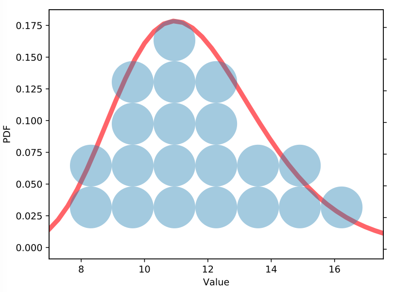
Quantile dotplot in python
This file contains bidirectional Unicode text that may be interpreted or compiled differently than what appears below. To review, open the file in an editor that reveals hidden Unicode characters.
Learn more about bidirectional Unicode characters
| """Quantile dotplot. | |
| Based on R code from https://github.com/mjskay/when-ish-is-my-bus/blob/master/quantile-dotplots.md | |
| Reference: | |
| Matthew Kay, Tara Kola, Jessica Hullman, Sean Munson. When (ish) is My Bus? | |
| User-centered Visualizations of Uncertainty in Everyday, Mobile Predictive Systems. | |
| CHI 2016. DOI: 10.1145/2858036.2858558 | |
| --------------------------- | |
| MIT License | |
| Copyright (c) 2018 Pamphile Tupui ROY | |
| Permission is hereby granted, free of charge, to any person obtaining a copy | |
| of this software and associated documentation files (the "Software"), to deal | |
| in the Software without restriction, including without limitation the rights | |
| to use, copy, modify, merge, publish, distribute, sublicense, and/or sell | |
| copies of the Software, and to permit persons to whom the Software is | |
| furnished to do so, subject to the following conditions: | |
| The above copyright notice and this permission notice shall be included in all | |
| copies or substantial portions of the Software. | |
| THE SOFTWARE IS PROVIDED "AS IS", WITHOUT WARRANTY OF ANY KIND, EXPRESS OR | |
| IMPLIED, INCLUDING BUT NOT LIMITED TO THE WARRANTIES OF MERCHANTABILITY, | |
| FITNESS FOR A PARTICULAR PURPOSE AND NONINFRINGEMENT. IN NO EVENT SHALL THE | |
| AUTHORS OR COPYRIGHT HOLDERS BE LIABLE FOR ANY CLAIM, DAMAGES OR OTHER | |
| LIABILITY, WHETHER IN AN ACTION OF CONTRACT, TORT OR OTHERWISE, ARISING FROM, | |
| OUT OF OR IN CONNECTION WITH THE SOFTWARE OR THE USE OR OTHER DEALINGS IN THE | |
| SOFTWARE. | |
| """ | |
| import matplotlib.pyplot as plt | |
| from matplotlib.patches import Circle | |
| from matplotlib.collections import PatchCollection | |
| import matplotlib.ticker as ticker | |
| import numpy as np | |
| from scipy.stats import lognorm | |
| # Parameters | |
| sample = 20 | |
| n_bins = 7 | |
| args = {'s': 0.2, 'scale': 11.4} | |
| data = lognorm.rvs(size=10000, **args) | |
| pdf = lognorm.pdf | |
| # Evenly sample the CDF and do the inverse transformation (quantile function) to have x. | |
| # probability of drawing a value less than x (i.e. P(X < x)) and the corresponding | |
| # value of x to achieve that probability on the underlying distribution | |
| p_less_than_x = np.linspace(1 / sample / 2, 1 - (1 / sample / 2), sample) | |
| x = np.percentile(data, p_less_than_x * 100) # Inverce CDF (ppf) | |
| # Create bins | |
| hist = np.histogram(x, bins=n_bins) | |
| bins, edges = hist | |
| radius = (edges[1] - edges[0]) / 2 | |
| # Plot | |
| fig, ax = plt.subplots() | |
| # Real PDF | |
| x_ = np.linspace(0, 30, 100) | |
| ax.plot(x_, pdf(x_, **args), 'r-', lw=5, alpha=0.6, label='lognorm pdf') | |
| ax.set_ylabel('PDF') | |
| ax.set_xlabel('Value') | |
| # Dotplot | |
| ax2 = ax.twinx() | |
| patches = [] | |
| max_y = 0 | |
| for i in range(n_bins): | |
| x_bin = (edges[i + 1] + edges[i]) / 2 | |
| y_bins = [(i + 1) * (radius * 2) for i in range(bins[i])] | |
| max_y = max(y_bins) if max(y_bins) > max_y else max_y | |
| for _, y_bin in enumerate(y_bins): | |
| circle = Circle((x_bin, y_bin), radius) | |
| patches.append(circle) | |
| p = PatchCollection(patches, alpha=0.4) | |
| ax2.add_collection(p) | |
| # Axis tweek | |
| y_scale = (max_y + radius) / max(pdf(x, **args)) | |
| ticks_y = ticker.FuncFormatter(lambda x, pos: '{0:g}'.format(x / y_scale)) | |
| ax2.yaxis.set_major_formatter(ticks_y) | |
| ax2.set_yticklabels([]) | |
| ax2.set_xlim([min(x) - radius, max(x) + radius]) | |
| ax2.set_ylim([0, max_y + radius]) | |
| ax2.set_aspect(1) | |
| plt.show() |
Sign up for free
to join this conversation on GitHub.
Already have an account?
Sign in to comment
This is an example
