- Color Names
- RGB
- HEX
- HSL
- RGBA
- HSLA values
HTML supports 140 standard color names. eg. Tomato,red,black
In HTML, a color can be specified as an RGB value, using this formula:
rgb(red, green, blue)
Each parameter (red, green, and blue) defines the intensity of the color between 0 and 255. For example, rgb(255, 0, 0) is displayed as red, because red is set to its highest value (255) and the others are set to 0.
In HTML, a color can be specified using a hexadecimal value in the form:
#rrggbb
Where rr (red), gg (green) and bb (blue) are hexadecimal values between 00 and ff (same as decimal 0-255). For example, #ff0000 is displayed as red, because red is set to its highest value (ff) and the others are set to the lowest value (00).
In HTML, a color can be specified using hue, saturation, and lightness (HSL) in the form:
hsl(hue, saturation, lightness)
Hue is a degree on the color wheel from 0 to 360. 0 is red, 120 is green, and 240 is blue. Saturation is a percentage value, 0% means a shade of gray, and 100% is the full color. Lightness is also a percentage, 0% is black, 50% is neither light or dark, 100% is white
RGBA color values are an extension of RGB color values with an alpha channel - which specifies the opacity for a color.
An RGBA color value is specified with:
rgba(red, green, blue, alpha)
The alpha parameter is a number between 0.0 (fully transparent) and 1.0 (not transparent at all):
HSLA color values are an extension of HSL color values with an alpha channel - which specifies the opacity for a color.
An HSLA color value is specified with:
hsla(hue, saturation, lightness, alpha)
The alpha parameter is a number between 0.0 (fully transparent) and 1.0 (not transparent at all):
CSS background properties:
- background-color
- background-image
- background-image: url("paper.gif");
- background-repeat
- repeat-x
- repeat-y
- no-repeat
- background-attachment
- To specify that the background image should be fixed (will not scroll with the rest of the page), use the background-attachment property:
- background-position
- background-position: right top;
Explanation of the different parts:
- Content - The content of the box, where text and images appear
- Padding - Clears an area around the content. The padding is transparent
- Border - A border that goes around the padding and content
- Margin - Clears an area outside the border. The margin is transparent
- color: Sets the color of text
- direction Specifies the text direction/writing direction
- letter-spacing Increases or decreases the space between characters in a text
- line-height Sets the line height
- text-align Specifies the horizontal alignment of text
- text-decoration Specifies the decoration added to text
- text-indent Specifies the indentation of the first line in a text-block
- text-shadow Specifies the shadow effect added to text
- text-transform Controls the capitalization of text
- text-overflow Specifies how overflowed content that is not displayed should be signaled to the user
- vertical-align Sets the vertical alignment of an element
- white-space Specifies how white-space inside an element is handled
- word-spacing Increases or decreases the space between words in a text
The position property specifies the type of positioning method used for an element.
There are five different position values:
- static
- relative
- fixed
- absolute
- sticky
The overflow property specifies whether to clip content or to add scrollbars when the content of an element is too big to fit in a specified area.
The overflow property has the following values:
- visible - Default. The overflow is not clipped. It renders outside the element's box
- hidden - The overflow is clipped, and the rest of the content will be invisible
- scroll - The overflow is clipped, but a scrollbar is added to see the rest of the content
- auto - If overflow is clipped, a scrollbar should be added to see the rest of the content
The float property is used for positioning and layout on web pages.
The float property can have one of the following values:
- left - The element floats to the left of its container
- right- The element floats to the right of its container
- none - The element does not float (will be displayed just where it occurs in the text). This is default
- inherit - The element inherits the float value of its parent
The clear property specifies what elements can float beside the cleared element and on which side.
The clear property can have one of the following values:
- none - Allows floating elements on both sides. This is default
- left - No floating elements allowed on the left side
- right- No floating elements allowed on the right side
- both - No floating elements allowed on either the left or the right side
- inherit - The element inherits the clear value of its parent
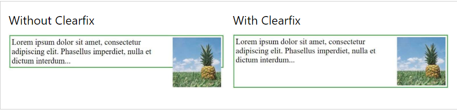
The most common way to use the clear property is after you have used a float property on an element.
If an element is taller than the element containing it, and it is floated, it will "overflow" outside of its container: Solution 1:
.clearfix {
    overflow: auto;
}
Solution 2:
.clearfix::after {
    content: "";
    clear: both;
    display: table;
}
You can easily create three floating boxes side by side. However, when you add something that enlarges the width of each box (e.g. padding or borders), the box will break. The box-sizing property allows us to include the padding and border in the box's total width (and height), making sure that the padding stays inside of the box and that it does not break.
* {
    box-sizing: border-box;
}A CSS selector can contain more than one simple selector. Between the simple selectors, we can include a combinator.
There are four different combinators in CSS:
- descendant selector (space)
- child selector (>)
- adjacent sibling selector (+)
- general sibling selector (~)
A pseudo-class is used to define a special state of an element.
For example, it can be used to:
- Style an element when a user mouses over it
- Style visited and unvisited links differently
- Style an element when it gets focus
Few Pseudo classes
| Selector | Example | Example description |
|---|---|---|
| :active | a:active | Selects the active link |
| :checked | input:checked | Selects every checked element |
| :disabled | input:disabled | Selects every disabled element |
| :first-child | p:first-child | Selects every elements that is the first child of its parent |
| :focus | input:focus | Selects the element that has focus |
| :hover | a:hover | Selects links on mouse over |
| :link | a:link | Selects all unvisited links |
| :nth-child(n) | p:nth-child(2) | Selects every element that is the second child of its parent |
| :visited | a:visited | Selects all visited links |
A CSS pseudo-element is used to style specified parts of an element.
For example, it can be used to:
- Style the first letter, or line, of an element
- Insert content before, or after, the content of an element
| Selector | Example | Example description |
|---|---|---|
| ::after | p::after | Insert content after every element |
| ::before | p::before | Insert content before every element |
| ::first-letter | p::first-letter | Selects the first letter of every element |
| ::first-line | p::first-line | Selects the first line of every element |
| ::selection | p::selection | Selects the portion of an element that is selected by a user |
The opacity property specifies the opacity/transparency of an element. The opacity property can take a value from 0.0 - 1.0. The lower value, the more transparent:
- CSS [attribute] Selector : selector is used to select elements with a specified attribute.
- CSS [attribute="value"] Selector : selector is used to select elements with a specified attribute and value.
- CSS [attribute~="value"] Selector : selector is used to select elements with an attribute value containing a specified word.
- CSS [attribute|="value"] Selector : selector is used to select elements with the specified attribute starting with the specified value.
- CSS [attribute^="value"] Selector : selector is used to select elements whose attribute value begins with a specified value.
- CSS [attribute$="value"] Selector : selector is used to select elements whose attribute value ends with a specified value.
- CSS [attribute*="value"] Selector : selector is used to select elements whose attribute value contains a specified value.
The CSS border-radius property defines the radius of an element's corners.
With the CSS border-image property, you can set an image to be used as the border around an element.
  #example1 {
    background-image: url(img_flwr.gif), url(paper.gif);
    background-position: right bottom, left top;
    background-repeat: no-repeat, repeat;
}

#example2 {
    background: url(img_flwr.gif) right bottom no-repeat, url(paper.gif) left top repeat;
}
CSS gradients let you display smooth transitions between two or more specified colors.
CSS defines two types of gradients:
- Linear Gradients (goes down/up/left/right/diagonally)
- Radial Gradients (defined by their center)
Syntax
background: linear-gradient(direction, color-stop1, color-stop2, ...);
//top to bottom
#grad {
    background: linear-gradient(red, yellow);
}

//Left to Right
#grad {
  background: linear-gradient(to right, red , yellow);
}

//diagonally from top left to bottom right
#grad {
  background: linear-gradient(to bottom right, red, yellow);
}

//using angle background: linear-gradient(angle, color-stop1, color-stop2);
#grad {
  background: linear-gradient(-90deg, red, yellow);
}#grad {
background: radial-gradient(circle, red, yellow, green);
}With CSS you can add shadow to text and to elements.
In this chapter you will learn about the following properties:
- text-shadow
- box-shadow
Example Text Shadow
h1 {
    text-shadow: 2px 2px;
}
//with color
h1 {
    text-shadow: 2px 2px red;
}
// multiple shadow
h1 {
    text-shadow: 0 0 3px #FF0000, 0 0 5px #0000FF;
}
Example box-shadow
div {
    box-shadow: 10px 10px grey;
}
CSS Text Overflow, Word Wrap, and Line Breaking Rules
- text-overflow
- word-wrap
- word-break
- text-overflow: clip; // to clip
- text-overflow: ellipsis; // to show .....
- word-wrap: break-word; // to break the word in next line
Web fonts allow Web designers to use fonts that are not installed on the user's computer. Your "own" fonts are defined within the CSS @font-face rule.
How to use
@font-face {
    font-family: myFirstFont;
    src: url(sansation_light.woff);
}

div {
    font-family: myFirstFont;
}- translate()
- rotate()
- scale()
- skewX()
- skewY()
- matrix()
div {
    -ms-transform: translate(50px, 100px); /* IE 9 */
    -webkit-transform: translate(50px, 100px); /* Safari */
    transform: translate(50px, 100px);
}div {
-ms-transform: rotate(20deg); /* IE 9 */
-webkit-transform: rotate(20deg); /* Safari */
transform: rotate(20deg);
}div {
-ms-transform: scale(2, 3); /* IE 9 */
-webkit-transform: scale(2, 3); /* Safari */
transform: scale(2, 3);
}div {
-ms-transform: skewX(20deg); /* IE 9 */
-webkit-transform: skewX(20deg); /* Safari */
transform: skewX(20deg);
}CSS transitions allows you to change property values smoothly (from one value to another), over a given duration.
div {
    -webkit-transition: width 2s, height 4s; /* Safari */
    transition: width 2s, height 4s;
}

div {
    transition-property: width;
    transition-duration: 2s;
    transition-timing-function: linear;
    transition-delay: 1s;
}

div {
    transition: width 2s linear 1s;
}
CSS animations allows animation of most HTML elements without using JavaScript or Flash!
What are CSS Animations? An animation lets an element gradually change from one style to another.
You can change as many CSS properties you want, as many times you want.
To use CSS animation, you must first specify some keyframes for the animation.
Keyframes hold what styles the element will have at certain times.
/* The animation code */
@keyframes example {
    from {background-color: red;}
    to {background-color: yellow;}
}

/* The element to apply the animation to */
div {
    width: 100px;
    height: 100px;
    background-color: red;
    animation-name: example;
    animation-duration: 4s;
}
Example 2 :
@keyframes example {
    0%   {background-color:red; left:0px; top:0px;}
    25%  {background-color:yellow; left:200px; top:0px;}
    50%  {background-color:blue; left:200px; top:200px;}
    75%  {background-color:green; left:0px; top:200px;}
    100% {background-color:red; left:0px; top:0px;}
}

/* The element to apply the animation to */
div {
    width: 100px;
    height: 100px;
    position: relative;
    background-color: red;
    animation-name: example;
    animation-duration: 4s;
}The @media rule, introduced in CSS2, made it possible to define different style rules for different media types.
Media queries can be used to check many things, such as:
- width and height of the viewport
- width and height of the device
- orientation (is the tablet/phone in landscape or portrait mode?)
- resolution
Media Query Syntax
A media query consists of a media type and can contain one or more expressions, which resolve to either true or false.
@media not|only mediatype and (expressions) {
    CSS-Code;
}
Example
@media screen and (min-width: 480px) {
    body {
        background-color: lightgreen;
    }
}