
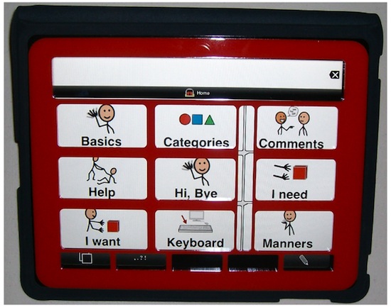
A thin piece of acrylic (plastic) that has holes cut in it. It is placed over a device and aids someone who struggles to use a touchscreen easily to touch fixed locations on the screen.
They can be made relatively easily and cheaply. The problem is how we design them - and store the designs.

- Create a templating system of deisgn elements that can be mixed and matched
- They choose their parts and then download their ready design which can be 'printed' at a laser cutting service
Templates are just SVG files - which are 'merged' using the svg merge function. XML files define how these files should be merged. Adding new designs will be done (for now) by users submitting new files to github.
We hope in the future to help create the parts in-browser (e.g: http://keyguides.sourceymonkey.com/gridtemplater.html and http://keyguides.e-wade.net/html/)
I have already a site working: http://keyguides.sourceymonkey.com and a github project: https://github.com/willwade/KeyGuideMaker with a version one of the code. I want to rewrite the code for this site and improve on it with a new templating layout (see below) and usability improvements.
Currently (v1) has all files in one template dir. This is messy! We want to seperate this into different folders. Each dir will then contain their relative parts. NB: All files are either .svg or .xml. We have no care for naming convention of these - the detail is in the file themselves.
templates /
- Types/ - Specifies the device types. Has a number of aspects. Name, Screen size and width. Device size and width. May have an outline SVG file. Also parts which are available on device.
- Parts/ - The small parts that are available as extras. These can be overlayed.
- Designs/ - Base designs that get merged with the Type and Parts. NB: Designs CAN link to other designs.
An example:
- name: String
- Notes: Text: 300 chars
- width: int in mm. - width of device. This is generally the maximum width a keyguard can be.
- height: int in mm. - height of device. This is generally the maximum height a keyguard can be.
- winwidth: int in mm. This is the window width
- winheight: int in mm. Window height
- winxpos: int in mm - mm along where window position starts (NB: LeoL Currently pixels)
- winypos: int in mm - mm down where window position starts (NB: LeoL Currently pixels)
- image example: A small (no more than 150px wide or tall) image representing the device
- image source: Optional. Is a SVG of the device outline. NB: Position is 0,0 by default. It doesnt have much role in Type. Winxpos and winypos mark where Device goes.
- parts: a list of optional parts available with this design.
	<type>
	    <name>iPad</name>
	    <width>238mm</width>
	    <height>182mm</height>
	    <winwidth>198</winwidth>
	    <winheight>148</winheight>
	    <dpi>132</dpi>
	    <winxpos>60</winxpos>
	    <winypos>90</winypos>
        <image example="Somefile.jpg" />
	    <image source="Type_iPadOutline.svg" position="0,0"/>
	    <optionals>iPadHomeButton,iPadMagnets,iPadSuckers</optionals>
	</type>
- name: a text label
- Type: What is this designed for? NB: Multiple
- Notes: Text: 300 chars
- case: optional. What case is this designed for. The idea is that you could have multiple different parts but for different cases. Default: fullscreen (i.e. full-device winwidth/winheight)
- image example: A small (no more than 150px wide or tall) image representing the part
- image source : svg and its position on the screen. NB: Singular.
    <part>
        <name>4 sucker keyhole type cuts</name>
        <types>
          <type>iPad</type>
          <type>iPad-Mini</type>
        </type>
        <case>fullscreen</case>
        <image example="Somefile.jpg" />
        <image source="iPadSuckers.svg" position="0,0"/>
    </part>
- name: a text label
- Type: What is this designed for? NB: Multiple.
- Notes: Text: 300 chars
- case: optional. What case is this designed for. The idea is that you could have multiple different designs but for different cases. Default: fullscreen (i.e. full-device winwidth/winheight).
- image example: A small (no more than 150px wide or tall) image representing the design
- image source : svg and its position on the screen. This is x mm from the top and y mm from the left. NB: Multiple. All designs naturally start being placed at 0mm, 0mm. Multiple designs get positioned on-top of one another. The first design should be the largest.
    <design>
        <name>TouchChat 30</name>
        <types>
          <type>iPad</type>
          <type>iPad-Mini</type>
        </type>
        <case>fullscreen</case>
        <image example="Somefile.jpg" />
        <image source="touchchat-30.svg" position="60,90"/>
        <image source="touchchat-messagewin.svg" position="57,44"/>
    </design>
- Present a screen showing All device types. Listed with a preview (image example). Notes shown alongside. User picks a device type.
- Device parts that are possible are then shown. Title, Image preview shown. Can pick multiple (i.e. checkbox). Notes shown on hover or popup.
- Present dropdown of Designs that are available. Image preview shown next to each. Notes shown on hover or popup. NB title in dropdown should be Design:Name-(Case (IF NOT FULLSCREEN)) e.g. if Two designs 'TouchChat' (with case: fullscreen) and 'TouchChat' (with case:CaseName): TouchChat, TouchChat-CaseName, OR: User can choose to upload their own custom Design SVG file. With X:Y co-ordinates of where it should be placed on the device svg.
- User chooses their file format. SVG, PDF for now.
- The image previews selected from 1-3 are presented to the user.
NB: What I would like at this point is a way of the user bookmarking this stage. e.g. /keyguard/d=1&t=4&p=3,2,4 Possible??
User chooses "Done" or "Cancel". If Done: System merges the SVG files and outputs a final merged SVG (or whatever format in 4) with their final output.
The code isnt that nice in the current version. Needs to be more efficient. Needs to look a bit nicer - please use a plain bootstrap theme. The image conversion isnt great. If you have any better suggestions of doing this please say. The crucial one is adding the image examples and note fields. I will need to provide you with some examples of these.