
Mentor: Ryan Birmingham NAN LI
Student: Yahia Zakaria
Eaglescaope is a framework for creating interactive visualizations and selection dashboards without coding. This project aims to expand upon the current visualizations supported by the framework and to add new features that facilitate creating and sharing data dashboards. The proposed contributions can be grouped into
- Supporting new multidimensional interactive visualizations: these new visualizations should help the user explore the relation between two or more variables and get more insights by interacting and filtering graphs.
- Refactoring and documentation: continue the refactoring process by separating filtering logic, adding data and filters to a global state, and adding documentation for the users on using the framework and its general architecture.
- Adding new features to the framework: that make the process of creating and sharing dashboards more accessible and more effortless.
-
Refactoring and Bugs fix In this PR contains fixes for the following bugs:
- Filters created on pie chart couldn't be cleared
- The pie chart filters can't be loaded from url
- Components doesn't rerender when resizing
Beside bug fixes this PR also contains several changes to improve code quality of the tool such as
- Updating the packages that use unsafe component lifecycle such as
react-resizableandreact-grid-layout - Rewrite most of the components to a functional style
- Move config and app data to a global state
- creating a custom-created React hook
useFetchto handle all fetch requests in the app. - Adding
proptypesto all components - Adding
ESLintto the project - Removing the build files from git tracking
-
Increase Render Performance For Scatter Chart
When testing scatter chart with datasets that has about 6000 example the FPS for the app decrease significantly, when investing the reasons that SVG components can't handle this number of points so the fix was to reimplement the chart using
CanvasAPI.
-
Adding 4 New Visualization Types
- Histogram: An approximate representation of the distribution of numerical data
- Parallel Coordinates Plot : A good way to visualize high-dimensional datasets by creating a vertical axis for each dimension and each data point is represented as a polyline
- 2D Density Chart: It is used to plot the combined distribution between two numerical values
- Heatmap: a visualization used to plot the data in a matrix format using the color of each cell to represent its value
-
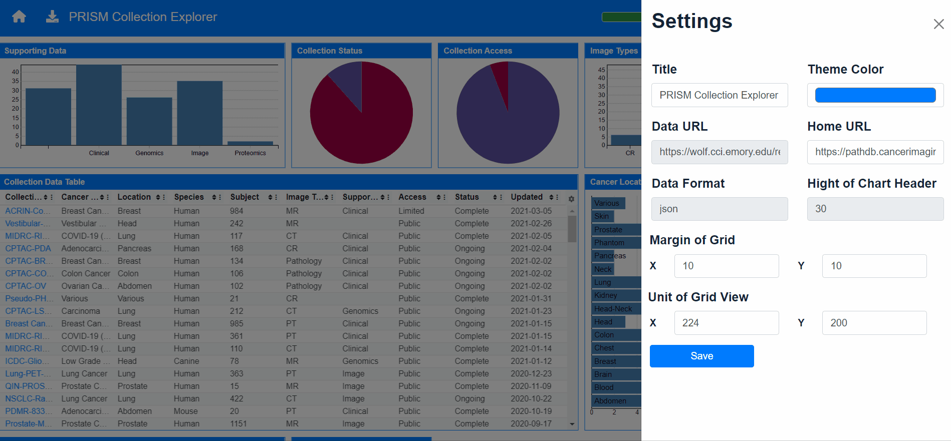
Change Dashboard Settings From GUI Before this PR the user couldn't change any of dashboard settings after creating it with a config JSON file, So this PR contains the implementation for a settings a components to allow user change any parameter during runtime and without need to modify config file or rebuild the tool.

-
Adding Visual Customizations Enable the user to customize some visualize properties of the tool such
- Adding a legend to pie chart if there is enough space or in full-screen mode
- Using the same tooltip across all components to avoid code duplication and for visual consistency
- Change color theme of dashboard
- Show or hide charts Borders
- Change charts borders radius
-
Change Charts Settings From GUI Implement
Vis-Settingscomponent so that the user can change charts specific parameters and see the affect of these changes during runtime
The fields input change dynamically based on chart type as some charts has x only, or y only, or x and y, or multiple x or y fields
-
Add or Delete Charts From GUI Enable user to remove or add charts from dashboard without the needed to edit config file or rebuild tool, after implementing this feature now the tool can be fully used from GUI

| PR | Description |
|---|---|
#46 |
Add histogram visualization |
#53 |
Refactoring and Code Quality |
#54 |
Update Scatter Chart To Use Canvas |
#55 |
Adding New Visualization Type "Parallel Coordinates plot" |
#57 |
Adding New Visualization Type "Density-2d plot" |
#58 |
Adding New Visualization Type "Heatmap" |
#61 |
Abstract tooltip to be used in different charts |
#62 |
Add Settings Board |
#63 |
Add Chart Settings Dashboard |
#65 |
Scatter Chart Bug Fix and Adding Vis-Borders Control |
#66 |
Add And Delete Charts From GUI |