CSS ribbons are often used when you want to display something important or eye catching on your site. Placing a small piece of text as a corner ribbon of a box can be a little tricky as it involves some trigonometry.
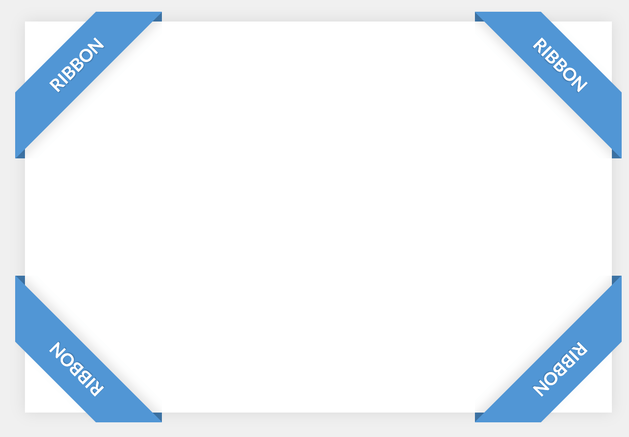
<!-- How to Create a Corner Ribbon in Pure CSS -->
<div class="box">
  <div class="ribbon ribbon-top-left">
   <span>ribbon</span>
  </div>
  <div class="ribbon ribbon-top-right">
   <span>ribbon</span>
  </div>
  <div class="ribbon ribbon-bottom-left">
   <span>ribbon</span>
  </div>
  <div class="ribbon ribbon-bottom-right">
   <span>ribbon</span>
  </div>
</div>The following styles only included the required declarations for the ribbon positioning. Any aesthetic concern is left to the author.
/* How to Create a Corner Ribbon in Pure CSS */
@import url(https://fonts.googleapis.com/css?family=Lato:700);

body {
  display: flex;
  justify-content: center;
  align-items: center;
  min-height: 100vh;
  background: #f0f0f0;
}

.box {
  position: relative;
  max-width: 600px;
  width: 90%;
  height: 400px;
  background: #fff;
  box-shadow: 0 0 15px rgba(0,0,0,.1);
}

/* Common */
.ribbon {
  width: 150px;
  height: 150px;
  overflow: hidden;
  position: absolute;
}

.ribbon::before,
.ribbon::after {
  position: absolute;
  z-index: -1;
  content: '';
  display: block;
  border: 5px solid #2980b9;
}

.ribbon span {
  position: absolute;
  display: block;
  width: 225px;
  padding: 15px 0;
  background-color: #3498db;
  box-shadow: 0 5px 10px rgba(0,0,0,.1);
  color: #fff;
  font: 700 18px/1 'Lato', sans-serif;
  text-shadow: 0 1px 1px rgba(0,0,0,.2);
  text-transform: uppercase;
  text-align: center;
}

/* Top Left*/
.ribbon-top-left {
  top: -10px;
  left: -10px;
}

.ribbon-top-left::before,
.ribbon-top-left::after {
  border-top-color: transparent;
  border-left-color: transparent;
}

.ribbon-top-left::before {
  top: 0;
  right: 0;
}

.ribbon-top-left::after {
  bottom: 0;
  left: 0;
}

.ribbon-top-left span {
  right: -25px;
  top: 30px;
  transform: rotate(-45deg);
}

/* Top Right*/
.ribbon-top-right {
  top: -10px;
  right: -10px;
}

.ribbon-top-right::before,
.ribbon-top-right::after {
  border-top-color: transparent;
  border-right-color: transparent;
}

.ribbon-top-right::before {
  top: 0;
  left: 0;
}

.ribbon-top-right::after {
  bottom: 0;
  right: 0;
}

.ribbon-top-right span {
  left: -25px;
  top: 30px;
  transform: rotate(45deg);
}

/* Bottom Left*/
.ribbon-bottom-left {
  bottom: -10px;
  left: -10px;
}

.ribbon-bottom-left::before,
.ribbon-bottom-left::after {
  border-bottom-color: transparent;
  border-left-color: transparent;
}

.ribbon-bottom-left::before {
  bottom: 0;
  right: 0;
}

.ribbon-bottom-left::after {
  top: 0;
  left: 0;
}

.ribbon-bottom-left span {
  right: -25px;
  bottom: 30px;
  transform: rotate(225deg);
}

/* bottom right*/
.ribbon-bottom-right {
  bottom: -10px;
  right: -10px;
}

.ribbon-bottom-right::before,
.ribbon-bottom-right::after {
  border-bottom-color: transparent;
  border-right-color: transparent;
}

.ribbon-bottom-right::before {
  bottom: 0;
  left: 0;
}

.ribbon-bottom-right::after {
  top: 0;
  right: 0;
}

.ribbon-bottom-right span {
  left: -25px;
  bottom: 30px;
  transform: rotate(-225deg);
}