We have on occasion heard the comment "APCA produces less contrast" — this is not true, though I see how some might come to that conclusion, it does not consider the totality of the new guidelines.
APCA does not produce contrast. APCA does nothing to the colors, it only predicts how a human will perceive them, and their effect on readability. And yes, if you try to compare APCA to the WCAG2 math it might appear that APCA allows lower contrast in some specific cases where one color is white or very bright, but across the entire range, APCA clearly, consistently, and correctly predicts contrast, while WCAG2 more often than not allows lower contrasts to pass that have even been shown to be unreadable, even with normal vision.
Here's an example a user brought to my attention recently:

WCAG reports this as a "fail" at 2.97:1. APCA reports the contrast as readable at Lc61 if you use the appropriate font sizes. Let me ask you if that seems like less than 3:1 contrast? Perhaps it's not fair without a comparison. So take a look at this sample below to compare, which one has better contrast? The one above or this one below?

After looking at this for a moment, scroll down for the answer....
Which has better readability contrast?....
••• deee dee 🎶
••• dee dah 🎵
••• dee dee deeeee 🎶
Alex: "It incorrectly claims black text on a #757575 background is a readable as 4.5:1"
ME:"...what is WCAG 2?"
The first sample above is the Orange example I am running on the APCA site. It is this "orange problem" that brought WCAG 2.x to my attention and is part of why the design community loathes WCAG 2 contrast guidelines, and probably why WCAG 2 contrast is not widely adopted except when required by force of law.
In the first example, APCA correctly reports the contrast as readable at Lc61 for the appropriate font sizes. WCAG reports a fail at 2.97:1. Yet the white on orange is clearly readable, in fact it is even more readable for individuals with CVD (color vision deficiency, sometimes incorrectly referred to as color blind).
Okay, and on the second, darker, sample, APCA reports a total fail and actually prohibits any readable text at this level (a low Lc31, half the contrast needed for readable content).
Should this second one be a pass? Should it be called 4.5:1? The colors are #797979 and #110402. APCA fails it for all content text, but WCAG 2 says it's 4.5:1 and fine even for body text. Here's a body text sample with those same colors:

WCAG 2 says this is fine and passes as AA. Do you agree? I don't, and neither does APCA.
FACT: When the brightest color is darker than #a0a0a0, WCAG 2 contrast prediction degrades until it is no longer providing useful results.
FACT: While WCAG2 might have been okay 15 years ago when there were only web fonts, and site stuck more closely to the standard black text, today's CSS designs and freely available fonts like Google Fonts demands a more accurate contrast method.
And here is a main issue: the numbers generated by WCAG 2's contrast math are not relative to human perception of supra-threshold contrast, which is the contrast needed for best readability. APCA very specifically is perceptually accurate, and predicts constant contrast across the entire visible range. WCAG2 contrast values are artificially inflated over part of the range to try and make up for these shortcomings. APCA does not need any such "brute force", and instead accurately predicts contrast which allows for a more flexible and larger set of colors for designers to use.
APCA guidelines are much more aligned to use cases and element spatial frequency (i.e. size and weight). Body text has a higher contrast requirement than WCAG2, as it should. Body text has a high spatial frequency and requires the highest contrast. But what about when you have a third element like a button? WCAG 2 forces the same contrasts or closely similar, making the designer's job difficult. But in APCA, as it is perceptually accurate, we can point out that a large element like a button works well with a much lower contrast, such as Lc45, even as low as Lc30. This gives the designer greater flexibility while also improving readability.
At the SAPC development site, we have a "Research Mode" you can click that reveals some interactive experiments that demonstrate some of the concepts.
And here are links to some brief Gists with loads of examples that more fully demonstrate this:
Comparison Article: The Lighter Side of Dark Backgrounds
Comparison Article: Orange You Wondering About Contrast?
It is not possible to create something that works correctly
and also be consistent to something that is incorrect.
And that is something we face with APCA. There is no way to compare the two. WCAG 2's problems are well understood. APCA is superior in accuracy and useful predictions. Fortunately, there is enough overlap that a "transition" can be had, some of the tools developed by other developers have a "pass all" setting, to pass both WCAG 2 and WCAG 3 at once, though the trade off is a loss of the flexibility that APCA normally adds.
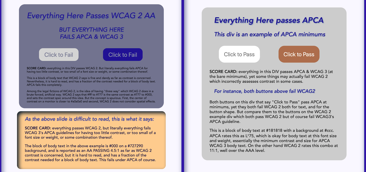
Here is the old WCAG 2 1.4.3 contrast guideline against the new WCAG 3 APCA contrast guideline. As the links above also show, this is not an isolated case. Using thousands of random colors, WCAG 2 incorrectly passed 49% — colors that were too low in contrast to read and should have failed.
(click image to view it ful size/full screen)
Also, APCA has an "escape level" called Score 1, it is the weakest passing score, and considered "poor" but placed there so as to allow sites to pass that are currently passing WCAG 2, while providing guidance to improve to the newer standard.
In April 2019 I started thread #695. In that thread I explain how and why I ended up taking this on as a full time research project. I originally thought I'd be done in three months. LOL. I mean ROTFLMAO. Going into year three, I can say that we will have a new readable world!
The internet killed the print industry. Magazines are all but gone. I miss reading real paper, and I find it very difficult to read on a screen. In fact, I believe the reason that so few people actually read today is due to this issue of unreadable websites. Consider the chilling effects of a populace that declines in reading, as a civil rights author, I can find no better motivation that making the world a more readable place.
APCA is demonstrably superior to the old method, but is also more involved than just the distance between two colors, as spatial frequency is a key part of the prediction.
Go back to PART I or PART II of this series.
Feel free to discuss this or start a chat of your own with APCA questions at the APCA Repo Discussions Tab.
Thank you,
Andy
Andrew Somers
Invited Expert, AGWG, Silver, LVTF
Myndex Color Science Researcher
Inventor SAPC/APCA
And also, I managed to get through that entire Gist without resorting to making laser-shootout "pew pew pew" sound effects.
@equivalent-design
Thank you!