What is contrast anyway? In this context, we are talking about the contrast of text on a background, and more directly, how well you can read that text. While this may seem simple in concept, the reality is not only challenging but increasingly important. The internet destroyed the printing industry nearly overnight. Where there were once magaine and newsstands, there are now empty spaces. And reading in general had dropped 40% in the last two decades.
And the internet is hard to read. Too hard, and it shouldn't be. There are some old existing standards on contrast and readability, some dating back to the last century, that are part of the problem. When WCAG 2 was being worked on nearly two decades ago, computers used bulky CRT monitors, and the iPhone was still on the drawing board.
Back then, cell phones were nothing but a phone, websites were only on your desktop/laptop, and those sites invariably used the same core websafe fonts & basic HTML colors. Served over a slow phone line.
Today we are literally issued a hand-held supercomputer that is on 24/7 and connected to all the world's knowledge, and which also happenes to double as a live GPS map, Walkman, camera, video production system, stock ticker, database, calendar, flashlight, and uh... something else, what was it now.... oh yea, a PHONE too as an added bonus to the supercomputer in your palm... and in fact a video phone, a video conference phone that plays the audio to your head without wires, while connecting to your car and tracks your health (and your car's health).
And all of that wrapped up into something more advanced¹ than had been imagined by the best science fiction authors of the time when WCAG 2 contrast was being written so many years ago.
(¹And by more advanced, of course I mean LOL-CATS and TikTok).
The technology WCAG 2 contrast was written for is so archaic as to be incomparible. And it's time we gave WCAG 2 contrast a gold watch and wished it a happy retirement. Finding the replacement has been the focus of several years of research and development. The result is the APCA: Accessible Perceptual Contrast Algorithm.
Technically black on white and white on black DO NOT have the same contrast. Contrast is not just about the difference or distance between two colors. I mean, colors are not even real — they are just a perception that mostly occurs in your neurological system. I.e. color is all in your head.
Like color, contrast is also not real, it is a perception, and that perception is mainly neurological in nature. There are many factors that play a significant role in the perception of contrast outside of color distance. If you are interested in a slightly deeper dive, please see the APCA Easy Intro, which focuses more on the theory ans use.
Perceptually, light text on dark background can be easier to read for some users, depending on ambient conditions and a user's impairments. Some reservations of negative polarity relate to reflected materials, which do not necessarily apply to self illuminated displays.
In terms of readability on a self-illuminated display, there is no consensus on if dark text on light or light on dark is actually "better" in terms of best fluent readability, and some studies I've read on this were flawed in approach for not taking into consideration other highly relevant factors. But the better studies more correctly show that it is situational and dependent on the user and specific user impairments and user needs. If anything, this points clearly to personalization as the best practice.
The beta development tool is in the SAPC directory, it has a feature on it called "research mode", and if you select "split contrast" there is a simplified version of the middle contrast experiment we use here in the lab. One thing to notice is that when the light and dark colors are very far apart, the middle contrast is about 2/3rds the way toward the brightest, and not in the middle. Though it is typically centered when the color distance is close.
You'll also notice that the perceptual middle is different when the middle color is the background as opposed to when the middle color is the text. This is due to a complicated interaction with spatial frequency, local adaptation, and other psychophysical effects.
The underlying math in APCA accounts for these aspects of perception (or at the very least, smooths them out into a reasonable averaged approximation), and is essentially perceptually uniform. If you double the APCA value from Lc 30 to Lc 60, the perceived contrast is also a doubling, and vice versa (within the bulk of the range).
White on black vs black on white polarity is built into the math, and the math is polarity dependent such that you must enter the text color in the text input and the background color in the BG input, or the results will be off. APCA outputs a negative value for light text on dark and a positive value for dark text on light, to emphasize the importance of polarity. "swapping" the two colors may not show a huge difference, but the difference is major if you invert around a center color as shown below.
(Say the bells of Saint Clemens...)
One of the more infamous failures of the old standard is the orange button scenario. Here are some comparative examples:

This in particular comes up in the area of SPOT READING, which has different requirements than fluent reading (i.e. reading at best speed and comprehension). looking only at the right side, at the WCAG 2.x results: which can you read better? The white text above or the black text below? Personally, I can't read the black text even with glasses on, though the white text is easy to read. These results are echoed across many test subjects, and indeed, this issue is discussed in many articles around the web.
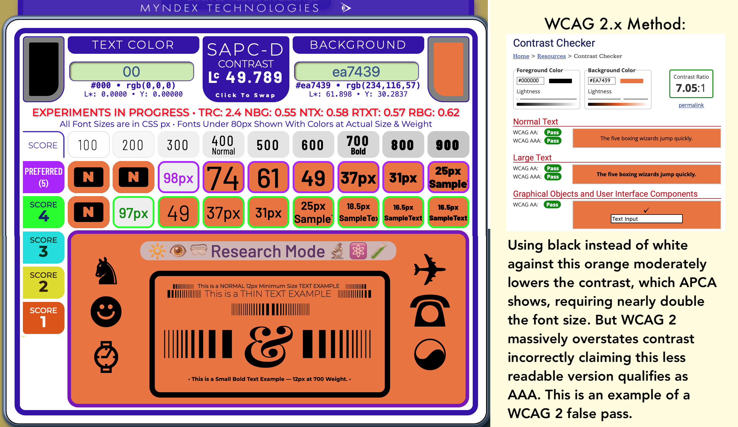
But it gets worse for the old WCAG 2.x — look below. After these colors are processed to simulate color vision deficiency, individuals with CVD (incorrectly called "color blind") have an even HARDER time with the black text on orange than the white.

Continued into PART TWO: The Lighter Side of Dark Backgrounds
And PART THREE: WCAG 2 vs APCA Shootout!
If you want the even deeper dive, there is issue #695 over on the WCAG repo, and we have a linktree of key knowledge, most written in an easy to digest plain language with visual examples: APCA Linktree.
Please let me know of any questions, the discussion tab at the APCA GitHub repo is open for comments!
Thank you!
Andy
Andrew Somers
W3 WAI Invited Expert
Myndex Color Scientist
Inventor of APCA
Love the prose (and the file name)!