Skip to content

Instantly share code, notes, and snippets.

@RobertAKARobin
Last active January 5, 2024 05:41
Show Gist options
  • Star 85 You must be signed in to star a gist
  • Fork 2 You must be signed in to fork a gist
  • Save RobertAKARobin/850a408e04d5414e67d308a2b5847378 to your computer and use it in GitHub Desktop.
Save RobertAKARobin/850a408e04d5414e67d308a2b5847378 to your computer and use it in GitHub Desktop.
Safari's date-picker is the cause of 1/3 of our customer support issues

Safari's date-picker is the cause of 1/3 of our customer support issues

...and obviously we're building a workaround. But I'm absolutely flabbergasted that a standard <input type="date"> HTML field, in a standard browser, from a company that bases its reputation good design, could be so dreadful.

The context

I'm the developer for a startup that sells a genetic test to recommend medications for high blood pressure. For medical reasons we need to know our customers' birth date. Most of our customers are in their 60s or older. We've found that many of them use iPads or iPhones. And they're the ones who complain to our customer support that our site is unusable.

The problem

This is what pops up when you tap on a date field. Not bad... unless you're trying to pick your birth date, which happens to be in 1945.

iphone

There is no option to manually enter the correct date. The only obvious path forward is to tap the left arrow button 924 times to get back to 1945. The not-obvious path forward -- which our elderly users cannot find -- is to tap "December 2022", which pops open this rolodex-type thing:

iphone_rolodex

This is also confusing because:

  • You can't pick the day
  • The months counterintuitively move independently of the year
  • The need to swipe up and down on the "rollers" is not obvious to those who weren't born during the Digital Age

Our fix

Our fix was to spend a surprising amount of time fiddling with custom Django fields and widgets (ask me how I feel about Django/Python some time) to split the date field into three separate <input type="number"> fields:

iphone_new

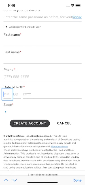
It's not fancy, but it works. In fact, it works because it's not fancy.

UPDATE: Our fix, v2:

Thanks for the great feedback! Based on everyone's comments, here's how I've updated the date field:

iphone_new_select

That is: the month field is now a dropdown. Here are my thoughts:

  • Use 3 separate inputs
    • Using a single text input with a required pattern, e.g. mm/dd/yyyy, would require our users to enter punctuation. That can be tricky on mobile devices, especially for nontechnical users like many of our customers. Also, it wouldn't really address the issue of people potentially confusing the mm/dd and dd/mm formats.
  • For the month, use a <select> dropdown instead of a numeric input:
    • Differences in date formats (m/d/y vs d/m/y vs y/m/d) make it hard to distinguish numeric inputs for date and month, and a dropdown removes that ambiguity
    • There are only 12 options for months
    • Nobody really thinks of months as numbers anyway
  • For the day, use <input type="number">:
    • Using a dropdown requires a JavaScript library to figure out which options are valid for which month, which IMO is unnecessary complexity in this case because our back-end will reject invalid inputs with a helpful error message
    • A great argument was made for using <input type="text" inputmode="numeric">. However, I'm going to continue with type="number" because:
      • The article largely addresses non-incremental numbers that are not "strictly speaking a number", e.g. phone numbers or credit card numbers. Days and years are incremental numbers.
      • This approach doesn't provide max and min. It does provide pattern, but semantically that is less correct when considering dates
  • For the year, use <input type="number">
    • A dropdown here would require the users to scroll through 100+ choices. In this case, I think just typing it out is easier
    • Some users suggested setting a default value of e.g. 1960. However, I think that needing to delete that value and/or change it to the user's actual birth year would be an additional obstacle for our non-technical users.

Conclusion

I've heard that "Safari is the new IE", and don't personally care for the iOS UI. But I chalked up the "New IE" stuff to annoying little CSS issues, and expected that devices recommended specifically for the elderly would be usable by the elderly.

We haven't lost millions, or even thousands on this. If we were in a position to be losing that much we'd also be in a position to buy robust usability testing services, which probably would have caught this issue early. But small-biz developers should be able to be confident that usability testing for built-in web browser functionality is a nice-to-have, not a need-to-have.

@notorand-it
Copy link

notorand-it commented Dec 27, 2022

Note that for an internationalized application, 3 date fields can be confusing as different countries have different orders. A calendar based data picker makes sure your application always gets the valid date, while with 3 input fields, some users fill in DD-MM-YYYY, while others fill in MM-DD-YYYY

I think you can add some help text in the placeholder="" attribute or even the value="".
We are in the 21st century (CE) and can spare some little extra computing resources to make UIs work in a smarter way...

@hkjels
Copy link

hkjels commented Dec 27, 2022

There’s rarely a good reason to know the exact birthday of a person and it’s somewhat personal information. More sites should just use something like: “How many years have you lived?” and a number field. Date-pickers are good for setting up appointments etc and the default of NOW then makes sense

@feld
Copy link

feld commented Dec 27, 2022

I wish there was a way for Fastmail's date/time picker to translate nicely to a touch interface


Untitled 2

@numbsafari
Copy link

The app my GP’s clinic uses is iPad-based and it asks your date of birth on three separate prompts, wizard-style: “What year were you born?” With a roller-style year picker, “what month were you born?” with buttons for each month, spelled out, and “what day were you born?”, again, with all the days in that month as buttons with simple labels.

It’s in a nice big, readable font because the questions each take up the whole screen. No confusion whatsoever. I watch all kinds of folks use it all the time and have never heard anyone complain.

It probably also works great with internationalization.

Maybe give that a try.

@guest271314
Copy link

Just clearly print the data format you expect the user to input and notify the user to manually type said date format.

@RobertAKARobin
Copy link
Author

RobertAKARobin commented Dec 27, 2022

Thanks all for the great feedback on our workaround! I've updated the website and this article with our revised approach and some thoughts about it: https://gist.github.com/RobertAKARobin/850a408e04d5414e67d308a2b5847378#our-fix-v2

@guest271314
Copy link

Is there an issue with just having the user manually print MM-DD-YYYY and if necessary using CSS :valid and :invalid?

@RobertAKARobin
Copy link
Author

RobertAKARobin commented Dec 27, 2022

@guest271314 I thought about that, but that would require entering punctuation, which on mobile devices can be tricky, particularly for nontechnical users like our elderly customers.

I'll update the article to mention that approach, though. Thanks!

@guest271314
Copy link

I don't think punctuation is tricky at all. If a user owns or operates a "smart" phone they already use the functionality. We are just talking about two (2) dashes or forward slashes or even just space characters.

@guest271314
Copy link

Technically no punctuation marks or even space characters are necessary. The format can be MMDDYYYY and that's it.

@dan-cooke
Copy link

dan-cooke commented Dec 27, 2022

Let me throw my rants here.

  1. I really don't like all those greyish and paleish colors used ever and ever often: on clear backgrounds they really don't work. Especially for people with lower sights. Text should definitely be "black on white" not light gray on pale yellow.
  2. More and more often I see web pages with some widgets (in light gray of course) displayed in clear and one or two more hidden behind a "three dots" widget. The overall number of widgets is less than 5. Hiding is useless.
  3. Keyboard inputs should be always possible, even with mobiles phones or tablets. Maybe you can setup the keyboard as a fall-back for the latter, but using touch/mouse to enter a select a city name from a list is really stupid.
  4. Why all those left and right margins? Why gracefully not fill all of the page width (and height)? Do you pay your UI/wen hosting by screen real estate?

@notorand-it wowww did you come here in a Time Machine? Widgets? You hate margins?

The things you are complaining about are pretty much standard design in any website.

do you know how stupid it would look if you didn’t use margins and filled the entire width?

@guest271314
Copy link

The context

I'm the developer for a startup that sells a genetic test to recommend medications for high blood pressure. For medical reasons we need to know our customers' birth date. Most of our customers are in their 60s or older. We have found that many of them are using iPads or iPhones. And they're the ones complaining to our customer support line about our site being unusable.

I suggest listening to the feedback from the target demographic.

If the mission is actually medically related, dell and whistles of Web pages are unnecessary distraction from why the user is even visiting the site. They are not visiting the site to be wowed by Web API's, images, or videos.

Make is as simple as possible to fill out a form, without any extraneous UI that obviously is an issue even fr folks who are rolling around with $500-$1000 devices.

You could even accept voice input at some point. But you might have issues with that as well.

If the date is required, just use three separate <input type="text"> elements with required attribute. MM DD YYYY - where the first two accept single values as well, so the user don;t have to even input a 0 before 1-9.

That is if you actually intend to listen to user feedback and design towards your target demographic. The issue is fixable right now by using the simplest approaches, not by compounding Web development possibilities with the actual mission statement. Your site doesn't have to be pretty, it just needs to work effectively for the target demographic.

@tif-calin
Copy link

@guest271314 There's plenty of "masking" libraries out there that would input the punctuation for your automatically. It also wouldn't be too hard to code your own simplified mask for this one input

@glsee
Copy link

glsee commented Dec 28, 2022

Nobody really thinks of months as numbers anyway

No. In many Asian cultures, months are simply named after the numbers in their native languages. To have to translate the months into their English names before selecting is more counter-intuitive to these people. If the target audience are people from these cultures, number inputs may be more intuitive.

The same can be said about the native order of day, month and year in these cultures.

@Edac2
Copy link

Edac2 commented Dec 28, 2022

Every time I use one of those date spinners, I feel like I'm in one of those old sci-fi movies, like The Time Machine. Imagine if you were born in 1943! At least add a soundtrack to build some suspense as the date back spins backwards in time toward the 19th century.

@bschwenk
Copy link

bschwenk commented Dec 28, 2022

I don't think punctuation is tricky at all. If a user owns or operates a "smart" phone they already use the functionality. We are just talking about two (2) dashes or forward slashes or even just space characters.

I'm not trying to disrespect the elderly here, but...have you ever actually watched an older person use a smartphone?

Furthermore, this suggestion introduces a wider margin of error, even without the dashes. What happens when a user accidentally mixes up month/day? Or an individual is from a region where days come before months?

What happens when a user starts trying to type out the actual month name or abbreviation and can't understand why they can't?

I think the current solution is the ideal...it restricts selections to specific data ranges and formats with almost no margin for error, and no ambiguity, while maintaining as much accessibility as possible.

@thomascallahan
Copy link

Setting a default year is a problem—how would you be able to validate the field? If they just forgot to update it then the form would validate but with the wrong year. Leaving it blank is the only way to prevent form submission without a correct year.

And setting it to something closer to the expected years for the users doesn’t actually make it easier to use if it’s a number filed anyway, so they would still have to type the whole year regardless of how close the default value is—that would only help if it were a select.

I suppose you could pre-fill the “19” so they would only have to type the last two, but that just seems likely to cause a different kind of confusion, and then you’d run into a Y2K-style problem in a few years (not to mention it would mean nobody under 22 could use the service now).

What you came up with seems like a good workaround — certainly better than Safari’s which I’ll admit took me a bit if trial and error to understand fully, and I’m “young” and very technical.

@lkdurvin
Copy link

As a person approaching "old" I can tell you it is a pain to have to spin back to 1954 just to prove I am over 21 for some reason. In many cases, it would suffice to have a checkbox to say, "I am over 21." Punctuation is possible on cell phones, but the marks are in different places from on desktop keyboards, just to confuse things. They are clearly labeled, but in 4 point type I can't see. And interfaces should always make it clear when something is a button. Just give me a hint! There is far too much weight given to design at the expense of function. If the app will be used by older people, make the interface larger.

@fbtoc
Copy link

fbtoc commented Dec 28, 2022

Do you really need the day of birth? Do you even really need the month? One field for the year. Easy.

@thinkjrs
Copy link

Nobody really thinks of months as numbers anyway

No. In many Asian cultures, months are simply named after the numbers in their native languages. To have to translate the months into their English names before selecting is more counter-intuitive to these people. If the target audience are people from these cultures, number inputs may be more intuitive. The same can be said about the native order of day, month and year in these cultures.

Fully agree @glsee. But more generally, assuming that people use anything some certain way is likely not going to work for a large number of users. Software allows for hyper scale/leverage, so making blanket assumptions is almost surely a recipe for disaster for many users (and the support team).

Also, almost surely is a probability joke for those travelers versed in the field.

@guest271314
Copy link

I'm not trying to disrespect the elderly here, but...have you ever actually watched an older person use a smartphone?

Yes.

If they don't want a smart phone they'll get and use a flip phone. If an individual has a smart phone and do not know how to use it, just to input 6 to 8 digits they should not be filling out forms on that device whatsoever.

Furthermore, this suggestion introduces a wider margin of error, even without the dashes. What happens when a user accidentally mixes up month/day? Or an individual is from a region where days come before months?

The same as above applies.

If people are too incompetent to fill out a form on a specific device they have no business filling out the form on their device.

The very simple solution for online is just use three (3) inputs.

Conspicuously put your phone number on the site for individuals to call and verify with an actual human.

@georgecrawford
Copy link

This link might be of interest if you haven’t already seen it.

@vladstudio
Copy link

I'm a big fan of 3 auto-complete inputs, implemented with https://selectize.dev/

Screen.Recording.2023-01-08.at.09.38.41.mp4

@alexeyshurygin
Copy link

Now I see why auto-filling of forms does not work. Fancy controls! 😈

@ismaell
Copy link

ismaell commented Mar 10, 2023

We have a standard format for dates, ISO-8601, why people keep coming up with new (old) formats?

Sign up for free to join this conversation on GitHub. Already have an account? Sign in to comment