Skip to content

Instantly share code, notes, and snippets.

@dideler
Last active March 18, 2024 07:37
Show Gist options
  • Star 25 You must be signed in to star a gist
  • Fork 5 You must be signed in to fork a gist
  • Save dideler/8018644 to your computer and use it in GitHub Desktop.
Save dideler/8018644 to your computer and use it in GitHub Desktop.
The Design of Everyday Things (First offering on Udacity)https://www.udacity.com/course/design101

Lesson 1: Affordances and Signifiers

Don't solve the problem given (as it's stated), figure out what the real underlying problem is.

To understand design, you have to be a good observer and question things. Travel with a camera and take photos. Don't use flash, use natural lighting when possible.

Affordances are the relationships (read: possible actions) between an object and an entity (most often a person). For example, a chair affords sitting for a human. Affordances enable interactions between entities and objects (similarly, anti-affordances prevent or reduce interactions). The presence of an affordance is determined by the properties of the object and of the abilities of the entity who's interacting with the object.

Signifiers are signals, communication devices. These signs tell you about the possible actions; what to do, and where to do it. Signifiers are often visible, but invisible (secret) signifiers do exist, like clicking a YT video to play and pause it, or double-clicking it to full screen it. Sometimes very useful features are "wasted" because they are very difficult to discover; consider making signifiers visible if possible. Sometimes it's good design to have a signifier but hide the affordance so that it only reveals itself to the intended user, e.g. a door handle that isn't grab-able, but pops out when it senses the key nearby.

Some affordances and signifiers are deliberately misleading, such as fake video cameras and warning signs, or a watch with fake buttons and dials.

Lesson 2: Conceptual Model & System Image

A designer communicates through the objects they design. That's the challenge.

Conceptual models are (highly simplified) explanations of how something works. They are useful for predicting how something will work and what to do in case something goes wrong. Sometimes a design intentionally avoids having an obvious model, for example a prankster device whose goal is to fool the user.

People form conceptual models all the time. Once you interact with an object, you form a conceptual model of how it works. It's the responsibility of the designer to help the user form a useful model. The best conceptual models can often be inferred from an object itself.

Designers have a clear conceptual model when designing the product, but users cannot talk with the designer to understand their design model, so they rely on the product's system image to form a user's model. A system image is whatever information is conveyed by the product. Information such as its shape, form, signifiers, affordances, and documentation in manuals.

Whenever an object has external labels (e.g. labels added by the user), that's a sign of poor design.

A key important property of a design is to communicate to people how it should be used, how it works.

Stuff like affordances and constraints make a design functional and usable and understandable but not necessarily interesting. We should also strive to make products delightful. Users should get enjoyment from using it. We have to manage to combine the fun with the other design principles we've learned so far.

Lesson 3: Gulfs of Evaluation & Execution

We've now learned 4 basic fundamental concepts:

  1. Affordances
  2. Signifiers
  3. Conceptual Models
  4. System Image

Two more important principles:

  1. Gulf of Execution, the mental state where users figure out how to execute
  • Leads to the concept of discoverability
  • How do I know what I can do?
  • What actions are possible? What are my alternatives? What can I do now? How do I do it?
  1. Gulf of Evaluation, the mental state where users figure out the response to an action taken
  • Leads to the concept of feedback
  • How do I know what happened?
  • What happened? Did it work? What does it mean? Is this OK? Have I accomplished my goal?

Two difficulties of using a product are

  • lack of discoverability (knowing what to do), and
  • lack of feedback (knowing what happened)

For feedback, we need to let someone know that their action is received and what happens next.

The two gulfs connect the user's goal ("What do I want to accomplish") with the state of the world (the world is where actions and everything else occurs). When users have difficulty crossing the gulfs, it's a sign of bad design.

Crossing the gulfs involves users (consciously or unconsciously) asking themselves a series of questions. These seven questions to cross the gulfs serve as a helpful checklist when designing something:

  1. What do I want to accomplish?
  2. What can I do now?
  3. How do I do it?
  4. What happened?
  5. What does it mean?
  6. What are my alternatives?
  7. Have I accomplished my goal?

Good designers empathize with the people they're designer for, that is, they understand and share their feelings. The above questions will help with that. Your job, as a designer, is to make sure that the people using your product can always find the answers.

Most of the products we've been looking at so far are physical products. When it comes to digital products (e.g. a mobile app), signifiers would be more important than affordances, for example. But all the principles learned so far apply to all products, virtual, digital, physical.


User testing is incredibly important. You should do it early to collect feedback before you start building.

Instead of explaining your design, show it to people and let them try it. Stand back and let them know your job is to improve it and you want their help and honest feedback. When they point to a wireframe and say what action they would do, offer them the next drawing so they see how the screen image changes in the flow.

Be quiet. Ask them to “make believe I am not here.” If you talk too much or help them, you aren’t learning anything new. When someone asks “would it do X”? Don’t answer the question, but instead ask “what would you like to see?” This way you capture valuable ideas.

Sketching is cheap. Engineering is expensive. Start on paper and get feedback by testing the design on others.

A wireframe shows the basic information and placement of different elements. Flows are sequences of wireframes. Flows create a UI story in much the same way a comic strip tells a story.


Predictable Targets is at the confluence of Discoverability, Visibility, and Stability. These three principles are vital to people's comfort and success with visual interfaces.

Supplying predictable targets does not preclude you from having dynamic, exciting screens. It just means that the things users have to find and touch or click, over and over again, should not move around. It means that when a user is finished using something the first time, the user should decide where it will stay in the future, not you. It means that the target is visible at all times. They don’t have to get near it before it mysteriously appears. It means putting the Continue button or its equivalent in the same place on every page. It also means, when you want the user not to continue without really considering what they are about to do, that you put it in a different place.

Predictable Target should appear high on your list of mandatory rules, only to be violated when it can be proven that another consideration, in a particular circumstance, will result in even greater productivity.


What do most buyers not want? They don't want to see all kinds of scary-looking controls surrounding a media player. They don't want to see a whole bunch of buttons they don't understand. They don't want to see scroll bars. They do want to see clean screens with smooth lines. Buyers want to buy Ferraris, not tractors, and that's exactly what Apple is selling.

When a company ships products either before user testing or after ignoring the results of that testing, both their product and their users suffer.

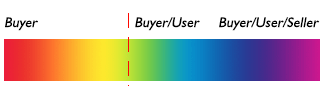
The UX community generally considers users to be arrayed along a spectrum that stretches from naive to expert. Apple expands that array by prefacing it with buyers. The following chart shows that more complete spectrum, flowing from the buyer before the sale, through the dashed red line at the point of sale, and then moving along from naive to expert user with the continuing passage of time.

Our efforts should resemble the third line on this chart, with all of us properly supporting people through a continuum stretching from customers’ first faint desires to the point at which they've become seasoned professionals.

If you keep your customers happy, they will become unpaid ambassadors for your product. Or, conversely, unpaid disparagers of your products. Ask yourself, what do you put your own faith in, manufacturers' puffery or experienced users' amazon reviews?

The best way to motivate sales is to demonstrate ease-of-learning and ease-of-use while simultaneously talking about power.

If you begin to think of your users as buyers, too, able to cut you off without a second’s thought should you fail to please them, you will discover that little spark of fear will concentrate your mind wonderfully as well. You’ll end up with a product that is more attractive, easier to learn, and more productive because you will be motivated to make your user/buyer happy, not just efficient.

@kevinux
Copy link

kevinux commented Jan 17, 2018

Thanks! Do you have summaries of other UX courses? :)

Sign up for free to join this conversation on GitHub. Already have an account? Sign in to comment