This is a collection of notes on how I’ve been approaching CNNs for pansharpening. It’s an edited version of an e-mail to a friend, who had asked about this tweet, and so it’s informal and somewhat silly; it is not as polished as, say, a blog post would be. Basically, what I’ve written up here is the advice I would give to an enthusiastic image processing hobbyist before they started working on pansharpening.
If you want a more serious brief review of the problem, try the first two pages of Learning deep multiresolution representations for pansharpening – most of the work I would recommend is mentioned there.
If you spot an error in the physics or math here, please mention it, but if you see a simplification or minor abuse of terminology, it’s on purpose; for textbook rigor, please refer to a textbook. The focus here is on how I’ve been trying to approach the problem, especially the domain knowledge, and not on model architecture or results.
Some points made:
- Think explicitly about spectral resolution; the resolution increase in pansharpening is diagonal across the spatial and spectral axes
- The way a typical pan band acts roughly like a mean of visible radiance creates an analogy to chroma subsampling
- But pan bands are not exactly visible radiance, mainly because of haze
- Most classical pansharpening techniques are more similar than different, but please don’t use PCA-based pansharpening
- Pyramidal pansharpening can be thought of as simple sensor fusion
- Pansharpening is only for people to look at, and therefore should be done end-to-end and not as an input to any other software
- L1 loss in a perceptually nonuniform color space is silly
- Pixelwise losses don’t get at texture well, which is particularly important in pansharpening; try Frei-Chen edges or similar
- Unconditional gans might be a way to get around the scale-locking in “Wald’s protocol”
- Use real color matching functions – don’t trust the names of the red, green, and blue bands
- Pixel shuffling’s 2ⁿ:1 scaling ratio is a cool match for the standard pan:mul spatial ratio
- Band misalignment is scale-dependent, so watch out
- Data availability is the main problem for experimentation
Why pansharpening? Because if you follow the news and read widely, you probably see a couple pansharpened images a day, and most of them are noticeably iffy. Because it’s ill-posed and that makes it fun. Because it’s closely connected to Bayer demosaicking, SISR, lossy compression, and a bunch of other interesting topics. Because it’s a great example of a heavily technical problem with more or less purely subjective outputs (see 2.4, below).
When we talk about the resolution of an image in everyday English, we mean its size as an image, in units of pixels: say, 4K, 1024×768, or 100 megapixels. In a more pedantic conversation, for example among astronomers, it’s more likely to mean angular resolution, or the fraction of the sphere that each pixel subtends, in units of angle: say, 1/100°, 1 arc second, or 20 mrad. In satellite imagery we usually assume that everything in the frame is the same distance from the sensor, and so when we say resolution we mean the ground sample distance (GSD), or the size of the real area covered by each pixel, in units of length: say, 1 km, 30 m, or 30 cm. For our purposes, spatial resolution will always mean GSD.
But note spatial. There are other resolutions. An image might resolve more or fewer light levels, measurable in bit depth – radiometric resolution. It might resolve change over time, measurable in images per year or day – temporal resolution. And it might use multiple bands to resolve different parts of the spectrum into separate colors or channels – spectral resolution.
A sensor’s different resolutions compete for design, construction, and operational resources. For example, more resolution of any kind means generating more data, which has to be downlinked. Every sensor is a compromise between resolutions.
Here we will ignore all but spatial and spectral resolution.
We can measure spectral resolution with the dimensionless quantity R = λ / Δλ, the ratio of a frequency to the distance to the next distinguishable frequency. In other words, a sensor can detect wavelength differences of one part in R. For the human visual system, R is very roughly 100: depending on conditions, the average observer can just about tell the difference between lights at 500 and 505 nm. High-end echelle spectrometers on big telescopes have an R of about 10^5, so they can measure the tiny redshift induced in stars by exoplanets too small to image directly.
For an example outside electromagnetism, people with relative pitch have an auditory R of about 17 or better, since the semitone ratio in twelve-tone equal temperament is the 12th root of 2 = 1.0594…, and 1/(1.0594-1) = 16.817… (unless my music theory is wrong, which would not surprise me).
1.3 Journey to the planet of redundant reflectance spectra: the tasseled cap transform and chroma subsampling
An intuitive interpretation of principal component analysis (PCA) is that we’re taking multidimensional data and defining new dimensions for it that align better with its distribution. In other words, the shape of the data stays the same, but we get a new set of coordinates that follow correlations within it. The new coordinates, or components, are ordered: principal component 1 is the strongest relationship (under various assumptions) among the bands, PC 2 is the strongest relationship after PC 1 is factored out, and so on. PCA is a blunt instrument, but it is good at turning up patterns.
In 1976, Kauth and Thomas put cropland reflectance timeseries through PCA. To our 2021 brains, numbed by the supernormal stimuli of multi-petabyte global datasets, their inputs were so small they practically rounded down to empty, but it was enough to see correlations that remain interesting. The orthonormal basis that PCA derived for their handful of image chips of Midwestern farms had axes that they named:
-
Brightness. The vector for this component was positive in every band, and amounted to a rough average of all of them.
-
Green stuff. This was negative for visible wavelengths and strongly positive for NIR, and looks a lot like NDVI. Loosely, a green–red or chlorophyll–everything else axis.
-
Yellow stuff (or, with opposite sign, wet stuff). This component tends to sort pixels on an axis from wet (open water, moist soil) on one end to ripe (senescent plants) on the other.
Projected into this 3D space, the annual cycle of crops followed a clear pattern. In winter, pixels lay on a plane representing different soils. As sprouts came up, pixels rose from the plane in the +green direction and converged toward the color of chlorophyll. Their traces filled a cone. As they ripened, they shifted in the +yellow direction, giving the cone a bent tip. Then, as the cells decomposed, they fell back onto the plane of soils. Overall, the traces looked like a tasseled cap: a windswept cone with diverging curves hanging from its tip. This analysis got taken very seriously: people still use it and calculate its coefficients for new satellites.
The basic pattern of the tasseled cap (TC) transform shows up with a wide range of terrestrial biomes and instruments. If you put a Sentinel-2 image of Malawi into PCA, you’ll get results that (at least in the first few components) look a lot like Landsat 2 over Illinois. This implies that the tasseled cap transform indexes some geostatistical fact that’s larger than how Kauth and Thomas first used it – that TC has something pretty general to tell us about Earth’s land surface. It will obliquely inform some stuff we’ll get into later, but the main reason I bring it up is because of the brightness component. It’s really interesting that it’s a rough average of all the bands. Let’s walk around this fact and squint at it from different angles. It means:
-
If a real-world surface reflects n% of light at any given visible wavelength, n% is close to the best estimate of its reflectance at any other visible wavelength.
-
Vivid, saturated colors at the landscape scale are rare in nature. (And the main exceptions are green veg/reddish soil and blue water/yellow veg: principal components 2 and 3. The things that come to mind when we think of bright colors – stop signs, sapphires, poison dart frogs – are salient because of their rarity at the landscape scale.)
-
From an information theory perspective, if you want a framework to transmit an approximation of a real pixel, a roughly optimal approach is to start with its mean value in all bands (then proceed to the degree to which it resembles vegetation, and the degree to which it resembles water, after which the residual will typically be very small).
-
By the central limit theorem and/or the nature of color saturation, the colors of everyday life will, as you downsample them or (equivalently) view them at the same angular resolution but from further away, tend to become less vivid.
All different ways of getting at the same statistical fact about reflectance from Earth’s surface. If I had to theorize, I would say that molecules and structures that strongly reflect only a narrow part of the spectrum are thermodynamically unlikely and thus developmentally expensive, and are therefore uncommon except where they confer strong benefit, e.g., aposematism. (Chlorophyll … well, I feel weird about chlorophyll right now because I feel like I’m missing a key idea somewhere in this.)
The human visual system takes advantage of this fact about the visible world. Our experience of hue is powerful and complex, but in terms of what’s quantifiably sensed, most information that makes it out of the eyes and into the brain is about luma (brightness) and not chroma (hue and saturation). In particular, our ability to see fine detail in chroma alone is much weaker than a reasonable layperson might guess. A practical illustration is that lossy image and video compression almost universally represents color information with less spatial detail than brightness information gets. We consistently rate a video, say, with sharp luma and blurry chroma as sharper than one with blurry luma and sharp chroma. So all the familiar lossy visual codecs, from JPEG to the MPEGs, deliver what amount to sharp monochrome images overlaid by blurry or blocky hue images.
This is also what most optical satellites do. WorldView-3, for example, collects a panchromatic band at 0.5 m resolution, and 8 multispectral bands at 2 m resolution. (These numbers are rounded up, and WV3 is not the only interesting satellite, but let’s use them for simplicity.) The reasons are closely analogous.
First, because there’s a tradeoff between spatial and spectral resolution (see 1.1 above). I’m looking at Table 1 in the radiometry documentation for WV3 Now I’m firing up python and typing:
def R(center_nm, ebw_µm):
    return center_nm / (1e3 * ebw_µm)
Now I’m calculating R for each band up to NIR2 and getting:
| Band | R |
|---|---|
| Panchromatic | 2.24 |
| Coastal | 10.6 |
| Blue | 8.92 |
| Green | 8.03 |
| Yellow | 15.8 |
| Red | 11.2 |
| Red edge | 18.7 |
| NIR1 | 8.21 |
| NIR2 | 10.3 |
(N.b., this is not the pukka definition of R from 1.2. The ideal spectrometer has square response curves with width λ/R, forming an exact cover of the spectrum. WV3 is just not designed that way, as Figure 1 shows, so we’re abusing terminology (I warned you) and using λ / effective bandwidth: a loose R that only has meaning for a single band. This version of R is useful here and doesn’t lead to absurdities, so we’ll note the sloppiness and run with it.)
The mean for the multispectral bands (which we might call the sloppy R of the multispectral sensor as a whole) is 11.5. The spectral resolution of the multispectral data, then, is a little over 5 times higher than the spectral resolution of the panchromatic data. Meanwhile, the spatial resolution of the pan band is 16 times higher than that of the mul bands. 2 m / 50 cm looks like 4×, but we’re thinking about area: it’s a 4² square of pan pixels that fit inside (spatially resolve within) one mul pixel. Conversely, it’s a set of 8 mul bands that approximately fit inside (spectrally resolve within) the pan band. (Yes, that’s a load-bearing “approximately” and we’ll have to come back to it.)
So if you imagine a hectare of land, it’s covered by 40,000 pan pixels with R = 2.24, and with 2,500 mul pixels at R = 11.5. The pan band has high spatial resolution but low spectral resolution, and the mul bands are the other way around.
If you look outside and it’s the Cold War, and you look inside and you’re in a lab designing an orbital optical imaging surveillance instrument, you probably want to make something that’s as sharp as possible, color be damned. In the literature, the point is often made that multispectral and particularly infrared imaging can spot camouflage, because for example a T-62 painted in 4BO green will generally stand out in the NIR band even though it’s designed not to in the green band. But then someone makes a green that reflects NIR or switches to 6K brown. From out here in the unclassified world, it seems that multispectral is useful, sometimes vital, but it's safe to say that spatial and not spectral resolution has always been the workhorse of space-based imagery.
(Also, since 1972, Landsat has been pumping out unclassified NIIRS 1 multispectral. I eBayed a faintly mildewy copy of Investigating Kola: A Study of Military Bases Using Satellite Photography, which is really impressive osint using Landsat alone. And it’s suggestive that the most famous leaked orbital surveillance image was (a) mind-bogglingly sharp for the time, and (b) monochrome; and that, 35 years later, another major leak could be described the same way. These lines of evidence tend to support the idea that optical spy satellites tend to go for sharpness above all.)
So this is why we have pan bands in satellite imaging. A curiosity is that almost all of them are biased toward the red end of the visible spectrum; often they have no blue sensitivity at all but quite a bit of IR. It’s mainly because of Rayleigh scattering, which is proportional to λ⁻⁴: most light scattered in clear air is blue. We see this when we look up and see a blue sky covering what would otherwise by a mostly black starfield. Satellites see the sky from the other side, but Earth’s surface shines through more clearly since it’s brighter overall than the starfield. The scale height of Earth’s atmosphere is about 8.5 km, so when you look at even reasonably close things in the landscape (e.g., Tamalpais from the Oakland hills, or Calais from Dover, or Rottnest Island from a tall building in Perth’s CBD, all ~30 km), you’re looking through much more sky than a satellite generally does.
Air in bulk, then, means blue haze. We tend to think of this as adding blue light, and in many situations it does, but let’s think of it as moving blue light around. Blue photons are diverted into the light path from a distant red object to the eye, but they’re also removed from the light path between a distant blue object and the eye. The blue sky and other haze are the photons that, by their absence from the direct path, make the sun slightly yellow instead of flat white. (Any color scientist reading this just had all their hair stand up like they touched a Van de Graaff generator, but we’re simplifying here.)
A hazy image’s blue channel isn’t just bright: it’s low-contrast – and especially from space, since that light’s been through at least two nominal atmospheres. Seeing is better toward the infrared. (One reason people like Kodak Technical Pan, a monochrome film with roughly the same biases as a typical satellite pan band, is that it gives high contrast landscapes dark skies.) Also – and this might be good, bad, or neutral – live vegetation shines, since it reflects NIR extremely well just outside the visible range. Look at the trees by that shipyard, for example.
On this footing, we can usefully say that to pansharpen is to combine panchromatic and multispectral channels into an image that approaches the spatial resolution of the pan band and the spectral resolution of the mul bands. Or, more narrowly, the spectral resolution of the visible mul channels within the visible frequencies.
We used chroma subsampling as an analogy for the pan/mul split in pansharpenable satellite sensors. Let’s dig further into that.
Human color perception is approximately 3D, meaning you can (at least sloppily) define any realistic color swatch with a 3-tuple of numbers. As with map projections, there are many useful projections of colors, but none of them completely meets every reasonable need. For people who work with computers, the most familiar is sRGB. Conceptually, sRGB takes radiance, i.e. the continuous EM spectrum in the visible range, and bins it into red, green, and blue segments, basically dividing it in thirds. There are all sorts of details to consider in the real world, but in theory it has a clear physical meaning. To measure a color, you measure photon fluxes through different band-pass filters. To create a color, you send photons out of primary lights, as with stage lights or (most likely) the screen you’re reading this on.
But this is not quite along the grain of human color perception. When we look at how visual artists, for example, like to organize colors, we find color wheels. These are generally gray in the center, with fully saturated colors along the rim. In a third dimension, we imagine that the circle is a cylinder or a sphere, with lighter colors toward the top and darker ones toward the bottom. Making white/black its own axis, instead of running diagonally along the R, G, and B axes, reflects how intuition and experiments suggest we tend to think in practice.
This kind of projection is called an opponent color space, because it lets us represent, for example, blue and yellow as perceptual inverses. (It’s a representation of opponent process theory, which is a broadly accurate summary of how the neural nets just behind and above our noses represent the color feature space.) With some mild abuse of jargon, we can call the lightness dimension of an opponent space the luma axis, and the other two axes together, representing the color qualities orthogonal to lightness (e.g., redness, saturation, etc.) are the chroma axes. The chroma planes let us represent a feature of the human visual system that is totally contingent and not physically present: purple. We feel that the deepest reds are in some way continuous with the deepest blues. This is not the case in, for example, aural perception: we do not think that the highest perceivable sounds are continuous with the lowest perceivable sounds. But in color perception, we have the line of purples, and chroma in an opponent color space is a convenient way of talking about this.
Additive and opponent spaces are radically different in intent, but in practice they look reasonably similar because they represent the same thing, to a Mollweide v. Robinson level. If you imagine the sRGB color space as the unit cube, with each axis running from none to all red, green, and blue, you can further imagine tipping that cube 45° so that its white vertex is on top and its black vertex is on the bottom. That’s a simple but valid opponent color space. There are more serious but only slightly more complex ones, for example YCbCr and YCoCg that probably encoded some of the things in your field of view right now.
Why wouldn’t he illustrate this?, you wonder. This is all about visual and spatial ideas, you point out. Well, look, if I started it would be a several-month project.
A baseline approach to pansharpening is to construct a low-res RGB image from your mul bands, upsample it, and put its chroma in the output chroma bands, discarding its luma component. Then put the pan band in the output luma band. You now have what amounts to a chroma subsampled image. Someone who’s learned to notice it will be able to see that the chroma is blurry, and especially around strong color contrasts (e.g., a bright red building against a green lawn) there’s a sort of smeared, wet-on-wet watercolor effect where we see upsampling artifacts along the border between the color blocks.
Furthermore, there will be chroma distortion from the fact that the pan band does not correspond to visible luma – it’s got too little blue and too much NIR. This means that, for example, water will be too dark and leaves will be too bright. You can see this clearly in cheaply pansharpened images: the trees have a drained, grayish pallor, as if they’ve just been told that the oysters were bad. That effect can be improved with algorithmic epicycles, but eventually you’re just reinventing some other more advanced technique. This basic approach is called IHS pansharpening (after an alternate name for opponent color spaces). I would only use it in an emergency.
People also pansharpen with PCA. The take their low-res mul image, apply PCA, upsample it, replace the first component (which, recall, will pretty much always be a rough average of the mul bands, i.e., will look about like a pan band) with the pan band, and rotate back from the PCA space to RGB. This is pretty clever! I mean that in a derogatory sense. It’s very bad. It relies on the rule of thumb that PC 1 tends to look like a pan band, which is true, but there’s no substantial advantage conferred by that statistical fact. IHS pansharpening is lazy but basically works, ish, and is predictable. PCA pansharpening is less lazy than IHS in the sense that it takes more computation, but there’s no theoretical or practical reason to expect the results to be better, plus it’s adaptive in a bad way. When I see a pansharpening paper that evaluates itself against the PCA method, I assume the proposed algorithm isn’t very good, because it’s like saying your sorting algorithm is substantially better than bubblesort.
The Brovey method works like this: We realize that we can’t entirely get around the fact that the pan band doesn’t align perfectly with real-world luma for the human eye. But we have another resource that should align better: the mul bands, or at least the ones we choose from within the range of human vision, perhaps appropriately weighted. Although these are not spatially precise, they are accurate as to what should look bright and what shouldn’t. So we can look at a mul pixel’s footprint and constrain the 16 pan pixels that sit inside it to have the same mean luma as the luma of the mul pixels, calculated by a color matching function (or see 2.7, below) that maps a spectrum to a perception. (In practice we do it in a semi-backwards way to avoid edge effects, but this is the core concept.) This should leave us with most of the fine gradients, i.e. detail at the ~2 pixel scale, of the pan band while constraining it at the slightly larger pixel neighborhood scale to conform to the overall brightness contours of the mul bands, which we trust more at those scales.
Brovey is analogous to sensor fusion in other domains, like positional data. Say you have a GPS fix stream that gives you positions that are accurate but not precise: it knows where you are +/- a few meters every few seconds, but within that range there’s random noise. And you have a 3D accelerometer, which is precise but not accurate: it can sense motions on the microsecond and mm scale, but it doesn’t know its own starting point, and if you were to integrate its momentary acceleration readings over more than a few minutes, noise and biases would lead to bizarre divergence. So what you do is, considering say just the north-south axis alone for clarity, you take your GPS timeseries and smooth it by making a, say, 30 second moving average. Then you take your accelerometer integration and smooth it by the same amount. Then you subtract the smoothed version of the accelerometer data out of it, so you’re left with only the short-term components of motion (a.k.a. the high frequencies), averaging 0. Then you add that short-term component onto the smoothed GPS timeseries.
Now, ideally, you have a signal that is both accurate (grounded by the GPS at coarser scales) and precise (sensitive to the accel’s record of small motions at fine scales) without the short-term noise of the GPS or the long-term noise of the accel. Maybe this is just the sketch version and really you do something a little fancier with FFTs or wavelets or something, but the analogy should make sense. The mul bands correspond to the GPS: they are spatially coarse but provide a better estimate of what should actually look bright. The pan band is like the accel: much better at picking up detail, but unreliable about absolute brightness. (And inversely in the spectral domain.)
This kind of fusion is common to Brovey, the Zhang method, indusion, pyramidal mthods, and so on; it’s an umbrella under which most of the reasonable classical image processing approaches fit. As a basic version, in pseudocode:
define pansharpen(pan: image[1, w, h], rgb: image[3, w/4, h/4]) -> image[3, w, h] {
  rgb_upsampled = upsample(rgb, 4); // bicubic or whatever
  pan_blurred = upsample(downsample(pan, 4), 4); // basically a low-pass filter
  pan_detail_only = pan - pan_blurred; // only the spatially fine features, mean near 0
  pansharp = clone(rgb_upsampled);
  for band in (R, G, B) {
    pansharp[band] = rgb_upsampled[band] + pan_detail_only;
  }
  return pansharp;
}
I like and use this family of methods. However, it can still produce noticeable artifacts. The trees overlapping the Tiber are a good example. What we’re seeing there is that the mul channels said “these regions look mostly the same – maybe there’s more texture in the trees, maybe they’re a purer green, but the difference is fairly minor on the scale of possible differences between image regions” while the pan band said “in the near infrared, the water is virtually black and the tree is virtually white, so there’s a very strong gradient here”. Since we trust the pan gradient at small spatial scales, it forces a gradient into the output. At slightly larger spatial scales, the mul bands have control and can correct, but a weird ring remains.
There are also more sophisticated classical pansharpening approaches, based on things like edge analysis. For example, if something in the pan band looks like it divides two areas that might have different chroma (because they have different brightness, or different texture, or whatever), the algorithm looks for a potential difference in chroma in the mul bands and tries to create a sharp edge in the output chroma aligned with the one in the luma. In my certainly incomplete knowledge, these don’t tend to work that much better than Brovey/indusion/pyramid approaches, which as you will have guessed from my description I think are in the sweet spot of accuracy v. complexity among the classical methods. That said, I think there’s probably room for breakthroughs in the edge-and-similar domain.
The edge approach suggests that this might be a good place to deploy CNNs. They’re good at recognizing edges, and they have proven pretty good at closely related tasks, like superresolution. Remember that we can think of pansharpening as the task of 4× spatial superresolution of the mul bands as guided by the pan band. (Or 8× spectral superresolution of the pan band as guided by the mul bands. Or you could reckon it as 5.13×, from the R ratio.)
I read a Medium post a few months ago talking about pansharpening data to make inputs to feature detection ML models. This annoyed me. Then, once I was done being annoyed at having to read a Medium ML post, I went on to be pissed by what it actually said.
Don’t train models to do anything on pansharpened imagery. Unless that’s all you have. Which I admit is virtually all the time. But if you can use the raw data, the stuff that you used as input to pansharpening in the first place, use that!
Look at it this way. Let’s say we have a pansharpening model P and a feature-extracting model F. We trained P with some loss that makes it take raw sampled pixels and create Good Pictures in some sense. Now we train F with a loss that makes it Know What Stuff Is in some sense. Great. Imagine that we train an end-to-end model E2E that takes raw pixels from the sensor with the Know What Stuff Is loss. What this flyblown Medium post wants us to believe is that in terms of Knowing What Stuff Is,
F(P(pixels)) > E2E(pixels)
Bullshit! We made a bad model is what we did! If our end-to-end model isn’t better than two models in succession, one of which has a loss unrelated to the output, we’re in trouble! This is so wrong in theory that if it’s right in practice, the practice is wrong.
More calmly, look. There’s fundamentally more information in the raw data. For example, the NIR bands: not being visible, by definition they should not appear in pansharpened output, but they can contain key information about surface materials that could distinguish a green sports tarmac from an actual field, a blue roof from a swimming pool, pale soil from ripe wheat, and so on. If there’s nonzero value at all in knowing what’s going on in the NIR, and surely there is, a nonzero amount of that information should be passed along. Or look at it this way – if pansharpening before feature extraction is truly optimal, well then, a well-designed and -trained end-to-end model will learn to pansharpen as an internal bottleneck.
Now, jumping off from here into waters more interesting than dunking on chumps on Medium, what if feature extraction before pansharpening is optimal? This is, to my mind, a good way of looking at what a CNN can bring to pansharpening. We don’t want to develop and manually adjust an edge analysis algorithm that handles every plausible case. We don’t want to code a manual tree detector, a manual water detector, and an explicit mechanism that says “where these kinds of pixels touch, don’t trust strong gradients in the pan band”, because we’d hit a combinatorial explosion of things in the world and their configurations. And their exceptions: if we say “where two things of similar mul color touch, ignore pan gradients” because that might, for example, erase subpixel features like chalk lines on sports fields, railroad tracks, or the texture in rows of bright flowers. And this kind of thing that we don’t want to case out by hand seems to be what deeper image processing CNNs are good at. They can plausibly learn to generalize the plane-tree-against-Tiber rule and the chalk-on-sports-field rule in a way that is assuredly not perfect – pansharpening is an ill-posed problem and any perfect solution is a fraud – but good enough to use for the actual goal of pansharpening, which is for people to look at. Not to make input to further models, because that’s mathematically illiterate. Just for people to look at. That’s what pansharpening is for.
Pansharpening is only for people to look at.
We could, but won’t, go on a sidebar here about the famous Babbage quote:
On two occasions I have been asked, — “Pray, Mr. Babbage, if you put into the machine wrong figures, will the right answers come out?” In one case a member of the Upper, and in the other a member of the Lower, House put this question. I am not able rightly to apprehend the kind of confusion of ideas that could provoke such a question.
The easy wryness makes me suspect that Babbage invented or exaggerated the incidents, but even if so, the misconception is real enough. The opaque mechanism of new technology, at least partly by virtue of its newness, always allows for some form of this confusion of ideas. And grifters will always use it to deceive and exploit. ML is a very good example of this today. The arguments to defend things like openly evil facial recognition are only one step more sophisticated than “I didn’t hit him in the head, the tire iron did – put the tire iron on trial and let me go” and yet we seem intellectually unequipped to object. Talk amongst yourselves about capitalism, innovation, and legibility; I will continue into this note on pansharpening.
The idea of training a feature extractor that only takes pansharpened data when you have the raw data right there is, ultimately, a branch of the parliamentarian confusion. Pansharpening’s outputs never contain more real information than its inputs do, and, with overwhelming likelihood, less. To believe otherwise is cringe. At their best, and this is the goal, pansharpening outputs contain good estimates of the truth and are pleasing and useful to look at. That’s it. Pansharpening is for human viewing, and that’s all.
Pansharpening is only for people to look at.
One implication of the conclusion in 2.4, which, just to repeat, was:
Pansharpening is only for people to look at.
is that we should be using perceptual losses for pansharpening models. In the literature, L2 loss (mean of square of difference between y and ŷ pixels) was standard for superresolution for a long time, but someone noticed that L1 (mean of absolute difference etc.) works better, even in terms of L2. The common interpretation of this is that L2 leads to models being ”too indecisive” and (for example) creating soft edges where there might or might not be an edge, instead of just showing an edge or not. I find this reasonable but perhaps a little incomplete. Frankly, it feels like an argument for GANs being even better than L1. However, there’s an underlying problem: L1 of what? Your classic GPU-licker who posts bad papers on arxiv and patronizing explanations of them on Medium (and is wearing sunglasses in his userpic, and simply adores commas splices) thinks that you just kind of have three channels in an image and they’re R, G, and B and there you go. If one of the numbers is different, the amount different is how bad a problem it is!
Well, bad news: it turns out the human visual system is kind of complicated. A late friend of mine wrote an introduction to it that weighs more than a kilo and a half. At a very conservative estimate of 10 facts per gram, that’s about 16,000 facts that we’re skimming past when we use L1 alone.
What’s better? Well, for starters, a perceptually uniform color space. RGB in any ordinary form simply does not have the presumed property that an equal amount of pixel value change in n channels is an equal amount of human-evaluated change. Constant steps in sRGB color space almost always yield perceptually non-constant results. For example, in the first illustration here, all the swatch borders are equally sharp according to L1(sRGB). So we should use a color space designed around that metric.
There’s no such thing in any simple terms, because the 3D “space” of human color perception is slightly non-Euclidean. In particular, if you step around the rim of the color wheel, you see more than π times as much difference as you would going from one edge to the other in a straight line. There are more perceptible hues than there are perceptible levels of saturations fitting in the same volume. So you can’t have a 3D color space with a triangle inequality that reflects what we actually see. But you can come close! It’s not too hard to match an opponent space to experimental data on perception. Yet most attempts, even ones by very fancy people, are not as good as they say on the label. But there are reasonable approximations that at least have the virtue of being easy to calculate! HSLuv, presented in that last link, is one. The one I think I like best today is Oklab. I have a few minor reservations about it (for example, since you asked, in that first image I think the purple is not saturated enough and the orange is too saturated). It’s head and shoulders better than sRGB for trying to determine whether a model got colors right.
Another issue is texture. A region of an image being slightly too bright is not as big a problem as a region having a checkerboard artifact with identical L1 magnitude, for example. SSIM is a pretty good texture-sensitive method that’s catching on in the literature, but I’ve found it really slow: more epochs but the same amount of training wall-clock time with an L1 loss seems to get results as good as SSIM can.
Something I haven’t seen in the literature but that made sense to me, so I’ve implemented (crudely, like an orangutan in a zoo pretending to use a stick as a phone) is Frei-Chen edges. These are really elegant in a number of ways, not all of which I take advantage of. They’re also fast as torch convolutional layers. (I can go further into them and my doubts about some of my implementation choices but I would, obviously, hate to go on too long.)
One way to split out the work that happens within pansharpening is:
- Make the pan band look more like perceptual luma, using the spectral information from the mul bands.
- Add texture to the mul bands, using the pan band and their own information, and transform them to perceptual chroma.
Simple Brovey, for example, does not do step 2 in full. Conceptually speaking, at least, its output chroma is merely upsampled, without any detail added. And a reasonable test of more sophisticated pansharpening is: Was any texture added to the chroma? Does it have detail at a scale finer than the spatial scale it was sampled at? This is what edge detection on the chroma channels can do explicitly in a way that L1 only does implicitly. It adds a direct check on soft edges in the chroma.
An elephant in the room here is gans. I’ve experimented with them but found them as unstable as I’d been warned. I would like to return to them one day when I’m more seasoned.
One of the odder things one might want to do with gans is to make an unconditional gan and throw some high-quality aerial or even snapshot images in the truth bucket. That is, train the pansharpener to make images that look a little like, say, landscape photos, at least at the texture level. Is this actually a good idea? Prob no, for a handful of individually moderately good reasons. But one of those moderately good reasons is interesting: maybe the model is supposed to be learning information that’s scale-dependent. A car, for example, is an object that has a fairly clear set of rules about edge sharpness and overall shape and vibe, and it should be recognizable partly because it falls in a pretty narrow set of sizes. The whole point of using a CNN instead of trying to hand-write some interpolation rules is that it should be doing things like recognizing cars. If I use a training image taken from a rooftop that has cars 200 pixels wide, will the pansharpener, when presented with real data where cars should be, you know, 3 pixels wide, try to find and enhance 200 pixel-wide car-like features? Or make whole trees look like individual leaves? Or render streets blurrily because it never learned what a street is supposed to look like at that scale?
And this is interesting because the problem is actually already present. What I’ve been doing, and most people seem to, is making training pairs like this, in pseudocode:
rgb = multispectral_to_rgb(multispectral_pixels);
mul_small = downsample(multispectral_pixels, 4)
pan_small = downsample(pan_pixels, 4)
x = (pan_small, mul_small) // input to model
y = rgb
ŷ = model.train(input=x)
loss = |y - ŷ|
model.learn_from(loss)
In words, we create a target image from the multispectral image, then downsample the inputs by a factor of 4. The downsampled pan is now the same resolution as the target image, and the downsampled mul is 1/4 that size (or 1/16 as many pixels). This means the target image has a resolution of 2 m, the input pan has a resolution of 2 m, and the input mul has a resolution of 8 m. We’re already feeding the model data that’s substantially different from the scale we want to run it at! We’re already teaching it cars are tiny! This is bad! But it’s hard to get around. It’s pretty standard, and it gets called Wald’s protocol, although strictly speaking Wald’s protocol is more of an evaluation metric that loosely implies that this is the least bad option.
So we don’t have a reliable x and y at the scale we actually care about. This bugs me constantly.
Another problem, while we’re here, is: if we’re downsampling, how should we be downsampling? The satellite sensor has some PSF and low-level resampling that we could theoretically try to reverse engineer by doing things like sampling off certain edges we can assume are straight and sharp, and I’ve seen people do that in papers (or at least refer to the fact that they did it somewhere offstage), but I don’t want to. I’m doing this for fun, man. I want to feel happy when I pansharpen. So I basically use bicubic or bilinear and know that I’m in a state of sin.
People will do this thing with WV2 and 3 data where they say “we make RGB data by taking the R, G, and B bands from the multispectral data”. This is foolish, and you can see why if you refer back to that WV3 PDF from 1.4 above. If you use the nominal RGB bands, then for example a hypothetical spectrally pure yellow object (at the extreme, a monospectral yellow laser) will be … black. Why would you want that? Using the proper color matching function for the full set of bands to XYZ color space and then into sRGB for display yields a mildly better-looking result, with a slightly richer mix of colors. It’s really not something you would notice in most cases unless you flip between the two, but it makes me happy. I hope it also encourages the model to think, from the very beginning, about all the bands and the information that can be extracted not only from each of them but from their relationships.
There’s more to say on the topic of band characteristics, but I’ll just throw this note in: I think a sophisticated enough model could do substantial spectral superresolution by being really clever about the overlaps of the bands and their overlaps with the pan band. The fact that the bands are not MECE and their averaged response is not the same as the pan band’s response is actually kind of an advantage and should allow for some interesting deductions about ambiguous spectral signatures. (It also suggests a fun question: if you know you’re going to be statistically untangling your bands anyway, what weird multi-overlapping band combination would be optimal in practice?)
If there’s one trick I’ve been playing with where I feel like I might be onto something substantive that others are not yet, it’s in applying pixel shuffles to pansharpening. And yet it has not produced impressive results.
Pixel shuffling (henceforth simply shuffling) is a technique that bijects layers with pixel grids. The first illustration in the paper, the color-coded one, is pretty good. But I’ll also explain it the way I learned about it, backwards, which I think is clearer. Consider the problem of demosaicking Bayer arrays. Most digital camera sensors are tiled in single-color–sensitive RGB sensor pixels in this pattern, the titular array:
RG
GB
Green gets double because the human visual system is basically more sensitive to green than to red or blue. This pattern is then interpolated, using any of a wide variety of techniques, so that each output pixel is converted from having only one band (a.k.a. channel) to having all 3. (The relationship with pansharpening and chroma subsampling is strong.) I learned a lot about CNN-based image processing in general from the excellent repo and paper _Learning to See inthe Dark – which, n.b., does joint denoising and demosaicking, because doing one and then the other would be foolish, just like pansharpening and then separate feature extraction would be foolish(╬ಠ益ಠ). Figure 3 in the paper shows how the 4 positions in the monomer of the Bayer array are each mapped to a layer. The spatial relationship between the color subsets remains stable and learnable. That is, if one green element goes to layer 1 and the other goes to layer 3, we have not actually (as you might reasonably worry at first glance) lost the fact that one of them is northeast of the other. Therefore, deeper in the network, successive layers can use and adapt spatial information about green light encoded in layer order.
This is an unshuffle operation. (I dislike the terminology, because to me a shuffle preserves dimensionality; I often forget which is shuffle and which is unshuffle.) Its inverse, then, is the last step in that figure: it interleaves pixels from a set of layers into a shallower but wider set of layers. That’s a shuffle.
The strength and weakness of a shuffle is that it’s not adaptive. An (un)shuffle is an unconditional, computationally trivial re-indexing and nothing more. At its worst, this removes an opportunity for a network to learn how to do domain-optimal upsampling in a spatially explicit way, and forces fine-detail spatial information into layers that could be specialized for feature extraction. At its best, it’s a cheap way to upsample, and the network can still interpolate as it sees fit, but as an operation between same-size layer sets, the last of which will then be unfurled by the unshuffle.
The fun coincidence here is that when we’re pansharpening, we’re dealing with resizes by powers of 2. That’s what shuffling does!
So here’s what I’ve been doing. Say a “footprint” is the area of one multispectral pixel, containing 16 panchromatic pixels. Say we want output of 256×256. This means that the input pan is 256 on a side, and therefore the input mul is 64 on a side: the area is 64 footprints across. We shuffle the pan pixels twice, so that they go from 1×256×256 to 4×128×128 and then to 16×64×64. Then we concatenate the pan and mul pixels, which we can now do because they are both n×64×64. Then, given 8 mul bands, we have a 24×64×64 input. If we look at one position in it, which is 24 deep, we see:
Layer 0: the pan pixel that corresponds to position 0, 0 within this 4×4 chunk
Layer 1: the pan pixel that corresponds to position 0, 1 within this 4×4 chunk
⋮
Layer 15: the pan pixel that corresponds to position 3, 3 within this 4×4 chunk
Layer 16: the pixel from the first mul band
⋮
Layer 23: the pixel from the last mul band
We send these layers through convolutions and then a shuffle, and repeat. Basically, we used unshuffling as a way to pseudo-downsample-yet-deepen the pan band’s representation. Then, over the course of the network, we shuffle the pan band back to its input resolution and hope that, as part of whatever’s going on in there (shrug.gif), the colors of the mul pixels “stick to” the pan pixels as they spread back out.
How does this work? Not very well. I mean, it works, but there are artifacts and it takes a lot of memory. Part of me has come around to feeling like it’s sort of precisely the wrong approach: that the way it encourages information to flow is exactly how it should not. Another part of me is sure that it’s very clever and I just need to stop making mistakes in other aspects of the design and training, and one day soon it will really shine.
Well, guess what: none of the data is really that clean.
One problem is that bands are collected at very slightly different times and angles. As a model: The sensor is a 1D array of receptors. They extend across the satellite’s direction of motion – thus the name pushbroom sensor. As the satellite moves smoothly over Earth’s surface, each sensor collects light for some tiny amount of time, quantizes it, moves it onto a data bus, and repeats. Imagine taking a desktop scanner and carrying it glass side down across the room: idealizing, you’d get a swath image of your floor. Same principle. However. To collect multiple bands, each band is facing a slightly different angle ahead of or behind the nadir angle. Imagine you swoop your scanner over your cat, in the head-to-toe direction. The red channel, let’s say, sees the cat first, and by the same token it sees it from slightly in front. Last is, say, the blue channel, which sees the cat a fraction of a second later, and slightly from behind, because it’s aimed just a bit backwards of the scanner’s nadir.
In postprocessing, you use a model of where the scanner was and the shape of the cat, and maybe do some cross-correlation, and you can basically reconcile the slightly different views that the different bands have and merge them into an close-enough aligned multiband package. You only get into trouble around overhangs, where one band saw detail that another band didn’t at all. And if the cat was in motion. And if you don’t know the shape of your cat perfectly. And the analogs of all these situations arise in satellite imagery. James Bridle’s rainbow planes are an excellent example. And clouds tend to have slightly rainbowy edges because, not being on the ground, a band alignment that aims to converge at the ground will not converge for them. We could go on. Bands are never perfect.
And this problem is much worse at native resolution than downsampled. Cars driving on city roads, for example, make clear rainbow fringes at full scale but hardly enough to notice at 1/4 scale. So when we train a network on downsampled imagery it sees cleaner band alignment than real data will have. Given a fully rainbow car, it freaks out and produces unpleasant things like negative radiance. This is a constant headache. (And an argument for gans, which are of course constant headaches.)
Also, and most prohibitive of all, getting data is hard. So far as I know, there is no standard pansharpening dataset from any major commercial imagery provider that is:
- Large (high gigabytes to low terabytes or so),
- representative of current-generation highest-resolution sensors,
- well distributed (among LCLUs, angles, seasons, atmospheric conditions, etc.), and
- unambiguously licensed for open, experimental work outside an organized challenge.
There’s SpaceNet data that meets 2 and I think 4. Some official sample data meets 2 and 4; others meet 2 and may be intended to meet 4 but that’s not how I read the licenses – public experimentation and incidental distribution, not in direct support of a purchasing decision, doesn’t seem to be covered. Landsat 8 data meets 1, 3, and 4. The federal government bought some Ikonos-3 data for things like the 2004 Indian Ocean tsunami, and you can get it through EarthExplorer under “Commercial Satellites”; that approaches 2 and meets 4. If you’re working for the federal government or are a professor in a remote sensing program, there are official channels to get data that meets all 4 criteria. But if you’re just a person with a hobby, your options are limited.
I hope for a future where the people producing this kind of data see the value in a low barrier to entry for hobbyists and non-rockstar researchers. I think it’s clear that pansharpening is a topic where we’re still sort of banging rocks together and getting excited about the sparks. I expect that the best and fastest progress would come from making it something that random undergrads and tinkerers can tackle, the way SISR and Bayer demosaicking are.
Pull up G**gl* Earth and go to 29.5, 106.538. You’re on a riverside in Chóngqìng. Use the history tool and go to the later of the two images from October 2015. You should see some barges and some kind of dredging or sand loading operation. Look especially at edges and color contrasts. Now here’s some output from a network that worked well but whose hyperparameters I lost (natürlich):
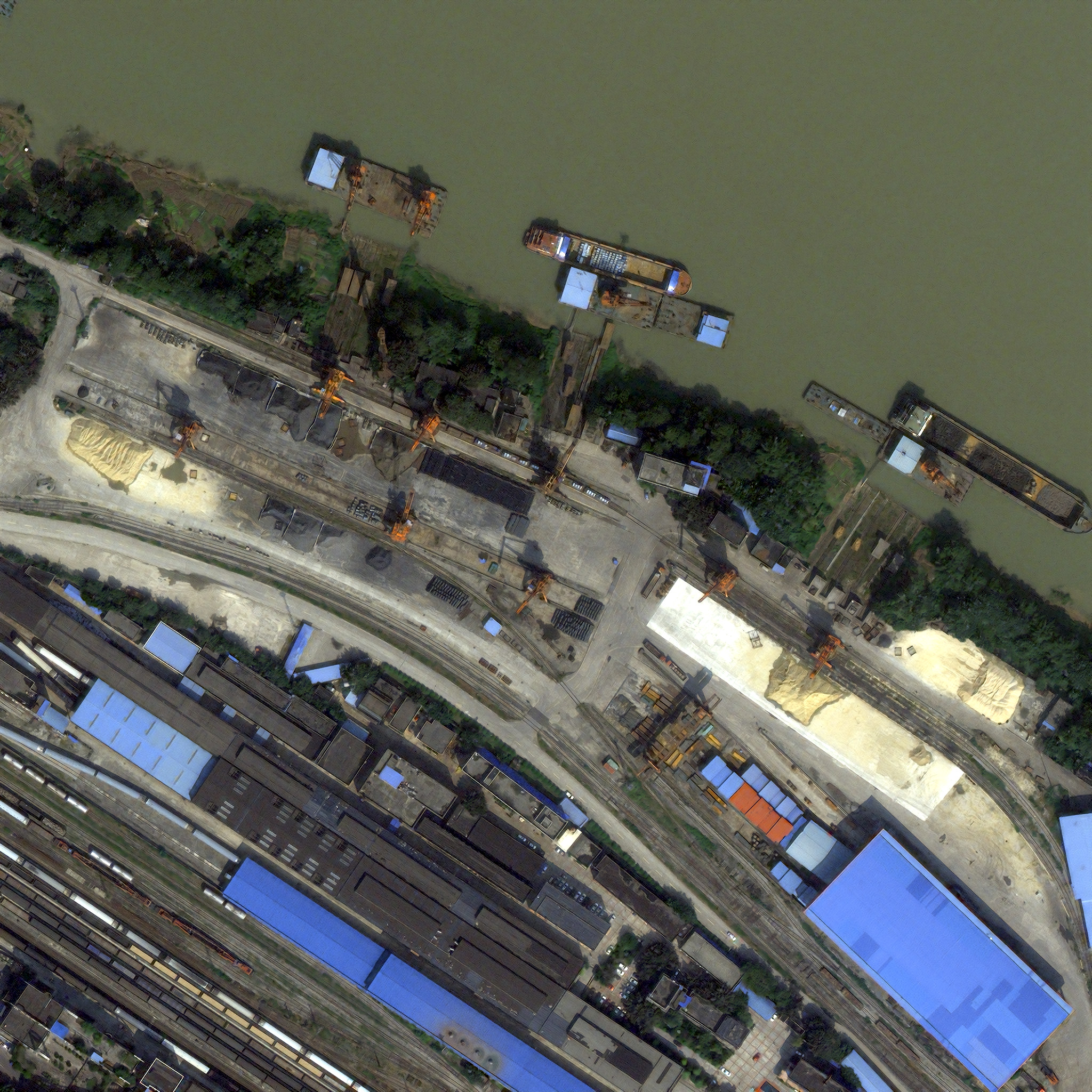
You’ll want to look at full size for it to have any meaning. I’ve done some very basic contrast and color correction to account for the smog and such. And, look, I suppose I should come clean about the fact that I am also trying to do super-resolution at the same time as pansharpening. That is, I’m trying to turn input with 2 m mul and 0.5 m pan into 0.25 m RGB. To see this at nominal resolution, zoom it to 50%. Look for interesting failure cases where red and blue roofs adjoin, and I think we’re seeing the Frei-Chen loss adding a sort of lizard-skin texture to some roofs that should probably be smooth. Train tracks are clearly a big problem; I think China is mostly on 1.435 m gauge, which is a good resolution test for a nominally ~50 cm pan band.
There are a lot of model architectures and losses to play with, and I enjoy returning to old failures with new skills. For example, something I had a lot of hope for that just didn’t pan out was a ”trellis” approach where there are multiple redundant (shuffle-based) upsampling paths. I still think that has promise but I haven‘t found it yet.
Or, for example, a technique based around using Brovey-or-similar as a residual, i.e., having the model provide only the diff from what a classical method produces. In theory, it might help take the model’s mind off the rote work of transmitting basic information down the layers and let it concentrate on more sophisticated ”that seems to be a tree, so let’s give it tree texture” fine-tuning stuff.
I’m not actually using a perceptually uniform color space for this training session (it’s YCoCg instead). I should take my own advice there.
I have a lot to learn about loss functions. I still don’t have the intuition I want for Frei-Chen.
I’ve tinkered with inserting random noise to train the model to look out for data problems. This feels too simple. I might have to insert plausibly fake band misalignment into the inputs to really make it work.
To model PSF uncertainty, I’m adding some noise here with a hack too gross to commit to text; that needs fixing.
I don’t have a good sense of how big I want the model to be. The one I was tinkering with today is 200k trainable parameters. That seems big for what it is, yet output gets better when I add more depth. This feels like a bad sign that I will look back on one day and say ”I should have realized I was overdoing it”, but who knows.
Better input data.
That’s what I’ve been doing with pansharpening. I hope at least some of this was interesting to think about. I am eager for any questions, advice, things this reminded you of, etc., yet at the same time I am aware that you are a person with other things to be doing. Also, I assume that there are a few major errors in typing or thinking here that I will realize in the middle of the night and feel embarrassed about, but that’s normal.
Cheers,
Charlie