Skip to content

Instantly share code, notes, and snippets.

@harshmittal2810
Last active July 4, 2022 08:30
Show Gist options
  • Star 0 You must be signed in to star a gist
  • Fork 0 You must be signed in to fork a gist
  • Save harshmittal2810/122f94448971086c5b6d7797157370dc to your computer and use it in GitHub Desktop.
Save harshmittal2810/122f94448971086c5b6d7797157370dc to your computer and use it in GitHub Desktop.
Android New UI style guide for implementing new style

This article contains all the basic components with minimal attributes to be used in our JioMeet. As we defined all the style attributes in themes, we don't need to define some of the duplicated attributes (like font, text size, textColor, corners, corner family, background, and some other attributes) again in the layout XML.

In order to apply the new UI theme for any activity, use Theme.App.NewUi for your activity in manifest.

Note: All the resources related to any module should be within that source package.

image-34c46419-070b-4562-9df7-cac5cc79e276

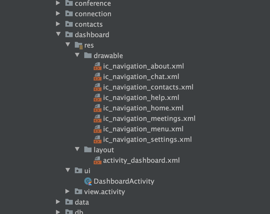
Ex: All the dashboard resources should be in the package/dashboard directory.

To add a new res directory you should add the path to your module. It will enable to addition of any resources in that module/res directory.

object SourceSets {

    val resourceDirectories = listOf(
        "org/jio/meet/dashboard"
    )
}

Toolbar

<com.google.android.material.appbar.AppBarLayout
    android:layout_width="match_parent"
    android:layout_height="wrap_content">

    <com.google.android.material.appbar.MaterialToolbar
        android:layout_width="match_parent"
        android:layout_height="wrap_content"
        app:menu="@menu/menu_contacts_screen"
        app:title="My Profile" />
</com.google.android.material.appbar.AppBarLayout>

BottomBar

<com.google.android.material.bottomnavigation.BottomNavigationView
    android:layout_width="match_parent"
    android:layout_height="wrap_content"
    app:menu="@menu/menu_home" />

TextViews

List Item Title

    <TextView
        android:layout_width="wrap_content"
        android:layout_height="wrap_content"
        android:text="Design Meeting Webinar"
        android:textAppearance="?attr/textAppearanceListItem" />
    <TextView
        android:layout_width="wrap_content"
        android:layout_height="wrap_content"
        android:text="30 minutes ago"
        android:textAppearance="?attr/textAppearanceListItemSmall" />

Buttons

To disable any button use enabled = false attribute.

Small Button

        <Button
            style="?attr/buttonStyleSmall"
            android:layout_width="wrap_content"
            android:layout_height="wrap_content"
            android:text="Small Button (Enabled)" />

Small Secondary Button

        <Button
            style="?attr/buttonStyleSmallSecondary"
            android:layout_width="wrap_content"
            android:layout_height="wrap_content"
            android:enabled="true"
            android:text="Small Button (Secondary)" />

Large Button

        <Button
            android:layout_width="match_parent"
            android:layout_height="wrap_content"
            android:text="Large Button (Enabled)" />

Text Button

        <Button
            style="?attr/borderlessButtonStyle"
            android:layout_width="match_parent"
            android:layout_height="wrap_content"
            android:text="TextButton"
            app:icon="@drawable/ic_menu_chat" />

InputFields

Outlined TextInput

        <com.google.android.material.textfield.TextInputLayout
            android:layout_width="match_parent"
            android:layout_height="wrap_content"
            app:endIconMode="clear_text">

            <com.google.android.material.textfield.TextInputEditText
                android:layout_width="match_parent"
                android:layout_height="wrap_content"
                android:hint="Simple Input Field"
                android:text="dhsladhakdjha" />

        </com.google.android.material.textfield.TextInputLayout>

Bottom lined TextInput

        <com.google.android.material.textfield.TextInputLayout
            style="?attr/textInputStyleBottomLined"
            android:layout_width="match_parent"
            android:layout_height="wrap_content">

            <com.google.android.material.textfield.TextInputEditText
                android:layout_width="match_parent"
                android:layout_height="wrap_content"
                android:hint="Simple Input Field"
                android:text="Simple Input Field" />

        </com.google.android.material.textfield.TextInputLayout>

CheckBox

        <com.google.android.material.checkbox.MaterialCheckBox
            android:layout_width="wrap_content"
            android:layout_height="wrap_content"
            android:text="CheckBox (Enabled)" />

RadioButton

            <RadioButton
                android:layout_width="match_parent"
                android:layout_height="wrap_content"
                android:text="RadioButton (Enabled)" />

Switch

        <com.google.android.material.switchmaterial.SwitchMaterial
            android:layout_width="wrap_content"
            android:layout_height="wrap_content"
            android:text="Switch (Enabled)" />

Chip

        <com.google.android.material.chip.Chip
            android:layout_width="wrap_content"
            android:layout_height="wrap_content"
            android:text="dasdhasldhasl" />

BottomSheet

<TextView
    android:id="@+id/audioOptionSpeaker"
    style="?attr/bottomSheetTextItemStyle"
    android:layout_width="match_parent"
    android:layout_height="wrap_content"
    android:text="@string/audio_speaker"
    app:drawableStartCompat="@drawable/ic_speaker_on" />

Use bottomSheetTextItemStyle style attribute to apply the bottom sheet option item.

Date Picker

    MaterialDatePicker.Builder.datePicker().build().show(supportFragmentManager, "MaterialDatePicker")

Time Picker

    MaterialTimePicker.Builder().build().show(supportFragmentManager, "MaterialTimePicker")

This article contains how to use the repository pattern in new features or modules.

The following image illustrates the folder structure we should follow for the data layer along with DI and other components.

The repository pattern

The repository pattern is a design pattern that isolates data sources from the rest of the app.

A repository mediates between data sources (such as persistent models, web services, and caches) and the rest of the app. The diagram below shows how app components such as activities that use LiveData might interact with data sources by way of a repository.

69021c8142d29198.png

The repository class isolates the data sources from the rest of the app and provides a clean API for data access to the rest of the app. Using a repository class is a recommended best practice for code separation and architecture.

Advantages of using a repository

A repository module handles data operations and allows us to use multiple backends. In a typical real-world app, the repository implements the logic for deciding whether to fetch data from a network or use results that are cached in a local database. This helps make our code modular and testable. We can easily mock up the repository and test the rest of the code.

For example, take the in-app review module. ReviewViewModel is the ViewModel class that will communicate between the view and the data layer. In ReviewViewModel we will inject the AppReviewRepository interface which is an abstraction for the data which we are going to use in controller classes.

image-4db27b4e-d94e-4cda-a8a1-6876b64951db

The AppReviewRepository class looks like below.

image.png

The implementation of AppReviewRepository will contain all the different Data Source abstractions which are going to involve in-app review data. In general data sources will be Local or Remote.

The local data source will interact with all the local persistent or in-memory storage types like Preferences or Database or Collections.

The remote data source will interact with any remote sources like HTTP or socket.

image.png

The AppReviewLocalDataSource class will contain a local source which is Preferences in this case.

image.png

As already stated, AppReviewRemoteDataSource will contain AppReviewApiService which is a Retrofit API service to interact with the network.

image.png

The AppReviewApiService class will look like below.

image.png

Finally, all the dependencies you will provide in your AppReviewModule which is a Hilt dependency injection module.

image.png

Any extension function or utility which is useful for JioMeet will be documented here.

ViewBindingActivity

This is a base class for Activities that uses ViewBinding. Base binding logic extracted to this class.

abstract class ViewBindingActivity<Binding : ViewBinding> : AppCompatActivity() {

    private var _binding: Binding? = null

    protected val binding get() = _binding!!

    abstract fun provideBinding(inflater: LayoutInflater): Binding

    override fun onCreate(savedInstanceState: Bundle?) {
        super.onCreate(savedInstanceState)
        _binding = provideBinding(LayoutInflater.from(this))
        setContentView(binding.root)
    }

    override fun onDestroy() {
        super.onDestroy()
        _binding = null
    }
}

The implementation class should pass the respective ViewBinding instance. So that the client activity can access all the view through binding instance.

class DashboardActivity : ViewBindingActivity<ActivityDashboardBinding>() {

    override fun provideBinding(inflater: LayoutInflater): ActivityDashboardBinding {
        return ActivityDashboardBinding.inflate(inflater)
    }

ViewBindingFragment

This is a base class for Fragments that uses ViewBinding. Base binding logic extracted to this class.

abstract class ViewBindingFragment<Binding : ViewBinding> : Fragment() {

    private var _binding: Binding? = null

    protected val binding get() = _binding!!

    abstract fun provideBinding(inflater: LayoutInflater): Binding

    override fun onCreateView(inflater: LayoutInflater, container: ViewGroup?, savedInstanceState: Bundle?): View? {
        _binding = provideBinding(inflater)
        return binding.root
    }

    override fun onDestroyView() {
        super.onDestroyView()
        _binding = null
    }
}

The implementation class should pass the respective ViewBinding instance. So that the client fragment can access all the view through binding instance.

class HomeFragment : ViewBindingFragment<FragmentHomeBinding>() {

    override fun provideBinding(inflater: LayoutInflater): FragmentHomeBinding {
        return FragmentHomeBinding.inflate(inflater)
    }
Sign up for free to join this conversation on GitHub. Already have an account? Sign in to comment