-
Float:
-
Float is a CSS property that is used to elements from side to side so other elements can "flow" around them. Float is a horizontal property, so the floated elements can only move to the left or right. The floated element will move as far left or right as it can, and the elements that come after the floated element will have their positioning affected as dictated by the code.
-
HTML:
<!DOCTYPE html> <html> <head> <title></title> <link href="release_0_float.css" media="screen" rel="stylesheet" type="text/css"> </head> <body> <img src="images/small_flower.jpg" class="flower_photo"> <p>Some text that is going to flow around the photo.</p> </body> </html>- CSS:
.flower_photo { float: right; } -
-
Positioning (Static, Relative, and Absolute)
-
Static:
- The default for HTML elements - the element is positioned according to the flow of the HTML
-
Relative:
- The selected element is positioned RELATIVE to where it would normally be in the flow of the page (e.g. 20px to the left). The elements surrounding the relative element are not affected - they still act as through the relative one is in its normal/default spot and taking up all of the space allocated.
- (From Mozilla Developer Network)
-
Absolute:
- Absolute positioning essentially takes the selected element out of the "flow" of the page - the other elements behave like the absolute element is not there, meaning that absolutely positioned elements can overlap with the other elements on the page.
-
-
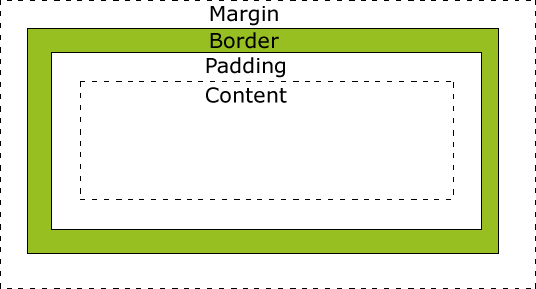
The Box Model:
- From W3Schools -
- As the image above shows, the "box" model is a way of thinking about the attributes of any given element. The "content" portion is the element itself (whether that's a line of text, an image, etc.). The "padding" clears an area around the content and can be affected by the content properties (e.g. if you assign the content a background color, the padding will also get that background color). The "border" goes around the content and the padding (this border can be assigned visual attributes, e.g. "1px solid black"). Finally, the "margin" is completely transparent and clears an area around the border of an element.
- HTML:
<!DOCTYPE html> <html> <head> <title></title> <link href="release_0_float.css" media="screen" rel="stylesheet" type="text/css"> </head> <body> <p class="box_model_example">This is the element text</p><p>This is another element besides the box model example</p> </body> </html> - CSS:
.box_model_example { background-color: green; padding: 1%; border: 1px solid black; margin: 10%; } - In the above example, both the content and margin background color has been changed to green, the border is thin, solid, and black, and the margin has push the second element away.
- From W3Schools -
-
Display * Inline
- Displays the selected element as inline, meaning that everything within the element is displayed in a line (horizontal, not vertical) * Block
- Displays the selected element as a block, meaning that everything within that element is essentially displayed in a chunk (vertical, not horizontal) * Inline Block
- A combination of the above! The element itself is displayed inline, but everything contained within that element is formatted as a 'block' element. Unlike float, when you add a parent element to an inline block display you don't get a collapse with your elements. The blocks still stay the way you want them too!
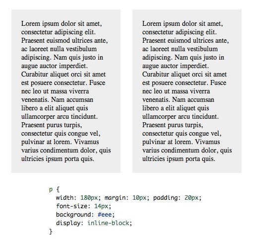
- Example (from Design Shack)
- As you can see, each paragraph element is displayed inline (the two paragraphs are next to each other), but the content of those paragraphs is displayed in a 'block' style.
Last active
August 29, 2015 14:01
-
-
Save lindseymenges/a12c794a3b66e943c7d5 to your computer and use it in GitHub Desktop.
A Brief Tutorial On CSS Positioning and Display

Sign up for free
to join this conversation on GitHub.
Already have an account?
Sign in to comment