-
-
Save lucprincen/9548ab19bfc34f10ef8a to your computer and use it in GitHub Desktop.
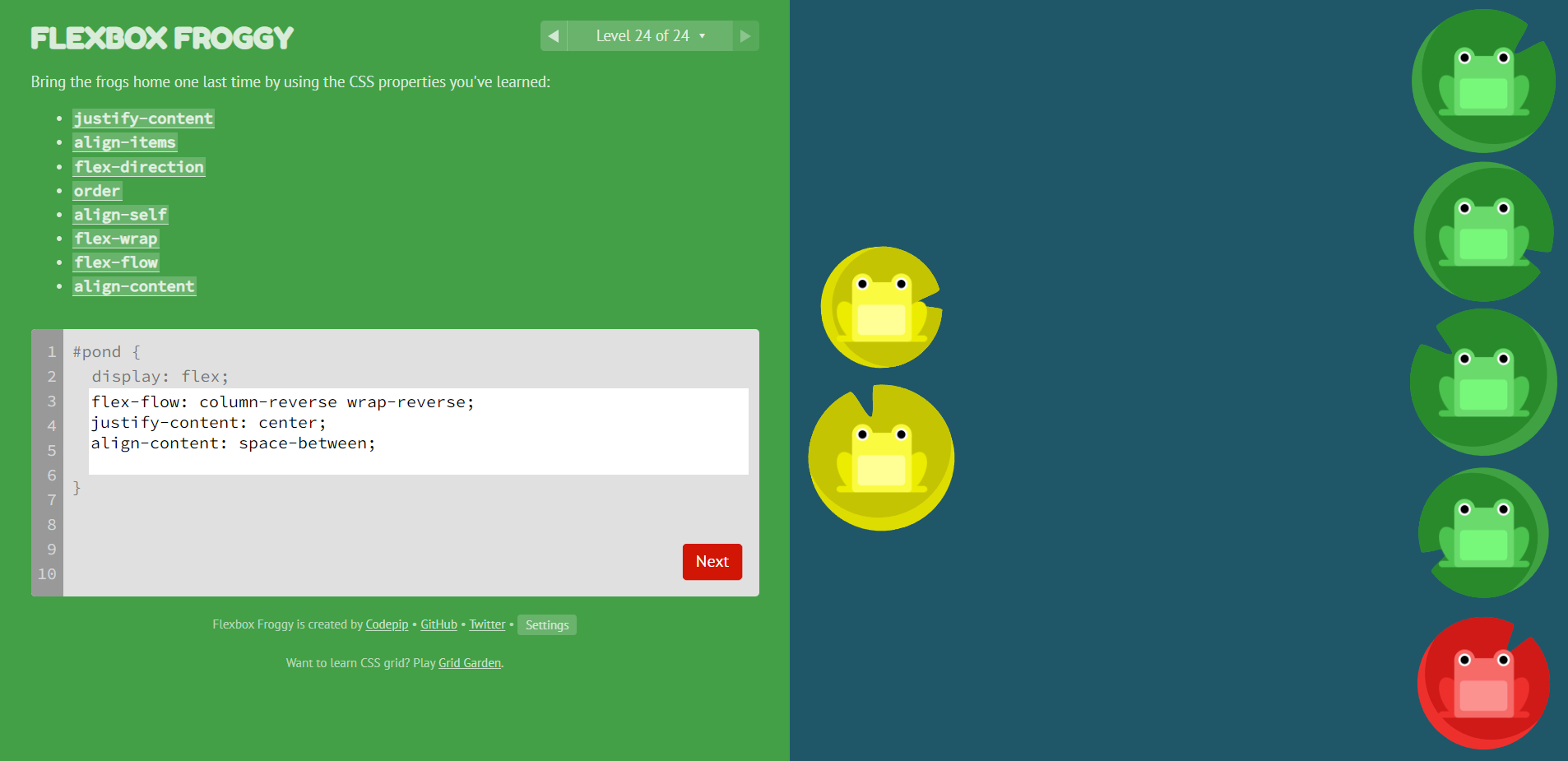
| flex-flow:column-reverse wrap-reverse; | |
| justify-content:center; | |
| align-content:space-between; |
Hello, my solution is:
flex-flow: column-reverse wrap-reverse;
align-content: space-between;
justify-content: center;
lol, i missed the justify:center
Hello, my solution is:
flex-flow:column-reverse wrap-reverse;
align-content:space-between;
justify-content:center;
wrap-reverse it is property i didn't know, thanks!
Its actually 4 lines not 3
flex-flow:column-reverse wrap-reverse;
justify-content:center;
align-content:space-between;
align-items: start
flex-direction: column-reverse;
flex-wrap: wrap-reverse;
justify-content: center;
align-content: space-between
It is valid! 😅

thnks
flex-direction:column-reverse;
align-items:flex-end;
flex-wrap:wrap-reverse;
justify-content:center;align-content:space-between;
Hi, my solution is:
flex-wrap: wrap-reverse;
justify-content: center;
flex-direction: column-reverse;
align-content: space-between;
Hi, my solution is:
flex-flow: column-reverse wrap-reverse;
justify-content: center;
align-items: flex-end;
align-content: space-between
It is valid! 😅
How did you get your frogs upside down lol
lmao froggies flipping
flex-direction:column-reverse;
flex-wrap:wrap-reverse;
align-content: space-between;
justify-content: center;
I didn't know about wrap-reverse, so I did it with
flex-flow: row-reverse wrap;
align-content: space-between;
justify-content: center;
transform: rotate(90deg);
Haha pretty hacky but oh well got through it.
flex-flow: column-reverse wrap-reverse;
align-content: space-between;
justify-content: center;
flex-direction:column-reverse;
flex-wrap:wrap-reverse;
align-content:space-between;
justify-content:center;
flex-flow: column-reverse wrap-reverse;
justify-content: center;
align-content: space-between
That's my solution
flex-flow: column-reverse wrap-reverse;
justify-content: center;
align-content: space-between;
It is valid! 😅
How did you get your frogs upside down lol
😂😂😂😂😂 LOL
Here is my solution -
It's really easy, just some trial and error methods with the CSS will get you close to the solution.

Haha, I must say, the frog flipping with "transform" is pretty creative!
I did it with 3 lines, which is still valid :
flex-flow: column-reverse wrap-reverse;
justify-content: center;
align-content: space-between;
BUT, you could also do it in this way if you must solve it in 4 lines:
flex-direction: column-reverse;
flex-wrap: wrap-reverse;
justify-content: center;
align-content: space-between;
"flex-flow" is basically a shortcut if you want to use flex-direction & flex-wrap at the same time :)
Here is my solution - It's really easy, just some trial and error methods with the CSS will get you close to the solution.

the same we are.
align-items: center;
align-content: space-between;
flex-flow: column-reverse wrap-reverse;
justify-content: center;
here's mine
flex-flow:column-reverse wrap;
justify-content: center;
align-content: space-between;
transform: scaleX(-1);
It is valid! 😅
How did you get your frogs upside down lol
look at first and last line of code.
flex-flow: column-reverse wrap-reverse;
justify-content: center;
align-content: space-between;
if you remove both -reverse in first line
and add
rotate: 180deg;
at the end you will achieve rotated valid solution
thanks a lot i missed the
align-content:space-between;

It is valid! 😅
😅😅😅😅
rotate: 180deg; lmao😅
Thanks, this helped me out today!
Thanks alot guys