
After this lesson you will be able to:
- explain what a component library is and what makes it different from a style library,
- add and configure a component library,
- use and set up a component of
antdlibrary
In web applications we have worked with styles in two different ways: the first has been writing our styles by hand, by ourselves, and the second option has been to opt for a library/framework for styles, such as Bootstrap, Bulma, etc. This latter gives us the ability to focus more on the functionality and business logic of the applications. However, just as our frontend development has advanced, style libraries are being left behind giving way to UI component libraries.

A component library is a package that contains a series of previously generated React components. Unlike style libraries that add styles based on HTML classes and functionality with jQuery, the component libraries are elements with everything needed to work by itself. The UI components contain the markup (HTML / jsx), styles (CSS), and logic (js) that they need to look and work well.
// Styles library/framework code
<button class='btn btn-primary'>Send</button>
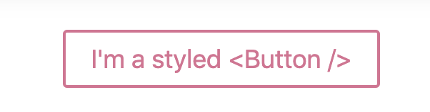
// Component library code
<Button primary>Send</Button>When style libraries needed additional visual properties, such as button type, column size, or other property, we added an extra class. Now react introduces a better way to handle the styles based on the props of the components and so the code is significantly reduced, and the markup looks very clean.
Antd is a react UI library that contains a set of high-quality components that enable us to build rich, interactive user interfaces. It provides us with a great amount of styled and functional components.
In your react project:
$ npm install antdImport the antd.css in the index.js file:
import 'antd/dist/antd.css'Now you can start to use UI components from the antd library - click here to access the official docs.
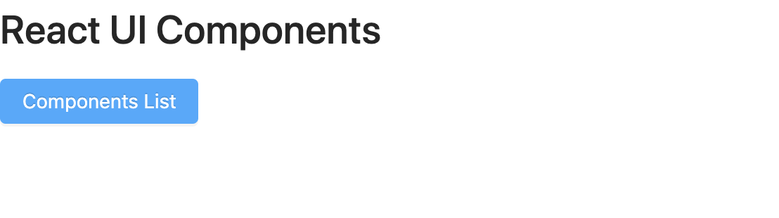
import { Button, Card } from "antd";

const { Meta } = Card;

const Main = () => (
    <main>
      <h1>React UI Components</h1>
      <Button type='primary'>Components List</Button>
      <Card
      hoverable
      style={{ width: 240 }}
      cover={<img alt="example" src="https://os.alipayobjects.com/rmsportal/QBnOOoLaAfKPirc.png" />} />
         <Meta
           title="Europe Street beat"
           description="www.instagram.com" />
       </Card>
    </main>
);
The result should look like this:
The antd grid system defines the frame outside the information area based on row and column, to ensure that every area can have stable arrangement.
The grid layout uses a 24 grid layout to define the width of each "box", but does not rigidly adhere to the grid layout.
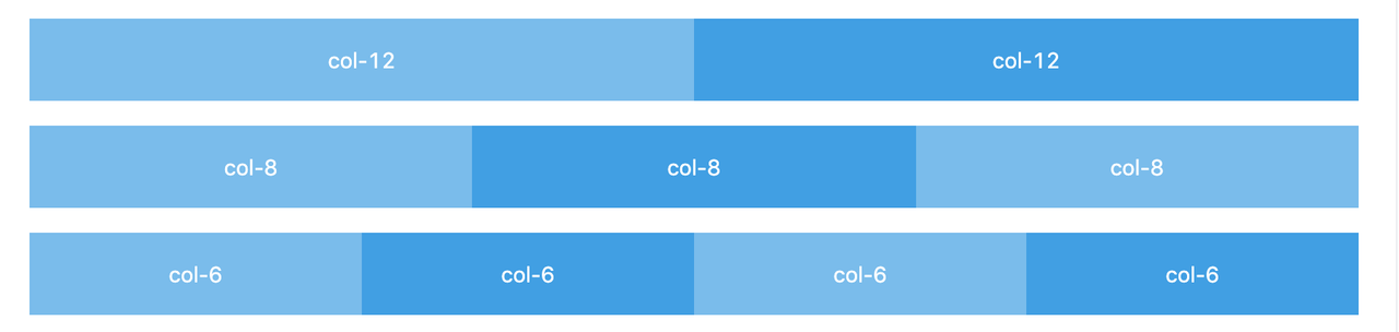
  import {Button, Row, Col} from 'antd'

  const Main = () => (
    <main>
      <Row>
        <Col span={12} style={{background: 'red'}}>Col</Col>
        <Col span={12} style={{background: 'blue'}}>Col</Col>
      </Row>
    </main>
)You can use the gutter property of Row as grid spacing.
  import {Button, Row, Col} from 'antd'

  const Main = () => (
    <main>
      <Row gutter={16}>
        <Col className="gutter-row" span={12}>
          <div
            className="gutter-box"
            style={{background: 'red'}}
          >
            col-6
          </div>
        </Col>
        <Col className="gutter-row" span={12}>
          <div
            className="gutter-box"
            style={{background: 'blue'}}
          >
              col-6
          </div>
        </Col>
      </Row>
    </main>
)Handling the overall layout of a page.
import { Layout, Menu } from "antd";

const {
  Header, Footer, Sider, Content,
} = Layout;

const Main = () => (
    <main>
        <Layout>
            <Header>
                <Menu
                  theme="dark"
                  mode="horizontal"
                  defaultSelectedKeys={['1']}
                  style={{ lineHeight: '64px' }}
                >
                  <Menu.Item key="1">nav 1</Menu.Item>
                  <Menu.Item key="2">nav 2</Menu.Item>
                  <Menu.Item key="3">nav 3</Menu.Item>
                </Menu>
          </Header>
          <Content>
            App Content
          </Content>
          <Footer>Footer</Footer>
        </Layout>
    </main>
);
There are many Layouts already created at antd layout page.
In this lesson, you have learned how to distinguish between styles library and component library and how a library of UI components works. You have also learned what it is and how to install it. You got familiarized with antd library that gives us many incredible components. In this lesson, we saw very few, but the principle is the same for any other component that you can find in the official docs.
