-
-
Save searls/7fd2c3223571a58a81006e7da66bd064 to your computer and use it in GitHub Desktop.
| <!doctype html> | |
| <html> | |
| <head> | |
| <meta charset="utf-8" /> | |
| <meta name="viewport" content="width=device-width, initial-scale=1.0" /> | |
| <title>Content Manager</title> | |
| </head> | |
| <body> | |
| <!-- Include the script that builds the page and powers Netlify CMS --> | |
| <script src="https://unpkg.com/netlify-cms@^2.0.0/dist/netlify-cms.js"></script> | |
| <link href="mobile-overrides.css" rel="stylesheet" /> | |
| </body> | |
| </html> |
| @media (max-width: 799px) { | |
| [class*=BackCollection], | |
| [class*=BackStatus] { | |
| font-size: .6rem; | |
| } | |
| [class*=AppHeaderContent], | |
| [class*=AppMainContainer] { | |
| margin-right: 0; | |
| margin-left: 0; | |
| min-width: calc(100vw - 24px); | |
| max-width: 100vw; | |
| } | |
| [class*=AppHeaderContent] { | |
| display: flex; | |
| justify-content: space-between; | |
| } | |
| [class*=AppHeaderQuickNewButton] { | |
| width: 100%; | |
| } | |
| [class*=AppHeaderButton] { | |
| padding-left: 4px; | |
| padding-right: 4px; | |
| } | |
| [class*=EditorContainer], | |
| [class*=ToolbarContainer] { | |
| min-width: initial; | |
| } | |
| [class*=ToolbarSubSectionFirst] { | |
| display: flex; | |
| flex-direction: column; | |
| } | |
| [class*=PublishedToolbarButton] { | |
| padding: 0 8px; | |
| } | |
| [class*=PublishedToolbarButton]::after { | |
| display: none; | |
| } | |
| [class*=DeleteButton] { | |
| margin-top: 5px; | |
| padding: 0 2px; | |
| } | |
| [class*=ViewControls] { | |
| position: initial; | |
| } | |
| [class*=PreviewPaneContainer-ControlPaneContainer] { | |
| padding: 0; | |
| } | |
| [class*=ControlPaneContainer] { | |
| max-width: 100vw; | |
| } | |
| [class*=EditorControlBar] [class*=ToolbarContainer] { | |
| display: flex; | |
| flex-direction: column; | |
| } | |
| [class*=CollectionContainer] { | |
| display: flex; | |
| flex-direction: column; | |
| } | |
| [class*=SidebarContainer] { | |
| position: initial; | |
| width: initial; | |
| } | |
| [class*=CollectionMain] { | |
| padding-left: 0; | |
| margin-top: 20px; | |
| } | |
| } |
@ambrod last one I changed yeah
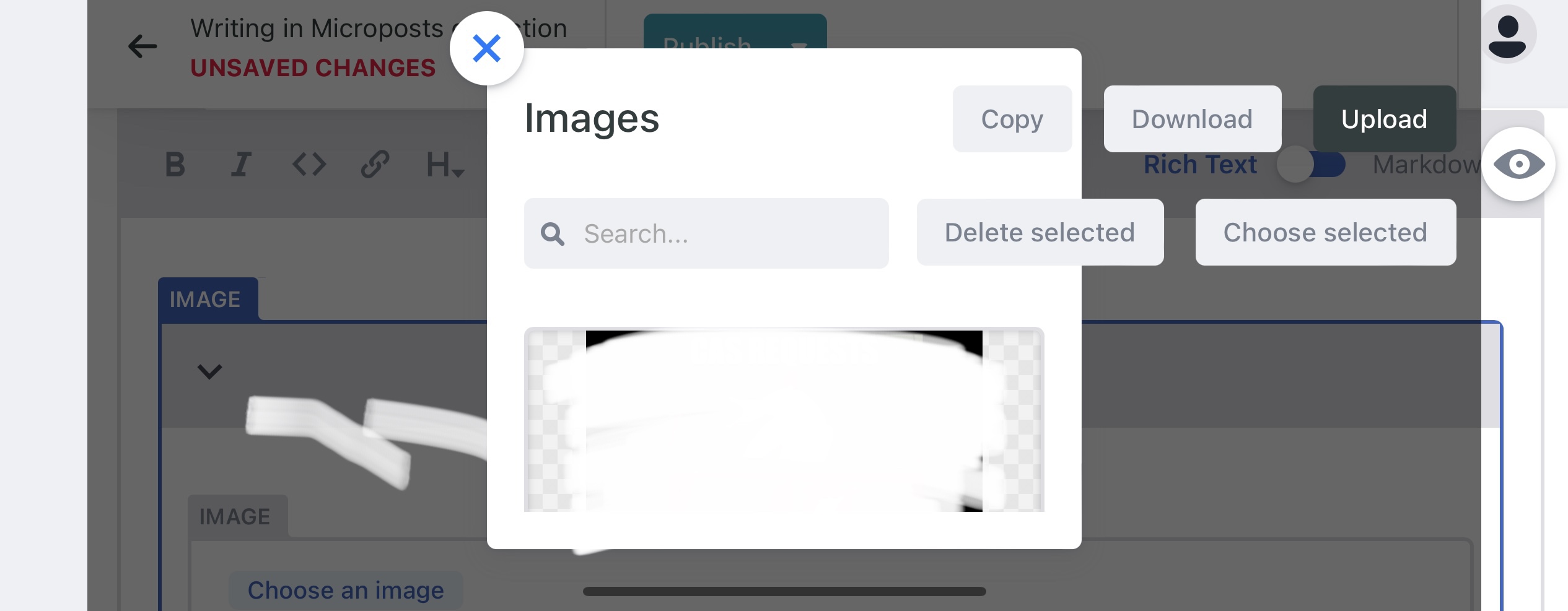
Love this it’s working 99% for me. For the life of me I can’t get the buttons in the image management modal to behave, though. I’m very likely missing something as I’m a FORTRAN and COBOL developer haha.

I'm very sorry but I never used the image features of this. You might try staticcms, which is a fork of the netlify CMS and is working on adding mobile support
Thanks for sharing this!
Thanks for the solution, @searls I've adapted your code to make the mobile view fully optimized (except for absolutely small view-ports).
No need to switch to StaticJsCMS now, and we can wait for the Decap Team to take their time to come up with a solution :)
Full post with screenshots: https://manikumar.in/blog/mobile-optimized-decap-netlify-cms/

/** Adapted By Mani Kumar (https://manikumar.in/blog/mobile-optimized-decap-netlify-cms/) From Source: https://gist.github.com/searls/7fd2c3223571a58a81006e7da66bd064 */
 @media (max-width: 799px) {
    /* Bring Any Dropdown To Center Of Page */
     [class*=DropdownList]{
         position: fixed;
         min-width: 20%;
         width: 90%;
         margin: auto;
         height: fit-content;
         top: auto;
         left: 0;
         right: 0;
         bottom: 10px;
         background: #e6f4fd;
         border: 2px solid #3a69c7;
    }
    /* Add Overflow To Modal Window */
     [class*=StyledModal]{
         width: 90dvw;
         width: 90%;
    }
     [class*=LibraryTitle]{
         display: none;
    }
     [class*=CollectionTopNewButton]{
         padding: 0px 10px !important;
         height: auto;
    }
     [class*=LibraryTop]{
         overflow-x: auto;
         height: fit-content;
         padding-bottom: 10px;
    }
    /* Hide Blog Post Title From Navbar */
     [class*=BackCollection]{
         display: none;
    }
    /* Add Padding To Control Pane */
     [class*=ControlPaneContainer] {
         padding: 0px 10px;
    }
    /* Rest As Per: Searl's Code*/
     [class*=BackCollection], [class*=BackStatus] {
         font-size: .6rem;
    }
     [class*=AppHeaderContent], [class*=AppMainContainer] {
         margin-right: 0;
         margin-left: 0;
         min-width: calc(100vw - 24px);
         max-width: 100vw;
    }
     [class*=AppHeaderContent] {
         display: flex;
         justify-content: space-between;
    }
     [class*=AppHeaderQuickNewButton] {
         width: 100%;
    }
     [class*=AppHeaderButton] {
         padding-left: 4px;
         padding-right: 4px;
    }
     [class*=EditorContainer], [class*=ToolbarContainer] {
         min-width: initial;
         overflow-x: auto;
    }
     [class*=ToolbarSubSectionFirst] {
         display: flex;
         flex-direction: column;
    }
     [class*=PublishedToolbarButton] {
         padding: 0 8px;
    }
     [class*=PublishedToolbarButton]::after {
         display: none;
    }
     [class*=ToolbarSubSectionFirst] {
         flex-direction: row;
    }
     [class*=SearchInput] {
         margin-top: 5px;
    }
     [class*=ViewControls] {
         position: initial;
    }
     [class*=PreviewPaneContainer-ControlPaneContainer] {
         padding: 0;
    }
     [class*=ControlPaneContainer] {
         max-width: 100vw;
    }
     [class*=EditorControlBar] [class*=ToolbarContainer] {
         display: flex;
         flex-direction: column;
    }
     [class*=CollectionContainer] {
         display: flex;
         flex-direction: column;
    }
     [class*=SidebarContainer] {
         position: initial;
         width: initial;
    }
     [class*=CollectionMain] {
         padding-left: 0;
         margin-top: 20px;
    }
}
@hithismani nice! Thanks for the write-up, too! I will try this out
great job ! Is this the last version ?