Last active
August 19, 2023 18:14
-
-
Save searls/7fd2c3223571a58a81006e7da66bd064 to your computer and use it in GitHub Desktop.
Mobile styling overrides for NetlifyCMS to make it more responsive-ish.
This file contains bidirectional Unicode text that may be interpreted or compiled differently than what appears below. To review, open the file in an editor that reveals hidden Unicode characters.
Learn more about bidirectional Unicode characters
| <!doctype html> | |
| <html> | |
| <head> | |
| <meta charset="utf-8" /> | |
| <meta name="viewport" content="width=device-width, initial-scale=1.0" /> | |
| <title>Content Manager</title> | |
| </head> | |
| <body> | |
| <!-- Include the script that builds the page and powers Netlify CMS --> | |
| <script src="https://unpkg.com/netlify-cms@^2.0.0/dist/netlify-cms.js"></script> | |
| <link href="mobile-overrides.css" rel="stylesheet" /> | |
| </body> | |
| </html> |
This file contains bidirectional Unicode text that may be interpreted or compiled differently than what appears below. To review, open the file in an editor that reveals hidden Unicode characters.
Learn more about bidirectional Unicode characters
| @media (max-width: 799px) { | |
| [class*=BackCollection], | |
| [class*=BackStatus] { | |
| font-size: .6rem; | |
| } | |
| [class*=AppHeaderContent], | |
| [class*=AppMainContainer] { | |
| margin-right: 0; | |
| margin-left: 0; | |
| min-width: calc(100vw - 24px); | |
| max-width: 100vw; | |
| } | |
| [class*=AppHeaderContent] { | |
| display: flex; | |
| justify-content: space-between; | |
| } | |
| [class*=AppHeaderQuickNewButton] { | |
| width: 100%; | |
| } | |
| [class*=AppHeaderButton] { | |
| padding-left: 4px; | |
| padding-right: 4px; | |
| } | |
| [class*=EditorContainer], | |
| [class*=ToolbarContainer] { | |
| min-width: initial; | |
| } | |
| [class*=ToolbarSubSectionFirst] { | |
| display: flex; | |
| flex-direction: column; | |
| } | |
| [class*=PublishedToolbarButton] { | |
| padding: 0 8px; | |
| } | |
| [class*=PublishedToolbarButton]::after { | |
| display: none; | |
| } | |
| [class*=DeleteButton] { | |
| margin-top: 5px; | |
| padding: 0 2px; | |
| } | |
| [class*=ViewControls] { | |
| position: initial; | |
| } | |
| [class*=PreviewPaneContainer-ControlPaneContainer] { | |
| padding: 0; | |
| } | |
| [class*=ControlPaneContainer] { | |
| max-width: 100vw; | |
| } | |
| [class*=EditorControlBar] [class*=ToolbarContainer] { | |
| display: flex; | |
| flex-direction: column; | |
| } | |
| [class*=CollectionContainer] { | |
| display: flex; | |
| flex-direction: column; | |
| } | |
| [class*=SidebarContainer] { | |
| position: initial; | |
| width: initial; | |
| } | |
| [class*=CollectionMain] { | |
| padding-left: 0; | |
| margin-top: 20px; | |
| } | |
| } |
I'm very sorry but I never used the image features of this. You might try staticcms, which is a fork of the netlify CMS and is working on adding mobile support
Thanks for sharing this!
Thanks for the solution, @searls I've adapted your code to make the mobile view fully optimized (except for absolutely small view-ports).
No need to switch to StaticJsCMS now, and we can wait for the Decap Team to take their time to come up with a solution :)
Full post with screenshots: https://manikumar.in/blog/mobile-optimized-decap-netlify-cms/
/** Adapted By Mani Kumar (https://manikumar.in/blog/mobile-optimized-decap-netlify-cms/) From Source: https://gist.github.com/searls/7fd2c3223571a58a81006e7da66bd064 */
 @media (max-width: 799px) {
    /* Bring Any Dropdown To Center Of Page */
     [class*=DropdownList]{
         position: fixed;
         min-width: 20%;
         width: 90%;
         margin: auto;
         height: fit-content;
         top: auto;
         left: 0;
         right: 0;
         bottom: 10px;
         background: #e6f4fd;
         border: 2px solid #3a69c7;
    }
    /* Add Overflow To Modal Window */
     [class*=StyledModal]{
         width: 90dvw;
         width: 90%;
    }
     [class*=LibraryTitle]{
         display: none;
    }
     [class*=CollectionTopNewButton]{
         padding: 0px 10px !important;
         height: auto;
    }
     [class*=LibraryTop]{
         overflow-x: auto;
         height: fit-content;
         padding-bottom: 10px;
    }
    /* Hide Blog Post Title From Navbar */
     [class*=BackCollection]{
         display: none;
    }
    /* Add Padding To Control Pane */
     [class*=ControlPaneContainer] {
         padding: 0px 10px;
    }
    /* Rest As Per: Searl's Code*/
     [class*=BackCollection], [class*=BackStatus] {
         font-size: .6rem;
    }
     [class*=AppHeaderContent], [class*=AppMainContainer] {
         margin-right: 0;
         margin-left: 0;
         min-width: calc(100vw - 24px);
         max-width: 100vw;
    }
     [class*=AppHeaderContent] {
         display: flex;
         justify-content: space-between;
    }
     [class*=AppHeaderQuickNewButton] {
         width: 100%;
    }
     [class*=AppHeaderButton] {
         padding-left: 4px;
         padding-right: 4px;
    }
     [class*=EditorContainer], [class*=ToolbarContainer] {
         min-width: initial;
         overflow-x: auto;
    }
     [class*=ToolbarSubSectionFirst] {
         display: flex;
         flex-direction: column;
    }
     [class*=PublishedToolbarButton] {
         padding: 0 8px;
    }
     [class*=PublishedToolbarButton]::after {
         display: none;
    }
     [class*=ToolbarSubSectionFirst] {
         flex-direction: row;
    }
     [class*=SearchInput] {
         margin-top: 5px;
    }
     [class*=ViewControls] {
         position: initial;
    }
     [class*=PreviewPaneContainer-ControlPaneContainer] {
         padding: 0;
    }
     [class*=ControlPaneContainer] {
         max-width: 100vw;
    }
     [class*=EditorControlBar] [class*=ToolbarContainer] {
         display: flex;
         flex-direction: column;
    }
     [class*=CollectionContainer] {
         display: flex;
         flex-direction: column;
    }
     [class*=SidebarContainer] {
         position: initial;
         width: initial;
    }
     [class*=CollectionMain] {
         padding-left: 0;
         margin-top: 20px;
    }
}@hithismani nice! Thanks for the write-up, too! I will try this out
Sign up for free
to join this conversation on GitHub.
Already have an account?
Sign in to comment

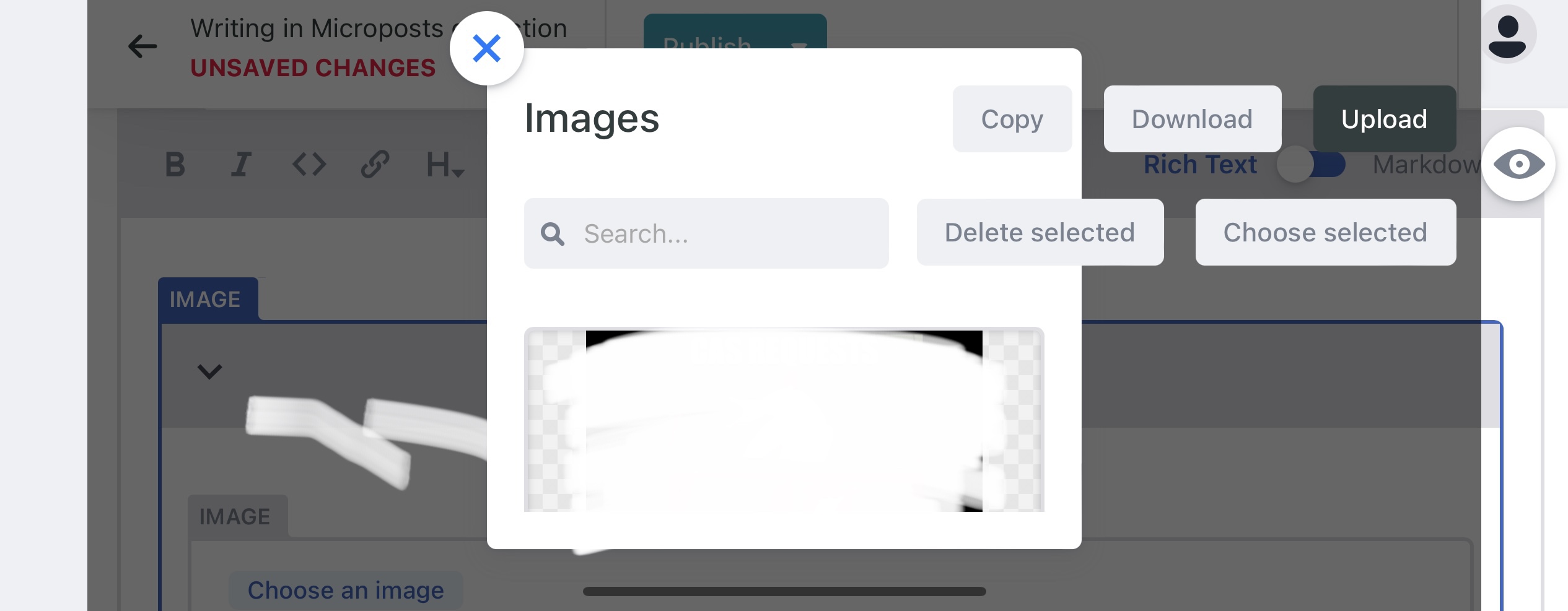
Love this it’s working 99% for me. For the life of me I can’t get the buttons in the image management modal to behave, though. I’m very likely missing something as I’m a FORTRAN and COBOL developer haha.

