This is a sample data for this sample script. The column B was created by the normal distribution formula, and the column C was created by multiplying random number for column B.
A, B, C
1.0, 0.0001, 0.0000
1.5, 0.0009, 0.0006
2.0, 0.0044, 0.0037
2.5, 0.0175, 0.0133
3.0, 0.0540, 0.0236
3.5, 0.1296, 0.0533
4.0, 0.2420, 0.0073
4.5, 0.3522, 0.2468
5.0, 0.3990, 0.0843
5.5, 0.3522, 0.3352
6.0, 0.2420, 0.2201
6.5, 0.1296, 0.0607
7.0, 0.0540, 0.0256
7.5, 0.0175, 0.0006
8.0, 0.0044, 0.0030
8.5, 0.0009, 0.0005
9.0, 0.0001, 0.0001
createChart() creates a chart from data. A chart with 2 lines is created by this method.
function createChart(){
  var sheet = SpreadsheetApp.getActiveSpreadsheet().getActiveSheet();
  var chart = sheet.newChart()
    .setChartType(Charts.ChartType.COMBO)
    .addRange(sheet.getRange('a1:a18'))
    .addRange(sheet.getRange('b1:b18'))
    .addRange(sheet.getRange('c1:c18'))
    .setPosition(5, 5, 0, 0)
    .setOption('series', {
      0:{type: 'line', color: 'red', curveType: 'function'},
      1:{type: 'line', color: 'blue', curveType: 'function'},
    })
    .setOption('useFirstColumnAsDomain', true)
    .setOption('height', 280)
    .setOption('width', 480)
    .setOption('title', 'Sample chart')
    .setOption('vAxis', {
      minValue: 0,
      maxValue: 0.4,
      gridlines: {
        count: 10
      }
    })
    .build();
  sheet.insertChart(chart);
}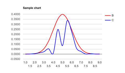
.setChartType(Charts.ChartType.COMBO)defines COMBO chart..setOption('series', {})defines each type for range'b1:b18'and'c1:c18'.0:{}and1:{}of.setOption('series', {})mean range'b1:b18'and'c1:c18', respectively.
modifyChart() modifies the chart with 2 lines. It modifies from red line to red bars.
function modifyChart(){
  var sheet = SpreadsheetApp.getActiveSpreadsheet().getActiveSheet();
  var chart = sheet.getCharts()[0];
  chart = chart.modify()
    .setChartType(Charts.ChartType.COMBO)
    .addRange(sheet.getRange('a1:a18'))
    .addRange(sheet.getRange('b1:b18'))
    .addRange(sheet.getRange('c1:c18'))
    .setPosition(5, 5, 0, 0)
    .setOption('series', {
      0:{type: 'bars', color: 'red'},
      1:{type: 'line', color: 'blue', curveType: 'function'},
    })
    .setOption('useFirstColumnAsDomain', true)
    .setOption('height', 280)
    .setOption('width', 480)
    .setOption('title', 'Sample chart')
    .setOption('vAxis', {
      minValue: 0,
      maxValue: 0.4,
      gridlines: {
        count: 10
      }
    })
    .build();
  sheet.updateChart(chart);
}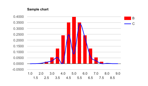
0:{type: 'bars', color: 'red'}was modified.
Reference pages are here and here.
This was accepted as a commission.
- May 13, 2017, Dr. Mehmet TEKDAL (Çukurova University)