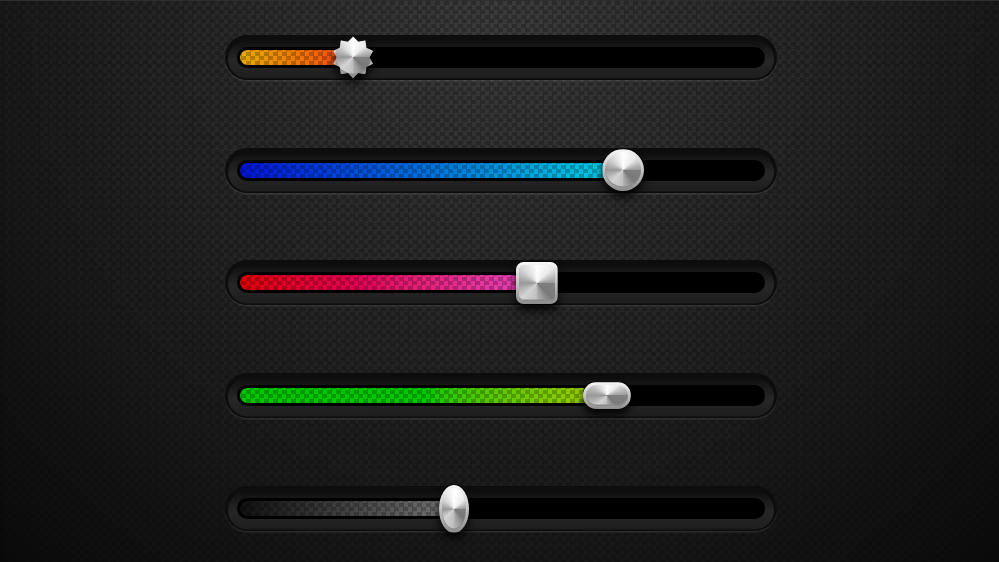
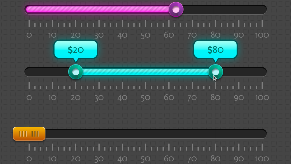
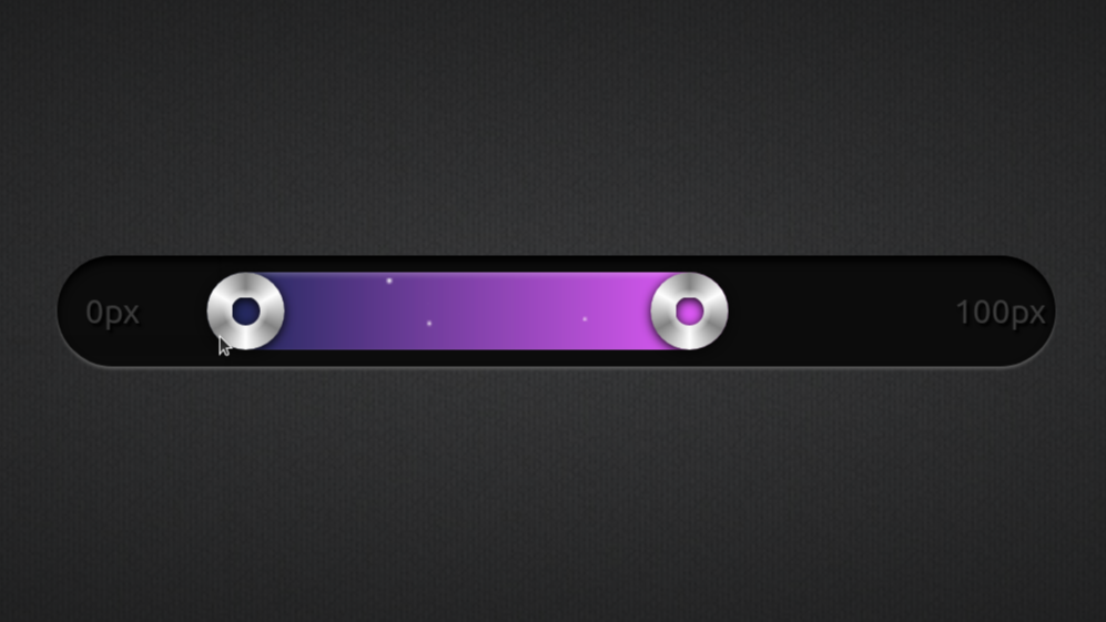
A lot (most?) of the designs I've implemented have something like this and I'd really like a pseudo for it to allow for a reliable CSS-only solution.
The CSS-only solutions I've seen use box-shadow to the left of the thumb, coupled with clip-path when the thumb is taller than the track.
But a lot of times, the progress needs to have gradient/ image background like in the examples below (all screenshots of sliders I've coded, each screenshot linking to the live demo) and this cannot be achieved with box-shadow on the thumb.
The approach I went for with these was to set a custom property either on the input[type='range'] itself or on its wrapper in the case of a multi-thumb range/ a range with a tooltip/ a range with a ruler with number labels and then update this custom property via JS whenever the slider value changes. When setting the custom property on the input[type='range'] itself, it looks like this:
addEventListener('input', e => {
  let _t = e.target;

  _t.style.setProperty('--val', +_t.value)
})
(when setting it on the wrapper, I replace _t with _t.parentNode)
The --val custom property is then used to compute the background-size of the progress-emulating, non-repeating top background layer(s) on the track in the case of a single thumb range (the multi-thumb case I dissected in detail in this series of articles: one, two).
$thumb-d: 4em; // thumb diameter
$thumb-r: .5*$thumb-d; // thumb radius

--track-w: min(100vw - 2.5em, 32em); /* responsive track width */

/* actually, it's not var(--val)/100 in the general case,
 * it's (var(--val) - var(--min))/(var(--max) - var(--min)) */
--thumb-x: calc(var(--val, 50)/100*(var(--track-w) - #{$thumb-d}) + #{$thumb-r});
To also cover the no JS case, I multiply the computed value for the background-size with a --js custom property that defaults to 0, but is switched to 1 in the JS case.
The background-size:
var(--progr-g) 0/ calc(var(--js, 0)*var(--thumb-x)) 100% no-repeat
Switching --js to 1:
.js { --js: 1 }
document.documentElement.classList.add('js')
This is simple, lightweight, flexible, but... no JS means no progress is seen on the track in any browser other than Firefox, which has a ::-moz-range-progress pseudo.
And a lot of times not even in Firefox, because the way ::-moz-range-progress works makes it unsuitable in a lot of cases, so I still fall back on the JS solution that the rest of the browsers require. This is why I'd like a standard progress to work like the IE/ pre-Chromium Edge ::-ms-fill-lower and not like ::-moz-range-progress.
So... what is it so bad about the way ::-moz-range-progress works?
Let's consider a basic input[type='range']. When this is at the minimum value, the ::-moz-range-progress pseudo has a width that's 0% of the range input element's content-box. When it's at the maximum value, the ::-moz-range-progress pseudo has a width that's 100% of of the range input element's content-box.
This is illustrated below (you can also play with the live demo if you want) where the actual input[type='range'], the track, the progress and the thumb all have a non-zero border and a non-zero padding. The padding area is transparent for all, while the border and content areas are semitransparent (gold for the actual input[type='range'], tomato red for the track, grey for the progress and purple for the thumb).
All seems fine for the default Firefox look where thumb is much taller than the track and progress.
However, the problem with it becomes obvious when we have a thumb that's shorter than the track or progress or has border-radius: 50%. Or both. You can see below how this looks in Firefox (live demo):
In the lower half, the progress is too short. In the upper part, the progress is too long.
IE/ pre-Chromium Edge used to do this better with ::-ms-fill-lower. At the minimum value, this pseudo had a width that was half of that of the thumb's border-box. At the maximum value, its width was equal to that of the track's content-box minus half of the thumb's border box. Illustrated below:
This meant it worked nicely in the cases where ::-moz-range-progress failed:
Things look worse when we want the track and progress to have rounded corners. Giving ::-moz-range-progress a border-radius that's equal to half he height of its border-box ends up looking really bad at small values (live demo, contrast with the nice-looking JS solution used by the other browsers):
We could round only the left corners of the progress, but this creates a different kind of issue at the other end while not solving the first one:
Sure, we could set overflow: hidden on the actual input[type='range'], but that wouldn't solve the initial problem and could turn into a an even bigger problem if we want to have an outer shadow on the thumb, a shadow that should be visible outside the padding-box of our input[type='range'] element.
Setting a mask on the progress works better, but we still have issues at the thumb corners (not to mention that adding a mask on the progress makes it show on top of the thumb, so then we need to set transform: translateZ(1px) on the thumb to fix that).
mask:
  radial-gradient(circle at $thumb-r, red $thumb-r, transparent 0),
  linear-gradient(90deg, red var(--mover-x), transparent 0)
    #{$thumb-r}/ var(--track-w) 100%
Covering those gaps with box-shadow won't do for a gradient/ image progress.
If the thumb only has a solid background and no outer shadow, we could ditch its rounding and use the progress background as a bottom layer underneath a radial-gradient() creating the thumb disc. But this comes with alignment issues, not to mention it requires to hide overflow on the input[type='range'] element and this creates another problem in certain situations, as mentioned above.
@mixin thumb($flag: 0) {
  border: none;
  width: $thumb-d; height: $thumb-d;
  border-radius: $flag*50%;
  @if $flag > 0 { background: mediumvioletred }
  @else {
    background:
      radial-gradient(closest-side, mediumvioletred calc(100% - 1px), transparent),
      var(--progr-g) right #{$thumb-r} top 0/ 50% 100% no-repeat #333
  }
}
There's also the option of moving and scaling ::-moz-range-progress while also emulating its background on the left end of the track.
$track-w: 32em; // FIXED track width, not responsive
$track-h: 4em; // track height
$track-r: .5*$track-h; // track radius

$thumb-d: $track-h; // thumb diameter
$thumb-r: .5*$thumb-d; // thumb radius

$mover-x: $track-w - $thumb-d; // range of thumb motion
$progr-f: $mover-x/$track-w; // factor needed to scale progress to a max of $mover-x

transform-origin: 0; /* scale w.r.t. left edge */
transform: translate($track-r) scaleX($progr-f);
background: var(--progr-g) #{-1*$track-r}/ calc(100% + #{$track-r})
The result seems good at a first glance, but increasing the height of the components relative to the track width shows we have a big problem: squishing the ::-moz-range-progress pseudo horizontally also affects the angle and the stripe thickness of its repeating gradient.
Sure, we could alter the angle of the ::-moz-range-progress gradient while leaving the one of the ::-moz-range-track gradient unchanged and the same for the distance between stripes, but this is going to cause alignment issues between the ::-moz-range-progress gradient and the one on the end of the ::-moz-range-track, which just makes us go deeper down the rabbithole of fixing problems caused by the fixes to the earlier problems.
In addition to this, the transform method only works if we have a fixed ratio between the track and thumb widths. It doesn't help if we want the track width to scale with the viewport while the thumb size remains the same because we cannot have division between values with units.
This method also comes with issues if we want to have a box-shadow on the track and/ or the progress.
At the end of the day, all these workarounds seem very hacky and not really worth the effort, so most often I just leave ::-moz-range-progress alone and make Firefox use the same JS solution that I use for the other browsers.
If there's going to be a standard progress, it's best if its left edge always coincides with the left edge of the content-box of the track, while its right edge always coincides to that of the vertical midline of the thumb, as it used to be the case for ::-ms-fill-lower.


Now, CSS has a standard
progress()function, would that work for your needs?That is, until Firefox improves it, we'll implement progress for the progress bar entirely on our own, without relying on
::-moz-range-progress.I have a reference implementation: https://codepen.io/yisi/pen/rNRxRYp?editors=0100