-
-
Save yrezgui/26a1060d67bf0ec2a73fa12695166436 to your computer and use it in GitHub Desktop.
| package com.example.compose.tutorial | |
| object SampleData { | |
| // Sample conversation data | |
| val conversationSample = listOf( | |
| Message( | |
| "Colleague", | |
| "Test...Test...Test..." | |
| ), | |
| Message( | |
| "Colleague", | |
| "List of Android versions:\n" + | |
| "Android KitKat (API 19)\n" + | |
| "Android Lollipop (API 21)\n" + | |
| "Android Marshmallow (API 23)\n" + | |
| "Android Nougat (API 24)\n" + | |
| "Android Oreo (API 26)\n" + | |
| "Android Pie (API 28)\n" + | |
| "Android 10 (API 29)\n" + | |
| "Android 11 (API 30)\n" + | |
| "Android 12 (API 31)\n" | |
| ), | |
| Message( | |
| "Colleague", | |
| "I think Kotlin is my favorite programming language.\n" + | |
| "It's so much fun!" | |
| ), | |
| Message( | |
| "Colleague", | |
| "Searching for alternatives to XML layouts..." | |
| ), | |
| Message( | |
| "Colleague", | |
| "Hey, take a look at Jetpack Compose, it's great!\n" + | |
| "It's the Android's modern toolkit for building native UI." + | |
| "It simplifies and accelerates UI development on Android." + | |
| "Less code, powerful tools, and intuitive Kotlin APIs :)" | |
| ), | |
| Message( | |
| "Colleague", | |
| "It's available from API 21+ :)" | |
| ), | |
| Message( | |
| "Colleague", | |
| "Writing Kotlin for UI seems so natural, Compose where have you been all my life?" | |
| ), | |
| Message( | |
| "Colleague", | |
| "Android Studio next version's name is Arctic Fox" | |
| ), | |
| Message( | |
| "Colleague", | |
| "Android Studio Arctic Fox tooling for Compose is top notch ^_^" | |
| ), | |
| Message( | |
| "Colleague", | |
| "I didn't know you can now run the emulator directly from Android Studio" | |
| ), | |
| Message( | |
| "Colleague", | |
| "Compose Previews are great to check quickly how a composable layout looks like" | |
| ), | |
| Message( | |
| "Colleague", | |
| "Previews are also interactive after enabling the experimental setting" | |
| ), | |
| Message( | |
| "Colleague", | |
| "Have you tried writing build.gradle with KTS?" | |
| ), | |
| ) | |
| } |
I think we have to define our Message Class as well.
data class Message(
    val title : String,
    val body : String
)
This should do it.
MainActivity.kt
`import android.content.res.Configuration
import android.os.Bundle
import androidx.activity.ComponentActivity
import androidx.activity.compose.setContent
import androidx.compose.animation.animateColorAsState
import androidx.compose.animation.animateContentSize
import androidx.compose.foundation.Image
import androidx.compose.foundation.border
import androidx.compose.foundation.clickable
import androidx.compose.foundation.layout.*
import androidx.compose.foundation.lazy.LazyColumn
import androidx.compose.foundation.lazy.items
import androidx.compose.foundation.shape.CircleShape
import androidx.compose.material.MaterialTheme
import androidx.compose.material.Surface
import androidx.compose.material.Text
import androidx.compose.runtime.*
import androidx.compose.ui.Modifier
import androidx.compose.ui.draw.clip
import androidx.compose.ui.graphics.Color
import androidx.compose.ui.res.painterResource
import androidx.compose.ui.tooling.preview.Preview
import androidx.compose.ui.unit.dp
import com.example.composepracticelistanimation.ui.theme.ComposePracticeListAnimationTheme
class MainActivity : ComponentActivity() {
override fun onCreate(savedInstanceState: Bundle?) {
super.onCreate(savedInstanceState)
setContent {
ComposePracticeListAnimationTheme {
// A surface container using the 'background' color from the theme
Surface(
modifier = Modifier.fillMaxSize(),
color = MaterialTheme.colors.background
) {
Conversation(messages = SampleData.conversationSample)
}
}
}
}
}
data class Message(
val author: String,
val body: String
)
@composable
fun MessageCard(msg: Message) {
// Add padding around our message
Row(modifier = Modifier.padding(all = 8.dp)) {
Image(
painter = painterResource(id = R.drawable.profile_picture),
contentDescription = null,
modifier = Modifier
// Set image size to 40 dp
.size(40.dp)
// Clip image to be shaped as a circle
.clip(
CircleShape
)
.border(1.5.dp, MaterialTheme.colors.secondaryVariant, CircleShape)
)
// Add a horizontal space between the image and the column
Spacer(modifier = Modifier.width(8.dp))
    // We keep track if message is expanded or not in this variable
    var isExpanded by remember { mutableStateOf(false) }

    // surfaceColor will be updated gradually from one color to the other
    val surfaceColor: Color by animateColorAsState(
        if (isExpanded) MaterialTheme.colors.primary else MaterialTheme.colors.surface
    )

    // We toggle the isExpanded variable when we click on this Column
    Column(modifier = Modifier.clickable { isExpanded = !isExpanded }) {
        Text(
            text = msg.author,
            color = MaterialTheme.colors.secondaryVariant,
            style = MaterialTheme.typography.subtitle2
        )

        // Add a vertical space between the author and message texts
        Spacer(modifier = Modifier.height(4.dp))

        Surface(
            shape = MaterialTheme.shapes.medium,
            elevation = 1.dp,
            // surfaceColor color will be changing gradually from primary to surface
            color = surfaceColor,
            // animateContentSize will change the Surface size gradually
            modifier = Modifier
                .animateContentSize()
                .padding(1.dp)
        ) {
            Text(
                text = msg.body,
                modifier = Modifier.padding(all = 4.dp),
                // If the message is expanded, we display all its content otherwise we only display the first line
                maxLines = if (isExpanded) Int.MAX_VALUE else 1,
                style = MaterialTheme.typography.body2
            )
        }
    }
}
}
@composable
fun Conversation(messages: List) {
LazyColumn {
items(messages) { message ->
MessageCard(message)
}
}
}
@Preview(
showBackground = true,
name = "Light Mode"
)
@Preview(
uiMode = Configuration.UI_MODE_NIGHT_YES,
showBackground = true,
name = "Dark Mode"
)
@composable
fun DefaultPreview() {
ComposePracticeListAnimationTheme {
Conversation(messages = SampleData.conversationSample)
}
}`
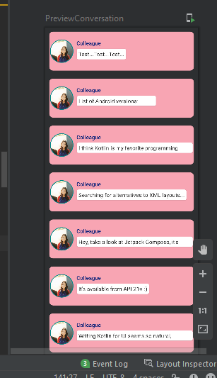
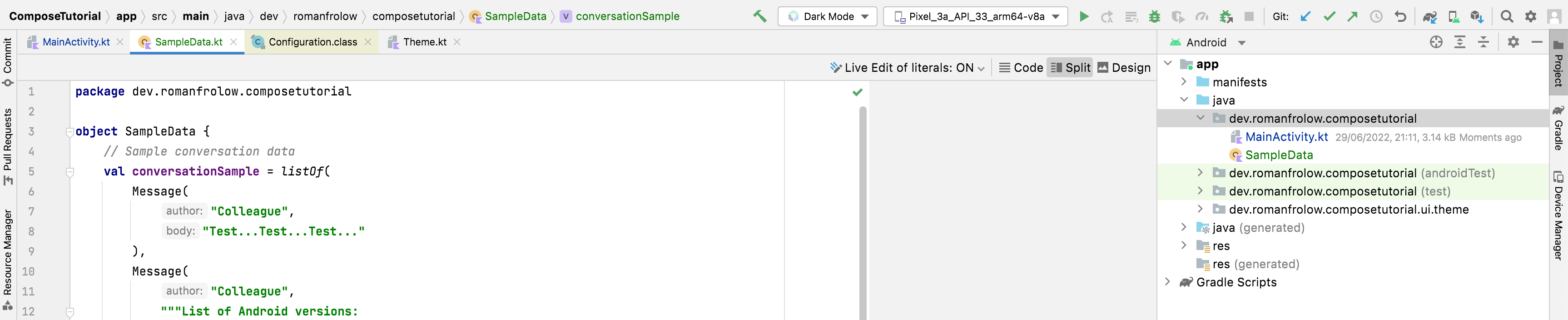
SampleData
object SampleData { // Sample conversation data val conversationSample = listOf( Message( "Colleague", "Test...Test...Test..." ), Message( "Colleague", "List of Android versions:\n" + "Android KitKat (API 19)\n" + "Android Lollipop (API 21)\n" + "Android Marshmallow (API 23)\n" + "Android Nougat (API 24)\n" + "Android Oreo (API 26)\n" + "Android Pie (API 28)\n" + "Android 10 (API 29)\n" + "Android 11 (API 30)\n" + "Android 12 (API 31)\n" ), Message( "Colleague", "I think Kotlin is my favorite programming language.\n" + "It's so much fun!" ), Message( "Colleague", "Searching for alternatives to XML layouts..." ), Message( "Colleague", "Hey, take a look at Jetpack Compose, it's great!\n" + "It's the Android's modern toolkit for building native UI." + "It simplifies and accelerates UI development on Android." + "Less code, powerful tools, and intuitive Kotlin APIs :)" ), Message( "Colleague", "It's available from API 21+ :)" ), Message( "Colleague", "Writing Kotlin for UI seems so natural, Compose where have you been all my life?" ), Message( "Colleague", "Android Studio next version's name is Arctic Fox" ), Message( "Colleague", "Android Studio Arctic Fox tooling for Compose is top notch ^_^" ), Message( "Colleague", "I didn't know you can now run the emulator directly from Android Studio" ), Message( "Colleague", "Compose Previews are great to check quickly how a composable layout looks like" ), Message( "Colleague", "Previews are also interactive after enabling the experimental setting" ), Message( "Colleague", "Have you tried writing build.gradle with KTS?" ), ) }
res>drawable>profile_picture.png
https://developer.android.com/images/jetpack/compose-tutorial/profile_picture.png
This works for me, I also change background color
padding and image sizae.
import android.content.res.Configuration
import android.os.Bundle
import android.os.Message
import androidx.activity.ComponentActivity
import androidx.activity.compose.setContent
import androidx.compose.animation.animateColorAsState
import androidx.compose.animation.animateContentSize
import androidx.compose.foundation.Image
import androidx.compose.foundation.background
import androidx.compose.foundation.border
import androidx.compose.foundation.clickable
import androidx.compose.foundation.layout.*
import androidx.compose.foundation.lazy.LazyColumn
import androidx.compose.foundation.lazy.items
import androidx.compose.foundation.shape.CircleShape
import androidx.compose.foundation.shape.RoundedCornerShape
import androidx.compose.material.MaterialTheme
import androidx.compose.material.Surface
import androidx.compose.material.Text
import androidx.compose.runtime.*
import androidx.compose.ui.Alignment
import androidx.compose.ui.Modifier
import androidx.compose.ui.draw.clip
import androidx.compose.ui.graphics.Color
import androidx.compose.ui.res.painterResource
import androidx.compose.ui.tooling.preview.Preview
import androidx.compose.ui.unit.dp
import com.example.jetpacktutorialchatapp.ui.theme.JetPackTutorialChatAppTheme
class MainActivity : ComponentActivity() {
override fun onCreate(savedInstanceState: Bundle?) {
super.onCreate(savedInstanceState)
setContent {
JetPackTutorialChatAppTheme {
Conversation(SampleData.conversationSample)
Conversation(messages = SampleData.conversationSample)
}
}
}
data class Message(
    val author: String,
    val body: String
)

@Composable
fun MessageCard(msg: Message,
color: Color = LightRed2
) {
    Row(
        modifier = Modifier
            .padding(10.dp)
            .clip(RoundedCornerShape(10.dp))
            .background(color)
            .padding(horizontal = 2.dp, vertical = 20.dp)
            .fillMaxWidth()

    ){

        Image(
            painter = painterResource(id = R.drawable.img),
            contentDescription = null,
            modifier = Modifier
                .size(60.dp)
// Clip image to be shaped as a circle
.clip(CircleShape)
.border(1.5.dp, MaterialTheme.colors.secondaryVariant, CircleShape)
)
// Add a horizontal space between the image and the column
Spacer(modifier = Modifier.width(8.dp))
        // We keep track if message is expanded or not in this variable
        var isExpanded by remember { mutableStateOf(false) }

        // surfaceColor will be updated gradually from one color to the other
        val surfaceColor: Color by animateColorAsState(
            if (isExpanded) MaterialTheme.colors.primary else MaterialTheme.colors.surface
        )

        // We toggle the isExpanded variable when we click on this Column
        Column(modifier = Modifier.clickable { isExpanded = !isExpanded }) {
            Text(
                text = msg.author,
                color = DeepBlue,
                style = MaterialTheme.typography.subtitle2
            )

            // Add a vertical space between the author and message texts
            Spacer(modifier = Modifier.height(4.dp))

            Surface(
                shape = MaterialTheme.shapes.medium,
                elevation = 1.dp,
                // surfaceColor color will be changing gradually from primary to surface
                color = surfaceColor,
                // animateContentSize will change the Surface size gradually
                modifier = Modifier
                    .animateContentSize()
                    .padding(1.dp)
            ) {
                Text(
                    text = msg.body,
                    modifier = Modifier.padding(all = 4.dp),
                    // If the message is expanded, we display all its content otherwise we only display the first line
                    maxLines = if (isExpanded) Int.MAX_VALUE else 1,
                    style = MaterialTheme.typography.body2
                )
            }
        }
    }
}
@Composable
fun Conversation(messages: List<Message>) {
    LazyColumn {
        items(messages) { message ->
            MessageCard(message)
        }
    }
}

@Preview
@Composable
fun PreviewConversation() {
    JetPackTutorialChatAppTheme {
        Conversation(SampleData.conversationSample)
    }
}


@Preview(
    showBackground = true,
    name = "Light Mode"
)
@Preview(
    uiMode = Configuration.UI_MODE_NIGHT_YES,
    showBackground = true,
    name = "Dark Mode"
)
@Composable
fun DefaultPreview() {
    JetPackTutorialChatAppTheme {
        Conversation(messages = SampleData.conversationSample)
    }
}
}
can someone explain how to import
I'm getting so many errors
I'd suggest making use of Kotlin's raw strings here:
object SampleData {
    // Sample conversation data
    val conversationSample = listOf(
        Message(
            "Colleague",
            "Test...Test...Test..."
        ),
        Message(
            "Colleague",
            """List of Android versions:
            |Android KitKat (API 19)
            |Android Lollipop (API 21)
            |Android Marshmallow (API 23)
            |Android Nougat (API 24)
            |Android Oreo (API 26)
            |Android Pie (API 28)
            |Android 10 (API 29)
            |Android 11 (API 30)
            |Android 12 (API 31)""".trimMargin()
        ),
        Message(
            "Colleague",
            """I think Kotlin is my favorite programming language.
            |It's so much fun!""".trimMargin()
        ),
        Message(
            "Colleague",
            "Searching for alternatives to XML layouts..."
        ),
        Message(
            "Colleague",
            """Hey, take a look at Jetpack Compose, it's great!
            |It's the Android's modern toolkit for building native UI.
            |It simplifies and accelerates UI development on Android.
            |Less code, powerful tools, and intuitive Kotlin APIs :)""".trimMargin()
        ),
        Message(
            "Colleague",
            "It's available from API 21+ :)"
        ),
        Message(
            "Colleague",
            "Writing Kotlin for UI seems so natural, Compose where have you been all my life?"
        ),
        Message(
            "Colleague",
            "Android Studio next version's name is Arctic Fox"
        ),
        Message(
            "Colleague",
            "Android Studio Arctic Fox tooling for Compose is top notch ^_^"
        ),
        Message(
            "Colleague",
            "I didn't know you can now run the emulator directly from Android Studio"
        ),
        Message(
            "Colleague",
            "Compose Previews are great to check quickly how a composable layout looks like"
        ),
        Message(
            "Colleague",
            "Previews are also interactive after enabling the experimental setting"
        ),
        Message(
            "Colleague",
            "Have you tried writing build.gradle with KTS?"
        ),
    )
}
I agree with @j-m-hoffmann's approach of using Kotlin's String Literals.
Less code and easier to read!
interesting ✨✨✨
I agree with your idea.
@j-m-hoffmann Thank you 👍
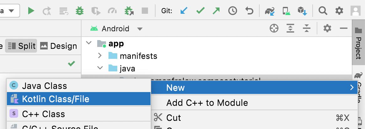
To import it right click in Project tab, Android selected in dropdown.
Right-click on app > java > dev.yourname.composetutorial then New > Kotlin Class/File and just paste content from this gist.
Does anyone know how to add 3 dots (...) at the end of the line when not expanded?
I imagine this is hard because you'd have to know the last 3 chars shown on the line and then replace them with ... and then ensure the line still displays them (didn't grow).
Or perhaps there's a better/idiomatic way to mark a message as incompletely-showing and thus in need of expansion?
Another,unrelated, thing:
EDIT: [SOLVED] by replacing remember with rememberSaveable yay!(thanks to this and this) // Does anyone know how to not lose the state of the expansion even though you scrolled away ? for example, expand the second entry then scroll to the bottom, then scroll back up, the second entry is no longer expanded! The state of isExpanded was lost and reset to false... This is rather unexpected (from the UI perspective)... (but of course code-wise it makes sense that the value false gets set when recomposition happens)
To import it right click in Project tab, Android selected in dropdown.
Right-click on
app > java > dev.yourname.composetutorialthenNew > Kotlin Class/Fileand just paste content from this gist.
thank for the screenshot and help. Also how do you have the package name dev.username.[something] I only have com.example.composetutorial

thanks very much.
thanks very much.
You're welcome, glad that my response helped out.
To import it right click in Project tab, Android selected in dropdown.
Right-click on
app > java > dev.yourname.composetutorialthenNew > Kotlin Class/Fileand just paste content from this gist.
THIS!!!! thank you very much!
nice)