Skip to content

Instantly share code, notes, and snippets.

@desandro
Last active December 30, 2021 23:11
Show Gist options
  • Star 94 You must be signed in to star a gist
  • Fork 0 You must be signed in to fork a gist
  • Save desandro/1c50118441f703f3f6e1 to your computer and use it in GitHub Desktop.
Save desandro/1c50118441f703f3f6e1 to your computer and use it in GitHub Desktop.
Bower logo

In addition to awesome docs #228, Bower deserves a proper logo. See below for sketches. I'm curious if you think any of these are worth me putting more effort into.


Take a look at Yeoman right now.

Screen Shot 2013-02-19 at 4 43 10 PM

The other two entities have awesome logos. Bower's got to represent.

Background

@fat introduced me to Bower by showing me this video: The Vogelkop Bowerbird: Nature's Great Seducer. Bower gets its name from the Bower bird, a line of birds who build structures to seduce their mates. As you'll see in the video, the Vogelkop is the most creative in its collection of treasures. It will stash leaves, bottle caps, berries, dung balls, mushroom heads, etc. This is essentially what Bower the project does - putting together a treasure trove of lots of goodies.

The Vogelkop is the best collector bowerbird, but for visuals, I've been drawing the Flame Bowerbird, with its striking red/yellow/green plumage.

Dancers on Fire

YouTube has a whole Smithsonian show just on the Flame Bowerbird Dancers on Fire. Watch 26:33 for a male in 'full twerk', seducing a female. He's presenting a blue leaf, and doing this one-wing swivel move.

Mood

I see Bower as approachable and practical. It works as a lil' helper. It's friendly.

Sketches

Studying the flame bowerbird.

bower sketch

bower sketch

bower sketch

Illustration

bower sketch

bower sketch

Bower sketch

bower sketch

The good ones

Mascot

good bower sketch

This is more of a traditional mascot. That's a blue leaf in its beak. It's doing the seduction twerk.

Geometric B

geometric bower

Geometric representation of a flame bower bird. It's cute cause it's a B. It's simple so it can be reduced to tiny sizes like avatars and favicons. With that B shape, we could do stuff like

bower with a bird b


2nd revisions

Tuesday, March 19, 2013

When we last left off 3 weeks ago, I started taking the Mascot illustration into Illustrator. Here's where that ended up:

bower illustrator

After speaking with a colleague, we concurred it wasn't quite it. While it was certainly a cute bird, there was too much detail and the feet were weird. Ideally, this logo should be the sort of imagery that you can slap on your laptop. It should fit right in there between an Octocat and the Twitter logo.

So I went back to paper, with the task of simplifying the forms.

bower revision 1

Feet removed. Wing detail simplified.

bower revision 2

Extending the body. Giving the torso more shape so it feels like the bird is swiveling around. The head is elevated above the body for more distinct silhouette.

But still, there's something missing from the above illustration. Per Erin, it feels 'embryonic'. Showing the other wing tip might resolve this.

I'm feeling pretty good with the way things are heading. We'll have a logo soon enough.


Vectoring simplified sketch

Bower working vector logo

Here's where I've taken it. This is working for me. But it's not quite 100% perfect

@isaacdurazo was awesome enough to reach out and offer his superb illustration skills. He'll be seeing the logo through to the finish. I'm really looking forward to what he comes up with.

Finalizing

Isaac @ Bocoup collaborated in finishing the logo. Here's where we landed. This image illustrates all the iterations and small tweaks that come with designing a logo mark.

Bower logo iterations

Isaac did a great job of unifying the colors and simplifying the forms. I brought Isaac's contributions into the previous stroked treatment.

It looks rad.

Bower

As a bonus, I've cleaned up all the control points in the illustrator file. In SVG, this illustration is 5KB.

Display the source blob
Display the rendered blob
Raw
Sorry, something went wrong. Reload?
Sorry, we cannot display this file.
Sorry, this file is invalid so it cannot be displayed.
@stuartpb
Copy link

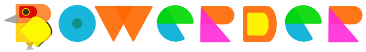
I like the "B" one as a logo (square is good), but I agree that it maybe looks too much like a "P" when presented with a yellow wing. What does it it look like with a green wing next to "OWER"?

@oskarrough
Copy link

Very nice, well done.

@kristofo
Copy link

Love this, you're right about the wing. Maybe you can just use a small line on the left side that suggests the other wing?

@addyosmani
Copy link

I really like the revision from March 19th. Nice work, sir!

@sperte
Copy link

sperte commented Mar 19, 2013

What, you don't like Copperplate? :)

I love the direction. Are you going to try and mimic any of the geometric symmetry from Twitter logo? http://www.underconsideration.com/brandnew/archives/twitter_gives_you_the_bird.php

@artzstudio
Copy link

What's the rationale for the geometric theme? This isn't resonating with the name "Bower" for me, or the homage to Twitter's bird. Though, anything is better than Copperplate. Not to be "that guy" but I'd love another direction to choose from. :)

@neagle
Copy link

neagle commented Mar 19, 2013

Perhaps the Bowerbird could have a rakishly cocked eyebrow? It's trying to seduce us, after all.

Also: I like the possible implication that the Bowerbird has killed the Twitter bird to procure that blue feather.

@theroux
Copy link

theroux commented Mar 19, 2013

@neagle It's a blue leaf. The bowerbird is a lover, not a fighter!

@theroux
Copy link

theroux commented Mar 19, 2013

<armchair graphic designer>

I wonder if the two lines-of-sight created by the head/leaf and wing pointing in different directions could be improved by having them converge?

Something like this: http://o.aolcdn.com/hss/storage/fss/7bb4504adaa5125852048648b6ead10f/bower-wing-curl.jpg (excuse the Photoshop hatchet job)

</armchair graphic designer>

@desandro
Copy link
Author

Thanks for the feedback!

Re: aligning with Twitter branding - That thing in the bird's mouth is a leaf, not a feather. If you watch videos about bower birds, they tend to present blue leaves. I realize the shape is very feather-y, right now, I need to make it more leaf-y.

The leaf will be Twitter Blue, but that's about it for aligning it with Twitter branding. The Twitter brand guidelines encourage other brands to use their own unique branding. Even though this project very much a part of Twitter, we like to keep our branding just for Twitter. I'm already stepping close by using a bird with one wing.

@artzstudio the rationale for the geometric illustration was to do something different than another friggin bird. At Twitter, everything is a bird.

@neagle Oh man, that cocked eyebrow may actually make it in. Good one.

@TheHippo
Copy link

👍

@necolas
Copy link

necolas commented Mar 19, 2013

Heading in a good direction. Simplify (some more), IMO! We should see how this works at smaller sizes too. Keep up the great work Dave!

@sindresorhus
Copy link

I really like the direction this is going.

@benschwarz
Copy link

Looking great Dave — is there a word mark also?

@desandro
Copy link
Author

Logotype will be the next thing. I'll be attacking that along with the docs redesign

@jondlm
Copy link

jondlm commented Apr 17, 2013

Love the logo. Thanks for taking the time to document your process, it's very helpful!

@nixstrom
Copy link

Looks great! Funny, when it popped up in my twitterfeed, I also thought the Bowerbird had eaten the Twitter-bird...

Also, I love the "BOWER" type, but I think the 'B' looks messy. It's neither a bird or a 'B'. Great work overall, though.

@sindresorhus
Copy link

@desandro It looks so good. Great work on it!

@xero
Copy link

xero commented Sep 10, 2013

great work! 👍
thanx for sharing the SVG

@LaurentGoderre
Copy link

Awesome logo!!

@MerlinCalo
Copy link

David, I enjoyed seeing the creative process, and learning about the story behind the logo. I think extending the body, simplifying the design, and saturating the color, made a big difference! Credit to @isaacdurazo also, I was not aware that it was a blue leaf the bower bird is holding. I always thought it was a feather too, and maybe there was some connection with Twitter, now I know! Thanks for sharing, and keep up the great work!

@MattArnold
Copy link

@KehindeAyanleye
Copy link

It's fascinating getting to see the this logo in making. Thanks.

@skullteria
Copy link

Thank u, :). This was really inspiring for me.

@MarceloBritoWD
Copy link

Very nice job!

@Revod
Copy link

Revod commented Jan 25, 2016

amazing!

@adamschwartz
Copy link

👍

@altyaper
Copy link

Awesome work!

@tnga
Copy link

tnga commented Jun 15, 2016

Yeah awesome work @desandro 👍 😄 ! I used your first revision, geometric B for the bowerder project which is related to bower. The rendering isn't exactly the same considering that i made it from scratch, but i hope you will appreciate. I also hope that this decision isn't a problem 😄 !

bowerder-banner

@beeman
Copy link

beeman commented May 3, 2017

Very cool to see the progress!

Sign up for free to join this conversation on GitHub. Already have an account? Sign in to comment